Tag

design

Browsing

By Carrie Cousins

All three of this month’s essential design trends have to do with typography. And the trends showcase some pretty stellar ways to use beautiful type to create user engagement and make a great first impression.

One common theme among these designs is that all of the typography styles are highly readable. If you plan to work with a more trendy or funky text element, choose a typeface that users won’t struggle to read. The trendy technique is the trick with these designs, not the typeface itself.

Here’s what’s trending in design this month:

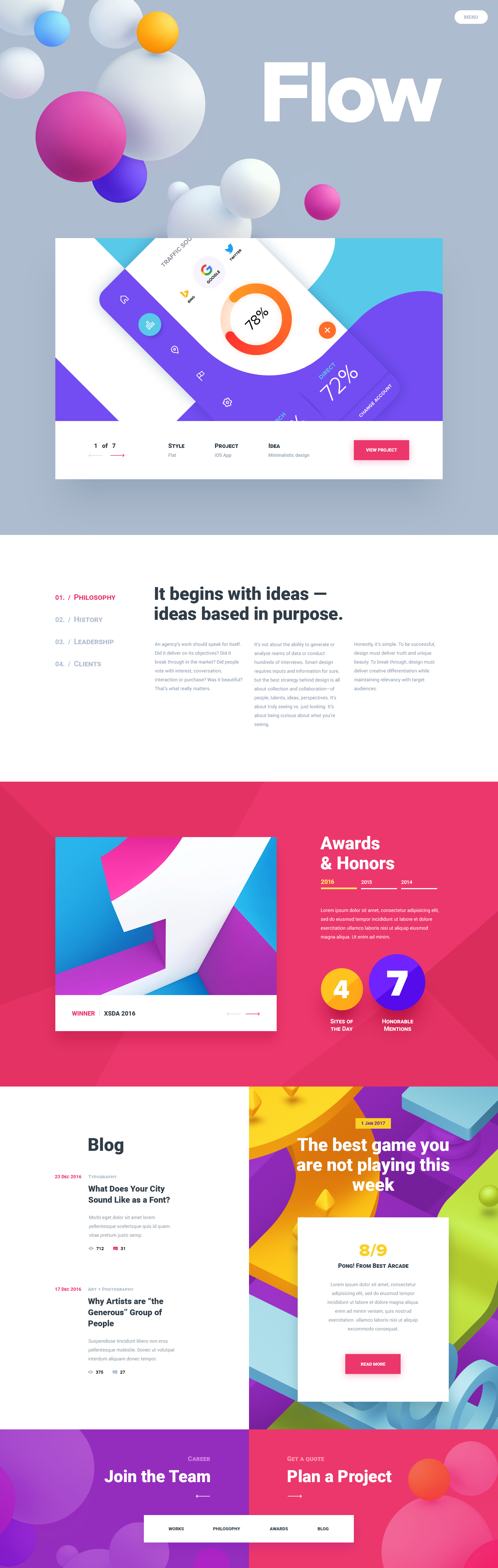
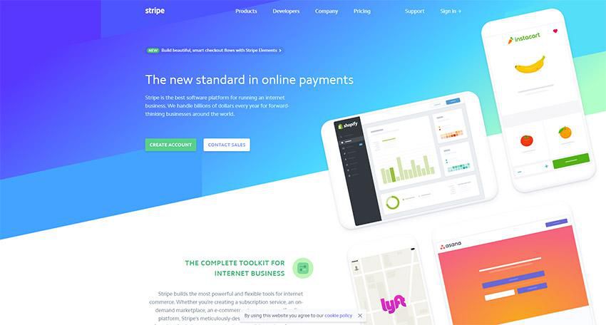
1. Just Type Above the Scroll

While a great image can help draw users into a design, sometimes the right words and space are the ticket.

The key to making the most of this design trend is to refine your message. The words need to be simple, say something meaningful and create value for the user.

So how do you do it?

  • Start with a key phrase. It can be your mission or a value proposition for users. Tell users what you bring to the table and why your website will be important to them.
  • Pick a simple typeface that has the same mood as the messaging for longer copy blocks.
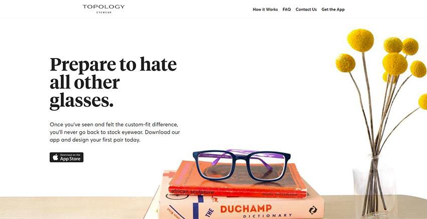
  • If the text block is short, such as with Types of Type, consider a funkier type option to draw users in.
  • Make the most of space. Note that in each of the examples below, text has plenty of room to breathe, making it easier to read at a glance. Space can also help draw the eye to text, and can balance text elements if you don’t want to center them on the screen, such as Design Ups.
  • Use color to help add visual interest. Bright, trendy hues can help draw users into the design. Color can also help set a mood that correlates to messaging.

When working with a type-heavy design, don’t force it. Sometimes you won’t have enough text to fill a full “screen.” Less+More and Type of Type use color blocking to create multiple panels that are sized perfectly for the text content therein.

less
designups
types

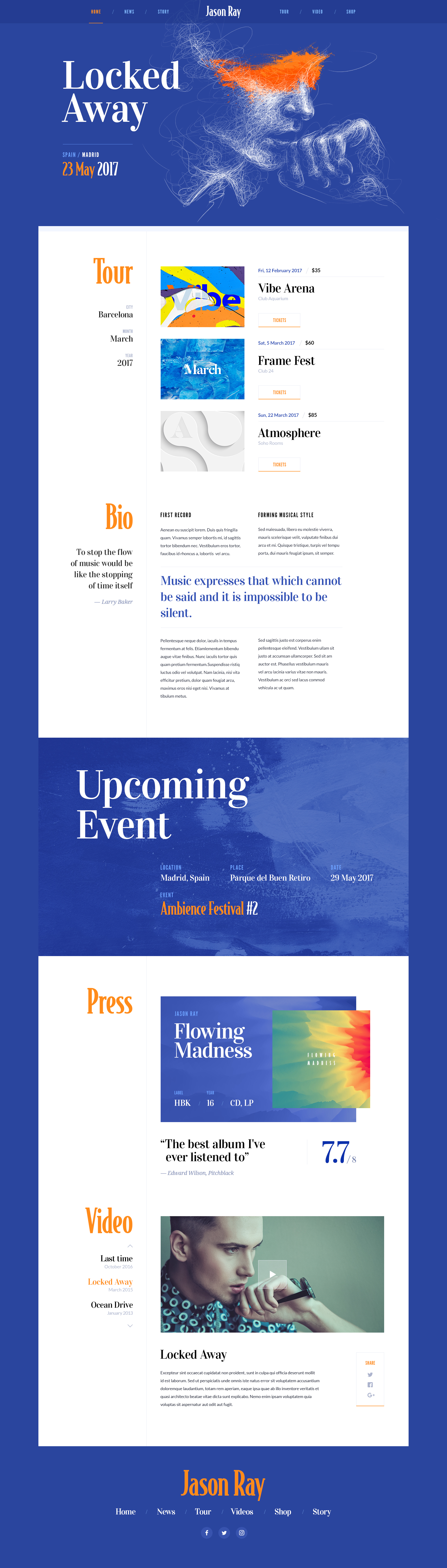
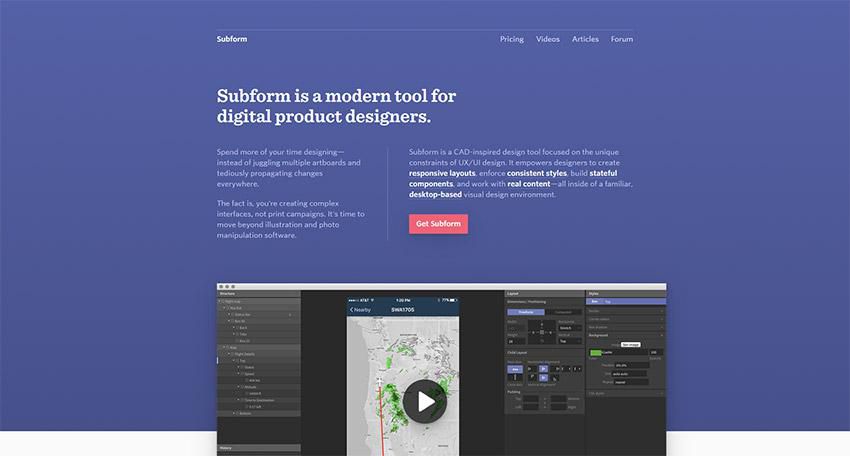
2. Text in White Boxes

With so many bold visual elements in website design projects—and so many responsive breakpoints to deal with—white boxes are re-emerging as a container element for text. White boxes with dark text inside can ensure readability when it comes to messaging on top of photos, video or illustration where there is color variance.

And while this trend might sound a little, well…sloppy or lazy, it actually looks great when done well.

You can’t just slap a box anywhere on an image and hope for the best. White boxes need to be placed strategically so that they don’t cover important parts of the image and so that users do move to them in the course of looking at the design.

White boxes need to be big enough to contain a reasonable amount of text and you should have a plan for this element on smaller screens, such as allowing everything in the text box to drop below the main image. Don’t try to put a text box over an image on smaller screens because you’ll end up with a box of text that’s too small to read or the box will cover most of the image itself.

If you pot for the white box treatment, have fun. Each of the examples below use white boxes in completely different ways.

Do Space cuts a white box into the bottom corner of the image so that most of the image is visible. The white box bleeds into the white space below so that it almost looks like it comes up out of the panel below. This technique helps connect the main slider to the content below (and can even encourage scrolling).

do-space

HowIt uses circular blobs so that the white text boxes better match the tone of the background illustration. This subtle shift in shape, so that the boxes appear more fluid helps connect the elements so that the boxes and background have a consistent feel. You don’t want white boxes for text to feel like they are haphazardly placed on the background. (That doesn’t work and won’t help create a cohesive feel for users.)

howlit

Macaulay Sinclair has more text than the other examples using one part of an image-panel grid to hold the text element. Here, the image behind the white box serves no information value. It has a color and movement scheme that looks similar to other images and mostly serves to create cohesion between the text element and rest of the design.

macaulay

3. Typography Cutouts

No one ever said that text has to be a series of solid filled letters. More designers are opting for typography cutouts that feature a color block over an image so that the image comes through clear lettering.

This technique can work with still or moving images and with full screen overlays so that only a small amount of information comes through letters (almost to create a texture) or with more of a block-over-image-style with more of the background image visible.

The trick to making this work is the right typeface. Letters have to have thick enough strokes so that the image or texture in the background is visible. You can’t do this with a thin or condensed font with any consistent success.

This technique also works best if the number of words and letters is fairly limited. Stick to one to three words with 10 or fewer letters or use very common words that users will know at a glance.

Danbury uses a bright text cutout as a draw to encourage users to engage with the video call to action. The entire orange box is just a giant button.

danbury

Fusion Winery uses a background video of a vineyard in the lettering. What’s great about this design is the triple layer effect: Video background below white text cutout below a product image.

wine

The Kaneko uses an unidentifiable image as the fill for letters. If you opt for this style, keep this background simple as done with this design. There’s just a touch of color and texture that draws the eye to the text on the stark canvas.

kaneko

Conclusion

The collection provides inspiration for those projects that might not have a great image or video, so that you can still find a way to create something that users will respond to. Don’t be afraid to use text as a visual and informational element in this design.

What trends are you loving (or hating) right now? I’d love to see some of the websites that you are fascinated with. Drop me a link on Twitter; I’d love to hear from you.

By Carrie Cousins

Carrie Cousins is a freelance writer with more than 10 years of experience in the communications industry, including writing for print and online publications, and design and editing. You can connect with Carrie on Twitter @carriecousins. More articles by Carrie Cousins

Sourced from webdesignerdepot.com

Sourced from ABDUZEEDO

After a Weekend of rest, I thought we should start it all with a burst of web design inspiration. A collection really well-designed by Prague-based design boutique Creative Mints. A great balance of typography, layout, and colors; somehow quite different from the usual “guaranteed approaches” and stock photo gallery designs we are seeing lately. It’s great to understand the UX of things but it never hurts to also put an accent on the playfulness of your designs.

ocated in Prague, Czech Republic, Creative Mints is a design boutique with projects focused mainly around illustration, UI/UX and Graphic Design. We really do enjoy their work on ABDZ, make sure to check out their Behance.

More Links

Web Design

Web Design Layout Collection by Creative Mints


Sourced from ABDUZEEDO

Visual hierarchy is vital to good website design. It’s one of the key principles that will make your website effective in accomplishing your goals for it.

There’s a lot of theory behind visual hierarchy. It’s so important that a lot of study and effort has been put into understanding how and why it works. Understanding it can help you use it.

Design is a Form of Communication

At its core, design is a form of visual communication. It’s about communicating ideas to others through a visual medium. This is true of all forms of design. It is especially true of web design, the design school of the information industry.

Massive blocks of information do not communicate well because people are actually visual thinkers. We don’t simply process data. People do not simply see things. Rather, human beings organize what they see in terms of “visual relationships”.

The Rise of Visual Hierarchy

The Rise of Visual Hierarchy

Why we see in terms of relationships has been a study unto itself. Anthropologists contend that it’s a remnant of hunter-gatherer history that helped our ancient ancestors survive.

A practical, less scholarly way of looking at it is that it’s just the way our brains understand information. We group similar elements together and organize them into meaningful patterns that we can use simply use.

Regardless of how you think the visual hierarchy used by the human brain came about, it is how we organize information and utilizing it is a very effective way of communicating a message.

The Tools of Visual Hierarchy

Now you understand the visual hierarchy is a useful tool for communicating information, how do you create it as a web designer?

The tools to pull it off are very simple and easy to learn. All you need to do is figure out how to use them.

Size

size

Bigger objects are essentially shouting. They demand people pay more attention to them. In terms of visual hierarchy, a viewer’s eye will naturally be drawn to a larger object.

This is one of the most powerful tools you can use for visual organization. Correlate size with importance. Your biggest elements should typically be your most important, while the smallest ones are normally the least important.

Color

Color

Color is both an organizational tool and a way of adding personality to your web design. Bold and contrasting colors demand a viewer’s attention and focus.

This is best used for buttons and hyperlinks. As a tool for adding personality, color can be used in more sophisticated ways.

Fun, bright colors can make a page exciting while claiming colors create a soothing feel. Color is very important. It can communicate a brand (i.e. Pepsi blue, McDonald’s yellow) or can be used as symbolism (i.e. passionate red). You can even apply colors as a way to classify info within the visual hierarchy.

Fonts

Fonts

Selecting the proper fonts for your design is critical when wanting to create visual hierarchy. It’s not just the font itself important, but how you use it. The weight and style you use are as important as the area of the site you place them in.

To organize what’s important, try using a variety of type sizes and weights. Italics serve their purpose as well in certain situations.

You can create a typeface hierarchy on your site with text of various sizes, weights, and spacing. It doesn’t matter that you’re using a single font on your website.

typeface hierarchy

By using a variation of it size and weight, you are not only drawing attention to the more important elements, but you are creating an overall composition that will be easy to read and understand for the visitor.

White Space

In the midst of all this careful use of visual hierarchy, make sure there is whitespace left. You need to give your content room to breathe.

Negative space is an important part of the visual design, defining it just as much as a positive use of space.

White Space

White space is often defined simply as being “the space between stuff on the page;” although, this extra space is not always white in color, which has led to more individuals instead referring to it as “negative space.”

White space essentially enables you to dictate which particular features of a website that you’re building should stand out over others. Thanks to the welcoming type of layout this creates, visitors will be more likely to remain on the website for longer amounts of time.

Whitespace offers a break for the eye and also highlights important elements. Too much crowding and clutter can drive viewers away because they can’t understand what is actually important.

The Human Eye and Scanning Patterns

The human eyes work in predictable ways. They are automatically drawn to certain points of interest. Some of this does depend on the individual person, but most people follow particular, predictable trends with how they view just about everything, including websites.

F-Pattern

This is the scanning pattern most people use for text-heavy websites like blogs or wikis.

The reader first scans a vertical line down the left side of the page, looking for keywords or other points of interest in the first few sentences of the paragraphs.

F-Pattern

Once the reader finds something interesting, he or she starts reading the text normally in horizontal lines. The overall pattern resembles the letter F (or E).

Z-Pattern

This scanning pattern is used on pages that are not centered on the text. Readers first scan a horizontal line across the top of a page. This of often because of the menu bar, but it is also a habit that comes from reading left to right.

Once the eye reaches the end of the horizontal line, it moves down and to the left, another left to right reading habit, and starts over again. The pattern resembles the letter Z.

Z-Pattern

This is a useful pattern to take advantage of in your site’s visual hierarchy. It addresses many basic site design requirements: calls-to-action, visual hierarchy, and branding.

It’s really, really great for those times when simplicity is a major priority and the call-to-action is the primary purpose of the page. It brings a sense of order to simpler websites. However, complex content does not work terribly well with the Z-pattern and the F-pattern might be a better choice.

These are a few best practices:

  • Separate your background so that the viewer’s sight is kept within the visual pattern framework.
  • Logos look good in the upper left, right where they are immediately visible.
  • A colorful secondary call to action within the Z-pattern can be a helpful guide for users.
  • Featured image sliders in the center of the page help separate the top and bottom aspects of the Z-pattern visual path.
  • Add icons to the left side of the page to guide people to the call-to-action.
  • The visual pattern should end in your primary call-to-action.

Understanding visual patterns and the natural movement of the human eye can help you arrange your website design to your best advantage. When you know what people will be looking for, you can arrange information so it best catches their attention and guides them where you want them to go.

Conclusion

Visual hierarchy is an important part of web design. Understanding how it works will allow you to create as effective a site as possible.

It provides a guideline for organizing your content. Take a look at some good site designs you’ve seen and see how they’ve used it to effectively communicate their message.

By

Sourced from speckyboy

By

HP is opening its software to help creatives and brands collaborate to achieve greater and more rapid customisation and personalisation of their products.

HP’s SmartStream Designer software, famously used to create the personalised bottles for the ‘Share a Coke’ campaign, has been stripped back to make it more accessible to designers. Until now the software was only accessible to owners of HP digital presses, but the lighter version of the software – HP SmartStream Designer for Designers (D4D) – is set to democratise the digital printing process.

The beta trial was unveiled at a launch party at the Black Swan Studios in London’s Bermondsey on Thursday.

Smirnoff gave its blessing to HP and emerging designers, the Yarza Twins, to show off the capabilities of the technology. The Yarzas created a design concept using 21 characters, 21 hats, 21 bodies and 21 patterns to reflect the brand Smirnoff 21 and showcase the capability of D4D. This resulted in the creation of individualised bottles, posters, table wrappings, wallpaper, based on an ‘Everyone the same, Everyone different’ concept.

“We are living in very tough times where everyone is very individualistic and believes their community is the best, so we wanted to bring it back the idea of everyone is the same, everyone is different,” added Marta Yarza.

Nancy Janes, global head of brand innovation at HP, said: “Share a Coke was the lighthouse campaign that people are very familiar with and helped people understand that HP digital printing is no longer short run.

“Now what the designers are looking for is; how do you take digital printing to the next level to make packaging truly unique, regardless of volumes.”

D4D is free-to-use and allows designers to create 20 variable images from every seed file, which will enable rapid prototyping.

Janes explained: “The designers can fix any design elements that need to remain and then vary or randomise everything else. If the brand client signs off on the concepts it can go into full blown production with a D4D enabled HP print service provider.”

Steve Honour, design manager at Diageo Europe & Africa, said the company would “love to” roll out the bottle designs on a commercial scale and added the HP technology meant this was a “feasible possibility.

“The idea of taking this to a larger scale and people standing and spending 10 minutes looking at the packaging as art is actually really exciting because sometimes art, design and creativity is not accessible, or shareable, let alone purchasable and touchable,” said Honour.

Silas Amos, who coordinated the collaboration between HP, Smirnoff and the Yarzas, believes allowing designers access to the software to prototype designs is “changing the rules”.

“Advertising has become a real-time medium, leaving packaging behind, but the opportunity is now here to move the packaging industry forward,” said Amos. “It is the only interruptive media left. I can screen out a banner ad, look away from a magazine, turn off the television, but if I want to get to the aspirin or the deodorant, I have to go through the packaging.

“You have to be very careful you are building the brand and not diluting the brand. The good stuff will be based on brands that have invested in building strong iconography that can be flexed so it is un-mistakably them even when they are highly abstracted.”

HP has created videos featuring the Yarzas to show off the capabilities of the software and explain how it can be used.

The 500 designers who will trial the software are being accepted on a ‘first come first served’ basis, and there will be 15 ‘super users’ providing detailed feedback during the beta trial.

Janes said the UK was chosen for the trial due to its innovative nature and because the “design community in London is really quite dynamic”.

Other designers and artists who have already trialed the technology and spoke of their efforts at the launch party included Emily Forgot, Supermundane and David Shillinglaw.

“I think this is a really playful technology and it feels like the future,” said Shillinglaw.

The software also allows users to print in a combination of seven colours than the usual four (cyan, magenta, yellow, and black).

“When you print normally, it does not look the same as your screen, but this way it looks exactly the same,” said Marta Yarza.

The software can be used on any type of print, whether that be a corrugated piece, a table covering, the floor, a leaflet, a brochure or a business card.

“Where people are looking for omnichannel executions I think print has a big role to play,” concluded Janes.

The new software will be trialed among 500 UK-based designers. From November 6 for a three-month period, designers will be able to register to be part of the beta programme by visiting here.

By

Sourced from THEDRUM

By Jenny Brewer

The Future had its inaugural event from 3-4 November in Dublin, organised by the founder of creative festival Offset, and its remit was simple: to explore the ideas, attitudes and innovations that will affect the design industry in years to come. Around 70 speakers took to four stages, ranging from design studios – many from Ireland and others further afield – to trend forecasters, ad agencies, and big name designers like Stefan Sagmeister and Paula Scher, plus It’s Nice That founders Alex Bec and Will Hudson, to share their take on the future. Interpretations were eclectic but generally offered a refreshing point of difference to typical talks that focus on existing work and hindsight, with many presenting analysis and predictions for the shifts in creativity and wider culture. Here we’ve picked out a few highlights and interesting takeaways.

Fjord-dublin-itsnicethat
Fjord Dublin

Lorna Ross, Fjord Dublin

Lorna Ross, director of design agency Fjord’s Dublin studio, kicked off her talk talking about her obsession with photos of “desire paths” on the internet. Google the term, she says, and you’ll discover countless times when humans created more efficient shortcuts to their destination. She used this as an analogy for how we should approach the creative process. “Design is about paying attention to what people are already doing.”

She continued that “designers are being asked to do increasingly difficult things,” as a direct result of changing eras of society, from a manufacturing economy to an experience economy, attention economy, sharing economy, and now a data economy. Members of her team are working in emerging technologies and experimenting with their job roles – for example, one staff member is a synthetic personality architect, designing what robots say and how they say it.

Lorna also touched upon the agency’s acquisition by Accenture, and commented that Facebook, Google and Amazon have grown their art and design headcount by 65%, showing a widespread investment in design by multinational tech companies. They’ve realised, she says, that “design needs to unlock the transformative potential of new technology”.

Campbelladdygetty
Campbell Addy: Getty

Will Rowe, Protein

Protein founder Will Rowe presented trends based on statistics and examples from its recent report. One of these focused on young people’s trust of institutions, finding that only 22% of millennials trust brands, and only 28% trust the media. “With the commercialisation of political issues, 35% [of Gen Z] think it’s positive but misses the mark,” Will said. “It comes down to authenticity.” He referred to brands who’ve succeeded, such as Getty, which commissioned photographer Campbell Addy to produce a series addressing diversity in stock imagery; and Absolut, which continued its long history of supporting LGBTQ rights with campaign Kiss With Pride.

This was echoed by The Future Laboratory’s Trevor Hardy later on, who stated that “60% of Gen Z support brands that take a stand on issues they feel strongly about, and take a civic role”.

Will also talked about how the virtual is merging with reality, and how brands are adapting, referring to Lil Miquela: “The archetypal Instagram star who goes to all the right parties, has a record label, a fashion line – the only difference is she doesn’t exist, she’s an avatar.” He also mentioned Alex Hunter, a virtual character in Fifa who just signed a sponsorship deal with Coca-Cola; and Google Pixel and Boiler Room’s VR dancefloors project.

Technology-will-save-us-micro-bit-list_guitar
Technology Will Save Us

Technology Will Save Us

Demonstrating its latest release, the Mover Kit, Technology Will Save Us spoke about the importance of offering kids off-screen fun. “Technology is closed to our generation,” said founders Bethany Koby and Daniel Hirschmann. “We don’t know how to fix it, it’s not a creative platform. But tech isn’t novel to kids now. They’re fearless about tech. We had a kid, and we were shocked at how pink and blue the toys still are. They don’t engage or empower kids, or help them to see what they’re capable of.”

Tech Will Save Us makes DIY kits for kids to learn making and coding skills, in line with the STEAM approach to education. There is a STEAM Barbie, Bethany said, “but a doll in a pencil skirt and glasses isn’t going to inspire a generation with the practical skills for the future”. The company was also instrumental in the design of the BBC’s Microbit, which aimed to inspire a generation of digital makers, and so far has seen a 9% increase in kids saying they would study ICT/Computer Science, and a massive 23% increase in girls doing so.

Yes-stefan-sagmeister-yes-dumbo-itsnicethat
Stefan Sagmeister

Stefan Sagmeister

Dividing opinion but drawing a crowd, as always, Stefan Sagmeister didn’t exactly stick to the “future” brief with his talk. He did, though, talk about how he believes beauty is becoming culturally important again after 50 years of modernist principles ruling design. “These economic modernists used modernism to pollute our earth with urbanist blocks,” he said, blaming architects Adolf Loos, author of Ornament and Crime, Ludwig Mies van der Rohe and Le Corbusier for “telling the world what it should look like” – which resulted in many cheap and “ugly” uses of modernism to save property developers money. “There is a joke that goes, ‘what is the difference between God and Le Corbusier? God never thought he was Le Corbusier’.”

Stefan also conducted what he called the Mondrian Test on the audience, asking for a show of hands on which of two images was the real Mondrian. “It’s never less than 85% of audiences that recognise the real one,” he claimed, explaining his inference that people instinctively know real beauty. “Form follows function is bullshit. Beauty has a function too.” He also referred to New York’s Highline as an example of beauty’s impact on behaviour. “It’s one of the most successful and influential buildings in post war America. There has not been a single crime on the Highline. I’ve never seen a single piece of trash. That is a direct result of its beauty. And right now there are around 16 projects worldwide trying to emulate its design.”

By Jenny Brewer

Sourced from It’s Nice That

By

WhatTheFont is a Shazam for fonts — a designer’s dream.

The app is a mobile version of the website previously developed by MyFonts, and recognizes any font you point at with your camera, including a variation of similar fonts to go with it. It also lets you buy the fonts you find directly through MyFonts or even share them on social media.

According to Seah Chickering-Burchesky, Senior UX Designer at MyFonts, the app can identify 130,000 fonts with the help of machine learning. The latest version of the app can spot multiple fonts in one image, as well as connected scripts.

I tried it out myself to see what the fuss was about, and it seems to be working perfectly for now: I took a picture of my screen, it checked for text, then let me choose which word’s font I wanted to identify. After that, it offered a list of fonts, usually the exact one I was trying to find.

The app aims to make it easier for designers and anyone who needs to recognize which fonts are used in any text, from websites to prints, ideally asserting. There are a few websites that recognize fonts, like Matcherator and WhatFontIs, but this is the first time we’ve seen the functionality in a mobile app

The app comes in hand for recognizing fonts in the real world, where visiting a website would be impractical. Users on ProductHunt have greeted it mostly with positive reviews so far, but we’ll have to wait a bit longer to see if succeeds in the long run.

By

Sourced from TNW

Based on insights from Facebook, ZenDesk, and others, InVision’s latest tool aims to solve a new kind of problem.

In the last couple of years, design systems have taken big companies ranging from Airbnb to IBM by storm, and for obvious reasons. The dream is to create a set of shared design elements—ranging from the design of a hamburger menu to the grid options of a webpage—and standardize them in such a way that designing becomes less a matter of pushing pixels and more like picking out the right Legos. That way, designers can spend less time futzing with visual design and more time focused on solving actual problems.

But it’s one thing to create those systems and another to manage them. That’s why Airbnb and Facebook have spent countless hours creating their own tooling systems. Today, InVision is announcing the InVision Design System Manager, aimed squarely at the myriad companies with beefy design and development teams which nonetheless have hit a wall in trying to build out their own design systems. It will be open for trials starting in December.

The new product builds upon one created by a company called Brand.ai, which InVision quietly acquired two months ago. It works as a plug-in to Sketch or the recently announced InVision Studio. With it, designers can access a list of shared elements stored in the cloud, and then drag and drop those into a design they’re working on. If they do alter those elements, those changes can be managed and synced with the original files. These were already features of Craft, InVision’s Sketch plug-in, but DSM has a number of features such as version control and permissions which make it a tool better suited to large teams. On top of that, the library of shared elements is used to automatically generate a website that contains all the elements, which developers can readily access.

Thus, according to InVision, using and updating the pieces of a design system becomes a simple part of the design and development workflow. The company spoke to Co.Design exclusively about the new launch.

[Image: courtesy InVision]

Strange Beginnings

Brand.ai has that funny name because the company didn’t start out working on design systems. It originally set out to make a tool that could automatically generate a logo if you gave it high-level brand values, such as “fun” or “sporty.” The team quickly realized that semantic information wouldn’t be enough and that it would need to pull in the company’s style guide to serve as data for a new logo. That’s when they hit a snag.

“We saw companies building those style guides using different tools. Even big companies were using Dropbox to share sketch files,” says Ehud Halberstam, Brand.ai’s founder. But even if a company intended to create one single element that everyone might use, such as a canonical “Buy” button, it was almost impossible to notify the entire team of developers and designers when that Buy button had been updated. “Even for teams like eBay who had already bought into the value of design systems, actually adopting them and using them day-to-day was viewed as a distraction,” Halberstam explains. “That’s the problem we set out to solve.”

One major facet of the problem was integrating both development and design—because design and development don’t quite work the same way. “Companies have touted before that they’re making a GitHub for designers,” points out Clark Valberg, InVision’s CEO. “The metaphor works loosely. But almost all the details do not. Ehud took the approach of looking at what the actual challenges are.” For example, designers, unlike developers, don’t want strangers copying their designs. “Open source” in the design world is known as “stealing.” Version control is another issue. Designers don’t want some random person from marketing to be able to change the color scheme of their UI elements, and then push those changes to the whole organization. Permissions have to be managed in a way that’s slightly different than mere pull requests.

Thus, one key feature of InVision DSM is that permissions are team-based rather than generic—instead of assigning someone Admin or Edit privileges over everything, they can be assigned based on individual collections of assets, so that, for example, an iOS designer can own the iOS designs without anyone futzing with them.

[Image: courtesy InVision]

Learning From The Giants

Many of the nuances of InVision’s new Design System Manager spring from the hundred-or-so companies that Brand.ai talked with when developing their system. For example, Facebook’s design team shot down Halberstam’s assumption that a design team would want to separate their nice, perfect documentation of their design system from the actual production files used to create them. Better to keep all the comments about how the files were meant to be used and why they looked the way they did in the actual product files. Thus, with InVision DSM, the comment threads can be accessed when you’re clicking on an asset that you’re using in Sketch. The idea of being able to set permissions on a team-by-team basis came from insights lent by NewsCorp and ZenDesk.

DSM also comes with features meant to plug into the development workflow. Ordinarily, designers hand developers a Sketch file, which the developer tries to translate into code using their own judgment and inspection tools such as X-Scope. InVision DSM hopes to handle that by translating every element inside a design library into automatically-generated CSS class names with corresponding property values. These can be accessed via a SASS file and an API call. What the developer does with it is up to them, Halberstam points out. The idea is to finally alleviate the pain of a designer having to tell a developer every time a color’s been updated.

That’s a capability that will surely give developers and designers hives over the potential for hiccups in translating Sketch files to CSS. But it’s one that Halberstam says presents the most opportunity, given how divorced the design and coding processes still are. “The reason for joining InVision was the realization that there’s so much opportunity given how many steps there are between design and development,” he says.

Cliff is director of product innovation at Fast Company, founding editor of Co.Design, and former design editor at both Fast Company and Wired. More

Sourced from CO.DESIGN

Sourced from Co.Design

It’s a marathon, not a sprint. Go with your gut. Relax, it’s only work. What advice would you give your younger self? It’s a perennial question, for anyone interested in gleaning the life advice of the older and wiser.

When its 30th anniversary, the foil and film materials company Foilco decided to celebrate its age by asking 30 designers what advice they’d give their younger selves. The results, designed by StudioDBD‘s Dave Sedgwick, are presented in beautiful graphic form, with each designer’s answer given its own typographical due in a book and in a collection of animations online.

Some pieces of advice are design related. “Design is about other people,” writes Christopher Doyle, of Christopher Doyle & Co. “Graphic design is not everything. Graphic design will not save you,” says Michael C. Place of Build. “Don’t look at design to inform your design,” writes Paul Hutchison of Hype Type Studio. Others apply to anyone, creative or otherwise. “Enjoy yourself and find interesting people to work with,” writes the graphic artist Anthony Burrill. “Hustle hustle hustle,” encourages Yah-Leng Yu, a designer at Foreign Policy. “Listen to the voice in your head. It’s who you are,” says Tony Brook of Spin. “The difficult things are usually the things worth doing,” writes Kathleen Sleboda of Gluekit.Flip through the rest of the 30 designers’ inspiring words in the slide show above, and on the project’s website.KS

Feature Image Credit: Dave Sedgwick

Sourced from Co.Design

B

Shapes are at the root of graphic design. They are figures and forms that make up logos, illustrations and countless other elements in all types of designs.

Shapes help the designer to add interest or organize elements of a design. They are not strictly ornamental, either, as shapes can have symbolic meanings, invoke feelings, or be used to direct the eye to the most important information.

The Different Types of Shapes

Shapes are one of the basic elements of graphic design and you have a great variety of shapes to choose from.

Geometric Shapes. These are your basic squares, rectangles, circles, triangles, and the like. These typically include sharp corners but may have rounded elements.

Organic Shapes. This type of shape has flowing lines and are also called ‘natural shapes.’ They resemble objects found in nature such as a pond (a squiggly blob), an apple, or a leaf.

Abstract Shapes. There are also those shapes which we cannot relate to reality. These are the freeform shapes like spirals, cloud-like formations, and multi-dimensional shapes that have become popular in modern logo design.

Using Shapes in Your Designs

Using shapes properly is one of the keys to successful graphic design. The form, color, size and other characteristics for the shapes in a layout can determine its mood and message.

Soft, curved and rounded shapes are perceived differently than sharp, angled shapes.

For instance, a company whose primary customer base is women may use circles and curves in their logo. Likewise, a business in the sports industry will want shapes with sharp lines that portray movement and action like the Nike logo.

Also, consider the invisible shapes of your designs such as the general outline for a website or brochure.

Your wireframe may include shapes for the header and placement of design elements, but the boundaries may not necessarily be drawn out or outlined in the final design.

  • Shapes can be grouped or used in patterns to add emphasis.
  • The “white space” or negative space left between shapes will also significantly impact a design.
  • Experimentation and altering of shapes within a design can ultimately lead to the desired result.

Shape Creation in Modern Graphic Design

Graphics software has transformed the way graphic designers can deal with shapes and Adobe Illustrator is the most useful tool the creation and manipulation of shapes.

  • Simple shapes such as circles, squares, and triangles can be created with a click and drag.
  • Adjusting lines and curves using the tools in Illustrator and similar programs can create more complex shapes, of limitless dimensions.
  • Colors, patterns, opacity and other characteristics of shapes can easily be altered.

It is important for designers to master the shape tools within their favorite software, as almost any shape that can be imagined can now be created.

Feature Image Credit: Yuri_Arcurs/Getty Images

By

Sourced from ThoughtCo.

By Mikelle Leow

What happens to your ability to think up novel ideas when you get older, and when does creativity truly peak?

To answer these questions, Alison Gopnik and Tom Griffiths—professors of psychology at the University of California, Berkeley—have conducted a handful of experiments with their colleagues to determine the effects of age on creativity.

The team began with a group of participants of different ages: namely four- and five-year-old preschoolers, six- to 11-year-old children, 12- to 14-year-old teenagers, and adults.

The researchers discovered that, when it came to making descriptions, preschoolers were the most likely to think up creative, unusual explanations, and school children were slightly less creative. “And there was a dramatic drop at adolescence. Both the teenagers and the adults were the most likely to stick with the obvious explanation even when it didn’t fit the data.”

However, when it came to social problems, teenagers were deemed the most creative group. “They were more likely to choose the unusual explanation than were either the 6-year-olds or the adults.”

“Why does creativity generally tend to decline as we age? One reason may be that as we grow older, we know more. That’s mostly an advantage, of course. But it also may lead us to ignore evidence that contradicts what we already think. We become too set in our ways to change.”

It turns out that while much of childhood and adolescence is spent exploring multiple facets of life, creativity dwindles in adulthood as a result of the stern constraints of reality. Moral of the story: it’s important to see things in a childlike wonder at times, even when your consciousness fights back and tells you how ridiculous things might be.

You can read more about this study over at The New York Times.

By Mikelle Leow

Sourced from DesignTaxi