Tag

Art

Browsing

By 

In an extract from his book Boost Your Creativity, Steve Brouwers argues why rest and relaxation are the creative’s best friend.

Today most people fill every spare moment with distractions.

Scroll. Swipe. Tap.

Mozart composed with astonishing speed, but that speed was likely made possible by long, quiet periods of internal processing – not visible ‘doing’.

It might feel like you’re doing nothing in these moments – but your brain is actually hard at work.

Doing nothing isn’t passive – it’s active recombination.
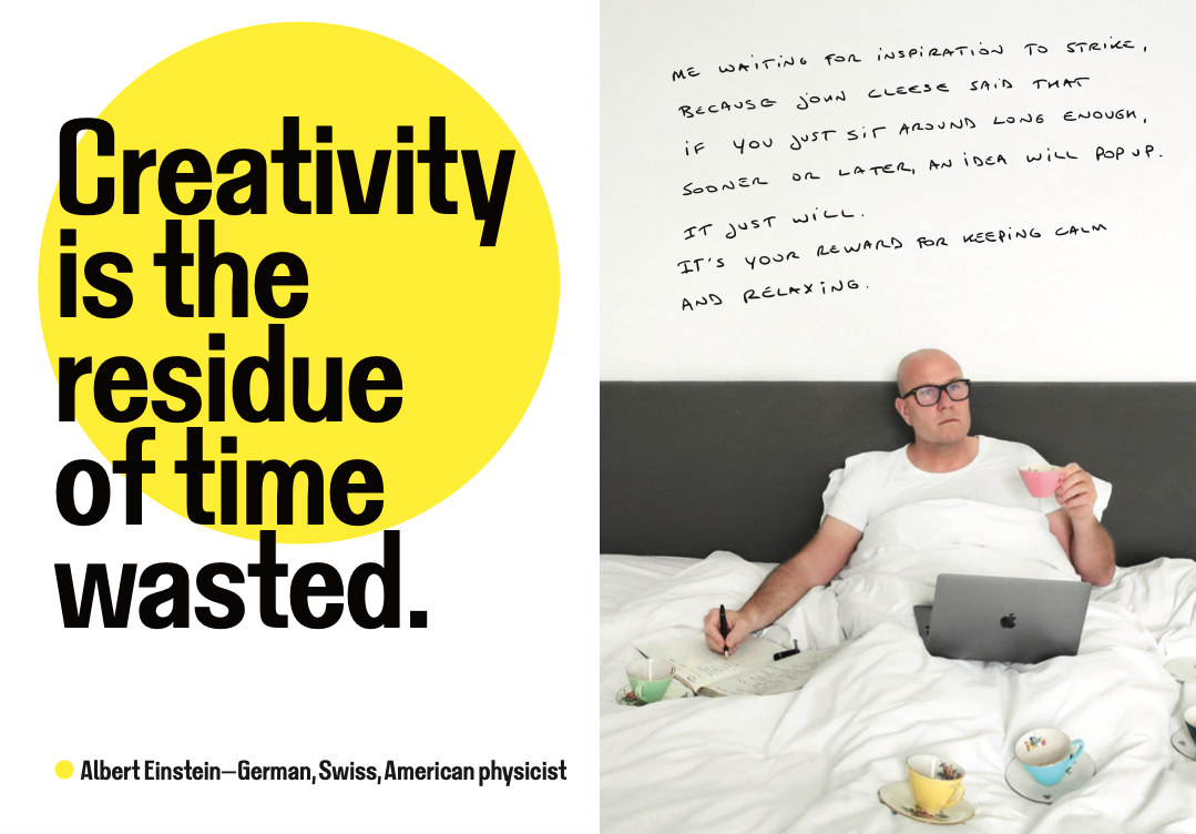
Creativity is the residue of time wasted

(Image credit: Boost Your Creativity, published by Luster) 

Beneath the surface, a network of regions called the Default Mode Network (DMN) lights up. This is your brain’s backstage crew, quietly preparing the next act of inspiration while the spotlight is off. The DMN is activated when you’re not focused on a specific task.

It thrives in the in-between spaces when you’re daydreaming, reflecting, thinking about the past or future, or imagining someone else’s thoughts. It’s the engine of empathy, memory, and mental time travel. Most importantly, it’s where creativity begins to simmer.

When you’re solving a clear-cut problem, your brain switches to a different mode: focused, logical, linear. But when you loosen your grip and let your attention wander, the DMN kicks in. That’s why your best ideas often sneak up on you when you least expect them: mid-shampoo, on the toilet, while doodling, or as you’re drifting off to sleep.

You’re not trying – and that’s the point.

The DMN connects ideas, stirs memories, and forms new patterns in those quiet moments when you’re not looking directly at the problem.

This is why some of the most powerful creative tools are the simplest: rest, reflection, movement, play, and purposeful pauses.

When you stop pushing your brain and let your mind wander, you’re not wasting time – you’re opening the door to insight.

This isn’t just theory. Creatives across several disciplines have noticed it too.

It appears that I have my best ideas just as I wake up. When my mind is not thinking about daily stuff yet and I am still lingering in that twilight zone of wondering.

Paul McCartney wrote Yellow Submarine in that twilight zone, as he was drifting off to sleep.

Designer Massimo Vignelli explained that he gets his ideas while shaving, which he emphasises, is the reason why he doesn’t have a beard.

So remember: sometimes the best way to create is to stop creating – just for a moment – and let your backstage brain take over.

Isn’t it wonderful that some of your best works are created while you’re ‘not working’ at all?

This is an extract from Boost Your Creativity by Steve Brouwers, published by Luster and available now from all good bookstores.

Feature image credit: Boost Your Creativity, published by Luster

By 

Steve is a Belgian creative director, teacher, author and speaker with over 25 years experience in the media industry. In his inspiring talks, Steve shares his insights and experiences with audiences around the world. He is known for his candid stories about imposter syndrome and procrastination – topics that resonate deeply within the creative community. He is the author of Creatives on Creativity, published by Luster in 2021.

Sourced from Creative BLOQ

Leaning into the language of cinema.

It can sometimes feel like big brands all are all working from the same design playbook. There was a time not so long ago when pretty much every brand used the same gangly-armed cartoon people (a style officially known as ‘Corporate Memphis’). So it’s refreshing that Netflix’s latest visual identity steers clear of tech’s obsession with one-dimensional vectors in favour of something much more cinematic.

The brand has unveiled a set of new iconography designed by Koto Studios, and not only does it lean in to the brand’s existing colour scheme, but it’s also just plain fun. (Looking for more design inspiration? Check out our roundup of the best logos of all time.)

Netflix illustrations

(Image credit: Koto Studio)

Koto (opens in new tab) says it was tasked to inject the language of cinema into the Netflix product experience. “We evolved their previous system by connecting iconography, typography, and illustration to roots within the cinematic universe, referencing effects and techniques reminiscent of the film-making process—in a way that feels immediately Netflix.”

Netflix icons

The new illustrations are delightful (Image credit: Koto Studio)

At the centre of the new visual language is a series of illustrations depicting (often surreal) objects in a delightfully vapour wave palette of purples and reds. Compared with all that Corporate Memphis (opens in new tab), this looks positively cutting-edge, even though the aesthetic is deliberately retro.

“We steered clear of the over-saturated, over-done, one-dimensional approach to graphic language typical of the tech and streaming worlds,” Koto says, “by defining a style that speaks to film enthusiasts, and feels inherently Netflix while remaining true to their core values: pioneering, welcoming, and always stimulating.”

Web design

We’ve seen enough ‘Corporate Memphis’ over the last few years (Image credit: Mitchell Wakefield on Twitter)

Along with the illustrations, the new visual identity includes more varied sizes and weights of the company’s Netflix Sans typeface, designed to “remain legible in functional applications, and flex to bold, cinematic title cards, genre-specific, or thematic comms.”

It’s certainly refreshing to see a big tech brand opt for a different visual style. Much like Burberry’s latest rebrand, Netflix’s new look is both retro and futuristic at the same time.

Feature Image credit: Koto Studio

By

Daniel Piper is Creative Bloq’s Senior News Editor. As the brand’s Apple authority, he covers all things Mac, iPhone, iPad and the rest. He also reports on the worlds of design, branding and tech. Daniel joined Future in 2020 (an eventful year, to say the least) after working in copywriting and digital marketing with brands including ITV, NBC, Channel 4 and more. Outside of Future, Daniel is a global poetry slam champion and has performed at festivals including Latitude, Bestival and more. He is the author of Arbitrary and Unnecessary: The Selected Works of Daniel Piper (Selected by Daniel Piper).

Sourced from Creative Bloq

By ,

Corporate Pride strikes again.

One inevitability of Pride month is what’s (un)affectionately known as Corporate Pride – which, as the name suggests, involves all manner of brands paying lip service to the cause with rainbow logos and the like. One of the slightly more creative efforts this year came from Coca-Cola – but it appears to have backfired spectacularly.

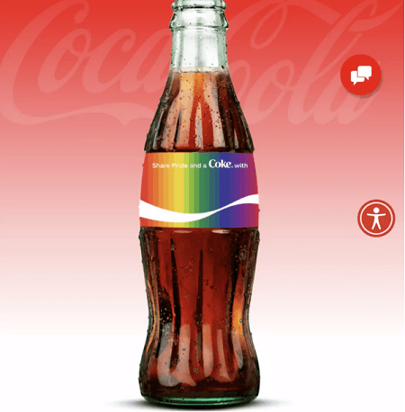
The company’s new custom bottle creator lets users personalise a rainbow-coloured Coca-Cola bottle sticker by entering a word, name or phrase of their choice. But the list of banned phrases, as well as some that are allowed, has proven somewhat questionable. (Check out our best print ads for some bold advertising that actually works.)

Coca-Cola

Coca-Cola’s custom bottle creator (Image credit: Coca-Cola)

If the user attempts to create a bottle with one of Coca-Cola’s prohibited words or phrases, they’ll receive the message: “Oops! Looks like the name you requested is not an approved one. Names may not be approved if they’re potentially offensive to other people, trademarked, or celebrity names. We’ve worked hard to get this list right, but sometimes we mess up. If you think this is an error, please contact our Customer Care team. Otherwise, please try again, keep it fun and in the spirit of sharing!”

And, naturally, users have been testing the limits of what Coca-Cola considers “fun and in the spirit of sharing”. In one of many eyebrow-raising examples, ‘White Lives Matter’ = fine, whereas ‘Black Lives Matter’ = not fine.

“We’re continuously refining and improving our Share A Coke personalisation tool to ensure it is used only for its intended purpose,” a Coca-Cola spokesperson told CNN Business. “Actual bottles are not made with words that are inconsistent with the program’s intent. We have clarified in the tool’s preview mode that proposed language may require further review.”

While we appreciate the company’s desire to filter out offensive phrases, one can’t help but wonder whether Coca-Cola’s half-hearted censorship mechanism is actually better than no mechanism at all. Like McDonald’s tasteless coronavirus-themed logo, Coke has ended up, no matter how well-intentioned, with a bonafide marketing fail on its hands. Still, at least it’s in good company this year – who can forget Burger King’s abysmal attempt at humour on International Women’s Day a few months back?

By

Sourced from CREATIVE BLOQ