Tag

Branding

Browsing

By Suzanne LaBarre.

Designers predict the major branding trends of 2017.

At a time of tremendous political and cultural upheaval, one thing remains certain: Companies will keep trying to sell you stuff, and they’ll keep coming up with new ways to do it. Design is, of course, a major part of that pitch. We spoke with designers and design leaders at nearly a dozen agencies to identify the major branding trends of 2017. Below, find their five key predictions. And stay tuned for part two, in which we discuss branding trends for 2022.

Brands Will Radicalize

Conventional wisdom has it that brands shouldn’t talk politics. Why risk alienating potential customers? That was before Donald Trump.

“With the rise of political authoritarianism, brands will face fundamental choices.”

Now that a sneering, orange man-child is sinking his tiny fingers into every aspect of American life, experts believe activism will become nearly as ubiquitous in the brand world as it is on college campuses. “As a reflection of the changing political tides, many brands will evolve from ‘mission-driven’ to ‘activist,’ encouraging consumers to go beyond simply subscribing to a set of core values and driving them to participate in actions to defend them,” says Geoff Cook, partner at the branding agency Base Design. “In choosing sides, brands will alienate certain consumers, yes, but will galvanize an impassioned constituency in the process.”

To Melanie McShane, head of strategy at Wolff Olins in New York, activism isn’t just about tapping into the zeitgeist; it’s a business imperative. “With the rise of political authoritarianism, brands will face fundamental choices,” she says. “About whether to take a stand on issues that offend them and their users, risking the wrath of politicians and their acolytes. Or stay quiet and seem complicit.”
Brand-led activism is already well underway. Following Trump’s executive order last month banning immigrants from seven predominantly Muslim nations, Lyft donated $1 million to the ACLU, Starbucks vowed to hire 10,000 refugees, Airbnb offered free housing to refugees, and Budweiser flaunted its immigrant roots in a heartfelt, if predictably corny, Super Bowl commercial. Other companies issued statements decrying Trump’s actions, to varying degrees of success; Gizmodo deemed IBM’s milquetoast statement “embarrassingly weak for a company that collaborated with the Nazis.”

Which raises an important issue: It’s one thing to take action on matters that reflect a company’s values. It’s another to exploit a fragile electorate to garner attention. Now is not the time for shameless opportunism. We have plenty of that in the White House.

Brands Will Finally Stop Trying To Trick You

Trump’s pathological lying could affect brands another way: It could actually persuade them to tell the truth.

Consumers are sick of the bullshit. And brands will have to adjust.

“2016 was one expression after another of an unprecedented collapse of people’s trust in established institutions,” says John Paolini, partner and executive creative director at Sullivan. “In 2017, this macro-societal trend will impact brands, creating pervasive skepticism among consumers in how they perceive the messages and promises companies are making to them. This sense of distrust and suspicion will catalyze a brand neo-traditionalism.” Brands will be stripped down to their essential parts, their narratives made simpler and more transparent. “Honesty will reign,” Paolini says. “Successful branding will have fewer tricks and more truth.”

How or whether that would apply to mega-corporations shilling morally questionable goods is anyone’s guess (will McDonald’s commercials start looking like clips from Super Size Me?). But the larger takeaway remains: Consumers are sick of the bullshit. And brands will have to adjust.
Symbols Will Become More Than Graphic Icons

Consider the most iconic logos of the 20th century: Nike’s swoosh, NBC’s peacock, Apple’s bitten fruit. These were testaments to the power of symbols. But Sagi Haviv, partner at the graphic design firm Chermayeff & Geismar & Haviv, believes the era of traditional symbol-based logos has drawn to a close. “When my partners Tom Geismar and Ivan Chermayeff were designing logos in 1957, the year our firm began, practically any conceivable geometric shape was available for trademarking,” he says. “Today it seems like every conceivable shape has been done. . . . As a result, both designers and clients have started to associate graphic logo design with trademark infringement, and many of them are deciding to play it safe by simply rendering the name alone, without a distinctive graphic icon.”

Haviv believes designers will still find ways “to create new, original graphic icons.” Indeed, we’ve already seen symbols take on new, unconventional forms. The hotel booking app Hotel Tonight turned its logo, a bed-shaped “H,” into a user interface element that consumers swipe to confirm a purchase. Wolff Olins recently designed an open-source mark that’s nothing but a colon and two slashes—a code string that can be rendered and remixed in text, on a web page, or anywhere else a brand might live. Expect more experiments that bring symbols to life in 2017.

The Visual Language Of VR Will Creep Into Meatspace

Branded virtual reality “experiences” are every company’s favorite new marketing tool, which is a pretty good sign they’re headed for the graveyard. But once you get past all the gimmicks, you’ll start to see VR used in some unexpected ways. “Right now, companies are approaching [VR] in a computer game way,” says James Trump, creative director at Moving Brands in San Francisco. “But there’s so much more that can be done. It’s new ground, and we haven’t really scratched the surface.”

Trump envisions brands experimenting with new forms of typography and layered visuals that capitalize on the 360-degree perspective wearing a virtual reality headset affords. Perhaps most intriguingly, he thinks the visual language of VR will inform branding in the real world. “Brands will start to be influenced by and borrow from the visual style of VR,” he says. “I can imagine this playing out in lots of ways—combining flat and 3D elements, more spatial-feeling typography, and more layering to imagery.”

AI Will Force Brands To Examine Their Ethics

The trend with the greatest potential to transform how brands reach consumers in 2017 and beyond is the rise of artificial intelligence. Whether through chatbots or voice assistants like Amazon’s Alexa and Apple’s Siri, brands can now speak directly to customers. On one hand, this lets companies cater their message to individual consumers, which could potentially reduce the annoying, spray-and-pray approach of most marketing today. As David Schwarz, partner at the experience design agency HUSH, puts it: “Much like your Facebook or Instagram timeline is both personally and algorithmically curated, branding will be more in the eye of the beholder than in the eye of top-down business leadership.”

On the other hand, AI gives companies unprecedented access to consumers’ lives. My colleague Mark Wilson paints a dark picture of such a future: “Have we evolved to be such inherently social creatures that when we have the opportunity—and eventual necessity—of talking directly to companies all day, will we all just be consumer pinballs, being knocked around a manipulation machine? Will regulators be able to keep up? Will social niceties allow big data to meld with big manipulation, so we’re sweet-talked into supersizing before we’re shamed by a drill instructor into exercising it off?”

These are troubling questions—ones that brands will have to grapple with before embracing artificial intelligence, and all the moral and ethical responsibilities attached to it. As for consumers: If we’ve learned anything from 2017 so far, it’s that even though brands may sound more and more human, they’ll never be our friend.
By Suzanne LaBarre

Sourced from fastcodesign.com

By Meg Miller.

We revisit the highs, the lows, the most-Tweeted about. Here are our picks for the best and worst identity design this year.

It has never been harder to design a good visual identity. Brands live on dozens of platforms, so they have to look as good on a billboard as they do on a phone screen. Armchair critics emboldened by the ease of the web attack change no matter how necessary, skewing clients toward less ambitious work. And yet the companies below managed to eke out thoughtful, even occasionally daring, new visual identities this year. Of course not everyone hit the mark. Here, we take you through a year of branding—the good, the bad, and the most controversial.

The Best

Grubhub
Grubhub may have started out as a small startup, but in 2016, the 12-year-old company services 7 million people and 44,000 restaurants. It needed a grown-up redesign: a look that was authentic yet polished and one that would work on both a national and hyper-local level. Wolff Olins took on the task and rebranded the company, populating ads with lifestyle photos (think Airbnb ads and Apple commercials) and hand-drawn lettering, and adding chef highlights, animated food items, and a custom keyboard of GrubHub “mmmojis” to the site. Overall, the new look is fresh and professional, but retained some of the scrappy personality of its earlier paper cut-out illustrations. The hope is that it will persuade the shrinking, but still sizable population of people who still prefer placing delivery orders over the phone to switch to the web.

MasterCard
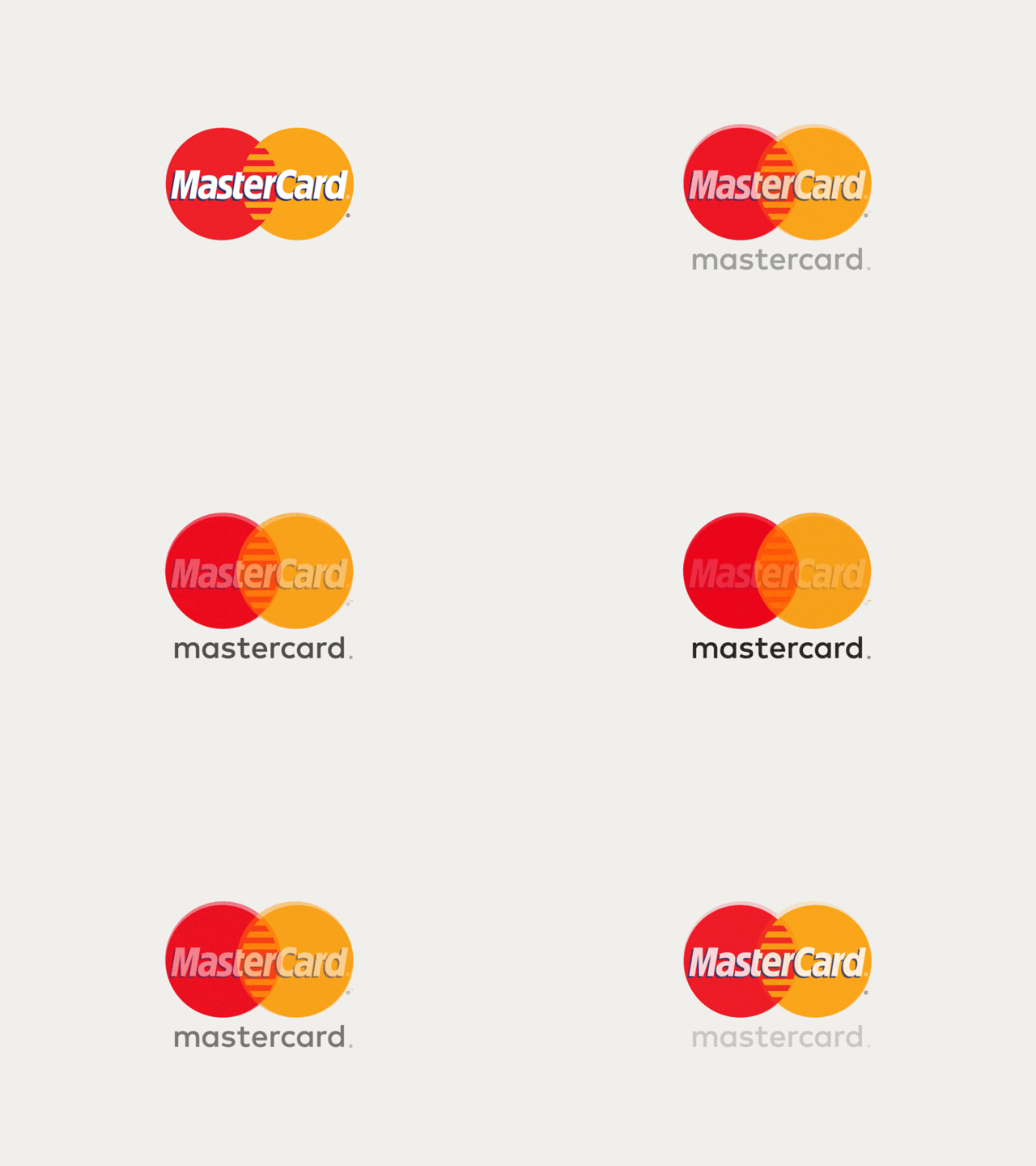
Before this year the MasterCard logo hadn’t changed significantly in 20 years, but the way that we buy and pay for things certainly had. Tasked with the company’s first major redesign in two decades, Pentagram partner Michael Bierut and designer Hamish Smyth refrained from making drastic changes to the familiar overlapping yellow and red circles in the logo—instead opting to modernize it by removing the comb effect in the center and placing the wordmark outside of the symbol. With the option to just use the familiar symbol without the wordmark, the system is flexible enough to work across multiple products and platforms, like the MasterPass digital payments and Priceless rewards program. The logo is also optimized to work well on mobile, the direction most of our bank transactions have been going.

Helia
Sometimes it’s the lesser-known companies that pack the biggest punch with a stellar redesign. Such was the case with Helia, a data science and analytics company whose client roster includes companies like Unilever, easyJet, IBM, Diageo, and Sony PlayStation. Designed by the New York-based design firm Form&, the identity system centers around a simple circular logo imbued with a gradient that changes colors based on weather and geographic data. In that way, in both the print and digital form, the color of the logo serves as a unique data stamp. The eye-catching redesign brings a company that typically works behind-the-scenes front and center.

Instagram
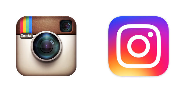
In May, Instagram shocked the internet when it unveiled a pared-down, rainbow-gradient upgrade to its Polaroid icon. But the new icon contained some clever details: an image that referenced photography’s evolution away from film-based cameras to phones, and a rainbow gradient that made the icon pop in a sea of other icons (and subtly referenced the rainbow stripes of the old icon). Not surprisingly, the fervor quickly subsided. Now your thumb gravitates instinctively toward the icon on your phone dashboard without a passing thought given to the skeuomorphic old one (there’s no need to reference analog cameras in an app for your iPhone cam).

Zendesk
The customer service software provider Zendesk offers one of the most drastic before-and-after logo stories: from a cartoonish smiling Buddha on a chat headset to a sleek system of geometric shapes. The identity retained its playfulness, though, with each Zendesk service receiving an iteration of the logo that has its own animated personality. The Help Center, for example, is two arrows, one leading the other. The logo for Support is a tall rectangle leaning on a shorter one. The best part might be when you realize why this charming shape system is so familiar: It was inspired by wooden toy blocks from the founder’s Danish childhood.

Zocdoc
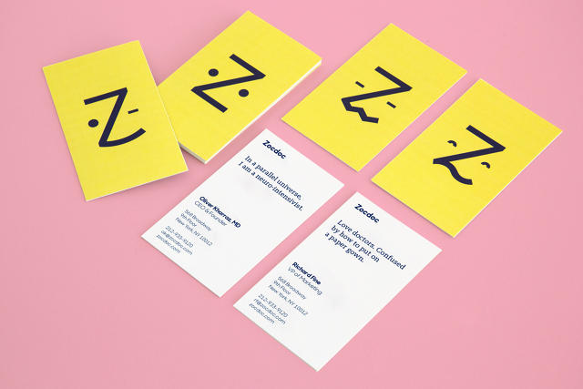
Health care platform Zocdoc launched in 2007 with a staid, traditional logo that the company’s founders bought for a mere $80. Now that the business is valued at $1.8 billion and is rapidly expanding its model to connect patients with hospital systems as well as individual practitioners, it figured it could afford something new. Wolff Olins did the redesign: a friendly, human-centered identity with a cute little anthropomorphic logo that turns the letter Z into a emoticon-like face, who goes by “Zee.” The responsive Zee gets it: He can look puzzled, sad, relieved, happy. He too experiences the roller-coaster ride of emotions you go through when you’re sick and struggling to recall the details of your health care co-pay, all while trying to book an appointment today, not three weeks from now.

VSCO
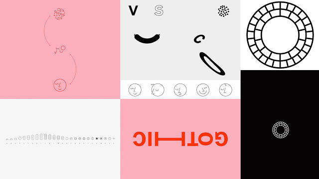
VSCO, the popular image editing app, got a major redesign this year, of both its user interface (launched in June) and its visual identity (launched in February). The identity redesign was based around a custom-made VSCO Gothic typeface and a system of slick yet emotive symbols that construct a visual alphabet of sorts. The new circular logo is meant to embody the global community that now uses the app not just for editing, but also as a photo-sharing platform. VSCO is like an artier Instagram, with a user base of mostly professional and amateur photographers. The new black, white, and dusty pink design reflects its trendiness, but in a way that is crisp and polished.

The Most Controversial

The Met
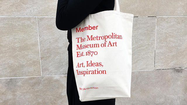
This year, the award for the rebrand that drew the most outrage goes to the Metropolitan Museum of Art. The Met overhauled its logo and identity system—much to the chagrin of many design critics—and revealed a new logo that rebrands the museum as “The Met.” The two words, stacked on top of each other in large scarlet lettering, replaced the stylized M logo originally taken from a woodcut by Luca Pacioli. Wolff Olins did the identity, but the rollout was botched when the museum sent out press materials with the new logo before it was announced. Identities tend to get judged harshly when they are launched sans explanation—especially changes as major as this one—but it’s been 10 months and the logo has already worn in nicely. We like the bold new design, and we’re glad it stuck around long enough for the dust to settle.

The Worst

Uber
When Uber’s new icon came out in February, it was widely ridiculed. It looked like PacMan. An asshole. A “little kind of bluish sideways ass.” Wired dedicated considerably more words to the icon with a behind-the-scenes look, during which Uber CEO Travis Kalanick said he kept the design in-house because he didn’t trust anyone else to do it for him. Bad call, Kalanick. The icon managed to look both soullessly corporate and overworked. It was also poorly executed. Yet, just like the (better, more thoughtful) Instagram redesign, the Uber icon shows how quickly these controversial rebrandings are normalized—particularly with apps we interact with so much that their use becomes almost subconscious.

Trump-Pence Logo
Well, here we are: the absolute worst brand design of the year. We wish we didn’t have to bring this pair up, but there’s no getting around the fact that the Trump-Pence logo takes the prize. The animation above says it all, but Twitter said it pretty well, too. The campaign buckled under the online mockery, pulled the logo, and replaced it with something less suggestive, but it was too late. The image is seared into our minds forever. With Trumpistan looming, you’ll want to keep this GIF close—a memento from simpler times.

By Meg Miller

Sourced from Fast Co Design