It’s been called an “unauthorized misappropriation”.
Volkswagen has sparked a design dispute after filing a lawsuit against a car dealership, claiming that its logo is “unauthorised misappropriation”. The Dallas-based dealership named “VDubs Only” has been accused of creating a “bastardised” version of the German manufacturer’s logo that could potentially mislead consumers.
As one of the most recognisable car logos out there, it seems bizarre that Volkswagen feels threatened by a small dealership. It’s by no means the most ridiculous logo design dispute we’ve seen but with Volkswagen claiming infringement and dilution of its identity, it’s clear the car brand is driving for a resolution.
(Image credit: Volkswagen/Vdubs Only)
The centre of the design dispute evolves around the VDubs Only logo, which features a “V” design against a blue background (sounds familiar but I’d say it’s far from a direct ripoff). Alongside the alleged logo infringement, Volkswagen claims that the VDubs name violates its trademark of the word ‘V-Dub’ which has previously been used in campaigns. It’s worth noting that Volkswagen only owns the rights to the hyphenated form of ‘V-Dub’, so technically there’s no foul in that department.
The official lawsuit claims that these alleged infringements will be “likely to cause potential purchasers of Defendants’ products and services, as well as the public at large, to believe that Defendants’ products and services are affiliated with, authorized, sponsored by, or endorsed by VW.” Volkswagen is searching for a permanent injunction to prevent Vdubs Only from allegedly misappropriating its marks.
(Image credit: Getty Images)
For more design debate stories, check out the Michael Jackson logo dispute. If you’re after more car branding controversy take a look at the Mercedes-Benz logo dispute that threatened to oppose a humble microbrewery.
Natalie is Creative Bloq’s staff writer. With an eye for trending topics and a passion for internet culture, she brings you the latest in art and design news. A recent English Literature graduate, Natalie enjoys covering the lighter side of the news and brings a fresh and fun take to her articles. Outside of work (if she’s not glued to her phone), she loves all things music and enjoys singing sweet folky tunes.
Branding is the most important part of your marketing strategy, without a recognizable brand, potential customers won’t know who you are.
The Nike tick, and the McDonalds sign are two of the most popular logos in the world. But there’s much more to a brand than a logo, colours and a slogan. Branding gives your audience insight into who your organization is outside of its corporate name. Therefore, a brand framework that gets results must answer five critical questions, and it starts with defining the vision for your brand. Once you are clear about the direction you want to take, everything else falls into place. But without a firm foundation in place, you’ll find it difficult to build. If you want to crush your company goals, start by developing a powerful brand framework that will guarantee results.
1) What is the Vision For Your Brand?
Start with the end in mind, think about where you see the company five, ten, and fifteen years from now. Please keep in mind that a vision is not strategy, at this point, you are not working out how to get to your destination. You are defining where you are now and where you want to go. Here are seven steps to help define your vision:
Step 1: What Are Your Goals? What do you hope your company will achieve?
Step 2: What Are Your Values? Define your values, it can be a sentence such as, “Adding a creative edge to education.” Or, words such as, “communication” and, “innovation.”
Step 3: Build Your Mission Statement: Your vision is an extension of what you are currently doing; therefore, build on your mission statement to further crystalize your vision.
Step 4: Make it Measurable: Dreams without deadlines will remain dreams. Put a deadline on the things you hope to achieve. A five or a ten year plan is a good place to start.
Step 5: Be Specific: Being wishy washy won’t get you very far, you can compare it to wearing a pair of glasses that are too weak for your eyes. You won’t be able to see anything. When you know exactly what you want, you are better able to aim for it.
Step 6: Think Ahead: Pay attention to the changes that are taking place in your industry and plan accordingly.
Step 7: Keep it Simple: Be as ambitious as you want, but keep it simple. Refrain from over defining your vision.
2) What is the Voice of Your Brand?
Have you ever answered your phone without looking at your caller ID but recognized the persons voice immediately? That’s because you’ve spoken to them so many times that you know what they sound like. That’s what your brands voice should be like. What you say and do should be so consistent across all channels that your customers immediately know it’s you when they come into contact with your brand.
3) What is Your Brand’s Story?
Every brand has a story, it gives your audience deeper insight into what a company is about, and the motivation behind why it started. Brand stories are important because we all remember a good story. It helps build an emotional connection with your audience especially if it’s inspiring and heartfelt.
4) Who is Your Target Audience?
Defining your target audience is the key to success. When you know exactly who you’re selling to and why, it is a lot easier to reach potential customers. For example, a nursery will want to target mothers and families with toddlers. Therefore, all advertising should be targeted towards this people group.
5) Who Are Your Competitors?
Regardless of the industry, there will always be competition. The good news is that competition can work to your advantage if you study them the right way. One of the best ways is to evaluate their bad reviews. In this way, you get to find out what they’re doing that their customers don’t like. You can use that as a marketing tactic to gain potential customers based on giving them what you know they want.
If you want to build a brand that performs, see a return on your investment, and gain a competitive advantage in your industry, the first step is developing an effective brand framework. We are living in an era where consumers demand authenticity, and the most effective way to deliver this, is through the right branding.
Elon Musk has been promising X’s transition into an “everything app” for some time now, but finally, we might have a breakthrough – behold X TV. An offshoot of the social media app, X TV is set to be an all-in-one entertainment app for your smart TV, bringing X’s “high-quality” content to your home.
The X overlord teased the new app via a cryptic video, debuting the new X TV logo design. With the X icon considered one of the worst new logo designs of last year, the launch of X TV was Elon’s chance to redeem himself. I’m sad to report that the result is a little underwhelming, to say the least.
Now I’m aware that for the sake of continuity, we can’t stray too far from the original logo design, but it feels like there could’ve been a little more consideration put into the new look. It seems that X (and now X TV) is caught up in the aesthetic of being edgy and fresh, and in turn, it’s giving us soulless minimalism.
Design aside, the new app is set to be an innovative form of media consumption, using tailored algorithms and AI-powered organisation to bring you the “immersive entertainment experience” that you deserve. My reservations will be held until I can make a fair judgement.
For more Elon-related news, check out why the Cybertruck’s latest design fail looks like the beginning of the end. For the logo buffs out there, take a look at the logo design quiz that has stumped the internet.
Natalie is Creative Bloq’s staff writer. With an eye for trending topics and a passion for internet culture, she brings you the latest in art and design news. A recent English Literature graduate, Natalie enjoys covering the lighter side of the news and brings a fresh and fun take to her articles. Outside of work (if she’s not glued to her phone), she loves all things music and enjoys singing sweet folky tunes.
McDonald’s, Old Spice and Corona prove the best branding is multi-sensory.
Multi-sensory branding is on the rise because of one simple human truth; consumers perceive the world using all of their senses. For a brand to succeed in the modern age, it needs to be more than meets the eye, and savvy marketers are building holistic expressions that consider what people see, hear, feel and believe.
When your messaging uses a strategic combination of visual and sonic branding, all boats rise with the tide. Visual branding works on a cognitive level, sonic assets deliver on a deeper emotional level. When they’ve been designed to work in harmony, these sensory dance partners leave a lasting impression that improves performance exponentially (see our pick of the best sonic logos).
The impact of sonic branding
Think of some of the world’s classic visual icons — the Golden Arches, Apple, AT&T’s Globe or the Corona wordmark. These brands have also developed their ecosystems to include distinct audio cues and sonic signatures. “Ba-da-ba-ba-ba” is just as evocative as the typography of McDonalds. AT&T’s “chimes” are the brand’s second most recognizable asset. Corona just launched a sonic identity that evokes beach relaxation within seconds and if you turn on a MacBook with your eyes closed you still know exactly who made it.
Yet some of the old guard still raise their eyebrows at the concept of sonic branding. Many think of it as intangible, or too good to be true despite the data showing it improves appeal, attribution and purchase intent. Some naysayers prefer a rudimentary type of “sonic branding” that only exists to score their logo animations. Unfortunately that type of waveform window dressing falls flat in audio-only environments where their visuals can’t be seen.
To be fair, if your only reference points are bad jingles or the 15 brands using the sound of a doorbell, it’s easy to assume the whole discipline is flimsy and ephemeral. It doesn’t help that a wave of music houses jumped on the bandwagon and are selling poor imitations to unsuspecting clients (“Would you like one note or two with your endcard, Madam?”)
Before I started working in the world of sonic branding, I was sceptical myself. But all that changed when I discovered the interconnected similarities between great sonic branding and the way visual brands are built.
Just as a visual identity can instantly evoke a sense of familiarity and trust, a strategically crafted sonic identity can convey authenticity, brand personality, and a variety of specific attributes. Although Sonic Logos or Mnemonics get most of the headlines, every sound or music choice a brand makes leaves a lasting impression on consumers. From advertising and apps to social, experiential and phygital.
A global brand such as American Express needs a sonic ecosystem that can span their entire customer journey. They craft every interaction from call centres, to mobile payments, to airport lounges (where they also have a branded scent). Their distinct sound and music helps Amex amplify feelings of strength, trust and a sense of adventure for their customers. When you interact with them, you feel like a part of something. You don’t live life without it.
The data
There’s also scientific backing behind that shows just how effective sonic branding can be. Many research studies show that ads with a sonic branding cue see an 850% uplift in branded attention. Consider this, if you hear a familiar jaunty whistle from across the room, you’ll probably clock it was an Old Spice commercial without paying any attention to it. In fact, that Old Spice whistle might in your head right now!
When sonic and visual elements are aligned, they reinforce one another, creating a more complete, unified brand experience. In our work with PepsiCo, we’ve seen significant uplift for their visual brand assets when sonic cues are applied. According to audio research company Veritonic, the introduction of sonic assets for the chip brand Tostitos saw a 38% increase in brand recall after only six months in market. Not only is audio a powerful tool on its own, it can actually supercharge the rest of a brand’s architecture.
How to succeed at sonic branding
When we’re partnering with brands, we ensure that elements of the strategy and discovery phase feel almost identical to visual brand building. Analysing the market, the competitors, target consumers and place in culture. Most of our clients are dipping their toes into sonic for the first time, so there needs to be an extra layer of education and it helps to compare it with development they’re more familiar with.
We become musical method actors, absorbing brand essence, purpose and personality and then translate that essence into sound. We develop concepts, emotional territories, adding instrumentation and audio design to bring a brand’s distinct, inevitable sound to life. Research adds confidence that the work is effective and will produce the desired results.
When we collaborated with Wieden+Kennedy on the global sonic identity for Corona, we needed to craft a musical expression that would be just as powerful as their other iconic assets – the flint bottle, crown logo, lime ritual, and association with the beach. We approached it as we do with every project: with the same level of rigor, craft, design and data as our W+K partners. We worked together to capture the soul of the brand, creating a system of assets that work in harmony with Corona’s brand architecture, delivering KPIs that will stand the test of time. One client said we’d caught sonic lightning in a bottle and it’s been incredible to see how quickly consumers have embraced it in campaigns all over the world.
Why it matters
So why does any of this matter? Brands need to tap into both reason and emotion because 90% of all decision-making takes place in the subconscious. Whether you’re buying a car or a candy bar, there’s a degree of emotional impulse that makes your choice just feel right. In a world where consumers are bombarded with messages from every direction, multi-sensory branding helps cut through the clutter and makes people feel something.
A holistic approach that values visual and sonic branding equally creates a lasting impression in the hearts and minds of consumers. It enables modern brands to make the leap from marketing into culture and become part of the fabric of our lives. So much so, we even start completing their sentences for them. Ba-dap-ba-ba-bah, I’m…
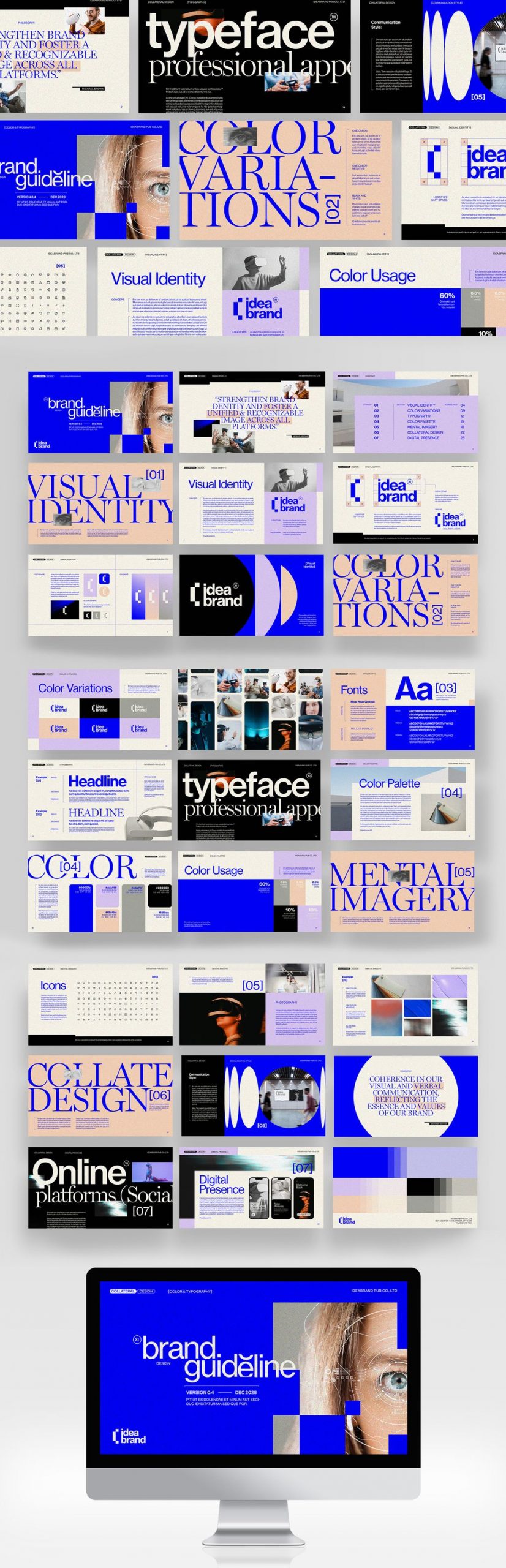
Unveiling the artistry: BrandPacks’ Adobe InDesign brand guidelines presentation template is something else.
A brand’s identity is its compass, guiding it through the vast ocean of consumer preferences. Every company, big or small, dreams of a unique and memorable brand image that resonates with its audience. Enter BrandPacks’ latest masterpiece – an Adobe InDesign Brand Guidelines Presentation Template that transcends the ordinary, elevating brand presentations to a whole new level.
Crafted with precision and passion, this 27-page template is more than just a set of guidelines; it’s a visual journey that transforms the mundane into the extraordinary. Let’s dive into the creative waters and explore why this template is the talk of the design town.
BrandPacks’ template is not just a document; it’s a symphony of visuals, meticulously composed to strike the right chord with your audience. The modern aesthetics and bold typography create a harmonious blend that captures attention and leaves a lasting impression. Each page tells a story, seamlessly connecting the dots between creativity and consistency.
2. Fully Customizable Magic:
Flexibility is the hallmark of a great design, and this template embodies that philosophy. With 27 fully customizable pages, it provides a canvas for your brand’s personality to shine. From colour schemes to typography, every element is a stroke on this canvas, waiting for your artistic touch. Adapt it to your brand’s unique voice, and watch it come to life.
3. Modern Elegance:
In a world of fleeting trends, timeless elegance speaks volumes. The modern look of this template is not just a passing trend; it’s a statement. The clean lines, sophisticated colour palette, and well-thought-out layouts exude a sense of modernity without compromising on the timeless essence that defines enduring brands.
4. Bold Typography, Bolder Impact:
Typography is the unsung hero of design, and BrandPacks’ template gives it the spotlight it deserves. Bold, impactful, and undeniably stylish, the typography in this template is more than words on a page; it’s a visual experience. From headers that command attention to body text that guides the reader, every word is a brushstroke in the masterpiece.
5. Uniquely Yours:
No two brands are the same, and this template understands that. It offers a unique style that serves as a starting point for your brand’s journey. Tailor it to your heart’s content, and let your brand personality shine through. The result? A presentation that reflects your brand, not a generic template.
6. Suited for Screens and Dreams:
In the era of digital dominance, the size matters – and this template gets it right. With dimensions of 1920 x 1080 px, it is tailored for screens, ensuring your brand guidelines look just as stunning online as they do in print. Seamlessly transition from boardroom presentations to online platforms, maintaining the visual integrity of your brand across all touchpoints.
In conclusion, BrandPacks’ Adobe InDesign Brand Guidelines Presentation Template isn’t just a template; it’s a design revolution. A testament to the marriage of functionality and aesthetics, it empowers brands to present themselves with flair and finesse. So, if you’re ready to take your brand to new heights, embark on this visual journey, and let the world see your brand through the lens of creativity and innovation. Brand guidelines have never looked this good.
How a brand is perceived by consumers can influence not only market structures, but also culture and even government policy.
rand development has become a major focus for firms hoping to find or maintain success in advanced markets. According to Steve Forbes, “Your brand is the single most important investment you can make in your business.” And he certainly is right.
A brand not only serves to identify firms and what they offer, it also conveys a company’s positioning strategy and value proposition. Promotional elements such as logos, names, symbols, and colours, are commonly leveraged for branding purposes but a brand can also be reinforced through pricing and distribution systems. For instance, if a company wants their product to be viewed as the best of the best, then they wouldn’t want it to be found on the shelves at a discount store. This is why Burberry has been known to burn excess inventory and perhaps it is also why premium brands will leverage opportunities to recycle their products.
Patagonia’s ‘Take-Back Program’ is truly a strategic marketing move since, by means of consumer participation, Patagonia can improve its environmental ratings. Patagonia gets the purchase first and the accolades after when buyers bring back their used apparel.
In addition to the ‘Take-Back Program,’ Patagonia offers store credit on certain items that have trade-in value. As such, Patagonia incentivizes further purchases and prevents products from ending up in donation bins.
Patagonia is known for its reputation of being environmentally focused, and reputation matters. Consumers will often choose products because of the brand. Take over-the-counter drugs. Unlike pharmacists who will opt for generic versions, consumers will buy Advil or Tylenol even when the properties of a generic drug may be identical to the name brand version.
Consumers are also more likely to try a new product if it is from a brand they trust or want to support; and this is why Taylor Swift can successfully sell the same songs over again.
The overall value generated from a brand is known as brand equity, and strong brand equity tends to ensure strong bottom lines. Therefore, the more valuable the brand, the more protection needed. Taylor Swift knows this all too well and has filed trademark applications for not only her name and initials, but also for the names of her albums and songs.
Companies (or celebrities) who may be less well known or can’t seem to compete with established notable brands may benefit from third-party certifications or strategic alliances to boost sales opportunities. Swift’s beau, Travis Kelce of the Kansas City Chiefs, has undoubtedly benefited from her spotlight. After their relationship began in the summer of 2023, sales took off for NFL merchandise and by the fall, Walmart was featuring Travis Kelce’s line of ‘kitchen prepared meals.’
There may be times, however, when companies want to distance themselves from certain connections or even from themselves.
For example, in 2017, The Hershey Co. sought out to acquire Amplify Snack brands, featuring natural and low-calorie food products such as Skinny Pop. Given that appealing to health-conscious consumers with a name synonymous with chocolate would likely be a hard sell for Hershey, expanding its product portfolio by acquiring established brands made good business sense.
Other big brands selling more wholesome products include PepsiCo Inc.’s ownership of KeVita (organic probiotic beverages) and Colgate-Palmolive’s ownership of Tom’s of Main (all-natural personal care products).
The downplaying of a brand name can occur not only for promotional reasons but also due to political pressures. And currently this is playing out in the pharmaceutical sector in a disconcerting way. Beginning at the start of 2024, in accordance with a Medicaid rebate program, drug makers must pay significant penalty fees for price increases that may have transpired over time. To seemingly bypass the penalties, Glaxo removed one of its products, Flovent, from its portfolio and replaced it with a lower-cost generic version. By doing so, Glaxo can sell its product devoid of a price history for the government to flag.
For those who need Flovent (predominantly children with asthma), there is a major drawback to this change. The generic version is not carried yet by all pharmacies and insurers don’t typically cover generic drugs. Lucrative incentives for insuring branded medicines have beena concern for quite some time, and drug pricing is indeed a tricky matter. Overpriced drugs are a problem, but unavailable drugs are an even bigger problem. Similar to the baby formula shortage in 2022, it seems government intervention can carry a high cost for consumer wellbeing.
Clearly strategies for branding can be quite contentious, and clearly brands matter in more ways than one.
How a brand is perceived and positioned in the marketplace can influence not only a company’s marketing mix but also society’s interests and government interference. Likewise, the way in which consumers respond and react to a brand and its value proposition can determine what may be offered and marketed—both for good and bad. In Capitalism: The Unknown Ideal, Ayn Rand notes that “the market value of a product is not an intrinsic value” but rather a representation of a “socially objective value.”
A product may be of the best quality and the best price, but if it is not of interest to consumers, it holds little value. Conversely, a product may seem to be void of any functional value and be of little use, like a diamond, but if consumers want it and have the means, they will buy it.
Dr. Kimberlee Josephson is an Associate Professor of Business at Lebanon Valley College in Annville, Pennsylvania, and a Research Fellow for the Consumer Choice Center.
Ever felt invisible? We share the world with 8 billion other people, and it’s easy to feel like you’re fading into the background in the hubbub of the city. Likewise, every business shares its industry with a huge number of competitors in a crowded market.
Sure, you might be more affordable, reliable, or innovative than your competitors, but your customers don’t know that for sure until they’ve tried you. Before that happens, you have to stand out from the crowd.
The way to do that is with clear brand identity design. A tight brand identity communicates your difference to your customers, sets you apart from your competitors, and makes you memorable to anyone who has used your products or services already.
Brand identity design is the sum of every visual and tonal branding choice your business makes. When it’s done well, it creates a coherent identity that gives you a relationship with customers that transcends the transactional.
The truth is, if you want to build a business in the 2020s, you need to build a brand. So let’s dive into brand identity design.
What is brand identity?
When you shop with the businesses and brands you love, you feel something.
IKEA doesn’t just make furniture, it furnishes homes with thriving families crafting their individual lives inside. Louis Vuitton doesn’t just sell bags, they sell luxury, and anyone buying a Louis Vuitton bag gets to feel, for a moment, a sense of that luxury in their lives.
This is brand identity: it’s how your customers, and potential customers, view your brand. It encompasses your mission, your values, and your brand tone.
Brand identity is built through various channels and strengthened in every interaction with your customers, but it is communicated in the first instance through the very first things your customers notice about your brand: your name, your logo, your tagline, and the wider visual elements of your brand.
Get the elements of brand identity design right, and you’re off to a strong start.
Why is brand identity important?
According to research published by the Economist, ‘brand’ creates around 30% of the value of companies in the S&P 500. A strong brand identity has a big impact on your bottom line.
Every successful brand has carefully crafted an identity so that its customers know exactly what the brand stands for. A brand identity connects your products or services with the lifestyle of your audience, and customers can have a meaningful experience when they shop with you.
In competitive markets, a strong brand identity ensures you stand out from your competitors and plays an important role in both reaching new customers and ensuring the loyalty of existing ones.
It takes work to create and maintain a brand identity, and that’s where brand identity design comes in. Brand identity design is the process of crafting your brand identity through your brand’s style choices, marketing and communication, and customer service.
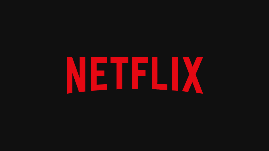
A quick case study in brand identity design: The Netflix brand
Examine any one of the products and services you regularly use and you’ll see the elements of brand identity.
Take Netflix, used every day by millions of people around the world, and a quick analysis reveals:
A great, memorable name with a modern, disruptive feel and a clear link to the product.
An iconic logo, with arcing text reminiscent of the cinema experience.
A distinctive black and red colour.
Minimalist typography choices that emphasize ease of use.
A quirky brand tone on social media.
Image Source
Did Netflix grow into an online streaming giant by accident? No, they used clever brand identity design to do it.
Everything is considered, creating a consistent brand experience every time you open the Netflix app. In fact, they even use sound as part of their brand identity. You think of Netflix as soon as you hear that “badum”, right? Even the souped-up movie theatre version.
The bare bones of brand identity design are everywhere, once you open your eyes to them. Let’s take a closer look.
How to start developing your brand identity
To design a brand identity that fits your business and will resonate with your target audience, you first need to ask (and answer) a few questions.
1. What is my brand’s purpose?
Everyone launching a business has a big idea, and every idea has a story behind it. Identify the unique value proposition that your business offers its audience: what has driven you to start your business and what do you have that your competitors lack?
Your purpose is the foundation of your brand identity, and as you develop your brand identity design you’ll be able to communicate your mission to your audience at every step.
2. Who is my audience and what do they want?
Brand identity design isn’t just about you: it’s about building a relationship with your customers. Building a strong brand identity is a dialogue, so you have to understand who you’re talking to.
Conduct market research to discover exactly who your customers are, what they dream about, and what they want to hear from you.
At the same time, perform some industry analysis to understand your competitors’ brand-building projects. Ask yourself what they’re getting right and what they’re missing. Spotting key trends in your industry can give you some shortcuts in communicating your purpose with your audience.
3. What core tone will work for my brand?
Your brand tone is like the personality of your brand. It should communicate your purpose and values to your audience, in a way they’ll be receptive to based on your research.
Luxury brands communicate exclusivity and prestige through their brand tone, while disruptive brands might be cheeky and creative.
Here are some brand tone examples:
Cutting-edge and innovative
Quirky and playful
Warm and homely
Your purpose, your audience, and your brand tone will come together to define your brand. Now it’s time to communicate your brand identity to your audience: let’s take a look at brand identity design.
What are the elements of brand identity design?
Once you understand your brand identity, you can begin brand identity design. Careful curation of the imagery and style choices associated with your branding will enhance your brand identity, reinforce your values, and fix your brand in the hearts and minds of your customers.
1. Craft your logo
Your logo is the launching point for brand identity design. It will be the most consistent image accompanying your products and can provide a foundation for further style choices, like colour and font choice.
A good logo must always be simple and memorable, but that doesn’t mean it’s simple to design one. Your logo needs to evoke your brand’s purpose and values and be versatile enough to use across video and still image marketing marketing material.
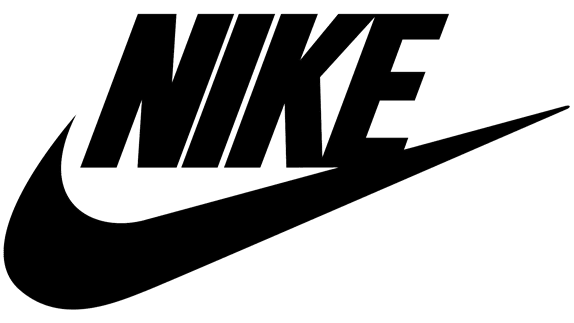
Prioritize simple, block colours and clean lines to create an uncluttered logo that consumers can grasp at a glance. Nike’s iconic swoosh symbolizes movement and sports, while Google’s utilitarian logo is paired with a splash of colour. Both create timeless imagery to accompany the brand’s further design choices.
You should have a consistent colour palette to accompany your brand’s communications. As well as being functional (a predominantly black logo will fail to stand out against a dark colour palette) your choice of colours will also stir your customers’ emotions, so choose the right ones.
Read up on the psychology of colour to understand how your colour palette will influence your customers and relate to your brand tone. If you want to create an impression of security and trust, lean on blue tones while orange is connected with creativity and confidence.
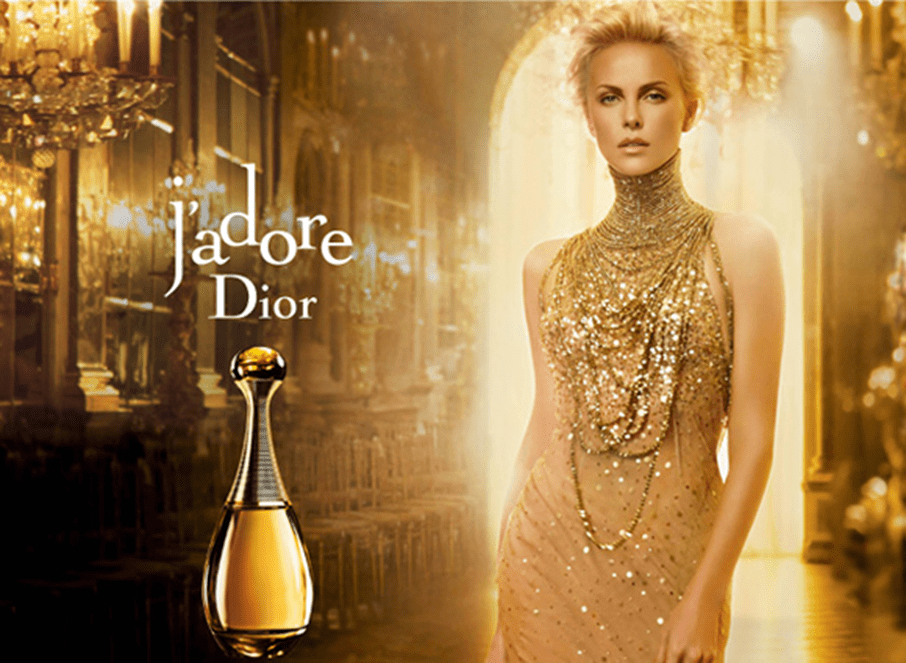
Mailchimp has opted for a ubiquitous cavendish yellow for its brand identity design, a colour that’s memorable and energetic. And we can see how to colour choices of the fashion house and perfume brand Christian Dior emphasize luxury
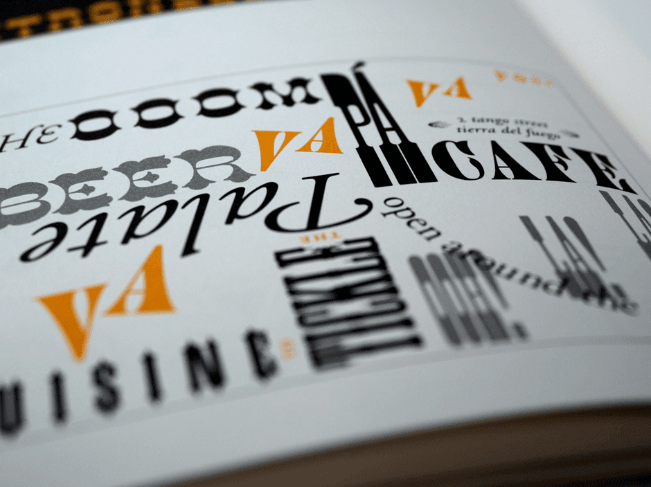
The next ingredient in brand identity design is your typography, and the fonts you use can say a lot about you.
Burberry’s new serif font has a classy and timeless feel, while simple fonts like those across Google’s branding are friendly and appealing. You could even design a new font based on sketches or handwriting if creativity and personality are at the heart of your brand identity.
Your typography choices should align with your logo and color palette, and they should always facilitate understanding rather than confusion in your customers. Mixing typography can create visually appealing contrasts, but avoid overly elaborate typography that’s hard for customers to interpret.
We’re visual creatures, devoting almost half our brain processing power to what we see around us. That means a visual language, one integrating icons and graphics, is a powerful addition to your brand
Throughout your branding, ask yourself if you could say it with a picture and if so, what kind of imagery would appeal to your customers and remain consistent with your brand tone.
Google’s strict guidelines for imagery and icons create an intuitive visual language for customers. For your own, you might prefer artistic sketches that appeal to your customers’ creative side or something photo-realistic over computer-drawn graphics.
5. Keep it consistent
While there are many important choices within brand identity design, the choices you make should be fixed. It’s fundamental to the functioning of your brand that your design choices are consistent across your website, product design, social media, email newsletters and anywhere else you have the opportunity to use them.
Consistency is professional and it will reinforce trust in your brand. But more importantly, it helps get the message across and builds a coherent identity that customers begin to understand implicitly. Eventually, it might take nothing more than a splash of your iconic colour to remind your customers of the values that your brand is founded on.
Building a brand style guide alongside your brand identity design can help keep your brand consistent. Your style guide can document your chosen colour palette, typography, and visual language, it can quickly onboard new hires who are learning about your brand tone and it can streamline the process when you hire creatives for new campaigns.
A brand style guide can even outline the tone your employees take when talking to customers, the arrangement of shop floor displays, and the rules for sonic branding. Brand identity design begins with your name, logo, and the immediate visual components of your brand, but the strongest brands curate every instance of user experience to align with these fundamental elements.
Brand identity design examples
Think about any of the brands you love, and you’ll realize that they have a coherent strategy around brand identity design. The most successful examples of brand identity design aren’t obvious: these brands have created a brand identity that feels organic, and customers connect with these brands naturally.
However, it doesn’t happen by accident. Every brand, from Christian Dior to Mailchimp, has made key decisions about every aspect of their brand design. Here are some brand identity design examples to draw inspiration from.
IKEA
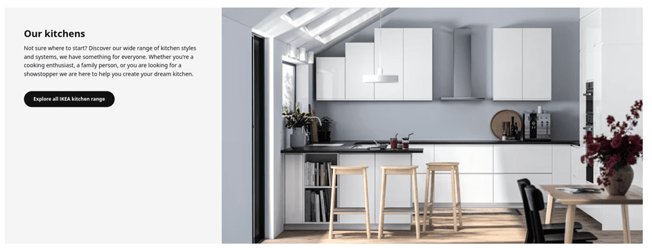
IKEA’s powerful branding gives them a strong top-of-mind awareness. The iconic colour scheme of their logo was inspired by their Swedish origins, but as well as being a patriotic nod to their homeland, it also effectively emphasizes the clean design and practical functionality they’re known for.
Even the name ‘IKEA’, in block capitals, combines pre-eminent practicality with a stylish and exotic twist.
Across IKEA’s branding, they use clean, uncluttered imagery, real photography over graphics, and prioritize neutral colour palettes.
This combination creates space for IKEA’s customers to project their desires onto their products, to the extent that the whole process of shopping at IKEA is one of self-actualization.
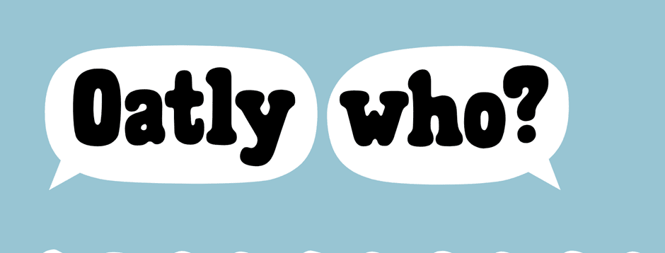
Oat milk brand Oatly follows well-established naming trends, with the -ly suffix immediately hinting that this is a disruptive brand outside the establishment.
They have created a quirky brand identity through their design choices, using subtly unaligned custom fonts to create an invitingly unprofessional feeling, and have perfected a warm, casual brand tone packed with offbeat humour.
Importantly, this humour is consistent across their social media, website, and product packaging to create a cohesive identity.
Oatly is a friendly brand integrating itself into the lifestyle of its users. These design choices might appeal to vegetarians and vegans already looking for alternative milk products, but by creating a wholly unpolitical brand identity, they effectively target young consumers from all walks of life.
Oh, and does anybody else see a cow in the black-and-white ‘Oatly Who?’ design above? Talk about subliminal.
Final thoughts
In a competitive business environment, the strength of your idea alone doesn’t guarantee success. You also need to communicate that idea to your customers, in a way that meaningfully connects your business with their lifestyle and aspirations.
That’s why building a brand identity is essential, and understanding brand identity design lets you optimize every detail of your brand to send the right message.
From a timeless logo, creative typography and a colour palette that leverages your customers’ psychology, brand identity design gives you the tools to build a powerful brand. Ready to get started? Check out our Brand Identity Design service at Squadhelp.
By Lotte Reford
Guest Author:Lotte Reford is Communications Lead for Squadhelp.com, an innovative naming & branding platform with more than 40,000 customers globally, from the smallest startups to corporations like Nestle, Philips, Hilton, and Pepsi.
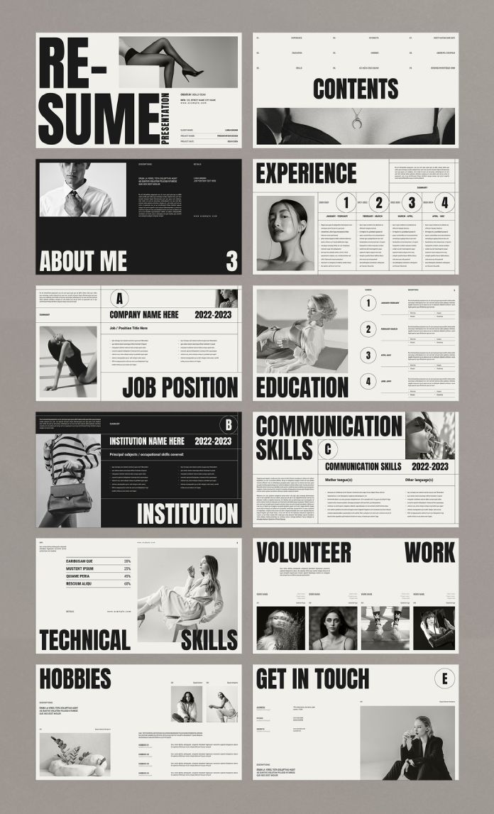
Showcase Your Professional Story With The Game-Changing CV/Resume/Portfolio Screen Presentation Template by TemplatesForest!
Hey, trailblazers of the professional realm! If you’re tired of the same old mundane CVs and resumes, get ready to revolutionize the way you present yourself or your design portfolio with this extraordinary CV/resume screen presentation template by TemplatesForest. Crafted with precision using the wizardry of Adobe InDesign, this template is not just a document; it’s a masterpiece in 1920×1080 pixels!
Let’s talk pixels and panache. This template is not your regular 8.5×11 affair; it’s a widescreen experience, designed for those who dare to dream big. A canvas as vast as your ambitions, this template invites you to think beyond boundaries and make a statement that refuses to be ignored.
12 Pages, Infinite Possibilities
Ever felt confined by the limitations of a single-paged CV? Fear not! TemplatesForest has your back with 12 pre-designed pages that are more than just templates; they are chapters in your professional narrative. Each page is a canvas for you to paint your skills, experiences, and achievements in the most vivid hues.
Customize to Conquer
You’re not a cookie-cutter professional, and your CV shouldn’t be either. TemplatesForest understands that which is why this template is fully customizable. From colours that reflect your personality to fonts that echo your style, the power is in your hands to mold your narrative.
A Symphony of Typography
Ever heard of a CV that reads like poetry? Now you have! With bold typography that demands attention and a layout that flows like a well-composed symphony, this template doesn’t just present information; it elevates it to an art form. Your potential employers won’t just read; they’ll be captivated.
Tailored for the Mavericks
Are you a graphic designer who defies the ordinary? An architect with a vision beyond blueprints? This template is your canvas. It’s not just for resumes; it’s a portfolio waiting to be unleashed. Let your creativity run wild, and let this template be the stage for your professional opus.
Modernity Personified
In the age of digital dominance, your CV should speak the language of the times. Modern, sleek, and utterly captivating, this template is not just a piece of paper; it’s a digital experience that screams, “I am here, and I mean business!”
A Toolkit for Success
Your CV is not just a document; it’s your brand. TemplatesForest doesn’t just offer a template; it provides you with a toolkit for success. A toolkit that says, “I am not just looking for a job; I am crafting a legacy.”
Final Word
In a world inundated with ordinary, dare to be extraordinary. TemplatesForest’s CV/Resume Screen Presentation Template is not just a document; it’s your story told in pixels and panache. It’s time to break the mold, shatter expectations, and present yourself like never before.
Get ready to unleash your professional story – because mediocrity is not an option, and with TemplatesForest, neither is blending in. Your journey to professional greatness starts here. Download, customize, and let your story shine!
Companies pivoted away from weird names in 2023, but some made questionable decisions to walk away from established branding built up over decades.
Making a good first impression with potential customers is critical for any business, and your brand name has a lot to do with that. Still, choosing a name can be an underappreciated aspect of branding.
That’s according to Justin Angle, a marketing professor at the University of Montana, who points out that few touch points on the customer journey are as meaningful as the initial introduction to the brand itself. “The name of the brand is often the first thing that the customer–or potential customer at that point–encounters, so it’s a critical part of the puzzle,” Angle says.
The names founders choose for their companies often reflect the broader culture at the time, and 2023 was no exception. Fordham University professor Dawn Lerman, who researches how language impacts consumers as they evaluate and choose brands, says 2023 marked a pivot away from weirder names and a return to normalcy. For years, startups, particularly in the technology sector, embraced disemvoweled brand names like Tumblr, Flickr, and Mud/Wtr out of necessity to avoid existing trademarks, and as a way to communicate that the company offered something unique and innovative. But over this past year, Lerman says, brand names have instead tended to be shorter, straightforward, and actual words.
“Consumers are looking for some stability in their lives at a time when there is economic trouble, social trouble, political trouble, cultural trouble, you name it,” says Lerman. “Having a brand name that is more simple, that communicates what it offers, I think is a reaction to that.”
Here are some of the brand names that resonated with consumers over the past year–and some that missed the mark.
OpenAI
OpenAI, which has dominated headlines over the last 12 months with its launch of ChatGPT and the board’s short-lived ouster of CEO Sam Altman, uses its name as a direct nod to the open-source nature of the company’s technology.“It’s a great example of a tech company that put a very simple name out there that tells us consumers, the world, what they’re all about,” says Lerman.
The name also represents broader trends in our use of language, according to University of Calgary marketing professor Ruth Pogacar, who studies how linguistics can impact brand perception and consumer choice. “Names beginning with vowels are having a resurgence perhaps with both people and brands,” she says. Think Swiss athletic brand On, supplement company Athletic Greens, and buy-now-pay-later business Afterpay, as well as iconic brands such as Adidas, Amazon, Apple, and Instagram.
Shein and Uniqlo
While OpenAI leaned into an adjective that best described the company’s ethos, two of the most successful clothing companies over the past year have names that don’t convey much of anything about their brands. They are not even English words. Still, that hasn’t deterred American consumers. Gen Z favourite fast-fashion brands Uniqlo, whose Japanese parent company reported record net profits of $1.99 billion for the fiscal year ending August 31, and Shein, which is reportedly seeking a $90 billion valuation for its planned IPO, have cultivated massive customer bases in the U.S. with names that don’t represent specific styles or product lines.
“They defy branding in a way, because there’s not much branding on the products they sell,” says Angle. “The products are sort of generic, like nice merino sweaters with no logos or patterns that aren’t really brand specific.”
Max, formerly HBO Max
This past year also included some high-profile examples of questionable branding decisions, the biggest lesson from which may be: don’t rebrand if you don’t have to. There’s no reason to throw away years of brand equity that your company has worked hard to build up. After the merger of Warner Media and Discovery, the HBOMax streaming service dropped what were arguably its three most important letters, rebranding as just Max. “HBO, to jettison decades of brand equity by renaming its app Max, which is meaningless,…it doesn’t make a lick of sense,” says Pogacar.
The University of Montana’s Angle says this name change is the latest in a long line of missteps for the brand, which has cycled through four names for its streaming app. “The HBO brand has been terribly managed in the streaming era…They just diluted it in so many ways by slicing it up.” he says. “Consolidating it into a single brand with Max is, I think, a step in the right direction, but it still feels like it’s an attempt to clean up a self-generated mass.”
Twitter rebranded to X
Warner Bros. Discovery CEO David Zaslav was not the only executive to walk away from years of valuable brand equity in 2023. This past July, Twitter ditched its bird logo and its name when owner Elon Musk rebranded the social media site as X.
Angle says it’s difficult to try to theorize a real rationale for the Twitter name change outside of Musk’s own eccentricness. “That one is like the biggest head-scratcher to me,” he says. “There is a story that’s trying to be told there. I just don’t think it makes a lot of sense.”
Despite the questionable branding decisions of Max and X, Pogacar predicts that we will see fewer embarrassing brand flops in the future. “As globalization has evolved and companies have gotten savvier, I think we don’t see as much of that anymore–which is too bad for the joke lists of terrible brands, but it’s probably good for business.”
McDonald’s has been sneakily building a brand new spin-off restaurant with an out-of-this-world theme. The new establishment named ‘CosMc’s’, has appeared in Bolingbrook, Illinois and until now has been kept under wraps – but recent images of the new building have garnered a mixed response online.
As of now, it’s unclear how CosMc’s will compare to McDonald’s existing chains but from the theming alone, it looks like we’re in for a blast from the past. This new design is certainly a change from what we’ve seen before, but McDonald’s iconic golden arches still remain one of the best logos of all time.
As you can imagine, the design of the mysterious CosMc’s is suitably space-themed, with a deep blue exterior and McD’s yellow accents (with a cameo from the golden arches of course). The CosMc’s wordmark logo is perhaps the biggest change from McDonald’s branding, featuring retro-inspired curved text that gives the restaurant a nostalgic appearance.
If you’re familiar with the intricate world of McDonald’s lore, you may recall the classic character behind the new restaurant design. CosMc was a fleeting side character featured in various McD’s ads in the late 80s and 90s – Ronald’s extra-terrestrial pal who’s arguably lesser known than other McDonald’s characters. After the success (and trauma) of the latest Grimace shake trend, do I spy McDonald’s attempting to revive another forgotten friend?
Pictures of the new restaurant were shared by X user Iman Jalali who called it “an evil love child of a Taco Bell and a Starbucks.” Jalali seemed on the fence about the new restaurant design and fellow X users showed equal confusion, with another user questioning “What’s with the weird space theme? Feels like something out of the 1960s or something.”
It seems that amidst the mystery, this new McDonald’s spin-off is dividing the internet. We won’t know for certain what the new restaurant entails, but for now, I’m glad to see another member of the McDonald’s gang getting revived, and I pray that his return will be equally as chaotic as the great Grimace resurgence.
Natalie is Creative Bloq’s staff writer. With an eye for trending topics and a passion for internet culture, she brings you the latest in art and design news. A recent English Literature graduate, Natalie enjoys covering the lighter side of the news and brings a fresh and fun take to her articles. Outside of work (if she’s not glued to her phone), she loves all things music and enjoys singing sweet folky tunes.