Tag

Design Trends

Browsing

By Tom May

We speak to the great and the good to get the temperature of the industry as we head into the halfway point of the 2020s.

As we approach 2025, the creative industry stands at a fascinating crossroads. The rapid evolution of AI is reshaping how we think about design. To gauge the industry’s mood, we’ve spoken to leading creative directors, agency founders, and industry visionaries about the trends they believe will define 2025.

Their insights reveal a complex landscape where technology and humanity intersect in unexpected ways. And in these changing times, they’re very much worth paying attention to, even if you’re the sort of person who generally ignores trends.

Because it’s no exaggeration to say that this moment feels like it’s going to be pretty pivotal in design history.

That’s how Jan Eumann, executive creative director at Wolff Olins, is feeling right now, anyway. “Generally, we try not to worry too much about the big trends in graphic design,” he begins. “Instead, we focus on where society is headed and how we can have a meaningful impact where it matters. That said, in terms of what work looks and feels like, we’re clearly in one of the most transformational shifts in technology since the introduction of the computer.

“AI has been central to many, if not most, conversations about technology over the last few years,” he continues. “But considering the increasing maturity of tools and applications, there’s no point watching from the sidelines any more.”

Yet, although AI might be the biggest story, it’s not the only one. Every action has an equal and opposite reaction, and the rise of AI has also produced a number of counter-trends that designers also need to know about. Plus, of course, there’s plenty of other stuff going on in the design world beyond that. So read on as we outline the 10 biggest design trends that are captivating design leaders’ minds right now.

1. AI moves to the final output

The conversation around AI has shifted dramatically. Whether you love it or hate it, one thing’s for sure: you can no longer ignore it.

Some, like creative director Michael Freimuth, are giving it a cautious welcome. “As a relatively early adopter, I’ve enjoyed seeing creatives become less intimidated by AI and more experimental with it,” he says. “Using it in more practical applications as a tool has been a nice antidote to the ‘deer in headlights’ vibe from last year. Understanding its limits and strengths, as well as when it’s creatively soul-sucking and awful versus experience enhancing, feels like progress.”

A collaborative zine produced by Franklyn and Michael Freimuth highlighting ai artists across an array of themes and visual exploration

As our special report earlier in the year shows, many agencies have already incorporated AI into processes such as idea generation, prototyping and mock-ups. But even if you’re not keen, OMSE founder James Kape points out that this emerging tech will still find you, somehow or other.

“AI has deeply embedded itself into everyday design tools, even when you’re not actively seeking it out,” he explains. “In Photoshop, for example, you can use the Generative Fill feature to remove, fix, or generate content with just a few clicks. Beyond that, new AI platforms like Exactly.ai enable users to generate illustrated assets from simple sketches, offering a new level of accessibility to design.”

And things seem to be moving faster and faster as we approach 2025. AI is now firmly embedded in search for Google, generative images are getting better and better, while numerous platforms are showcasing generative video tools that are shockingly convincing.

Red Antler crafted the brand identity for a new AI infrastructure company, Ori, using augmented design applications to bring the AI brand to life

Could the coming year see AI become ready for prime time rather than just a handy ideation tool? Kiser Barnes, partner and CCO at Red Antler, believes so. He predicts that next year: “AI will transition from being a behind-the-scenes tool for processes and sketches to an actual execution tool, creating brand assets and content in real-time. AI’s role in design will become more direct, moving beyond ideation to final output.”

Even so, though, the elephant in the room is that AI will probably put many designers out of work. In an article we published in May, Simon Case predicted that AI will destroy jobs and create a movement towards one-person design agencies. As the capabilities of the technology continue to advance, that scenario does seem to be getting more and more likely by the day.

2. The return to physical experiences

As AI accelerates, though, our experts believe there will also be a powerful movement in the opposite direction. “The faster technology moves, the more we’ll see a counter-trend emerge: a return to handcrafted, human-centred design,” says Barnes.

Graeme McGowan, co-founder of Jamhot, agrees. “As the world of AI develops, we’re leaning into creating more human connectedness through our work,” he says. “That’s something that I think will be more important to brands going forward.”

GAB by Jamhot
GAB by Jamhot
GAB by Jamhot
GAB by Jamhot

Miro LaFlaga, co-founder of Six Cinquième, takes a similar view. “More and more, I see younger generations coming full circle, with the pendulum swinging back to a time where real life, genuine, intimate, in-person connection is king,” he says. “What will that look like? We know the digital world isn’t going anywhere, but I believe brands that can play both sides well and connect the two experiences to create meaningful engagements will win.”

This trend is particularly evident in retail, where Tom Munckton, executive creative director at Fold7Design reports “there’s a rebalancing happening of the ‘virtual’ to ‘physical’ showings for brands, with big retail marketplaces exploring more and more IRL [in real life] experiences combined with pure e-commerce. This is in line with broader trends around human-made design. With the world wearying of AI, we’re seeing more of the human details, nuance and imperfections creep back in.”

Andy Harvey, founder and executive creative director at Communion Studio, adds: “In 2025, I think we’ll see a reaction to the screen-saturated world of recent years. This could manifest in two significant ways: hyper-personalised nutrition, driven by a deeper understanding of the power of natural health, and a desire for more IRL gatherings, driven by a return to face-to-face connection. And perhaps a little more hedonism.”

3. The craft renaissance

As another element to the backlash against AI, along with a broader rejection of mass production and digital saturation, there’s a growing appreciation for craft and heritage in design. Luigi Carnovale, founder and creative director at Design LSC, outlines several key factors driving this trend.

“The first is personalisation,” he begins. “Consumers want unique, handmade items with personal meaning, moving away from mass-produced products. The second is sustainability. This focus on eco-friendly and ethical consumption aligns with the craft’s slow, intentional production. Thirdly, advances in technology will blend with traditional craftsmanship, creating innovative yet authentic designs.”

4. More experimentation

As design tools become more accessible, the industry faces an interesting dichotomy. As Mike Perry, founder and chief creative officer of Tavern points out: “Inexpensive Adobe competitors such as Canva means everyone’s a designer, or thinks they are. As a result, a wealth of content is being created. But since these programs rely so heavily on templates, everything coming out of them looks the same. It’s becoming harder to find new ideas and aesthetics in this sea of copies-of-a-copy-of-a-copy. With AI being trained on all this content, we can expect to see even more of the same in the future.”

At the same time, though, he sees opportunity in this challenge: “Less gatekeeping means more room for experimentation at the fringes. We expect to see continued iterations on the ‘undesigned’ trend, more chaos, more maximalism to counter the crisp, clean, blandness the algorithm will inevitably continue to serve us.”

5. The rise of design writing

If we reach a stage when AI can create images, videos, and other final outputs just by reading text prompts alone, it stands to reason that writing text will be an increasingly important design skill in 2025 and beyond.

As Perniclas Bedow, creative director at Bedow, puts it: “The industry is now ready to embrace the written word. Articulate what you do before you do it. Craft sentences and use the words as a guide rather than visual references. It’s time-consuming and challenging, but it opens up new worlds and shifts the outcome away from the formulaic.

Bimmi’s brand narrative, Nature’s Poetry, is conveyed through typewriter letters. Work by Bedow
A Lovely Atmosphere was created for GBGT Box’s promotional boxes. The square boxes represent the atmosphere’s five layers. Work by Bedow
Swee Kombucha’s probiotic brews are 100% natural, with a packaging design based on 100 cells, each filled with a color representing the percentage of each ingredient. Work by Bedow
Neko’s logotype is split in half, with the lower part slightly ahead, reflecting their tagline, Ahead of Your Health. Work by Bedow

6. Sound becomes a key design element

Another trend emerging for 2025 is the increased importance of audio in digital design. Simon Carr, design director at DesignUps, provides some detailed insight into this.

“As audio becomes more accessible and more popular with web tools, it makes sense that there will be more creative ways to utilise sound files on websites,” he explains. “This could be implemented in many ways: from soundtracks to UI sounds as a user navigates and makes choices.”

And here’s something else that may be changing. “It’s long been felt that auto-play audio on a website should be avoided,” says Simon. “But going forward, I expect websites with a focus on sound will implement options to play audio or not, based on stored user preferences.”

7. Sustainability takes centre stage

Environmental consciousness continues to significantly influence design decisions, with positive results being seen in areas such as packaging. Brands are recognising that this will get them much further with the public than anything that might be perceived as ‘greenwashing’.

“Brands are looking to wear their ethics proudly, like a fine suit,” says Simon Manchipp, founding partner at SomeOne. “In 2025, expect a visual language that whispers of environmental stewardship: natural textures, earthy palettes. But brands will not only look sustainable but ensure they’re rooted in ecological mindfulness. Packaging may move to be as minimal as a haiku, made of materials that leave barely a footprint, and designs will exude a sense of calm, as though the planet itself had taken a deep, contented breath.”

8. Minimalist maximalism

So what impact will all this have on what designs actually look like? “I’ve heard a lot of talk about ‘Minimalist Maximalism’,” says Cat How, founder and executive creative director of How Studio. “Minimalism has been a dominant design trend for many years, but in 2025, this trend, I think, will 10x itself and blend the simplicity of minimalism with the boldness of maximalism. So, we are still embracing the clean lines and white space of minimalism with more expressive and unexpected elements, such as vibey colours, massive type, and other eclectic elements.”

Wild Thingz by How&How
Blum by How&How (Designers: Lina Aragon and María Alejandra Maya-Fresa)

9. Health becomes the new luxury

The wellness sector is experiencing unprecedented innovation and investment right now, and that’s having an impact on design. Because health is becoming inextricably linked with wearables and tech, but someone has to make sense of all that data, or it’s next to useless.

“Visualising health data is becoming the ‘new luxury,'” stresses Sarah Williams, co-CEO of Beardwood&Co. “Apple is doubling down on Health in their latest Apple Watch release, and everyone from Spotify CEO Daniel Ek to health platform Equinox to motivational speaker Tony Robbins is getting in on the opportunity to offer high-end, data-driven health services at a premium. The key focus? Making the unseen visible and the future predictable.”

Choice Organics. Work by Beardwood&Co

This trend extends beyond personal technology into physical spaces, notes Roly Grant, creative director at Without Studio. “The biggest trend we’re experiencing is investment and innovation in being active and staying well,” he reports. That includes: “specialist hot/cold studios; luxury martial arts clubs; more accessible family health clubs… expect energy from this space, as new concepts compete to stand out in 2025.”

Another notable development is the emergence of women’s health brands. “Start-up brands are winning big with women by creating effective products for our bodies and communicating with refreshing honesty about our journey through periods, pimples, mood management, vaginal health and menopause,” explains Julia Beardwood, founder of Beardwood&Co. “Brands such as Modibodi, Starface, p-HD, Winged, MixHERS, Womaness and MenoWell, all founded and led by women. No one cares better for women than other women.”

10. Inclusivity becomes non-negotiable

The push for authentic representation is certain to gain continuing momentum in 2025. “Brands will go beyond tokenism to embrace authentic representation,” predicts Simon, “ensuring that every facet of human experience is not only acknowledged but welcomed into the fold. Expect to see designs catering to every ability, culture, and shade of human life. It could be a glorious symphony of inclusivity, visually expressed with grace and humanity.”

When it comes to inclusivity, one aspect that’s often overlooked is age. As Oscar Mason, creative strategist at Outlaw, points out: “In an industry distracted by ‘magpie trinket trends’ it’s easy to lose sight of where the real opportunity lies. One thing bubbling in my view is the shift in marketers, designers, and brand managers placing emphasis on those who have the greatest spending power: those who are in their over 50s.

“In the UK, people over 50 make up 40% of the population but control a massive 80% of the wealth. Yet, we are washed with Gen Z insight reports and briefs that request us to target those who happened to be born between the years of 1997 and 2013. Sometimes it feels like we are reflecting marketers’ tastes rather than those of consumers.”

Looking ahead

As we move towards 2025, the design industry appears to be embracing seemingly contradictory forces: technology vs humanity, minimalism vs maximalism, digital vs physical, and youth vs experience. In the second half of this decade, successful designers and brands will be those who can navigate these dualities, creating work that resonates on both emotional and practical levels.

If we can all strike this balance and harness a thoughtful approach to design, the creative industry should have an exciting and transformative year ahead. Keep reading Creative Boom to stay abreast of developments, and we’ll keep sharing the best stuff to inspire you.

Feature Image Credit: Adobe Stock

By Tom May

Sourced from Creative Boom

By 

Surprise, creatives hate minimalism.

Design trends can be a tricky thing to handle well. When a trend gets popular every company wants to hop on the bandwagon, but in most cases, it slowly becomes too much of a good thing. Unfortunately, in today’s lightspeed trend cycle, the birth of a design trend also marks its untimely death.

In the wake of this ever-changing design plague, graphic designers took to Reddit to share their design trend pet peeves – from illegible typography to cringy retro revivals – but don’t take it too much to heart. As we’ve seen with the resuscitation of design aesthetics like Frutiger Aero, just because your favourite design trend has met its demise doesn’t mean it won’t come back stronger than ever.

The most common design pet peeve shared on the r/graphic_design subreddit was the influx of soulless minimalism. Naturally, as graphic designers, there’s a compulsion to explore the creative possibilities of a project – something that the minimalism trend has destroyed.

“It has its place just like every other style, but everybody can’t have a minimalist logo and branding,” user u/thegreenstars says. Pointing to recent examples like the new Johnson and Johnson logo and the X rebrand, they question why brands are no longer trying to stand out against the competition. “Why are y’all ruining your brand identity and ditching your whole personality to conform to this “need” for minimalist design?” they add.

Feature Image credit: Getty Images

By 

Natalie is Creative Bloq’s staff writer. With an eye for trending topics and a passion for internet culture, she brings you the latest in art and design news. A recent English Literature graduate, Natalie enjoys covering the lighter side of the news and brings a fresh and fun take to her articles. Outside of work (if she’s not glued to her phone), she loves all things music and enjoys singing sweet folky tunes.

Sourced from Creative Bloq

By

As we enter a new decade, we look at where design is heading.

A new decade brings new trends, and the evolution of existing ones. Last year saw exciting developments across the spectrum of visual design that will develop and evolve in the new year.

Here, we look at what’s hot in design right now and how we see it developing in 2020, covering everything from web design to fun fonts to graphic design and UI. Here are seven of our biggest predictions for what we’ll see happening in design this year. You heard it here first.

01. Branded animation

With GIFs now part of how we communicate, anyone designing for digital knows that people love movement. Illustration has become big for social media and web design over the last few years, but there’s now growing demand for the illustrations to move as shorter attention spans need to be satisfied.

GIFs can be a powerful way to bring brands to life. In 2020, we expect to see more fully branded motion graphics, from micro-interactions to moving logos to animated GIFs celebrating milestone events on social media.

Animations will also get more continuous. The safety video from Delta Airlines (above) shows the direction branded animation is going in, with one scene rolling into the next through fluid dynamic transitions that evolve and tell a story. The trend to build each scene out of the previous one takes viewers on journeys through a transforming world. And animation doesn’t only live online or on a screen.

Branded animations designed by London-based Animade were an integral part of Mailchimp’s rebranding in 2019, including the monkey logo that winks when you move the cursor over it, but the animators also created this interactive wall art. Interactive illustrations will offer a chance to reinvent communication and tools and engage with illustration in real-world environments.

02. Ultra minimalism

Calendly’s ultra minimalist landing page focuses attention on the call to action (Image credit: Calendly)

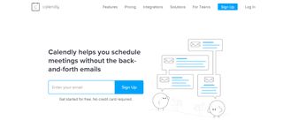
Minimalism seems like it will never become passee. It looks clean, sleek and for websites, it reduces loading time and scores better in search results. Services like Slack, Monday and Calendly are aware of this and have been leading the trend for minimalist landing pages that put the focus on the call to action and conversions.

With no distracting background elements, their sites are easy to navigate and make it easy to sign up. The trend is to complement the white space and simple message with an illustration – Calendly uses a modern looking line drawing to add to the clean feel, Monday opts for an animated demo with pots of colour to draw the eye, while Dropbox  dispenses even with the illustration, dedicating half the screen to the sign up form. Other sectors are following the trend, opting for simple and direct approach, which will stay with us in 2020.

03. Combining realism and flat design

design trends 2020

Magdiel Lopez combines realism and flat design to stunning effect (Image credit: Magdiel Lopez)

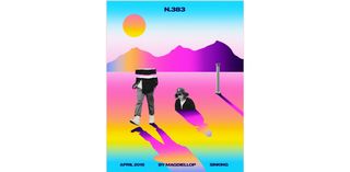
Recent years have seen a huge trend for flat design, and over the last year, isometric design has been the big thing, led especially by design for cryptocurrency sites, while 3D has been getting better and better. Now we’re starting to see more of a tendency to get the best of both worlds by layering elements of flat design and realistic 3D images. This can be through combining 3D design and flat design or through collages that combine flat design and photography like the beautiful dreamy posters created by Magdiel Lopez.

His work bridges the gap between the simplicity of flat design and the complexity and authenticity of realism, and communicates interaction between the real and digital worlds. The combination of 3D and flat design can also be a way to bring goods to life, such as on the urban trekking shoe company Déplacé Maison website or highlight blended learning experiences like on the Ocean School website.

04. Playing with the elements

design trends 2020

Azure The Oceanic’s site offers an engaging sense of freedom with cursor-controlled play  (Image credit: Azure The Oceanic)

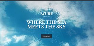
In web design, there’s a growing tendency to play with water, air and light to create engaging effects, which follows a trend in design in general towards rejecting rigid geometric lines and shapes in favour for soft, flowing lines. It’s fun and playful, approachable, easier on the eye and still feels new.

The design and text on the Beyond Beauty project’s website seem to float around the space, conveying the sense of freedom that the project embodies. Expect to see a lot more free-floating elements in 2020 as we say goodbye to gravity. The theme for flowing shapes and lines is taken up also in the use of water and lights, for example, with cursor-controlled shimmer and ripple effects like in this site from property developers Azure The Oceanic. The Barovier & Toso website also uses cursor controlled liquid ripple and shimmer effects to give a sense of mystery and luxury to its products.

05. Heavy but simple fonts

design trends 2020

 CPGD’s site is on trend for 2020 with bold simple text (Image credit: CPGD)

The trend for big and heavy fonts is not going to move easily. With people spending more of their time online on small screens, big fonts are practical, but it’s a trend that extends to the world of graphic design and even packaging, since they also look great and give personality to text. When it comes to thickness, the rule for 2020 will continue to be the bigger and bolder the better, with text taking centre stage and overtaking image and video as the main element.

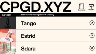
Designers are using bold or extra bold fonts paired with simple backgrounds or much lighter text to create interesting contrast in a design. Text may even go beyond a composition’s edges, and be split into multiple lines. CPGD, a list of direct to consumer brands, is on trend with a site that uses bigger Helvetica Now Display much bolder than most ecommerce sites, which can often suffer from lots of small text.

Large text is not only for headlines and titles, but sites like that of Germany agency Polar Gold show a trend to beef up the size of the text in paragraphs too, and expect to see more incorporation of movement too like in the bold and playful Piano Trio Fest site.

06. Dynamic live data visualisation

design trends 2020

The Economist showed lived data visualisation based on the reaction of fans during a football match (Image credit: The Economist)

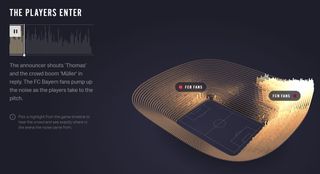
Data visualisation has been a growing trend for years. And there’s much more to come. In 2020, complex live data – like dashboard stats – will become even more immediately available, and designers will need to showcase information in a way that adapts to changes and dynamically animates. In the past year, The Economist’s Reimagine the Game offers visualisation of fans’ reactions in the stadium during football matches providing a kind of timeline of the match  complete with goals and yellow cards. In 2020, expect data visualisations to go dynamic live, interactive and to cover everything.

07. AR and VR finally go mainstream

design trends 2020

AR and VR offer whole new design mediums (Image credit: Getty Images)

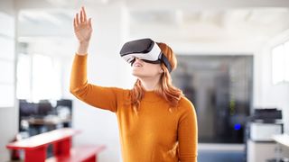
It’s been a long time coming but VR is finally coming into the mainstream and is expected to become  one of the most consumed technologies of the next few years. What’s exciting for design is that more than being a trend, virtual reality offers a whole new medium to design for. UI and UX within VR is huge area in which to explore not only how we touch a screen but how we move around inside it.

Expect big opportunities in holographic 3D design and virtual reality e-commerce solutions, while AR will increasingly offer more demand for digital animation, with magazines like The New Yorker bringing pages to life through our phones’ cameras and Apple and Google introducing their own AR development platforms, ARKit and ARCore. And whatever happens in the areas of VR and AR is also bound to have an effect on wider design.

By

Sourced from CREATIVE BLOQ

By Carrie Cousins

All three of this month’s essential design trends have to do with typography. And the trends showcase some pretty stellar ways to use beautiful type to create user engagement and make a great first impression.

One common theme among these designs is that all of the typography styles are highly readable. If you plan to work with a more trendy or funky text element, choose a typeface that users won’t struggle to read. The trendy technique is the trick with these designs, not the typeface itself.

Here’s what’s trending in design this month:

1. Just Type Above the Scroll

While a great image can help draw users into a design, sometimes the right words and space are the ticket.

The key to making the most of this design trend is to refine your message. The words need to be simple, say something meaningful and create value for the user.

So how do you do it?

  • Start with a key phrase. It can be your mission or a value proposition for users. Tell users what you bring to the table and why your website will be important to them.
  • Pick a simple typeface that has the same mood as the messaging for longer copy blocks.
  • If the text block is short, such as with Types of Type, consider a funkier type option to draw users in.
  • Make the most of space. Note that in each of the examples below, text has plenty of room to breathe, making it easier to read at a glance. Space can also help draw the eye to text, and can balance text elements if you don’t want to center them on the screen, such as Design Ups.
  • Use color to help add visual interest. Bright, trendy hues can help draw users into the design. Color can also help set a mood that correlates to messaging.

When working with a type-heavy design, don’t force it. Sometimes you won’t have enough text to fill a full “screen.” Less+More and Type of Type use color blocking to create multiple panels that are sized perfectly for the text content therein.

less
designups
types

2. Text in White Boxes

With so many bold visual elements in website design projects—and so many responsive breakpoints to deal with—white boxes are re-emerging as a container element for text. White boxes with dark text inside can ensure readability when it comes to messaging on top of photos, video or illustration where there is color variance.

And while this trend might sound a little, well…sloppy or lazy, it actually looks great when done well.

You can’t just slap a box anywhere on an image and hope for the best. White boxes need to be placed strategically so that they don’t cover important parts of the image and so that users do move to them in the course of looking at the design.

White boxes need to be big enough to contain a reasonable amount of text and you should have a plan for this element on smaller screens, such as allowing everything in the text box to drop below the main image. Don’t try to put a text box over an image on smaller screens because you’ll end up with a box of text that’s too small to read or the box will cover most of the image itself.

If you pot for the white box treatment, have fun. Each of the examples below use white boxes in completely different ways.

Do Space cuts a white box into the bottom corner of the image so that most of the image is visible. The white box bleeds into the white space below so that it almost looks like it comes up out of the panel below. This technique helps connect the main slider to the content below (and can even encourage scrolling).

do-space

HowIt uses circular blobs so that the white text boxes better match the tone of the background illustration. This subtle shift in shape, so that the boxes appear more fluid helps connect the elements so that the boxes and background have a consistent feel. You don’t want white boxes for text to feel like they are haphazardly placed on the background. (That doesn’t work and won’t help create a cohesive feel for users.)

howlit

Macaulay Sinclair has more text than the other examples using one part of an image-panel grid to hold the text element. Here, the image behind the white box serves no information value. It has a color and movement scheme that looks similar to other images and mostly serves to create cohesion between the text element and rest of the design.

macaulay

3. Typography Cutouts

No one ever said that text has to be a series of solid filled letters. More designers are opting for typography cutouts that feature a color block over an image so that the image comes through clear lettering.

This technique can work with still or moving images and with full screen overlays so that only a small amount of information comes through letters (almost to create a texture) or with more of a block-over-image-style with more of the background image visible.

The trick to making this work is the right typeface. Letters have to have thick enough strokes so that the image or texture in the background is visible. You can’t do this with a thin or condensed font with any consistent success.

This technique also works best if the number of words and letters is fairly limited. Stick to one to three words with 10 or fewer letters or use very common words that users will know at a glance.

Danbury uses a bright text cutout as a draw to encourage users to engage with the video call to action. The entire orange box is just a giant button.

danbury

Fusion Winery uses a background video of a vineyard in the lettering. What’s great about this design is the triple layer effect: Video background below white text cutout below a product image.

wine

The Kaneko uses an unidentifiable image as the fill for letters. If you opt for this style, keep this background simple as done with this design. There’s just a touch of color and texture that draws the eye to the text on the stark canvas.

kaneko

Conclusion

The collection provides inspiration for those projects that might not have a great image or video, so that you can still find a way to create something that users will respond to. Don’t be afraid to use text as a visual and informational element in this design.

What trends are you loving (or hating) right now? I’d love to see some of the websites that you are fascinated with. Drop me a link on Twitter; I’d love to hear from you.

By Carrie Cousins

Carrie Cousins is a freelance writer with more than 10 years of experience in the communications industry, including writing for print and online publications, and design and editing. You can connect with Carrie on Twitter @carriecousins. More articles by Carrie Cousins

Sourced from webdesignerdepot.com