Simplify your social media game with ready-to-use templates.
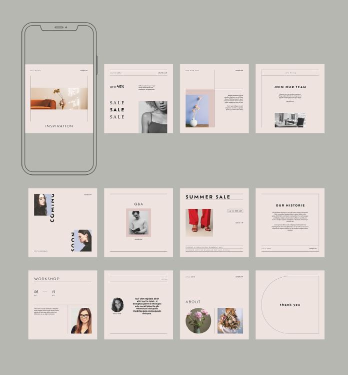
In today’s digital era, social media has become an integral part of our lives. Whether you’re a business owner, a content creator, or an influencer, it’s essential to have a visually appealing and engaging social media presence. However, not everyone has the time or design skills to create stunning graphics from scratch. That’s where Adobe Stock comes to the rescue! With Adobe Stock contributor @orangeberry‘s set of simple social media post templates in Adobe InDesign, you can effortlessly elevate your online presence.
Efficient and Customizable Designs:@orangeberry‘s set of social media post templates offers a convenient solution for those seeking professionally designed graphics. Each template comes in a standard size of 1080 x 1080 pixels, optimized for various social media platforms such as Instagram, Facebook, and Twitter. These pre-made designs provide a solid foundation, ensuring your content stands out in a sea of endless feeds.
Versatile Design Options: With 12 unique templates to choose from, you’ll find a wide range of options to suit your brand’s aesthetic and communication needs. From bold and vibrant layouts to minimalist and elegant designs, @orangeberry‘s collection caters to diverse styles and content themes. Whether you’re promoting a product, sharing a quote, or announcing an event, there’s a template for every occasion.
Seamless Customization in Adobe InDesign: The templates are created using Adobe InDesign, a powerful graphic design software known for its versatility and user-friendly interface. With InDesign’s intuitive editing features, you can easily customize the templates to match your brand’s colours, typography, and imagery. Make your social media posts truly unique by adding your own photos, logos, or other visual elements that resonate with your audience.
Time-Saving Convenience: One of the biggest advantages of using @orangeberry‘s social media post templates is the time saved. By starting with a pre-designed template, you eliminate the need to start from scratch, significantly reducing the time and effort required to create eye-catching graphics. Spend more time crafting compelling captions or engaging with your audience while still maintaining a consistent and professional visual identity.
Endless Possibilities: While the templates provide a great starting point, don’t limit yourself to their original design. Use them as a springboard for inspiration and let your creativity shine. Customize the layout, experiment with different fonts, or rearrange the elements to create a design that truly represents your brand’s personality.
Having visually appealing and engaging social media content is crucial. Thanks to Adobe Stock and @orangeberry‘s set of social media post templates in Adobe InDesign, creating stunning graphics has never been easier. With customizable designs and a range of options, you can streamline your social media game and present your brand in a professional and captivating manner. Don’t let design constraints hold you back; unleash your creativity with these ready-to-use templates and make a lasting impression on your audience.
As part of our series of design in 2023, How&How founder and creative director Cat How offers her view on what might happen in branding over the next year.
What do you think 2023 will hold for branding design?
I’m always highly sceptical about ‘trends’ in design. I’m very much of the mindset that fashions fade, while true design (where form follows function) is eternal. A good logo, therefore, should never follow (or be inspired by) a particular zeitgeist. It would not be the purest representation of itself, or the strategy behind it, if it did. So my future trend predictions lie mostly around ‘moods’ or themes that we’ve found emerging in the creative industry as a whole.
Metaverse
I’m seeing a glut of futuristic fonts, impossible 3D renders, and quirky sci-fi gradients emerging as a way of (sardonically?) talking about the known-unknowns of the Metaverse. Part joke, part next big thing… the jury is still out, but I’m really liking the retrofuturist humour.
Light Mode/Dark Mode Websites
We’re increasingly designing colour systems which work in light mode and dark mode as a way of future-proofing the websites of the brands we build. Not only that, but dark mode websites are more energy efficient than light mode ones, which is partly connected to my next point.
Beyond Green
As we’ve been designing more and more climate-tech and sustainability brands over the past year, we’ve found that conventional green as a brand colour is losing traction. Gone are earth tones, soft treatments and hippy-vibes. Eco-branding is moving into a more minimal, futuristic direction with simplified monochromatic colour palettes (see our On The Edge rebrand) which speak more to Gen Z. These new brands want to talk about climate in a minimal, aspirational and future-focused way.
Purpose or Mission-First Branding
After the insecurity of the last few years, people are desperate for authenticity, transparency and honesty from the brands they interact with. They demand more from brands in terms of what they say as well as what they do. Brands have always helped people keep companies accountable, but this has never been more true than today. Brands that misrepresent their products and clash with the values of their audience are quickly swept away.
What was your favourite branding project from 2022 and why?
One of our big pushes last year, as well as in 2023, will be to get more women in design, be this through a scholarship initiative, mentoring or internship programs for young female designers. It goes without saying, then, that one of my favourite design projects of 2022 was from a young designer called Tais Kahatt for Gulp Sichuan Chilli Oil. Such a fun little project with super-simple, but effective illustrations, edgy art direction and a mono palette centred around one punchy, spicy red. For such a young designer I was really impressed by Tais’ craft in bringing everything together. As well as this one, I loved Caterina Bianchini’s new rebrand for Bunch too. Super fun!
Are you wondering what the top graphic design trends will be in 2023? We tell you!
The graphic design industry is ever-changing and keeping up with the latest trends can be tough. But, if you want to stay ahead of the curve, it’s important to know what’s popular in the design world.
That’s why we’ve put together a list of the top 20 graphic design trends that we think will be big in 2023. From neon colors to vintage graphics, there’s something for everyone on this list!
So, without further ado, here are the top 20 graphic design trends for 2023:
1. Neon Colors
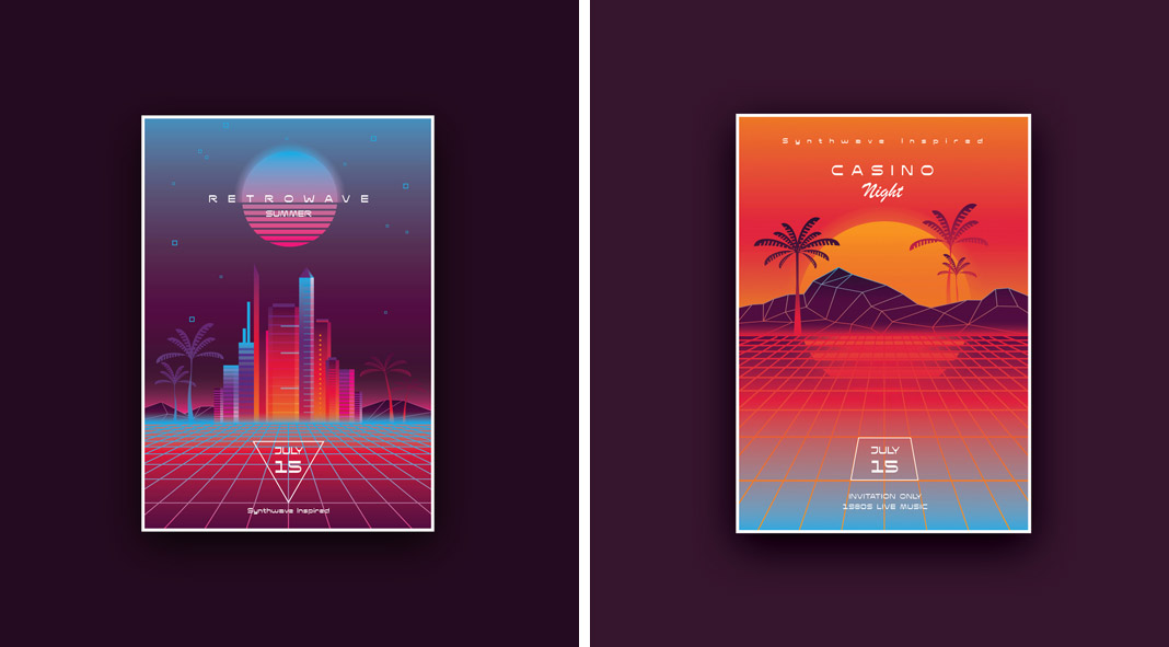
Retro-futuristic poster templates with neon colors by Adobe Stock contributor Diana Hlevnjak, aka Polar Vectors.
Neon colors are making a comeback in a big way and they’re perfect for graphic design. They’re bright and eye-catching, and add a touch of fun to any design. Neon colors are perfect for logos, flyers, posters, and other marketing materials. That’s right – those garish, eye-catching shades that were once reserved for birthday parties and bowling alleys are now being used in everything from corporate designs to magazine covers. So what sparked this neon revival? Some say it’s a reaction to the muted tones of the digital age, while others believe that designers are simply looking for new ways to stand out in a saturated market. Whatever the reason, there’s no denying that neon is one of the hottest trends in graphic design right now. So if you’re looking to add a little pizzazz to your next project, don’t be afraid to reach for the neon crayons. Just don’t be surprised if your clients ask you to tone it down a bit.
Minimalist design is all about simplicity and clean lines. This trend has been popular for a few years now and it shows no signs of slowing down. It’s simple, clean, and modern, making it a great choice for branding, marketing materials, packaging, and web designs. If you want to create a modern and stylish graphic, opt for a minimalist design.
3. Bold Typography
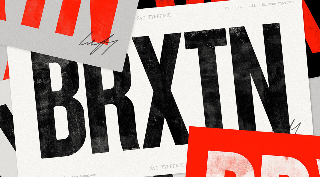
Brixton SVG typeface, a hand-printed bold font family by Ellen Luff.
Bold typography is another great way to make your graphic design stand out. Use large, eye-catching fonts to grab attention and add impact to your design. Just be sure not to use too many different font styles in one graphic, as this can look cluttered and confusing. From street signs to movie posters, this style of lettering is everywhere you look.
4. Vintage Graphics
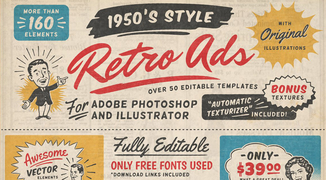
1950s retro-style vintage ad templates for Adobe Illustrator and Photoshop created by DISTRICT 62 STUDIO.
Vintage graphics are making a big comeback in the design world. If you’re looking for a graphic that has a retro feel, consider using vintage graphics. By pairing vintage illustrations with modern fonts and layouts, designers are able to create stunning visual effects that are both nostalgic and contemporary. This trend is also evident in the resurgence of vintage-inspired logos and brand identity designs. As more businesses seek to create a unique and memorable brand identity, vintage graphics are becoming an increasingly popular design element. With their ability to evoke a sense of history and nostalgia, vintage graphics are sure to remain a popular trend in the world of graphic design. You can find some great vintage graphics online or hire a graphic designer to create something custom for you.
5. Geometric Shapes
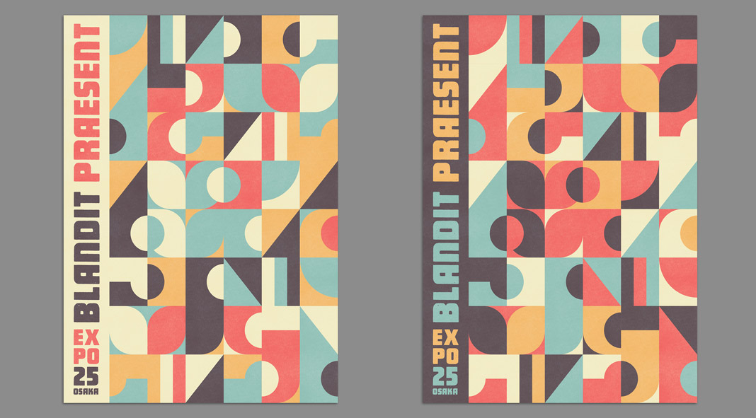
Abstract geometric poster templates with flat pattern design elements by blackcatstudio.
Geometric shapes are simple, yet effective, and they can add interest to any graphic design. Use basic shapes like circles, squares, and triangles to create patterns, or use more complex shapes to add depth and dimension. In recent years, we have seen a resurgence of geometric shapes in both web and print design, and it shows no signs of slowing down. While some geometric shapes are more playful, others can be used to create a more serious or sophisticated look. No matter what your style, there is a geometric shape that will suit your needs. So go ahead and embrace the trend!
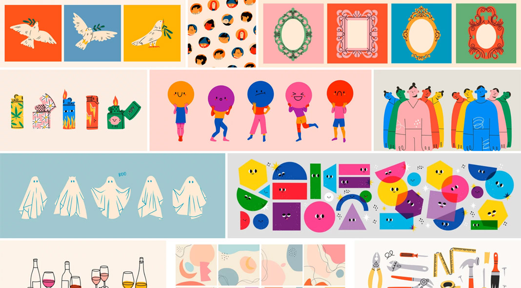
Hand-drawn elements add a personal touch to any graphic design. Whether you use simple sketches or more complex illustrations, hand-drawn elements can add a unique touch that sets your graphic apart from the rest. If you’re looking for a way to add hand-drawn elements to your graphic, there are many resources online that you can use. You can find free clip art and illustrations, or hire a graphic designer to create something custom for you. Just be sure to keep the overall look of your graphic consistent with the overall style of your design.
Unlike traditional color schemes, which use three or more colors, duotone schemes rely on just two tones. This minimal approach can create a sleek and sophisticated look, perfect for brands that want to convey a sense of sophistication and style. This trend adds a bit of interest to any design without using too many colors.
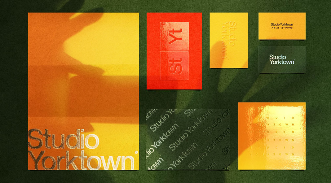
8. Metallic Colors
Meiji, a multi-print effects Photoshop mockup by Studio Yorktown.
Metallic colors are shiny and eye-catching, making them perfect for graphic design. Use metallic colors to add a touch of luxury to your graphic or to make it pop against a plain background. From shimmering gold to rich bronze, these colors add a sophisticated style to any design.
Negative space is the empty space around and between the subjects in a graphic. This trend is all about using negative space creatively to add interest and impact to your design. It’s a minimalistic approach that has been gaining popularity in recent years, as more and more designers strive to create clean and sophisticated designs.
Animated graphics are a great way to add movement and interest to your graphic design. Everywhere you look, from advertisements to websites to social media posts, businesses are using animation to capture attention and stand out from the competition. And it’s not just small businesses; even major brands are using animated graphics to communicate their messages. While some may dismiss animated graphics as a passing fad, there’s no denying that they are an effective way to engage audiences and deliver information in a memorable way. You can hire a graphic designer to create a custom animation for you or use free resources online to create simple animations.
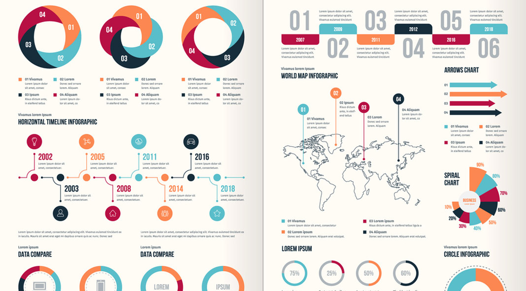
Infographics are a great way to present information in a visually appealing way. As a society, we are constantly inundated with information. In the age of the internet, we have access to more data than ever before, and it can be overwhelming to sift through everything and find what we’re looking for. This is where infographics come in. An infographic is a visual representation of data or information, and they have become increasingly popular in recent years as a way to quickly and easily communicate complex ideas. For graphic designers, infographics offer a unique challenge, as they must distill a lot of information into a single, visually-appealing image. As infographics continue to grow in popularity, we can expect to see more designers experimenting with this trend.
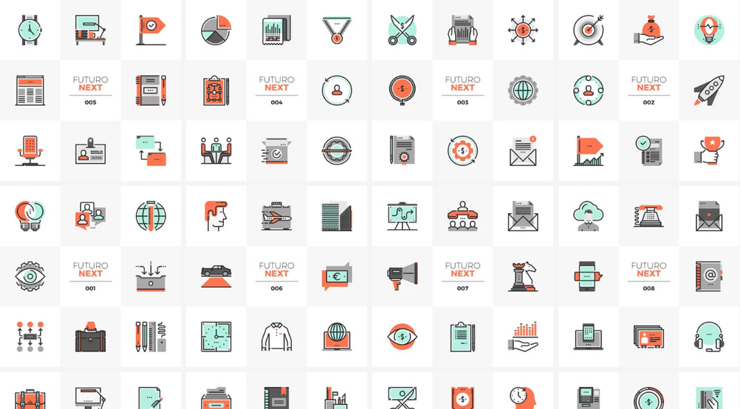
Nothing new but icons are simple, yet effective, graphic elements that can be used to represent different concepts or ideas. You’re probably thinking, “Icons are so overdone. Everyone is using them.” But that’s exactly why they’re such a popular graphic design trend right now. Icons are eye-catching and easy to understand, making them perfect for grabbing attention in a crowded marketplace. And because they’re so versatile, they can be used in a variety of ways to communicate your brand’s unique identity. So if you’re looking for a way to make your mark, consider using icons in your next design project.
13. Photo Manipulation
Photo manipulation effects for Adobe Photoshop by Pixelbuddha.
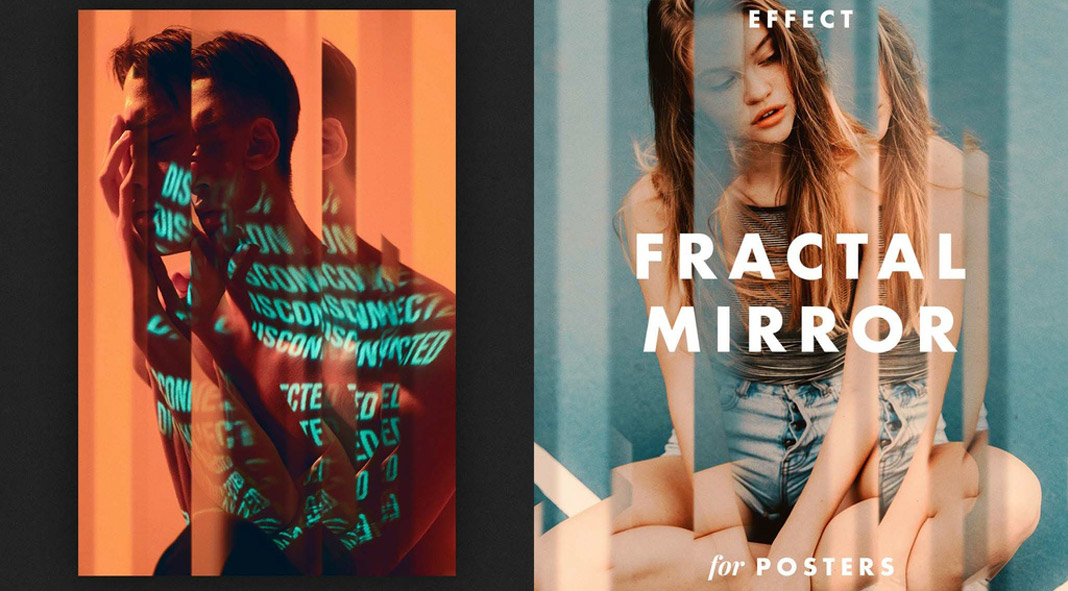
Photo manipulation is the process of manipulating images to create a desired effect. This graphic design trend is perfect for those who want to add a bit of creativity to their work. There are many different techniques that can be used in photo manipulation, so it’s a great way to experiment with your graphic design.
Vector graphics are computer graphics that are created using mathematical objects called vectors. They can be transformed to any size without loss of quality. Vector graphics are nothing new in the design world but the clean and modern style is currently very popular and can be found across any type of media ranging from print to the web.
90s design was all about big bold statements. From chunky die-cut shapes to DayGlo colors, 90s designers had a knack for making an impact. And while some 90s trends have since fallen by the wayside, others are currently making a comeback. So what makes 90s design so special? Part of it has to do with the fact that 90s designers weren’t afraid to experiment. They pushed boundaries and challenged convention, creating a style that was both eye-catching and forward-thinking. But 90s design also has a certain sense of nostalgia about it. Whether you love it or hate it, there’s no denying that 90s design is here to stay.
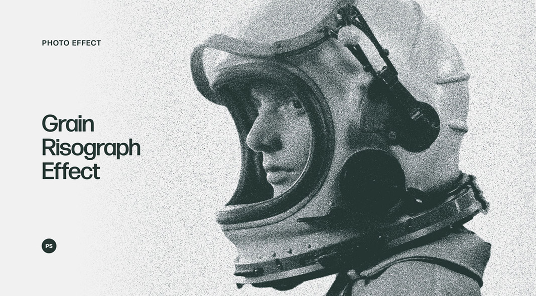
One of the latest trends in graphic design is the use of grain and noise textures. These textures can add a sense of depth and realism to a design, and they can also be used to create a vintage or distressed look. Grain and noise textures are often used in conjunction with other effects, such as halftone dots or overlays. When used correctly, they can help to create a cohesive and visually arresting design. However, like all trends, grain and noise textures should be used sparingly, as too much of either can quickly become overwhelming. So if you’re looking to add a little grain or noise to your next project, be sure to use it judiciously.
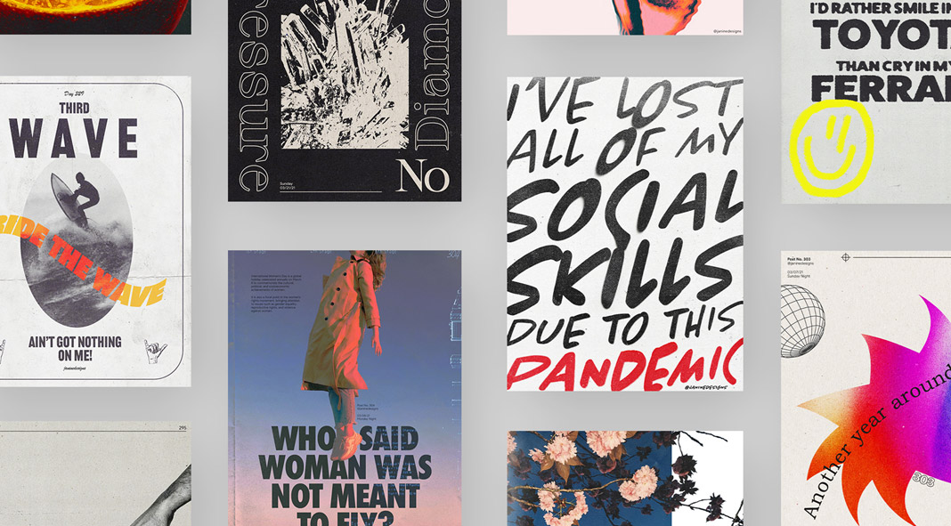
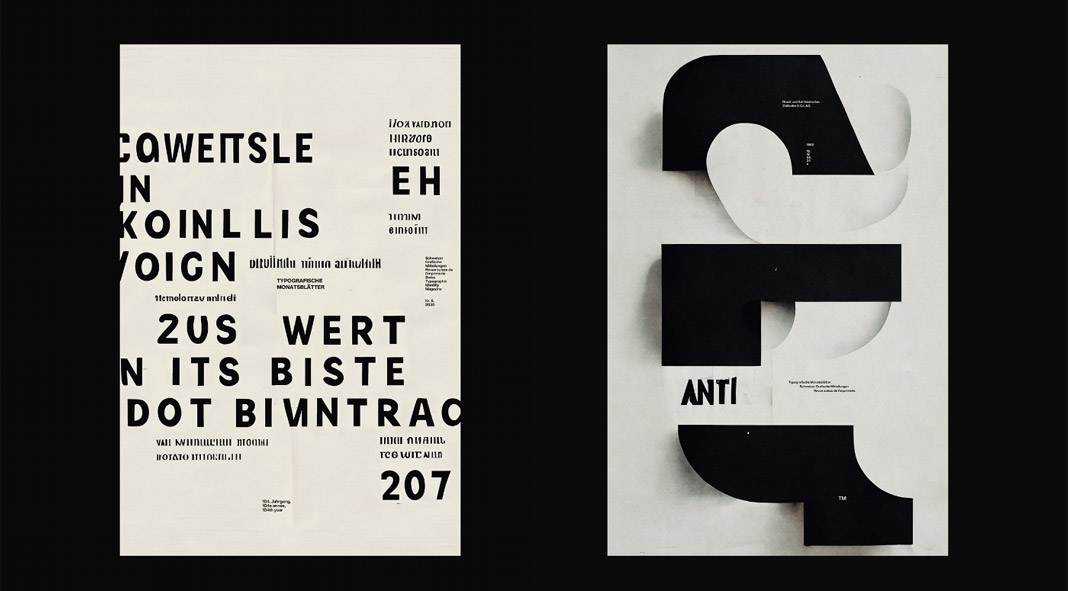
In the world of graphic design, experimental typography is having a moment. This trend involves pushing the boundaries of typefaces to create unique, eye-catching designs. While experimental typography has been around for decades, it has recently gained popularity thanks to the rise of digital design tools and social media. As a result, experimental typography is now being used by everyone from major brands to small businesses. And while not everyone is a fan of this trend, there’s no denying that experimental typography can be incredibly effective when used correctly. So if you’re looking to add a touch of personality to your next project, don’t be afraid to experiment with your typography.
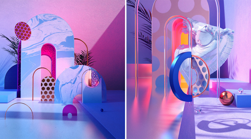
It’s no secret that computer-generated graphics are becoming increasingly popular. Once relegated to the world of science fiction movies and video games, computer-generated graphics are now being used in everything from advertisements to product packaging. And it’s easy to see why. With their ability to create realistic images and text effects, computer-generated graphics offer designers a lot of flexibility. Plus, thanks to advances in technology, computer-generated graphics are becoming more and more realistic all the time. As a result, we’re likely to see even more computer-generated designs in the coming years.
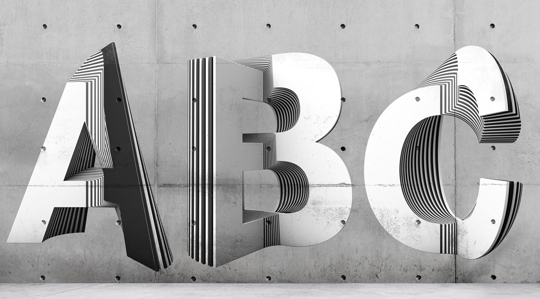
3D elements are nothing new. In fact, they’ve been around for centuries in the form of sculptures and other art forms. However, 3D design is now starting to make its way into the world of graphic design, and it’s definitely making a splash. Thanks to advances in technology, rendered 3D elements can now be created with ease, and they offer a unique way to add depth and interest to any project. From logos to illustrations, 3D elements are becoming increasingly popular, and it’s easy to see why. If you’re looking to add a touch of dimension to your next project, don’t be afraid to experiment with 3D design.
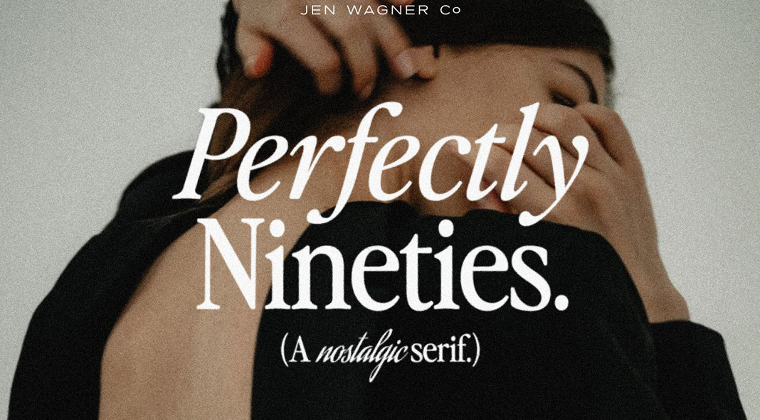
These days, serif fonts are all the rage in the world of graphic design. And it’s no wonder why! These traditional fonts convey a sense of sophistication and elegance, making them perfect for luxury brands or high-end businesses. But serif fonts can also be used to add a touch of stylishness to more down-to-earth designs. So whatever your project may be, don’t be afraid to add a little serif flair. After all, that’s what all the cool kids are doing these days.
Why tech has an age-bias problem, and what we can do to fix it.
I’m building a business in senior tech. And yes, I’m aware that—for many of you—that will sound like an oxymoron: “Tech for seniors? My [insert family member here] can barely use their phone!” But prepare to be surprised: Here’s what I’ve learned about how wrong we all are.
By now, we’re all familiar with some version of the statistic that consumers ages 55 and over are growing in number and control 70% of our country’s wealth. That’s correct, a clear fact. We’re also all familiar with—and perhaps adherent to—a blanket assumption that older generations neither want nor understand technology. By contrast, that is a gross misconception; one that we in the tech industry are far overdue in addressing.
Before becoming a founder in the senior tech space, I spent over a decade working on “regular” tech products—most of which were geared toward twenty- and thirtysomethings. In fact, it was that front row seat to the age bias in tech that eventually led to my passion for developing tech innovation to serve adults 55 and over. As someone not in the demographic that my company targets, I’ve had to learn about our consumer the old-fashioned way—with user research, lots of conversations, and more than a few missteps. Now, nearly two years into building product for an older demographic, here are a few key things I’ve learned along the way about designing for our aging population:
Put the people—not the aging—first.
Too often, we tech folk have shorthanded usability for older adults by simply increasing font size and designing for iPad legibility.
I learned early that one of the best (meaning: worst) ways to belittle our user was to go into design thinking, “this is for someone over 55.”
One: Even if the U.S. Census and media brackets do still batch everyone over 55 or 65 into one single age range, in reality it’s about as far from a homogeneous group as you can get.
Two—and perhaps more importantly—that thinking, and its resulting designs, aren’t reflective of how that demographic sees themselves. No one wakes up in the morning and thinks, “It’s Saturday, I’m 60, what should I do today?” (Arguably, no one of any age does that—so why do we treat “senior” as a defining characteristic?)
As designers and product managers, we have to design for how our users define themselves—which, for this demographic, is almost never in an age-first way. This same idea applies to branding and communication elements like headlines and imagery: For example, we never use the word “senior” because it’s a mismatch with how our users describe themselves—instead, based on what we’ve heard from our consumers and our team members, we say “older adults.”
We also take special care with imagery—stock photos of this age group are full of these hazy, backlit, “golden years” kind of shots of people with gray hair walking in the park. This drives our team members, who are actually in this demo, crazy—it’s just so far off of how they actually live their lives and spend their time—doing activities, having coffee, visiting friends . . . all in normal lighting.
Which brings me to the fact that the so-called tech illiteracy of older generations is a fallacy.
Just think about it: People 50 and over were actually the first generations to adopt tech—they bought the first cell phones, mastered Pong, played the first Ataris, and Nintendos. The fact that these generations didn’t grow up as digital natives doesn’t mean they’re digitally inept or uninterested.
Instead, what the tech industry writes off as “tech incompetency” is more often than not a question of habit and training.
Take what’s commonly known as the “hamburger menu” as an example. Twentysomethings who grew up with phones in their hands have been trained—for years—to know that those three lines on a mobile website are an expandable menu. But older users, who may be newer to using mobile for browsing, don’t necessarily know that same design language—not because they’re dense, but because they don’t have those same years of training.
Instead of writing that off as incompetence, why not think about it as a design and training problem? How might we create designs and educational tools so that we’re bringing older demographics along with our design signals? How can we actually design products that this demographic tells us they want, instead of retrofitting designs for twentysomethings for an entirely different target market?
Finally: Think equally hard about the design of your team.
As a product manager at places like Zynga and ClassPass, a rule of thumb was to “design for ourselves.” That’s common in many tech environments, in which the average age of workers (35) more or less matches that of the user target.
But now that I’m building for someone whose age doesn’t match my own, that guideline no longer applies: I’m no longer personally a user of the product I’m designing, which means I can rely less on intuition and gut. Targeting a demographic different from my own has pushed me and my team to lean harder on design and marketing best practices—we do usability testing, talk to our consumers, prioritize elegant and simple design. When I was first thinking about the Hank concept, for example, I didn’t start to build anything right away, like I might have at other companies. Instead, I booked myself on a seven-day cruise to the Bahamas and spent the trip pitching the concept to cruise participants within the Hank demo. In exchange for their feedback, I would hand out dozens of Amazon gift cards. In some ways, I’ve found that being outside of our target demo makes the product easier to “get right”—because we, by necessity, have to remove our personal biases and assumptions from what we’re building.
What that also means is that I’ve hired a more senior team than most other tech organizations I’ve seen in the past. That’s not necessarily an effort to get us closer to our target demo’s age; it’s more a reflection of needing people who have the training to understand and implement those best practices rather than using our gut to get us halfway there.
In hiring folks that understand our user’s mindset, needs, and position, tech teams can better step out of an echo chamber of developing products for 20- to 30-year-olds. The 55 and over populations have been overlooked and misunderstood for too long by the tech industry, and they deserve some truly dashing product.
Feature Image Credit: Getty
By Brian Park
Brian Park is cofounder and CEO of Hank, a digital platform connecting adults 55 and over with like-minded people and activities in their community.
There’s no doubt that technology has transformed the design world. While much of the design process used to involve hands-on work with X-Acto blades, Cow Gum, and French curves, it’s now evolved into a largely digital-driven industry. Apps of all kinds have digitized the functional elements of a creative studio: Dropbox in place of a filing cabinet, Slack in place of a quick call.
While it may seem that the litany of apps could potentially overwhelm a project or even stifle creativity, a handful of them have risen to the top of the design world’s list—for productivity, inspiration, and communication. We asked designers, illustrators, and creatives from around the world to share their go-to apps. Here are 22 they told us they can’t live without.
The responses have been edited for length and clarity.
Things and RightFont
The first is Things, a task management and productivity app. I find it super useful to manage my days, weeks, and months as far as organizing projects both professionally and personally. It’s native to iOS and macOS and keeps my mind clear and my desk clean.
The second is RightFont, which is a professional font manager for macOS. It’s intuitive and easy to use and has the ability to auto-activate with Adobe software such as Illustrator or InDesign. The dynamic font preview tool is also useful for comparing various typefaces with one another. It makes managing and installing fonts a smooth and enjoyable process.
My most useful work app would be Dropbox. I keep all my work files and photos saved there, and it keeps multiple older versions of every file saved so I can go back if I overwrote something by mistake.
Insight Timer is my go-to meditation app for goal setting, affirmation, and staying optimistic. I don’t consider myself a spiritual person but I believe in the power of the mind and visualizing success—just like athletes do. I’m happy to report that great things keep happening to my career as a designer and an artist.
I don’t know how to work or live without Todoist! [With] all my work and personal to-dos in one place and also connected to my calendar, my mind is at rest and I can focus on designing. I have “Work This Week” for priority jobs and “Work Bucket” for jobs that need doing but have no deadline (e.g., PR, website update, find art residency).
It sounds funny but my go-to app is really just Spotify currently. I can work from anywhere at this point, and I can work both digitally or even with raw essentials—paper and pencil are easily accessible anywhere. The only thing I can’t work without is my music library!
One of my favourite apps for inspiration is, in fact, Tumblr. I’ve remained loyal since 2010, and while the app has seen its ups and downs, from a design inspiration standpoint the sheer quantity of content, images, posters, archival documents, colours, textures, and text helps to keep my creative juices flowing.
My photo editing is done through Lightroom. I also use Do You Travel pre-sets to give my pics a little added punch. I use Retouch for quick photo edits like removing stray lines or random objects from pics, and I use InShot for any simple video editing like splicing clips and speeding up footage.
My go-to app would be Behance! It’s a great source of inspiration because not only can you see a range of amazing work from various artists covering multiple disciplines, but you are able to watch in-depth livestreams which show a creative’s design process and methodologies. You really get a sense of the individual behind the work. Streams on Behance like Adobe Live are a perfect example of this! As well as being a freelance designer, I also have the privilege of being a host on Adobe Live. This gives me the opportunity to speak with creatives from different backgrounds and upbringings. This can certainly provide inspiration and influence within my own practice.
VSCO and my photos app go hand in hand. As a designer and illustrator, I often get inspired by the colours, scenes, and composition of the world around me. I capture photos often and edit them in VSCO, which allows me to really bring photos to life with their filters and editing options, like bumping up the saturation and adding some grain.
—Sophia Yeshi, illustrator and designer, Yeshi Designs
Adobe Illustrator
I use Adobe Illustrator as a daily tool for poster and logo creation. It’s a very versatile tool that helps me achieve very complex designs and have fun in the process. It helps me as a designer/human in the way I can play around with shapes and generate striking pieces and patterns that can be used in lots of formats.
Amongst my notes and camera apps, TikTok (and its “For You Page”) is a constant scroll of new, unexpected, and richly authentic perspectives, sandwiched between current world events, tear-inducing stories, and, of course, the occasional meme. Yes, it can turn into procrastination (we’ve all been there), but I truly believe many of the next top creatives are utilizing the platform and pushing it to be something far beyond the initial intention. Personally, I’m not there for “design inspo,” but instead open the app with a creative project top of mind and leave with a fresh outlook that I believe feeds back into the work and keeps it culturally relevant.
My current go-to app is Procreate for the iPad Pro. Seeing as I mix traditional and digital mediums, pen and ink has always been my preferred medium. I’m from the old-school era of designers who used light boxes, tracing paper, and scanners to create illustrations. Since switching to Procreate about four years ago, it has helped a great deal in bridging the gap in the process I was used to for executing my artwork. I find that I produce at a much faster rate now as I directly sketch/ink in the app, replacing the process of sketching, inking, and touching up on a light box or tracing paper; scanning; then transferring to either Photoshop or Illustrator, which I had been accustomed to for so many years.
I admit I’m not the most app-centric type, but I will say that I love my Notes app. I have notes for basically every avenue of my life ,from meeting notes to TV shows I want to start to Wordle guesses I’m sitting on. It’s chaotic, but it’s all there.
—Katrina Ricks Peterson, art director, Actual Source
Are.na
There are only a few primary apps I use (other than the ubiquitous design software) worth noting. The main one would be Are.na. I use this as a research tool for projects—mostly as private channels, but a few that are public. It allows you to gather not only images but documents, text, links, sounds, etc. There’s also a bit of community involved that you can tailor and isn’t based on an algorithm.
Apple Calendar is synchronized with my Google account, my phone, and my computer, so I have my schedule very organized. I think this is a very important point in my day as a freelance designer in order to focus on work, complete my tasks, and have a life-work balance.
I use Pinterest for quick inspiration every day. What I like best about Pinterest is the strong visual associations, but I’ll say my fave for this are some websites like Savee (they should make an app!), The Brand Identity, or Fonts in Use.
Instagram is a great source because it has been used by designers to showcase their portfolio/works. I follow a lot of creative individuals, and they all have different design approaches, so the pieces shown on my feed have a range and have mixed styles, from mild to wild ideas! Looking at the best works isn’t just to gather inspiration for my next work, but it has become a motivation that I can also do more great things that other creative individuals would be able to take inspiration from.
My go-to app would have to be InDesign. As much as I would love to work exclusively on an iPad (I love the idea and simplicity of it), it’s InDesign that keeps me attached to my MacBook. Besides being the only full-featured app to lay out books and magazines on, it’s the perfect blank canvas to throw ideas onto and organize however you like, with very few restrictions. But then again, it’s one of the first applications I was trained on, so you learn to basically do everything on it. . . . I’m sure the same could be said with Excel?
Wasting your time may be an example of exaptation, where traits evolved to serve one function end up serving another.
When I was 17, I read about the first natural language A.I., named SHRDLU, created by Terry Winograd way back in 1968. The user could talk to it about various shapes in a block world and it could respond and manipulate the world with impressive comprehension.
What struck me was how SHRDLU died. Operating systems back then were updated frequently and were rather bespoke. Each update caused a type of bit rot in existing programs, making various functions inaccessible. Every year or two, someone would try to have a conversation with SHRDLU, and it would error out earlier and earlier, becoming more and more aphasic and finally mute.
I found the slow death of this A.I. tragic, dramatic, and gripping. I tried to resurrect its code, and like so many others, I failed. There was no point to any of this. It was only a curiosity for me — some might call it a waste of time.
But what I’ve found over and over is that the things you waste your time on lead to your best designs. This random inspiration and diverse interests approach to innovation and design is a repeatable technique, and I’m certainly not the first to say so. Nobel prize winners are about three times as likely as the general public to have an artistic avocation. It may also explain why the concept of a liberal arts education has endured for nearly two millennia.
Humboldt incorporated subjective emotional experience into his scientific works thanks to conversations with his friend Goethe. Elon Musk’s use of Iain M. Banks’s ship naming conventions is evidence of some wasted, or possibly well-spent, time reading the Culture series. Newton was a poet. Galileo was a painter. Before Oprah launched one of the most successful book clubs ever, there was Oprah’s love of reading.
Turn Wasted Time Into a Resource
With the modern non-stop pressure to produce and the inundation of “productivity hacks,” I can be as hard on myself as anyone for wasting time. In order to turn a waste of time into a valuable design resource, you need to be analytical about your consumption, but only after the fact. That’s how you extract utility in the future. In Book 2 of The Analects, Confucius said, “Learning without thought is pointless; thought without learning is dangerous.”
Firstly: Enjoy. Go toward what interests you. Don’t judge yourself. Give yourself permission to abandon a book halfway through and start three more simultaneously. Spend an hour trying to take a photo of a bumblebee and fail entirely. Watch reality TV and watch the ads too. Learn to weld without having a welding project in mind. Eat a croissant.
Secondly: Be retrospectively analytical. You are always learning, even if you don’t notice at the time. Take a moment to think about how you’ve chosen to spend your time and what you learned. Maybe you learned how a novel holds (or doesn’t hold) your attention, how a new language-invariant interaction from a video game crosses cultural barriers, or lessons in teamwork from whirligig beetles. This analysis sometimes happens years after the experience, or you may revisit the same experience several times at different intervals and draw other lessons from it.
Finally: Always create. You will go through production and consumption cycles. But you can go through consumption cycles with no guilt if you know you will have a production cycle in the future. Without the confidence that you will create, you will always fear being only a consumer, a critic, or a viewer. With the confidence that you have created and will create, you can waste your time delightfully and without compunction.
In the End, Wasting Time Can Lead to Your Success
Wasting your time may be an example of exaptation, where traits evolved to serve one function end up serving another. In 2010, I sketched out a documentary series that was ultimately my inspiration for MasterClass. I wrote a list of possible instructors, and in looking back on that list, I see Annie Leibovitz, Hans Zimmer, and James Cameron, all instructors who now have their own MasterClass. I also found J.D. Salinger, Steve Jobs, Trent Reznor, and, strangely, Terry Winograd.
After working with my co-founder, David Rogier, and our team to build and shape the concept into MasterClass, I took a year off, travelled to 28 different countries, and became interested in for-credit education. The space seemed crowded and hard to break into, but in pondering why SHRDLU was so good at natural language responses, compared to, let’s say, Siri, I realized how valuable a highly-constrained universe is for teaching. And introductory topics are well-constrained universes. This was the kick I needed to get out and start Outlier.org.
I might have called reading about an early A.I. and getting emotional over it a waste of time, but looking back, it’s hard to think there isn’t value that it provided in my most recent companies. Your interest and development of a trait like skill in music may end up serving another function, like writing dialogue the way Aaron Sorkin does, like music. For all you know, your waste of time will turn into your next big creation.
This well-designed resume template is available for download on Adobe Stock.
Consisting of four pages including cover, letter, cv, and closing page, this high-quality resume template is a real eye-catcher. Designed by Adobe Stock contributor @GraphicArtist, this beautiful template can be edited very easily. You only need basic knowledge of how to work with Adobe InDesign. Using this modern and minimalist resume template, you are sure to stand out from the crowd of competitors. Created with a uniform layout and delicate yellow accents, this resume and cv template will hopefully help you to get your desired job.
As mentioned before, this customizable resume template requires Adobe InDesign. You can get the latest version from the Adobe Creative Cloud website, just have a look here. Feel free to learn more about this Adobe InDesign template by clicking on the following link or have a look at the images below.
The world is designed against the elderly, writes Don Norman, 83-year-old author of the industry bible Design of Everyday Things and a former Apple VP.
More people than ever are living long, healthy lives. According to the U.S. Department of Health and Human Services, the average life expectancy is 78.6 years for men and 81.1 for women. More relevant, however, is that as people grow older, their total life expectancy increases. So for those who are now 65, the average life expectancy is 83 for men and over 85 for women. And because I’m 83, I’m expected to live past 90 (but I’m aiming a lot higher than that). And these are averages, which means that perhaps half of us will live even longer.
Those of us who are still active and healthy at advanced ages–I qualify–discover that we aren’t quite as capable as our younger selves. That doesn’t mean that we aren’t healthy and workable–I still have a very active job and travel on business around the world, but I have to admit that I’m getting slower and weaker, with diminished eyesight, hearing, taste, touch, and, well, almost everything physical. The number of active, healthy oldsters is large–and increasing. We are not a niche market. And businesses should take note: We are good customers often with more free time and discretionary income than younger people.
Despite our increasing numbers the world seems to be designed against the elderly. Everyday household goods require knives and pliers to open. Containers with screw tops require more strength than my wife or I can muster. (We solve this by using a plumber’s wrench to turn the caps.) Companies insist on printing critical instructions in tiny fonts with very low contrast. Labels cannot be read without flashlights and magnifying lenses. And when companies do design things specifically for the elderly, they tend to be ugly devices that shout out to the world “I’m old and can’t function!” We can do better.
What Older Consumers Want and Need
As we age, we have more experience with life, which can make us better decision-makers and managers. Crystalized intelligence, it is called, and it gets better with experience. A caveat is that we often face physical changes that designers fail to account for into their work.
Vision deteriorates. The lens of our eyes harden, making focusing more difficult. I used to be able to read tiny text by holding it close to my eyes, but my inability to focus at close distances defeats that activity. Floaters and debris start accumulating inside the eye, which scatters the light on its way to the retina, reducing contrast and making it more difficult to see small, low-contrast objects. For the increasing number of people who have cataract surgery, the eye’s lenses have ben replaced with plastic, which usually have a fixed focus. (Artificial lenses that can be focused are under development.) A flashlight has become an essential item, whether the one built into many phones or carried separately, because illumination makes tiny type easier to read although even then, a magnifying glass might be useful.
Hearing decreases. High frequencies are first to go, which also tends to impair directional sensitivity, which in turn makes it more difficult to attend to someone in a crowded, noisy environment. Loud restaurants are torture. So, more and more, my wife and I select restaurants by their noise level rather than by their food quality. At home while watching TV, whether shows, streaming events, or movies, we always turn on the captions, which often block critical parts of the image. Even worse, when a film shows someone speaking in a foreign language, the film often translates the words, but so too does the closed captioning, and the two are placed on top of one another, making both attempts to help the viewer completely unhelpful.
Bad Design Abounds
The problems I face are much milder than those faced by millions of aging people. With so many of us needing better devices, why are so many things still designed in ways that defeat our ability to function?
Take the screen design for Apple’s phones. The designers at Apple apparently believe that text is ugly, so it should either be eliminated entirely or made as invisible as possible. Bruce Tognazzini and I, both former employees of Apple, wrote a long article on Apple’s usability sins ,which has been read by hundreds of thousands of people. Once Apple products could be used without ever reading a manual. Today, Apple’s products violate all the fundamental rules of design for understanding and usability, many of which Tognazzini and I had helped develop. As a result, even a manual is not enough: all the arbitrary gestures that control tablets, phones, and computers have to be memorized. Everything has to be memorized.
These thoughtless, inappropriate designs are not limited to Apple. New technologies tend to rely on display screens, often with tiny lettering, with touch-sensitive areas that are exceedingly difficult to hit as eye-hand coordination declines. Physical controls are by far the easiest to control–safer too, especially in safety-critical tasks such as driving a car, but they are disappearing. Why? To save a few cents in manufacturing and in a misplaced desire to be trendy. Speech can be a useful substitute for physical controls, though not as helpful as proponents claim.
Then there’s the aesthetic problem. When products are developed for the elderly, they tend to be ugly and an unwanted signal of fragility. As a result, people who need walkers or canes often resist. Once upon a time, a cane was stylish: Today it is seen as a medical device. Why can’t we have walkers and canes for everyday use, to help us in everyday life, to carry our packages, provide a way to sit when we are tired, or viewing some event, and yes, to maintain our balance? Make them items of pride, stylish enough that everyone will want one.
Everyone Needs Better Design
Do not think that thoughtful design is just for the elderly, or the sick, or the disabled. In the field of design, this is called “inclusive design” for a reason: It helps everyone. Curb cuts were meant to help people who had trouble walking, but it helps anyone wheeling things: carts, baby carriages, suitcases. Closed captions are used in noisy bars. As Kat Holmes points out in her book Mismatch, all of us are disabled now and then. Some of us have permanent disabilities, but all of us have suffered from situational and temporary problems. When outside in the sun, the text message that just arrived is unreadable: wouldn’t it be nice if the display, whether cell phone, watch, or tablet, could switch to large, higher contrast lettering? Are elderly people handicapped? Maybe, but so is a young, athletic parent while carrying a baby on one arm and a bag of groceries in the other (and perhaps trying to open their car door). Ride-share bicycles and scooters cannot be used by people who need to carry bulky packages. Everyone has difficulty hearing people in noisy environments. Noise-cancelling headphones are for everyone, not just the elderly. Almost anything that will help the elderly population will end up helping everyone.
The Promise of Good Design
Jeremy Myerson, a designer at London’s Royal College of Art (and a good friend) curated an enticing exhibit at London’s Design Museum entitled “New Old,” that explored the potential for design and designers to enhance the experience of our later lives (described in this Fast Company article “Why you should be designing for your 73-year-old self). Walkers, scooters, and shopping carts for the elderly tend to lack any semblance of grace or elegance. Not so the “scooter for life,” designed by the British firm PriestmanGoode, which has three wheels for stability and a sleek pouch for storing groceries.
Powerful lightweight motors and batteries promise to motorize many new things, including walkers, wheelchairs, bicycles, tricycles, baby carriages, and shopping carts. I’ve even seen electric surfboards. If these devices are stylish and useful, they will empower everyone, from the very young to the very old. Moreover, once the stigma attached to devices that look medical is eliminated, we will see more elderly adding to their activities, and more 90-year-olds surfing. One of my 90-year-old friends just started scuba diving. Age is not a barrier.
Are there any other examples of promising designs for older people? Yes, but they are surprisingly difficult to find. They are so rare that when they are found, museums put on them on exhibit and newspapers write articles.
Looking Ahead
Designers and companies of the world, you are badly serving an ever-growing segment of your customer base, a segment that you too will one day inhabit. Isn’t it time to reform: to make things that are functional and stylish, useable and accessible? Every ailment that I described that impacts the elderly is also present in people of all ages. Designs that make it easier for elderly people often are of equal value for younger people. In fact, for everyone. Help the elderly, and the results will help many more, including yourself, someday.
Feature Image Credit: Photo by Alex Macro/Getty Images
By Don Norman
Don Norman is a leading authority on the design of emotional pleasing and useable technology. He is the author ofDesign of Everyday ThingsandEmotional Design, a former vice president at Apple, and professor and director of the Design Lab at the University of California, San Diego.
The following was previously published in an earlier edition of Marketing Insider.
From business practices and political policies, to school curricula and building designs, inclusivity is permeating many aspects of our lives. With one in four Americans living with some form of disability, these policies are intended to include those who might otherwise be left out or marginalized from areas of daily life.
And in today’s online world, one means of inclusivity that’s more important than ever is accessible website design, especially as 4.6% of disabled Americans suffer from a visual impairment. However, seven websites in 10 still contain “accessibility blocks” that render them either extremely difficult or impossible for millions of consumers to use, according to a study by an accessibility software company.
If your own brand is guilty of this, you could be losing business to competitors with more inclusive websites. So what exactly can you do to make your own site more accessible?
Have a clear visual hierarchy. Making sure that your site content is presented and organized clearly is crucial for making it easy to digest, and therefore accessible to all. This involves setting out your information using a clear visual hierarchy that takes visitors on a natural, logical journey through the content. In order to do this, many designers implement principles of the Gestalt approach. This is a series of theories related to visual perception, based around the concept that humans will see the whole before the individual parts when looking at a group of objects.
Make interactive elements and text large enough. According to Google guidelines, touch targets like icons and links should be at least 48×48 pixels to ensure those with impaired vision or motor skills can easily interact with a website.
In addition, padding and spacing should be taken into consideration in order to further simplify interactions, with touch elements recommended to be at least 8 pixels apart. This reduces the possibility of users tapping on the wrong option.
By the same token, text should also be big enough for users to read, so set font size at least 16 pixels — and if smaller text must be used, ensure it’s in upper case. Furthermore, always provide a customizable text option for users to tailor the text size to their liking.
Consider contrast colour combinations. The colours you use can also have a huge impact on your site’s accessibility. Using high levels of contrast can be hard to look at, even for those who aren’t visually impaired, while low levels can make it hard to differentiate between various on-page elements, especially for those who are colour-blind. It’s recommended that you refer to the W3 guidelines for online accessibility, which stipulate a contrast ratio of at least 4:5:1 in larger elements, and 7:1 in regular ones.
Provide captions for video content. You’ve probably watched a video in a different language with subtitles before, so you’ll know that if these captions weren’t present, you wouldn’t have been able to understand what was being said.
Visitors with hearing impairments who watch videos on your site will face the exact same issue, even if the content is in their mother tongue. As such, you should always include subtitles, as well as full transcripts for any audio material. This can have SEO benefits as well as being good practice for accessibility.
Video communications are central to the modern workplace as creative teams continue to work together remotely, and Zoom has made it quick and easy for anyone to set up and conduct virtual meetings. Zoom’s mission — to make video communications frictionless and secure — aligns perfectly with one of our goals for Adobe Creative Cloud — making it as easy as possible to do your best creative work in a frictionless environment. That is why, today, we are thrilled to announce Zoom and Adobe are coming together. The new Zoom plugin for Adobe XD is making working together on creative work easier than ever.
We know remote work poses unique challenges for design teams that rely on close collaboration to bring their creations to life. Creativity is best when teams work and design together, feeding off each other’s ideas and building on them. Adobe XD powers collaboration at every step of the design process, from editing together in real-time with other designers to getting feedback from product managers, developers, and other stakeholders. And with the plugin, you can quickly join or start Zoom meetings directly from XD.
View and join a scheduled meeting or by meeting ID right from XD.
The Zoom plugin for XD brings visibility to upcoming Zoom meetings right inside XD so you will never be late for design reviews, user testing, and other sessions where you need to get feedback. This plugin lets you connect and sync your Zoom meetings in Google or Outlook calendar, so you will see them right within the XD Plugins Panel, front and center. When it is meeting time, it takes just one click to join and launch Zoom. You can even join with screen share enabled if you are the one presenting.
And you are connected to your team with screen sharing in an instant.
Coediting in Adobe XD: More interactive than ever with Zoom
Coediting in Adobe XD lets you and your team work together in real-time. You can invite other designers, copywriters, developers, and anyone else to view and edit documents with you.
In a virtual work environment, Zoom helps teams recreate some of the ways of working together, like discussing design options or reviewing changes. With the Zoom plugin for XD, you can start ad hoc meetings to review XD designs with other editors on the document. Click start to generate invites pre-filled with co-editors on the document, add or delete who you want in your meeting, then click send to email invites to your Zoom meeting — all without ever leaving XD.
Start design reviews with co-editors on XD documents in a few clicks.
If you and your team use Zoom for virtual meetings, you can install the Zoom plugin for XD here in the XD Plugin Manager to start working with Zoom in Adobe XD now.