Design Thinking needs a digital upgrade / extension to be more productive and helpful in an environment where organizations are facing digital challenges.
Digital Design Thinking tries to take the best of Design Thinking — its customer and experience mindset — and employ this in a digital environment — at scale. Creating several new benefits to the Design Thinking methodology.
There are a number of advantages to Digital Design Thinking over traditional Design Thinking in the right types fo projects:
A. DATA
A traditional Design Thinking method collects information and data at the beginning of the process, to inform the process, and then the team gets to work — not touching data again. In a Digital Design Thinking approach we are using data all the time. So its not a linear process with data at the beginning, its more a circular process with data at the center, like a hub, feeding every process all the time.
B. REAL-TIME
The nature of physical interviewing and prototyping takes weeks or months to plan, execute and analyze. An organization in a digital environment does not necessarily have this luxury. With Digital Design Thinking we are testing and measuring with real time behavior online. Making an instant feedback loop giving the organization needed insight before it becomes outdated.
C. AT SCALE
A traditional Design Thinking process is limited to the in-depth analysis of the behaviors and thinking of a small group of people. On digital platforms we can test and collect behavioral data at scale — at close to no additional cost.
D. LOW COST
Traditional Design Thinking is a fairly expensive experiment involving several roles, teams and processes. Digital Design Thinking ideally tries to redesign or improve current platforms or business practices.
E. HAWTHORNE-EFFECT
In Design Thinking the prototypes are discussed or experimented with people who know they are being tested. This exposes the experiments to the Hawthorne effect suggesting that people who know they are being observed change their behavior. With Digital Design Thinking there is no indication to the customer that they are in a test. They are experiencing and engaging with a service that they perceive as valuable in itself and they act according to their instincts and motivations. (As an example think of an online tool where you can design your own car or shoes before ordering them.)
F. CONTINUOUS
A traditional Design Thinking project will solve a problem that exists within a limited time frame — when the project is running. In Digital Design Thinking the process is continuous. We are always running experiments, always collecting behavioral data.
This list is not extensive, and I am sure many people will argue that the presentation of Design Thinking is rather narrow, or that I am over valuing the abilities of digital platforms. But neither of those arguments should limit us from exploring the opportunities we can discover when combining Design Thinking with digital abilities.
Two years ago we introduced completely rewritten and redesigned Mail and Calendar apps in Windows 10. (Not the screens pictured above.) While the apps were functional and modern looking, they still lacked a more refined and delightful look and feel. In the “software as a service” era, we’re able to improve our features and designs with a cadence that customers have come to expect. Even before the 2015 release, we began thinking about the next app iterations.
Our early redesign set the goals to visually align with Windows, reduce chrome, give the app a fresh, more refined, and beautiful look, while raising the bar of “craftsmanship” (the internal name for our efforts). The team established design guidelines grounded in a purposeful use of typography, color, and motion, to convey a delightful and highly functional app.
Timing plays a part in every story
It wasn’t until early 2017, engineering resources became available to work on our redesign. About the same time, the Fluent team (code named NEON) was launching, and actively driving adoption of the new Fluent Design System into Microsoft apps. That meant we had a refreshed design challenge; (Thank you Satya) rethinking what we kept, what we left behind, and how we became more Fluent going forward.
While the Fluent launch was exciting, our team remained mindful that we were redesigning apps that had millions of users and fans. Altering things they were used to—like title bar, ribbon, and key functionality—had to be carefully considered. Obviously, we didn’t want to alienate our users, and we were not interested in any backwards steps in usability.
One insight we gained early on in user testing was that “different” did not necessarily mean “problem.”
Integrating fresh cues from early Fluent Design mail work with the aforementioned redesign ideas turned out to be fairly straightforward — as some of the overarching principles were already aligned. Even some of the Fluent design elements, namely “acrylic” with its translucent surface treatment, were already present in some form in our existing app (semi-transparent navigation pane).
Early “Craftsmanship” refresh for mail (never shipped)
Early “Craftsmanship” refresh for calendar (never shipped)
Fluent Mail & Calendar explorations
The design explorations coming from the recently launched Fluent team didn’t meet all of the requirements we had for our apps in terms of workflow, personalization, localization, accessibility, etc. Our team examined each of those requirements, applying aspects of the Fluent Design System into our own explorations.
The first Fluent design elements we looked to implement were “acrylic” which is the translucent, glassy surface treatment for panels and “reveal”, the light effect that appears on hover to reveal actionable elements. Each of them presented their own set of challenges and we remained in close communication with Fluent and the other Office teams, learning what worked and what didn’t.
Early exploration for Fluent Mail in light theme
Early Fluent exploration for Calendar
Experimenting with a blue top bar, aligning more to the Outlook brand
Acrylic — Background or no background, that is the question
Acrylic is a Fluent Design System component that allows incorporation of light, depth, motion, material, and scale into the UI. It adds a partially transparent texture (material) to certain UI elements like panes. With its introduction one natural question that arose was: “If I can see through it, what do I see? What is in the background?” Having already established a background picture as a default within our app we asked ourselves “Does our background clash with the desktop background? Are we going to get rid of our background picture in favor of the user’s desktop picture? What about other app windows in the background that might not look pretty? How does it work with (brand) colors?” This lead to an array of explorations.
Early “empty state”-explorations (when no email is selected) with the user’s desktop showing through the acrylic and wide panel margins
Later “empty state”-exploration with less translucency and another window showing through
Later “empty state”-exploration with in-app background picture
Ultimately, we decided in favor of the in-app background photo because we knew it delighted our users. It also reduced visual background clutter in the empty state when no email is selected. (However, our users have the options of changing the picture or turning it off in personalization settings.)
Reveal on white with “brickwork”-effect between panes did not work for us
To Reveal — or not to reveal?
Reveal is a lighting effect that brings depth and focus to interactive elements. By showing borders of controls and buttons on hover it reveals actionable elements and helps understanding the UI. While the concept of reveal is great- the devil is always in the details. In the first iteration reveal not only exposed interactive elements, but also exposed the borders of controls in neighboring panels and brought attention to previously invisible different alignments of controls. For example, elements in the left navigation pane didn’t necessarily align to elements in the message list because they scroll differently. That, in turn, created sort of a brickwork-effect visible with reveal that added more visual noise to the app, something we actually wanted to get rid of. So in order to avoid all that we decided to turn off reveal in the message list- only apply it on the navigation pane and also turn off reveal on vertical lines in the folder list. With all that said, we know the Fluent design team is hard at work to improve reveal based on our feedback and we will reevaluate it’s use in other places in our app in the future.
“How do I move my window?”
A key part of the redesign was giving the user a clear information hierarchy and reducing visual clutter by removing the app window’s title bar. While not only aesthetically pleasing, it reduced the calls to action present on the screen and let the user focus on their content.
An obvious concern was that this change might cause confusion by removing users’ visual affordance for how to move the app window. Our design still allowed users to move the app by clicking and dragging the top 32 pixels, but we were worried that users might be confused if the visual affordance wasn’t present. We debated running a user study to determine the consequences of this change but realized that since other apps in Windows 10 had previously made similar changes, we could reach out to them and see if their users had experienced difficulty when their app’s title bar was removed.
What we discovered was very encouraging. The Edge team shared the experience they had using their app’s title bar exclusively to organize webpage tabs. They told us that initial user feedback was mixed, and while some users did initially have reservations, that feedback had dissipated quickly and overall opinion of the design choice was positive.
When Mail and Calendar instituted the change we saw virtually no feedback about the removal of the title bar. To the contrary, feedback referred to the app as ‘modern’ and ‘fresh’. It turned out that dragging the top of an app window was such a common pattern that our app remained completely usable without that legacy UI element.
Exploration with folder flyout
Moments of truth in code
After we designed everything and handed off specifications and comps to our partner in engineering there came the critical “moments of truth in code.” There are often deltas when it comes to fonts, colors, transparency values etc. between designing in a design program and building in code. Applying and tweaking in the real thing becomes an essential part of the process working directly with the engineers to iron out all the little kinks.
Through the testing phase (called dogfood at Microsoft), we went through multiple iterations, either to address things we had obviously missed, or things that were accessibility related based on feedback. These issues included font color contrast on acrylic, selection color with actual acrylic in code, as well as testing with different background images.
(The background colors for selected items in the navigation pane were important as fallback solution in scenarios where Fluent is not supported due to hardware or software restrictions or if it is turned off by the user.)
Reminder: Designers are not the customers
A constant point of discussion had been the selected state for accounts and folder in the left navigation pane. Fluent Design controls use a small vertical selection indicator to the left of the selected item which appears not unlike the proven unread mail bar in the message list. Despite initial concerns that the similar appearances but different meanings might confuse users, and after multiple design iterations for the unread marker and the selected state, we went ahead and implemented and tested it in dogfood. Interestingly enough, there was very little feedback about this. Users did not have problems distinguishing the two.
User testing is always a good reminder that the things we designers perceive as inconsistencies might not be perceived as such by users. In one of the discussions with a user I heard “It’s a thing that is marked because it’s important.” We learned that when seen in use context, what we perceive as inconsistencies become less important and users quickly adapt.
Details: Lines in message list
A good example where we tried to adhere to Fluent Design principles by celebrating just the content and remove as much chrome as possible from the UI are the horizontal lines in the message list. Users found it difficult to distinguish between individual messages and, based on feedback, we had to gradually bring lines back to increase usability. It turned out that just using the spacing to separate messages from each other wasn’t clear enough, especially since we had introduced a new feature of small previews of attachments (photos) in the message list and messages with varying heights started to bleed into each other. Similarly, we reintroduced the line between message list and reading pane. Sometimes the eye needs those subtle visual cues not to stumble.
Evolving story
The design of the apps today is a snapshot in time. The design will constantly improve and evolve. We’re already working on fine-tuning with information density settings, Fluent connected animations and a light theme. Expect to see more evolution from Fluent Design and the Windows Mail and Calendar apps in the months and years to come!
These apps are just two chapters in a much larger story—where the Fluent Design provides intelligence and consistency across apps and devices from 0D to 4D. The cool thing to consider as a designer is this: whether you are chatting with Cortana on Invoke, using launcher on your Android phone, inking with Edge on your Surface, or creating with Paint 3D in your Cliff House with a head mounted display, Fluent Design ensures that you (and your users) will have consistently delightful experiences.
Fluent is a collaborative effort
Find out more about Fluent Design and join the diverse community of creators!
Check out #FluentFridays on twitter @MicrosoftDesign
This story reflects the effort and dedication of a great number of teams and teammates. I took on adoption for Mail and the overall communication with the Fluent and Office teams for the framework and shared components while Hiroshi Tsukahara looked at it from the Calendar perspective. Chris Bimm, who also contributed to this article, drove the effort from the PM side. Andrew Falk helped with the motion design and Barry Li was a great dev collaborator with more patience than you can imagine! Also thanks to everyone on the PM, engineering and design team who is not mentioned here but without their contribution this wouldn’t have been possible. Last but not least, a special shout-out to March Rogers and Jason Blackheart, former colleagues who laid a lot of the groundwork for this.
Typography can make or break a product. Here’s how to excel at it
Communication plays a vital role in design. In order to be successful, your products have to clearly communicate their intent and purpose. When we talk about communication, we usually mean text, because the purpose of any text on your website or app is to establish a clear connection with users.
Typography plays a significant role in this process: Good typography makes the act of reading effortless, while poor typography turns users off. As Oliver Reichenstein states in his essay “Web Design Is 95% Typography”:
Optimizing typography is optimizing readability, accessibility, usability(!), overall graphic balance.
This statement is relevant not only for the web, but for all UIs.
How to Make Typography Work for You and Your Users
There are a lot of conflicting opinions out there about best practices for typography, and there isn’t one strict set of rules that apply in every case. However, there are several things you can do to make sure the typography is honoring the content and improving readability.
Here are 10 practical recommendations and tips that you can use in your projects:
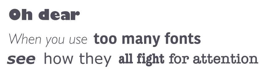
1. Keep the Number of Fonts Used at a Minimum
In order to prevent situations like this, try to limit the number of used fonts.
Using more than three typefaces simultaneously can make your app/site look busy and unstructured. It’s better to limit the number of used font families to a minimum (two is plenty, one is often sufficient) and stick to the same ones through the entire website/app.
Start by selecting a typeface for your body text
This is a very important decision which will affect the decisions of any other typeface like headlines. Body text is the most common element in a product. This is what all your users will see and experience. As a result, the look and feel of your body text will have the greatest impact on the quality of your design.
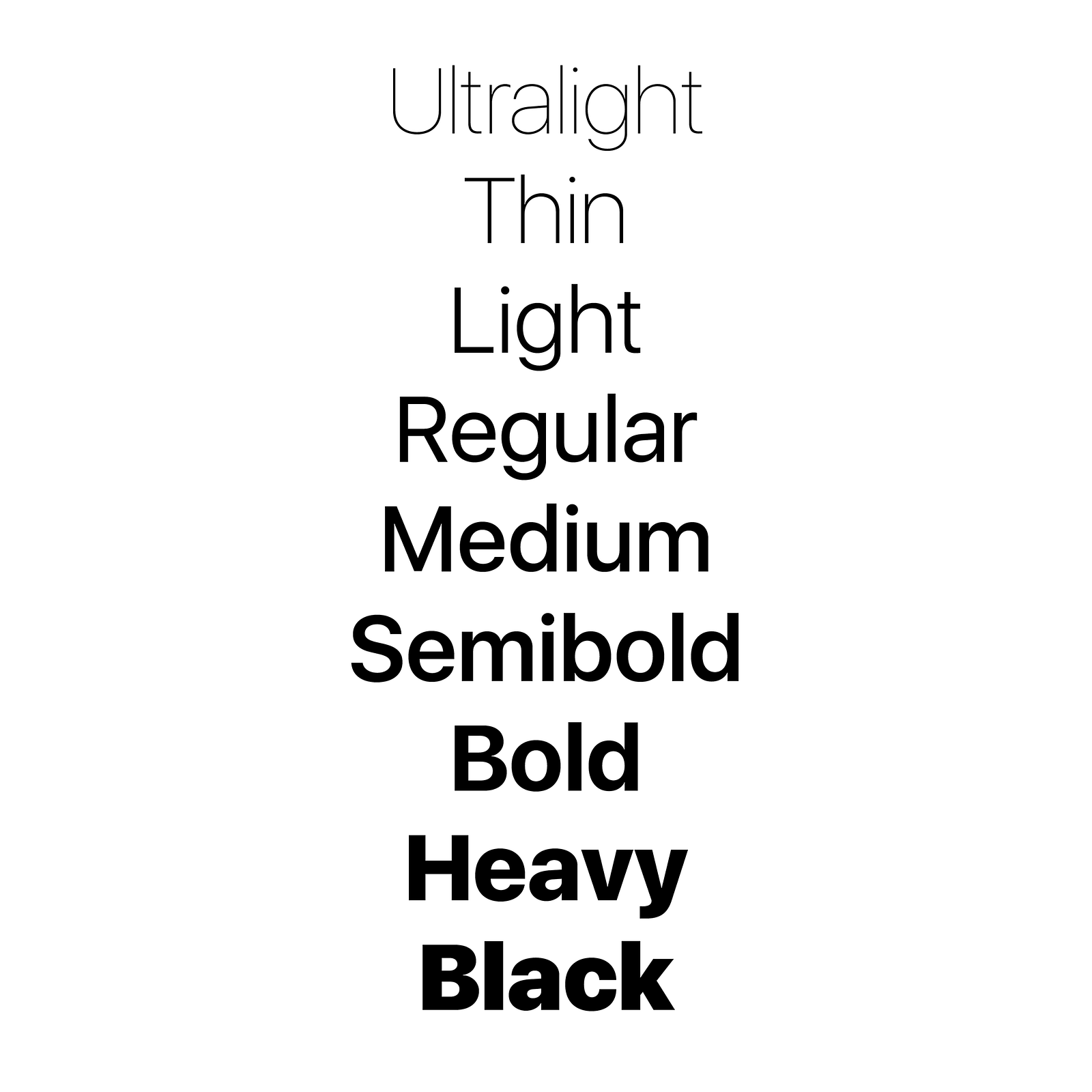
Stay with one font until you master it
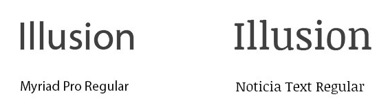
For beginners, it’s recommended to stay with one font until you have achieved mastery of that font. Play with the styles. Modern typefaces already come with many different styles, which means they share common distinct weights. Typefaces with a larger range of styles can help you differentiate text in special contexts, like a button or a label. A good example is San Francisco typeface from Apple.
San Francisco typeface from Apple
Ensure font families complement each other
If you still want/need to use more than one font, ensure the font families complement each other. Take the example of fonts combinations below. The combination of Georgia and Verdana (left) share similar values that create a harmonious pairing. Compare that to the pairing of Baskerville and Impact (right) where the heavy weight of Impact vastly overshadows its counterpart.
Using two fonts successfully within a layout requires an understanding of the chosen fonts. Ensure the font families complement each other based on their character width.
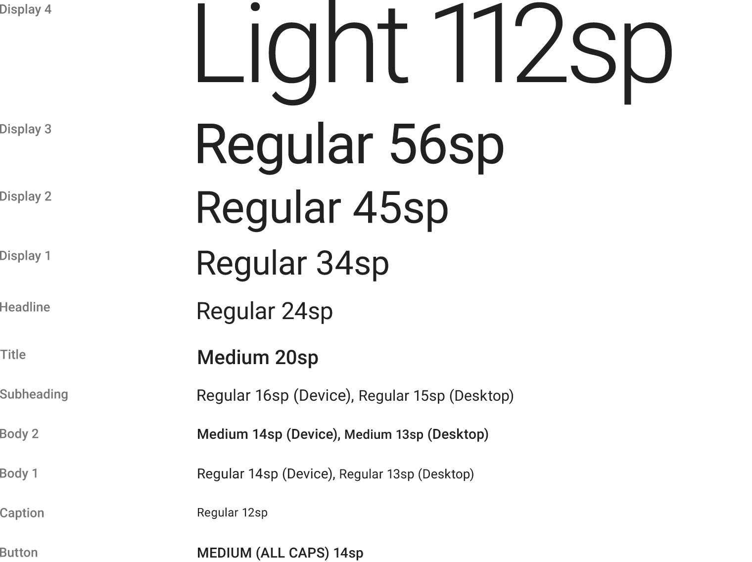
2. Choose the Proper Font Size
The size of your text has a huge impact on the experience of reading something on screen:
Text that is too small can cause the reader to strain. As result, users will skip most of the information presented. This is especially true for mobile, where tiny type on a small, bright screen can be a headache for users.
Text that is too large can also cause problems. Large text can be distracting and tends to call attention to itself.
That’s why you should always start with a comfortable font size for your body text. While it’s impossible to provide a one-fits-all solution for the font size, a general rule of thumb is:
For desktops: Use 16 px font or higher for body text. It’s not too big and it’s comfortable to read.
For iOS devices: Use a text size that’s at least 11 points (it’s legible at a typical viewing distance without zooming).
For Android: Minimal readable font size is 12 sp, but it is highly recommended to use at least 14 sp for the main text.
Tip: Selecting font size can be daunting. But there is a technique that can help you — a modular scale. A modular scale is a sequence of values that can be applied to determine the size of your text styles in a harmonious way. You first choose a ratio — For example, the golden mean 1:1.618 (scale factor). Then you pick the base size of your text, for example, 16px. After that, you multiply to get the sequential numbers: 16px, 26px, 42px, 68px, 110px. You can use a tool like Gridlover to find a proper font size for different scale ratios.
3. Justify Left and Mind the Gap
In the Western world, type is read top to bottom and left to right. By justifying type left, you make the text easier to read. The eye is able to find the edge and this makes reading the copy much easier: A consistent left (vertical) edge assists readers by providing a place for the eye to return to after finishing each (horizontal) line.
It’s also important to mind the gap and avoid having a single word on the last line of a paragraph (otherwise known as a widow):
A widow is a single word or a very short line of text at the end of a paragraph. Avoid it as possible.
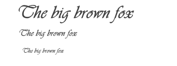
4. Choose a Typeface that Works Well in Various Sizes
With the growing popularity of type design, the sea of typefaces from which to choose gets bigger each year. Users will use your app/access your site from devices with different screen sizes and resolutions. Since a majority of UIs require text elements of various sizes (button copy, field labels, section headers, etc), it’s important to choose a typeface that works well in multiple sizes to maintain readability in every size.
It’s essential to make sure that the typeface you choose is legible on smaller screens! Try to avoid fonts that use cursive script, such as Vivaldi (in the example below): although they are beautiful, they are difficult to read.
Vivaldi typeface will be difficult to read on the small screen
5. Use Fonts with Distinguishable Letters
Lack of distinction between capital I and lowercase l.
Legibility is a measure of how easy it is to distinguish one letter from another in a particular typeface. However, not all typefaces are created with legibility as a primary design function. Many typefaces confuse similar letterforms, specifically with “i”s and “L”s (as seen in the image above). Another common legibility issue is poor letter spacing — set together, an “r” and “n” can easily become an “m”. You need to avoid these kinds of fonts because people will have problems reading them on small displays.
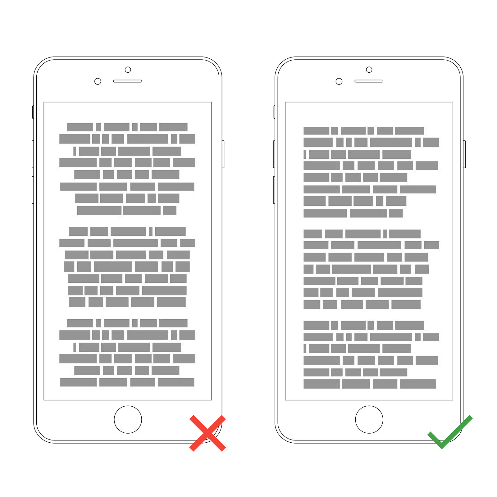
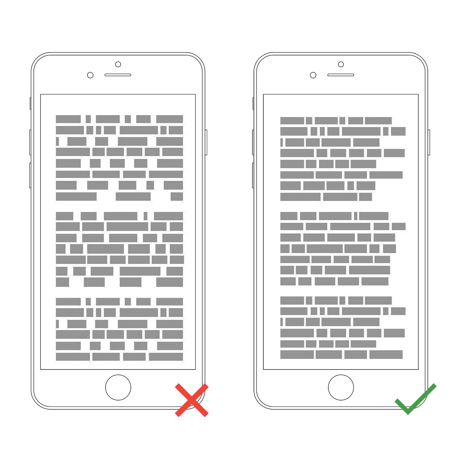
6. Limit Line Length
Wikipedia has a way too long lines of text.
Line length is the horizontal distance of a block of text. Unfortunately, long lines are probably one of the most common design problem on the web. Having the right amount of characters on each line is key to the comfortable reading of your text. The generally accepted, ideal line length for comfortable reading on desktop is around 60 characters per line, including spaces (according to “Typographie”by E. Ruder). This line length has a positive impact on reading rhythm: Our mind is energized when jumping to the next line (as long as it not so frequent).
If a line is too short, the eye will have to travel back too often, breaking the reader’s rhythm. If a line of text is too long, the user’s eye will have a hard time focusing on the text. Image credit: Material Design
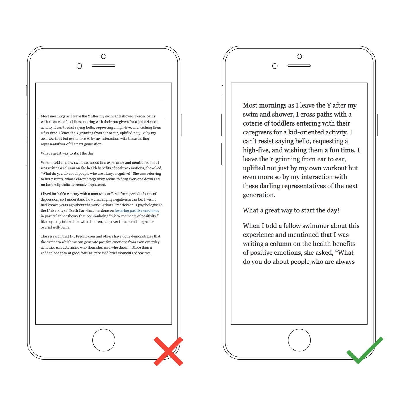
It’s rare that 60 characters extend to the edge of a desktop screen, but on most mobile devices 60 characters (if displayed large enough to be legible) extend beyond the boundaries of the visible area of the screen. A rule of thumb for mobile typography is to stick to 30–40 characters per line (line length for narrow columns of text in newspapers or magazines).
Below is an example of two sites viewed on a mobile device. The first one uses 50–75 characters per line (optimum number of characters per line for print and desktop), while the second one uses the optimal 30–40 characters.
In web design, you can achieve an optimal number of characters per line by restricting the width of your text blocks using em or pixels.
Left: The text is too small to read on a small device without pinching and zooming. Right: The text is comfortable to read on a mobile screen.
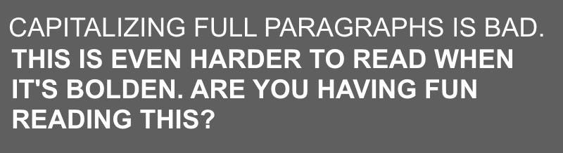
7. Avoid All Caps
All caps text — meaning text with all the letters capitalized — is fine in contexts that don’t involve reading (such as acronyms or logos), but it’s better to avoid all caps when your message involves reading. As mentioned by Miles Tinker, in his landmark work, Legibility of Print, all-capital print greatly retards the speed of scanning and reading in comparison with lower-case type. Don’t use all caps in text blocks longer than one line of text.
8. Don’t Lose Your Rag
A rag is the edge of a block of text. When text is justified, the words on the line are spaced equally so that there’s no rag on either side. It’s better to avoid using forced justified type because it results in inconsistent whitespace.
Ragged right text has an additional benefit for mobile users. A lot of factors can distract a person from reading (such as an incoming call). A rag creates a random shape down the right-hand column that helps the eye easily relocate its last position and re-engage with text copy.
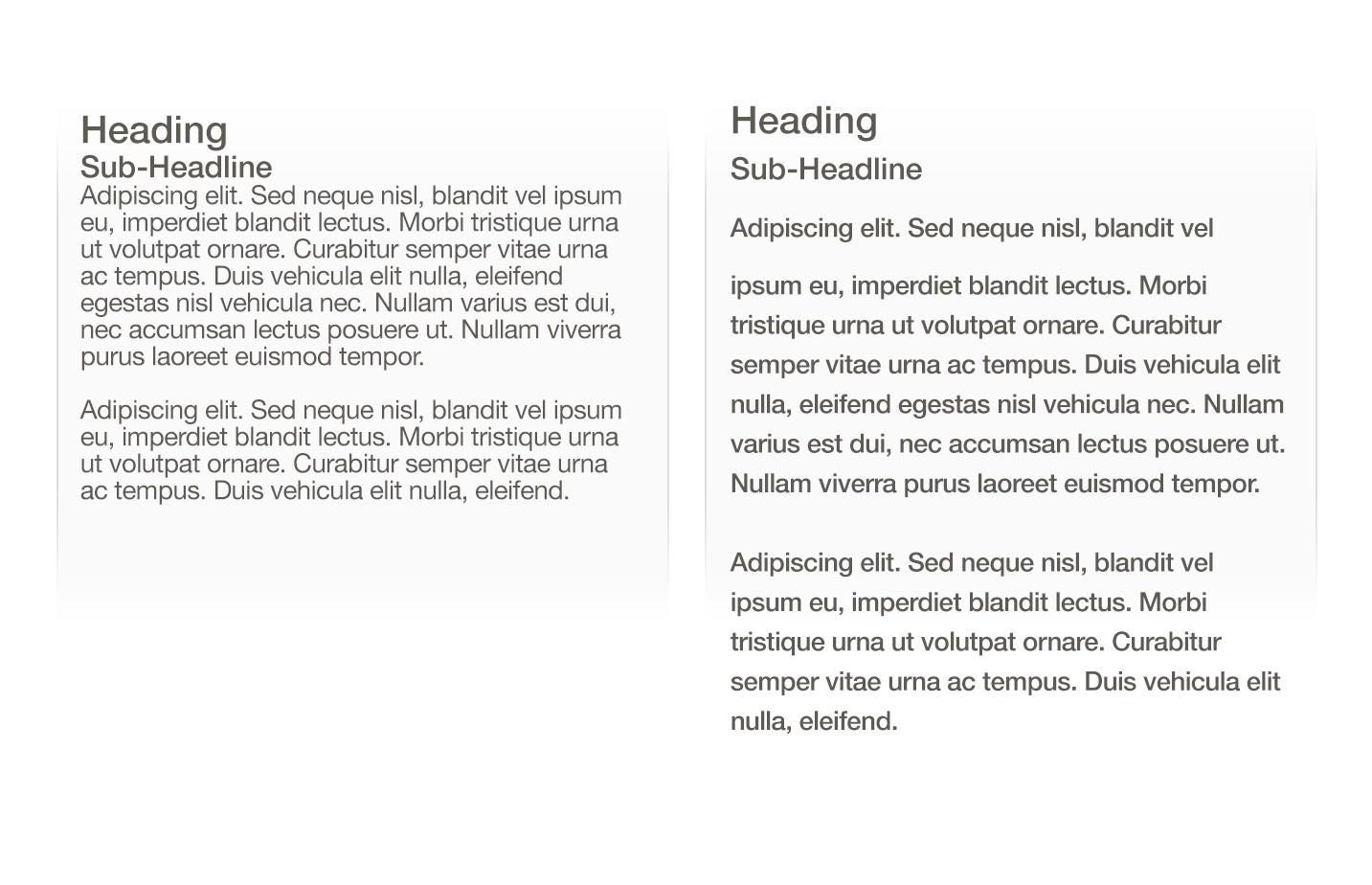
9. Don’t Minimize Spacing Between Lines
Too tight; Too much; Just right. By adding a right amount of space to text — both between lines and in the margins — you are helping users better interact with the words.
Typography is all about spacing. In typography, we have a special term for the spacing between two lines of text — leading (or line height). In word-processing software, this concept is usually referred to as “line spacing.”
Bad leading leads to text that looks crowded. By increasing the leading, you increase the vertical white space between lines of text, generally improving readability in exchange for screen real estate.
Good spacing aids readability. Properly using white space has been proven to increase comprehension: It gives readers the perception that text isn’t too dense and feels easier to read. A simple rule is your leading should be wider than your word spacing. As a rule of thumb, leading should be about 30% more than the character height for good readability.
“The main factors that will influence the readability of your text are a good balance between font size and line spacing”
Too tight; Just right. Image credit: Apple
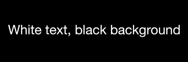
10. Make Sure Your Text Has Sufficient Color Contrast
Even high-contrast text is hard to read when there is glare, but low-contrast text is nearly impossible.
You should use color and contrast to help users see and interpret your text. Contrast is particularly important when designing for mobile because of the potential for distracting glare.
The right amount of contrast is a tricky thing and quite often designers face following problems:
They choose text color that is too similar to the background color. This makes text hard to read.
These lines of text are difficult to read against their background colors.
They create too much of a contrast between the text and the background. This also causes readability issues. One of the most common issues is light-colored text against dark backgrounds (white-on-black combinations). Forcing users to read white text on a black background for a long time can strain the user’s eyes.
Even people with perfect vision experience eye fatigue from staring at white text on a black background for too long.
WC3’s Web Content Accessibility Guidelines are a good place to start if you want to master color contrast. They set minimum standards for contrast so that users with different visual abilities (including the people with moderately low vision) can read your text. The W3C recommends the following contrast ratios for body text and image text:
Small text should have a contrast ratio of at least 4.5:1 against its background. A ratio of 7:1 is preferred.
Large text (at 14 pt bold/18 pt regular and up) should have a contrast ratio of at least 3:1 against its background.
Tip: Ensure sufficient color contrast for your text for best readability. You can use a contrast ratio tool to quickly find out if you’re within the optimal range.
Bonus: Helpful Resources
I’ve also prepared a list of resources that will help you improve your typography skills:
Google Fonts and Typekit will help you discover typefaces for your next web or mobile app project.
Gridlover (we’ve mentioned this resource before in section 2, but it worth to say it again because it’s an excellent way to create your modular scale.
Just My Type is a collection of font pairings from Typekit.
Typewolf is a great source of typography inspiration.
Conclusion
Good typography not only makes us read but also makes us feel. Typography is a skill that every designer needs to master in the digital age. As with any design project, guidelines and tips are just a place to get started. The first piece of advice is to practice. You only really learn something by doing it. The more you try text styles on, the better idea you will get of how it looks and works for your users. Take this practical guide as a starting point on your road for crafting typography for your screen design.