Cloud-based review tool Dropbox Replay is a serious time-saver, and fits perfectly into the way creative work is evolving. We explain why it’s a must-have for designers in 2024.
The creative industry is highly competitive, and creative freelancers and agencies are constantly being squeezed in all directions. Clients, armed with tighter budgets, expect top results. Yet, while agencies strive to create best-in-class content, they must also balance fair pay for designers with maintaining profitability. So what’s the solution?
Here’s where Dropbox’s vision of a more enlightened way of working comes in. The tech company is dedicated to helping designers and agencies realise their full potential, and Dropbox Replay, a cloud-based review tool, is helping them put that principle into action.
Right now, creatives all over the world are discovering how Dropbox Replay can revolutionise their workflows and speed up content delivery. Read on as we share five key features that make Replay a great addition to any designer’s toolkit, followed by a case study that highlights how it could boost your design practice too.
01. Live sessions
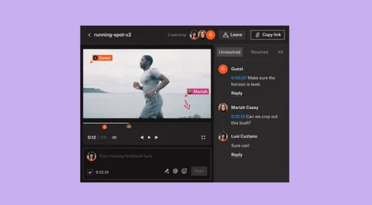
Dropbox Replay revolutionises the way design reviews are conducted by introducing live sessions. This allows multiple stakeholders to simultaneously view and comment on an image, video or audio file at the same time; fostering real-time collaboration and ensuring everyone is on the same page.
Replay seamlessly handles ultra-high definition video and lossless audio playback, maintaining synchronisation across all viewers, ensuring a smooth and engaging review experience.
02. Effortless project sharing
Dropbox Replay saves you time by eliminating the hassle of exporting compressed files and cluttering up your hard drive. Instead it generates a simple link for designers to share with your clients, collaborators and stakeholders.
This makes it super-easy to send out your projects for review. There’s no need for constant file transfers and version updates; you just share the link once, and once only.
03. Frame-by-frame feedback
Dropbox Replay goes beyond traditional text-based feedback, empowering reviewers to provide detailed and actionable comments using browser-based annotation tools.
Reviewers can mark up specific frames, write comments and even add annotations, ensuring that feedback is precise and easily identifiable. There’s no need for anyone to have specialised software and your client reviewers don’t even need a Dropbox account to access and provide feedback, making project-sharing accessible to a wide range of stakeholders.
04. Adobe and other software integrations
Dropbox Replay integrates seamlessly with industry-leading editing software such as After Effects, Premiere Pro, Final Cut Pro, Blackmagic Design DaVinci Resolve, LumaFusion, and WeVideo. That means reviewers can provide feedback directly from their editing workflows, without having to open a new tab.
This eliminates the need to switch between platforms and ensures that feedback is captured quickly, efficiently and in the context of the specific project.
05. Version Control and History Tracking
When you’re sharing files manually over email, it’s often impossible to keep track of who requested what changes, which corrections have been done, and so on. That’s not a problem with Dropbox Replay, though, as it provides comprehensive version control, keeping track of every iteration of a project and any associated feedback.
This enables you to easily revisit past versions, compare changes, and identify the evolution of your work. Replay also stores comments and markups for each version, providing a complete record of the review process.
Case study: Captive8 Media

With its seamless integrations and focus on efficiency, Dropbox Replay is the catalyst designers need to thrive in today’s creative landscape. One such designer is Matthew Stokes, founder of the London based video production company, Capitve8 Media.
Having weathered the 2008 recession, COVID and the economic after-effects, Stokes has learned to master something that’s helped Captive8 Media stay in business: operating efficiently.
Stokes harnesses tech to handle the unavoidable business admin and to prioritise more of the work he loves. The more that these pieces of tech talk to each other, the better; which is why he’s used Dropbox since day one.
Captive8 Media’s work happens on a quick turnaround, making speed and efficiency business critical: Raw video is captured and immediately gets uploaded to Dropbox. Stokes’s editor then takes that footage, edits the video down to a rough cut, and opens it in Dropbox Replay. They’ll go back and forth leaving feedback on edits before a cleaner video is created and ready to be shared—again, via Replay—with clients who are just as widely dispersed as Captive8 Media’s own remote team.
“I don’t have to tell people how to use it, it’s self-evident,” says Stokes. “That’s where you put your feedback, you press submit, it appears there, job done.”

Replay’s ease has become integral to Captive8 Media’s creative process and customer service. The company has amassed a perfect 5-star score on Google Business with nearly 200 reviews. “In fact,” he says, “we recently had a review and someone specifically said, “We love the review process.”
By succeeding in creating simple and efficient processes, Captive8 Media has more time to focus on one of Stokes’ biggest passions: getting down in the details. And, at the same time, he’s been able to make more space for what matters most to him: a better work-life balance.
Stokes shares, “Captive8 Media is going to continue doing good stuff with good people in a good way, and keeping a smile on my face and a roof over my head.”
By
Tom May is an award-winning journalist and editor specialising in design, photography and technology. Author of the Amazon #1 bestseller Great TED Talks: Creativity, published by Pavilion Books, Tom was previously editor of Professional Photography magazine, associate editor at Creative Bloq, and deputy editor at net magazine. Today, he is a regular contributor to Creative Bloq and its sister sites Digital Camera World, T3.com and Tech Radar. He also writes for Creative Boom and works on content marketing projects.
Sourced from CREATIVEBLOQ

