McDonald’s has been sneakily building a brand new spin-off restaurant with an out-of-this-world theme. The new establishment named ‘CosMc’s’, has appeared in Bolingbrook, Illinois and until now has been kept under wraps – but recent images of the new building have garnered a mixed response online.
As of now, it’s unclear how CosMc’s will compare to McDonald’s existing chains but from the theming alone, it looks like we’re in for a blast from the past. This new design is certainly a change from what we’ve seen before, but McDonald’s iconic golden arches still remain one of the best logos of all time.
As you can imagine, the design of the mysterious CosMc’s is suitably space-themed, with a deep blue exterior and McD’s yellow accents (with a cameo from the golden arches of course). The CosMc’s wordmark logo is perhaps the biggest change from McDonald’s branding, featuring retro-inspired curved text that gives the restaurant a nostalgic appearance.
If you’re familiar with the intricate world of McDonald’s lore, you may recall the classic character behind the new restaurant design. CosMc was a fleeting side character featured in various McD’s ads in the late 80s and 90s – Ronald’s extra-terrestrial pal who’s arguably lesser known than other McDonald’s characters. After the success (and trauma) of the latest Grimace shake trend, do I spy McDonald’s attempting to revive another forgotten friend?
Pictures of the new restaurant were shared by X user Iman Jalali who called it “an evil love child of a Taco Bell and a Starbucks.” Jalali seemed on the fence about the new restaurant design and fellow X users showed equal confusion, with another user questioning “What’s with the weird space theme? Feels like something out of the 1960s or something.”
It seems that amidst the mystery, this new McDonald’s spin-off is dividing the internet. We won’t know for certain what the new restaurant entails, but for now, I’m glad to see another member of the McDonald’s gang getting revived, and I pray that his return will be equally as chaotic as the great Grimace resurgence.
Natalie is Creative Bloq’s staff writer. With an eye for trending topics and a passion for internet culture, she brings you the latest in art and design news. A recent English Literature graduate, Natalie enjoys covering the lighter side of the news and brings a fresh and fun take to her articles. Outside of work (if she’s not glued to her phone), she loves all things music and enjoys singing sweet folky tunes.
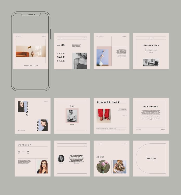
Simplify your social media game with ready-to-use templates.
In today’s digital era, social media has become an integral part of our lives. Whether you’re a business owner, a content creator, or an influencer, it’s essential to have a visually appealing and engaging social media presence. However, not everyone has the time or design skills to create stunning graphics from scratch. That’s where Adobe Stock comes to the rescue! With Adobe Stock contributor @orangeberry‘s set of simple social media post templates in Adobe InDesign, you can effortlessly elevate your online presence.
Efficient and Customizable Designs:@orangeberry‘s set of social media post templates offers a convenient solution for those seeking professionally designed graphics. Each template comes in a standard size of 1080 x 1080 pixels, optimized for various social media platforms such as Instagram, Facebook, and Twitter. These pre-made designs provide a solid foundation, ensuring your content stands out in a sea of endless feeds.
Versatile Design Options: With 12 unique templates to choose from, you’ll find a wide range of options to suit your brand’s aesthetic and communication needs. From bold and vibrant layouts to minimalist and elegant designs, @orangeberry‘s collection caters to diverse styles and content themes. Whether you’re promoting a product, sharing a quote, or announcing an event, there’s a template for every occasion.
Seamless Customization in Adobe InDesign: The templates are created using Adobe InDesign, a powerful graphic design software known for its versatility and user-friendly interface. With InDesign’s intuitive editing features, you can easily customize the templates to match your brand’s colours, typography, and imagery. Make your social media posts truly unique by adding your own photos, logos, or other visual elements that resonate with your audience.
Time-Saving Convenience: One of the biggest advantages of using @orangeberry‘s social media post templates is the time saved. By starting with a pre-designed template, you eliminate the need to start from scratch, significantly reducing the time and effort required to create eye-catching graphics. Spend more time crafting compelling captions or engaging with your audience while still maintaining a consistent and professional visual identity.
Endless Possibilities: While the templates provide a great starting point, don’t limit yourself to their original design. Use them as a springboard for inspiration and let your creativity shine. Customize the layout, experiment with different fonts, or rearrange the elements to create a design that truly represents your brand’s personality.
Having visually appealing and engaging social media content is crucial. Thanks to Adobe Stock and @orangeberry‘s set of social media post templates in Adobe InDesign, creating stunning graphics has never been easier. With customizable designs and a range of options, you can streamline your social media game and present your brand in a professional and captivating manner. Don’t let design constraints hold you back; unleash your creativity with these ready-to-use templates and make a lasting impression on your audience.
Let’s explore the boundless possibilities of AI-powered graphic design for creative professionals.
Artificial intelligence (AI) is transforming the way graphic design professionals work. By combining AI technology with creative skills, graphic designers can unlock new potential for their projects and produce amazing results. This article will explore the power of AI in graphic design and provide an ultimate guide for creative professionals looking to incorporate it into their workflow. We’ll discuss the benefits of using AI-powered tools, showcase examples of successful projects that have used this technology, provide tips on getting started with AI tools, outline challenges associated with incorporating artificial intelligence into digital graphics workflows and look ahead to future trends related to AI in graphics.
AI in graphic design and its potential for creative professionals
The potential of AI in terms of graphic design is a truly exciting concept to consider. With a combination of artificial intelligence and creative professionals, innovative designs can be created quickly and efficiently. This can provide a huge advantage when it comes to creating visuals for products, services, webpages, or ads; AI allows a designer to prototype and experiment with a multitude of different styles at a moment’s notice. By unlocking a more efficient workflow for designers, AI has the potential to nurture the creative process like never before – making graphic design more accessible and offering boundless possibilities for exploration and experimentation.
The benefits of using AI-powered tools for graphic designers
If a modern graphic designer is looking to take their creativity to a new level, AI-powered tools can help streamline the design process and maximize their potential. AI algorithms can be used to automate mundane tasks, allowing designers to focus on more important aspects such as concept development and refinement. This helps to make a project more efficient, reducing time wasted on mundane tasks that a computer can do from a few minutes to a matter of seconds. In addition, AI-powered dynamic design tools help designers create a custom look by automatically generating variations on a single theme with a few mouse clicks or voice instructions. This saves time and allows for rapid experimentation and quick iteration in finding the most stunning designs.
How to use AI tools to enhance creativity in design projects
AI tools are a fresh new way for graphic designers to add a spark of creativity and a unique quality to their design projects. By taking advantage of these technologies, designers can create a range of eye-catching visuals that captivate audiences like never before. AI tools can also be used to quickly generate multiple solutions, enhance existing graphics, and discover innovative ways to express complex ideas. As a result, merging the creative insight of a designer with the power of AI is rapidly becoming a go-to method for producing truly remarkable design projects.
Examples of graphic design tools that include AI technology
AI technology has been a game changer for graphic design software. Many of today’s popular software products include features that can generate artwork automatically and identify errors in a design.
Unleash the power of artificial intelligence with Luminar AI and transform your photos into true works of art! This intuitive image editor has revolutionized photo editing, making it easier than ever to achieve stunning results. With features designed to maximize convenience while delivering unbeatable precision, Luminar AI is the perfect tool for any level photographer.
Adobe Creative Cloud is at the forefront of AI technology, taking full advantage of it to optimize its software with a suite of tools designed for ease and accuracy. Leveraging AI, Adobe Creative Cloud helps creatives make accurate selections, automate routine tasks like retouching models in an image, or even recognize and save searchable keywords from a video clip. Creative professionals can explore a limitless range of possibilities with AI-powered apps within Creative Cloud – from quickly editing and organizing large volumes of photos to creating complex 3D artwork.
By incorporating Generative AI into Adobe Express, both experienced and inexperienced creators can reach their creative goals. Rather than having to scour for a template that already exists, users of Express will be able to generate one with ease by providing a simple prompt. With the help of Generative AI, they’ll then have the ability to add an object or create unique text effects based on what they’re envisioning – while still keeping full control over it all! The Adobe Express tools are also perfect for editing images, and applying colours and fonts; guaranteed to get you closer to your dream poster, flyer, or social media post without fail.
So far, Artificial Intelligence-driven generative systems have been mainly utilized in the realm of image creation. Nonetheless, I think that this technology also has the potential to benefit creatives who work across different disciplines such as 3D design, texture development, and logo making among others.
Innovative AI capabilities also mean users don’t have to worry about spending hours continuously tweaking and optimizing pieces of artwork, with feedback generated quickly and realistically. For those looking to experience just how powerful ai-powered graphic design can be, there is a range of different software options available that offer the best of both worlds – human creativity coupled with tech’s precision.
Tips on getting started with using AI-powered tools in graphic design
With AI-powered software becoming increasingly more accessible and advanced, now is a great time to get familiarized with utilizing ai in your graphic design projects. Different ai applications can simplify complex art tasks, speed up the workflow processes, and ensure a better quality end product. It might seem like a daunting task to learn the ins and outs of a new piece of software, but with a little dedication, it doesn’t have to be overwhelming. Seek out online tutorials that will guide you on how to use AI software, look for community groups that build awareness of the latest advancements in AI technology or even see if your colleagues already have an experience that they can share!
The challenges associated with incorporating artificial intelligence into graphic design workflows
AI technology has the potential to revolutionize the graphic design industry. AI promises automated assistance for tedious tasks, freeing up valuable time for creators to focus on more creative objectives. Yet, AI’s complexity and ever-evolving nature present unique challenges when it comes to its incorporation into graphic design workflows. AI requires a thoughtful marriage between human creativity and AI capabilities in order to maximize AI’s intended benefits. Thus, incorporating AI into graphic design can be a daunting endeavour that requires careful planning and consideration of resources in order to ensure success. However, this challenge is an exciting opportunity as it provides an avenue for design professionals to further hone their creative problem-solving skills while continuing to explore the possibilities AI holds for the future of graphic design.
Future trends related to AI in digital graphics
AI is revolutionizing digital graphics, and it’s only going to become increasingly influential as we look toward the future. AI can be used to create photorealistic 3D models in various fields, like architecture, engineering, and game design, with greater speed and accuracy than ever before. AI-driven AI solutions are also helping to enhance existing projects without being overly intrusive or disruptive. Furthermore, AI tools are providing a much more intuitive user experience for graphic designers: AI can automate optimization processes, meaning tasks that usually took hours of manual tweaking can now be handled in seconds. AI is not just making our lives easier; it’s pushing forward the potential of digital graphics in ways never before imagined!
Header image via Adobe Stock contributor @Jackie Niam. Do not hesitate to find inspiring projects from all over the world in the Graphic Design category on WE AND THE COLOR.
It can sometimes feel like big brands all are all working from the same design playbook. There was a time not so long ago when pretty much every brand used the same gangly-armed cartoon people (a style officially known as ‘Corporate Memphis’). So it’s refreshing that Netflix’s latest visual identity steers clear of tech’s obsession with one-dimensional vectors in favour of something much more cinematic.
The brand has unveiled a set of new iconography designed by Koto Studios, and not only does it lean in to the brand’s existing colour scheme, but it’s also just plain fun. (Looking for more design inspiration? Check out our roundup of the best logos of all time.)
(Image credit: Koto Studio)
Koto (opens in new tab) says it was tasked to inject the language of cinema into the Netflix product experience. “We evolved their previous system by connecting iconography, typography, and illustration to roots within the cinematic universe, referencing effects and techniques reminiscent of the film-making process—in a way that feels immediately Netflix.”
The new illustrations are delightful (Image credit: Koto Studio)
At the centre of the new visual language is a series of illustrations depicting (often surreal) objects in a delightfully vapour wave palette of purples and reds. Compared with all that Corporate Memphis (opens in new tab), this looks positively cutting-edge, even though the aesthetic is deliberately retro.
“We steered clear of the over-saturated, over-done, one-dimensional approach to graphic language typical of the tech and streaming worlds,” Koto says, “by defining a style that speaks to film enthusiasts, and feels inherently Netflix while remaining true to their core values: pioneering, welcoming, and always stimulating.”
We’ve seen enough ‘Corporate Memphis’ over the last few years (Image credit: Mitchell Wakefield on Twitter)
Along with the illustrations, the new visual identity includes more varied sizes and weights of the company’s Netflix Sans typeface, designed to “remain legible in functional applications, and flex to bold, cinematic title cards, genre-specific, or thematic comms.”
It’s certainly refreshing to see a big tech brand opt for a different visual style. Much like Burberry’s latest rebrand, Netflix’s new look is both retro and futuristic at the same time.
Daniel Piper is Creative Bloq’s Senior News Editor. As the brand’s Apple authority, he covers all things Mac, iPhone, iPad and the rest. He also reports on the worlds of design, branding and tech. Daniel joined Future in 2020 (an eventful year, to say the least) after working in copywriting and digital marketing with brands including ITV, NBC, Channel 4 and more. Outside of Future, Daniel is a global poetry slam champion and has performed at festivals including Latitude, Bestival and more. He is the author of Arbitrary and Unnecessary: The Selected Works of Daniel Piper (Selected by Daniel Piper).
Are you wondering what the top graphic design trends will be in 2023? We tell you!
The graphic design industry is ever-changing and keeping up with the latest trends can be tough. But, if you want to stay ahead of the curve, it’s important to know what’s popular in the design world. That’s why we’ve put together a list of the top 20 graphic design trends that we think will be big in 2023. From neon colours to vintage graphics, there’s something for everyone on this list!
So, without further ado, here are the top 20 graphic design trends for 2023:
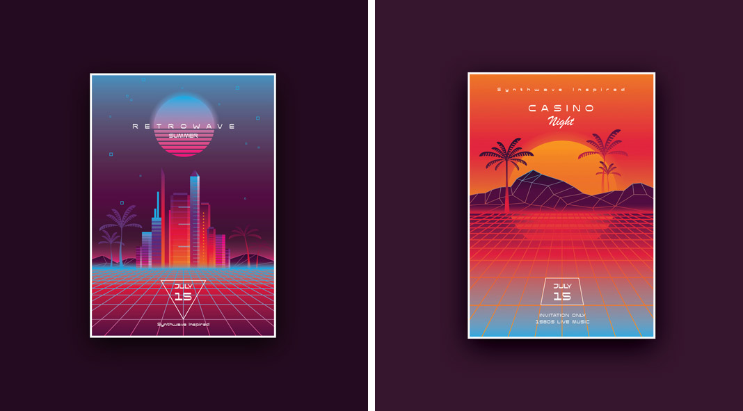
1. Neon Colours
Retro-futuristic poster templates with neon colours by Adobe Stock contributor Diana Hlevnjak, aka Polar Vectors.
Neon colours are making a comeback in a big way and they’re perfect for graphic design. They’re bright and eye-catching, and add a touch of fun to any design. Neon colors are perfect for logos, flyers, posters, and other marketing materials. That’s right – those garish, eye-catching shades that were once reserved for birthday parties and bowling alleys are now being used in everything from corporate designs to magazine covers. So what sparked this neon revival? Some say it’s a reaction to the muted tones of the digital age, while others believe that designers are simply looking for new ways to stand out in a saturated market. Whatever the reason, there’s no denying that neon is one of the hottest trends in graphic design right now.
So if you’re looking to add a little pizzazz to your next project, don’t be afraid to reach for the neon crayons. Just don’t be surprised if your clients ask you to tone it down a bit.
Minimalist design is all about simplicity and clean lines. This trend has been popular for a few years now and it shows no signs of slowing down. It’s simple, clean, and modern, making it a great choice for branding, marketing materials, packaging, and web designs. If you want to create a modern and stylish graphic, opt for a minimalist design.
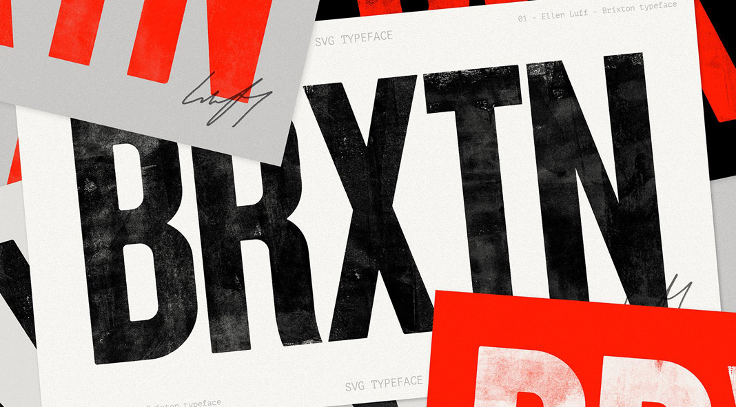
3. Bold Typography
Brixton SVG typeface, a hand-printed bold font family by Ellen Luff.
Bold typography is another great way to make your graphic design stand out. Use large, eye-catching fonts to grab attention and add impact to your design. Just be sure not to use too many different font styles in one graphic, as this can look cluttered and confusing. From street signs to movie posters, this style of lettering is everywhere you look.
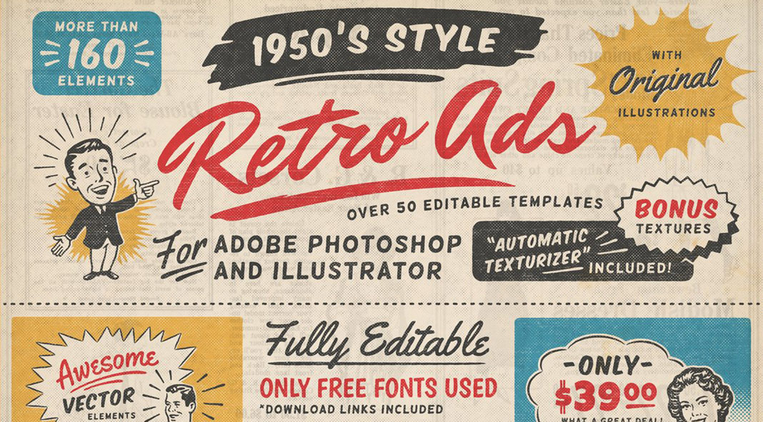
4. Vintage Graphics
1950s retro-style vintage ad templates for Adobe Illustrator and Photoshop created by DISTRICT 62 STUDIO.
Vintage graphics are making a big comeback in the design world. If you’re looking for a graphic that has a retro feel, consider using vintage graphics. By pairing vintage illustrations with modern fonts and layouts, designers are able to create stunning visual effects that are both nostalgic and contemporary. This trend is also evident in the resurgence of vintage-inspired logos and brand identity designs. As more businesses seek to create a unique and memorable brand identity, vintage graphics are becoming an increasingly popular design element. With their ability to evoke a sense of history and nostalgia, vintage graphics are sure to remain a popular trend in the world of graphic design. You can find some great vintage graphics online or hire a graphic designer to create something custom for you.
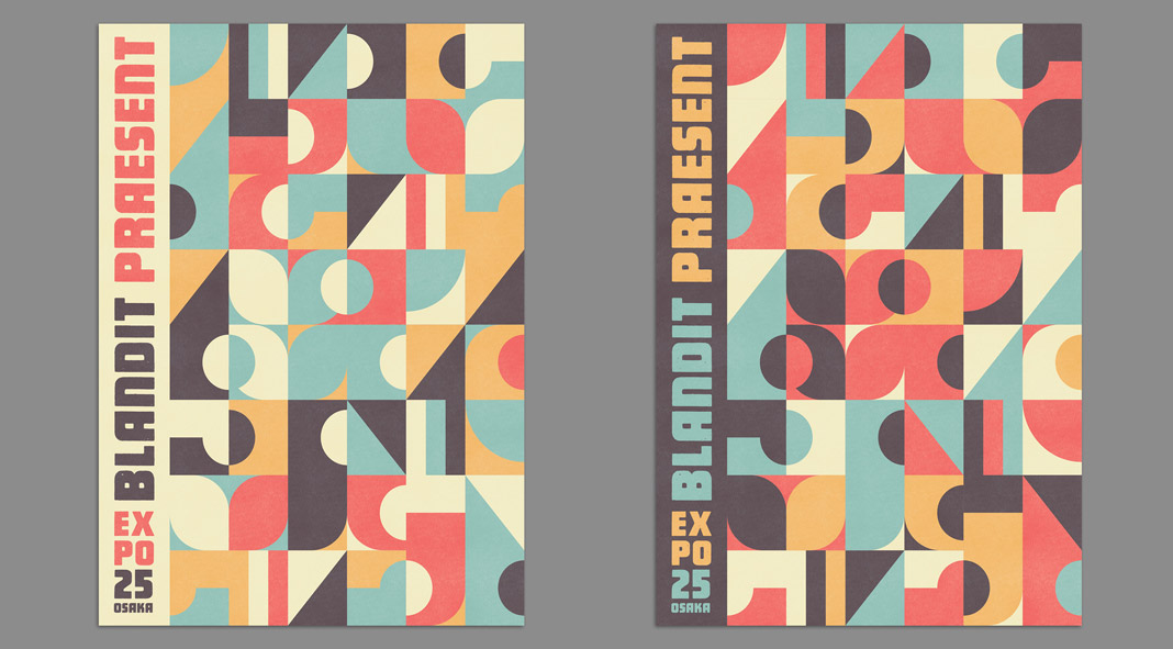
5. Geometric Shapes
Abstract geometric poster templates with flat pattern design elements by blackcatstudio.
Geometric shapes are simple, yet effective, and they can add interest to any graphic design. Use basic shapes like circles, squares, and triangles to create patterns, or use more complex shapes to add depth and dimension. In recent years, we have seen a resurgence of geometric shapes in both web and print design, and it shows no signs of slowing down. While some geometric shapes are more playful, others can be used to create a more serious or sophisticated look. No matter what your style, there is a geometric shape that will suit your needs. So go ahead and embrace the trend!
Natural hand-drawn elements add a personal touch to any graphic design. Whether you use simple sketches or more complex illustrations, hand-drawn elements can add a unique touch that sets your graphic apart from the rest. If you’re looking for a way to add hand-drawn elements to your graphic, there are many resources online that you can use. You can find free clip art and illustrations, or hire a graphic designer to create something custom for you. Just be sure to keep the overall look of your graphic consistent with the overall style of your design.
Unlike traditional color schemes, which use three or more colors, duotone schemes rely on just two tones. This minimal approach can create a sleek and sophisticated look, perfect for brands that want to convey a sense of sophistication and style. This trend adds a bit of interest to any design without using too many colors.
8. Metallic Colors
Meiji, a multi-print effects Photoshop mockup by Studio Yorktown.
Metallic colors are shiny and eye-catching, making them perfect for graphic design. Use metallic colors to add a touch of luxury to your graphic or to make it pop against a plain background. From shimmering gold to rich bronze, these colors add a sophisticated style to any design.
So what is negative space in graphic design? It is the empty space around and between the subjects in a graphic. This trend is all about using negative space creatively to add interest and impact to your design. It’s a minimalistic approach that has been gaining popularity in recent years, as more and more designers strive to create clean and sophisticated designs.
Using animated graphics is a great way to add movement and interest to your graphic design. Everywhere you look, from advertisements to websites to social media posts, businesses are using animation to capture attention and stand out from the competition. And it’s not just small businesses; even major brands are using animated graphics to communicate their messages. While some may dismiss animated graphics as a passing fad, there’s no denying that they are an effective way to engage audiences and deliver information in a memorable way. You can hire a graphic designer to create a custom animation for you or use free resources online to create simple animations.
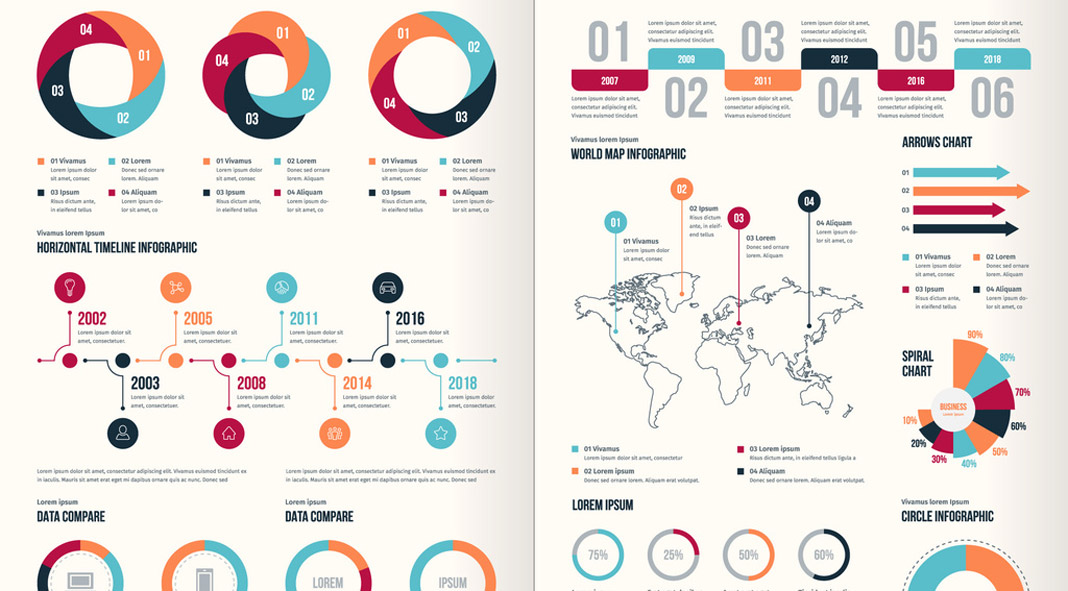
Infographics are a great way to present information in a visually appealing way. As a society, we are constantly inundated with information. In the age of the internet, we have access to more data than ever before, and it can be overwhelming to sift through everything and find what we’re looking for. This is where infographics come in. An infographic is a visual representation of data or information, and they have become increasingly popular in recent years as a way to quickly and easily communicate complex ideas. For graphic designers, infographics offer a unique challenge, as they must distill a lot of information into a single, visually-appealing image. As infographics continue to grow in popularity, we can expect to see more designers experimenting with this trend.
Nothing new but icons are simple, yet effective, graphic elements that can be used to represent different concepts or ideas. You’re probably thinking, “Icons are so overdone. Everyone is using them.” But that’s exactly why they’re such a popular graphic design trend right now. Icons are eye-catching and easy to understand, making them perfect for grabbing attention in a crowded marketplace. And because they’re so versatile, they can be used in a variety of ways to communicate your brand’s unique identity. So if you’re looking for a way to make your mark, consider using icons in your next design project.
13. Photo Manipulation
Photo manipulation effects for Adobe Photoshop by Pixelbuddha.
The creative task of photo manipulation is the process of manipulating images to create a desired effect. This graphic design trend is perfect for those who want to add a bit of creativity to their work. There are many different techniques that can be used in photo manipulation, so it’s a great way to experiment with your graphic design.
Vector graphics are computer graphics that are created using mathematical objects called vectors. They can be transformed to any size without loss of quality. Sure, vector graphics are nothing new in the design world but the clean and modern style is currently very popular and can be found across any type of media ranging from print to the web.
90s design was all about big bold statements. From chunky die-cut shapes to DayGlo colors, 90s designers had a knack for making an impact. And while some 90s trends have since fallen by the wayside, others are currently making a comeback. So what makes 90s design so special? Part of it has to do with the fact that 90s designers weren’t afraid to experiment. They pushed boundaries and challenged convention, creating a style that was both eye-catching and forward-thinking. But 90s design also has a certain sense of nostalgia about it. Whether you love it or hate it, there’s no denying that 90s design is here to stay.
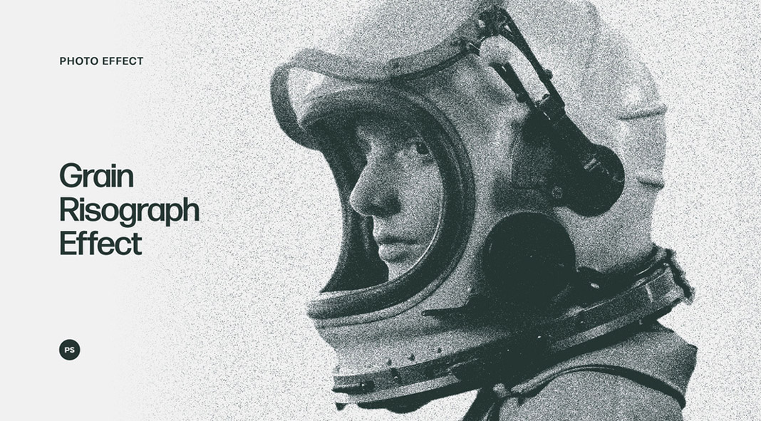
One of the latest trends in graphic design is the use of grain and noise textures. These textures can add a sense of depth and realism to your design, and they can also be used to create a vintage or distressed look. Grain and noise textures are often used in conjunction with other effects, such as halftone dots or overlays. When used correctly, they can help to create a cohesive and visually arresting design. However, like all trends, grain and noise textures should be used sparingly, as too much of either can quickly become overwhelming. So if you’re looking to add a little grain or noise to your next project, be sure to use it judiciously.
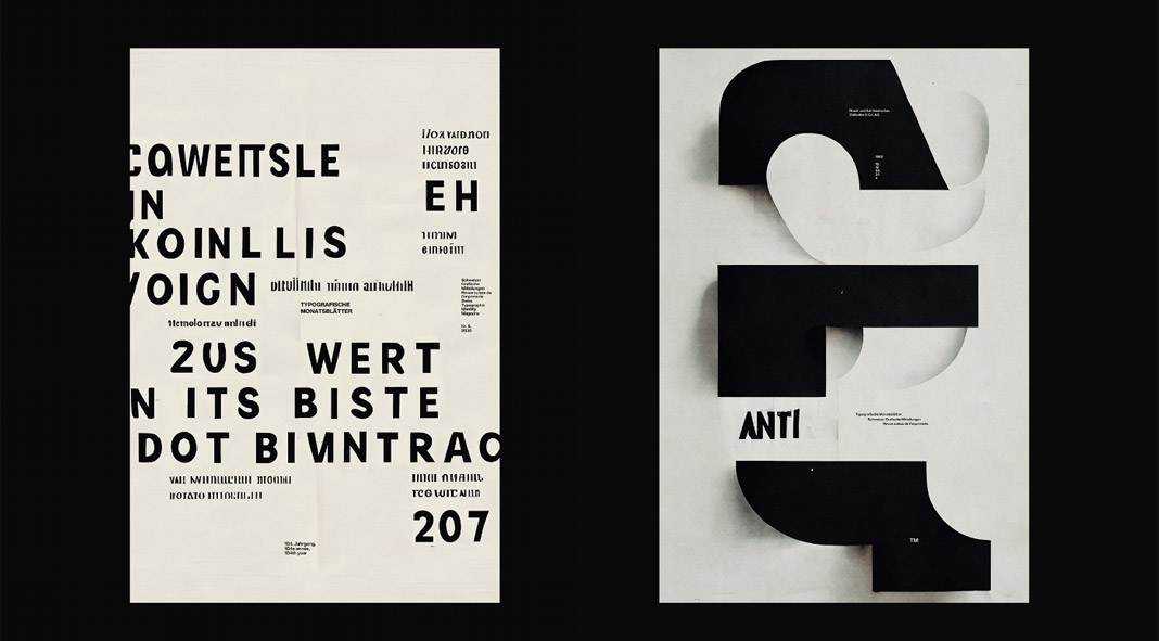
In the world of graphic design, experimental typography is having a moment. This trend involves pushing the boundaries of typefaces to create unique, eye-catching designs. While experimental typography has been around for decades, it has recently gained popularity thanks to the rise of digital design tools and social media. As a result, experimental typography is now being used by everyone from major brands to small businesses. And while not everyone is a fan of this trend, there’s no denying that experimental typography can be incredibly effective when used correctly. So if you’re looking to add a touch of personality to your next project, don’t be afraid to experiment with your typography.
It’s no secret that computer-generated graphics are becoming increasingly popular. Once relegated to the world of science fiction movies and video games, computer-generated graphics are now being used in everything from advertisements to product packaging. And it’s easy to see why. With their ability to create realistic images and text effects, computer-generated graphics offer designers a lot of flexibility. Plus, thanks to advances in technology, computer-generated graphics are becoming more and more realistic all the time. As a result, we’re likely to see even more computer-generated designs in the coming years.
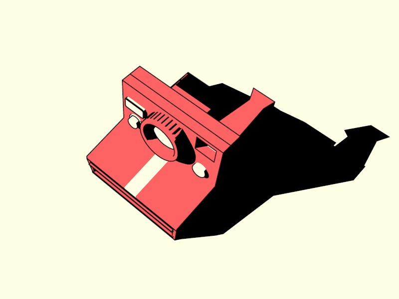
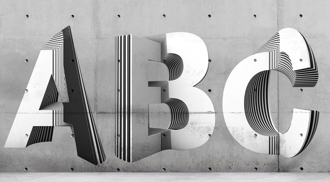
3D elements are nothing new. In fact, they’ve been around for centuries in the form of sculptures and other art forms. However, 3D design is now starting to make its way into the world of graphic design, and it’s definitely making a splash. Thanks to advances in technology, rendered 3D elements can now be created with ease, and they offer a unique way to add depth and interest to any project. From logos to illustrations, 3D elements are becoming increasingly popular, and it’s easy to see why. If you’re looking to add a touch of dimension to your next project, don’t be afraid to experiment with 3D design.
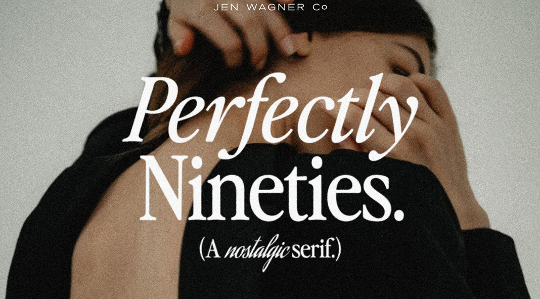
These days, serif fonts are all the rage in the world of graphic design. And it’s no wonder why! These traditional fonts convey a sense of sophistication and elegance, making them perfect for luxury brands or high-end businesses. But you can also use serif fonts to add a touch of stylishness to more down-to-earth designs. So whatever your project may be, don’t be afraid to add a little serif flair. After all, that’s what all the cool kids are doing these days.
Available for use in Adobe InDesign, this easy-to-use resume/cv template provides a professional look.
Applying made easy—with this professional resume/curriculum vitae template you will have a good chance to get the job of your dreams. Created by freelance graphic designer, illustrator, and Adobe Stock contributor @Roverto Castillo, this Adobe InDesign is based on the standard size of A4. It consists of a cover letter and a resume page. Every section is fully editable. You can also add as many pages as you want. Customizing the pages is quite easy—with just a few clicks, you can add your own content to the predesigned layout. Based on a modern and simple design, this resume/cv template is the perfect solution to showcase your personality and skills in style. The layout consists of various, well-ordered subject areas.
Please note that this customizable resume/cv template requires Adobe InDesign. You can get the latest version from the Adobe Creative Cloud website—just take a look here. For those who want to learn more about this professional Adobe InDesign template, feel free to click on the following link. Using this template, you will definitely stand out from the crowd of competitors.
You can download this professional resume/curriculum vitae template for Adobe InDesign here. By the way, with an Adobe Stock trial subscription, you can download this high-quality InDesign file for free.
Do not hesitate to find more trending graphic design templates on WE AND THE COLOR. The category includes plenty of useful graphic stock material for different needs such as logos, patterns, countless vector files, or PSD mockups. For creative inspiration, we recommend having a look at our extensive Graphic Design category.
Are you wondering what the top graphic design trends will be in 2023? We tell you!
The graphic design industry is ever-changing and keeping up with the latest trends can be tough. But, if you want to stay ahead of the curve, it’s important to know what’s popular in the design world.
That’s why we’ve put together a list of the top 20 graphic design trends that we think will be big in 2023. From neon colors to vintage graphics, there’s something for everyone on this list!
So, without further ado, here are the top 20 graphic design trends for 2023:
1. Neon Colors
Retro-futuristic poster templates with neon colors by Adobe Stock contributor Diana Hlevnjak, aka Polar Vectors.
Neon colors are making a comeback in a big way and they’re perfect for graphic design. They’re bright and eye-catching, and add a touch of fun to any design. Neon colors are perfect for logos, flyers, posters, and other marketing materials. That’s right – those garish, eye-catching shades that were once reserved for birthday parties and bowling alleys are now being used in everything from corporate designs to magazine covers. So what sparked this neon revival? Some say it’s a reaction to the muted tones of the digital age, while others believe that designers are simply looking for new ways to stand out in a saturated market. Whatever the reason, there’s no denying that neon is one of the hottest trends in graphic design right now. So if you’re looking to add a little pizzazz to your next project, don’t be afraid to reach for the neon crayons. Just don’t be surprised if your clients ask you to tone it down a bit.
Minimalist design is all about simplicity and clean lines. This trend has been popular for a few years now and it shows no signs of slowing down. It’s simple, clean, and modern, making it a great choice for branding, marketing materials, packaging, and web designs. If you want to create a modern and stylish graphic, opt for a minimalist design.
3. Bold Typography
Brixton SVG typeface, a hand-printed bold font family by Ellen Luff.
Bold typography is another great way to make your graphic design stand out. Use large, eye-catching fonts to grab attention and add impact to your design. Just be sure not to use too many different font styles in one graphic, as this can look cluttered and confusing. From street signs to movie posters, this style of lettering is everywhere you look.
4. Vintage Graphics
1950s retro-style vintage ad templates for Adobe Illustrator and Photoshop created by DISTRICT 62 STUDIO.
Vintage graphics are making a big comeback in the design world. If you’re looking for a graphic that has a retro feel, consider using vintage graphics. By pairing vintage illustrations with modern fonts and layouts, designers are able to create stunning visual effects that are both nostalgic and contemporary. This trend is also evident in the resurgence of vintage-inspired logos and brand identity designs. As more businesses seek to create a unique and memorable brand identity, vintage graphics are becoming an increasingly popular design element. With their ability to evoke a sense of history and nostalgia, vintage graphics are sure to remain a popular trend in the world of graphic design. You can find some great vintage graphics online or hire a graphic designer to create something custom for you.
5. Geometric Shapes
Abstract geometric poster templates with flat pattern design elements by blackcatstudio.
Geometric shapes are simple, yet effective, and they can add interest to any graphic design. Use basic shapes like circles, squares, and triangles to create patterns, or use more complex shapes to add depth and dimension. In recent years, we have seen a resurgence of geometric shapes in both web and print design, and it shows no signs of slowing down. While some geometric shapes are more playful, others can be used to create a more serious or sophisticated look. No matter what your style, there is a geometric shape that will suit your needs. So go ahead and embrace the trend!
Hand-drawn elements add a personal touch to any graphic design. Whether you use simple sketches or more complex illustrations, hand-drawn elements can add a unique touch that sets your graphic apart from the rest. If you’re looking for a way to add hand-drawn elements to your graphic, there are many resources online that you can use. You can find free clip art and illustrations, or hire a graphic designer to create something custom for you. Just be sure to keep the overall look of your graphic consistent with the overall style of your design.
Unlike traditional color schemes, which use three or more colors, duotone schemes rely on just two tones. This minimal approach can create a sleek and sophisticated look, perfect for brands that want to convey a sense of sophistication and style. This trend adds a bit of interest to any design without using too many colors.
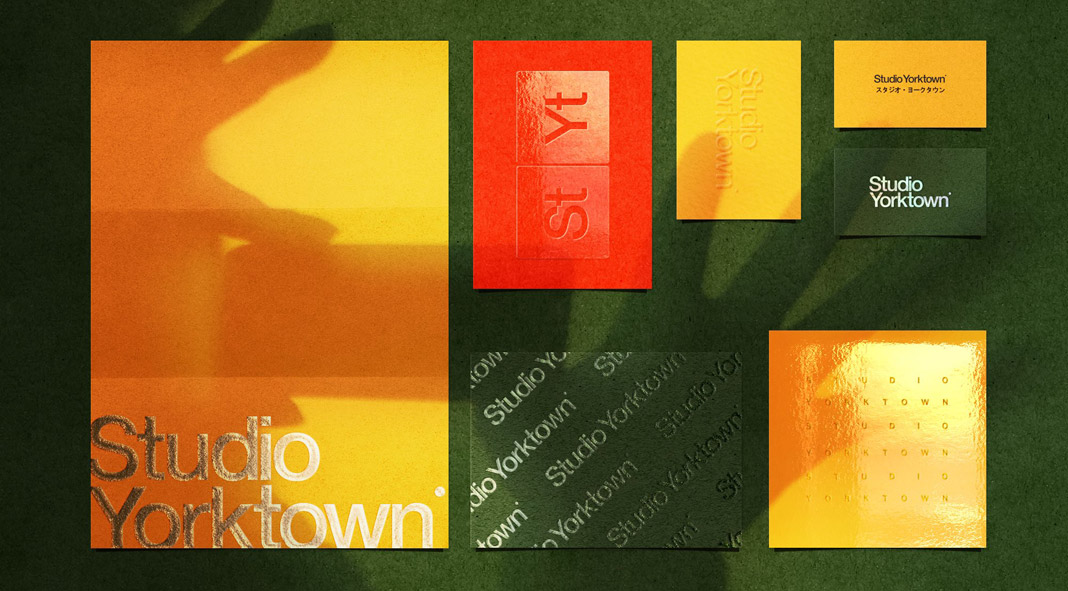
8. Metallic Colors
Meiji, a multi-print effects Photoshop mockup by Studio Yorktown.
Metallic colors are shiny and eye-catching, making them perfect for graphic design. Use metallic colors to add a touch of luxury to your graphic or to make it pop against a plain background. From shimmering gold to rich bronze, these colors add a sophisticated style to any design.
Negative space is the empty space around and between the subjects in a graphic. This trend is all about using negative space creatively to add interest and impact to your design. It’s a minimalistic approach that has been gaining popularity in recent years, as more and more designers strive to create clean and sophisticated designs.
Animated graphics are a great way to add movement and interest to your graphic design. Everywhere you look, from advertisements to websites to social media posts, businesses are using animation to capture attention and stand out from the competition. And it’s not just small businesses; even major brands are using animated graphics to communicate their messages. While some may dismiss animated graphics as a passing fad, there’s no denying that they are an effective way to engage audiences and deliver information in a memorable way. You can hire a graphic designer to create a custom animation for you or use free resources online to create simple animations.
Infographics are a great way to present information in a visually appealing way. As a society, we are constantly inundated with information. In the age of the internet, we have access to more data than ever before, and it can be overwhelming to sift through everything and find what we’re looking for. This is where infographics come in. An infographic is a visual representation of data or information, and they have become increasingly popular in recent years as a way to quickly and easily communicate complex ideas. For graphic designers, infographics offer a unique challenge, as they must distill a lot of information into a single, visually-appealing image. As infographics continue to grow in popularity, we can expect to see more designers experimenting with this trend.
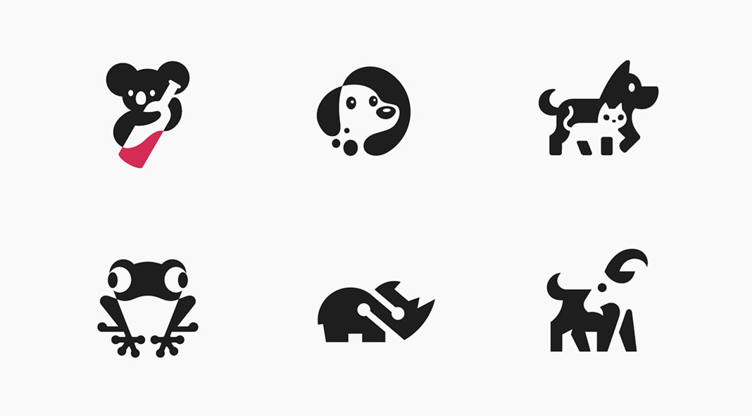
Nothing new but icons are simple, yet effective, graphic elements that can be used to represent different concepts or ideas. You’re probably thinking, “Icons are so overdone. Everyone is using them.” But that’s exactly why they’re such a popular graphic design trend right now. Icons are eye-catching and easy to understand, making them perfect for grabbing attention in a crowded marketplace. And because they’re so versatile, they can be used in a variety of ways to communicate your brand’s unique identity. So if you’re looking for a way to make your mark, consider using icons in your next design project.
13. Photo Manipulation
Photo manipulation effects for Adobe Photoshop by Pixelbuddha.
Photo manipulation is the process of manipulating images to create a desired effect. This graphic design trend is perfect for those who want to add a bit of creativity to their work. There are many different techniques that can be used in photo manipulation, so it’s a great way to experiment with your graphic design.
Vector graphics are computer graphics that are created using mathematical objects called vectors. They can be transformed to any size without loss of quality. Vector graphics are nothing new in the design world but the clean and modern style is currently very popular and can be found across any type of media ranging from print to the web.
90s design was all about big bold statements. From chunky die-cut shapes to DayGlo colors, 90s designers had a knack for making an impact. And while some 90s trends have since fallen by the wayside, others are currently making a comeback. So what makes 90s design so special? Part of it has to do with the fact that 90s designers weren’t afraid to experiment. They pushed boundaries and challenged convention, creating a style that was both eye-catching and forward-thinking. But 90s design also has a certain sense of nostalgia about it. Whether you love it or hate it, there’s no denying that 90s design is here to stay.
One of the latest trends in graphic design is the use of grain and noise textures. These textures can add a sense of depth and realism to a design, and they can also be used to create a vintage or distressed look. Grain and noise textures are often used in conjunction with other effects, such as halftone dots or overlays. When used correctly, they can help to create a cohesive and visually arresting design. However, like all trends, grain and noise textures should be used sparingly, as too much of either can quickly become overwhelming. So if you’re looking to add a little grain or noise to your next project, be sure to use it judiciously.
In the world of graphic design, experimental typography is having a moment. This trend involves pushing the boundaries of typefaces to create unique, eye-catching designs. While experimental typography has been around for decades, it has recently gained popularity thanks to the rise of digital design tools and social media. As a result, experimental typography is now being used by everyone from major brands to small businesses. And while not everyone is a fan of this trend, there’s no denying that experimental typography can be incredibly effective when used correctly. So if you’re looking to add a touch of personality to your next project, don’t be afraid to experiment with your typography.
It’s no secret that computer-generated graphics are becoming increasingly popular. Once relegated to the world of science fiction movies and video games, computer-generated graphics are now being used in everything from advertisements to product packaging. And it’s easy to see why. With their ability to create realistic images and text effects, computer-generated graphics offer designers a lot of flexibility. Plus, thanks to advances in technology, computer-generated graphics are becoming more and more realistic all the time. As a result, we’re likely to see even more computer-generated designs in the coming years.
3D elements are nothing new. In fact, they’ve been around for centuries in the form of sculptures and other art forms. However, 3D design is now starting to make its way into the world of graphic design, and it’s definitely making a splash. Thanks to advances in technology, rendered 3D elements can now be created with ease, and they offer a unique way to add depth and interest to any project. From logos to illustrations, 3D elements are becoming increasingly popular, and it’s easy to see why. If you’re looking to add a touch of dimension to your next project, don’t be afraid to experiment with 3D design.
These days, serif fonts are all the rage in the world of graphic design. And it’s no wonder why! These traditional fonts convey a sense of sophistication and elegance, making them perfect for luxury brands or high-end businesses. But serif fonts can also be used to add a touch of stylishness to more down-to-earth designs. So whatever your project may be, don’t be afraid to add a little serif flair. After all, that’s what all the cool kids are doing these days.
The marketing world is always evolving with new ways for brands to differentiate themselves. The importance of brands being proactive online is vital – but what can brands do offline to help their company stand out?
Experiences offer a brand the opportunity to elevate themselves beyond two-dimensional entities, allowing them to articulate personality and emotion in different ways. Through experience design, brands can take their visitors on an immersive experience that reflects their values, mission, history and so on.
At the forefront of this movement is Mather & Co, an agency that helps commercial brands across the globe to hoist their offline presence and overtake their competitors by creating experiences that showcase a unique brand story. Established in 1995 by Chris Mather, Mather & Co’s work includes the Gretna Green Experience; Downton Abbey: The Exhibition; Silverstone Interactive Museum; the R&A World Golf Museum; and The Royal Mint Experience.
Many of the best brand activations sit at the cross-section between creativity and technology, using the latter as a tool to bring great ideas to life. So, what’s the secret of successful experience-based marketing?
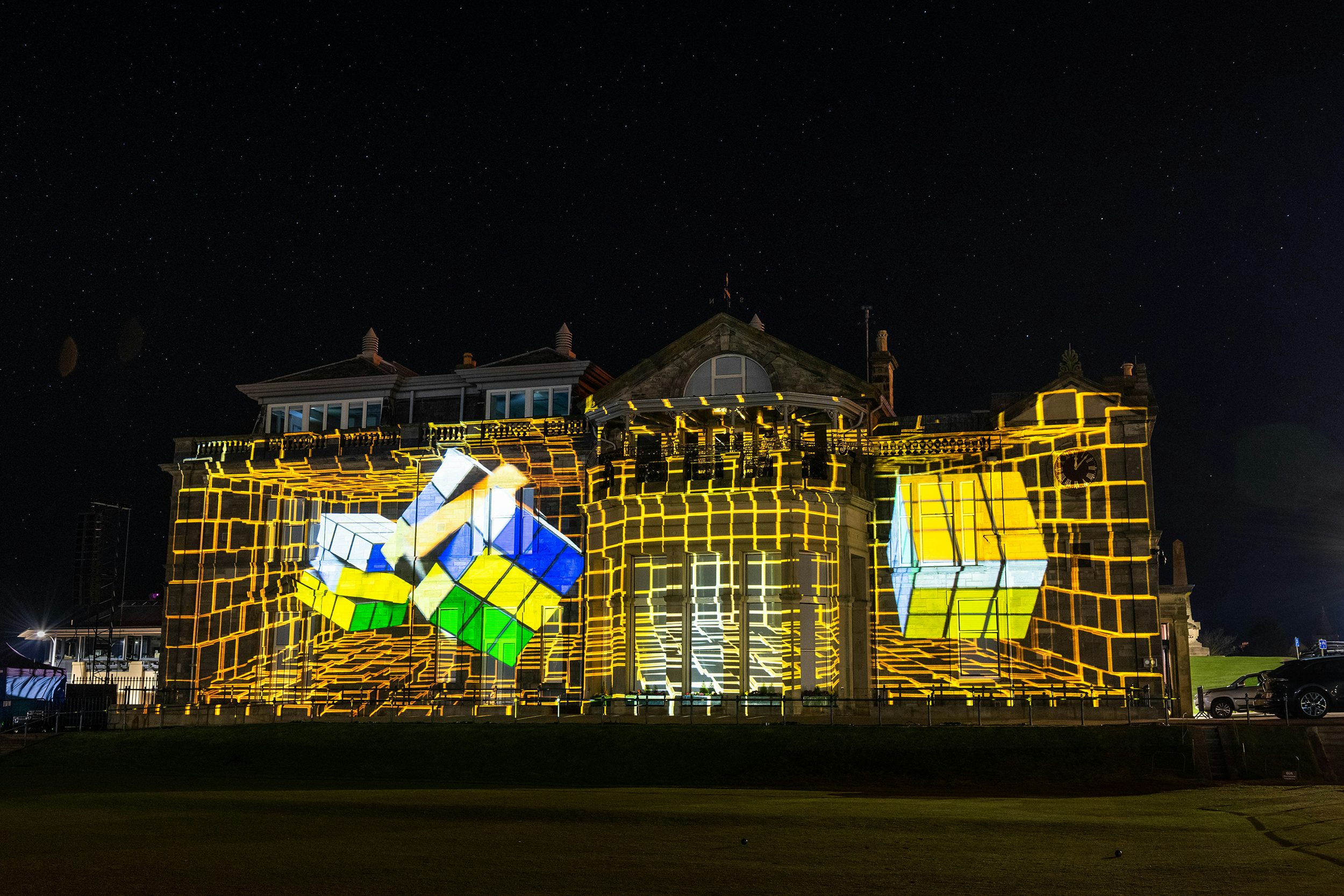
MAKING A GRAND STATEMENT
Projection-mapping technology can transform any irregular surface, such as the face of a building, into a canvas for breath-taking audio-visual experiences that may extend a brand’s reach. Through next-level design and production any surface may be augmented and transformed into an exciting and immersive display to communicate a story or showcase a product.
Successful examples of immersive projection mapping technologies include Wear the Rose, a 360-degree sports experience that took over London’s O2 Arena, as well as a giant installation in Saudi Arabia using the Tuwaiq Mountains as its canvas.
A recent project for the R&A World Golf Museum saw Mather & Co produce the Celebration of Light projection-mapping show across the famous Royal & Ancient Clubhouse building. This extension of the experience allowed the iconic golfing brand to reach millions of people worldwide, narrating 150 years of golfing history to mark the occasion of the 150th Open.
Photo: James Bridle
CONNECTING WITH YOUR HERITAGE
Sometimes it is the history and heritage behind a brand that steers the type of experience you need to develop. The Famous Blacksmiths Shop in Gretna Green is legendary for runaway marriages stretching back hundreds of years, but the legend is in danger of being forgotten altogether with the ageing demographic of visitors.
Here, the Mather & Co team recognised the need to reinvigorate the brand in new ways to connect with younger audiences – creating a new experience on site telling the story of romance, rebellion, and unstoppable love since 1754. The shop has been transformed into an immersive, storytelling experience at the heart of the iconic Gretna Green destination. The experience takes visitors on emotional love story and highlights the business as a whole – a family run business. It is a modern and contemporary take on a 200-year-old history.
“Before the redevelopment, Gretna Green was already a significant destination in British history – the new experience still holds the original magic and romance of the site,” says Sarah Clarke, managing director at Mather & Co. “The experience now allows visitors to delve into the heart-felt love stories and also explores Gretna Green as a brand itself.”
Gretna Green Experience; Photo: Chris HumphreysGretna Green Experience; Photo: Chris Humphreys
CREATING INTERACTIVE MOMENTS
The way people interact in experiences, and what they want from them, has changed dramatically over the past decade. With technology at everyone’s fingertips, people are now looking for more participatory and physical interactivity that they cannot do at home. Creating immersive and interactive experiences allows brands to connect with their audiences in different and more memorable ways.
At the home of British motor racing, the new Silverstone Interactive Museum tells the brand story of the circuit and its place in British motorsport in a fully interactive way. From taking part in tyre changes and sitting in an iconic historic F1 car, to getting involved in the tech lab and designing your own vehicle, this Mather & Co project immerses visitors in the experience – not only enhancing their understanding of the brand, but making them a vital part of it.
Photo: Peter CorcoranPhoto: Peter Corcoran
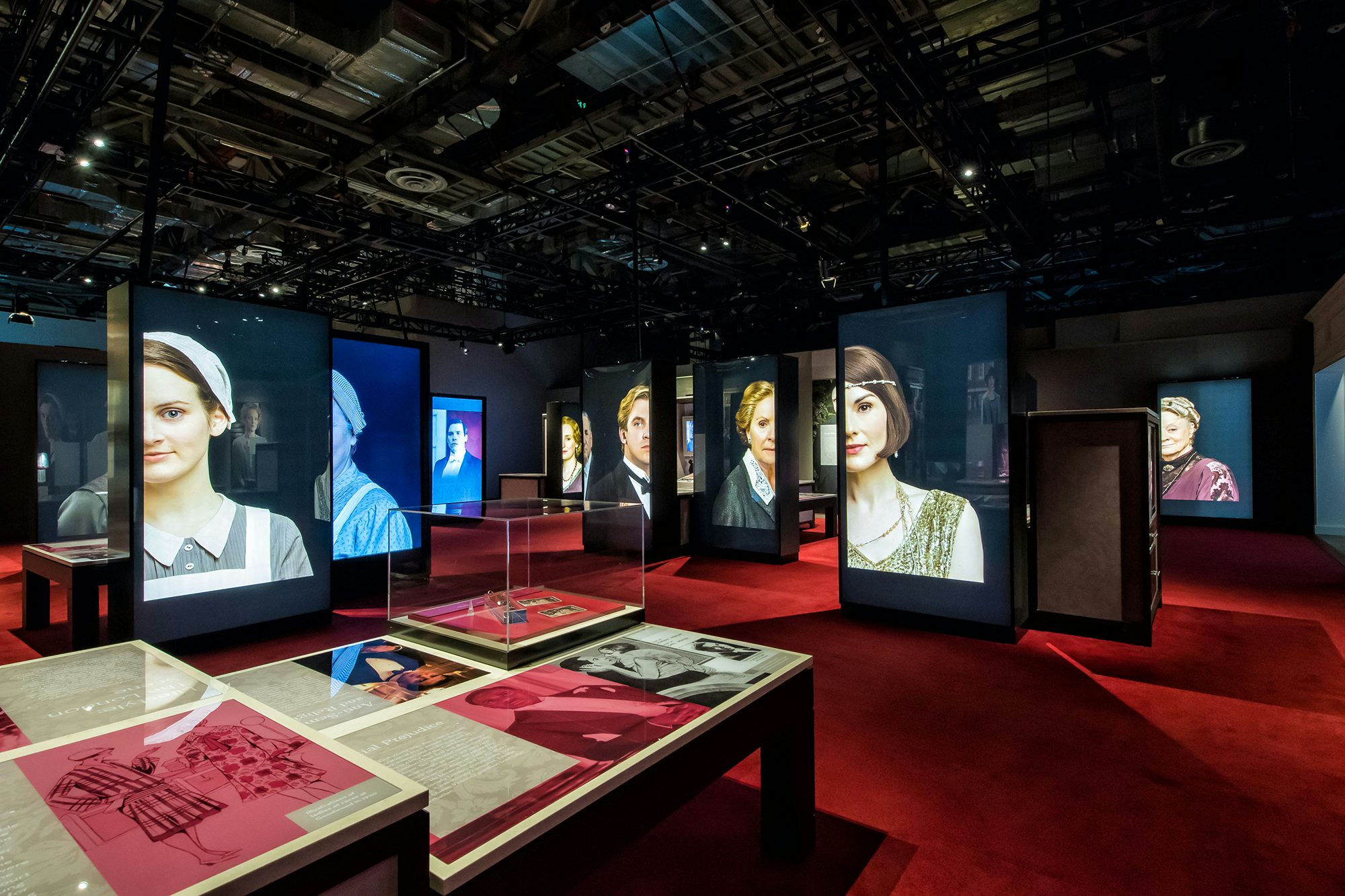
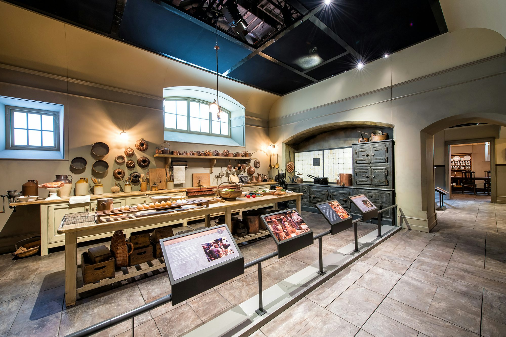
RELIVING MEMORIES
For TV programmes and films, iconic moments are there to draw on in extension experiences. No-one can deny the success of offers such as the Harry Potter Studio Tour, Game of Thrones Studio Tour and the Doctor Who Experience which are sweeping the nation and extending connections with fans of the shows.
“When it comes to designing a visitor attraction, we must understand what makes the visitors want to keep coming back for more,” continues Clarke. “It should be an extension of the brand, so the values must be translated in the experience.”
Mather & Co worked with NBCUniversal and Emmy-winning writer Julian Fellowes to create an immersive experience for the internationally acclaimed TV programme Downton Abbey and created one of the most successful studio tours in the UK around the original Coronation Street set.
For both, the key was to authentically recreate the sets, immerse ourselves fully in the brand and select the memories that resonated the most with fans. It was about taking visitors on an emotional journey beyond the fourth wall right into the beating heart of their favourite shows.
Photo: Bespoke FoundryPhoto: Bespoke Foundry
To discuss how your brand could unlock the full potential of experience design, contact Mather & Co; matherandco.com
Your brand’s graphic design capabilities–or lack thereof–will go a long way in enhancing your credibility and appeal with your target audience.
While there are many things that can make or break a new digital brand, few are more important for growing your initial audience than strong design sensibilities.
The need for strong design goes well beyond coming up with a logo. Design affects your website and all other marketing materials, and can influence everything from users’ initial impressions to your ability to convert sales.
By tapping into your audience’s preferences, strong design can help you cultivate a memorable visual identity that ensures lasting results for your brand.
We are visual learners by nature.
It is estimated that 65 percent of the population are primarily visual learners: This means that pictures and other graphics are their main way of absorbing information.
This should hardly come as a surprise, as studies have consistently found that we are better at retaining visuals than written or spoken information. One study actually found that while only 10 percent of people were able to recall written content after three days, 65 percent were able to remember information that was presented with visuals.
In other words, images and graphic design both make a stronger first impression and are more likely to stick in the memory.
This is why dominant brands like Nike have kept the same logo for years: Strong visual design can boost brand recall like nothing else. When done right and used consistently, a single image or combination of colours can instantly evoke your brand in the minds of your customers.
Strong design quickly communicates your brand identity.
Our brains are able to process images much quicker than text. And in an age when the average person’s attention span has shrunk to eight seconds, that fast processing of visual information is vital for communicating your brand’s identity.
This became especially clear during a recent conversation with Christiaan Huynen, founder and CEO of DesignBro. As part of his company’s platform, Huynen has reviewed portfolios from countless designers, giving him ample insight into what works and what doesn’t.
In our conversation, he was quick to point out that strong design can separate itself from weak design in a matter of seconds. The right combination of colours, images, typography, and symbols conveys identity and can even foster an emotional connection between the brand and the customer.
Even when customers aren’t design experts, they can inherently recognize strong, visually appealing design work–which in turn makes the brand more appealing.
Though it may be a cliche, the idea that “a picture is worth a thousand words” is very much applicable in quickly establishing and communicating a brand’s visual identity. Strong design tells customers if a brand is playful or serious, traditional or unconventional.
Strong design can have a direct impact on your sales results.
Creating instant identity through strong design can have a very real impact on a digital brand’s sales. A study in the United Kingdom found that for every £100 spent on design, a company’s profits would increase by an additional £83. At the same time, customer turnover would dramatically increase. The companies increased profits while simultaneously cutting costs.
In the digital era, strong graphic design draws customers’ eyes to the portions of your website that you most want them to visit. Bold menus and buttons make customers more likely to click through to view your products and services–and even more importantly, add them to their shopping cart.
A well-thought-out design also gives a professional appearance that can assure customers who might be wary of an unknown digital brand. Strong design leads to the assumption that your products or services are of similar quality.
Of course, weak design can have the opposite effect, scaring off customers who judge poor design as an indicator of low-quality products or a potential scam website.
Strong graphic design work that is utilized in your content marketing efforts will also boost engagement and sales. Social media graphics, infographics, or branded photos that are consistent with your brand’s visual identity will boost online engagement and lead to more clicks to your website.
Your brand’s graphic design capabilities–or lack thereof–will go a long way in enhancing your credibility and appeal with your target audience. By making a meaningful investment in design and utilizing best practices throughout your website, you can set your digital brand up for success.
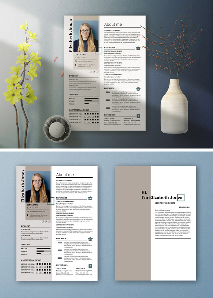
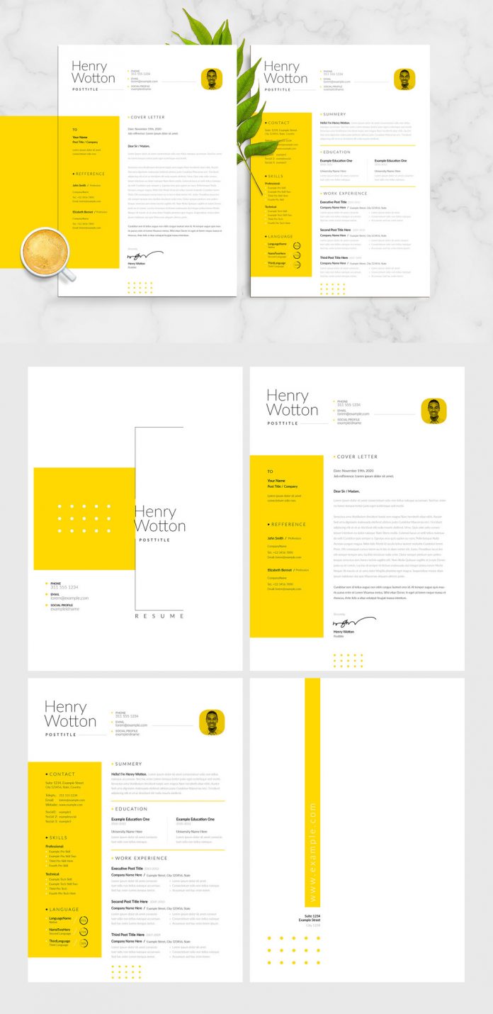
This well-designed resume template is available for download on Adobe Stock.
Consisting of four pages including cover, letter, cv, and closing page, this high-quality resume template is a real eye-catcher. Designed by Adobe Stock contributor @GraphicArtist, this beautiful template can be edited very easily. You only need basic knowledge of how to work with Adobe InDesign. Using this modern and minimalist resume template, you are sure to stand out from the crowd of competitors. Created with a uniform layout and delicate yellow accents, this resume and cv template will hopefully help you to get your desired job.
As mentioned before, this customizable resume template requires Adobe InDesign. You can get the latest version from the Adobe Creative Cloud website, just have a look here. Feel free to learn more about this Adobe InDesign template by clicking on the following link or have a look at the images below.


")