Tag

homepage

Browsing

By 

Visitors enter anywhere, so every page must orient them.

I can usually tell when a website has been designed around an outdated assumption. The Homepage is polished and persuasive. Move one level deeper, however, and the experience collapses. Service pages lack context, articles offer no route forward, and case studies assume prior knowledge.

This is important because people don’t arrive politely through the front door. They enter through whichever URL answers their question, whether that is a search result, an article, a portfolio link, or a product recommendation. In practice, the first page someone sees is their Homepage.

I don’t mean every page should imitate the Homepage. I mean every page must be capable of welcoming a stranger.

For help building your own site, see the best blogging platforms or the best website builders for small businesses.

The Homepage-first journey is fictional

Many website projects are still planned as neat diagrams: Homepage, navigation, enquiry. It looks sensible in a sitemap. Real behaviour is far less obedient.

Search engines surface relevant pages, not necessarily the root domain. Colleagues and friends share page URLs. Campaigns use dedicated landing pages and AI-assisted search recommends specific resources and not company home pages that weren’t cited.

Contentsquare’s 2026 benchmark report draws on 99 billion web sessions across more than 6,500 websites, showing the scale and fragmentation of digital journeys.

Search engines surface relevant pages, not necessarily the root domain. Colleagues and friends share page URLs. Campaigns use dedicated landing pages and AI-assisted search recommends specific resources and not company home pages that weren’t cited.

Contentsquare’s 2026 benchmark report draws on 99 billion web sessions across more than 6,500 websites, showing the scale and fragmentation of digital journeys.

A service page should identify the service, the intended customer, and the outcome. An opening that explains that a company replaces damaged underground pipes without excavating an entire driveway establishes scope, relevance, and distinction.

Clarity here is not simplistic copywriting. It reduces the interpretation visitors must perform before deciding whether to stay.

Self-sufficient does not mean repetitive

The obvious danger is duplication. Once teams accept that every page must introduce the business, they often paste the same company paragraph, accreditation strip and oversized call to actions across every template.

That creates consistency, but not necessarily usefulness.

A Homepage caters to multiple audiences. An internal page has a narrower job, so it should be more specific, not simply smaller

A page should carry enough information to stand on its own while showing evidence relevant to the decision being made. Someone reading a technical guide may need an author biography, review date and links to deeper resources. A prospective buyer needs specifications, availability and guarantees about returns. On a location page, service coverage and local proof matter more than the company’s full history.

A Homepage caters to multiple audiences. An internal page has a narrower job, so it should be more specific, not simply smaller.

Put trust where the claim is made

Instilled website on three mobile screens

(Image credit: Instilled)

One of my strongest opinions about website design is that centralised proof is wasted proof.

Businesses commonly place their best testimonials, certifications and case studies on the Homepage, then expect visitors to seek them out. Most will not. If a service page makes a claim about response times, specialist knowledge or measurable results, the evidence should appear beside it.

That could mean placing a relevant quotation below the process section, linking a performance figure to a case study or displaying the certification required for that work.

Trust is contextual. A five-star review about friendly communication does little to support a claim about technical capability. Strong pages match the proof to the concern occupying the visitor at that moment.

Designers treat navigation as a hierarchy of movement: Homepage, then category, then subcategory, and then a single page. Visitors will move back and forth instead.

Someone reading a blog may want to read one more guide before considering a service. Shoppers often seek another item for comparison. A case-study reader might want to examine the methodology rather than immediately completing a contact form.

Internal links should reflect likely decisions rather than merely mirror the sitemap. Google recommends logical site structures, links between relevant pages and concise anchor text that describes the destination. That is useful SEO guidance, but it is also basic courtesy.

‘Learn more’ places the burden on the visitor. ‘Compare installation options’ tells them what lies ahead.

The next step is not always conversion

There is a persistent belief that every commercially useful page needs a prominent enquiry button. Calls to action are measurable, familiar and easy to defend in a design review.

Sending everyone towards the same form can be intellectually lazy.

Still, sending everyone towards the same form can be intellectually lazy.

A visitor may be researching, comparing, or checking a single detail. The right next step depends on their readiness. Sometimes it is requesting a quote. Elsewhere, it is examining specifications, reading a case study, checking service areas or understanding the process.

I prefer to design for progression, without pressuring visitors. Each page must help visitors make the next useful decision, even if it doesn’t immediately generate a lead. Premature conversion pressure can make a website feel less helpful when visitors are looking for reassurance.

Audit the pages people actually enter

Homepage redesigns attract attention. Entry-page audits are often more valuable.

Use analytics to identify the service pages, articles, products and case studies through which new users arrive. Review each one without relying on knowledge gained elsewhere.

Check if the page is understandable, establishes ownership, presents relevant proof and offers clear progression. Test it on mobile, where breadcrumbs disappear, headings wrap, and supporting context is pushed below the opening section.

The goal is to remove hidden dependencies that make internal pages work only for visitors following the intended path.

The homepage still matters as the broadest expression of the brand. But it no longer owns the first impression.

That responsibility is now distributed across the website. Every significant page is a potential front door, and I believe it should be designed with the confidence, context and care that position deserves.

Feature image credit: Getty Images

By 

Sue Vervaet is a WordPress web developer and Head of Digital at Instilled. She is a highly experienced WordPress web developer with specialist knowledge in custom-built websites.

Her role is to turn written content and design concepts into websites that are easy to use, functional, secure and SEO friendly. With expertise across front-end development, web design, SEO, analytics and content management systems, Sue helps ensure each website is built with both users and search engines in mind.

Sourced from CREATIVE BLOQ

By .

Once in awhile, when browsing the internet, you might get on a homepage or landing page that takes your breath away. Having a great home page does take a lot of effort and time, but when it’s finally done, you can really take pride in your work.

And there’s nothing better than that!

The reason of this article is showing you that landing pages don’t have to be cluttered with information and lots of visuals to be good!

They only need a few great well-executed elements and some eye-candy characteristics!

Let’s start with the beginning.

What is a homepage and what’s its use?

The homepages we’re talking about can represent the pages on which an user gets after clicking a banner ad, a PPC ad, promotional email, a social media post or a link. But also a homepage can the first page presented when a user selects a site or presence on the World Wide Web.

There is more than meets the eye when it comes to landing pages. That’s why a good landing page isn’t about great design or CTA’s or even about very useful visual elements.

The best homepage is considered successful when it drives good ROI and when it starts converting.

Landing pages and also homepages can inspire users to:

  • Buy certain products
  • Sign up for newsletters
  • Create an account
  • Contact team
  • Download exclusive content
  • Connect on Social-Media

Take away Fact:

A landing page does not represent your homepage, but it’s most of the times the first page a visitor sees!

So, what are the components of a great landing page? What are the elements that creates the best homepages for your website?

Well, it’s easier if I’m showing them to you through some great examples I stumbled upon in the last few months.

1. Interactions

There are a few things that can keep a user engaged more time on your website. And one of those things is interaction. If while browsing your website a user goes over an element which has interaction with his mouse, he’ll definitely be attracted to it. It works like magic! And everyone loves magic.

What you can do is simply think about some of the things that can be made more fun and animated on your page. Be it a chat bubble (for support) or some basic interactivity on some of your elements.

These little gimmicks are called ‘easter eggs’ and represent an intentional joke or a hidden message or feature. You might remember them from the online games you played when you were younger.

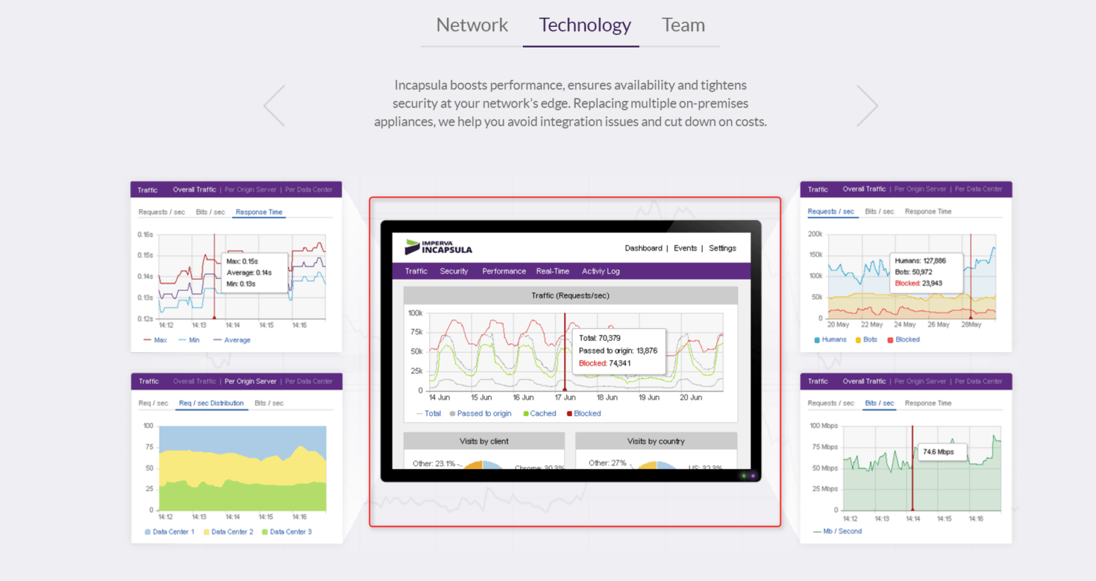
Incapsula is already mastering Easter eggs and has many interactions on its website meant to give something fun and attractive to its visitors. These are the little interactions that makes the difference between an UX designed homepage and just a well designed homepage.

Like this one.

Incapsula homepage

2. Simplicity

‘Less is more’ works in this case too.

Do you remember those cluttered sites of the 90’s? With lots of text, small images and many links? You could get lost in there! Nowadays, people’s attention span has lowered to the point that if they are not immediately attracted to something, they will close the tab.

So make sure your homepage is clean and the epitome of simplicity! Concentrate on what you know is important for visitors, not on what you believe they might like.

Take away fact:

Did you know that 48 percent of landing pages contain multiple offers? That might give a headache to anyone who gets on those landing pages. Why not keeping your offers specific? via Marketing Sherpa

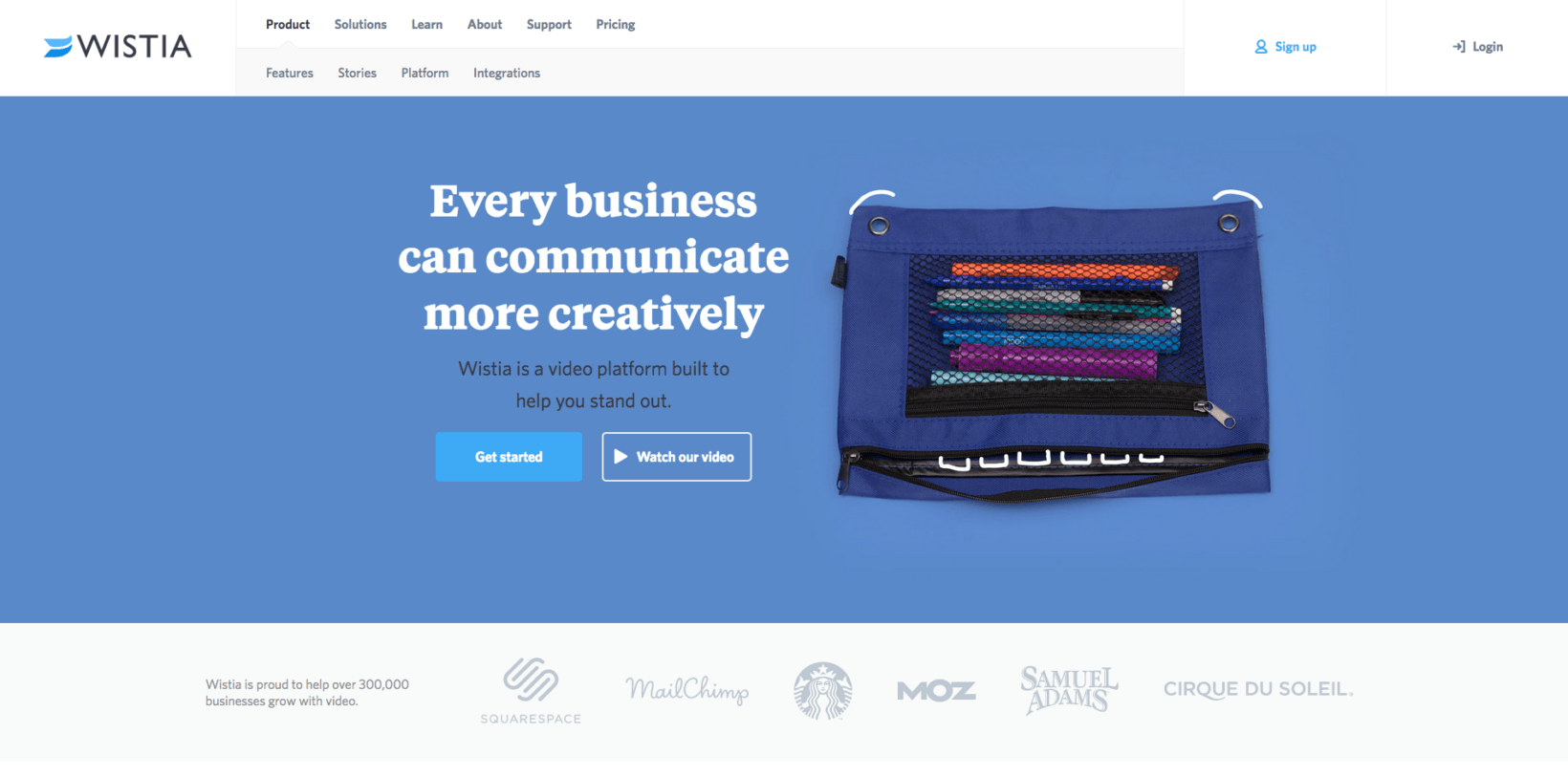
Wistia has a really simple and specific homepage. A simple form with basic information needed and no unnecessary information.

Wistia homepage

3. Great headline

I like to call the headline – the hook of a great landing page.

Why? Because its role is to grab the attention of the reader and inform him what the product or service is about! And that’s what keeps users on the page.

Remember to keep it simple and short. Not more than 10 to 15 words.

What’s important to know when it comes to headlines, is to match the message on your banner ad with the one of your landing page. If your banner ad promises something, make sure that the visitor won’t be disappointed when he gets to your page.

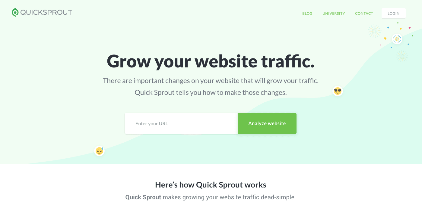
Quicksprout for example, choose “Grow your website traffic.” as a headline.

quicksprout

Why? Because they know what their potential client’s needs are and they can fulfill them.That’s a pretty good ‘hook’!

4. Benefits of the visitors

Your homepage should send the idea that it can help solving a problem or just tell them who you are and what you do. That’s why whatever you choose to have on your page, be it graphic elements or text, they should push the idea that they’re in the benefit of the visitor. People get to your page because they have a pain, a need they hope you can help with.

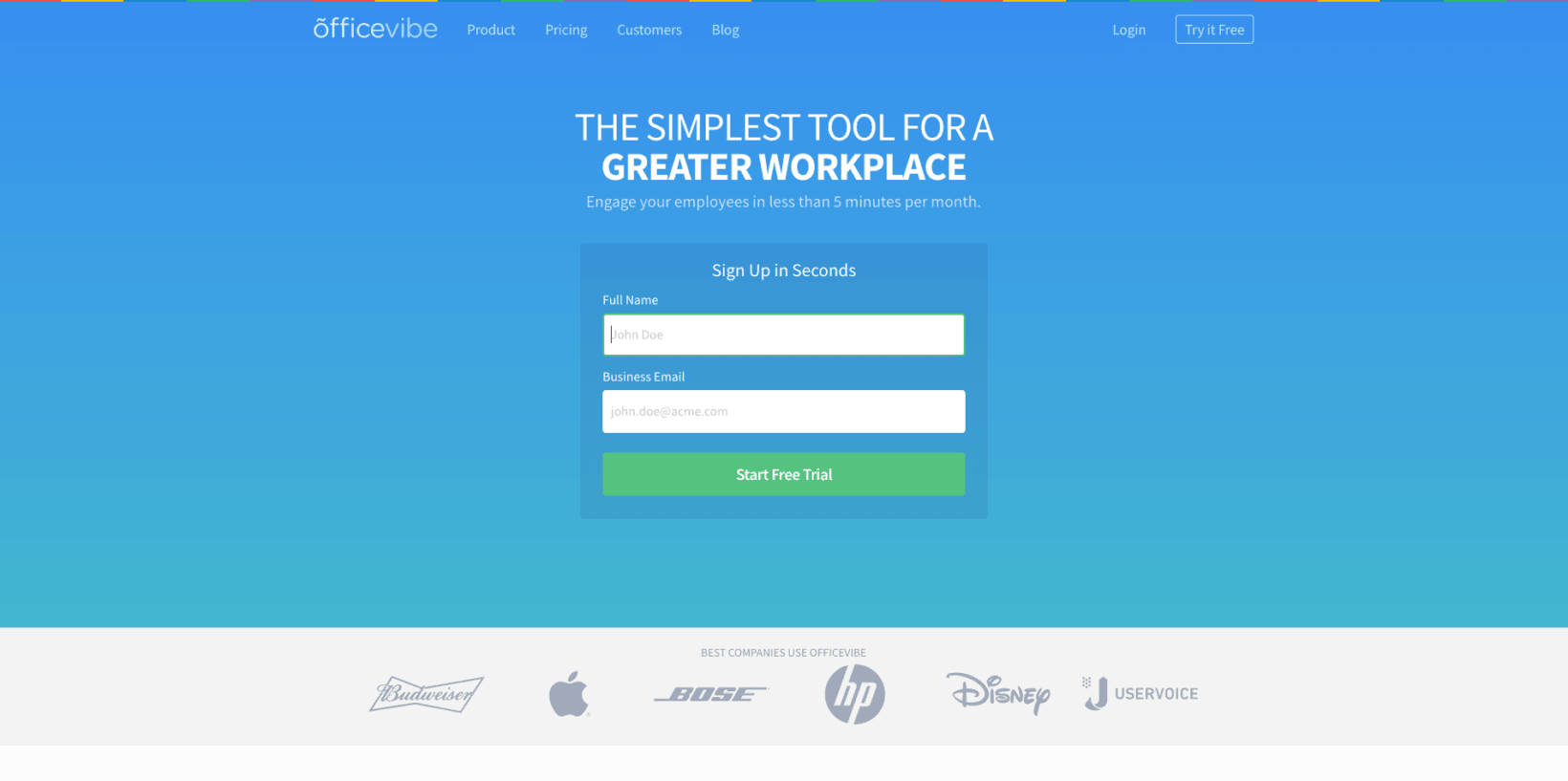
One example I love is Officevibe’s homepage on how easy they can sign up.

officevibe

You can see that the text is concentrated on the visitor with words like “workplace”, “employee”, and last but not least – the CTA “Start Free Trial”.

So if you want to design one of the best homepages out there, make sure that you present your visitors their benefits.

5. CTA

CTA is one of the most important elements in a landing page.

It’s how you get something back from all your marketing efforts.

Try to avoid words like ‘BUY!’ or ‘Download’ and use something more personalized and unique about your product or service.

Smartketer, a banner ad design service, chose a customized CTA for their homepage. If you arrived on that page, you’re probably interested in someone helping you with your banner ads, Facebook or mobile banner ads.

Smartketer banner ads design service

You can simply click the CTA which says “Order banners” and you’ll be taken to an order form to choose your plan.

Quick and efficient!

6. Branding and design

As I said above, there must be a correlation between your banner ad and your landing page, and not only when it comes to text.

We, as humans, are attracted to variations of colors! The difference of color between the background and the key points of you landing page directs the visitors exactly where you want them to go. What’s really helpful when choosing the right palette for your landing page, are your brand colors. You can always use your main brand color for your background and contrast your CTA with something else from you color scheme.

When it comes to visuals, they can be photos, illustrations, graphic elements or even short videos! If you’re a blogger or a thought leader, one of the greatest strategies is using a photo of yourself in the homepage or landing page of your website.

Paul Jarvis homepage

Paul Jarvis chose to use his photo as background for his homepage, while still focusing in the email subscription box.

The white space is also very useful in this case.

If used correctly, it gets from ‘nada’ to ‘Prada’ in seconds by directing the viewer’s attention to what’s important.

7. Social proof

What’s the best proof that a product or service is worth your attention? Some other people that can swear by it, of course!

Susan Weinschenk author of Neuro Web Design: What Makes Them Click? said that,

“If you want people to act on the data, then you need to couple it with emotional data.”

And that’s exactly what social proof is.

There are a few ways through which you can use Social Proof on your landing pages or homepages:

  1. Testimonials

You can easily ask some of your customers to tell you why they love your product. This tactic credibility can be boosted if you’re adding a photo next to the quote. Or you can talk with influencers from your industry to give you a quote about your work.

  1. Social Media shares

Social sharing buttons are besides great tool for growing your community, but also, an efficient tool to prove the reputation of your product.

  1. Embeded Social Media posts

Nowadays, in the age of opinion, everyone is encouraged to put it on the Internet. Even though most people use Social Media for rants and public shaming of some brands, you might find a gold mine of positive posts about your product. Don’t forget to ask for permission before embedding the posts on your website!

  1. Publications proof

Top websites in your industry that wrote an article about your brand can be a social proof. For example, if you are an entrepreneur and you have a personal website and publications like Inc or Entrepreneur mentioned you in one of their article you can add it to your website. People will know that you are a big deal in your industry.

Conclusion

If your purpose is to increase conversions and have great results (and don’t we all?), you should really give all you’ve got to create a rocking landing page! You don’t even have to follow all the guides and trips and tricks you find on the internet.

All you need to do is keep in mind your objectives, your audience and keep all simple!

What are other examples of the best homepages you found while browsing?

Photo Source

By

Sourced from TNW