For years, brand homes—dedicated spaces where consumers can immerse themselves in a brand’s story, values, and products—have prioritized either exclusivity or mass accessibility. Activations have often cantered on exclusive ultra-high-net-worth experiences, while easily accessible brand history-focused locations risk veering into tired museum territory—rarely giving visitors a reason to return.
But the next generation isn’t interested in velvet ropes or a dull brand history lesson. Those are the experiential codes of the past. Today’s brand home must speak in a language that chimes with the younger audience it’s trying to captivate.
Embracing a New Aesthetic
Gen Z have finely tuned visual tastes. They’re drawn to the surreal and captivated by AI-powered imagery. For them, everything is subconsciously expected to be ‘aesthetic’ and Instagrammable—even the most functional spaces. ‘Fridgescaping’ videos are on the rise over on TikTok, for example, while Pinterest boards showcase airport security trays artfully arranged with visually pleasing objects.
As the digital generation, Gen Z crave real-life experiences as a form of escapism—but only those wrapped in exceptional execution. A brand home targeting this audience will win by translating Gen Z’s AI-driven visual sensibilities into real-world environments that feel born from an algorithm and built to be shared. Spaces that look like they’re plucked straight out of a social feed.
In 2025, following the success of the Back to Nature rebrand, UK agency, LOVE hit the road (literally) with a joy-packed ‘Snack Stop’ pop up on the California coast—which took snackers on a nostalgic trip to a time when life was simple, and snacks were great. Popping up at the iconic Abbot Kinney, the gas station-inspired space had a bright, bold shop exterior, while a stylized gas pump and pink convertible Cadillac filled with goodies added a cool photo op for both visitors and passers-by. Throughout the space, props tapped into the brand’s tone of voice while providing content for the ‘gram
Harnessing Gen Z’s FOMO will be a critical part of future brand home strategy. We’re hardwired to feel the ‘fear of missing out’ when something—or somewhere—is temporary. Spaces needs to constantly deliver new, time-sensitive news to give people a reason to return.
Gen Z are digital natives, shaped by fast-scrolling, ever-changing feeds—and they crave experiences that mirror this pace. For brand homes, this means crafting permanent spaces with a pop-up mentality: modular, shapeshifting environments that transform with the time of day, season or cultural—environments that lean into the temporary and the fear of missing out. Selfridges’ ‘The Corner Shop’ leads the way—a pioneering retail concept that allows guest brands to creatively take over the space.
This mindset extends to the way Gen Z travels. They sidestep tourist clichés in favour of cultural ‘hidden gems’—places they can discover and share before they hit the mainstream. For brands, this means seeking out locations that feel both relevant and unexpected, and designing them as culturally rooted destinations that reward early adopters. IKEA turning up for a ‘Hack House Party’ in a north London neighbourhood, staged ahead of its Oxford Circus store opening, is a great example.
Enable Community and Connection
Another powerful driver is Gen Z’s desire for community. Togetherness and connection should sit at the heart of every brand home brief. This generation looks to brands for a sense of belonging and for cultural moments that feel like a reward for their loyalty. A brand’s cultural involvement with its surrounding community can have a significant impact on a consumer’s purchasing decisions. It reflects a cohort that values creativity and brand-relationships through the lens of connection and self-expression, not status and exclusivity.
Gen Z also seek knowledge exchange through creative, enriching spaces. Brand homes should be reframed as cultural hubs and creative playgrounds – places where guests will want to come and stay.
Tapping into our ever-expanding opportunities for entertainment and experience, brand homes are most successful when they are multifaceted, merging art installations, music, food, fashion and performance. Product buy-in will follow. Prada Mode’s travelling club embodies this approach: a destination for contemporary culture, offering guests unique art experiences alongside music, dining and conversation.
So, this is where brand homes are headed. In the future, they must be living, breathing spaces that evolve with shifting tastes and values, keeping pace with a new generation. By blending heightened aesthetics, ever-changing experiences, and a genuine sense of community, brands can create spaces that not only attract visitors, but ignite cultural movements.
This industry perspective is by Ella Palmer, culture and strategy manager at Manchester, United Kingdom–based creative agency LOVE.
Ella Palmer is the culture and strategy manager at Manchester, United Kingdom–based creative agency LOVE., which partners with global brands across the arenas of sport, luxury, food, alcohol and beauty. Guided by the mantra “We see what you won’t,” LOVE. has shaped strategies and campaigns for clients including Heineken, Hendrick’s, JBBDCo., Laithwaites, Lucky Charms, Moët Hennessy, Nike, Penfolds and SK-II. A trend forecaster and strategic thinker, Palmer combines cultural insight with creative curiosity
Design Director at Mother Design, Bentzion Goldman, feels identity design has become safe, sanitised and downright boring in the last 12 months. Let’s flip that in 2026, he argues, and make branding weird again.
his is the third year I’ve written about trends and predictions in branding. It usually goes like this: I review the year’s biggest identity design work, layer in my own observations, and provide a light roadmap for the year ahead.
But this year was different. Looking back at the biggest rebrands, what was most remarkable was how utterly unremarkable they were. What stood out was not how bad the brands were but rather their overwhelming okayness. A troubling trend became clear: the rise of safe, forgettable branding.
2025 was the year of Cracker Barrel, the year of HBO MAX / MAX / HBO MAX, and the year of MS NOW (née MSNBC). All branding efforts landed with, at best, a sigh and, at worst, public outrage. What’s more, some of the biggest changes were so subtle you may have barely noticed them: Amazon, Tripadvisor, Verizon, Walmart, Lyft, and OpenAI quietly tweaked their brand systems, even if some of those endeavours were billed as overhauls. Creative Boom even wrote a piece on how the quiet rebrand took over 2025.
Don’t get me wrong, on two accounts. I believe in the power of a masterful brand refresh that subtly tweaks its brand elements, artfully balancing heritage with progress. And there was beautiful, innovative branding released this year. But something deeper emerged when looking at brands with the highest visibility. You might recall the ‘blanding’ era of the 2010s. I think we’ve hit a similar wall at this moment, but for altogether different reasons.
Everything is just okay
Earlier this year, I read James Poniewozik’s piece for The New York Times, The Comfortable Problem of Mid TV, which has stayed with me ever since finishing it. Poniewozik argues that we’ve entered an era in TV where everything is just … okay. He writes that a decade ago, we experienced an era of a lot of bad TV, but the risks and imagination required to make those shows also led to many standout series.
Now, the advent of high-pressure, high-budget streaming platforms and an associated low appetite for risk have resulted in a slew of shows that are beautifully shot, incredibly expensive, and yet—just okay. True creative risk-taking is exceedingly rare to find. Instead, we have a lot of the perfectly acceptable yet often emotionless middle ground.
I believe something similar is happening in the world of branding.
The enemy of a good brand used to be a bad brand: badly kerned typography, poorly chosen colours, and digital illiteracy. Today, the enemy of a good brand is no longer a bad brand, but one that is just okay.
The proliferation and democratisation of design software, along with an increasing awareness of design among the general public, have created an environment where even the smallest teams can produce competent branding. And let me be clear: this is a good thing. Design should be for everyone, and the ability for clients, beginners, and non-designers to create design work elevates the field for everyone. Per a Michael Bierut anecdote, the fact that we now have online trolling of rebrands means people care about branding!
But this new reality has also resulted in a sea of work that’s simply okay. Scroll through this year’s branding projects, and you’ll see a multitude of brands using the same tricks. Many of these identities have no technical fault, and yet they lack a certain emotional depth; the kind of spiritual centre that makes a brand truly resonate with its audience.
Striking a nerve
I think this exact feeling is the reason why the Cracker Barrel rebrand struck such a nerve with the general public. The original identity may have had technical shortcomings, but what the new brand gained in optimisation, it lost in emotional resonance. And now the pushback has created a heightened environment of fear where brands are now even more risk-averse, wary of becoming the next big branding flop torn apart in the comments.
In this new era of mid-branding, we need a new playbook. One that empowers designers to expand their aperture and dare to dream again.
So what’s the way forward? Allow me to advocate for the value of being weird in design.
Weird gets normalised
The simple truth is, people don’t know what they like until they see it. And until they like it, they might hate it. History is full of examples of art so novel in its time that it provoked outrage and even violence. The sans serif style of typography, now completely commonplace, was once considered so radical compared to the serif and ornamental styles of its era that people called it monstrous, ugly, and grotesque—a name that stuck.
In 1913, a ballet by Igor Stravinsky called The Rite of Spring was so innovative for its time, with its use of syncopation, dissonance, and sharp dance movements, that people hurled objects at the stage, cried, and even started fistfights in the audience. The police were called to calm the riot. And you thought the comments on Brand New were bad. Experimentation and transgression are vital for discovering new ideas and finding novel ways forward.
What’s remarkable is that these examples, once shocking innovations, are now normalised. The lesson is profound: people hate change, but, given time, change softens until it becomes the new normal. It is up to us designers to be the tastemakers and the future tellers. This is radical permission: it is a licence to look beyond familiar references and to challenge what we consider ‘good design’.
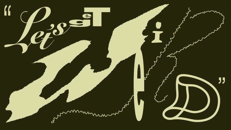
Image by Bentzion Goldman
This idea is illustrated by industrial designer Raymond Loewy’s MAYA principle: Most Advanced Yet Acceptable. This urges designers to push things as far as possible, up to the point where they remain within the tolerance of user comfort. In other words, design something unoriginal, and it will feel predictable, yet design something too radical, and you could incite a riot in a ballet theatre. Our charge, as designers, is to find that sweet spot right on the bleeding edge of innovation.
Here are three brands from the past year that do exactly that.
How to do it
Cotton Design’s identity for Eternal Research is a retro-futuristic system featuring an engraving-inspired wordmark, eleven Victorian-inspired headline typefaces, generative ornamental patterns made with code, and a triangular piece of hardware called the Demon Box. The system defies easy categorisation, balancing minimalism and maximalism in a way that feels immersive and genuinely new.
Mother Design, which I must confess I work for, released branding for Fhirst, a prebiotic soda line that burst onto the market this year. The packaging system draws on the joyful design of early 2000s soda branding, featuring a reverse-contrast script wordmark, an animal mascot for each flavour (the dolphin is my personal favourite), Papyrus as a supporting typeface, and gradients, bubbles, and starbursts galore. It’s a more-is-more system that could easily fall off the rails, but never does, thanks to careful selection and use of brand elements. Instead, the brand radiates pure joy; I have yet to see someone scroll through the project without smiling.
The final project is Clue Perfumery, with design and art directed by Caleb Vanden Boom. Its script logo is beautifully weird, with extreme contrast and bottom-heavy curves that feel both refined and expressive. The brand’s editorial tone is elevated by wildly imaginative art direction: perfume bottles photographed in fish tanks, large-scale butter sculptures, and, most recently, a limited-edition scented stone sculpture shaped like an apple. Clue is one of those brands where the connective tissue isn’t a single idea, but rather good taste and boundless creativity. The eclectic choices work in harmony, resulting in a brand that is lush, unexpected, and engaging.
A Victorian-inspired triangular musical instrument, soda mascots featuring dolphins and eagles, and a perfume bottle covered in butter: these are the kinds of daring choices that push boundaries and yield designs with emotional resonance. These brands are not weird for the sake of it; rather, the unexpected choices are deeply connected to who they are as a brand. The designers involved in their creation reject the safe route, opting instead to question, to research, and to play.
Feeling optimistic
I have every reason to be optimistic for the year ahead in design. We have more tools at our disposal than ever, which means bigger challenges and bigger rewards. I think we will see many brands that make us scroll quickly past without batting an eyelash. But through the sameness, the smartest, most creative, and weirdest brands will find a way to stand out and create inspiring, innovative work.
And for the designers among us, this framework gives us permission to step outside our peripheries and dig deeper for inspiration. In our age of automation and algorithms, designers have the privilege of interrupting the churn of predictable sameness with the uniquely human elements of taste and unexpectedness. Everything is possible, because what is bizarre, weird—even grotesque—today is merely normal tomorrow. So, my biggest hope for the year ahead is precisely this: let’s dream again.
Ever felt invisible? We share the world with 8 billion other people, and it’s easy to feel like you’re fading into the background in the hubbub of the city. Likewise, every business shares its industry with a huge number of competitors in a crowded market.
Sure, you might be more affordable, reliable, or innovative than your competitors, but your customers don’t know that for sure until they’ve tried you. Before that happens, you have to stand out from the crowd.
The way to do that is with clear brand identity design. A tight brand identity communicates your difference to your customers, sets you apart from your competitors, and makes you memorable to anyone who has used your products or services already.
Brand identity design is the sum of every visual and tonal branding choice your business makes. When it’s done well, it creates a coherent identity that gives you a relationship with customers that transcends the transactional.
The truth is, if you want to build a business in the 2020s, you need to build a brand. So let’s dive into brand identity design.
What is brand identity?
When you shop with the businesses and brands you love, you feel something.
IKEA doesn’t just make furniture, it furnishes homes with thriving families crafting their individual lives inside. Louis Vuitton doesn’t just sell bags, they sell luxury, and anyone buying a Louis Vuitton bag gets to feel, for a moment, a sense of that luxury in their lives.
This is brand identity: it’s how your customers, and potential customers, view your brand. It encompasses your mission, your values, and your brand tone.
Brand identity is built through various channels and strengthened in every interaction with your customers, but it is communicated in the first instance through the very first things your customers notice about your brand: your name, your logo, your tagline, and the wider visual elements of your brand.
Get the elements of brand identity design right, and you’re off to a strong start.
Why is brand identity important?
According to research published by the Economist, ‘brand’ creates around 30% of the value of companies in the S&P 500. A strong brand identity has a big impact on your bottom line.
Every successful brand has carefully crafted an identity so that its customers know exactly what the brand stands for. A brand identity connects your products or services with the lifestyle of your audience, and customers can have a meaningful experience when they shop with you.
In competitive markets, a strong brand identity ensures you stand out from your competitors and plays an important role in both reaching new customers and ensuring the loyalty of existing ones.
It takes work to create and maintain a brand identity, and that’s where brand identity design comes in. Brand identity design is the process of crafting your brand identity through your brand’s style choices, marketing and communication, and customer service.
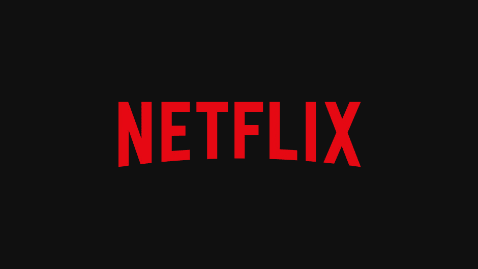
A quick case study in brand identity design: The Netflix brand
Examine any one of the products and services you regularly use and you’ll see the elements of brand identity.
Take Netflix, used every day by millions of people around the world, and a quick analysis reveals:
A great, memorable name with a modern, disruptive feel and a clear link to the product.
An iconic logo, with arcing text reminiscent of the cinema experience.
A distinctive black and red colour.
Minimalist typography choices that emphasize ease of use.
A quirky brand tone on social media.
Image Source
Did Netflix grow into an online streaming giant by accident? No, they used clever brand identity design to do it.
Everything is considered, creating a consistent brand experience every time you open the Netflix app. In fact, they even use sound as part of their brand identity. You think of Netflix as soon as you hear that “badum”, right? Even the souped-up movie theatre version.
The bare bones of brand identity design are everywhere, once you open your eyes to them. Let’s take a closer look.
How to start developing your brand identity
To design a brand identity that fits your business and will resonate with your target audience, you first need to ask (and answer) a few questions.
1. What is my brand’s purpose?
Everyone launching a business has a big idea, and every idea has a story behind it. Identify the unique value proposition that your business offers its audience: what has driven you to start your business and what do you have that your competitors lack?
Your purpose is the foundation of your brand identity, and as you develop your brand identity design you’ll be able to communicate your mission to your audience at every step.
2. Who is my audience and what do they want?
Brand identity design isn’t just about you: it’s about building a relationship with your customers. Building a strong brand identity is a dialogue, so you have to understand who you’re talking to.
Conduct market research to discover exactly who your customers are, what they dream about, and what they want to hear from you.
At the same time, perform some industry analysis to understand your competitors’ brand-building projects. Ask yourself what they’re getting right and what they’re missing. Spotting key trends in your industry can give you some shortcuts in communicating your purpose with your audience.
3. What core tone will work for my brand?
Your brand tone is like the personality of your brand. It should communicate your purpose and values to your audience, in a way they’ll be receptive to based on your research.
Luxury brands communicate exclusivity and prestige through their brand tone, while disruptive brands might be cheeky and creative.
Here are some brand tone examples:
Cutting-edge and innovative
Quirky and playful
Warm and homely
Your purpose, your audience, and your brand tone will come together to define your brand. Now it’s time to communicate your brand identity to your audience: let’s take a look at brand identity design.
What are the elements of brand identity design?
Once you understand your brand identity, you can begin brand identity design. Careful curation of the imagery and style choices associated with your branding will enhance your brand identity, reinforce your values, and fix your brand in the hearts and minds of your customers.
1. Craft your logo
Your logo is the launching point for brand identity design. It will be the most consistent image accompanying your products and can provide a foundation for further style choices, like colour and font choice.
A good logo must always be simple and memorable, but that doesn’t mean it’s simple to design one. Your logo needs to evoke your brand’s purpose and values and be versatile enough to use across video and still image marketing marketing material.
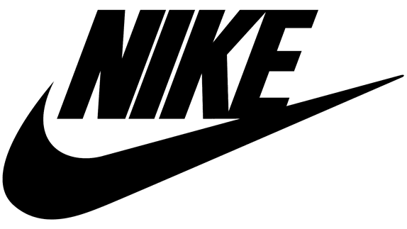
Prioritize simple, block colours and clean lines to create an uncluttered logo that consumers can grasp at a glance. Nike’s iconic swoosh symbolizes movement and sports, while Google’s utilitarian logo is paired with a splash of colour. Both create timeless imagery to accompany the brand’s further design choices.
You should have a consistent colour palette to accompany your brand’s communications. As well as being functional (a predominantly black logo will fail to stand out against a dark colour palette) your choice of colours will also stir your customers’ emotions, so choose the right ones.
Read up on the psychology of colour to understand how your colour palette will influence your customers and relate to your brand tone. If you want to create an impression of security and trust, lean on blue tones while orange is connected with creativity and confidence.
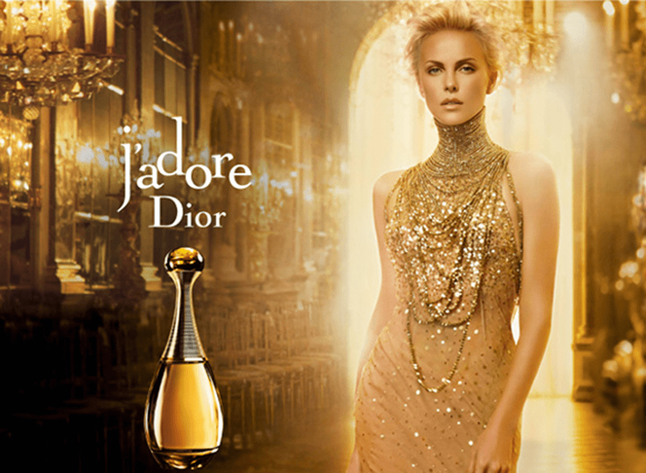
Mailchimp has opted for a ubiquitous cavendish yellow for its brand identity design, a colour that’s memorable and energetic. And we can see how to colour choices of the fashion house and perfume brand Christian Dior emphasize luxury
The next ingredient in brand identity design is your typography, and the fonts you use can say a lot about you.
Burberry’s new serif font has a classy and timeless feel, while simple fonts like those across Google’s branding are friendly and appealing. You could even design a new font based on sketches or handwriting if creativity and personality are at the heart of your brand identity.
Your typography choices should align with your logo and color palette, and they should always facilitate understanding rather than confusion in your customers. Mixing typography can create visually appealing contrasts, but avoid overly elaborate typography that’s hard for customers to interpret.
We’re visual creatures, devoting almost half our brain processing power to what we see around us. That means a visual language, one integrating icons and graphics, is a powerful addition to your brand
Throughout your branding, ask yourself if you could say it with a picture and if so, what kind of imagery would appeal to your customers and remain consistent with your brand tone.
Google’s strict guidelines for imagery and icons create an intuitive visual language for customers. For your own, you might prefer artistic sketches that appeal to your customers’ creative side or something photo-realistic over computer-drawn graphics.
5. Keep it consistent
While there are many important choices within brand identity design, the choices you make should be fixed. It’s fundamental to the functioning of your brand that your design choices are consistent across your website, product design, social media, email newsletters and anywhere else you have the opportunity to use them.
Consistency is professional and it will reinforce trust in your brand. But more importantly, it helps get the message across and builds a coherent identity that customers begin to understand implicitly. Eventually, it might take nothing more than a splash of your iconic colour to remind your customers of the values that your brand is founded on.
Building a brand style guide alongside your brand identity design can help keep your brand consistent. Your style guide can document your chosen colour palette, typography, and visual language, it can quickly onboard new hires who are learning about your brand tone and it can streamline the process when you hire creatives for new campaigns.
A brand style guide can even outline the tone your employees take when talking to customers, the arrangement of shop floor displays, and the rules for sonic branding. Brand identity design begins with your name, logo, and the immediate visual components of your brand, but the strongest brands curate every instance of user experience to align with these fundamental elements.
Brand identity design examples
Think about any of the brands you love, and you’ll realize that they have a coherent strategy around brand identity design. The most successful examples of brand identity design aren’t obvious: these brands have created a brand identity that feels organic, and customers connect with these brands naturally.
However, it doesn’t happen by accident. Every brand, from Christian Dior to Mailchimp, has made key decisions about every aspect of their brand design. Here are some brand identity design examples to draw inspiration from.
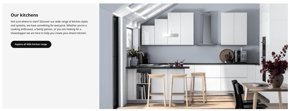
IKEA
IKEA’s powerful branding gives them a strong top-of-mind awareness. The iconic colour scheme of their logo was inspired by their Swedish origins, but as well as being a patriotic nod to their homeland, it also effectively emphasizes the clean design and practical functionality they’re known for.
Even the name ‘IKEA’, in block capitals, combines pre-eminent practicality with a stylish and exotic twist.
Across IKEA’s branding, they use clean, uncluttered imagery, real photography over graphics, and prioritize neutral colour palettes.
This combination creates space for IKEA’s customers to project their desires onto their products, to the extent that the whole process of shopping at IKEA is one of self-actualization.
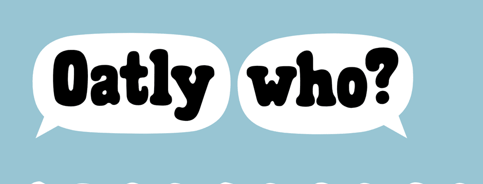
Oat milk brand Oatly follows well-established naming trends, with the -ly suffix immediately hinting that this is a disruptive brand outside the establishment.
They have created a quirky brand identity through their design choices, using subtly unaligned custom fonts to create an invitingly unprofessional feeling, and have perfected a warm, casual brand tone packed with offbeat humour.
Importantly, this humour is consistent across their social media, website, and product packaging to create a cohesive identity.
Oatly is a friendly brand integrating itself into the lifestyle of its users. These design choices might appeal to vegetarians and vegans already looking for alternative milk products, but by creating a wholly unpolitical brand identity, they effectively target young consumers from all walks of life.
Oh, and does anybody else see a cow in the black-and-white ‘Oatly Who?’ design above? Talk about subliminal.
Final thoughts
In a competitive business environment, the strength of your idea alone doesn’t guarantee success. You also need to communicate that idea to your customers, in a way that meaningfully connects your business with their lifestyle and aspirations.
That’s why building a brand identity is essential, and understanding brand identity design lets you optimize every detail of your brand to send the right message.
From a timeless logo, creative typography and a colour palette that leverages your customers’ psychology, brand identity design gives you the tools to build a powerful brand. Ready to get started? Check out our Brand Identity Design service at Squadhelp.
By Lotte Reford
Guest Author:Lotte Reford is Communications Lead for Squadhelp.com, an innovative naming & branding platform with more than 40,000 customers globally, from the smallest startups to corporations like Nestle, Philips, Hilton, and Pepsi.


 Back to Nature’s Pop-Up Snack Shop
 The James Beam Distillery offers varied experiences and is a cultural destination in the Clermont Kentucky community with events ranging from bourbon tastings to Kentucky Derby parties.
 The Guinness Storehouse in Dublin offers an immersive, multi-floor experience at St. James’s Gate