Tag

landing page

Browsing

Sourced from Forbes

Having a well-designed landing page is crucial for businesses to achieve their key performance indicators (KPIs) and boost their bottom line. An effective landing page can captivate visitors, convert them into leads or customers and ultimately drive revenue. However, creating an effective landing page is not merely about aesthetics; it requires a strategic approach.

Below, 18 Forbes Business Development Council members explore proven strategies to create landing pages that not only meet KPIs but also maximize conversions and contribute to the overall growth of your business.

1. Focus On Your CTA

A single, clear call-to-action (CTA) is a vital strategy for an effective landing page. This simple, direct proposition guides visitors towards conversion, improving KPIs and the bottom line. Ensure your CTA is compelling and distinct, making the next step unambiguous for maximum impact. – Tomer Warschauer Nuni, Pink Moon Studio Ltd

2. Be Consistent

Consistency is key. A landing page must have a clear call to action that aligns with the primary goal of the landing page. The “hook” has to be relevant to the goal and call to action. – Mark Clark, Modern Optical International

3. Demonstrate The Benefits To Customers

To effectively meet KPIs and increase the bottom line, your landing page needs to gain a prospect’s attention and lead them to action. Catch their attention with interactive graphics and video, but also deliver a “what’s-in-it-for-them” message—highlighting ROI, customer successes and testimonials. – Julie Thomas, ValueSelling Associates

4. Be Strategic When Choosing Your URL

An effective landing page starts with an effective, easy-to-remember URL. Think about vanity phone numbers—this would be a vanity landing page URL. Then, leverage the key pain points needed on that page so that people fill out the form or do your CTA. An easily-remembered URL, along with addressing pain points, is a win-win for all. – David Strausser, SEIDOR USA

5. Conduct A/B Testing

Create one to two landing page templates with content tailored to the audience. It’s critical to establish consistent layouts to properly A/B test which specific elements perform the best for each audience. Create messaging and value proposition “hooks” around keywords your audience searches for at each phase: education, consideration and decision. – Janet Waring, ArtForm Business Solutions, Inc.

6. Tailor Your Landing Page Strategically

We customize our landing page for some of our most strategic accounts. This means that when an individual from a strategic account visits our website, the content that they see is personalized for their company and industry. Web personalization helps create customized and unique experiences for customers and prospects rather than providing a single broad experience, helping to increase conversion. – Rakhi Voria, Procore Technologies

7. Optimize The Page For Conversions

Leveraging social proof helps alleviate visitors’ doubts or hesitations and increases the likelihood of conversion. Place these elements strategically, close to the CTA, or near critical benefits. – Lomit Patel, Tynker

8. Create Unique Pages For Adverts

Many businesses use the same landing page for all adverts. A landing page must be unique to the advert. The advert is the hook, the landing page must instantly reinforce the consumer’s decision to click on the hook by displaying the product, price and delivery, and then clearly outlining the CTA. The effectiveness of the landing page’s success hinges on its ability to match the advert. – Peter Schravemade, REACH ASEA

9. Use A ‘How To’ Headline

We lose more than half of the people who visit a landing page. The most effective way to keep them is to offer a benefit. The headline is going to be crucial. It doesn’t have to cost money, although a “get 10% off” headline works well. The “how to” headline works just as well because you are teaching customers how to solve an issue. Of course, pair the headline with a good CTA. – Bryce Welker, Crush The LSAT

10. Address Audience Pain Points

Create a single, clear and compelling CTA that is aligned with the audience and marketing messages that drive the traffic to the page. We showcase relevant and persuasive content offers that resonate with our target audience and build trust by telling their story, using their words in the copy and describing their pain point and desired outcomes as accurately as possible. – David Mattson, Sandler

11. Offer A Seamless Experience Across Devices

Combining clarity, simplicity and a seamless experience is the formula for an impactful landing page. Drive visitors to one desired action through a straightforward yet compelling page optimized for every device. But never stop testing, improving and refining to maximize results. Success comes from constant optimization through experimentation. – Abdulaziz Alnaghmoosh, Manga Productions

12. Keep It Simple

Adhere to the “keep it simple, stupid” principle, as effective landing pages should employ a good storytelling approach that includes real examples relevant to your target audience. Additionally, a clear CTA is crucial. Provide something valuable to your visitors without immediately requesting customer data, and aim to pique their curiosity enough to encourage them to take the next step. – Gregory Lipich, InfoSec Global

13. Improve The Guest Experience

In the hospitality space, a property’s website is often the first place consumers look for information. To drive bookings, meet KPIs and boost ROI, it’s important to centre your webpage design around improving the guest experience. Mobile-friendliness, simple navigation, prominent CTAs and user-generated content are all important components to consider. – Frederic Dominioni, Solonis

14. Add Interactive Storytelling

Instead of presenting your site pages as usual, you can add things like animations, interactive graphics, videos and even mini-games. By doing interactive storytelling, you stand out and become memorable to your visitors. In the process, you drive higher engagement and conversions. However, always keep it simple. Don’t add clutter. – Wayne Elsey, The Funds2Orgs Group

15. Highlight Customer Testimonials

By incorporating compelling testimonials and positive reviews on your landing page, you can leverage the power of social proof to establish trust and credibility with your audience. This trust increases the likelihood of conversions and helps you meet your KPIs, ultimately driving the desired bottom-line results. – Kane Carpenter, Daggerfinn

16. Be Clear

A successful strategy for designing an effective landing page is to focus on clarity and simplicity. The headline should immediately communicate the value proposition, and the design should guide visitors toward a single, clear CTA. Engaging visuals, concise copy and social proof can build trust. This keeps users engaged, leads to higher conversion rates and increases the bottom line. – James Mull, htmull

17. Demonstrate Your Value

A key strategy is to spotlight how your solution tackles the visitor’s challenges. Back this with testimonials and case studies. Clearly articulate your value proposition and how it solves their problem. A precise CTA invites engagement with the solution, drives conversions and boosts the bottom line. – Michael Fritsch, UST Xpanxion

18. Intrigue Your Audience

Effective landing pages really are an art. It takes constant testing and changes even if they are ever so slight and based on engagement. It should begin with best practices such as ensuring it is a simple read that intrigues the reader and incorporates multiple CTAs that allow for conversion. If you use visuals, make sure they are pertinent to the offer and don’t overwhelm the reader. – Richard Lindhorn, VivoAquatics Inc.

Feature Image Credit: Getty

Sourced from Forbes

Sourced from Forbes

Having a well-designed landing page is crucial for businesses to achieve their key performance indicators (KPIs) and boost their bottom line. An effective landing page can captivate visitors, convert them into leads or customers and ultimately drive revenue. However, creating an effective landing page is not merely about aesthetics; it requires a strategic approach.

Below, 18 Forbes Business Development Council members explore proven strategies to create landing pages that not only meet KPIs but also maximize conversions and contribute to the overall growth of your business.

1. Focus On Your CTA

A single, clear call-to-action (CTA) is a vital strategy for an effective landing page. This simple, direct proposition guides visitors towards conversion, improving KPIs and the bottom line. Ensure your CTA is compelling and distinct, making the next step unambiguous for maximum impact. – Tomer Warschauer Nuni, Pink Moon Studio Ltd

2. Be Consistent

Consistency is key. A landing page must have a clear call to action that aligns with the primary goal of the landing page. The “hook” has to be relevant to the goal and call to action. – Mark Clark, Modern Optical International

3. Demonstrate The Benefits To Customers

To effectively meet KPIs and increase the bottom line, your landing page needs to gain a prospect’s attention and lead them to action. Catch their attention with interactive graphics and video, but also deliver a “what’s-in-it-for-them” message—highlighting ROI, customer successes and testimonials. – Julie Thomas, ValueSelling Associates

4. Be Strategic When Choosing Your URL

An effective landing page starts with an effective, easy-to-remember URL. Think about vanity phone numbers—this would be a vanity landing page URL. Then, leverage the key pain points needed on that page so that people fill out the form or do your CTA. An easily-remembered URL, along with addressing pain points, is a win-win for all. – David Strausser, SEIDOR USA

5. Conduct A/B Testing

Create one to two landing page templates with content tailored to the audience. It’s critical to establish consistent layouts to properly A/B test which specific elements perform the best for each audience. Create messaging and value proposition “hooks” around keywords your audience searches for at each phase: education, consideration and decision. – Janet Waring, ArtForm Business Solutions, Inc.

6. Tailor Your Landing Page Strategically

We customize our landing page for some of our most strategic accounts. This means that when an individual from a strategic account visits our website, the content that they see is personalized for their company and industry. Web personalization helps create customized and unique experiences for customers and prospects rather than providing a single broad experience, helping to increase conversion. – Rakhi Voria, Procore Technologies

7. Optimize The Page For Conversions

Leveraging social proof helps alleviate visitors’ doubts or hesitations and increases the likelihood of conversion. Place these elements strategically, close to the CTA, or near critical benefits. – Lomit Patel, Tynker

8. Create Unique Pages For Adverts

Many businesses use the same landing page for all adverts. A landing page must be unique to the advert. The advert is the hook, the landing page must instantly reinforce the consumer’s decision to click on the hook by displaying the product, price and delivery, and then clearly outlining the CTA. The effectiveness of the landing page’s success hinges on its ability to match the advert. – Peter Schravemade, REACH ASEA

9. Use A ‘How To’ Headline

We lose more than half of the people who visit a landing page. The most effective way to keep them is to offer a benefit. The headline is going to be crucial. It doesn’t have to cost money, although a “get 10% off” headline works well. The “how to” headline works just as well because you are teaching customers how to solve an issue. Of course, pair the headline with a good CTA. – Bryce Welker, Crush The LSAT

10. Address Audience Pain Points

Create a single, clear and compelling CTA that is aligned with the audience and marketing messages that drive the traffic to the page. We showcase relevant and persuasive content offers that resonate with our target audience and build trust by telling their story, using their words in the copy and describing their pain point and desired outcomes as accurately as possible. – David Mattson, Sandler

11. Offer A Seamless Experience Across Devices

Combining clarity, simplicity and a seamless experience is the formula for an impactful landing page. Drive visitors to one desired action through a straightforward yet compelling page optimized for every device. But never stop testing, improving and refining to maximize results. Success comes from constant optimization through experimentation. – Abdulaziz Alnaghmoosh, Manga Productions

12. Keep It Simple

Adhere to the “keep it simple, stupid” principle, as effective landing pages should employ a good storytelling approach that includes real examples relevant to your target audience. Additionally, a clear CTA is crucial. Provide something valuable to your visitors without immediately requesting customer data, and aim to pique their curiosity enough to encourage them to take the next step. – Gregory Lipich, InfoSec Global

13. Improve The Guest Experience

In the hospitality space, a property’s website is often the first place consumers look for information. To drive bookings, meet KPIs and boost ROI, it’s important to center your webpage design around improving the guest experience. Mobile-friendliness, simple navigation, prominent CTAs and user-generated content are all important components to consider. – Frederic Dominioni, Solonis

14. Add Interactive Storytelling

Instead of presenting your site pages as usual, you can add things like animations, interactive graphics, videos and even mini-games. By doing interactive storytelling, you stand out and become memorable to your visitors. In the process, you drive higher engagement and conversions. However, always keep it simple. Don’t add clutter. – Wayne Elsey, The Funds2Orgs Group

15. Highlight Customer Testimonials

By incorporating compelling testimonials and positive reviews on your landing page, you can leverage the power of social proof to establish trust and credibility with your audience. This trust increases the likelihood of conversions and helps you meet your KPIs, ultimately driving the desired bottom-line results. – Kane Carpenter, Daggerfinn

16. Be Clear

A successful strategy for designing an effective landing page is to focus on clarity and simplicity. The headline should immediately communicate the value proposition, and the design should guide visitors toward a single, clear CTA. Engaging visuals, concise copy and social proof can build trust. This keeps users engaged, leads to higher conversion rates and increases the bottom line. – James Mull, htmull

17. Demonstrate Your Value

A key strategy is to spotlight how your solution tackles the visitor’s challenges. Back this with testimonials and case studies. Clearly articulate your value proposition and how it solves their problem. A precise CTA invites engagement with the solution, drives conversions and boosts the bottom line. – Michael Fritsch, UST Xpanxion

18. Intrigue Your Audience

Effective landing pages really are an art. It takes constant testing and changes even if they are ever so slight and based on engagement. It should begin with best practices such as ensuring it is a simple read that intrigues the reader and incorporates multiple CTAs that allow for conversion. If you use visuals, make sure they are pertinent to the offer and don’t overwhelm the reader. – Richard Lindhorn, VivoAquatics Inc.

Feature Image Credit: getty

Sourced from Forbes

Technology has changed the digital marketing landscape forever. We now have more ways than ever before to communicate company and product benefits. Marketers can improve on-site engagement and sales when they use the tools they have at their disposal.

Business leaders and marketers across all industries want nothing more than to connect with their readers and grow their brands. However, they face many challenges along the way. One of the biggest hurdles is convincing users to invest in a product or service. The simplified solution is to build engaging product landing pages.

The thing is, not all landing pages are created equal. You have to know how and when to connect with customers if you want to find success.

Technology has changed the digital marketing landscape forever. We now have more ways than ever before to communicate company and product benefits. Marketers can improve on-site engagement and sales when they use the tools they have at their disposal.

Now, let’s dive in and look at several actionable ways you can use tech to create high-converting product landing pages.

Show relevant lead magnets

Lead magnets are one of the best things you can do with your product landing page. Simply put, these are exclusive content and offers designed to generate leads and provide value to readers.

Common examples of lead magnets include:

  • Discounts
  • Case Studies
  • Infographics
  • Event Invitations

These offers are crucial for improving conversions because, on average, 40-70% of qualified leads are not ready to buy. If a customer leaves without interacting with your brand meaningfully, they will likely forget it exists.

On the other hand, if a user joins your email list, you have a direct line to stay in touch and build rapport through lead nurturing.

The key to getting people to click a lead magnet is to offer something the reader will find valuable. This concept will vary based on the intended audience. Segmenting visitors based on their unique interests, goals, and pain points can help you come up with inventive and effective lead magnets.

There are plenty of different lead-generation plugins that allow users to create attractive and engaging offers for product landing pages.

Make mobile-friendly product landing pages

Google has made it clear that they want business leaders to optimize their websites for mobile. When you consider that over 68% of the global population owns a mobile device, this shouldn’t come as a surprise, according to smachballon.com.

Online shoppers use smartphones and tablets to engage with brands, read reviews, and shop. Mobile apps are on the rise that allows consumers to do all of this and more. If your website or app, including your landing pages, is not optimized for mobile, you could miss out on significant traffic and clicks.

There are many ways to ensure your site is ready for mobile users. Here are a few tips to keep in mind:

  • Use a landing page builder that comes with mobile templates.
  • Reduce the size of images and host videos off-site for faster loading times.
  • Make sure buttons and navigation work with handheld devices.
  • Test your product landing page with multiple operating systems and devices.

You’ll find that putting smartphone users first in terms of page design and functionality can lead to a tremendous boost in conversions.

Optimize for voice search

While we are on the topic of mobile devices, let’s talk about voice search. Did you know that around 30% of all searches were conducted without a screen last year? In other words, people use smart speaker devices or voice assistant apps on their smartphones and computers to search for websites, information and products.

Websites not optimized for what a customer might say have a slim chance of appearing in the results for these types of searches. The good news is you can start making changes today to make your landing pages voice search-friendly.

We suggest including FAQs at the bottom of each product page. This seemingly small addition can significantly impact how people engage with your brand.

At face value, an FAQ section answers vital questions asked by your target audience. The option to see these questions and answers can guide users and help them determine if your product or service is right for them.

Behind the scenes, FAQs can help build your search presence, particularly when it comes to voice search. When someone uses voice search, they typically ask a question. If your landing page answers their inquiry concisely and accurately, Google may relay the answer you provided to the user.

You can also appear in the featured snippets at the top of Google for specific keyword searches. It’s worth mentioning that over 40% of voice results come from featured snippets.

It’s also a good idea to add schema markup to your website. Schema markup is behind-the-scenes code that allows Google to understand your intent better. Marketers use this SEO strategy to inform Google about product availability, prices, and more.

The bottom line is this; if you want to attract more visitors to your landing page, even if they aren’t using a screen, voice search optimization is a must.

Focus on user benefits

A fundamental mistake many business owners make when designing their product landing pages is they spend too much time focusing on features instead of benefits. The two ideas are similar but differ in one important way.

Features are what your products can do. Benefits describe how features will ultimately help the end user. For example, a social media marketing plugin might promote a feature called a social wall. Most potential customers, even those skilled in social media marketing, will wonder exactly what they mean and why they should care.

Now, imagine if, instead of promoting a social wall feature, the company stated that this feature allows people to share all of their social media feeds in one place, which can boost brand awareness.

The second description is more detailed and explicitly tells users how they will benefit from this feature.

When designing your product landing pages, keep your customers’ needs in mind. Instead of writing a bullet list of features like you’re in an investor call, spend some time thinking about your product from your customer’s eyes. Write benefit-oriented descriptions, and people are far more likely to engage with your business.

Show social proof

Social proof is an excellent way to improve your landing page conversion rate. If you’re unfamiliar with the concept, social proof is a psychological phenomenon that causes people to do things based on other people’s experiences. We all tend to trust people and businesses that are respected by others.

The most common type of proof is user reviews. Think about the last time you bought something from Amazon. There’s a good chance you scrolled to the bottom of the page to learn what other people thought of the product.

If you saw only 1-star reviews, you likely decided to pass and look for a similar product with better reviews. Similarly, a bunch of 5-star reviews may have prompted you to place an order.

Research shows that user reviews and other types of social proof can have a noticeable impact on conversions. In fact, surveys suggest that 83% (trustpulse dotcom) of people trust customer reviews over traditional advertising.

There are two primary ways to add reviews to your landing page. The first method involves placing an open-ended review form on your page, just like Amazon. Customers can review your products, and future visitors can see how others feel about your brand.

The other way to show reviews is to pull positive feedback from social media and surveys. You could include a section on the product page that reads, “see what others think of (product)!” A few glowing reviews can turn a prospect who is on the fence into a happy, paying customer.

You can also use live sales notifications and trust seals to capture visitors’ attention and convince them to take action.

Split test product landing pages

Much like the rest of your website, your product landing pages need to evolve with the needs of your customers. Split tests are a great way to experiment with new ideas and improve clicks.

Split tests, also known as A/B tests, involve changing a page, email, or social media marketing campaign for 50% of your audience. These changes can be subtle, like switching the verbiage on a call-to-action, or they can be something more noticeable, like a complete colour swap.

The objective of split testing is to see which version of the page leads to more clicks and sales.

Let’s say a marketing team decides to test their call-to-action by changing “subscribe now” to “subscribe and save.” After enough time has passed – we suggest two weeks to a month for each test – they look at the results.

If the subscribe and save option saw significantly more clicks, the team may use this new call-to-action on pages they want to improve.

It’s possible to test many different aspects of your pages, but it’s worth mentioning that tracking one test per page is the best option. Multiple tests make it hard to determine what led to better (or worse) results.

Final thoughts

Online businesses need product landing pages to generate leads, sales, and interest in their brand. Every industry is different, so it’s always a good idea to introduce new strategies slowly so you can figure out what works.

The tips presented today will help steer your product landing page in the right direction. The tools and resources you need to improve performance and connect with more customers are out there. The only thing left to do is get started.

By ReadWrite.com

Our mission: We are building the next generation of tech media companies focused on providing relevant information in a way that favors readers’ productivity instead of page views and time on site. Leveraging this new and efficient type of content, ReadWrite aggregates professional communities dedicated to specific subjects of interest such as connected cars, smart homes, AR/VR, fintech and APIs.

Sourced from Entrepreneur

By ReadWrite.com

Technology has changed the digital marketing landscape forever. We now have more ways than ever before to communicate company and product benefits. Marketers can improve on-site engagement and sales when they use the tools they have at their disposal.

Business leaders and marketers across all industries want nothing more than to connect with their readers and grow their brands. However, they face many challenges along the way. One of the biggest hurdles is convincing users to invest in a product or service. The simplified solution is to build engaging product landing pages.

The thing is, not all landing pages are created equal. You have to know how and when to connect with customers if you want to find success.

Technology has changed the digital marketing landscape forever. We now have more ways than ever before to communicate company and product benefits. Marketers can improve on-site engagement and sales when they use the tools they have at their disposal.

Now, let’s dive in and look at several actionable ways you can use tech to create high-converting product landing pages.

Show relevant lead magnets

Lead magnets are one of the best things you can do with your product landing page. Simply put, these are exclusive content and offers designed to generate leads and provide value to readers.

Common examples of lead magnets include:

  • Discounts
  • Case Studies
  • Infographics
  • Event Invitations

These offers are crucial for improving conversions because, on average, 40-70% of qualified leads are not ready to buy. If a customer leaves without interacting with your brand meaningfully, they will likely forget it exists.

On the other hand, if a user joins your email list, you have a direct line to stay in touch and build rapport through lead nurturing.

The key to getting people to click a lead magnet is to offer something the reader will find valuable. This concept will vary based on the intended audience. Segmenting visitors based on their unique interests, goals, and pain points can help you come up with inventive and effective lead magnets.

There are plenty of different lead-generation plugins that allow users to create attractive and engaging offers for product landing pages.

Make mobile-friendly product landing pages

Google has made it clear that they want business leaders to optimize their websites for mobile. When you consider that over 68% of the global population owns a mobile device, this shouldn’t come as a surprise, according to smachballon.com.

Online shoppers use smartphones and tablets to engage with brands, read reviews, and shop. Mobile apps are on the rise that allows consumers to do all of this and more. If your website or app, including your landing pages, is not optimized for mobile, you could miss out on significant traffic and clicks.

There are many ways to ensure your site is ready for mobile users. Here are a few tips to keep in mind:

  • Use a landing page builder that comes with mobile templates.
  • Reduce the size of images and host videos off-site for faster loading times.
  • Make sure buttons and navigation work with handheld devices.
  • Test your product landing page with multiple operating systems and devices.

You’ll find that putting smartphone users first in terms of page design and functionality can lead to a tremendous boost in conversions.

Optimize for voice search

While we are on the topic of mobile devices, let’s talk about voice search. Did you know that around 30% of all searches were conducted without a screen last year? In other words, people use smart speaker devices or voice assistant apps on their smartphones and computers to search for websites, information and products.

Websites not optimized for what a customer might say have a slim chance of appearing in the results for these types of searches. The good news is you can start making changes today to make your landing pages voice search-friendly.

We suggest including FAQs at the bottom of each product page. This seemingly small addition can significantly impact how people engage with your brand.

At face value, an FAQ section answers vital questions asked by your target audience. The option to see these questions and answers can guide users and help them determine if your product or service is right for them.

Behind the scenes, FAQs can help build your search presence, particularly when it comes to voice search. When someone uses voice search, they typically ask a question. If your landing page answers their inquiry concisely and accurately, Google may relay the answer you provided to the user.

You can also appear in the featured snippets at the top of Google for specific keyword searches. It’s worth mentioning that over 40% of voice results come from featured snippets.

It’s also a good idea to add schema markup to your website. Schema markup is behind-the-scenes code that allows Google to understand your intent better. Marketers use this SEO strategy to inform Google about product availability, prices, and more.

The bottom line is this; if you want to attract more visitors to your landing page, even if they aren’t using a screen, voice search optimization is a must.

Focus on user benefits

A fundamental mistake many business owners make when designing their product landing pages is they spend too much time focusing on features instead of benefits. The two ideas are similar but differ in one important way.

Features are what your products can do. Benefits describe how features will ultimately help the end user. For example, a social media marketing plugin might promote a feature called a social wall. Most potential customers, even those skilled in social media marketing, will wonder exactly what they mean and why they should care.

Now, imagine if, instead of promoting a social wall feature, the company stated that this feature allows people to share all of their social media feeds in one place, which can boost brand awareness.

The second description is more detailed and explicitly tells users how they will benefit from this feature.

When designing your product landing pages, keep your customers’ needs in mind. Instead of writing a bullet list of features like you’re in an investor call, spend some time thinking about your product from your customer’s eyes. Write benefit-oriented descriptions, and people are far more likely to engage with your business.

Show social proof

Social proof is an excellent way to improve your landing page conversion rate. If you’re unfamiliar with the concept, social proof is a psychological phenomenon that causes people to do things based on other people’s experiences. We all tend to trust people and businesses that are respected by others.

The most common type of proof is user reviews. Think about the last time you bought something from Amazon. There’s a good chance you scrolled to the bottom of the page to learn what other people thought of the product.

If you saw only 1-star reviews, you likely decided to pass and look for a similar product with better reviews. Similarly, a bunch of 5-star reviews may have prompted you to place an order.

Research shows that user reviews and other types of social proof can have a noticeable impact on conversions. In fact, surveys suggest that 83% (trustpulse dotcom) of people trust customer reviews over traditional advertising.

There are two primary ways to add reviews to your landing page. The first method involves placing an open-ended review form on your page, just like Amazon. Customers can review your products, and future visitors can see how others feel about your brand.

The other way to show reviews is to pull positive feedback from social media and surveys. You could include a section on the product page that reads, “see what others think of (product)!” A few glowing reviews can turn a prospect who is on the fence into a happy, paying customer.

You can also use live sales notifications and trust seals to capture visitors’ attention and convince them to take action.

Split test product landing pages

Much like the rest of your website, your product landing pages need to evolve with the needs of your customers. Split tests are a great way to experiment with new ideas and improve clicks.

Split tests, also known as A/B tests, involve changing a page, email, or social media marketing campaign for 50% of your audience. These changes can be subtle, like switching the verbiage on a call-to-action, or they can be something more noticeable, like a complete colour swap.

The objective of split testing is to see which version of the page leads to more clicks and sales.

Let’s say a marketing team decides to test their call-to-action by changing “subscribe now” to “subscribe and save.” After enough time has passed – we suggest two weeks to a month for each test – they look at the results.

If the subscribe and save option saw significantly more clicks, the team may use this new call-to-action on pages they want to improve.

It’s possible to test many different aspects of your pages, but it’s worth mentioning that tracking one test per page is the best option. Multiple tests make it hard to determine what led to better (or worse) results.

Final thoughts

Online businesses need product landing pages to generate leads, sales, and interest in their brand. Every industry is different, so it’s always a good idea to introduce new strategies slowly so you can figure out what works.

The tips presented today will help steer your product landing page in the right direction. The tools and resources you need to improve performance and connect with more customers are out there. The only thing left to do is get started.

By ReadWrite.com

Sourced from Entrepreneur

By

Creating a landing page to attract investors as a VC can be a challenging task, especially in today’s market where safety of the investment is a top concern. With the number of scams and mistakes that have taken place in the industry, investors are looking for assurance that their money is in safe hands. In order to attract these investors, it’s important to understand what they are looking for and update your landing page consistently.

Here are some key factors to consider when creating a landing page that will attract investors:

  • Show the process and steps taken to protect investors: Investors want to know how their money is being safeguarded. This includes information on how due diligence is conducted and any data that supports the process. Be sure to present this information in a simple, step-by-step manner.
  • Include information about the people involved in the investment decision: Investors want to know who they are entrusting their money to. This includes information on the board of members, their qualifications, and how the investment decision is made.
  • Highlight past investment success with specific numbers: Including information on your portfolio and past investments can build trust. However, it’s important to also include specific numbers to show that these investments have paid off. This includes information on how the fund or portfolio companies performed across different market conditions.
  • Include feedback from other investors: Crypto space runs quite a lot anonymously, but when you can put faces out there and build trust that will come in very handy. Include feedback from other members who have been part of the investment for a longer period of time. This can be in the form of videos, audio, or text.
  • Include media publications and other places where you’ve been featured: Any publicity that can help build trust and interest in your fund should be included on the landing page. This includes media publications where you’ve been featured and events where you’ve spoken.
  • Have a structured, corporate-looking website: A well-organized website can attract traditional investors who value structure and trust. However, it’s important to consider the type of investor market you’re trying to attract.
  • Showcase the team’s backgrounds and expertise: Investors want to know that the team behind the fund has the technical ability to understand a project, the ability to foresee the marketing, financial, and compliance side, and diverse expertise in the team.
  • Do not appear desperate or needy: The landing page should clearly state that the kind of investors you’re looking for is not everyone but a very specific type. The more you qualify them, the more boundaries or barriers you set, the more interested the target group would be to be part of it.
  • Create a demand by requiring mandatory training or testing: Funds can require that investors pass a mandatory test or training course before they can invest. This creates a sense of exclusivity and demand that can attract more investors.

Ultimately, every investor segment is different, and it’s important to market effectively and build trust and interest in your fund. By understanding what investors are looking for, creating a structured and organized landing page, and showcasing the team’s expertise, you can attract the right investors for your fund.

Disclaimer. The information provided is not trading advice. Cryptopolitan.com holds no liability for any investments made based on the information provided on this page. We strongly recommend independent research and/or consultation with a qualified professional before making any investment decisions.

By

A prolific writer, KEY brings an insider perspective to blockchain ventures and crypto startups. He shares cutting edge content marketing strategies from his 11 years of management experience. Perfectly balanced in mind and body, he runs marathons, target-shoots, engages in extreme sports and takes a vacation break in 5+ countries annually.

Sourced from Cryptopolitan

By  

Currently, there are 1.8 billion active websites on the internet, with more on the way. As a result, business owners must think of innovative strategies to attract new clients.

The landing page is a useful marketing tool for this. It is, in fact, a requirement for any internet business. And having the right URL is paramount to designing a high-converting landing page.

Continue reading for advice on how to choose the right URL for your landing page.

What Exactly Is a Landing Page?

A landing page is a web page created particularly to route users to when they respond to a promotion. This is a ‘response’ page on the organization’s main website, not the promotional domain name (which will host a purpose-built website or minisite).

So, consider your end goal before starting to create a landing page. What are your objectives? Is it to expand your email list, offer a certain service or product, or publicize an upcoming event?

What Makes a Good Landing Page URL?

It’s always a good idea to modify your URL with something that suggests what your landing page supports to tell your viewers where they’ll go when they click your link.

Because we prefer to consume information fast online, the most effective URLs have a total length of 50–60 characters. Consider how you could change your URL if it’s considerably longer than that. Concentrate on your keywords and important details.

Things To Know for Having a Perfect URL for Your Landing Page

Many people believe that the most significant component of your landing page SEO is your headlines or meta tags, however, Google, Yahoo, and Bing look at your URL first.

You obtain even more visibility than you would from an optimized landing page if your URL is appropriate to the keywords you’ve picked for your practice.

Here’s a comprehensive guide to serving as a one-stop-shop resource for all of your landing page URL structuring needs to assist you on your SEO path.

Maintain a straightforward and consistent approach

Consider search engines to be those reliable, dependable, and responsible people in your life. They dislike surprises and don’t like too much excitement or change. They’re looking for readability, uniformity, and steadiness.

When it comes to keeping things simple, the length of your landing page URL is also vital to consider. Short URLs (the shorter the better) are more likely to appear on Google’s first page.

Shorter URLs improve the user experience, increase browser confidence, and are more easily shared.

Don’t jam keywords into the URL of your landing page

Try to include one or more of your keywords in the title of your website when choosing a URL. This is an excellent approach to guarantee that your website’s landing page and deep pages appear in the search results for that term. Google is particularly adept at indexing websites based on their URLs.

When optimizing the URL of a web page or landing page for SEO, keep it brief and minimize “spammy” keyword stuffing.  It’s completely common to have three, four, or five words in your URL…ask yourself: how does this seem to a regular user?

Because if someone visits your page and sees 15 words strung together as though they are variants of the same term, it appears to be spam.

So, don’t make it a habit to put a lot of terms in there, because there are lots of areas on a website where you can have relevant phrases and have them be useful to visitors – without coming off as keyword stuffing.

Keep it reliable.

Everything comes down to a question of reliability. Google prioritizes its users’ needs and the user experience.

As a result, your website will be ranked based on a variety of factors, including how long it has been live since it was initially indexed, the type of material you publish, and the security mechanisms you employ.

Use HTTPS instead of HTTP. The “s” in HTTPS means secure, and it means exactly that. Your browser’s contact with that specific website is encrypted and safe.

This is the industry standard for all websites that exchange financial data, such as online banking and e-commerce.

Best Landing Page URLs Practices

Customizable landing page URLs have the primary benefit of making them more recognizable to your audience. Here are some pointers as per the experts at QRG101, the best US business listing directory, on how to create good URLs to help you make the most of this functionality.

istockphoto-1300930633-170667a

Ensure that URLs correspond to the content of the page

It’s always a good idea to modify your URL with something that suggests what your landing page supports to tell your viewers where they’ll go when they click your link.

Make it comprehensible

These URLs are most likely familiar to you. They consist of extensive strings of numbers and special characters that don’t reveal much about the destination of the link. Use whole words whenever feasible when customizing your landing page URL.

Don’t use stop words

Remove stop words like “and” or “the” from your URL to shorten and simplify it. These words aren’t normally necessary for readers to understand the URL, but consider readability and length when considering whether or not to eliminate them.

Wrapping it up

Landing pages are critical to your internet business’s success and survival. They’re one of the most effective ways to gather leads and move prospects through the sales funnel.

That’s why creating a good landing page necessitates planning and a laser-like concentration on a certain goal.

By  

Sourced from Data Science Central

Sourced from Forbes

In this era of online marketing, a landing page is not a luxury, it’s a necessity. In most cases, the difference between closing a sale and having a consumer choose a competitor can be chalked up to not having an engaging landing page.

Professionals in the field can immediately spot if a landing page has the right features that will convert visitors or simply make them look for something else. But what are these elusive elements that make up the perfect elements of a landing page? We asked 11 experts from Forbes Agency Council to share some of the crucial and irreplaceable components a landing page should have in order to convert visitors. Here’s what they said.

1. Simplicity And Efficiency

Limit the narrative. Simplicity is key in telling the story efficiently. Be focused with your approach and don’t make it about multiple offerings. Center on that one thing that makes the product or service the best option and make sure it’s obvious. Great visuals help, but to convince a consumer, you need to hammer home the value. – Paul E. Benninghove, Pavone Marketing Group

2. Crystal-Clear Value Proposition

A crystal-clear value proposition will make or break your landing page’s conversion rate. If a visitor doesn’t immediately understand what you’re selling, and why they must have it (or learn more about it), you’ve lost them. So don’t get too clever in your headline — just make sure it’s working hard to convey the compelling reason a visitor should read on. – Howard Breindel, DeSantis Breindel

3. Direct Message, Minimalist Design

A direct message and a minimalist design are key to a successful landing page. I have seen a 30 to 50+% conversion on landing pages with a concise message, form at the top and simple form with fewer than five fields. A landing page with a simplified design and direct message increases your conversion rate and gets the prospect to the next step of the buyer’s journey. – Elyse Flynn Meyer, Prism Global Marketing Solutions

4. Fast Loading Time

Load time plays a critical part in the success of a landing page. Visitors don’t like to wait, and each year, that wait time becomes shorter before they decide to hit the back button. The last thing you want is a beautiful landing page that nobody sees load. Always consider load time when creating landing pages; watch your image sizes and make sure to compress any that are too large. – Randy Soderman, Soderman SEO

5. Message Match

The most important part of landing pages is message match. You have to make sure your landing page (particularly the copy) matches where they came from. If they clicked on an ad about a 20% off promo code, your headline needs to say exactly that. People are looking for instant confirmation they are on the right page or they will bounce off. Make sure your lander matches up with your source! – Marc Hardgrove, The HOTH

6. Strong Call To Action

Apart from the obvious requirement for eye-pleasing design with minimal wording, you need a strong call to action. Limited-time offer deals are one of the most effective ways to trigger impulse buying and increase sales, in addition to selling a solution to a common customer problem. Know your target market! – Sophie Bowman, Brand Branding PR

7. Problem-Solving Differentiators

Include problem-solving differentiators. As marketers, we can get caught up in showcasing features. We can’t forget that the landing page needs to provide a valuable solution. Filling your pages with jargon can do more to alienate audiences than convert them. How will you save them time, cash and business headaches? Focus on how your unique approach will add greater value than your competition’s. – Bernard May, National Positions

8. Authenticity

You must express “why” you, your company, your product or your service has value and purpose. No one is going to dig to find out what you need them to know. Keep it simple, direct and impactful, and make sure it’s authentic to your brand and consistent with all other communication platforms. Be clear on what you offer and what people can expect when they engage you. – Pat Fiore, FIORE

9. Great Creative

Your brand is your story, and if your creative is an afterthought, your potential customer may be turned off. Show your customers you care about your relationship. With all the clutter out there, it’s helpful to stand out and know the story you’re telling. Putting effort into your communication, both your messaging and visuals, will give your story the presentation it deserves. – Marc Becker, The Tangent Agency

10. Testimonials, Mobile Optimization

There are two key elements that I consider really important: 1) Testimonials — at least three real reviews or videos from actual customers increase the conversion rate dramatically; 2) Mobile optimization — it seems obvious in 2020, but many people still don’t realize how optimized should a landing page be, and they don’t test it on several mobile devices before launching it. – Stefano Mongardi, TheWebMate

11. Quizzes And Tests

Include quizzes and tests in your landing page. We found that quizzes and tests perform better. Not all landing pages can have a simple “Do You Qualify?” style test, but if you can, include it instead of a standard contact information form. – Peter Boyd, PaperStreet Web Design

Sourced from Forbes

By .

Once in awhile, when browsing the internet, you might get on a homepage or landing page that takes your breath away. Having a great home page does take a lot of effort and time, but when it’s finally done, you can really take pride in your work.

And there’s nothing better than that!

The reason of this article is showing you that landing pages don’t have to be cluttered with information and lots of visuals to be good!

They only need a few great well-executed elements and some eye-candy characteristics!

Let’s start with the beginning.

What is a homepage and what’s its use?

The homepages we’re talking about can represent the pages on which an user gets after clicking a banner ad, a PPC ad, promotional email, a social media post or a link. But also a homepage can the first page presented when a user selects a site or presence on the World Wide Web.

There is more than meets the eye when it comes to landing pages. That’s why a good landing page isn’t about great design or CTA’s or even about very useful visual elements.

The best homepage is considered successful when it drives good ROI and when it starts converting.

Landing pages and also homepages can inspire users to:

  • Buy certain products
  • Sign up for newsletters
  • Create an account
  • Contact team
  • Download exclusive content
  • Connect on Social-Media

Take away Fact:

A landing page does not represent your homepage, but it’s most of the times the first page a visitor sees!

So, what are the components of a great landing page? What are the elements that creates the best homepages for your website?

Well, it’s easier if I’m showing them to you through some great examples I stumbled upon in the last few months.

1. Interactions

There are a few things that can keep a user engaged more time on your website. And one of those things is interaction. If while browsing your website a user goes over an element which has interaction with his mouse, he’ll definitely be attracted to it. It works like magic! And everyone loves magic.

What you can do is simply think about some of the things that can be made more fun and animated on your page. Be it a chat bubble (for support) or some basic interactivity on some of your elements.

These little gimmicks are called ‘easter eggs’ and represent an intentional joke or a hidden message or feature. You might remember them from the online games you played when you were younger.

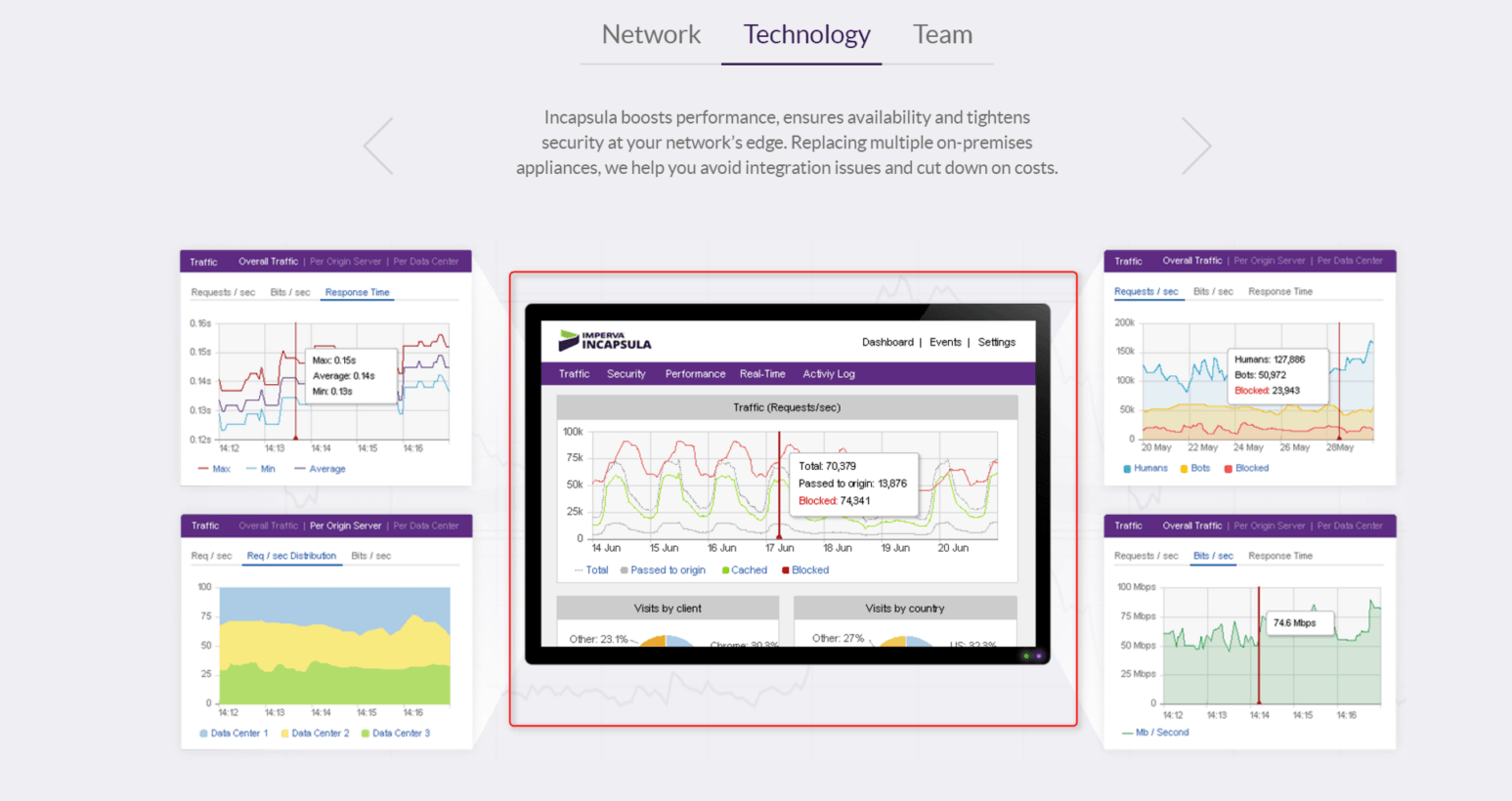
Incapsula is already mastering Easter eggs and has many interactions on its website meant to give something fun and attractive to its visitors. These are the little interactions that makes the difference between an UX designed homepage and just a well designed homepage.

Like this one.

Incapsula homepage

2. Simplicity

‘Less is more’ works in this case too.

Do you remember those cluttered sites of the 90’s? With lots of text, small images and many links? You could get lost in there! Nowadays, people’s attention span has lowered to the point that if they are not immediately attracted to something, they will close the tab.

So make sure your homepage is clean and the epitome of simplicity! Concentrate on what you know is important for visitors, not on what you believe they might like.

Take away fact:

Did you know that 48 percent of landing pages contain multiple offers? That might give a headache to anyone who gets on those landing pages. Why not keeping your offers specific? via Marketing Sherpa

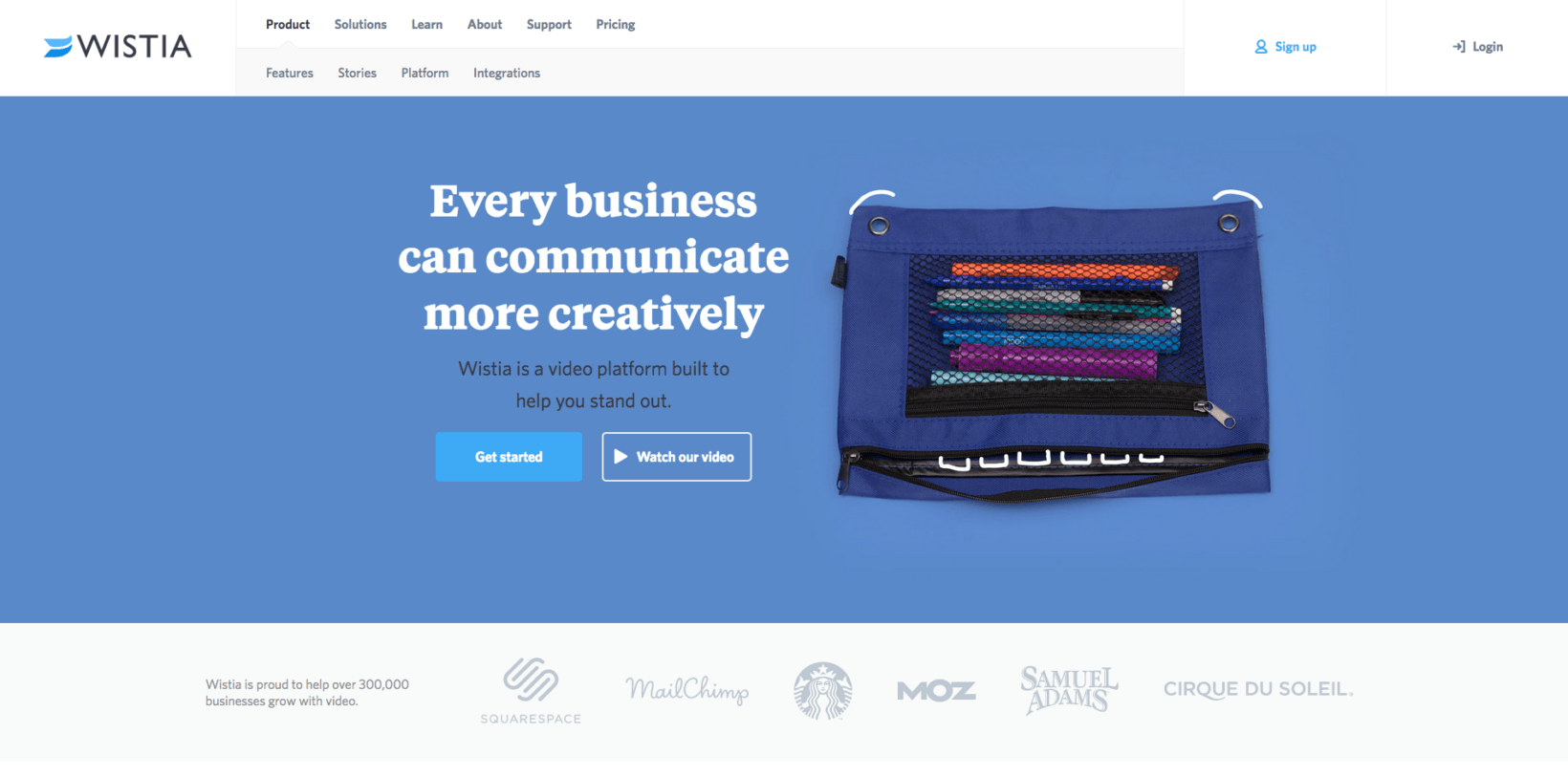
Wistia has a really simple and specific homepage. A simple form with basic information needed and no unnecessary information.

Wistia homepage

3. Great headline

I like to call the headline – the hook of a great landing page.

Why? Because its role is to grab the attention of the reader and inform him what the product or service is about! And that’s what keeps users on the page.

Remember to keep it simple and short. Not more than 10 to 15 words.

What’s important to know when it comes to headlines, is to match the message on your banner ad with the one of your landing page. If your banner ad promises something, make sure that the visitor won’t be disappointed when he gets to your page.

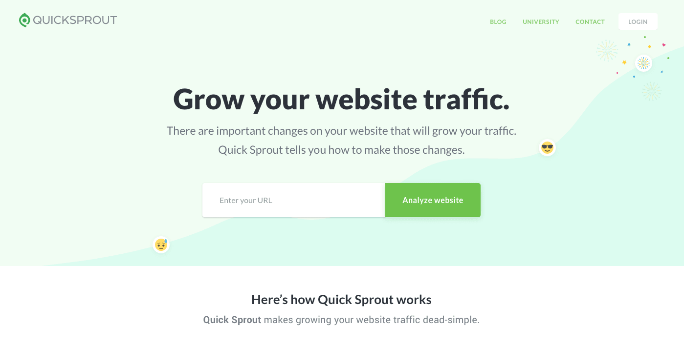
Quicksprout for example, choose “Grow your website traffic.” as a headline.

quicksprout

Why? Because they know what their potential client’s needs are and they can fulfill them.That’s a pretty good ‘hook’!

4. Benefits of the visitors

Your homepage should send the idea that it can help solving a problem or just tell them who you are and what you do. That’s why whatever you choose to have on your page, be it graphic elements or text, they should push the idea that they’re in the benefit of the visitor. People get to your page because they have a pain, a need they hope you can help with.

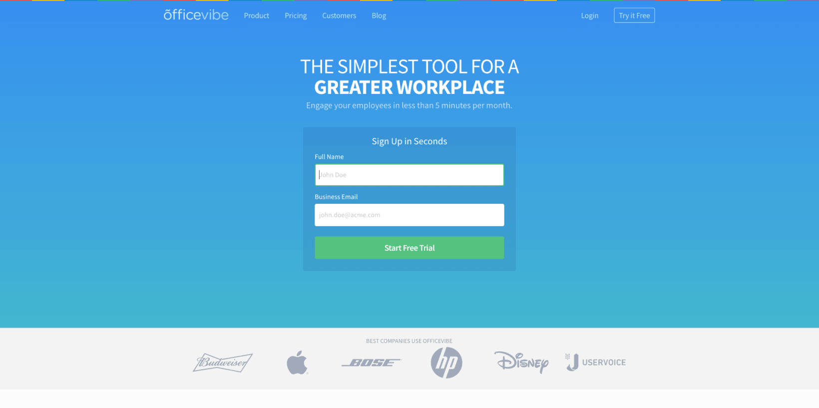
One example I love is Officevibe’s homepage on how easy they can sign up.

officevibe

You can see that the text is concentrated on the visitor with words like “workplace”, “employee”, and last but not least – the CTA “Start Free Trial”.

So if you want to design one of the best homepages out there, make sure that you present your visitors their benefits.

5. CTA

CTA is one of the most important elements in a landing page.

It’s how you get something back from all your marketing efforts.

Try to avoid words like ‘BUY!’ or ‘Download’ and use something more personalized and unique about your product or service.

Smartketer, a banner ad design service, chose a customized CTA for their homepage. If you arrived on that page, you’re probably interested in someone helping you with your banner ads, Facebook or mobile banner ads.

Smartketer banner ads design service

You can simply click the CTA which says “Order banners” and you’ll be taken to an order form to choose your plan.

Quick and efficient!

6. Branding and design

As I said above, there must be a correlation between your banner ad and your landing page, and not only when it comes to text.

We, as humans, are attracted to variations of colors! The difference of color between the background and the key points of you landing page directs the visitors exactly where you want them to go. What’s really helpful when choosing the right palette for your landing page, are your brand colors. You can always use your main brand color for your background and contrast your CTA with something else from you color scheme.

When it comes to visuals, they can be photos, illustrations, graphic elements or even short videos! If you’re a blogger or a thought leader, one of the greatest strategies is using a photo of yourself in the homepage or landing page of your website.

Paul Jarvis homepage

Paul Jarvis chose to use his photo as background for his homepage, while still focusing in the email subscription box.

The white space is also very useful in this case.

If used correctly, it gets from ‘nada’ to ‘Prada’ in seconds by directing the viewer’s attention to what’s important.

7. Social proof

What’s the best proof that a product or service is worth your attention? Some other people that can swear by it, of course!

Susan Weinschenk author of Neuro Web Design: What Makes Them Click? said that,

“If you want people to act on the data, then you need to couple it with emotional data.”

And that’s exactly what social proof is.

There are a few ways through which you can use Social Proof on your landing pages or homepages:

  1. Testimonials

You can easily ask some of your customers to tell you why they love your product. This tactic credibility can be boosted if you’re adding a photo next to the quote. Or you can talk with influencers from your industry to give you a quote about your work.

  1. Social Media shares

Social sharing buttons are besides great tool for growing your community, but also, an efficient tool to prove the reputation of your product.

  1. Embeded Social Media posts

Nowadays, in the age of opinion, everyone is encouraged to put it on the Internet. Even though most people use Social Media for rants and public shaming of some brands, you might find a gold mine of positive posts about your product. Don’t forget to ask for permission before embedding the posts on your website!

  1. Publications proof

Top websites in your industry that wrote an article about your brand can be a social proof. For example, if you are an entrepreneur and you have a personal website and publications like Inc or Entrepreneur mentioned you in one of their article you can add it to your website. People will know that you are a big deal in your industry.

Conclusion

If your purpose is to increase conversions and have great results (and don’t we all?), you should really give all you’ve got to create a rocking landing page! You don’t even have to follow all the guides and trips and tricks you find on the internet.

All you need to do is keep in mind your objectives, your audience and keep all simple!

What are other examples of the best homepages you found while browsing?

Photo Source

By

Sourced from TNW