Giving a brand an animated personality can get big wins, but there are a few catches.
By MediaStreet Staff Writers
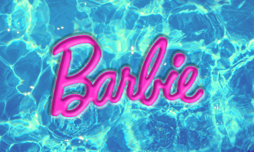
When the Pixar lamp buries the letter “I” by jumping on it, this is an example of what’s called “agent animation” – a type of new brand logo that makes it feel alive.
New research by two Boston College marketing professors says the low usage of these animated logos means there’s an early adopter opportunity for some companies to create animated logos. It may just get you attention and impress your markets. But there are catches… your brand already has to been seen as dynamic.
“This research shows a different route that brands can take to help imbue life into themselves,” says S. Adam Brasel, Associate Professor of Marketing at Boston College. “If we think that that a logo is alive or that a brand is alive, it’s easy for us to give it a personality. If we have an underlying thought that this thing has a mind, now suddenly it’s much easier for us to feel ‘Oh, that thing is a friend’ or ‘That thing is reliable’ or ‘That thing is exciting.'”

“Marketers don’t really know much about agent animation or its ability to bring a brand to life” says co-researcher Henrik Hagtvedt, Associate Professor of Marketing at Boston College. “It’s a little bit like the social media phenomenon. First, it presented opportunities that few companies were utilising. Then, a lot of firms felt like they should be jumping on the bandwagon, but many didn’t really know how to do it right. Eventually, the firms that figured it out reaped a lot of benefits. I’m not suggesting that animated logos will be as big a deal as social media, but we’re currently seeing stage one: under-utilisation.”
https://giphy.com/gifs/logo-6cW4ZPD7zeR0c
The study tackles the complicated question of how animation influences consumer attitude toward a firm or brand. It finds the successful use of agent animation is determined by the vibe a company gives off. Not every brand fits every kind of animation, and some may not be compatible with animation at all. Companies need to proceed with caution when tinkering with the logo that’s the prime representative for the brand.
Brasel and Hagtvedt found that object-animated logos – those that move in predictable, almost mechanical patterns – are aligned with more businesses that rely on an image of stability, such as life insurance and financial services. On the other hand, agent-animated logos – those that appear to move on their own in a lifelike fashion – encourage more favourable attitudes toward firms with consumer expectations of dynamism, such as entertainment companies.
https://giphy.com/gifs/retro-CE1SbY4VMNmX6
“Animation is a channel that brands can use to express their brand personality,” says Brasel, “but that channel needs to fit with the message that brand wants to send.”
“As with the design of logo graphics, companies should take great care when designing logo animation,” says Hagtvedt. “The logo is in many ways the centrepiece of a brand’s persona, and logo animation can help mould a brand’s image. It is therefore important that this is done strategically, to fit with the brand’s overall identity.”

The more dynamic the brand, the more sense it makes for consumers to see agent animation. Further, animation can be tailored to signal sophisticated or exciting personality traits, to fit with firms that have or seek those brand personalities.
“Given that the market for TV and online advertising is so competitive, marketers want to make sure they don’t waste any dollars,” says Brasel. “We know consumers aren’t paying much attention to commercials to begin with, so we want to make sure that every moment of the commercial has the maximum impact for the messages that it’s trying to tell. It’s surprising that more companies aren’t utilizing logo animation, because it’s a very low cost-low effort way to convey extra brand information. It’s just not currently being used.”
Brasel and Hagtvedt also looked at more than 400 30-second commercials broadcast on television and the web and found an astonishingly low usage rate. For the television commercials, 62% featured static logos, 35% featured object animation (a logo being moved around the screen in a mechanical fashion), while only 3% utilised agent animation. Online advertisements featured even less logo movement: 93% featured static logos, and 7% utilised object animation. What this shows is an opportunity for first movers.
“Low marketplace utilisation suggests such animation could potentially provide early adopters with a competitive advantage,” according to the report. While there are advantages with being a first-mover, companies need to be careful of strategic miscues.
“Some brands go out and change their logo when they should not have, and it can cost them millions of dollars,” says Hagtvedt. “If consumers respond badly to the change, you have additional losses. On the other hand, if a brand becomes old and stodgy and loses brand equity as a result, that can also be difficult to win back. And that could be a reason to consider animation.”

The favourable effects documented in the studies suggest opportunities for agent animation within retail and shopping environments as well, according to the researchers, who say animation on in-store signage could draw attention to specials, deals, or items that are in oversupply.
“You see more electronic signage in stores now, so there are a lot of possibilities for animation in stores,” says Hagtvedt. “You can have little helpers for the customers at the end of a shelf, or you can have larger signs along the walls. There are also future opportunities on the horizon. For instance, perhaps one day we’ll see animated packaging.”

“Given so few companies are doing it, there is a chance to gain a very inexpensive competitive advantage in the marketplace by doing this,” says Brasel. “It’s a low cost, relatively low risk way to increase advertising effectiveness as long as they do a little research first to make sure it fits their brand and makes sense.”