
People just don’t get it
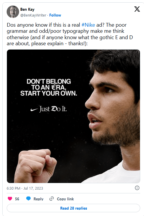
‘Just Do it’ is one of the best-known brand taglines around. It’s been serving Nike since 1988, and it’s just as recognisable as its swoosh logo, one of the most famous textless logos. Many would say it didn’t need any other intervention, which has left people perplexed as to why Nike appears to have jumped on a recent typography trend.
People have been commenting on social media to ask why the brand placed a couple of apparently random gothic Blackadder-style letters on a post featuring Spanish tennis star and current men’s singles number one Carlos Alcaraz. But it’s not the one advert. Nike has been changing up the ‘D’ in several recent adverts.
Adaptive logos are having a bit of a moment right now. It’s something that MTV logo did so well back in the 1980s, and the LA28 Olympic Games logo has resurrected the concept with a design that can take on infinite interventions, including, controversially, from the games’ sponsors.
The choice of an ‘old-fashioned’ font in this particular piece is presumably intended to draw attention to the world ‘era’, the idea that Alcaraz is marking the start of a new period in tennis following the dominance of the likes of Federer for two decades. Some have even suggested that the E and D are references to Federer’s F logo and Djokovic’s D logo respectively, although the link seems tenuous.

A more likely theory is that Nike is trying to tap into Gen Z’s penchant for using messy mixes of typography and special font generators for social media: 80’s/90’s exuberance taken further. Nike’s ‘What the Football’ advert created for the FIFA Women’s World Cup (see below) features several versions of the ‘D’ in its close, and graphics for the campaign feature a clash of clean sans serif overlaid with colourful dripping graffiti and inflated fonts.


“Perfectly aligned with online typographic trends ATM. A mish-mash of styles for absolutely no reason whatsoever,” one person commented on Twitter. The Alcaraz application feels confusing and poorly executed but the broader use of mixed fonts to reject the minimalist trend of recent years doesn’t feel entirely out of place for a brand that’s long been as much about streetwear and youth culture as it has sport. If you’re looking to mix up typography in your own work, see our pick of the best free fonts and the best font pairings.
By
Joe is a regular freelance journalist and editor at Creative Bloq. He writes news and features, updates buying guides and keeps track of the best equipment for creatives, from monitors to accessories and office supplies. A writer and translator, he also works as a project manager at London and Buenos Aires-based design and branding agency Hermana Creatives, where he manages a team of designers, photographers and video editors who specialise in producing photography, video content, graphic design and collaterals for the hospitality sector. He enjoys photography, particularly nature photography, wellness and he dances Argentine tango.