Tag

packaging

Browsing

By Ellie Krieger 

Next time you grab a package off the grocery store shelf thinking it looks like a healthful choice, take a beat before you toss it into your cart. The better-for-you allure of it could be as superficial as the wrapper itself. From print colour to bottle shape, specific package design elements can have a real influence on the perceived health benefits of the food inside.

But unlike explicit written nutrition claims such as “low sodium,” which are subject to strict governmental regulation, the implied health messages of package design are entirely up to the manufacturer. While design techniques are often used fairly to communicate the presence of a more healthful product, they are also sometimes employed in misleading ways. Keep an eye out for these tricks of the trade to avoid being duped by a product with a deceptively healthful veneer.

Thin, shapely containers: It’s no accident that many packaged lower-calorie drinks such as skinny margaritas and flavoured sparkling waters come in thin bottles. That silhouette propels the message that the product is slimming, since research demonstrates that people perceive food and drinks in elongated packages as less caloric than those in wide packages. And when a thin container also has a curviness to it, with an indented “waist” (a concave shape), the product inside is perceived as healthier, particularly by women who have a high body mass index, according to a recent study published in the journal Food Quality and Preference. Such a container may actually hold a better-for-you, lower-calorie option, but it could also serve as an unwarranted health halo on a drink you’d be better off avoiding.

Images of fields, farms, grains and produce: The images printed on many packages can reveal more about what the manufacturer wants you to associate with the food than the quality of the food itself. As I browsed the grocery store recently, I saw pictures of whole wheat still in its husk on boxes of crackers made only with refined flour; sketches of garden leaves on bags of coconut sugar, and prominent images of ripe whole fruit and vegetables on snack bars and puffs that contain more sugar than produce on the ingredient list, and the produce was in powdered form at that. Pictures on packages can be powerful unconscious cues, connoting unprocessed, farm-fresh, natural foods that are flush with healthful properties. Very often the ingredient list tells a different story.

Muted colors: When food manufacturers want to give you the impression that their food is more healthful and natural (read: free of artificial ingredients, less processed) they tend to steer clear of bold colours on their packaging in favor of lighter, more muted tones. That’s because research shows people associate paler hues with a better-for-you products and bright colors with more intense, possibly artificially boosted, flavors. Healthier products in the United States tend to have pale white, green, brown and yellow coloration, so plucking a product off the shelf based on package colour might actually lead you to a better choice. But then again it might not. Colour impacts our perception more powerfully than we might realize — even to the point of defying logic. One study, for example, found that a candy bar with a green calorie label was perceived as healthier than the exact same bar with the same calorie information on a red label.

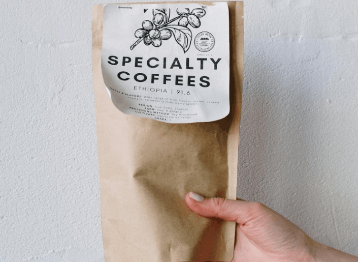
Brown paper packaging: In the same vein, packaging material considered to be eco-friendly, such as glass or brown cardboard or paper, can lead us to believe the food inside is better too — higher quality, more sustainably produced and healthier. Since environmentally conscious consumers are often willing to pay more for those attributes, it’s a ripe opportunity for marketers to rebrand the same old product, often at a price premium.

Transparency: Another design that has become increasingly popular is transparent material for all or part of a food package. A window into what is inside a container not only provides the obvious benefit of allowing you to see what you’re getting before you make a purchase, it also informs, correctly or not, our overall impression of the food inside. Research shows that foods in transparent packages are perceived to be higher quality, more attractive, fresher, and healthier than those in opaque packages.

Taken together, these design techniques are not necessarily a bad thing — they will often lead you to products that are genuinely better for you and the planet. But to be a smart consumer, don’t judge a food by its container. At the very least, make a habit of turning a package over to read its ingredient list and nutrition facts before adding it to your cart.

Feature Image Credit: Packaging material that is considered eco-friendly, such as brown paper, can lead us to believe the food inside is better, too. (iStock)

By Ellie Krieger 

Sourced from The Washington Post

By Candide McDonald & Lindy Hughson.

The rules of marketing are changing fast, and as they do, packaging looks set to become one of the most important forms of media that connects millennials to brands.

Millennials don’t play by the rules. That, no doubt, contributes to the misconception that they are narcissistic, vain, selfish and uninterested in anything that doesn’t relate to their lives directly. In truth, it’s that no other generation has had so many ways to express itself. Millennials are just using what is available to explore and confirm who they are. This is, or has been, a rite of passage for everyone since moving into adulthood began.

But the fact that millennials don’t play by the traditional rules of marketing has important consequence for brands. They don’t hang out on TV, in print or on radio, because they have other options. And they’re not at all receptive to being told what they should or shouldn’t buy by brands, because they have the means to find out everything they need to know – all by themselves.

With the world’s leading tech companies, including Microsoft, Apple, Samsung, Huawei, LG, Acer, Intel, Meta, Magic Leap, and ODG, all working feverishly to make mixed reality part of everyday life in the very near future, packaging may well become one of the most important forms of media that connects millennials to brands.

Packaging that activates mixed media could become the on-shelf and in-hand catalyst that enables millennials to find out everything they need to know about brands – all by themselves, as well as being how brands “talk” to and play with millennials to get them to engage with them. But even without mixed reality’s ability to turn packaging into next-generation websites filled with 3D content that users can touch, hold, speak to, and learn from, packaging can still be the door that gives brands access to millennials’ attention.

As the founder of UK company GBH Design, Mark Bonner, puts it in his foreword to Silas Amos’s book Digital Print. A Bigger Spectrum, “Our audience is on the move and we need to move with them. Which media will they consume our [brand] story in first? Our ideas need multiple front doors. We need to catch our target in a triangulation of crossfire to get our messages heard. And no-one knows where the magic bullet will come from”.

What we do know is that for millennials, their mobile phones are the font of all knowledge, an always-on entertainment provider and the preferred means of communication (trumping verbal conversations).

That does not mean that brands have a captive millennial audience on mobile. According to an Accenture study last year, 69% of those aged 18 to 24 and 64% of those between 25 and 34, know how to block ads. Globally, 41% do it. Millennials don’t like to be interrupted, but there’s something more fundamental – the law of attraction. Beg a millennial (or anyone else, for that matter) to “come to your party” and he or she won’t want to come.

Packaging gives brands the chance to let people know they are “hosting a party” – a competition, video series, music concert, game, recipe series, background story…and provides the door that allows them to access it. That’s not begging. To a millennial, that’s cool.

CASE STUDY: Party like you mean it

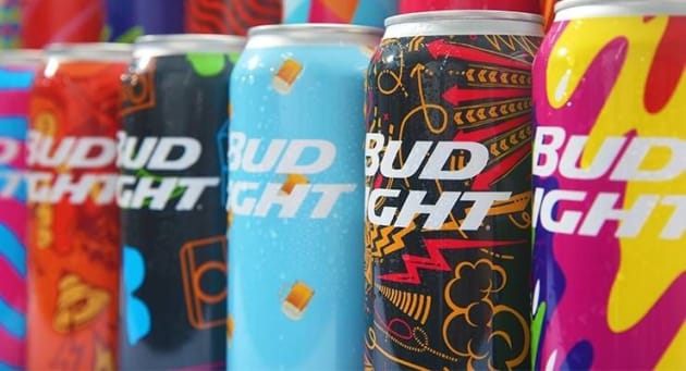
Bud Light “created a party” on its packaging that resonated with millennials at Mad Decent Block Party music festival events held in the US and Canada in September 2015.

HP Mosaic software was used to provide customised shrink-sleeves for a limited-edition run of beer cans. Printed on an HP Indigo WS 6800 digital press, 31 designs were transformed into more than 31 million possible graphics, ultimately creating 200,000 unique can designs, with no two cans exactly alike.

Recounting this case study in Digital Print – A Bigger Spectrum, Silas Amos writes: “Mad Decent Block parties have a mission to bring new genres and cultures to light in the constantly evolving music world, while Bud Light’s tagline tells us it’s ‘up for whatever’. Together they wanted an ethos that would amplify their spontaneous ‘anything goes’ ethos.”

Bud Light Mad Decent Block 

“Today’s consumer is seeking unique, customised experiences,” says Valerie Toothman, VP of Innovation, Anheuser-Busch (brand owner of Bud Light). “The reaction we got at the Mad Decent Block parties proved that custom graphics are indeed an impactful and relevant way to elevate a consumer’s experience with the the brand.”

According to Jason Beckley, business development manager HP South Pacific, “HP’s ‘Mosaic’ software takes customisation to a new level, it allows for the creation of an almost infinite number of designs based on core patterns within a brands’ visual image, and which when assembled on-shelf provides an arresting display with each printed piece unique and distinctive from the next.”

Bud light cans 2

By Candide McDonald & Lindy Hughson

Sourced from Packaging News