
By Mikelle Leow.
Cadbury is making a chock full of changes to its branding, marking its biggest logo revamp in at least 50 years.
As reported by news.com.au, the confectionery giant is adopting a thinner script wordmark that looks closer to the signature of founder William Cadbury, which was often spotted on transport vehicles for over half a century.
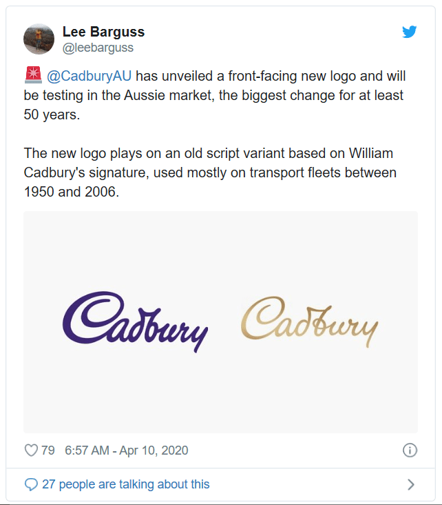
The visual identity was created by brand design agency BULLETPROOF, who explained that it draws upon “Mr Cadbury’s generous spirit—not one glass, but a glass and a half.”
Quite significant is the metallic sheen near the front of the logo as if a light is being shone on it, as well as the loop around the ‘b’.
The new branding will first roll out in Australia, debuting on the packaging of Cadbury Dairy Milk Marble bars re-released for the market. The brand teased the logo on visuals posted to Instagram for Easter.
More noticeable on the wrappers is Cadbury’s new take on the ‘Dairy Milk’ branding. Whereas its official logo is now slimmer, the ‘Dairy Milk’ logomark is now thicker and flashier.
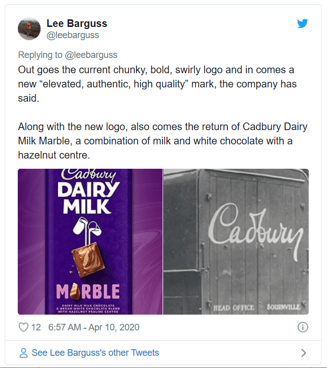
Cadbury stylized the new version in all-caps, swapping the swirly base of the logo with an “elevated, authentic, high-quality” mark, it told news.com.au.
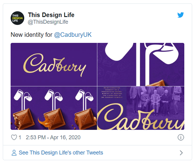
All-new type treatments are hand-drawn for a playful flair that also looks both “familiar” and “wholesome.”
In retaining its core identity, Cadbury is keeping its trademark purple and “a glass and a half” imagery on its wrappers.
Feature Image Credit: [via news.com.au, cover image via Kevin Khoo / Shutterstock.com]