Sales data from one of the world’s largest online marketplaces uncovers 2017’s major cultural milestones.
By MediaStreet Staff Writers
The past year was full of trends, moments, and movements that changed the cultural and commercial landscape. Today, eBay released its new ‘Top Shopped’ report that takes an exclusive look at 2017 sales from the marketplace. With over a billion listings eBay can somewhat be a barometer of trends.
“With a watch purchased every four seconds and a smartphone purchased every five seconds, eBay sales uniquely reflect the cultural zeitgeist,” said Bradford Shellhammer, eBay’s Head of Personalisation and Engagement. “From Adidas Superstars to eco-friendly luxury, to Wonder Woman memorabilia and merchandise to Radiohead on vinyl, shoppers know that whatever they’re coveting, they can find it on eBay.”
#1 The Force Is Strong: In the two months before the December 15 release of Episode VIII, The Last Jedi, Star Wars fever transcended generations to reach new levels of fandom. There were more than 450K Star Wars items bought, with Rey proving herself the most beloved character (7K Rey items purchased), and the Star Wars Lego collaboration was the most popular Star Wars-related toy (7.5K bought).
#2 Royal Fever Reigns: Between Netflix’s “The Crown,” Pippa Middleton’s wedding, and Meghan Markle’s engagement to Prince Harry, eBay saw US shoppers coveting British brands throughout the year. In the weeks following the first outing as an engaged couple on November 27 – and with Meghan wearing a white belted wrap coat – there were more than 13 white coats purchased every hour on eBay. Additionally, 4.6K Mulberry ‘The Bayswater’ handbags, and more than 3K pairs of Hunter Wellingtons were purchased since January 1, 2017.
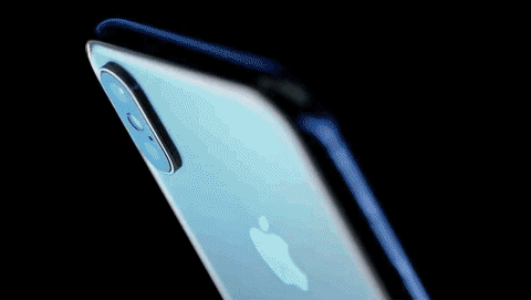
#3 Swanky Phones: With larger screens and new technology like Face ID, smartphones continued to get more premium in 2017 with the introduction of the iPhone X. Since its debut, eBay shoppers collectively have bought more than 29K iPhone Xs and nearly 39K iPhone 8s. Throughout the year, there were more than 2.6 million smartphone purchases on eBay.
#4 Art for Social Change: More than ever before, artists were compelled to start a dialogue about social issues – and shoppers showed their support. The eBay community raised nearly US$800K for the New York Public Art Fund through an exclusive charity sale of Ai Weiwei works – within 24 hours. Meanwhile, nearly 13K works of art by Shepard Fairey were purchased in 2017 – with sales spiking in January and November, months with notable political moments.
https://giphy.com/gifs/l0MYKDPgWd3pFaGNq
#5 Move Over Millennial Pink: As the Millennial Pink obsession reached its tipping point, ‘Gen-Z’ yellow bubbled up, priming itself to take the reigns as the new ‘It’ colour of 2018. In fact, there was a 7 percent increase in sales of yellow dresses (seen on celebs and social media influencers alike) compared with 2016.
#5 Coffee Culture: Shoppers are elevating their at-home coffee game. Last year, there was an 85 percent increase in year-over-year sales of Chemex Coffeemakers, and a 70 percent increase in sales of Ninja Coffee Bars. In fact, a Ninja Coffee Bar was such a hot-selling holiday gift in 2017, that one sold every two minutes on November 14.
#6 Connected Home: Enabling people to search, listen and shop faster, Wi-Fi connected, voice-activated devices and smart speakers infiltrated the home. The most popular were Nest devices (more than 211K bought), followed by the iRobot Roomba (more than 58K bought). The Google Home Mini spiked since its October 19 debut, with shoppers purchasing nearly 240 every day.
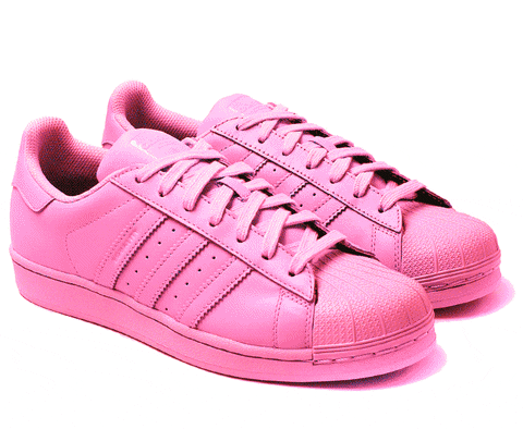
#7 Throwback Streetwear: The ’80s and ’90s streetwear trend reached its tipping point in 2017, with more than 57K fanny packs and more than 25K Champion sweatshirts purchased. When it came to most coveted sneaker, the Adidas Superstar (107K pairs bought) beat out the Reebok Classic (28K pairs bought) and the Nike Cortez (24K) in a huge way.
#8 Female Empowerment: In an unprecedented political year, social issues bubbled to the surface and had an unparalleled impact on fashion choices. Shoppers bought more than 43K pieces of apparel featuring political and feminist slogans, 24K women’s pantsuits, and 2K ‘Nasty Woman’ shirts
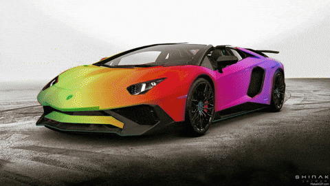
#9 Car Collectors: From rare to new, eBay continues to let shoppers buy for their dream garage. Perfect for weekend road trips or for a showroom display, some of the most impressive (and expensive) 2-door coupes and supercars include a 2006 Ford GT Base that sold for over US$240K or a 2017 Lamborghini Huracan LP580 2-door Spyder that sold for nearly US$230K.
#10 Revival of Vinyl: With Sony Music Entertainment beginning to press records after a three-decade hiatus, the frenzy for vinyl made an impact in 2017. There was a 24 percent increase in vinyl record sales on eBay compared to 2016 – with almost 10K vinyl records being purchased every day in 2017. Fleetwood Mac’s Rumours was most coveted on vinyl, followed by Radiohead’s OK Computer. Crosley was the most popular record player brand, followed by Jensen; and, there were over 95K record players and turntables bought throughout the year.
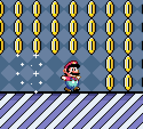
#11 Trending Toys: Nostalgia was everywhere this year, and trending toys were no exception. Shoppers went wild for Super Nintendo (over 500K gaming systems bought), Tamagotchi toys (16.6K bought), and Teddy Ruxpin (more than 8K).
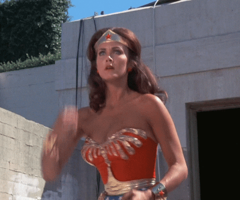
#12 Superhero Stardom: Marvel & DC Comics superheroes were ubiquitous throughout 2017, in the lead up to and following notable movie releases. Spiderman: Homecoming, Wonder Woman and Thor: Ragnorok proved most popular, with 205K Spiderman comic books (43 bought every hour) and 55K Spiderman action figures purchased; 47.7K Wonder Woman comic books and 17K action figures (also the third most popular Halloween costume bought on eBay); and nearly 9K Thor comic books and more than 15K action figures bought since the release of the films.
#13 Solar Eclipse of the Heart: Named the biggest and best solar eclipse in US history, shoppers went to great lengths to view the August 21 spectacle. For the eclipse, there were 133.5K protective glasses, 19K tents, and 10.5K pairs of binoculars purchased in the month leading up to the eclipse.
#14 Rainbow Saturation: The obsession with mythical creatures reached its peak in 2017, with psychologists musing that the trend reflected a form of escapism during a tumultuous year. The movement took on various forms as shoppers coveted clothing and accessories in a variety of colours, including unicorn phone cases (nearly 70K bought), unicorn costumes (56K bought), unicorn pajamas and onesies (nearly 21K bought) and mermaid makeup brushes (57.5K bought).
#15 Going Green: Environmental awareness and sustainability, became the norm as opposed to the exception. Gucci announced its commitment to fur-free design, and sales increased by seven percent compared to 2016 sales. Dior introduced eco-friendly packaging, with sales increasing 13 percent year-over-year on eBay.
All three of this month’s essential design trends have to do with typography. And the trends showcase some pretty stellar ways to use beautiful type to create user engagement and make a great first impression.
One common theme among these designs is that all of the typography styles are highly readable. If you plan to work with a more trendy or funky text element, choose a typeface that users won’t struggle to read. The trendy technique is the trick with these designs, not the typeface itself.
Here’s what’s trending in design this month:
1. Just Type Above the Scroll
While a great image can help draw users into a design, sometimes the right words and space are the ticket.
The key to making the most of this design trend is to refine your message. The words need to be simple, say something meaningful and create value for the user.
So how do you do it?
Start with a key phrase. It can be your mission or a value proposition for users. Tell users what you bring to the table and why your website will be important to them.
Pick a simple typeface that has the same mood as the messaging for longer copy blocks.
If the text block is short, such as with Types of Type, consider a funkier type option to draw users in.
Make the most of space. Note that in each of the examples below, text has plenty of room to breathe, making it easier to read at a glance. Space can also help draw the eye to text, and can balance text elements if you don’t want to center them on the screen, such as Design Ups.
Use color to help add visual interest. Bright, trendy hues can help draw users into the design. Color can also help set a mood that correlates to messaging.
When working with a type-heavy design, don’t force it. Sometimes you won’t have enough text to fill a full “screen.” Less+More and Type of Type use color blocking to create multiple panels that are sized perfectly for the text content therein.
2. Text in White Boxes
With so many bold visual elements in website design projects—and so many responsive breakpoints to deal with—white boxes are re-emerging as a container element for text. White boxes with dark text inside can ensure readability when it comes to messaging on top of photos, video or illustration where there is color variance.
And while this trend might sound a little, well…sloppy or lazy, it actually looks great when done well.
You can’t just slap a box anywhere on an image and hope for the best. White boxes need to be placed strategically so that they don’t cover important parts of the image and so that users do move to them in the course of looking at the design.
White boxes need to be big enough to contain a reasonable amount of text and you should have a plan for this element on smaller screens, such as allowing everything in the text box to drop below the main image. Don’t try to put a text box over an image on smaller screens because you’ll end up with a box of text that’s too small to read or the box will cover most of the image itself.
If you pot for the white box treatment, have fun. Each of the examples below use white boxes in completely different ways.
Do Space cuts a white box into the bottom corner of the image so that most of the image is visible. The white box bleeds into the white space below so that it almost looks like it comes up out of the panel below. This technique helps connect the main slider to the content below (and can even encourage scrolling).
HowIt uses circular blobs so that the white text boxes better match the tone of the background illustration. This subtle shift in shape, so that the boxes appear more fluid helps connect the elements so that the boxes and background have a consistent feel. You don’t want white boxes for text to feel like they are haphazardly placed on the background. (That doesn’t work and won’t help create a cohesive feel for users.)
Macaulay Sinclair has more text than the other examples using one part of an image-panel grid to hold the text element. Here, the image behind the white box serves no information value. It has a color and movement scheme that looks similar to other images and mostly serves to create cohesion between the text element and rest of the design.
3. Typography Cutouts
No one ever said that text has to be a series of solid filled letters. More designers are opting for typography cutouts that feature a color block over an image so that the image comes through clear lettering.
This technique can work with still or moving images and with full screen overlays so that only a small amount of information comes through letters (almost to create a texture) or with more of a block-over-image-style with more of the background image visible.
The trick to making this work is the right typeface. Letters have to have thick enough strokes so that the image or texture in the background is visible. You can’t do this with a thin or condensed font with any consistent success.
This technique also works best if the number of words and letters is fairly limited. Stick to one to three words with 10 or fewer letters or use very common words that users will know at a glance.
Danbury uses a bright text cutout as a draw to encourage users to engage with the video call to action. The entire orange box is just a giant button.
Fusion Winery uses a background video of a vineyard in the lettering. What’s great about this design is the triple layer effect: Video background below white text cutout below a product image.
The Kaneko uses an unidentifiable image as the fill for letters. If you opt for this style, keep this background simple as done with this design. There’s just a touch of color and texture that draws the eye to the text on the stark canvas.
Conclusion
The collection provides inspiration for those projects that might not have a great image or video, so that you can still find a way to create something that users will respond to. Don’t be afraid to use text as a visual and informational element in this design.
What trends are you loving (or hating) right now? I’d love to see some of the websites that you are fascinated with. Drop me a link on Twitter; I’d love to hear from you.
Carrie Cousins is a freelance writer with more than 10 years of experience in the communications industry, including writing for print and online publications, and design and editing. You can connect with Carrie on Twitter @carriecousins. More articles by Carrie Cousins
The Future had its inaugural event from 3-4 November in Dublin, organised by the founder of creative festival Offset, and its remit was simple: to explore the ideas, attitudes and innovations that will affect the design industry in years to come. Around 70 speakers took to four stages, ranging from design studios – many from Ireland and others further afield – to trend forecasters, ad agencies, and big name designers like Stefan Sagmeister and Paula Scher, plus It’s Nice That founders Alex Bec and Will Hudson, to share their take on the future. Interpretations were eclectic but generally offered a refreshing point of difference to typical talks that focus on existing work and hindsight, with many presenting analysis and predictions for the shifts in creativity and wider culture. Here we’ve picked out a few highlights and interesting takeaways.
Fjord Dublin
Lorna Ross, Fjord Dublin
Lorna Ross, director of design agency Fjord’s Dublin studio, kicked off her talk talking about her obsession with photos of “desire paths” on the internet. Google the term, she says, and you’ll discover countless times when humans created more efficient shortcuts to their destination. She used this as an analogy for how we should approach the creative process. “Design is about paying attention to what people are already doing.”
She continued that “designers are being asked to do increasingly difficult things,” as a direct result of changing eras of society, from a manufacturing economy to an experience economy, attention economy, sharing economy, and now a data economy. Members of her team are working in emerging technologies and experimenting with their job roles – for example, one staff member is a synthetic personality architect, designing what robots say and how they say it.
Lorna also touched upon the agency’s acquisition by Accenture, and commented that Facebook, Google and Amazon have grown their art and design headcount by 65%, showing a widespread investment in design by multinational tech companies. They’ve realised, she says, that “design needs to unlock the transformative potential of new technology”.
Campbell Addy: Getty
Will Rowe, Protein
Protein founder Will Rowe presented trends based on statistics and examples from its recent report. One of these focused on young people’s trust of institutions, finding that only 22% of millennials trust brands, and only 28% trust the media. “With the commercialisation of political issues, 35% [of Gen Z] think it’s positive but misses the mark,” Will said. “It comes down to authenticity.” He referred to brands who’ve succeeded, such as Getty, which commissioned photographer Campbell Addy to produce a series addressing diversity in stock imagery; and Absolut, which continued its long history of supporting LGBTQ rights with campaign Kiss With Pride.
This was echoed by The Future Laboratory’s Trevor Hardy later on, who stated that “60% of Gen Z support brands that take a stand on issues they feel strongly about, and take a civic role”.
Will also talked about how the virtual is merging with reality, and how brands are adapting, referring to Lil Miquela: “The archetypal Instagram star who goes to all the right parties, has a record label, a fashion line – the only difference is she doesn’t exist, she’s an avatar.” He also mentioned Alex Hunter, a virtual character in Fifa who just signed a sponsorship deal with Coca-Cola; and Google Pixel and Boiler Room’s VR dancefloors project.
Technology Will Save Us
Technology Will Save Us
Demonstrating its latest release, the Mover Kit, Technology Will Save Us spoke about the importance of offering kids off-screen fun. “Technology is closed to our generation,” said founders Bethany Koby and Daniel Hirschmann. “We don’t know how to fix it, it’s not a creative platform. But tech isn’t novel to kids now. They’re fearless about tech. We had a kid, and we were shocked at how pink and blue the toys still are. They don’t engage or empower kids, or help them to see what they’re capable of.”
Tech Will Save Us makes DIY kits for kids to learn making and coding skills, in line with the STEAM approach to education. There is a STEAM Barbie, Bethany said, “but a doll in a pencil skirt and glasses isn’t going to inspire a generation with the practical skills for the future”. The company was also instrumental in the design of the BBC’s Microbit, which aimed to inspire a generation of digital makers, and so far has seen a 9% increase in kids saying they would study ICT/Computer Science, and a massive 23% increase in girls doing so.
Stefan Sagmeister
Stefan Sagmeister
Dividing opinion but drawing a crowd, as always, Stefan Sagmeister didn’t exactly stick to the “future” brief with his talk. He did, though, talk about how he believes beauty is becoming culturally important again after 50 years of modernist principles ruling design. “These economic modernists used modernism to pollute our earth with urbanist blocks,” he said, blaming architects Adolf Loos, author of Ornament and Crime, Ludwig Mies van der Rohe and Le Corbusier for “telling the world what it should look like” – which resulted in many cheap and “ugly” uses of modernism to save property developers money. “There is a joke that goes, ‘what is the difference between God and Le Corbusier? God never thought he was Le Corbusier’.”
Stefan also conducted what he called the Mondrian Test on the audience, asking for a show of hands on which of two images was the real Mondrian. “It’s never less than 85% of audiences that recognise the real one,” he claimed, explaining his inference that people instinctively know real beauty. “Form follows function is bullshit. Beauty has a function too.” He also referred to New York’s Highline as an example of beauty’s impact on behaviour. “It’s one of the most successful and influential buildings in post war America. There has not been a single crime on the Highline. I’ve never seen a single piece of trash. That is a direct result of its beauty. And right now there are around 16 projects worldwide trying to emulate its design.”
It’s time to look ahead and predict how the web will evolve over the next 12 months.
What trends should you be aware of, and how should you adapt your skills to stay ahead of the curve in web design and development in 2017?
In 2016, flat design became a standard — partly thanks to Google’s Material Design visual language — cinemagraphs continued their rise to add subtle motion to photos, responsive design finally become mandatory, and progressive web apps that can run offline became the next big thing.
What does 2017 have in store for us? We asked the industry’s experts for their views of the future.
Chatbots and conversational interfaces really took off in 2016.
Andy Budd, co-founder and CEO of Clearleft, thinks that although the rise of chatbots, voice UIs, and smart assistants will continue, it won’t last.
“At the moment, all these technologies are racing towards the ‘peak of inflated expectations,’ and will find themselves in the ‘trough of disillusionment’ for many early adopters by the middle of this year,” Budd explains.
Peter Smart, head of UX and product strategy at Fantasy, reckons that interfaces will become more human but adds we still have a long way to go.
“Increasingly intelligent conversational bots, including the likes of Zo and Xiaoice, will begin to leave the confines of messaging apps and permeate web experiences,” he explains. “Expect to see them first as smart assistants in ecommerce experiences. While likely to have the usefulness of Microsoft’s Clippy for the near future, the era of empathic web continues to draw near.”
Microsoft’s newly launched chatbot Zo, currently only available on Kik. Microsoft’s first chatbot, Xiaoice, already has 40 million users.
To find out how to design a conversational interface, read Tim Metz’s article and check out these 10 links to get started with conversational UIs and chatbots.
Lily Dart, service designer and head of digital design at the Department for International Trade in the UK, predicts that in 2017, we’ll see the rise of machine learning in everyday apps.
“In the last year, the clients I work with are being approached by more and more start-ups claiming to be able to solve their biggest issues through machine learning,” she explains. “Most of them have half-baked algorithms they’re looking to test, but it’s clear that the industry has been bitten by the machine learning bug.”
“A few high profile apps have begun to show us the possibilities; the most notable being Spotify and their Discover Weekly feature. Spotify has proven how good machine learning can dramatically increase the stickiness of your product — now it’s time for everyone else to catch up.”
Fantasy’s Peter Smart, meanwhile, thinks that machine learning will also drive a dynamic real-time web.
“What does your Amazon homepage look like?” he asks. “It’s oddly personalized. Yet, we’ve come to expect this level of smart personalization. The next step for these CRM powered technologies is real-time. In 2017, we will see the first instances of this technology changing, not just the products you see, but entire components of a user’s experience as algorithms multi-variant test layouts to discover the presentations that inspire most user action.”
3. Emotionally intelligent design
Pamela Pavliscak, a design researcher, data scientist, and founder of Change Sciences agrees that in 2017 we’ll see a turn towards emotionally intelligent design.
“The human-machine relationship is more emotional than rational, yet we practice emotional design narrowly,” she argues. “Emotional design has come to mean humanizing technology with cute animal mascots and eternally chipper chatbots. Or, it means driving engagement with delightful and variable rewards that keep us clicking. Rather than cultivating positive emotion, more often than not we’ve ended up making people feel addicted. So, it’s time to revisit our ideas about emotional design.”
“Emotion-sensing technology will be a source of experimentation, but even more so, a source of inspiration,” Pavliscak continues. “It nudges us to redefine emotional design. Right now apps and chatbots don’t know whether you are having a good day or a bad day, whether you are running up against a big deadline or are about to leave for a long weekend, whether you spent the last hour laughing with close friends or arguing with your spouse. They might be engaging or even delightful, but they lack emotional intelligence. Whether we start to really use emotion-sensing technology or not, even considering emotion as context rather than destination, as nuanced and mutable rather than one-dimensional, is a step toward emotional intelligence. My hope is to see more design that respects human emotion rather than exploits it in the coming year.”
For more on emotional intelligence, read Peter Smart’s research on the future of the web, and watch his presentation from Generate San Francisco 2016.
4. Virtual reality
VR finally went mainstream in 2016 and can now be experienced in the browser.
“I’m really interested to see how virtual reality’s popularity grows and how designers adapt to it,” enthuses Kyle Fiedler, chief design officer at thoughtbot. “It’s been wild to see something that was on the fringe gaining fast momentum. It’s in Samsung commercials now!”
Andy Budd, however, thinks it’s another fad.
“Virtual Reality is on a similar path to conversational interfaces, although moving slightly slower and tracking six months behind,” he argues. “The UI challenges with VR are both more complex and more easy to understand than conversational interfaces, as the medium and matter are closer to what we know. As such, I’m expecting a lot more VR/AR froth in early 2017 off the back of the HoloLens launch, reaching the ‘peak of inflated expectations’ if Magic Leap ever actually appears.”
Magic Leap was founded in 2010 and has raised $1.4 billion, but has yet to release a product.
5. Location and context awareness
“One of the things that sets mobile devices apart is the way they travel with users — and their ability to understand the location and context around them,” says Kevin Ball, engineering lead for ZURB Foundation.
“Those capabilities are increasingly exposed to websites, and we believe that a huge area of coming innovation will be in making websites more responsive to the environments around them. Especially with the growth of the Internet of Things, the opportunity is tremendous — imagine loading a website and immediately seeing reviews and pricing comparisons for all of the internet-enabled devices near you, without having to search or install an application. Or imagine a website that uses some combination of the Media Streams API(streaming video from your camera), the Geo Location API, and Mozilla’s WebVR library A-frame, to serve you an augmented version of reality, once again without ever installing an app.”
6. Micro-interactions
Kevin Ball also thinks that in 2017 micro-interactions will increasingly enter mobile apps, and become a lot more device-specific.
“Mobile-first design has been focused on layout,” he explains. “Things like stacking columns and layering in less important items as screen real-estate grows — with complex interactions and animations reserved for the desktop. As mobile traffic continues its meteoric rise and mobile web tooling matures, there is a ton of opportunity to take advantage of the native paradigms of different devices for mobile-focused interactions.”
Touch and gesture-related JavaScript libraries, for example, now enable you to create subtle animations (like the tweet refresh interaction on Twitter’s mobile app). Subtle animations within mobile web apps can also be used to direct attention to interactive elements — providing a mobile-specific equivalent to the use of hover effects on desktop screens.
Karl Randay, design principal at 383, agrees and says that micro-interactions will be used to increase simplicity in digital experiences. “Micro-interactions are simple, single-use moments that perform a basic function,” he explains. “Like adjusting a particular setting or controlling a single feature: hitting ‘like’, for instance, or pulling down to refresh.”
“When paired with simple gestures and subtle, visual feedback we barely notice we’re performing them. They become part of the natural way we interact with our products and services, a powerful way to build habits with users while also providing surprise and delight. They can be the difference between an experience you just interact with, and an experience you love. Instagram Stories does this nicely, with the subtle page resistance when refreshing, or when liking or holding for emoticons.”
Tubik Studio has created a concept for a tabbar button micro-interaction.
7. Colors
Web developer and Shopify Expert Kelly Vaughn thinks 2017 will be “a year of going against the design grain” — or, as her designer Sarah Hutto puts it, “year of the funky.”
Vaughn therefore expects to see bold, bright colors and gradients making a comeback. However, keep your (client’s) target audience in mind.
“Do they respond well to bold and bright colors, or are they more drawn to a toned down palette?”
Camden Town Brewery does an excellent job of using colors, but also makes great use of micro-interactions.
Pantone has crowned Greenery the color of the year 2017, as it’s refreshing and revitalizing, so that may be a good starting point if it fits your brand and audience. To get a better understanding of how effective ecommerce sites use colors, check out these 10 beautiful color schemes and also dig into Canva’s color theory article.
Kyle Fielder reckons that 2016 will be the year we start to think about cohesive experiences.
“From my phone, to my watch, to desktop, tablet, and VR. This year, we’ll continue to iterate on how, where, and on what device people will be using the software we build.”
To find out how to create a unified, consistent user experience, regardless of where the digital experience begins, continues, and ends, check out Cameron Moll’s keynote on unified UX at Generate New York 2016.
9. Even more JavaScript!
“JavaScript, JavaScript, JavaScript. This has been a trend for a few years now but 2016 saw a lot of change, and I think 2017 will be filled with people being caught up to speed,” says designer and developer Wes Bos. Bos created a range of excellent JavaScript training courses, including ES6.io, ReactForBeginners.com, and a free vanilla JavaScript 30-day challenge.
“We saw ES6 start to become commonplace. Vanilla JS is slowly taking a foothold over jQuery. React.js, Vue, and Angular are starting to becoming more commonplace. I hope to see tooling become a little easier to use — the folks from Webpack know this is an issue and are working on how to solve it. My advice would be to hunker down on vanilla JavaScript — get really good at it, and whatever JavaScript framework or library comes at you, you’ll feel confident learning it.”
Wes Bos’ JavaScript 30-day challenge teaches you JavaScript by building 30 things, in 30 days, with 30 video tutorials.
Kyle Fiedler agrees, and adds that everywhere he goes people are talking about React and React Native.
“I’m really interested to see if they can maintain this energy and popularity. It would mean that it could be faster to build for a wide variety of devices and platforms, which puts more emphasis on design to create those cohesive experiences.”
We’ve seen a lot of talk in product design circles about journey mapping, and understanding the ideal user journey.
“But what happens when the non-ideal user journey is experienced?” Karl Randay asks. “Or a user that hasn’t been considered, tries to interact with your product or service?”
“Using a process similar to how we map the ideal user journey, designed failure allows us to build a better understanding of situations where a user may try to use something ‘wrong,’ or attempt something that hasn’t been factored into the design of the experience. By building an understanding of worst case scenarios and potential for failure, we can model and attempt to course correct through the idea of ‘graceful failure,’ bringing a positive experience and humanized response to an otherwise awkward moment for any user. A really simple example of this is using humanized responses for content that no longer exists, or even providing suggestions for content when a specific search returns nothing (instead of the ubiquitous 404 or an empty list). Slack does this nicely; if you’ve half-written a message to someone but leave, you get a little pencil icon telling you that you’re not quite finished.”
“I’m betting that the more designers run design sprints, the more they’re going to realize that they need more information going into them,” muses thoughtbot’s Kyle Fiedler. “Research will start to be at the forefront of the design process and influence more and more products.”
And if you want to discover how to run design *and* content sprints, don’t miss Steve Fisher’s workshop at both Generate New York, and his own Design & Content conference in Vancouver this year.
Watch GV’s Jake Knapp and John Zeratsky discuss the design sprint they developed.
12. Better collaboration across design and development
As well as working together on design sprints, designers and developers will improve collaboration thanks to the software they use.
“Designer’s toolboxes will continue to mature,” predicts Fantasy’s Peter Smart. “Gone are the days of Adobe’s reign. In 2017, with better prototyping tools from InVision, Webflow, Figma, and many others, we’ll see designers and developers breaking out of silos to develop a greater shared understanding, and dramatically increased workflow speed.”
“Design and engineering are merging,” he says. “Today, designers mostly create 2D drawings that represent static slices of a richer experience. These drawings disregard additional dimensions like state, context, and motion. While the best designers will use whatever tools are necessary to work across these other dimensions, creating great digital products for global audiences currently requires much more work than it should.
“We are starting to see designers pick up principles from engineering to increase their own efficiency, explore the endless possibilities screens provide, and create more consistent experiences. As tools make it easier for organizations to create shared design systems, this leads to a more streamlined workflow, and greater collaboration across design and engineering.”
13. Merging of UX and service design
“My big bet for 2017 is the eventual coming together of UX Design and Service Design,” says Andy Budd. “For many years these related disciplines have had understandably different markets and communities of practice. However, as more and more services are delivered digitally, and as more and more digital products use service as the connective tissues, these two fields will start to merge.”
Clearleft’s UX London conference is adding a Service Design track for the first time in 2017.
14. Facebook and Google as destinations for content
In 2017, Facebook and Google will become even more important for the consumption of content, reckons Andrew Turrell, director of user experience at RED Interactive Agency.
“Facebook and Google have links open in their own article formats, Instant Articles, and AMP pages,cementing their place as destinations for content, not just jumping off points,” he argues. “They are setting standards for fast loading speed and minimal UI. In 2017, content sites will work harder to align to these new standards.”
Experience designer Benjamin Evans points to the 2016 presidential election cycle in the US, which proved that lies spread (and can be believed) faster than the truth.
“The Facebook echo chamber has become our global newspaper,” he says. “According to a study by Stanford University, a high percentage of ‘digital natives’ cannot distinguish between facts or fiction on their newsfeeds. With journalistic standards being undermined by the ever-pressing need for clicks, those of us who create media are struggling to figure out how to regain and keep the public’s trust. Although Google and Facebook have (finally) begun testing fact-checking features that help users discern fact from fiction, the responsibility falls to us as designers to find and embrace new and interesting ways to communicate credibility, safety, and trust online.”
How can we action this? Evans cites a 1999 article by Jakob Nielsen that listed numerous ways a website can communicate trustworthiness. He believe the way forward is to see how far we can push these tenets:
Design quality: “Tomorrow’s designs will embrace an MLP — Minimum Lovable Product — experience as a way to communicate the credibility needed to convert visitors into customers.”
Radical Transparency: “The more transparent designers are — from attribution of stock photos to colophons for content — the more likely we are to trust them as legitimate. Involving your users at more points of the design process is a great way to build ongoing trust.”
Comprehensive context: “We’re going to see more prominence given to sources and a greater level of transparency surrounding information presented, so that users gain a deeper context of the content they’re engaging with.”
A great example of this is Timeline — a news app that shows you stories with historical context surrounding each piece.
16. Mass disruption to foundational Internet services
Peter Smart thinks that 2016′s DDoS attacks, which resulted in major service blackouts for the likes of Twitter, Netflix, and Spotify, were just the beginning.
“We will continue to see agents targeting core parts of the Internet’s infrastructure with increasing frequency, resulting in disruption to our daily dependencies on the web,” he fears. Security and offline apps are therefore becoming more important than ever.
17. The rise of the diversity designer
“From mishaps like Snapchat’s racist filters, to the brilliant inclusiveness of Unicode’s new gendered emojis, 2016 was the year that diversity in design finally stepped onto the centre stage,” explains Benjamin Evans, who is collaborating with a number of designers to create an inclusion framework at Belong.
He hopes that 2017 will bring an even bigger push towards inclusivity in the creative and tech communities, and that designers will empathize more with a greater range of perspectives.
“The key is to make inclusive thinking part of your design process,” he recommends. “Go searching for ideas, thoughts, and opinions that differ from your own, ask the right questions and — most importantly — listen to the answers. There is no magic bullet, but empathy is the perfect starting point.”
Following suggestions from Google and Apple, the Unicode consortium released emojis that not only acknowledge different skin colours, but also introduce non-traditional gender roles.
Bonus: 2017 According to Jeffrey Zeldman
When we asked web design veteran Jeffrey Zeldman, founder of studio.zeldman and A List Apart, for his 2017 predictions, he came back with a contribution that we thought was too important to edit, so here it is in its entirety:
“Under relentless time and financial pressure from their bosses, many web developers will continue to take shortcuts — including shortcuts that harm the user experience.
Many designers will imitate the successful designs of other designers.
Smart (and lucky) teams will involve everyone in the design of the total user experience, but many equally smart and talented designers and developers will be stuck working in silos.
Some people who are frustrated will stop caring. Other people who are frustrated will begin working for themselves.
Some people who are frustrated will stop caring. Other people who are frustrated will begin working for themselves.
More design will move in-house, making it harder for freelancers and agency professionals to find work. Because of the shrinking market, employers will be positioned to demand more and more skills from their applicants, while paying less and less.
Designers and developers will be asked to make moral choices about user privacy and other important issues. The buck will stop with us.
Many companies will imitate the style guides of a few companies. Flat design with gradients will saturate the market. Default Bootstrap layouts and code will saturate the market.
Sites that look like Squarespace templates will saturate the market.
A few individuals will find a way, despite all the pressures on us all, to continue to do good, creative, human-focused work.”
Oliver is an independent editor and content consultant, based in Bath, England. Formerly the editor of net magazine, he has been involved with the web design and development industry for more than a decade and helps businesses across the world create content that connects with their customers. He curates and chairs Generate, the conference for web designers, and is passionate about user experience, accessibility and designing for social good.