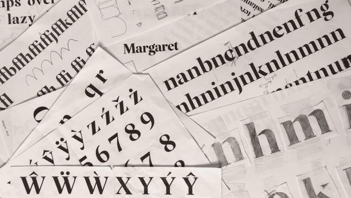
Tag

typefaces

Browsing

Sourced from WATC

For amazing typographic designs in the year 2023, take advantage of our top 10 free fonts selection that graphic designers can download.

We have searched through many free fonts on different platforms and gathered a collection of the 10 best fonts for graphic designers to download in 2023. This set contains a variety of styles, as mentioned before all selected fonts are available for free with designated options for private or commercial use.

10. Bigilla – Free Display Serif Font

Bigilla - Free Display Serif Font
Bigilla – Free Display Serif Font

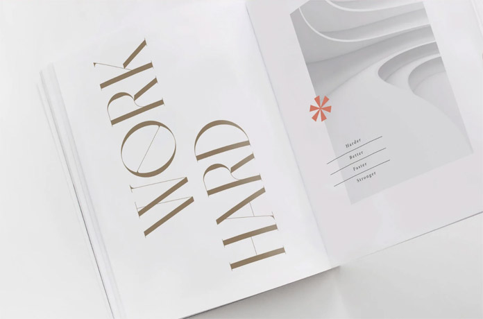
Bigilla is a trustworthy display serif typeface that was created by Jérémie Gauthier. The design includes multiple font weights, such as Regular and Bold. The free Bigilla font also comes with included ligatures and several alternate options. This typeface is perfect for multilingual purposes and can be used in an array of designs, including but not limited to branding, posters, magazines, packaging designs, etc.
Free Download

9. Juliette – Free Handwritten Signature Font

Juliette - Free Handwritten Signature Font
Juliette – Free Handwritten Signature Font

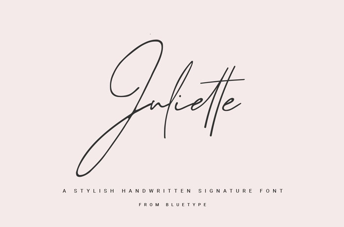
Juliette is the perfect font for creating sophisticated, yet natural and simple signatures in the style of real handwriting. With Juliette’s refined style you can create elegant designs without appearing stuffy. This free handwritten signature font is a great choice for a wide range of projects.
Free Download

8. Projekt Blackbird – Free Sans Serif Font

Projekt Blackbird - Free Sans Serif Font by by Leonit Gashi
Projekt Blackbird – Free Sans Serif Font by by Leonit Gashi

Projekt Blackbird, designed by Leonit Gashi, is a free font that looks great in headlines and web design projects. It can be used for both personal and commercial purposes. The typeface provides a unique and contemporary look.
Free Download

7. Handler – Free Vintage Sans Serif Font

Handler - Free Vintage Sans Serif Font
Handler – Free Vintage Sans Serif Font

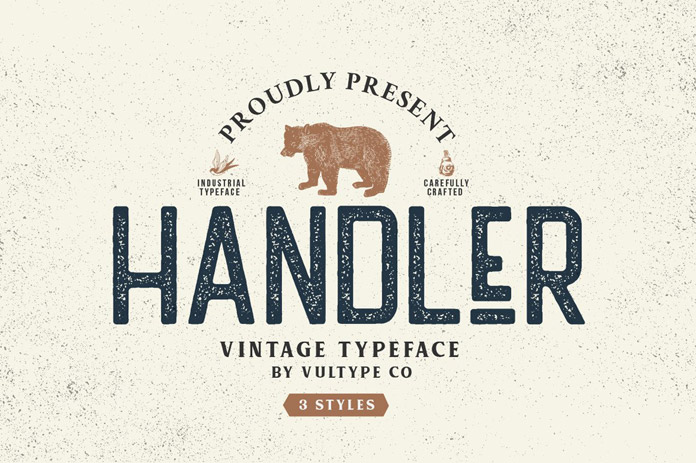
If you’re looking for a fantastic new vintage typeface, look no further than Handler! This retro-style font has three different character options – regular, stamp, and rough. Mix them up or use them separately to create unique interest in your projects or designs. Handler is perfect for logos, branding, vintage apparel, packaging, and more!
Free Download

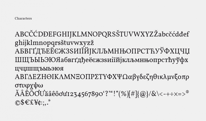
6. Margaret Serif Font

Margaret Serif Font
Margaret Serif Font

The Margaret Serif font is a beautifully classic display typeface created by Kacper Janusiak and the team at K94 Studio. This free serif font can be used in headlines, branding, and logotypes. It is perfect for adding a touch of elegance to any project. Just click on the link below to get further information about all features.
Free Download

5. Gilroy Font

Gilroy font family by Radomir Tinkov.
Gilroy Font

Designed by Radomir Tinkov, Gilroy is a fully functional sans-serif font family, which is actually not free of charge but two styles (Light and Extra Bold) can be downloaded for free on Fontspring. Gilroy is a fantastic choice for a wide range of print and digital applications like websites, mobile apps, branding, signage, and editorial design. Learn more by reading below or clicking the link below!
Free Download

4. Vollkorn – Free Google Font

Vollkorn - Free Google Font
Vollkorn – Free Google Font

Vollkorn is a serif font family that takes inspiration from classic designs. Its regular style was Friedrich Althausen’s first type designing attempt, which he published in 2005 under a Creative-Commons-License. The typeface quickly gained popularity and after only two years, it had been downloaded thousands of times. Today, Vollkorn is available as a free Google Font in 4 weights (Regular, Semi-Bold, Bold, and Black) plus matching Italics for each weight. With its dark and meaty serifsVollkorn can accommodate both print and web design projects equally well.
Free Download

3. Restora – Old-Style Roman Serif Font

Restora Font
Restora Font

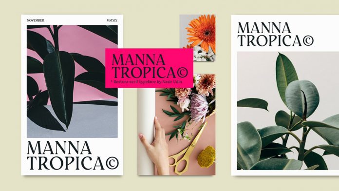
Restora is a popular roman serif font family that offers both a free version and a paid version. The full family includes eight weights ranging from thin to black, plus matching italics for each weight. The free version of Restora includes Extra Light and Thin Italic styles. You can purchase the complete family of 16 fonts here or follow the link below to download the two free styles.
Free Download

2. Ade Display – Free Serif Font

Ade Display - Free Serif Font
Ade Display – Free Serif Font

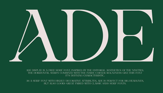
Ade Display is a free sans-serif font created by Thunder Studio. It was inspired by the editorial look of fonts from the nineties and combines horizontal serifs with inside corner roundness to create its unique character. The elegant typeface is ideal for big headlines.
Free Download

1. Big John Pro – The Best Free Fonts

Big John Pro free fonts
The Best Free Fonts: Big John Pro

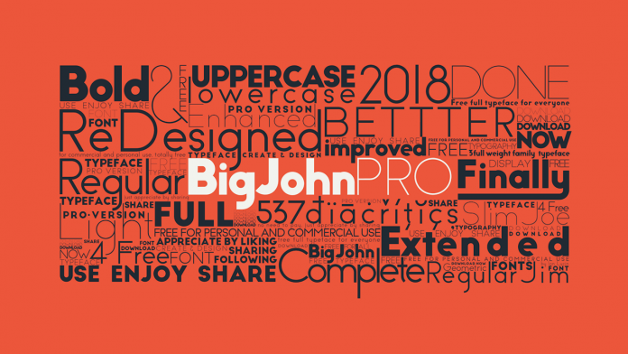
Big John PRO is one of our all-time favourite free fonts. Designed by Ion Lucin, it’s the updated version of Big John and Slim Joe font which you can find here. The new Pro edition has bold, light, and regular font styles for both personal or commercial use—and absolutely free of charge! To download, just click on the link in the bio section of the Instagram account belonging to Mr. Lucin himself.
Free Download

We hope you found our top ten free fonts for 2023 helpful and that you were able to find the right typeface for your next project. If you want to explore more of our recommended typefaces, we suggest browsing through our recommended Fonts category. You can also find great design assets in our Templates​ category.

By Dirk Petzold

Instagram: @weandthecolor

Sourced from WATC

By

A great web design is so much more than just delivering content and making it look good. When visitors come to your site, they produce a set of feelings about your website and your organization. The type of feelings they produce – positive or negative – are entirely in your hands and should not be overlooked when designing content.

Over the years, there has been a body of knowledge produced to help designers create effective visuals that play into the psychology of their viewers. In order to achieve this, one must understand how different web design elements and how we use them affect the mood, attitude and experience the visitor will have while browsing our website.

Below are four major areas of website design and development that have the biggest impacts on the psychology of website visitors. These are the tools you’ll need to create a visually-engaging site that encourages visitors to return.

Content

For websites, content drives the design you see on screen. Visitors come to a website to access information they need. Web design helps them find the information they need quickly and with ease.

In the early days of the Web, it was common to see pages and pages slammed with content, often pages with 10,000 words or more (as a comparison, this article is about 1,600 words). With pages loaded down with content, it made it extremely difficult to find content, let alone read through to get the information needed. This often invoked stress, anxiety and overall unpleasant feelings for visitors.

With today’s Web design, content should be edited and organized so that there is a happy medium between providing adequate and needed information while not overwhelming visitors. When content is in that happy place, visitors are able to find the information quickly and they feel good afterwards.

Hiding content, presenting too much content or otherwise mudding up your website makes visitors irritable, leading to possible loss in potential business.

In addition, the type of content you present sets a tone for you and your organization. If your content doesn’t present the right information in a logical place, is hard to follow or tends to beat around the bush on important information, then visitors will feel this way about you.

work desk computer laptop

Keep your content clean, organized, easy to read, concise, and professional to help aid in the psychology of your visitors and produce positive vibes.

To help you craft the best content for your website, this article at Tuts+ goes into further detail on the psychology of great content for your website.

Space

The way a Web page is organized can dramatically affect how a visitor feels while they are there. Organizing content should be a priority in any web design, but this organization should take into consideration the space it takes up on the site.

If you’re not familiar, “white space” is the areas of a design in which no content or visual element demanding our attention is present. White space plays an important role in any type of design work, especially Web design, because it visually gives a resting place for the visitor. These resting places are often found in margins and the space around things.

whitespace design web

The concept of minimalism – that is, using the least amount of visual content needed to convey your point or idea – is currently very popular across the Web, specifically on services like Squarespace.

Said differently, if a visitor comes to your website and every inch of real estate on the screen is taken up by words, graphics, blinking things, etc., it starts to feel chaotic and makes them uneasy. If no white space is present, there is nothing for them to move their eyes to take a visual break.

If you take the time to edit and organize your content in a way that is respectful of the space you have to present the information, you give a feeling of professionalism, organization and overall good vibes to visitors. You want your visitors to feel like you have your stuff together and that you are easy to work with.

Keeping things simple with a well organized website using adequate white space tells visitors you know what’s important and you don’t want to waste their time.

Learn more about white space and keeping things simple in this Smashing Magazine article.

Color

chalk colors

When designing a website, often the colors are dictated by the organization’s new or existing visual identity (or brand). But how these colors are used affects how the visitor feels when they visit your site.

Most visual identities have neutral colors (i.e the tints, shades, and hues of whites, grays, and blacks) that are used along with their main colors. In most modern web designs, these neutral colors often take dominance in terms of how much real estate they take up.

For instance, if an organization’s main colors are blue and yellow, with neutrals being white and black, it is likely that they may choose a white background to display their content on, instead of a blue or yellow background.

These neutrals act much like white space does: it provides an opportunity for rest. Using the example above, if all you see on that organization’s website was blue and yellow, it would be an overwhelming site to focus your attention on (think yellow text on a blue background).

The types of colors you use also play into the psychology of your Web design. Cooler colors (blues, greens, purples) often provide an inviting, professional and relaxed feeling. In contrast, it can be used to give a very cold and unfriendly feeling as well. Warmer colors (yellows, oranges, reds) are soothing, warm, and give a sense of creativity but can also give off negative feelings such as anger and stress.

example color design

In addition, neutrals such as white often give a positive feeling of openness, but could also feel bland and dull. Grays are often considered slick, modern, and clean, but can be very cold and uninviting. Blacks are often associated with being professional and clean cut, but is also very overpowering and can be rather generic.

How you use colors to help convey the positive feelings discussed above depends on the tint (lightness), hue (type) and shade (darkness) of the color as well as how much of the color you opt to use. If you want your site to be inviting, open and creative, a combination of blues and greens, with touches of yellow or orange, on a white or light gray background will help convey these positive feelings to your visitors.

For more information on how exact colors play into the psychology of web design, Vandelay Design has a great article outlining each primary and secondary color and its effects on viewers.

Typography

type we can make

Finally, typography can convey tons of emotions and feelings for visitors to your website. There are thousands of typefaces out there, and thanks to advancing Web technology such as CSS3, these typefaces have found their way onto websites as well.

No more picking a typeface out of the 15 or so Web-safe fonts. This has opened the door to thousands of new typefaces that can be used. And with great choice comes great responsibility.

Typefaces are designed to be used in specific situations and for certain uses. Serif fonts (those with little serifs, or feet, on the letters like Times New Roman) are often associated with professionalism, scholarly, and seriousness, while san-serif fonts (like Helvetica) are a bit more modern feeling, clean and more informal.

nytimes font front page

For example, most news websites (i.e. The New York Times) use serif fonts to help convey the feeling of tradition, importance and knowledge. They want you to feel like they are an authority, that what you are reading is important and that they know what they are talking about.

Sans-serif fonts are used more and more to convey a feeling of modern, clean, sophistication and upscale. Those in the technology industry often use san-serif fonts much more than serif fonts because they want visitors to feel like they are up-to-date and futuristic.

For more on what kind of fonts to use for your web design, Super Dev Resources has two great infographics to help you navigate your typography.

The way type is presented on the page is also important. Leading (space between the lines) and kerning (space between the letters) should be evaluated as well. Large leading with lots of white space between lines makes the copy feel airier and easier to read; little leading gives a crowded feeling and is hard to read more than one paragraph at a time.

via Fonts.com
via Fonts.com

Space between paragraphs, margins between blocks of text and other elements on the page, and font size (and its relation to leading) are also factors to consider. Tight paragraphs are uninviting and hard to read, copy that is too close to elements such as pictures make the page feel crowded, and too large or too small font size will either make the visitor feel like you are screaming at them or whispering.

Need ideas on the types of fonts available for your Web design? Check out offerings by Abobe’s TypeKit or Google Fonts for ideas on the possibilities.

Conclusion

It is often the designers’ job to understand the psychology of their design choices when producing a design, but understand the basics in some key areas of design will help you understand and even further help produce great content and manage your web design more effectively.

While these areas focus mainly on website design, a lot of the psychology of design can be used in other areas of design as well, such as logo and print design.

By

Sourced from TNW