Tactile design is reshaping branding, packaging, and digital UI with texture, embossing, and material surfaces that make design feel as good as it looks.
Screens have flattened everything. Swipe, tap, scroll — interaction is mostly frictionless now. But a countermovement is gaining ground. Designers across branding, print, packaging, and even digital interfaces are leaning into texture. They are making surfaces that suggest weight, grain, and resistance. They are designing things that feel like something.
This is tactile design. It is not a single aesthetic. It is an approach — a commitment to material honesty and sensory depth. When a brand prints its identity on uncoated stock with debossed letterforms, the paper’s tooth becomes part of the message. When a package uses kraft board with a blind-embossed logo, the roughness and the relief tell a story about craft and care before the product is even opened.
Tactile Design in Branding and Packaging
The most effective tactile design in branding starts with material selection. Studios working across print and packaging consistently reach for surfaces that have presence: cotton rag stock, duplex boards, textured uncoated papers, and natural materials like linen and wood pulp. These choices carry meaning. An uncoated cream paper reads handmade. A heavy coated board reads luxury. Kraft reads honest and sustainable.
Finishing techniques add the next layer. Debossing presses type or imagery into the surface, creating a recessed impression that readers touch without thinking. Embossing does the opposite, raising forms above the sheet. Foil stamping adds metallic contrast while still referencing physical material. Letterpress printing, with its characteristic ink bite and impression, turns the act of reading into a physical encounter with the page.
Tactile Design in Digital and UI
UI designers have long experimented with material metaphors — subtle noise overlays, paper-grain backgrounds, and linen-pattern interfaces that recall physical surfaces. The goal is not skeuomorphism for its own sake. It is warmth. A slight texture on a background removes the sterile coldness of a pure flat surface. It grounds the interface in the physical world.
Haptic feedback in mobile design extends this logic. A well-timed vibration when a button activates does not just confirm the action — it adds a moment of physicality that flat audio feedback cannot replicate. As displays improve and surface materials evolve, tactile design will bridge the screen and the hand more precisely.
The best tactile work understands that texture is not decoration. It is communication. Every grain, every impression, every surface choice sends a signal about quality, intent, and care. The studios and designers pushing this work are not chasing a trend. They are recovering something that flat digital design left behind.
For amazing typographic designs in the year 2023, take advantage of our top 10 free fonts selection that graphic designers can download.
We have searched through many free fonts on different platforms and gathered a collection of the 10 best fonts for graphic designers to download in 2023. This set contains a variety of styles, as mentioned before all selected fonts are available for free with designated options for private or commercial use.
10. Bigilla – Free Display Serif Font
Bigilla – Free Display Serif Font
Bigilla is a trustworthy display serif typeface that was created by Jérémie Gauthier. The design includes multiple font weights, such as Regular and Bold. The free Bigilla font also comes with included ligatures and several alternate options. This typeface is perfect for multilingual purposes and can be used in an array of designs, including but not limited to branding, posters, magazines, packaging designs, etc. Free Download
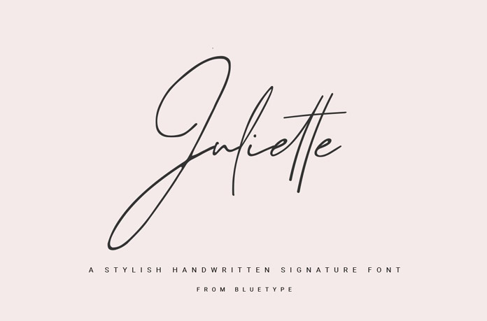
9. Juliette – Free Handwritten Signature Font
Juliette – Free Handwritten Signature Font
Juliette is the perfect font for creating sophisticated, yet natural and simple signatures in the style of real handwriting. With Juliette’s refined style you can create elegant designs without appearing stuffy. This free handwritten signature font is a great choice for a wide range of projects. Free Download
8. Projekt Blackbird – Free Sans Serif Font
Projekt Blackbird – Free Sans Serif Font by by Leonit Gashi
Projekt Blackbird, designed by Leonit Gashi, is a free font that looks great in headlines and web design projects. It can be used for both personal and commercial purposes. The typeface provides a unique and contemporary look. Free Download
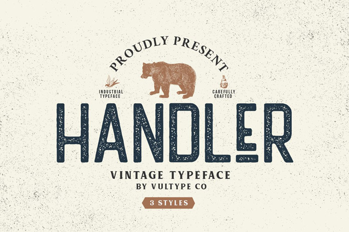
7. Handler – Free Vintage Sans Serif Font
Handler – Free Vintage Sans Serif Font
If you’re looking for a fantastic new vintage typeface, look no further than Handler! This retro-style font has three different character options – regular, stamp, and rough. Mix them up or use them separately to create unique interest in your projects or designs. Handler is perfect for logos, branding, vintage apparel, packaging, and more! Free Download
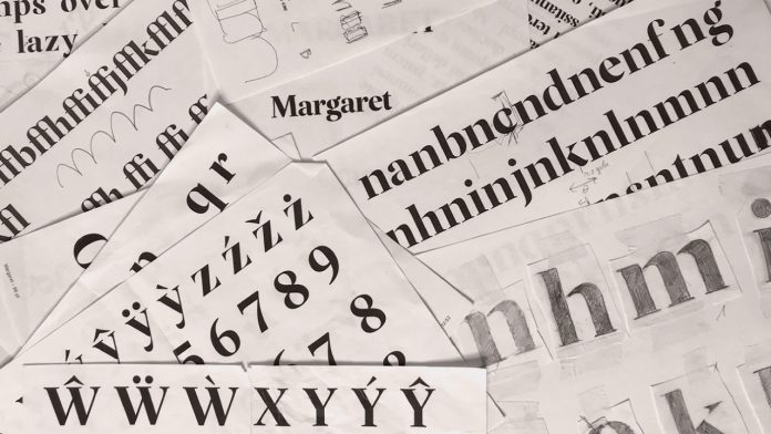
6. Margaret Serif Font
Margaret Serif Font
The Margaret Serif font is a beautifully classic display typeface created by Kacper Janusiak and the team at K94 Studio. This free serif font can be used in headlines, branding, and logotypes. It is perfect for adding a touch of elegance to any project. Just click on the link below to get further information about all features. Free Download
5. Gilroy Font
Gilroy Font
Designed by Radomir Tinkov, Gilroy is a fully functional sans-serif font family, which is actually not free of charge but two styles (Light and Extra Bold) can be downloaded for free on Fontspring. Gilroy is a fantastic choice for a wide range of print and digital applications like websites, mobile apps, branding, signage, and editorial design. Learn more by reading below or clicking the link below! Free Download
4. Vollkorn – Free Google Font
Vollkorn – Free Google Font
Vollkorn is a serif font family that takes inspiration from classic designs. Its regular style was Friedrich Althausen’s first type designing attempt, which he published in 2005 under a Creative-Commons-License. The typeface quickly gained popularity and after only two years, it had been downloaded thousands of times. Today, Vollkorn is available as a free Google Font in 4 weights (Regular, Semi-Bold, Bold, and Black) plus matching Italics for each weight. With its dark and meaty serifsVollkorn can accommodate both print and web design projects equally well. Free Download
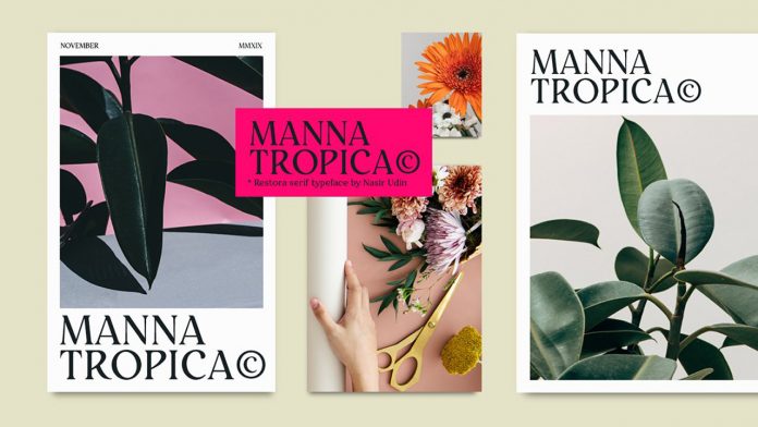
3. Restora – Old-Style Roman Serif Font
Restora Font
Restora is a popular roman serif font family that offers both a free version and a paid version. The full family includes eight weights ranging from thin to black, plus matching italics for each weight. The free version of Restora includes Extra Light and Thin Italic styles. You can purchase the complete family of 16 fonts here or follow the link below to download the two free styles. Free Download
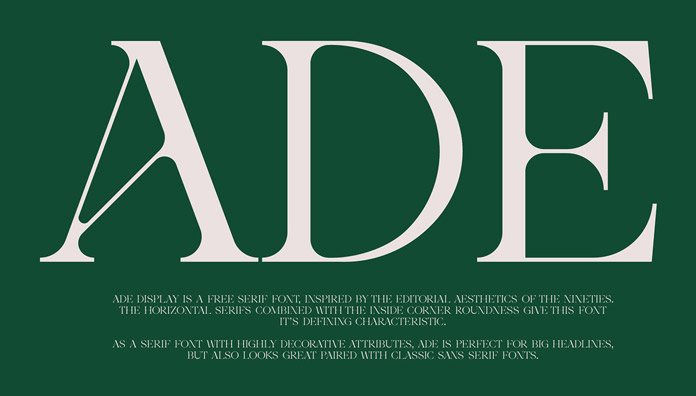
2. Ade Display – Free Serif Font
Ade Display – Free Serif Font
Ade Display is a free sans-serif font created by Thunder Studio. It was inspired by the editorial look of fonts from the nineties and combines horizontal serifs with inside corner roundness to create its unique character. The elegant typeface is ideal for big headlines. Free Download
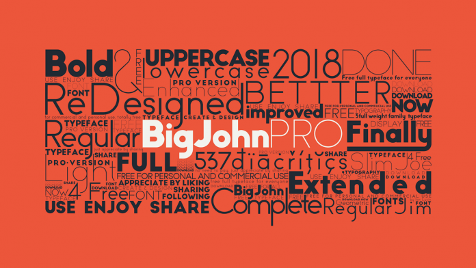
1. Big John Pro – The Best Free Fonts
The Best Free Fonts: Big John Pro
Big John PRO is one of our all-time favourite free fonts. Designed by Ion Lucin, it’s the updated version of Big John and Slim Joe font which you can find here. The new Pro edition has bold, light, and regular font styles for both personal or commercial use—and absolutely free of charge! To download, just click on the link in the bio section of the Instagram account belonging to Mr. Lucin himself. Free Download
We hope you found our top ten free fonts for 2023 helpful and that you were able to find the right typeface for your next project. If you want to explore more of our recommended typefaces, we suggest browsing through our recommended Fonts category. You can also find great design assets in our Templates category.
Placing a heavy focus on minimal details such as a varied colour palette and direct typography, United Sodas of America takes a different path to packaging design.
When it comes to packaging, most designers tend to zoom in on the details, looking endlessly for an illustrator to work with, or an inventive approach to its labelling, maybe – or even an extra bold typeface to catch someone’s eye off the shelf. It seems little attention is often paid to the actual vessel, an element thought of as a non-negotiable factor handed over from the manufacturer. Yet the newly launched United Sodas of America pushes against this design approach, surprisingly placing its can’s shape centre stage and in turn making the everyday become iconic.
The result of over two years worth of work by Brooklyn-based brand design company Center, the design approach for United Sodas of America is built around the idea of reinventing soda and an audience’s initial perception of it. Beginning by studying and visually riffing off the name provided – as well as the brief’s leading question: “What if soda was invented in 2020?” – the agency’s founder Alex Center notes that the team (made up of Kevin Batory, Ashleigh Bowring, Pete Freeman, Andrew Galloway and Alex himself from Center, and Marisa Zupan and Kate Reeder from United Sodas) first identified soda as “a classic American beverage”. Therefore in its attempt to reinvent it aesthetically, the agency and brand should purposefully “embrace that, not avoid it,” he tells It’s Nice That. Center’s focused on the idea to add very little to the can visually, creating a minimalistic identity that manages to retain the same nuanced detail of its neighbours in the fridge.
The most obvious design decision when looking at Center’s approach is the colour palette used, again a concept driven from the product’s name. The inclusion of a 12 colour rainbow-like selection is a purposeful step away from the red, white and blue we often associate with the US, developed from the team feeling that “in a world that sees just red and blue, variety unites,” explains Alex. Collectively believing in this concept also led United Sodas of America to launch with 12 available flavours, and include one of each in their flagship variety pack. “That’s not normal for a beverage company,” adds Alex. “So that’s why the brand is so colourful, because the idea is that within the range of flavours, everyone is going to find one that speaks to them. A flavour for every flavour, if you will.”
Despite its simplicity, deciding upon this unified yet wide ranging colour palette took the team’s time. As Alex points out: “With a brand that is as minimal as United Sodas, all of the details needed to be perfect”. Beginning by tracing back the approaches of great American midcentury colour masters and colour field painters, including Ellsworth Kelly, Clyfford Still, Helen Frankenthaler and Mark Rothko, Center’s team aimed towards utilising colour as “a way of creating deeper meaning” as these artist had, referencing their colour palettes as a starting point.
More specific shades were then selected when it came to assigning colours to flavour, an approach which suitably “thought beyond just ‘the colour of the fruit’,” says Alex. Referencing not only flavour but wider ingredients, personality and a feeling, each comes together “in a tone that created an entire immersive experience, a flavour world,” he continues. This was also inspired by how the painters mentioned often made their own paints. “Clyfford Still used to mix them in his garage, Frakenthaler added extra oil to get the paints to mix with the canvas, creating a more complex tone,” points out Alex, “so, of course, a simple ‘blue’ wouldn’t do it for sour blueberry!” Each of these careful decisions add nuance to United Sodas of America’s branding, and is an area Center will continue to explore, “with more visuals, copy and sounds that make each a complete sensory experience.”
Aside from colour, the beverage’s branding is then brought to life through typography. The decision to use Klim Type Foundry’s Founders Grotesk as the main brand typeface was driven from a want to “feel unbranded”. Founders Grotesk offers “just the right amount of trustworthiness and directness but also some quirk to it,” says Alex. “It’s matter-of-fact and informative at times, and humorous at others.”
With United Sodas of America now launched in a design style which utilises minimalism “to represent the idea of a new America,” Center’s branding has piqued the interest of many with its unique approach. Reflecting on this, Alex adds: “The reaction has been truly everything we could have hoped for, and more,” he tells us. “We’ve been working on this project since we launched the studio in 2018 and have been itching to get it into people’s hands ever since.” For the founder, it’s been an additionally rewarding experience, given his background of working at Coca-Cola and across the wider beverage industry. “To go out on my own and put together a team of amazing humans that are building this iconic brand, I’m just so insanely proud.”
90% of all the information on the web is in writing. That means that typography is a skill that dictates that 90%. That’s a staggering figure that highlights just how important typography is.
It’s absolutely everywhere: blog posts, social media, magazines, reports, books, and so much more.
What this means for you as a designer is that text is your primary means of communication. If you haven’t got your typography skills down, then you’re not going to be able to deliver your ideas to your audience.
Luckily for you, we’ve got a list of useful tips and rules that you can follow to avoid that happening. Even if you’re not the best at typography, follow the information that we’ve laid out here, and you’re going to be fine.
Pick an Industry Standard Font
There are a ludicrous number of fonts to choose from when designing your web typography. Some of these fonts are much better than others, though, so make sure you do your research and pick one that’s proven to get results.
There’s nothing worse than looking at an unreadable squiggly mess on a page, so put some thought into what font you’re using.
Back in the day, tiny font sizes used to be all the rage. That might be passible on massive blocky monitors, but people are using phones and tablets to browse the web these days.
You need to make sure that those users can read your content, so pick a big font that’s easily visible as soon as you glance at it.
We’ve found that 15 – 25 px yields the best retention rates, but so long as it’s legible and nice to look at, you shouldn’t have a problem.
Make Your Headings Proportionate
Headings are the signposts of your web typography. It helps the user navigate the page and highlights what information might be important to them.
It’s vital that your headings stand out, so make sure that you’re using at least a 180% increase in size when compared to your body text.
There’s nothing more frustrating than trying to read a block of text that has awful line spacing. Not only does it turn the reading into a chore, but it can be incredibly hard to follow.
That’s why you’re going to set your line spacing appropriately. 120 – 145% percent of the overall point size should do it.
Tracking and Kerning
Adding tracking and kerning to your text is going to help it look neater and roomier. What this does is adjust the spacing between letters proportional to the size of the text. The space between the words of a heading versus lines of text isn’t going to be the same.
This can help to keep everything separate for your user, making it easier to navigate through the information.
Whitespace is a vital part of web design as a whole, and that includes typography. You need to have some decent whitespace in between your headings and your paragraphs. If you don’t, then the whole thing is going to become a cluster of information, which is exactly what you’re trying to avoid.
Your user’s eyes need places to rest. This doesn’t just go for on the page, but when they read, too. If you don’t have whitespace, they get fatigued. When they get fatigued, they stop reading.
This is the exact opposite of what you’re trying to achieve, so make sure you’re obeying this web typography rule at all times.
Limit Your Line Length
Limiting your line length is an industry-standard practice for a reason. If you’re not doing it, then your page is going to suffer when it comes to professionalism.
45 – 90 characters is a good-sized line length to take that also leaves a lot of room for your personal preference.
One factor you might want to consider when choosing your line length is what device you expect your clients to be using. There’s a clear difference in device usage across services here, and you can get away with longer line lengths with users visiting from bigger machines.
Serifs and sans-serifs. Both of these typefaces have advantages and disadvantages, but you should only be using one.
Determine what your target audience or client is looking for and use that information to influence your decision.
This is completely separate from your font selection, bear in mind. The typeface is a stylistic family of fonts that fall within it.
That being said, you should determine your typeface before your font, and not the other way around.
Structure and Hierarchy
If you don’t have a hierarchy, you descend into chaos and pandemonium. This is as true for typography as it is for life.
We’re not just talking about your H1, H2, H3, and P HTML tags here, but the way in which you present your information, as well.
If you have quotes, links, lists, or anything in between, make sure that it all follows a uniform structure.
If you’re doing a listing page, then you don’t want the links to a resource being halfway through one entry, at the bottom of another, and the top of another.
Further Your Web Typography Education
Web typography is a discipline that cannot be learned in a day. It takes constant practice and exercise to develop your skills, and that’s only one part of the equation.
The industry standard is constantly evolving and changing, meaning that you need to keep up to date with all of those changes.
Keep yourself plugged in and make use of all the practice and educational resources you can find.
Conclusion
Web typography is an overwhelming discipline that can take its toll on even the most seasoned designer. It’s like a muscle, though, and the more you use it, the stronger you’re going to be.
It’s, unfortunately, a massive part of web design, meaning it’s completely unavoidable. You’re going to have to tackle it at some point; we just hope that our tips help you when you get there
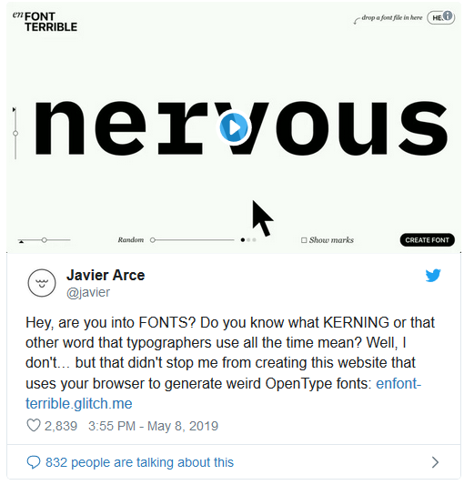
EnFont Terrible lets you remix your fonts in seconds.
You can never have too many fonts, we’ve found, and just to complicate matters we’ve also found a fantastic new site that makes it absurdly easy to mutilate your existing type, turn it into whole new pieces of typographical joy and even create stunning kinetic typography in a matter of seconds.
It’s called EnFont Terrible, which is by far the best pun you’re going to hear this week, and it’s the work of Spanish designer Javier Arce. He claims that he doesn’t really know about kerning or any of that complicated typography stuff, but decided to make his own type generation site anyway.
If you can’t be bothered with typography tutorials, you’ll be delighted to learn that EnFont Terrible is quite gloriously simple to use; either use the default fonts that come with it or upload your own, and by dragging a few sliders around you can warp and mutate it into something quite weird and wonderful in a matter of seconds, without having to know the first thing about typography.
Once you’re happy with it, just hit the Create Font button in the bottom right-hand corner and you’ll instantly save your mutant creation in OpenType format.
As a serious typographic tool it probably leaves a little to be desired, but as a fun way of mucking about with fonts it’s very hard to beat, and with the right input fonts and a bit of experimentation you could quite easily grow a massively expanded font collection over the course of an afternoon.
Don’t take our word for it, though; you can get to grips with EnFont Terrible’s tools here.
Be Bold. Or Italic. Never regular – as the old graphic design joke goes. It’s a pretty played out pun by this point, but the truth is that typography is as essential to great design today as it has always been. Let’s take a look at the ways that creative and inspired typography can help designers to build unforgettable online experiences.
Maybe there’s even something a little surprising in our ongoing obsession with all things font, given the move from print to digital design. But, of course, effective and cohesive visual communication is now more important than ever. And typography is intrinsically related to technological advancements in the digital era.
95% of websites are made up of content. But equally important to what words you’re saying is how those words look. So, an opening word of advice for brands and organisations in the early phases of web design: pay as much attention to your Sans Serif as you do to your “About Us” section.
Let’s take a look at the ways that creative and inspired typography can help designers to build unforgettable online experiences.
UX Design & Establishing Hierarchy
As we’ve moved further and further into the world of UX, we’ve found that an increasingly important part of good design is finding a way to guide your user through site in the most natural way possible, with minimal effort on their part when it comes to making sense of everything. Type not only creates harmony and consistency across your site – it also provides a frame of context for your user to interpret content.
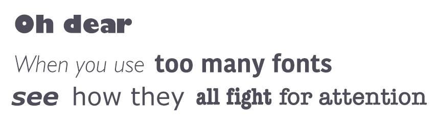
Whether that’s through style or size or placement – the user differentiates different types of information. A much better option than presenting them with a homogenous block of text. Of course, going wild with too many fonts will have the opposite effect. Select between two and four fonts and apply them carefully.
Brand Identity & Bespoke Typefaces
Robert Bringhurst describes typography in his book as “the craft of human language with a durable visual tone”. Type is a meaningful a mode of visual communication that gives an impression of tone and personality and relationship to the audience as human speech in exactly the same way that speech does.
The right font has the power to evoke the feelings and emotions in your user that you want them to associate with your brand or business. 2017 was the year of the bespoke typeface – Youtube and Coco-Cola both released their own custom fonts. They followed in the footsteps of Google, who released Roboto is 2011. Roboto is a neo-grotesque sans-serif font described by the company as “modern, yet approachable” and, “emotional”.
For brands and organisations, the custom typeface is a pragmatic move. To say that it’s a crowded marketplace would be a meaningless understatement, and designing something that’s just yours is a way of protecting your brand and cementing your visual identity.
As any good luxury branding agency will tell you, the bespoke typeface is here to stay. Here’s a good roundup, taking a look at The Death of Helvetica.
Typography and Virtual Reality
The digital designer’s role will change again with the arrival of VR and AR into mainstream culture and brand experiences. Type is still immensely relevant, but these new interfaces with their own unique set of challenges. The entire dynamic of typography as a visual medium changes.
As The Drum puts it: “in VR, type becomes physical, elastic, monumental, dimensional, and confrontational”. Designers must consider motion, volume, UI/ UX and sound in additional to the visual effect. VR dispenses with the frame, creating a new challenge for your user when it comes to establishing context for… well, text. The job of the designer is, as always, to solve it.
There’s always a place for considerations related to font when it comes to web design. Make sure your words are speaking for your brand in the way that you want them to with careful and consider application of typography and a creative approach to harnessing new technologies.
Good design is often based on a careful mix of tradition and innovation. And revolutionary inventions are solidly based on the findings by previous generations of professionals. So, whatever a domain of creative work you have chosen as your job, it’s important to sometimes stop and look back, listening to wise and experienced voices of people being in that job for years.
Earlier we have already shared numerous expert quotes, tips, video talks and books worth reviewing to support our readers with useful resources. In particular, you could check the insights into Design Is a Job by Mike Monteiro and Designing for Emotion by Aarron Walter—the books belong to the series A Book Apart for designers offering the diversity of expert tips, case studies, and resources. Today continuing on this way, we are sharing a new set of quotes by Erik Spiekermann, a famous German typographer, designer and writer, an honorary professor at the University of the Arts Bremen and ArtCenter College of Design. Having passed the long way in graphic design from 1970s, being an author of books and articles as well as awards winner, he is justly recognized as a guru of typography and avidly shares his experience and expertise. So, here we will save a bunch of 20 useful expert tips for Tubik Quotes Collection — we got them from his blog, his interview for 99U and other published writings. Join in and let’s look into his thoughts together to know a bit more about the master.
I’m very much a word person, so that’s why typography for me is the obvious extension. It just makes my words visible.
Inherent quality is part of absolute quality and without it things will appear shoddy. The users may not know why, but they always sense it.
These days, information is a commodity being sold. And designers—including the newly defined subset of information designers and information architects—have a responsible role to play. We are interpreters, not merely translators, between sender and receiver. What we say and how we say it makes a difference. If we want to speak to people, we need to know their language. In order to design for understanding, we need to understand design.
The materials shape your idea.
I learned that a brand isn’t a logo. There has to be implementation. You can design anything, but if the rubber doesn’t hit the road, you’ll be remembered as a great strategist but the client won’t call you again. You have to have a strategy, and you also have to be able to visualize it—one doesn’t go without the other.
The attention someone gives to what he or she makes is reflected in the end result, whether it is obvious or not.
I’ve always designed typefaces for specific solutions. In other words, a problem. Everything has always been done for a specific purpose. As a designer, you work for somebody else. That’s not negative. I work for a client, and I solve their problems. I bring my artistic vision to it, my creativity, whatever you want to call it. But essentially, I’m being paid to blow somebody else’s trumpet.
You are what you are seen to be.
The function has to be the brand. If it works well, it has to be branded at the same time.
If a design project is to be considered successful—and success is the true measure of quality—it must not only add an aesthetic dimension, but solve the problem at hand.
I mean, everyone puts their history into their work.
When I do typography, it’s 150 percent effort.
I know a lot of advertising agencies that thrive on overtime because they have a dozen interns who work for free and they spend their weekends doing free pitches. We don’t do free pitches because we don’t have any free time. Our time is valuable, and I’m not giving away ideas to some prospective client. That’s giving away the most valuable resource you have.
Work is gas. Work will fill any given volume.
Clients need to understand that they’ve hired us to do something they are not good at. And that they need to pay us for our knowledge, skills, experience and, yes: attitude.
My advice, now and always, is learn, learn, learn—starting right here.
Contrary to popular belief, designers are not artists. We employ artistic methods to visualize thinking and process, but, unlike artists, we work to solve a client’s problem, not present our own view of the world.
Being a designer is all about attitude. Sure, you have to know your craft, but as we both found out, you can pick most of that up over time if you’re prepared to listen, watch, and learn. Without the right attitude, however, you’ll always be a vendor to some people, a crazy artist to others.
So what’s new? The present generation of UI/UX designers may think that they invented a new way of designing, but we’ve had these issues forever. Trying to fit a lot of text onto the how-to page inside a pharmaceutical package is probably more difficult than doing the same on a screen. There’s no zoom on that paper, so it has to be really well done just for that one version and circumstance. My method? Think. Consider. Sketch. Think again. And look around you. It’s all been done before, albeit with different code.
Inspiration. From real life. I open my eyes and I travel and I look. And I read everything.
Typography can make or break a product. Here’s how to excel at it
Communication plays a vital role in design. In order to be successful, your products have to clearly communicate their intent and purpose. When we talk about communication, we usually mean text, because the purpose of any text on your website or app is to establish a clear connection with users.
Typography plays a significant role in this process: Good typography makes the act of reading effortless, while poor typography turns users off. As Oliver Reichenstein states in his essay “Web Design Is 95% Typography”:
Optimizing typography is optimizing readability, accessibility, usability(!), overall graphic balance.
This statement is relevant not only for the web, but for all UIs.
How to Make Typography Work for You and Your Users
There are a lot of conflicting opinions out there about best practices for typography, and there isn’t one strict set of rules that apply in every case. However, there are several things you can do to make sure the typography is honoring the content and improving readability.
Here are 10 practical recommendations and tips that you can use in your projects:
1. Keep the Number of Fonts Used at a Minimum
In order to prevent situations like this, try to limit the number of used fonts.
Using more than three typefaces simultaneously can make your app/site look busy and unstructured. It’s better to limit the number of used font families to a minimum (two is plenty, one is often sufficient) and stick to the same ones through the entire website/app.
Start by selecting a typeface for your body text
This is a very important decision which will affect the decisions of any other typeface like headlines. Body text is the most common element in a product. This is what all your users will see and experience. As a result, the look and feel of your body text will have the greatest impact on the quality of your design.
Stay with one font until you master it
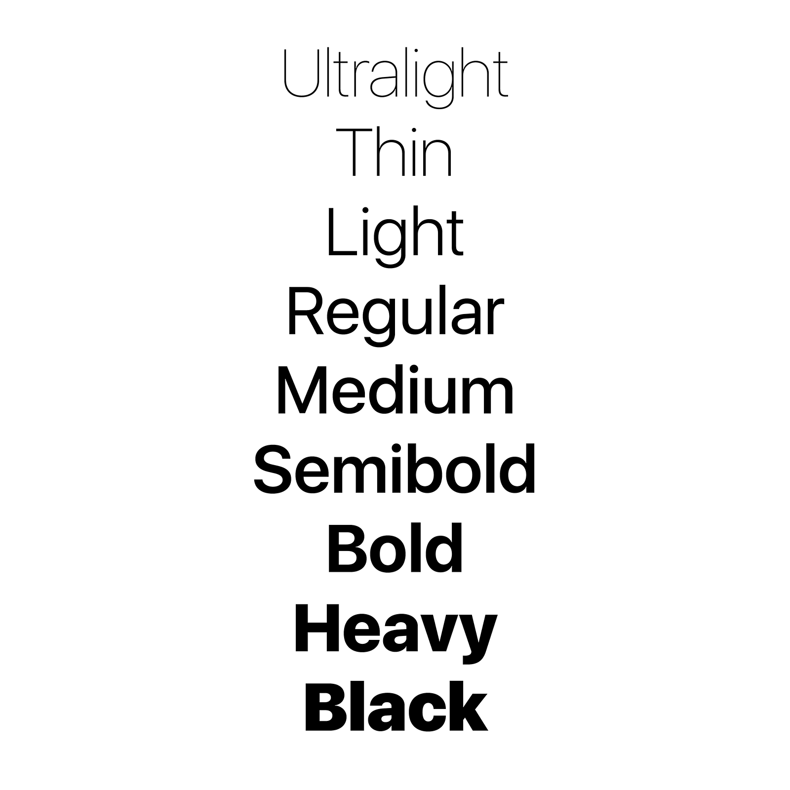
For beginners, it’s recommended to stay with one font until you have achieved mastery of that font. Play with the styles. Modern typefaces already come with many different styles, which means they share common distinct weights. Typefaces with a larger range of styles can help you differentiate text in special contexts, like a button or a label. A good example is San Francisco typeface from Apple.
San Francisco typeface from Apple
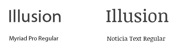
Ensure font families complement each other
If you still want/need to use more than one font, ensure the font families complement each other. Take the example of fonts combinations below. The combination of Georgia and Verdana (left) share similar values that create a harmonious pairing. Compare that to the pairing of Baskerville and Impact (right) where the heavy weight of Impact vastly overshadows its counterpart.
Using two fonts successfully within a layout requires an understanding of the chosen fonts. Ensure the font families complement each other based on their character width.
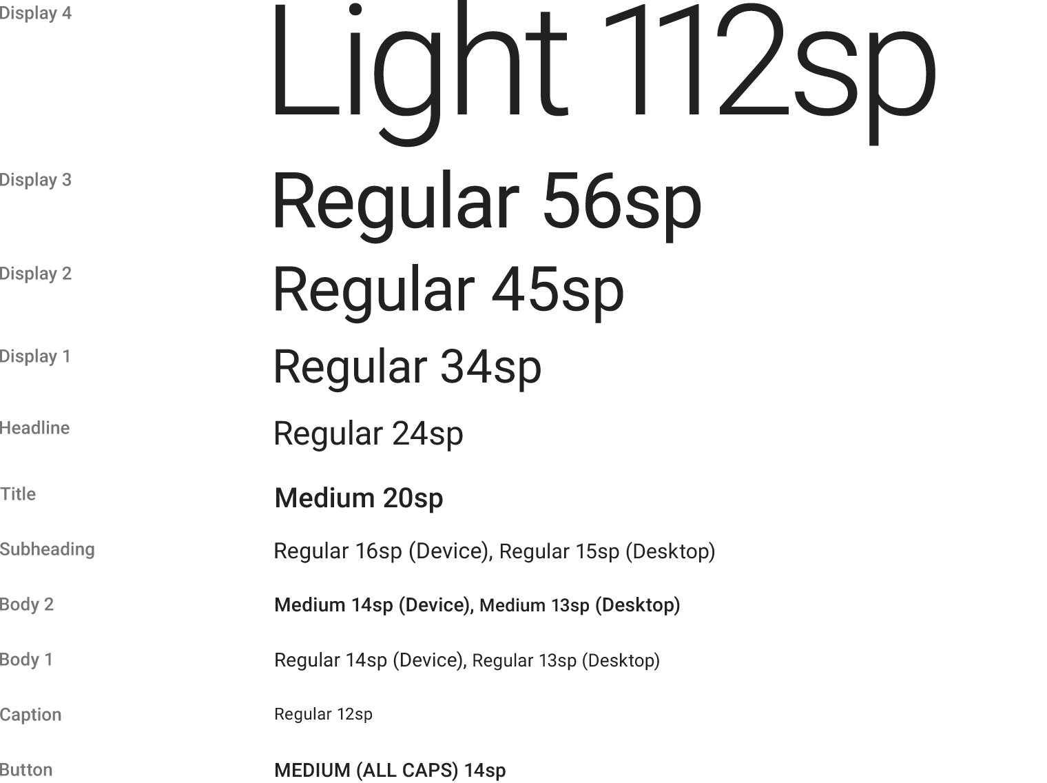
2. Choose the Proper Font Size
The size of your text has a huge impact on the experience of reading something on screen:
Text that is too small can cause the reader to strain. As result, users will skip most of the information presented. This is especially true for mobile, where tiny type on a small, bright screen can be a headache for users.
Text that is too large can also cause problems. Large text can be distracting and tends to call attention to itself.
That’s why you should always start with a comfortable font size for your body text. While it’s impossible to provide a one-fits-all solution for the font size, a general rule of thumb is:
For desktops: Use 16 px font or higher for body text. It’s not too big and it’s comfortable to read.
For iOS devices: Use a text size that’s at least 11 points (it’s legible at a typical viewing distance without zooming).
For Android: Minimal readable font size is 12 sp, but it is highly recommended to use at least 14 sp for the main text.
Tip: Selecting font size can be daunting. But there is a technique that can help you — a modular scale. A modular scale is a sequence of values that can be applied to determine the size of your text styles in a harmonious way. You first choose a ratio — For example, the golden mean 1:1.618 (scale factor). Then you pick the base size of your text, for example, 16px. After that, you multiply to get the sequential numbers: 16px, 26px, 42px, 68px, 110px. You can use a tool like Gridlover to find a proper font size for different scale ratios.
3. Justify Left and Mind the Gap
In the Western world, type is read top to bottom and left to right. By justifying type left, you make the text easier to read. The eye is able to find the edge and this makes reading the copy much easier: A consistent left (vertical) edge assists readers by providing a place for the eye to return to after finishing each (horizontal) line.
It’s also important to mind the gap and avoid having a single word on the last line of a paragraph (otherwise known as a widow):
A widow is a single word or a very short line of text at the end of a paragraph. Avoid it as possible.
4. Choose a Typeface that Works Well in Various Sizes
With the growing popularity of type design, the sea of typefaces from which to choose gets bigger each year. Users will use your app/access your site from devices with different screen sizes and resolutions. Since a majority of UIs require text elements of various sizes (button copy, field labels, section headers, etc), it’s important to choose a typeface that works well in multiple sizes to maintain readability in every size.
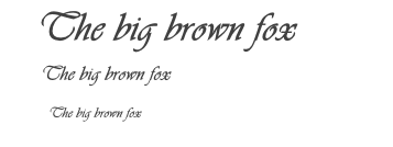
It’s essential to make sure that the typeface you choose is legible on smaller screens! Try to avoid fonts that use cursive script, such as Vivaldi (in the example below): although they are beautiful, they are difficult to read.
Vivaldi typeface will be difficult to read on the small screen
5. Use Fonts with Distinguishable Letters
Lack of distinction between capital I and lowercase l.
Legibility is a measure of how easy it is to distinguish one letter from another in a particular typeface. However, not all typefaces are created with legibility as a primary design function. Many typefaces confuse similar letterforms, specifically with “i”s and “L”s (as seen in the image above). Another common legibility issue is poor letter spacing — set together, an “r” and “n” can easily become an “m”. You need to avoid these kinds of fonts because people will have problems reading them on small displays.
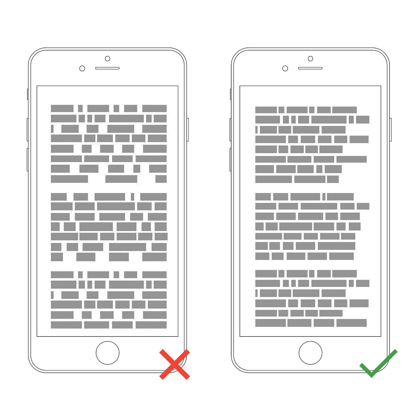
6. Limit Line Length
Wikipedia has a way too long lines of text.
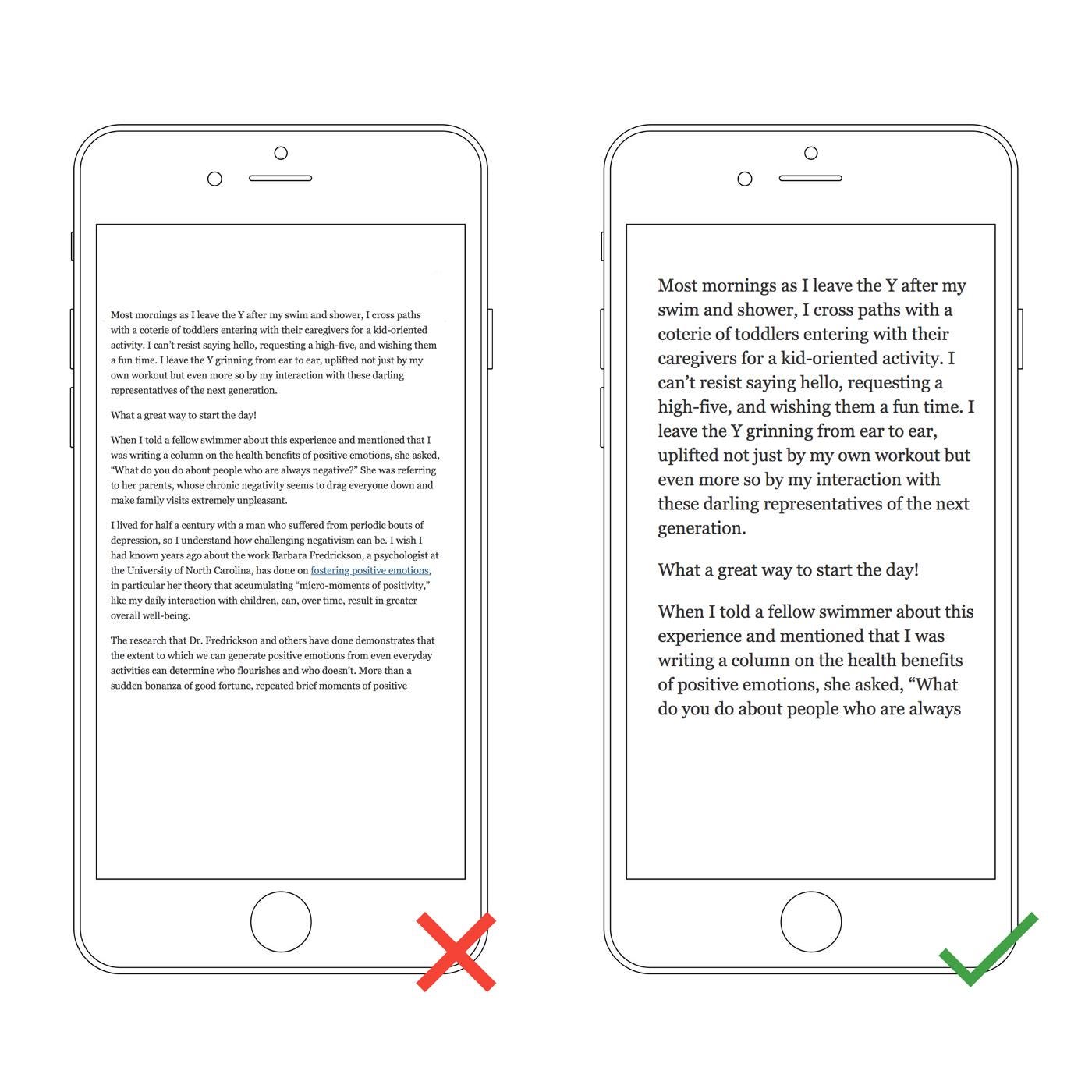
Line length is the horizontal distance of a block of text. Unfortunately, long lines are probably one of the most common design problem on the web. Having the right amount of characters on each line is key to the comfortable reading of your text. The generally accepted, ideal line length for comfortable reading on desktop is around 60 characters per line, including spaces (according to “Typographie”by E. Ruder). This line length has a positive impact on reading rhythm: Our mind is energized when jumping to the next line (as long as it not so frequent).
If a line is too short, the eye will have to travel back too often, breaking the reader’s rhythm. If a line of text is too long, the user’s eye will have a hard time focusing on the text. Image credit: Material Design
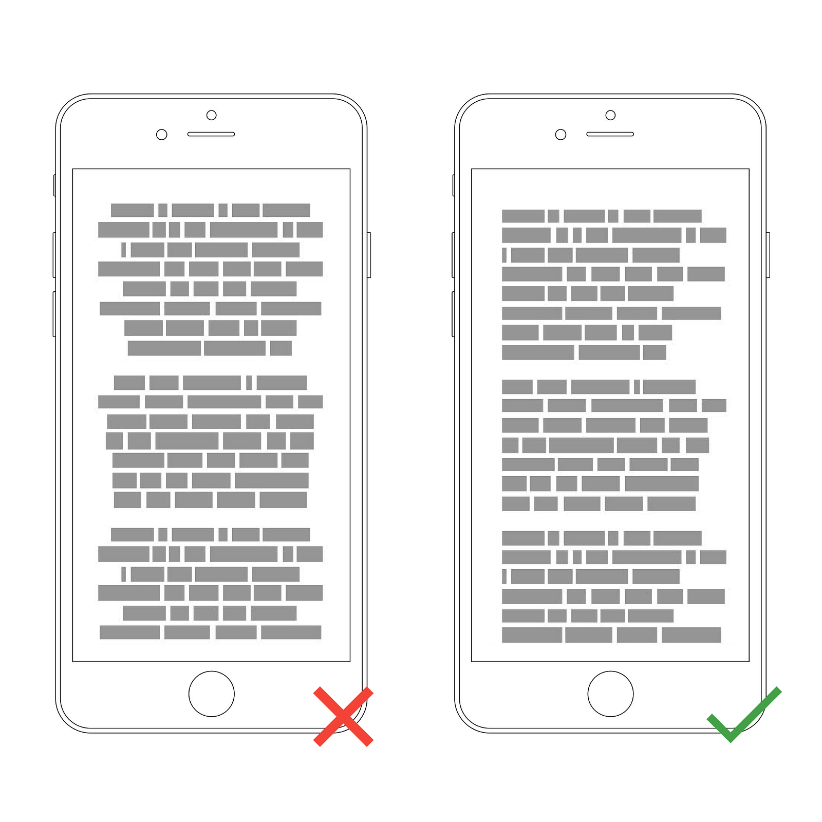
It’s rare that 60 characters extend to the edge of a desktop screen, but on most mobile devices 60 characters (if displayed large enough to be legible) extend beyond the boundaries of the visible area of the screen. A rule of thumb for mobile typography is to stick to 30–40 characters per line (line length for narrow columns of text in newspapers or magazines).
Below is an example of two sites viewed on a mobile device. The first one uses 50–75 characters per line (optimum number of characters per line for print and desktop), while the second one uses the optimal 30–40 characters.
In web design, you can achieve an optimal number of characters per line by restricting the width of your text blocks using em or pixels.
Left: The text is too small to read on a small device without pinching and zooming. Right: The text is comfortable to read on a mobile screen.
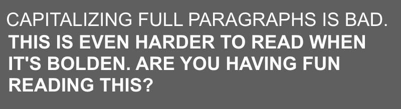
7. Avoid All Caps
All caps text — meaning text with all the letters capitalized — is fine in contexts that don’t involve reading (such as acronyms or logos), but it’s better to avoid all caps when your message involves reading. As mentioned by Miles Tinker, in his landmark work, Legibility of Print, all-capital print greatly retards the speed of scanning and reading in comparison with lower-case type. Don’t use all caps in text blocks longer than one line of text.
8. Don’t Lose Your Rag
A rag is the edge of a block of text. When text is justified, the words on the line are spaced equally so that there’s no rag on either side. It’s better to avoid using forced justified type because it results in inconsistent whitespace.
Ragged right text has an additional benefit for mobile users. A lot of factors can distract a person from reading (such as an incoming call). A rag creates a random shape down the right-hand column that helps the eye easily relocate its last position and re-engage with text copy.
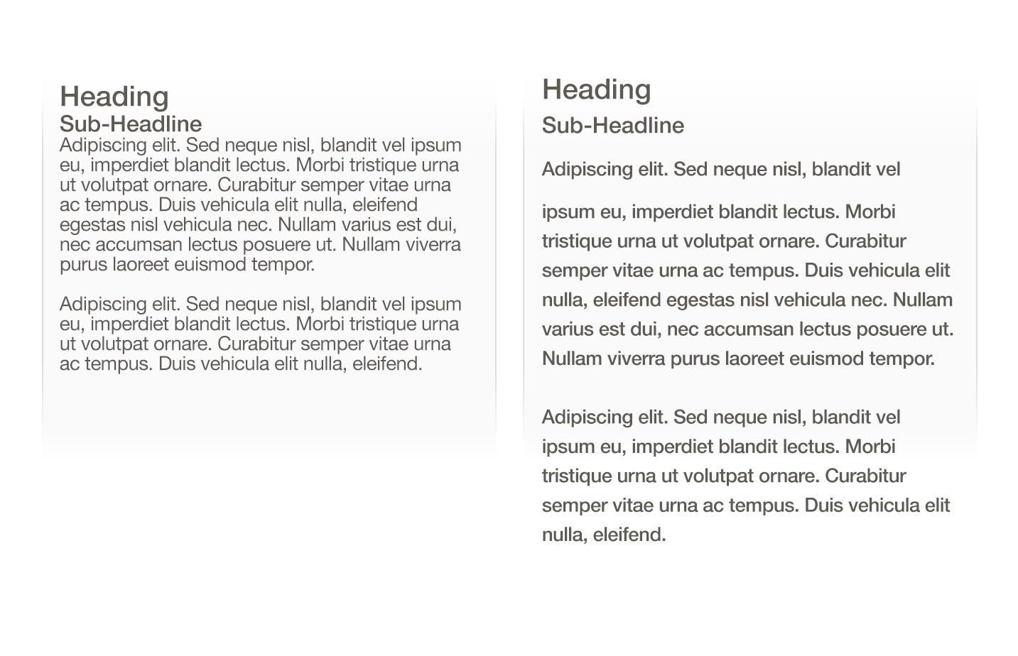
9. Don’t Minimize Spacing Between Lines
Too tight; Too much; Just right. By adding a right amount of space to text — both between lines and in the margins — you are helping users better interact with the words.
Typography is all about spacing. In typography, we have a special term for the spacing between two lines of text — leading (or line height). In word-processing software, this concept is usually referred to as “line spacing.”
Bad leading leads to text that looks crowded. By increasing the leading, you increase the vertical white space between lines of text, generally improving readability in exchange for screen real estate.
Good spacing aids readability. Properly using white space has been proven to increase comprehension: It gives readers the perception that text isn’t too dense and feels easier to read. A simple rule is your leading should be wider than your word spacing. As a rule of thumb, leading should be about 30% more than the character height for good readability.
“The main factors that will influence the readability of your text are a good balance between font size and line spacing”
Too tight; Just right. Image credit: Apple
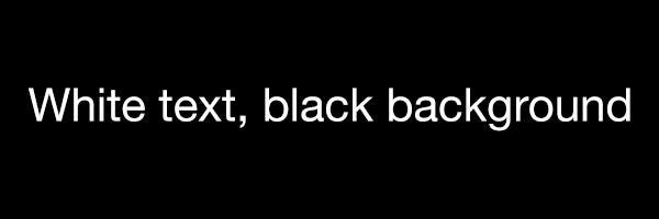
10. Make Sure Your Text Has Sufficient Color Contrast
Even high-contrast text is hard to read when there is glare, but low-contrast text is nearly impossible.
You should use color and contrast to help users see and interpret your text. Contrast is particularly important when designing for mobile because of the potential for distracting glare.
The right amount of contrast is a tricky thing and quite often designers face following problems:
They choose text color that is too similar to the background color. This makes text hard to read.
These lines of text are difficult to read against their background colors.
They create too much of a contrast between the text and the background. This also causes readability issues. One of the most common issues is light-colored text against dark backgrounds (white-on-black combinations). Forcing users to read white text on a black background for a long time can strain the user’s eyes.
Even people with perfect vision experience eye fatigue from staring at white text on a black background for too long.
WC3’s Web Content Accessibility Guidelines are a good place to start if you want to master color contrast. They set minimum standards for contrast so that users with different visual abilities (including the people with moderately low vision) can read your text. The W3C recommends the following contrast ratios for body text and image text:
Small text should have a contrast ratio of at least 4.5:1 against its background. A ratio of 7:1 is preferred.
Large text (at 14 pt bold/18 pt regular and up) should have a contrast ratio of at least 3:1 against its background.
Tip: Ensure sufficient color contrast for your text for best readability. You can use a contrast ratio tool to quickly find out if you’re within the optimal range.
Bonus: Helpful Resources
I’ve also prepared a list of resources that will help you improve your typography skills:
Google Fonts and Typekit will help you discover typefaces for your next web or mobile app project.
Gridlover (we’ve mentioned this resource before in section 2, but it worth to say it again because it’s an excellent way to create your modular scale.
Just My Type is a collection of font pairings from Typekit.
Typewolf is a great source of typography inspiration.
Conclusion
Good typography not only makes us read but also makes us feel. Typography is a skill that every designer needs to master in the digital age. As with any design project, guidelines and tips are just a place to get started. The first piece of advice is to practice. You only really learn something by doing it. The more you try text styles on, the better idea you will get of how it looks and works for your users. Take this practical guide as a starting point on your road for crafting typography for your screen design.
Typography is the most effective and meaningful vehicle for your brand personality.
Typography surrounds us at all times, on all mediums. We see type used on websites, physical products, digital, print and television ads, magazines and on every book cover. The use of type is so pervasive that it ends up becoming invisible to most people. After all, very few people go around saying, “Wow, that’s a nice typeface!”
That being said, typography can communicate a lot of ambient information in an immediate and emotional way. Readers will respond to the size, the different shapes, weight and color of the type as well as bringing their own cultural references to bear before they actually read the words. By using the right typeface, a startup can create a strong emotional impression that, combined with effective messaging, can lead to more successful brand communication.
For example, when Red Antler was considering a typographic approach for Allbirds, a brand that uses premium natural materials to make comfortable and stylish shoes, we needed to find a typeface that would be a counterbalance to the looser script style of the logo. While the logo communicates a curious sense of ease and movement, we wanted the rest of the type to feel very modern and dynamic. In contrast with the logo, which summarily skips along, the headlines feel very bold and direct, connoting a sense of confidence and a no-nonsense attitude.
When thinking about typography as you build a product or site for your startup, you want to think through several key things, including what kind of impression you want to make, and make sure that the typography matches the message and purpose of your communications. Typography is the most effective and meaningful vehicle for your brand personality; not only does typography convey your message, it also communicates your personality, brand attributes (is your brand trustworthy, playful, serious) and your tone of voice.
Below are seven specific things to think about as you explore the world of typography for your startup or business:
1. Understand the value.
Typography is an essential element of your overall brand identity toolkit. Along with your logo and colors, type is one of the core elements that make up your brand identity. While photography and illustration are important to help visualize your offering, no other tool is as immediate, flexible or readily available to you as your typefaces.
2. Create a distinct and recognizable typographic image with your logo.
While a logo can’t communicate everything about your business, it can help give your audience cues as to who you are and how you might behave. The right type choice can help position your company in a meaningful way. Are you empathetic and accessible, are you trustworthy and credible, are you unique and one of a kind?
3. Find unique opportunities to embed meaning.
Typography can be truly empowering, as it can enable you to create a distinct set of shapes that are memorable. Typography can also position you differently from your competition.
Red Antler’s recent work with GoodUncle, a new food delivery service that gives people access to crave-worthy food no matter where they live, illustrates exactly that. We created a logo that is pretty weird looking, with a stretched G that also doubles as a U. The dripping goopy G evokes the delicious dripping ingredients that makes your mouth water. In this case, we embraced a more unexpected treatment that really brought to life the personality of the Gooduncle name and their unique offering. The primary intention of creating this was that if we pique curiosity in the typeface, then the overall brand experience will be infinitely more memorable.
As a startup, there’s a lot to communicate, from headlines on your homepage to the detailed FAQ page. You need a selection of typefaces that can speak in different tones and at different volumes depending on the context. It’s important that your type choices complement each other. Strong, logical type hierarchy allows you to communicate the various layers of messaging. For example, bold display for headlines, clear and credible value props, hardworking with great legibility that works at small sizes in print and digital.
5. Sweat the details.
The amount of space you specify between letters, words and lines can impact the overall perception of the message or content. When we are working with a fashion or beauty brand, for instance, we’ll pay particular attention to the spacing of letters in the logo and headlines often adding a lot more space between letters to evoke a sense of elegance and luxury.
6. Invest in quality.
There are thousands of typefaces, and some are better drawn than others. Be wary of badly constructed typefaces for use as a workhorse typeface that needs to service your many needs. The nuances of weight, height, width, thick and thin strokes as well as how the letters relate to each other are all carefully calibrated by an expert typographer. Chose a “cut” that has good pedigree and a large family that gives you adequate flexibility to communicate through the many layers of your business whether it’s a PowerPoint deck, a subway campaign or your “How It Works” web page.
A custom typeface is unique to your brand, has the ability to accurately express your tone of voice and brad personality, and if executed well can be as recognizable as your logo. Some challenges do exist, including the need to commit time and budget to enlist an expert typographer to draw the typeface, ensure a tight brief and pick the right partner.
Typography is a powerful tool that, if given the right amount of attention by a founder, can be incredibly valuable as you build your startup brand, and can convey your message and personality in an authentic, understated and effective way.