Tag

UX

Browsing

By Carrie Cousins

Color impacts everything from how a user feels when they interact with a design, to how they use the design, to whether they can fully see and understand it. Quite simply, color is a lot more than a decorative tool; color is central to user experience.

Let’s start with a common example: You’ve just finished a website design for someone. It looks and functions exactly like the wireframe. Everyone on the design team has praised the project. The client hates it, but they can’t explain why.

The culprit might be color. Different colors can evoke such strong emotions that people have sharp reactions to them. It’s part personal preference, part psychological, and even part social norms. Understanding these tendencies and user preferences can greatly impact user experience.

Here’s what you need to know.

User Expectations and Preferences

User experience starts with the type of user your website or app is designed for. Basic demographics such as gender or region where a user lives can impact their perception of your design based on color. (You can read more about color and cultural considerations here.)

One of the most interesting impacts from color on UX is linked to gender. Studies have shown that men and women tend to like and dislike certain types of color.

swatch

Men tend to interact more with websites that have darker design schemes and more saturated colors, such as the design for VLNC Studio, above.

Women tend to prefer to interact with websites that have lighter design schemes and more muted color palettes, such as Tally, below.

Some men have a sharp reaction to websites using distinctly feminine colors such as pastel pinks, purples, and yellows.

More women tend to be put off by websites with harsh color schemes such as dark background with fully saturated red accents.

Mid-tone palettes are the most generally appealing to everyone.

swatch

Color Associations and Meanings

While it’s not an exact science, colors have fairly distinct emotional associations. Note that some colors can fall into categories of extremes. These associations tend to work with other design elements to create an overall vibe.

When a user sees a certain color or combination of colors, it creates an immediate response in the brain.

  • Red: Power, danger, love/passion, hunger
  • Yellow: Energy, happiness, light, warmth
  • Orange: Creativity, determination, stimulation, encouragement
  • Green: Nature, growth, harmony, freshness
  • Blue: Confidence, trust, serenity, calmness
  • Purple: Magic, royalty, ambition, independence

Establishing Brand Recognition

swatch

You expect design elements for Coca-Cola to be red. The color is so synonymous with the brand that it’s referred to as “Coke red.” Change the color and the brand is confusing. You don’t recognize it right away. The user is jarred and doesn’t quite react in the expected fashion. The drink might even seem to taste different.

All of those feelings come from changing the color. You might have felt yourself say “what?” when you saw the first image with green Coca-Cola branding.

swatch

It impacted the user experience you would have with the brand moving forward.

Color is an important element in branding because it creates that distinct connected between a user and a design. Color tells users what the brand is about. It tells users about the thing they are about to engage with.

Change that color, or use something off brand, and the user experience suffers because website visitors are suddenly confused or uncertain about the brand they thought they knew.

User Patterns Connect to Color

Have you noticed how many websites use red or orange buttons?

There’s a reason for that.

Bright colored buttons that contrast with the background of a website – red and orange often stand out from either light or dark backgrounds. Can help users find, understand, and want to engage with click- or tappable elements because they visually, and immediately, know what their expectation of that element is.

A key part of user experience is providing easy opportunities for users to interact that they enjoy and understand.

swatch

Cruise uses a ghost-style button with red text and a red hover state. It’s a different spin on traditional solid-color buttons, but there’s little question as to how to interact with it. Color draws users to the button.

bluez

Net Bluez uses a bright orange button for the most important element in the navigation menu. Notice how that element tends to jump off the screen begging to be clicked.

Increasing Conversion Rates

Challenge yourself in the design process to A/B Test button color. You’ll likely find that one color has a distinctly higher conversion rate than the other. (And it might not be the color you expect.)

Conversion rates tend to increase when the color of buttons or links is in stark contrast to the rest of the design. So, while you want to use a brand palette, picking a contrast color is key to generating conversions that contribute to overall user experience.

Look at the website below for a minute. Which color button is most likely to make you click? (The original color is blue.)

swatch

Providing Accessibility to All Users

Finally, color impacts UX in a way that’s not emotional or rooted in psychology. It’s much more practical than that.

Color impacts user experience because it can make a design accessible or not.

In order for everyone to understand a design fully, and engage with content, they must be able to see and read it with ease. Using color palettes and contrast ratios that fall in line with Web Content Accessibility Guidelines (WCAG 2.1) can ensure that every user can understand your color choices.

Use a color-blind filter, such as those in the comparisons below, to help simulate what other users might see when they look at your website. How could that impact usability?

swatch
swatch

Conclusion

Think of color as a tool to help users better interact and experience the content on your website. It impacts user experience on an emotional and usability level.

The key to figuring out if color is impacting UX in the right way is through user testing. A/B color tests can be a valuable tool.

By Carrie Cousins

Carrie Cousins is a freelance writer with more than 10 years of experience in the communications industry, including writing for print and online publications, and design and editing. You can connect with Carrie on Twitter @carriecousins. More articles by Carrie Cousins

Sourced from WebDesignDepot

By Vernon Joyce

As connected products are integrated into more aspects of our day to day lives, UX will be responsible for translating strategy into intuitive experiences.

Forbes

The demand for UX has become clear as organisations rush to create products that put client needs before business needs. These organisation often have large UX and design teams who focus solely on providing the best possible experience to their customers.

But what if you or your business cannot afford to hire a UX designer to review your product or service?

My goal for sharing this framework is to allow anyone to do a UX review; whether you are a UX designer or not. You can use this framework to analyse a product or service* or analyse a piece of work for a potential client. You could even use this to review your own work as the tools and techniques I use leave little room for bias.

*Although this framework can be used for any type of product or service, it will primarily focus on web.

**There are plenty of dev goodies in this article – it’s not purely meant for designers.

Objectives of the review

It’s important to start your review by positioning your objectives. This sets the tone and ensures that both you and your stakeholder have the same expectations — whether you are presenting your review or sending it via email.

Some objectives or outcomes could include:

  1. Identify opportunities
  2. Substantiate design changes
  3. Identify technical issues
  4. Discuss UX improvements

These objectives will mostly relate to your initial briefing — why did your client want you to do a UX review in the first place?


Business objectives

Business objectives are what your client is trying to achieve. Sometimes objectives can easily be ascertained by yourself but they could also require additional research. In the case of research it depends on your client — sometimes their objectives are obvious but often there are deeper needs that need to be brought to the surface through further inspection.

Unpacking these objectives is important — let’s take *increasing sales *as an example. Are they trying to sell more of a specific product or perhaps drive in-store traffic? These details are important as it makes your outcomes much more tangible and measurable. It is much easier to credit a sales increase of a specific product to a UX improvement, than to match a sales increase of a thousand products to an objective that has not been properly defined.

These objectives can be unpacked by conducting interviews with your client and their stakeholders and additional objectives could also be identified through market research. A simple survey through Survey Monkey can provide valuable insights if you have access to your stakeholder’s clients.

Lastly, state these objectives in your review to remind your client of the problems you are trying to solve. This will reaffirm your thinking throughout the review and give your ideas credibility.


Personas and userflows

Now that you understand the business’ needs, it’s time to look at the user’s needs. A popular way of unpacking user needs is by creating personas or persona sheets. In short a persona is a fictional user with needs, aspirations and desires that are usually linked to objectives within their lives.

Take Sandy for example. She is a middle-class professional female with a family of two. She likes learning about technology, watching documentaries and spending time with her children. Sandy is an ideal customer for a geeky toy shop, where she can purchase an electronic toy that both her and her children can enjoy.

Creating personas can be daunting but become an invaluable tool. Personas can be set up through research along with a firm understanding of you or your stakeholder’s business objectives. Shane Williams offers a comprehensive look at creating personas in Getting started with creating personas — questions to ask.

Now that we know who your users are, it’s time to look at the steps they would take to achieve their goals. This can be done by creating userflow diagrams. These diagrams demonstrate sample user journeys based on your user’s objectives and can often be combined with business objectives for a full client experience view.

Example of user flow diagram

There are many ways to create these diagrams, whether using sticky notes or an online tool like Draw.io. There are no rules when it comes to designing these diagrams — but it is important that your diagrams are easy to follow and read-able.


Working with data

Data is the cornerstone of a good UX review and without it you might find it difficult to back up your findings. Google analytics offers a great starting point for user interaction data, provided you know what you are looking for.

Something as simple as a drop in traffic on a given day could indicate a problem — perhaps users had a negative reaction to a new feature or maybe you posted something on social media that got negative press.

Device information (such as mobile vs desktop traffic) could also be meaningful when deciding on which device to focus your usability assessment.

Event tracking in Google Analytics provides another helpful source of information assuming it has been set up correctly. CrazyEgg is a great alternative should you not have the expertise to set up event tracking in GA as it offers heatmaps for both clicks and scroll on different devices.

The behavior flow report is also invaluable and offers insights into the journey users take in the form of a flow diagram. It provides data on drop-offs, sessions and more with the ability to highlight or analyse specific user paths.

Example of Google Analytics’ behavioural flow diagrams

Conducting System Usability Scale (SUS) surveys is also a handy way to quickly gauge the usability of a system through user feedback. SUS tests can be conducted on products, websites, apps or software and provide a scaled result regardless of the volume of feedback. The SUS survey’s data is also useful going into the usability review.

Lastly the persona sheets you set up in the previous section are also an excellent source of data. Keep your user objectives in mind when examining any of these data sources and you might find behavioural patterns that indicate a gap in the user’s journey.

You or your client might not always have data tools set up. In these cases my advice would be to postpone the review until you have meaningful analytics to work with. Installing GA is quick and easy and should give you relevant insights after only a month.


Usability review

Usability rules the Web. Simply stated, if the customer can’t find a product, then he or she will not buy it.

Jakob Nielsen

Usability speaks to the core of the review — is the product usable?

It’s time to make some assumptions about the usability of your project based on business and user needs. Step into the shoes of your users using your persona sheets, userflows and analytical data. Start using the application or service on different devices, browsers or operating systems while following your userflows. You will quickly pick up on journeys that are possibly frustrating or pieces of functionality that do not help you achieve your objective as the user.

You might also come across design flaws, broken or confusing components or responsive issues. Jot all of these potential problems down while taking screen shots. Once you have moved through the project as a user, step into the shoes of the product owner and go through the same process.

Your next challenge is making the feedback easy to understand when consolidated. Remember — your client might not have any understanding of UX or design and it is your job as a UX reviewer to make the feedback concise. Explain your thinking verbally in detail if necessary, but keep your written feedback short and to the point. It is also very important to make sure that the feedback is not seen as a list of problems or issues but rather as opportunities for improvement.

Lastly, do not go into solution mode yet. At this point you are only identifying usability problems. I like to consolidate my feedback into buckets:

1. User journeys

This should cover any problems relating to a user’s journey. If you have trouble convincing your stakeholder of these problems, try placing them in the user’s shoes. Some examples of user journey flaws could include:

  • Information needed by a user is too low down a page
  • Important pages are hidden too deeply within the information architecture
  • Information is unnecessary and does not provide value to a user
  • Too many clicks are required to make a purchase
  • Inconsistent user journeys
  • Important information sits below the fold

2. General

What are the consistent problems across the product or service? List anything that is not specific to a journey or device.

3. Design

Having a design background is very useful in this section of the review, but is not necessarily a requirement. There are some aspects of design that are generally obvious to spot:

  • Design inconsistencies (i.e buttons are different sizes on different pages)
  • Problems with alignment
  • Poor page hierarchy

4. Mobile

The accuracy of your mobile review is very dependent on the different types of devices you use to test (both tablet and smart phones). These issues could include:

  • Responsive problems (i.e not mobile friendly)
  • Scale problems such as fonts being too small
  • Pinch or zoom is required on some pages

5. Desktop

For the most part you would have covered any issues on desktop in the other sections, but from time to time there might be issues that are desktop specific. Also keep your analytics in mind — if your traffic is primarily mobile you might want to skip over this section.


Accessibility review

Accessibility is often overlooked by both developers and designers — I am guilty of this myself. It has however become increasingly important to consider disabled users as we become driven by digital. Something as simple as green text on a red button could completely ruin a colour-blind user’s experience and result in a lost sale or lead.

Accessibility covers several aspects including colour, font size, font types, descriptive text or alt tags. It is important to consider all these design and technical aspects as they might affect the user’s experience.

A tool I often use for testing accessibility on the web is Google Lighthouse. Lighthouse is available via Chrome developer tools and offers detailed feedback on the speed, progressive web app features, accessibility, best practices and SEO of a website.

Google Lighthouse results

Not only does it offer solutions, but also substantiates suggested changes making it a powerful tool in a UX reviewer’s arsenal.

When a button doesn’t have an accessible name, screen readers announce it as “button”, making it unusable for users who rely on screen readers.

Example of Google Lighthouse feedback

Eightshape’s colour contrast grid is a useful tool for analysing the accessibility of a digital colour palette while Colorsafe offers an easy way to find passable colour combinations.

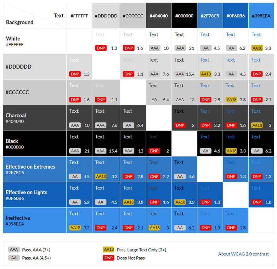
Results of Eightshapes’ color contrast test

Technical review

Whether or not you include the technical review in your presentation depends on the way you position it as well as how technical your audience is.

What makes the technical review helpful is that more often than not small code changes can make a big difference in conversion rates and overall user experience.

1. Performance / speed

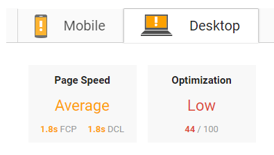
A score from Google Page Speed Insights

A great tool for analyzing website speed is Google’s better-known Page Speed Insights. PSI offers some quick tips for improving your page speed which includes caching of assets, optimizing images and more for both desktop and mobile. The suggestions can at times become a bit technical, but Google offers links to helpful articles that explains each suggestion in detail.

Performance can also be analysed using Google Lighthouse (mentioned earlier). Lighthouse provides a lot more detail than PSI and also makes suggestions based on newer technologies (like the HTTP/2 standard).

2. Best practices

Best practices deal with whether or not a project is following standards for a given device or medium. A good example of this is when print standards creep into the web, such as forcing line breaks in headlines, which is bad practice for responsive web projects.

Lighthouse is also a good tool for best practice suggestions; but knowing what is considered best practice often comes down to your experience with the channel or device you are reviewing.

3. SEO

SEO is not often considered when looking at the user experience of a web product— but it should be. SEO deals not only with your rank, but also your search appearance. If your page does not have an enticing title and description you lose every opportunity to bring that user into your website. Often some of the problems you solve for when it comes to accessibility will impact your SEO as well (such as making alt tags more descriptive).

Lighthouse provides some high level feedback on SEO, but for a more detailed view I would recommend Moz.

SEO Software, Tools & Resources for Smarter Marketing\
Backed by the largest community of SEOs on the planet, Moz builds tools that make SEO, inbound marketing, link…moz.com


Opportunities

The next step is to look at how you or your client can close some of the gaps in their user’s experience using the wealth of data gathered from the review. These suggestions could be based on feedback from your review or opportunities you identified while using the product, for example:

  • Adding related articles to existing pages will allow a user to continue his journey through the website once they finish reading an article
  • Reducing the length of the form could improve its usability which might lead to additional leads

Be careful of making swooping statements like “Adding a banner area will increase traffic*”. *An opportunity should imply the possibility of improvement and not a promise thereof.


Metrics

Implementing a solution to an identified UX problem might not be enough — you also need to be able to measure its success. This can be done by setting metrics for specific action points.

A good metric needs to be tangible and achievable. “Increase sales” for example is not a tangible metric. How would you accurately measure that and more importantly correlate it to a UX change?

Break your metrics down, give them a deadline and bring them back to your objectives and identified opportunities:

  • Decrease the bounce rate of X page by 5% by adding related articles
  • Capture 5 more leads on X page per day by making the form easier to use

Your client might also want to set their own metrics. In these cases make sure that their expectations are reasonable and achievable.


Next steps

Discuss next steps with your client even if you might not be responsible for implementation. Without actionable points the review is bound to become a coffee-stained desk-drop. Creating a list of actions or tasks along with their priority and metrics is a good starting point and will provide your stakeholder with enough guidance to start implementation on their own.

Who knows, you might even become that implementation partner or a UX designer within their team.


I hope you found this framework useful — would love to know more about your experiences in the comments below. Thanks for reading.

Originally posted on Medium

By Vernon Joyce

Sourced from DEV

By Piotr Koczorowski.

Have you ever asked yourself what UX is all about? It’s about learning from mistakes. You can build a design around the idea of turning bad experiences into good ones.

We tend to follow the core principles of UX design, but sometimes they slip designers’ minds, and it leads to mistakes that are becoming an integral part of most projects. If UX were treated as linguistics, I would say they no longer are mistakes — they became UX errors.

To locate these errors, I reached out with the question ‘What one UX mistake on websites drives you crazy?’ to the following UX experts in the field: Paul Olyslager, Frank Gaine, Brad Frost, Stephen Hay, Andy Budd, Molly Wolfberg, and Heydon Pickering.

Here is the list of 8 worst practices in UX design.

Expecting the unexpected

Paul OlyslagerPaul Olyslager

What one UX mistake on websites drives you crazy?

The unexpected. Performing an action (e.g. clicking a button) that does not result in a way I have thought it would.

Paul Olyslager, UX Manager at Nu3 shared with us one of the core reasons for all bad user experiences — the unexpected. Have you ever been irritated with something that works opposite to your expectations? Many websites have this problem, when their users don’t know exactly what to do.

The creator of a hilarious website Webpages That Suck, Vincent Flanders, addressed this issue and coined in 1998 the term mystery meat navigation, which means designing webpage elements in such a way that they do not communicate their purpose — just like overprocessed food.

Life shows it still happens. One of UsabilityTools’ clients was a mystery meat butcher in navigation. Their front page featured an area, which had elements posing as call to action buttons asking people to Register Now. Through a click tracking study, they saw that people clicked on them too often, while the buttons didn’t do anything.

24% of these clicks did NOTHING.24% of these clicks did NOTHING.

That made people quit the site, since they assumed it is broken. After changing the buttons into clickable ones, their conversion rate went up by 122%. A small usability fix, but influential.

Luke Wroblewski, an expert in mobile environments, mentions another abomination of unexpected design: The meat tornado.

Hamburgers and kebabs in mobile are the Jessie and James of UX design — prevalent and annoying. Luis Abreu describes how distasteful hamburger menus are. They were supposed to be the fast food of navigation. However, they became harmful to our designs, as users are ignoring them and therefore do not discover all options.

Be clear. Make sure that every item in your project has a purpose, and that it communicates its purpose immediately.

You spin me round

Frank GaineFrank Gaine

What one UX mistake on websites drives you crazy?

Those ‘Top 20′ websites, where you have to click a Next button and refresh the page to see each item in the list. Grrrr. They should just do a big long list on the one page.

Are you dizzy when you browse the web? I sure am. The growing abundance of clickbaiting pagination makes many nauseous.

They exist to get more clicks and the page views. A terribly cheap way of exploiting your users. A dark pattern in web design. But it’s not the only one.

Similar Read:  Decoding Recruitment Industry Outlook and Where Technology Fits into the Picture

Brad Frost speaks of the bastard child of the merry-go-round family — carousels. They are supposed to bring “fun” to the user. However, they are badly executed, causing confusion and misinformation. Because of that, people tend to skip them.

The website Should I Use a Carousel? provides you with the best answer whether you should use it.The website Should I Use a Carousel? provides you with the best answer whether you should use it.

If you need stats telling you why carousels are bad for your website, According to Harrison Jones from Search Engine Land, sliders are bad for both usability and SEO.

Remove image sliders, carousels, and clickbaiting pagination. Be clear and honest, as no one wants to struggle with the dark side of web design.

Immobile pages

Stephen HayStephen Hay

What one UX mistake on websites drives you crazy?

When I follow a link to your site on my phone, and I can only get to the content if I ‘download the app’. I’m not going to download the app.

Many a time upon entering a webpage was I greeted with a lovely message on my phone that I need to download a dedicated app for that.

Stephen Hay from Zero Interface tells us exactly what happens in that situation: nothing. People quit the page and forget it ever existed.

Thank you, Pintrest, for providing me with choice. It’s rare Thank you, Pintrest, for providing me with choice. It’s rare

There is not much to tell about this issue — any honest person should realise that. Acting with integrity towards your users is a must. Forcing them to download applications so they can browse your website is a shameful way of extorting statistics. And the claims that some websites aren’t optimized for mobile browsers… stop right here. Don’t.

theartofbadperformance

Brad FrostBrad Frost

What one UX mistake on websites drives you crazy?

Performance is perhaps the most crucial aspects of a user experience, but unfortunately it’s largely ignored.

And it’s largely ignored because it’s invisible. Teams spend a lot of time polishing the aesthetic experience and enjoy diving into the latest development tools, but ultimately neglect how fast the experience loads and performs. It’s up to us to prioritize performance in our projects in order to better serve our users.

Bad performance ain’t gonna receive no applause, says Brad Frost. It all narrows down to how fast we can operate the website. High page loading times yield devastating results. KISSMetrics even created a great infographic showing you stats, which prove that a slow website equals death.

Jakob Nielsen speaks how responsiveness is a basic user interface rule that needs to be incorporated into every project you make. Do not forsake performance for the sake of aesthetics. Slow loading times and heavy websites are the first detrimental factors that people notice. Some long after the days of Flash websites, which showcased creativity under the principle “I can, so I will,” but it’s a pitfall.

Be creative and usable.

Everybody hates reading

Frank GaineFrank Gaine

What one UX mistake on websites drives you crazy?

I hate huge amounts of text without subheadings to summarize and divide up the text!

Since we rely heavily on the Internet nowadays, reading is an essential activity. Because of that, rules and guidelines were created in order to make that task as pleasurable as possible — especially since people scan instead of reading.

Similar Read:  The Challenges We Rarely Talk About When Building Startups

Some do employ them properly, but some forget that reading content should be optimized.

UXBooth tells you that most designers put visuals before the content itself, claiming it is destroying the value of the text. Later on, however, they advocate how both design and content can be optimized — the right way to go. By optimizing typography, text division, order, and many more you can deliver the most pleasant experience to your readers.

Content serves the web right now, so it is crucial to make it easy to digest.

If you want to go in-depth with optimizing your text, have a look at this amazing piece from Smashing Magazine telling you how to craft a perfect paragraph. We have been taught in our classes that paragraphs are the building blocks of every text, so let’s make sure that their quality is awesome, or else the whole thing shall crumble.

UX Movement shows how center alignment makes orphans and children cry, and they also advocate that you should get rid of orphans entirely (you know, those dangling pieces in the text, not realchildren).

Give people a nice read.

Your forms are out of form

Andy Budd

What one UX mistake on websites drives you crazy?

As a user I get really frustrated when overly enthusiastic form validation tells me a field is wrong when I know it’s right. This usually happens when I try to add an international prefix to a phone number, let’s say, but I’ve also had buggy validation tell me that my date of birth was wrong, which is especially annoying.

A related frustration is when the page refreshes and some of the information you previously entered has been removed and it’s not clear what’s actually causing the error in the first place.

I have no idea why so many websites neglect web forms and leave them completely not optimized when their business heavily relies on them. You work in eCommerce? Imagine having bad order and delivery forms — your conversion rates are going to hit the ground so hard your business will lose its balance.

Websites tend to lie to you that you need to undergo a “quick” registration process that will take only a minute, and 15 minutes later you still are trying to enter the right CAPTCHA at the end. Don’t forget about re-entering your password every time, because it resets for security purposes.

Soo, hunter2 is out of question?Soo, hunter2 is out of question?

Smashing Magazine comes to help with an extensive guide to optimizing your web forms. Once you focus on three basic aspects of web forms (Relationship, Conversation, Appearance), you can fully understand the core principles of successful form design.

There is one thing — check out this website focused on showcasing terrible forms on the Internet, BadForms. What I found curious is the fact that the category “Good Forms” is actually empty. Dear Internet, start optimizing your forms, thanks — Everyone.

If you are desperate to find out whether your forms are good, UsabilityTools offers comprehensive web form analytics.

Sign in? Sign OUT.

Molly Wolfberg from UX SistersMolly Wolfberg from UX Sisters

What one UX mistake on websites drives you crazy?

When I have to go through too many clicks to sign in! there’s one banking site I use often, and I have to click THREE TIMES to even get to my login page. It’s awful! If you’re making people sign in to use your product, make it easily accessible!

Registering is a bane of many users. Not only registering should be quick and easy — signing in when returning to the service should be a breeze as well.

Similar Read:  Is Neuromarketing the Next Phase of Advertising?

Do I hear faint “But it follows the 3-clicks principle…” in the background? No. The 3-clicks rule is an obsolete relic that only illogically shuts down any design-related debates. UX Booth orders you to stop counting clicks, as the amount of pages you need to go through is not the issue — the amount of effort required for each of them is.

Of course, the above is related to the browsing experience in general, but both the signing in and the general browsing face the same issue — being too strenuous for users. There are two solutions:

  • If signing in takes too much effort because of the clicks you need to make, simplify it.
  • If reaching information on your website can be done with two clicks, but requires tons of searching because of the abundance of tabs in the navigation menu, simplify it.

Generally, simplify it.

That does sound like a good principle, right? Let’s see the final point then:

Simplify

Heydon Pickering from Smashing MagazineHeydon Pickering from Smashing Magazine

What one UX mistake on websites drives you crazy?

Complexity is the most prolific enemy of good user experiences, blighting all kinds of users. Complexity is also one of the hardest things to fix after the fact.

The only way to “fix” complexity is to axe features, so being the anti-complexity tzar means telling people their work has to be destroyed. Not an easy job. Good planning and the willingness to say “no” in the early stages of a product’s life are the best way to reduce complexity.

Complexity is THE issue of all UX projects, and is one of the most common mistakes. Many designers don’t see that their project is overloaded with features, even though they are core elements. Being critical towards your own work is difficult, as removing one part causes others to crumble, and this is the scenario we need to change.

The philosophy of all modern projects gravitates towards this one rule — simplicity. UXMag speaks how hard it is to be simple. If you want to make it, try following 10 principles UXMag proposes. They advocate being focused, as that will lead you to a clear product. Smashing Magazine highlights many examples of changing projects by employing the rule of simplicity. The results are often immediately pleasant to the eye, proving that the results are there.

Remember — complexity is dirty. Clean it all up and make your projects simple.

Just one thing

Thanks to reaching out to UX experts, we could gather what actually bugs people on everyday basis. Some of abovementioned points appear to be painstakingly obvious — the question is why they still appear? The answer might be the fact that they became too integrated with most of the designs, and that forced us to get accustomed.

That is a terrible mistake.

Never get used to bad experiences. Do your best to deliver and demand the most pleasant UX possible. Do it for both yourself and for others.

PS. I actually have a mistake number 9 — using colors and contrasts wrong. I even conducted a study and wrote an article about it, check it out if you want to learn more — Color vs Contrast: Which Impacts People The Most?

Disclaimer: This is a curated post. The statements, opinions and data contained in these publications are solely those of the individual authors and contributors and not of iamwire and the editor(s). This article was initially published here.

By

Sourced from iamwire