Starting an online business might seem a little overwhelming at times. There are a lot of questions that will pop into your head: “where do I start?”, “how do I measure my results?”, “how do I create and manage my content?”
You’d be surprised how easy and simple it can actually be – with the right tools, of course.
We’ve found these 10 amazing tools that will be the only thing you need when combined with WordPress: marketing automation, Instagram followers, file storage, and much more will be taken care off in a glimpse.
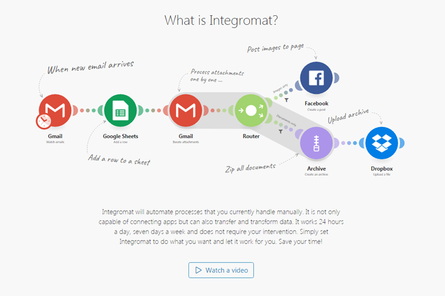
No WordPress page can go without a good cloud workflow automation – with all the plugins, apps and tools you already use, this one will make the process so much faster. All needed automation is created through a beautifully designed editor. You can choose from many pre-made templates that integrate perfectly with WordPress.
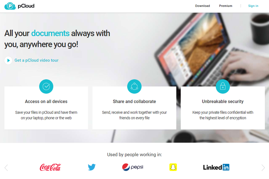
There are multiple dropbox alternatives on the internet – but if you’re a WordPress user and value security and speed, then this is the only option for you. Other than these two advantages of security and speed, the tool also lets you share your files with your colleagues which is highly convenient.
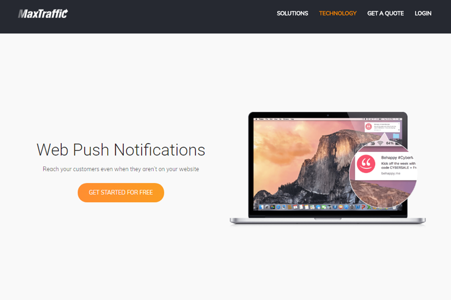
Sending web push notifications is one of the best strategies for bringing a customer back to a WordPress website. Keep your customers alert and waiting: send them notifications about new products and services, sales or upcoming events – make the visits to your website spike up.
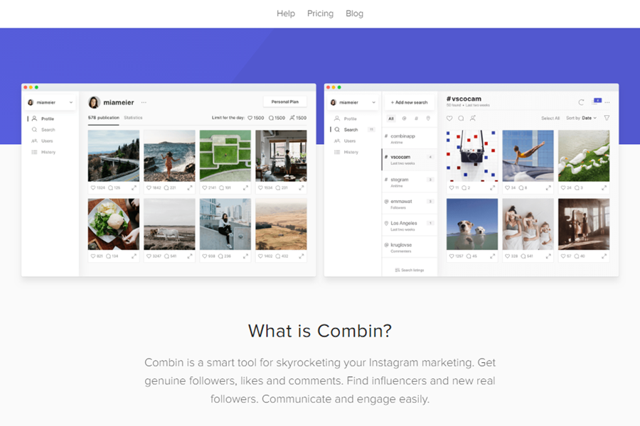
If you have a plan to start a business, you probably already know, that after creating a website, a WordPress platform is not enough – you will have to do something with marketing and especially social media. Get real Instagram followers by using Combin – like, comment, and follow other users to attract their attention.
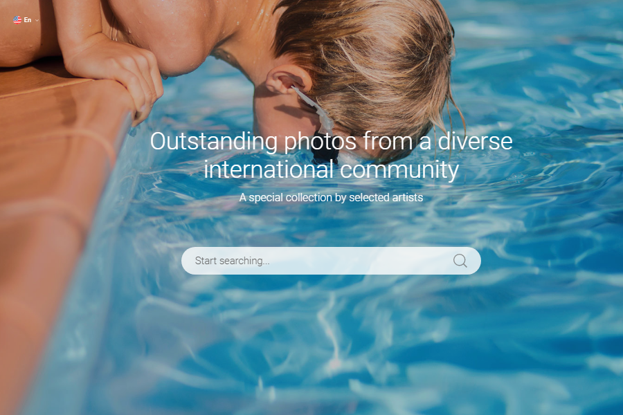
Visual information is crucial for any website nowadays. To represent our brand, we often use stock photos – there is a wide selection of free and paid stock images around the web. The focused collection is something new and different – it has complete sets of pictures for different themes like animals, cities, education and more. Perfect for creating a strong image of the brand.
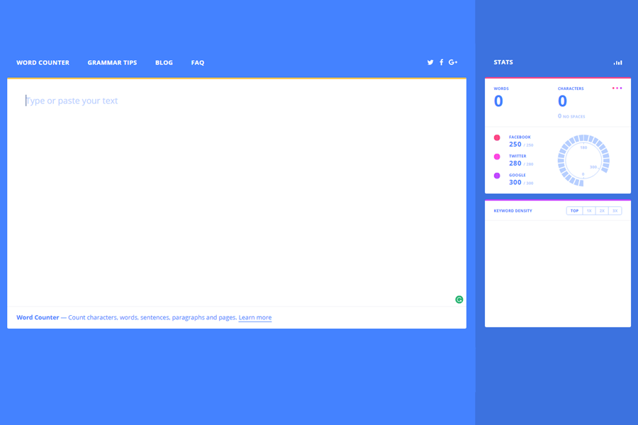
WordPress is an amazing platform for content creation – it has various content and SEO tools to help you out, but one important tool that you just cannot go without is a very precise word counter. This one has a minimalistic design, is easy to use and understand, and also has integrated social media standards for word count.
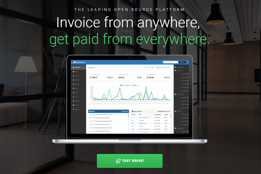
After starting an online business you will have to step up your game and start working with your potential clients – collecting their emails by offering them something of value in return and reaching them with your news and sales. Proposals creation tool can help you reach your customer – the drag & drop tool offers great templates to make it look great. And later it can help you send the invoice from anywhere, after all the name is InvoiceNinja.
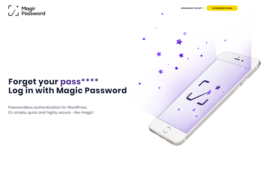
This WordPress Security Plugin can work wonders when it comes to remembering passwords and usernames. This plugin also protects you from brute-force attacks, phishing & keylogger attacks, and WordPress website takeover. The tool works by pairing your smartphone with your WordPress account and creating a specific code when you need to log in.
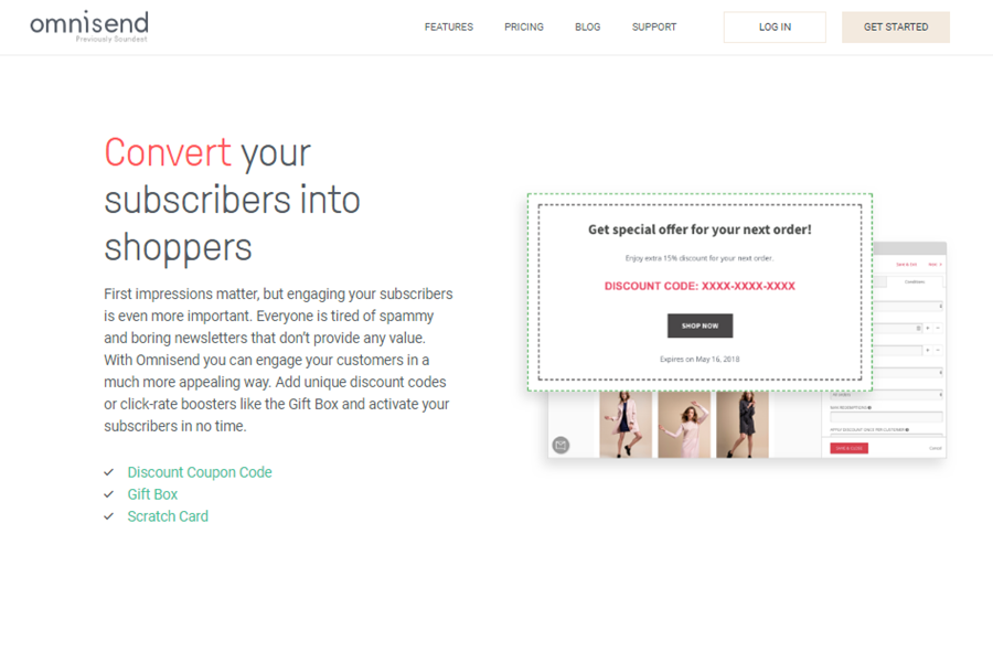
Omnisend is an ideal tool for WordPress ecommerce marketing automation if you want to run an e-shop. It can make the work with the website visitors so much easier: turn them into subscribers with signup boxes, popups, and landing pages. Afterward, start working your way up by converting your subscribers into shoppers and eventually – repeat buyers.
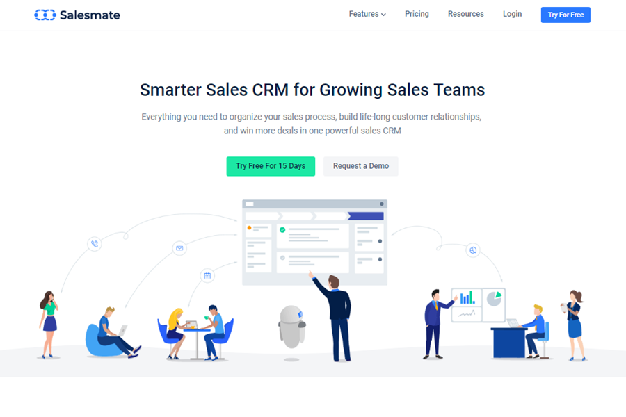
Salesmate is one of the best additional tools for WordPress – if you want to run an e-shop, it will work wonders by helping you plan and keep on track with your sales processes. It’s easily customizable and adjustable, therefore easy to use and integretable with more than 700 different apps.
If you are marketing anything in the tourism game, this is what you need to know.
By MediaStreet Staff Writers
For those that are lucky enough to get away on holiday or go on an extended travel stint, we can predict what actvities you might be doing after a new study has been published by Hotels.com
The company have used a data-crunching bot to track what people are hashtagging the most on their sojourns. More than five million brags globally were analysed using a combination of Tweet data, Instagram posts and travel keywords and destinations mentioned on other social media. So here are the results.
Worldwide travellers are all about the culture: they enjoy musing around museums (300,000 brags), old-town charm (170,000 brags) and a spot of sunshine (130,000 brags), but they can also be found in floating restaurants, erotic museums and night markets.
TOP 10 GLOBAL THEMES
Museum
Rooftop bar
Old Town
Modern Art
Opera
Sunshine
Olympic Games
Cathedral
Gallery
Ballet
This travel bragging trend echoes the findings from the recent Hotels.com Mobile Travel Tracker report, which revealed that one in six travellers search social media before their trip to plan the photos they’ll take. And 56% of people surveyed admit to spending more than an hour a day on their smartphones while on holiday.
While travellers naturally brag about taking in the tourist hotspots and cultural offerings, more people than ever are sharing foodie ‘grams, shopping stories and luxe posts.
#Foodporn You’re never more than an Insta-scroll away from #FoodPorn and the brag lists are brimming with culinary treats. Cakes in Stockholm and curry in Toronto spice up the brag lists, and New York steak and pizza both made the cut. Perhaps more surprisingly, enchiladas proved twice as popular as modern art in Mexico City, ice cream scooped 10% of all San Francisco brags and Jumbo Kingdom floating restaurant in Hong Kong took second place in the Hong Kong chart with more than 20,000 brags.
Shop ’til you drop Shopping is a must-do for most travellers. Those visiting Paris brag more about the Rue Vieille du Temple, famous for its boutiques, than Le Louvre! Other top shop-spots included Bal Harbour in Miami, the Harbour City mall in Hong Kong, vintage shops in Melbourne and the stylish Cecile Copenhagen fashion brand made the Danish capital’s top 10.
Five-star luxury When travellers check into a posh, luxury hotel they naturally want the world to know. The stunning 5-star Ritz Carlton in San Francisco topped the city’s brag list, the Four Seasons in Singapore proved brag-worthy and the Park Hyatt came in at number one in Seoul – most likely for its awe-inspiring rooftop pool.
Scott Ludwig at Hotels.com said, “Bragging about your travel experiences on social media has become the norm – if you didn’t get social kudos out of it, it didn’t happen!”
Have you listed your company in our Media Directory? It’s free! Everyone’s favourite price! Click here to do it now.
Before you dish out money to bid for a top-ranked ad position on a search engine, you may want to pause and make sure it’s actually going to pay off.
By MediaStreet Staff Writers
New research out of Binghamton University, State University of New York suggests that instead of just spending to get that top spot, advertisers should be considering other factors as well to ensure they are getting the best results from their sponsored search advertising campaigns.
Sponsored search advertising involves paying search engines, like Google and Bing, to bid for placements on the search results pages for specific keywords and terms. The ads appear in sponsored sections, separate from the organic search results, on those pages.
“The common belief in sponsored search advertising is that you should buy the top ad position to get more clicks, because that will lead to more sales,” said Binghamton University Assistant Professor of Marketing Chang Hee Park. “But the fee for the top position could be larger than the expected sales you’d get off that top position.”
Park, with the help of Binghamton University Professor of Marketing Manoj Agarwal, analysed data collected from a search engine and created a model that can forecast the number of clicks advertisers could expect in sponsored search markets based on four factors:
Rank in the sponsored listings
Website quality
Brand equity
Selling proposition
The model gives advertisers a way to quantify the expected clicks they’d get by adjusting these four factors, while also taking into consideration how their competitors are managing these four factors. This could enable advertisers to find a perfect blend of the four factors to ensure they are getting the most out of what they are paying for their ad positions.
It may also indicate that they should be spending more money to bolster their brand or website rather than amplifying their offers in top ad positions.
“Using this model, you may find that paying less for a lower ad position while investing more in improving your website is more effective than spending all of that money strictly on securing top ad positions,” said Agarwal.
This applies especially if your competitor has a poorer-quality website, but is spending more than you on securing top ad positions.
Their model found that poor-quality advertisers that are ranked higher in ad positions drive consumers back to the search results page, leading consumers to then click on advertisers in lower ad positions to find what they are looking for.
In contrast, they also found that a highly-ranked good-quality advertiser results in significantly less clicks for all the advertisers ranked below them.
“It’s more likely that in the top position, all advertisers being equal, you’ll get more clicks. But depending on these four factors, as well as the quality of your competitors, you may find that you’ll get more clicks in the second or the third position,” said Park.
“Conceptually, this is not a new idea, but now the model can help determine this by accounting for multiple factors at play at the same time.”
Advertisers aren’t the only ones who can benefit from this research.
Park and Agarwal’s model found that simply reordering the listed advertisers could result in significant changes in overall click volume (the total number of clicks across all advertisers) for search engines.
“Because they often charge on a pay-per-click model, search engines can now simulate which ordering of advertisers in a sponsored search market results in the most overall clicks and, therefore, most revenue” said Park. “Search engines may want to consider charging advertisers in a way that gives the search engine more flexibility in determining the order in which the ads in sponsored sections are displayed.”
A new survey indicates that 1 in 5 small businesses use social media in place of a website. Many assume a website is cost-prohibitive and may not consider the risks of not having one.
By MediaStreet Staff Writers
More than one-third (36%) of small businesses do not have a website, according to the websites section of the fourth annual Small Business Survey conducted by Clutch, a B2B research firm. One in five small businesses (21%) selectively use social media instead of a website in an effort to engage customers.
The survey indicates that small businesses consider cost a bigger concern than the potential repercussions of not having a website.
Social media platforms such as Facebook and Instagram attract small businesses by cultivating a highly engaged user base. However, relying solely on social media may be a risky strategy for businesses.
“Whenever you put all of your eggs into someone else’s basket, it’s risky,” said Judd Mercer, Creative Director of Elevated Third, a web development firm. “If Facebook changes their algorithm, there’s nothing you can do.”
Facebook recently announced changes that potentially increase the risk of using social media in place of a website. The social media platform plans to prioritise posts from family and friends over posts from brands.
This new policy may make it more difficult for small businesses to reach their audiences through social media. As a result, websites are expected to regain importance among businesses – as long as cost is not considered an obstacle.
Among small businesses that do not currently have a website, more than half (58%) plan to build one in 2018.
Some Small Businesses Say Website Cost is Prohibitive, But Others Cite Costs of $500 or Less
More than a quarter (26%) of small businesses surveyed say cost is a key factor that prevents them from having a website. However, nearly one-third of small businesses with websites (28%) report spending $500 or less.
Small businesses may not be aware that some web development agencies offer packages that defray costs by dividing website construction into multiple phases or sliding rates for small businesses. “You don’t necessarily need to launch with your first-generation website,” said Vanessa Petersen, Executive Director of Strategy at ArtVersion Interactive Agency, a web design and branding agency based in Chicago. “Maybe just start small.”
Mobile-Friendly Websites Becoming Standard Businesses that do have websites are moving en mass to mobile friendly ones, the survey found. Over 90% of respondents said their company websites will be optimised for viewing on mobile devices by the end of this year.
In addition to the 81% of company websites that are already optimised for mobile, an additional 13% that say they plan to optimise for mobile in 2018.
Clutch’s 2018 Small Business Survey included 351 small business owners. The small businesses surveyed have between 1 and 500 employees, with 55% indicating that they have 10 or fewer employees.
To read the full report and source the survey data, click here.
After a Weekend of rest, I thought we should start it all with a burst of web design inspiration. A collection really well-designed by Prague-based design boutique Creative Mints. A great balance of typography, layout, and colors; somehow quite different from the usual “guaranteed approaches” and stock photo gallery designs we are seeing lately. It’s great to understand the UX of things but it never hurts to also put an accent on the playfulness of your designs.
ocated in Prague, Czech Republic, Creative Mints is a design boutique with projects focused mainly around illustration, UI/UX and Graphic Design. We really do enjoy their work on ABDZ, make sure to check out their Behance.
Visual hierarchy is vital to good website design. It’s one of the key principles that will make your website effective in accomplishing your goals for it.
There’s a lot of theory behind visual hierarchy. It’s so important that a lot of study and effort has been put into understanding how and why it works. Understanding it can help you use it.
Design is a Form of Communication
At its core, design is a form of visual communication. It’s about communicating ideas to others through a visual medium. This is true of all forms of design. It is especially true of web design, the design school of the information industry.
Massive blocks of information do not communicate well because people are actually visual thinkers. We don’t simply process data. People do not simply see things. Rather, human beings organize what they see in terms of “visual relationships”.
The Rise of Visual Hierarchy
Why we see in terms of relationships has been a study unto itself. Anthropologists contend that it’s a remnant of hunter-gatherer history that helped our ancient ancestors survive.
A practical, less scholarly way of looking at it is that it’s just the way our brains understand information. We group similar elements together and organize them into meaningful patterns that we can use simply use.
Regardless of how you think the visual hierarchy used by the human brain came about, it is how we organize information and utilizing it is a very effective way of communicating a message.
The Tools of Visual Hierarchy
Now you understand the visual hierarchy is a useful tool for communicating information, how do you create it as a web designer?
The tools to pull it off are very simple and easy to learn. All you need to do is figure out how to use them.
Size
Bigger objects are essentially shouting. They demand people pay more attention to them. In terms of visual hierarchy, a viewer’s eye will naturally be drawn to a larger object.
This is one of the most powerful tools you can use for visual organization. Correlate size with importance. Your biggest elements should typically be your most important, while the smallest ones are normally the least important.
Color
Color is both an organizational tool and a way of adding personality to your web design. Bold and contrasting colors demand a viewer’s attention and focus.
This is best used for buttons and hyperlinks. As a tool for adding personality, color can be used in more sophisticated ways.
Fun, bright colors can make a page exciting while claiming colors create a soothing feel. Color is very important. It can communicate a brand (i.e. Pepsi blue, McDonald’s yellow) or can be used as symbolism (i.e. passionate red). You can even apply colors as a way to classify info within the visual hierarchy.
Fonts
Selecting the proper fonts for your design is critical when wanting to create visual hierarchy. It’s not just the font itself important, but how you use it. The weight and style you use are as important as the area of the site you place them in.
To organize what’s important, try using a variety of type sizes and weights. Italics serve their purpose as well in certain situations.
You can create a typeface hierarchy on your site with text of various sizes, weights, and spacing. It doesn’t matter that you’re using a single font on your website.
By using a variation of it size and weight, you are not only drawing attention to the more important elements, but you are creating an overall composition that will be easy to read and understand for the visitor.
White Space
In the midst of all this careful use of visual hierarchy, make sure there is whitespace left. You need to give your content room to breathe.
Negative space is an important part of the visual design, defining it just as much as a positive use of space.
White space is often defined simply as being “the space between stuff on the page;” although, this extra space is not always white in color, which has led to more individuals instead referring to it as “negative space.”
White space essentially enables you to dictate which particular features of a website that you’re building should stand out over others. Thanks to the welcoming type of layout this creates, visitors will be more likely to remain on the website for longer amounts of time.
Whitespace offers a break for the eye and also highlights important elements. Too much crowding and clutter can drive viewers away because they can’t understand what is actually important.
The Human Eye and Scanning Patterns
The human eyes work in predictable ways. They are automatically drawn to certain points of interest. Some of this does depend on the individual person, but most people follow particular, predictable trends with how they view just about everything, including websites.
F-Pattern
This is the scanning pattern most people use for text-heavy websites like blogs or wikis.
The reader first scans a vertical line down the left side of the page, looking for keywords or other points of interest in the first few sentences of the paragraphs.
Once the reader finds something interesting, he or she starts reading the text normally in horizontal lines. The overall pattern resembles the letter F (or E).
Z-Pattern
This scanning pattern is used on pages that are not centered on the text. Readers first scan a horizontal line across the top of a page. This of often because of the menu bar, but it is also a habit that comes from reading left to right.
Once the eye reaches the end of the horizontal line, it moves down and to the left, another left to right reading habit, and starts over again. The pattern resembles the letter Z.
This is a useful pattern to take advantage of in your site’s visual hierarchy. It addresses many basic site design requirements: calls-to-action, visual hierarchy, and branding.
It’s really, really great for those times when simplicity is a major priority and the call-to-action is the primary purpose of the page. It brings a sense of order to simpler websites. However, complex content does not work terribly well with the Z-pattern and the F-pattern might be a better choice.
These are a few best practices:
Separate your background so that the viewer’s sight is kept within the visual pattern framework.
Logos look good in the upper left, right where they are immediately visible.
A colorful secondary call to action within the Z-pattern can be a helpful guide for users.
Featured image sliders in the center of the page help separate the top and bottom aspects of the Z-pattern visual path.
Add icons to the left side of the page to guide people to the call-to-action.
The visual pattern should end in your primary call-to-action.
Understanding visual patterns and the natural movement of the human eye can help you arrange your website design to your best advantage. When you know what people will be looking for, you can arrange information so it best catches their attention and guides them where you want them to go.
Conclusion
Visual hierarchy is an important part of web design. Understanding how it works will allow you to create as effective a site as possible.
It provides a guideline for organizing your content. Take a look at some good site designs you’ve seen and see how they’ve used it to effectively communicate their message.
A great web design is so much more than just delivering content and making it look good. When visitors come to your site, they produce a set of feelings about your website and your organization. The type of feelings they produce – positive or negative – are entirely in your hands and should not be overlooked when designing content.
Over the years, there has been a body of knowledge produced to help designers create effective visuals that play into the psychology of their viewers. In order to achieve this, one must understand how different web design elements and how we use them affect the mood, attitude and experience the visitor will have while browsing our website.
Below are four major areas of website design and development that have the biggest impacts on the psychology of website visitors. These are the tools you’ll need to create a visually-engaging site that encourages visitors to return.
Content
For websites, content drives the design you see on screen. Visitors come to a website to access information they need. Web design helps them find the information they need quickly and with ease.
In the early days of the Web, it was common to see pages and pages slammed with content, often pages with 10,000 words or more (as a comparison, this article is about 1,600 words). With pages loaded down with content, it made it extremely difficult to find content, let alone read through to get the information needed. This often invoked stress, anxiety and overall unpleasant feelings for visitors.
With today’s Web design, content should be edited and organized so that there is a happy medium between providing adequate and needed information while not overwhelming visitors. When content is in that happy place, visitors are able to find the information quickly and they feel good afterwards.
Hiding content, presenting too much content or otherwise mudding up your website makes visitors irritable, leading to possible loss in potential business.
In addition, the type of content you present sets a tone for you and your organization. If your content doesn’t present the right information in a logical place, is hard to follow or tends to beat around the bush on important information, then visitors will feel this way about you.
Keep your content clean, organized, easy to read, concise, and professional to help aid in the psychology of your visitors and produce positive vibes.
To help you craft the best content for your website, this article at Tuts+ goes into further detail on the psychology of great content for your website.
Space
The way a Web page is organized can dramatically affect how a visitor feels while they are there. Organizing content should be a priority in any web design, but this organization should take into consideration the space it takes up on the site.
If you’re not familiar, “white space” is the areas of a design in which no content or visual element demanding our attention is present. White space plays an important role in any type of design work, especially Web design, because it visually gives a resting place for the visitor. These resting places are often found in margins and the space around things.
The concept of minimalism – that is, using the least amount of visual content needed to convey your point or idea – is currently very popular across the Web, specifically on services like Squarespace.
Said differently, if a visitor comes to your website and every inch of real estate on the screen is taken up by words, graphics, blinking things, etc., it starts to feel chaotic and makes them uneasy. If no white space is present, there is nothing for them to move their eyes to take a visual break.
If you take the time to edit and organize your content in a way that is respectful of the space you have to present the information, you give a feeling of professionalism, organization and overall good vibes to visitors. You want your visitors to feel like you have your stuff together and that you are easy to work with.
Keeping things simple with a well organized website using adequate white space tells visitors you know what’s important and you don’t want to waste their time.
When designing a website, often the colors are dictated by the organization’s new or existing visual identity (or brand). But how these colors are used affects how the visitor feels when they visit your site.
Most visual identities have neutral colors (i.e the tints, shades, and hues of whites, grays, and blacks) that are used along with their main colors. In most modern web designs, these neutral colors often take dominance in terms of how much real estate they take up.
For instance, if an organization’s main colors are blue and yellow, with neutrals being white and black, it is likely that they may choose a white background to display their content on, instead of a blue or yellow background.
These neutrals act much like white space does: it provides an opportunity for rest. Using the example above, if all you see on that organization’s website was blue and yellow, it would be an overwhelming site to focus your attention on (think yellow text on a blue background).
The types of colors you use also play into the psychology of your Web design. Cooler colors (blues, greens, purples) often provide an inviting, professional and relaxed feeling. In contrast, it can be used to give a very cold and unfriendly feeling as well. Warmer colors (yellows, oranges, reds) are soothing, warm, and give a sense of creativity but can also give off negative feelings such as anger and stress.
In addition, neutrals such as white often give a positive feeling of openness, but could also feel bland and dull. Grays are often considered slick, modern, and clean, but can be very cold and uninviting. Blacks are often associated with being professional and clean cut, but is also very overpowering and can be rather generic.
How you use colors to help convey the positive feelings discussed above depends on the tint (lightness), hue (type) and shade (darkness) of the color as well as how much of the color you opt to use. If you want your site to be inviting, open and creative, a combination of blues and greens, with touches of yellow or orange, on a white or light gray background will help convey these positive feelings to your visitors.
For more information on how exact colors play into the psychology of web design, Vandelay Design has a great article outlining each primary and secondary color and its effects on viewers.
Typography
Finally, typography can convey tons of emotions and feelings for visitors to your website. There are thousands of typefaces out there, and thanks to advancing Web technology such as CSS3, these typefaces have found their way onto websites as well.
No more picking a typeface out of the 15 or so Web-safe fonts. This has opened the door to thousands of new typefaces that can be used. And with great choice comes great responsibility.
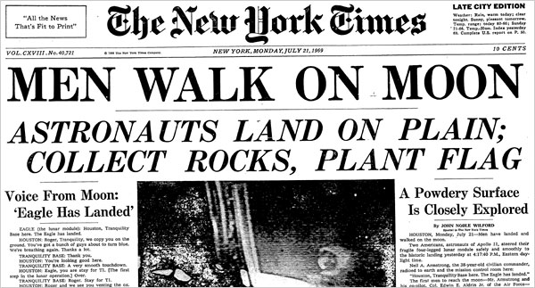
Typefaces are designed to be used in specific situations and for certain uses. Serif fonts (those with little serifs, or feet, on the letters like Times New Roman) are often associated with professionalism, scholarly, and seriousness, while san-serif fonts (like Helvetica) are a bit more modern feeling, clean and more informal.
For example, most news websites (i.e. The New York Times) use serif fonts to help convey the feeling of tradition, importance and knowledge. They want you to feel like they are an authority, that what you are reading is important and that they know what they are talking about.
Sans-serif fonts are used more and more to convey a feeling of modern, clean, sophistication and upscale. Those in the technology industry often use san-serif fonts much more than serif fonts because they want visitors to feel like they are up-to-date and futuristic.
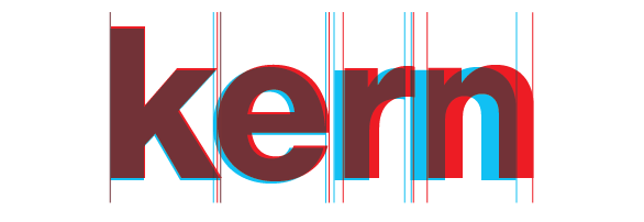
The way type is presented on the page is also important. Leading (space between the lines) and kerning (space between the letters) should be evaluated as well. Large leading with lots of white space between lines makes the copy feel airier and easier to read; little leading gives a crowded feeling and is hard to read more than one paragraph at a time.
via Fonts.com
Space between paragraphs, margins between blocks of text and other elements on the page, and font size (and its relation to leading) are also factors to consider. Tight paragraphs are uninviting and hard to read, copy that is too close to elements such as pictures make the page feel crowded, and too large or too small font size will either make the visitor feel like you are screaming at them or whispering.
It is often the designers’ job to understand the psychology of their design choices when producing a design, but understand the basics in some key areas of design will help you understand and even further help produce great content and manage your web design more effectively.
While these areas focus mainly on website design, a lot of the psychology of design can be used in other areas of design as well, such as logo and print design.
Web designers may use a number of techniques, approaches and philosophies while creating compelling and engaging digital interfaces. Each designer has their own preferences – some prefer to work from the top down, beginning with the most basic elements and building their product down to the last detail. This approach is the most common and often yields a well-thought out, quality product.
There are some designers, on the other hand, who favor a bottom-up approach. These designers start with the smallest elements and move their way up to big-picture design, from the simple to the complex. This is also referred to as atomic web design. Why would a website designer work this way, and is it right for you? Let’s explore the possible merits.
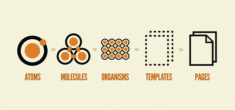
Atoms are the world’s most basic building block. They can’t be broken down anymore without losing the essence of what they truly are.
Combine two or more atoms together, and you’ll get molecules. Atoms become more versatile and functional when they band together.
When molecules combine together in a meaningful way, they become organisms – living, tangible forms.
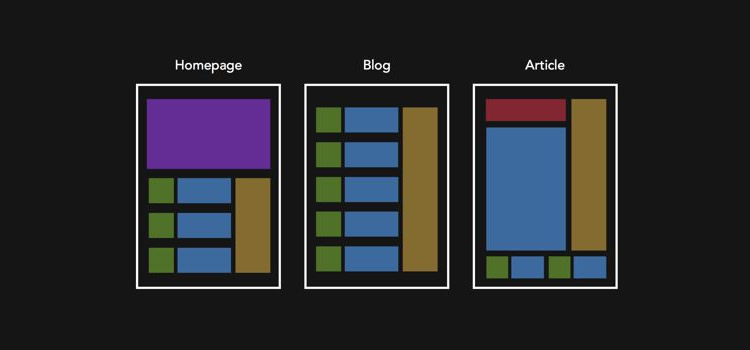
Atomic design follows the same basic concept – it holds that even the most basic HTML elements can combine to create something tangible and functional – but putting it together requires the bottom-down approach. In atomic design, that process looks like this:
Image via bradfrost.com
Atoms are the foundational building blocks of our pages that can’t be broken down anymore before losing their functionality. They include the most basic of HTML elements like inputs, buttons, form labels, and so on.
Combine atoms to form molecules and you’ll get something that takes on new properties. In web design, molecules are things like search forms (a form label, a button, and an input combined).
Organisms in a digital interface are groups of simple user interface (UI) elements working together toward a common goal. For example, a search form, a logo, and a navigation list might make up a header.
Templates are groups of organisms functioning together to create page-level objects that articulate a design’s structure.
Pages are instances in which we can see what a UI looks like with text, images, and media in place.
Atomic design isn’t linear – rather, it’s a model we use so we can think of the product as the sum of its parts. Each stage plays an important role in the end product – paying attention to these elements will help assure a quality user experience.
The Benefits of Atomic Design
Atomic design can require a lot more thought and planning, but it’s often worth the extra effort. Here are some of the benefits of using this type of design:
Build a System of Components
When you break a system down to its most basic parts (atoms), it’s easier to see which parts of a site can be reused and how you can mix and match them to create more molecules and organisms.
Image via creativebloq.com
More Intuitive Layout
Because of the nature of atomic web design, interfaces tend to be more intuitive and easier to code. This is true during the creation and in the future when you need to tweak your site. As an added bonus, it’s also easier for a new developer to understand the codebase.
Atomic design also minimizes the risk of writing duplicate code. Since you’re using “atoms” to create the initial layout, it’s easier to see where you’re using different components of a site. If you need to replicate existing code elsewhere on the site, it’s easier to find where it’s stored.
Your Style Guide Is Simple
If you design a site according to the principles of atomic design, you can incorporate all your atoms and molecules into your styleguide.
This keeps your design and messaging consistent across platforms. You can even extrapolate elements from a design that’s not atomic, but it’s always better to begin with atomic design principles than to try and apply them retroactively.
Faster Prototyping and Updating
When you have a list of atoms on hand from the beginning, it’s easier to mockup pages and prototypes. All you need to do is combine your basic elements for the page, then you can refine and customize for the final site.
Atomic design also facilitates quick updates and removal of certain design features. When you’re only changing one element at a time, it’s easier to ensure that your updates get carried out throughout the interface.
Why Consider Atomic Design?
Aside from the benefits outlined above, atomic design helps fulfill a simple purpose: Designers can easily discover the truths about a project’s design – the quality of its basic elements as well as its organization around the entire structure.
Atomic design encourages a strong user experience (UX) structure by providing a methodology for designers. By adhering to component-based guidelines, designers can still rely on their creativity without clashing with developers.
Developers naturally work from the ground up, but design tends to be a more artistic enterprise. Often, an artist begins with a general idea and solidifies it as they go along. Atomic design, by contrast, requires designers to work from the ground up, which can help ensure that an interface is consistent and purposeful. It also saves time and tension between a designer and developer.
A common language can be created when you utilize the atomic design method to create a web page. This common language, called your interface inventory, helps assure that developers and designers are inventing new solutions to an old problem, especially when that problem already has a working solution.
For example, you need to add a new contact form to a project. Thanks to atomic design and your interface inventory, you already have the style you need to create the form, so you don’t need to involve the designer. This doesn’t necessarily take work away from the designer, but it also doesn’t require them to create new mockups for every project.
Atomic design also works as quality assurance. When you’re building or testing a website, you have a built-in styleguide in your interface inventory. It works as a designer tool and as a developer tool – at its most basic level; it allows everyone to participate in the conversation while keeping elements consistent and high quality.
A Radical Idea for Building Your Site
Atomic design isn’t for the faint of heart. For both designers and web developers, it requires rethinking the entire process of creating a website. The process is methodical and requires a lot of legwork. Once you create your atoms and molecules, assembling them into an inventory creates a simple style guide that can inform the rest of your interface’s elements.
Using the principles of atomic design allows designers and developers to remain on the same page. It not only keeps style consistent and high quality, it also allows for quicker mockups and rapid prototyping. This leads to a better product and higher customer satisfaction.
If you’re beginning a new project or interface soon, consider applying the principles of atomic design. You might be surprised by how much you like it.
Stephen Moyers is an online marketer, designer, avid tech-savvy blogger. He is associated with Los Angeles based SPINX Digital Agency. He loves to write about web design, development, online marketing, social media and much more. Apart from writing, he loves traveling & photography. Follow Stephen on Twitter & Google+.
We can all agree that the best websites are designed for both users and search engines, right?
That means you never should sacrifice beauty over function, or vice versa.
Check your website for the following six common mistakes to see if your beautiful design is preventing your pages from ranking high in search engines.
Mistake 1: Missing H1 Tags (Especially on the Home Page)
Imagine entering a website with a nice background picture, a well thought out font, and an elaborate color scheme. It looks amazing. Browsing through feels like a walk in a beautiful garden.
Too bad nobody will find it in search engines.
Why? Because very often website designers and developers forget about essential SEO elements.
The most common offense is removing an H1 tag just because there is no place for it on the page.
The H1 tag is one of the first elements search engine crawlers will look at to determine what the page is about. Having this tag, and including your target keyword, improves your chances of ranking higher.
Here’s a website that has a clear H1 tag front and center:
This H1 tag helps Sock Fancy rank in the top three organic positions for many keywords related to “monthly socks”.
If you wish to explain to designers and website owners how the website will benefit from an H1 tag, introduce them to a five-second test. According to this test, if a user can easily tell what the website is about after only looking at it for five seconds, its user experience is good.
Usually, the easiest way to explain the purpose of the website is by using a descriptive H1 tag above the fold.
Mistake 2: Large Images & Media Files
Beautiful imagery makes your website look amazing. But you need to be careful with the size of your media files.
Including large images and videos can negatively impact your site speed, which may result in lower rankings.
How do you know if you have large content on your website and how can you fix it?
For a quick scan, you can use Google PageSpeed Insights Test that will tell you exactly what images Google thinks are too large on the page.
This test shows that the page can be further optimized by reducing the size of the images by 70 percent.
You can also use Screaming Frog as an alternative to identify large images and media files across your website.
Once you’ve identified those images, resize and/or compress them and re-upload to your website.
Mistake 3: Popups
Recently Google warned websites to avoid using intrusive interstitials and pop-ups.
User experience, especially on mobile devices, is quite important to Google. When creative or elaborate popups appear before your visitors can access main content, it can negatively impact UX and, therefore, your SEO.
This might be a good time to reassess your pop-up strategy, especially if you’re seeing a decline in organic traffic.
Mistake 4: Text in Images
Surprisingly, this mistake is widespread. Instead of including a text layer over an image, many website designers just include text into an image.
Why is it so bad?
For starters, search engines can’t “see” the image like people can. Therefore, search engines can’t “read” the text on the image. Essentially, it’s the equivalent to not including the text at all.
In the example below, the entire banner above the fold is one image. Because of that, the website is missing an H1 tag, a subheadline, and main benefits that could be helpful in ranking higher for their target keywords.
Another reason this design tactic is faulty is because it isn’t responsive. So on a mobile device, the text and the button are going to appear very small, causing poor user experience.
Mistake 5: Infinite Scroll
This popular web design technique can really hurt your SEO performance when done incorrectly.
Infinite scroll loads more content as the user gets to the bottom of the page. If your pagination isn’t set up correctly, search engines won’t be able to crawling your pages.
Let’s say you have infinite scrolling enabled on your blog that has 100 pages. If you only show 10 most recent posts by default, that’s what search engine robots will see. Since robots crawl websites via links there is no way for them to know there is more content on the page beyond the top 10 articles.
The good news is that you can make infinite scroll pages search-friendly. Follow the instructions Google Webmaster Blog provides and you won’t have to compromise between design and SEO.
Mistake 6: Thin Content
Product and service pages are the most important pages on your website.
The higher rankings you can get for them for your target keywords, the more business you will have. It’s that simple.
Some of the common mistakes related to thin content:
Not having service/product pages on the website. By eliminating those pages from your website altogether, you rob yourself of an opportunity to rank organically for your target keywords.
Having one page listing multiple products or services. The best SEO practice is to have one idea/keyword per page. That way it is clear to search engines what each page is about and they can rank it accordingly. Once you start including multiple products or services on the same page, it becomes confusing and your website can lose rankings.
Having little text on your service/product pages. Once you’ve identified which service/product pages to include on your website, spend some time thinking about the copy you will include on each page. If you have descriptive content that explains to your visitors what the benefits of working with you or buying from you are, there is a greater chance these pages will rank higher. There is also a higher chance that visitors will turn into customers. It’s a win-win!
Summary
Whether you’re working on a new website or redesigning an existing website, don’t forget about these critical SEO elements. After all, what good is a beautiful website that either nobody can find or delivers a hideous user experience?
Here are some website redesign pointers for growing small and medium-sized businesses
By MediaStreet Staff Writers
Says Ufuoma Otu of Take Culture Media, “Whether you plan to redesign your website in-house or source it externally, play an active role in managing the process. This is the first tip we give to growing small and medium-sized businesses. The initiative you display on the front end and the attention you give to communicating the site’s vision early on will help drive momentum on your project and ultimately help make it successful.”
Other tips include:
Know what you want.
This helps saves a lot of time, effort, revisions, and increases the likelihood of you and your developers creating a finished product your team is happy with for a long time. Well, until it’s time to redesign your website – again!
Carve out time to peruse various websites you like, figure out various elements of them you can integrate into your site to enhance your users’ experience.
Commit to an effective review process.
The website redesign process is only as complicated as you and your team make it. Yes, the process may vary based on the size of the website, company or project it’s being built or redesigned for. Will you communicate changes primarily – by phone, email, in-person meetings? Who are the stakeholders who will green light progress and changes? For example, in smaller companies, the C-suite is more accessible and will play a more active role. In larger organisations, department heads may wield more influence on changes and updates to be made.
Usability is king.
It used to be content is king – it still is. So is usability. Welcome to the user experience kingdom. Always think of how your users will interact with your site. Envision this, test it, implement, and test again – on different devices and platforms. The general rule of thumb is: use fewer words, more photos or graphics (depending on your industry), and intuitive navigation. The point is to make the user experience as smooth as possible. Keep testing until you go live.
Be flexible.
Stick to your process – yes. But on the flip side of that, be flexible. Creating or redesigning a site is a dynamic process that happens in real-time and in tandem with changing needs, market changes, and other factors that are not always within your team’s control. Provide vision and guidance, but be open to your team’s interpretation of the vision expressed.
Honour the creative process.
It is a creative endeavour; recognise it as such and not simply as a to-do item on your list. Or you can, but you may end up with a site that lacks essence. Lead with praise before offering constructive criticism, and the next iteration of the site could very well knock your socks off.
Make it a visual canvas.
The most stunning websites walk the fine line between eye-catching colours and white space. This makes them visually appealing but makes the content easy on the eye. Nowadays we look at screens all day long, so adopt an elegant site design that is simple and users will be glad to use – and even simply admire.
Share it.
What good is the most well-designed website no one knows about? Once you finally have the website you are proud of, share it! Let everyone in your organisation know about it. Don’t forget your clients, social media community, and collateral materials. And remember to update your relevant keywords on search engines.