• HOME
  • DIRECTORY
  • INTERVIEWS
  • Podcasts
  • MEDIA VIEWS
  • THE INDIE LIST
  • MEDIA JOBS
  • MEDIA STATS
    • TV
    • RADIO
  • GET LISTED
  • LOGIN
  • CONTACT
Mediastreet Mediastreet
News

What’s up with the new Facebook app logo?

By editor July 2, 2019
0
Share
Share on Facebook Share on Twitter Pinterest Email
Share

By Kerrie Hughes

Not so long ago we reported on Facebook’s biggest redesign in a decade. The social media platform’s iconic blue bar on mobile is long gone, with the company instead opting for a clean, white look. The redesign has rolled out across the globe over the past week, but in that short time a number of users have noticed something a little off with the new app logo.

To start with, the new icon now boasts the same vibrant blue gradient as Facebook’s messenger app icon, which looks a whole lot better in our opinion. But it’s not the colour people have real issue with, it’s the placement of the ‘f’ that’s really, let’s say, f-ing people off.

  • Logo design: everything you need to know

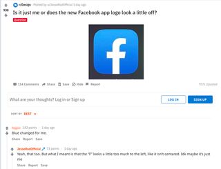
Conversation peaked this weekend when Reddit user JessRodOfficial asked the question: Is it just me or is the Facebook logo a bit off? Cue over a hundred messages (and counting) from other people the new icon design is clearly driving mad.

Screenshot of reddit Facebook question page

Does the new Facebook app icon look central to you?

So what’s up with it? Reddit user combuchan commented: “All the “weight” on the right throws the balance of the glyph off. The slanting on the left side of the crossbar should be the same as the right.” And from the discussion thread, this is an opinion many share.

However, others were quick to jump and in point out that the previous app icon design saw the ‘f’ clearly offset to the right, and that’s maybe why new centre alignment seems wrong to so many people. “The problem is that it IS centered, and it used to always be offset slightly to the right,” Reddit user HarmlessSnack comments.

The busy discussion also leads to broader comments on Facebook’s redesign overall. “The blue having changed in the logo but not in the actual interface throws me off more than anything. It’s inconsistent,” says Reddit user le_cynthesizer.

But Facebook isn’t in everyone’s bad books, with Android/Reddit user ExpectTheUnexpected championing the design. “Actually for the first time the Android icon is the correct one. The new logo is actually a circle, and turned into a rounded square on iOS. The centered ‘f’ looks better in a circle as intended, in my honest opinion.”

Upon closer inspection (in Illustrator), we found the stem of the f to be directly centred. But regardless of whether it’s in the middle or not, to be so uncomfortable visually for so many would suggest Facebook might not want to wait another decade before its next update.

Feature Image Credit: Icon images: Facebook

By Kerrie Hughes

Sourced from CREATVIE  BLOQ

facebookFacebook app logo
0
Author editor

  • Website
Prev Post

Want To Stifle Your Team’s Creativity? Do These Things

July 2, 2019
Next Post

Product Owner

July 3, 2019

Related Posts

The Great Un-Pinning: Why Pinterest Abandoned Publishers and Flipboard Became Their Essential Alternative in 2025

October 24, 2025

News publishers take paywall-blocker 12ft.io offline

October 23, 2025

Write A Comment Cancel Reply

  • About
    About Me

    Mediastreet is your up to date Business Directory which also provides you with up to date Business News and Tips.

  • Mediastreet Directory
  • Connect & Follow
    Facebook Twitter Instagram
  • Newsletter

    Subscribe to our newsletter for exclusive content and all of the behind the scenes details.

  • Latest Posts
    • 5X: The five seismic shifts that will reshape communications and marketing over the next five years

    • What You Need to Know About the TikTok Creator Rewards Program

    • Substack is the best place on the internet – let’s hope the brands don’t ruin it

    • How The Creator Economy Is Reshaping Modern Marketing – And Why Brands Are Paying Attention

  • Interviews
    • The Personality is Eoin Wrixon and his role is CEO of Packed.House and Wide Eye Media

      The Personality is Eoin Wrixon and his role is CEO of Packed.House and Wide Eye Media

    • Adrian Serle, Former CEO of Communicorp speaks to Mediastreet on his thoughts and experience in the Irish Radio market

      Adrian Serle, Former CEO of Communicorp speaks to Mediastreet on his thoughts and experience in the Irish Radio market

    • Grace Aungier – Queen of Magazines

      Grace Aungier – Queen of Magazines

  • Categories
    • Jobs (158)
    • News (5,523)
    • Sales (6)
    • Uncategorized (752)
  • Archives
  • About

    Mediastreet is your up to date Business Directory and also provides you with up to date Business News and Tips.

  • Recent Tweets
    Tweets by MediaStreetIrl
  • Popular Posts
    • More Time on Social Media is NOT Linked to Poor Mental Health
      November 3, 2017
  • Facebook
  • Twitter
  • Instagram

© 2020 Mediastreet. All Rights Reserved

Top
Mediastreet
  • HOME
  • DIRECTORY
  • INTERVIEWS
  • Podcasts
  • MEDIA VIEWS
  • THE INDIE LIST
  • MEDIA JOBS
  • MEDIA STATS
    • TV
    • RADIO
  • GET LISTED
  • LOGIN
  • CONTACT