By Angela He
Newsletters are all the rage these days, and with good cause: in the age of cluttered social media feeds and algorithmically-sourced content, newsletters remain one of the few ways to reach readers in a way that feels refreshingly personal. We’re big fans of newsletters over here, and we’ve heard many of our readers feel the same way.
However, The Atlantic’s newsletter infrastructure was from another time, and was showing its age. When we first built our newsletter codebase several years ago, we wanted to be able to publish every newsletter as an article on our website, which limited what we could do. That’s changed — newsletters are now a standalone editorial product, and the old restrictions don’t apply.
We’d reached the technical limitations of what we could do with our current code, and our editors were finding creative workarounds to the limited styling available, such as using emojis in place of actual section dividers. It was long past time to burn down our old newsletter infrastructure and start from scratch.
Building a complete editorial toolkit
Our legacy newsletter system was good for editing text and adding images, but the landscape had evolved to where we wanted to provide a complete editorial toolkit for our writers to create richer email reading experiences.
From a product design perspective, we had to think about two sets of users: our writers, who would be interacting with the newsletter admin system to create and publish these emails, and our readers, who would be reading the newsletters. We worked with editorial folks to map newsroom needs and came up with a range of formats we wanted to better support: photo essays, interviews, excerpts, timelines, news roundups, feature stories… the list goes on and on.
Our new backend provides a more flexible set of tools to accommodate these formats, while laying the groundwork for whatever the newsroom cooks up in the future. Through multiple rounds of design reviews and testing, along with good ol’ documentation, we made sure the new system was clear and the toolkit was easy enough to use that writers could run with it themselves.
A modular design system
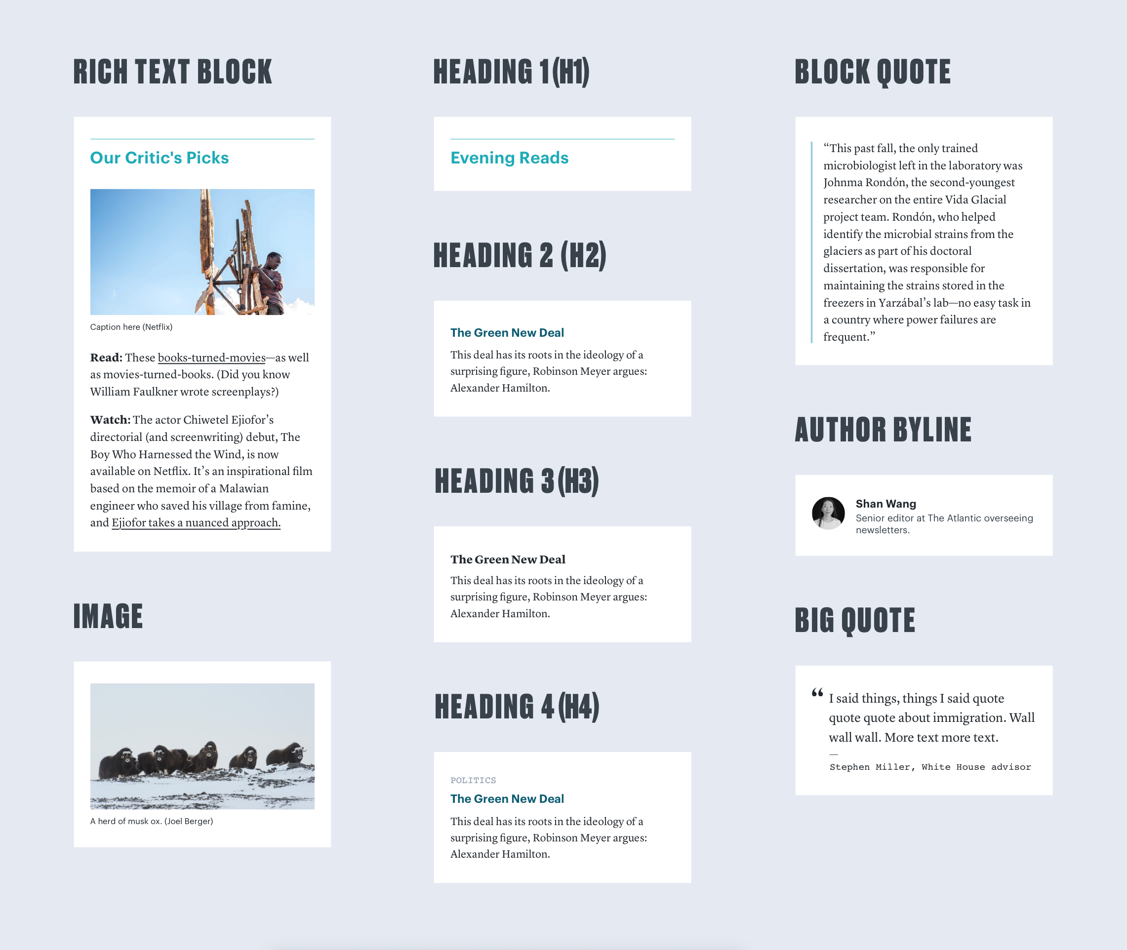
Designing for newsletters means accounting for how different email clients render various elements and fonts (more on that later), while also providing enough flexibility that editors can create a new newsletter with a unique look while still having it feel consistent with The Atlantic’s newsletter brand. Back in the day, we basically stored newsletter content as raw HTML in our database. But to achieve our new goals of flexibility and brand cohesion, we created a range of styleable modules that editors could stack together to build a newsletter.
While each module’s structure is consistent across the suite, certain elements such as typefaces or background colors can be changed so different newsletters can be themed in distinct ways, while still being recognizable as Atlantic newsletters.
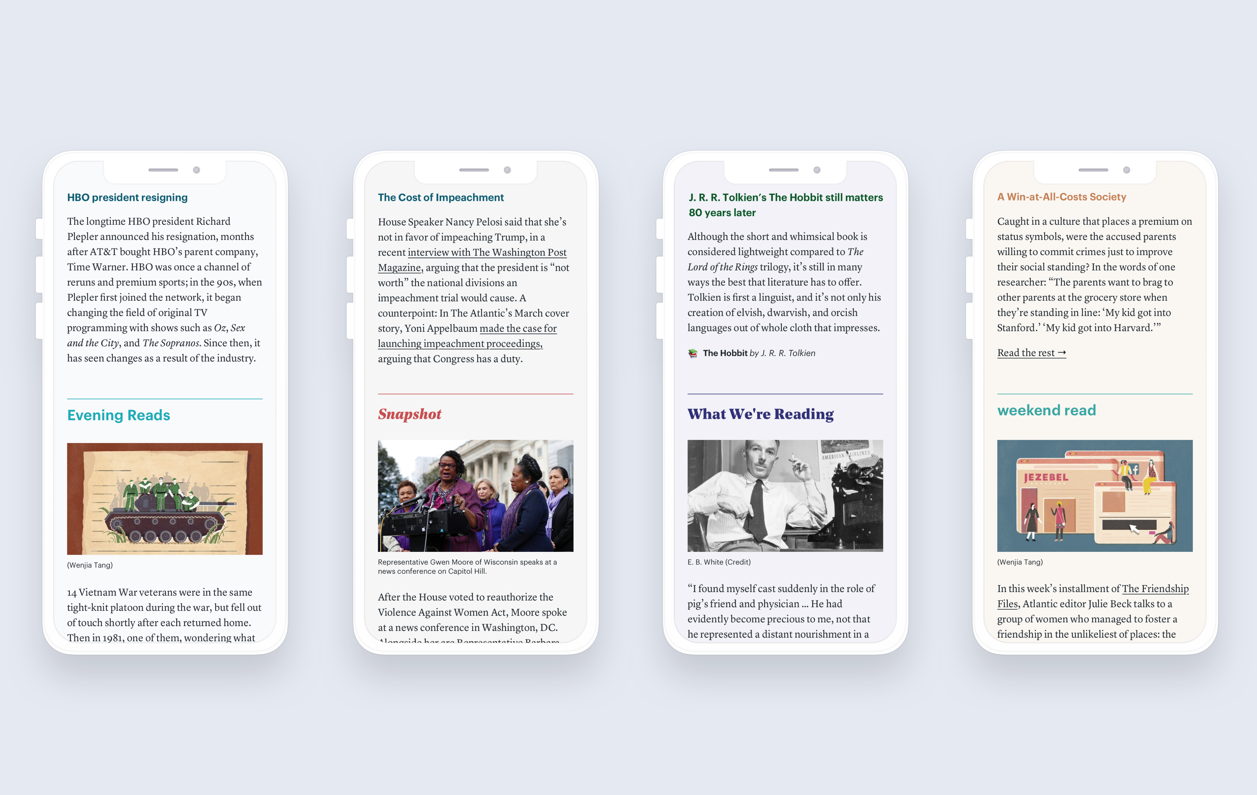
This modular system also gives editors a lot more flexibility with creating new kinds of newsletters. They could put together an image-heavy newsletter that primarily uses image blocks, or they could make a text-centered version that relies on big quotes and lists. Both versions are easy to make with the new system, and since we’re using modules that have already been tested across email clients, we know they’ll look great no matter where they’re found.
Progressive enhancement approach
Coding for email is notoriously challenging because different email clients display the same newsletter in different ways. One of the biggest inconsistencies among email clients? Fonts.
Not all major email clients support custom fonts. However, a progressive enhancement approach with our typography allows everyone, even people using older versions of Outlook, to receive the best experience we can deliver. In practice, this means organizing our font stack in the following tiers:
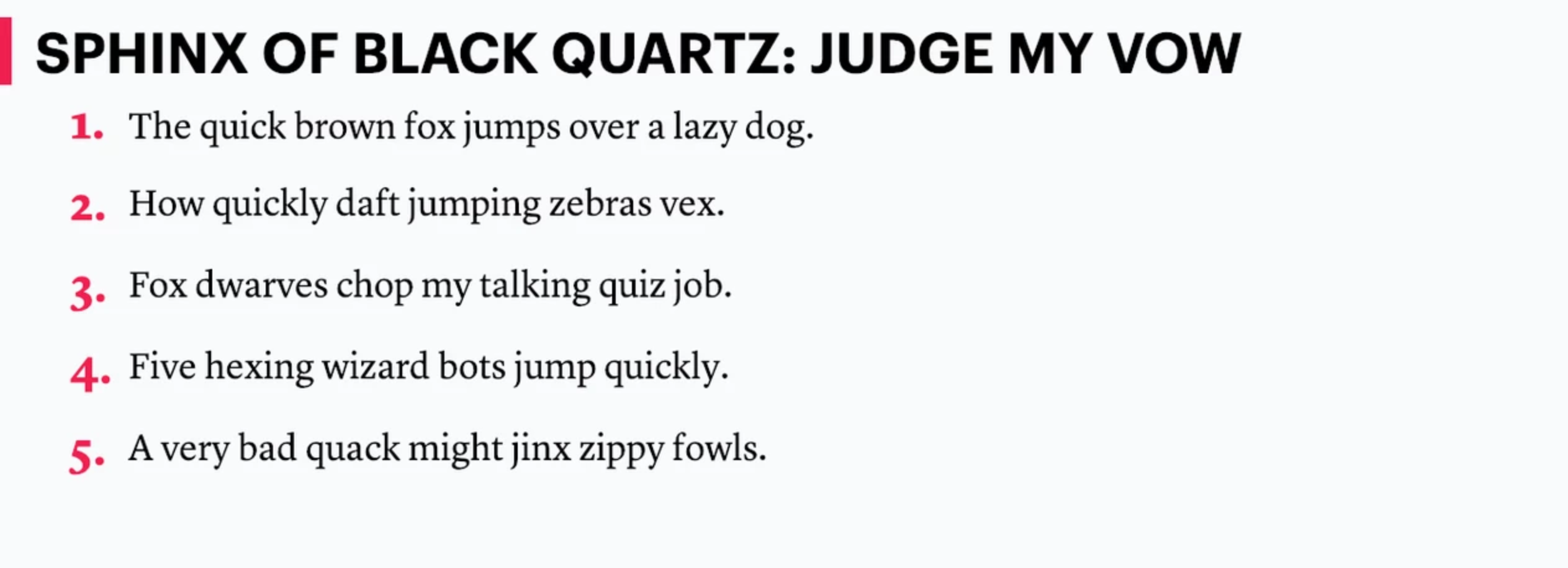
1. Our Brand Fonts
These are web fonts that need to be loaded externally, so they will only appear in the best-case scenario: that is, a user on an email client that supports loading external fonts. In the following example, we’re using Graphik for our heading and Lyon Text for our body text . This is how the component would ideally appear in the browser and in Apple Mail/iOS:
2. Modern Native Fonts
Because many major email clients, notably Gmail, do not support loading web fonts, our brand fonts will unfortunately not always be available. However, the good news is that Gmail now has a few of its own fonts built in natively, namely Roboto and Google Sans. Operating systems have also upgraded their system fonts in recent years, each with its own proprietary sans-serif answer to Helvetica. For OSX & iOS, there is San Francisco, for Windows, Segoe UI, and for Android, Roboto.
These fonts are good news for email developers because they expand our options a bit more — these new system fonts typically come in a wider array of weights than your run-of-the-mill system fonts. The only bad news is that serifs are nowhere to be found (however, Georgia is an old standby in the next tier down).
Here’s how our example above would look in Gmail on a desktop using Chrome — note that the headline font has been replaced with Google Sans, and the body font we’re seeing is Georgia:

3. Ye Olde System Fonts
For older machines and Outlook, we’ll fall back to default system fonts. Some more styling degradation happens here too, like losing the red border and some spacing irregularities, but with some experimentation, we were able to devise an experience that still looks correct even in this limited environment.
Here’s a system font scenario, Outlook 2013 on Windows 7. For fonts we’re back to good old Arial and Georgia, but hey, it’s still legible:
So that’s the overview of newsletter design and development techniques that will power the next generation of Atlantic newsletters! The flexibility of the modular design system and progressive enhancement techniques will allow the framework and designs to be applied to various newsletters.
Of course, this would not be possible without the efforts of our wonderful team: Obssa Bizuwork, Alison Buki, Ana Carano, Jason Goldstein, Clarissa Matthews, Max McBride, Andrew McGill, Michael Owen, Loren Riesenfeld, Shan Wang, and Bella Woo.
Feature Image Credit: Thanh Do / The Atlantic