Author

editor

Browsing

By

Walmart and Microsoft’s surprise bid for TikTok is aimed at social commerce, an area Facebook is just starting to explore.

By

Sourced from cnn

Sourced from yahoo! finance.

FANSDOOR is the leader of social media optimize services, it using AI analysis technology dedicated to social media advertising, to jack up the online popularity of enterprises and rapidly increases reach and views.

SEATTLE, WA / ACCESSWIRE / Since the outbreak of COVID-19, many brick-and-mortar store have been severely hit and gradually shifted their business to e-commerce. This is a huge moment for the world, whether it is a personal brand, a company, a group enterprise, or a non-profit organization, it is not easy to get attention on the Internet. FANSDOOR is a professional social media strategy consultant team, which optimizes online KPI for customers, its Facebook page has 1.3 million fans, which is worthy of your trust!

Open the Fans Door

According to data from Statista, as of the second quarter of 2020, Facebook has more than 2.7 billion monthly active users, they use the world’s largest app frequently. In the first half of 2020, FANSDOOR created 150 million fans, 1.2 billion video views, and 2.5 billion reach for Facebook users in the world through advertising services.

Let Your Fans More and More

Exclusive innovative “FansLock Ads Tracking Technology” increases the effectiveness of advertising services and increases the popularity of your social accounts!
Fake likes and Bot webtraffic flood the market, Fake data makes social networking site operators make wrong operating decisions. FANSDOOR brings real traffic, fans and followers to enterprises page and channel. The Innovative AI Technology lock the reach source in various social media advertising services, search and connect more users to create an endless stream of fans, views and Subscribers! These data will enable the company to gain attention, promote the communication and Interaction between the business and customers.

Fans all over the World

FANSDOOR business scope in Asia is all over China, Taiwan, Hong Kong, Singapore, the Philippines, India and other regions. They undertake many top public relations firm cases, create amazing KPIs for customers, and also serve private customers, tailoring various social media popular data. In recent years, they have also expanded their business in Europe and the Americas, with footprints all over the world.

Assembling multi-national technical and marketing teams, FANSDOOR specializes in helping customers solve the problem of insufficient visibility. Using accurate advertising services and professional public relations experience, it can not only create the number of Facebook fans, but also create Instagram, YouTube, Twitter and other social media’s social data sources.

About FANSDOOR

FANSDOOR has assembled multinational technology and marketing teams to help customers solve the problem of insufficient visibility. Using accurate advertising services and professional public relations experience, it can not only create Facebook fans, but also create Instagram, YouTube, Twitter and other social media’s social data sources. Follow FANSDOOR immediately!

Facebook: https://facebook.com/fansdoor
Youtube: https://www.youtube.com/channel/UCMhmWTJWkhRUqJiesc49zUw
Instagram: https://instagram.com/fansdoor
Twitter: https://twitter.com/fansdoor

Contacts:

Company Name: FANSDOOR
Email: [email protected]
Website: https://www.fansdoor.com

SOURCE: Fansdoor South America

Sourced from yahoo! finance

Aside from DTC brands, there has been a slower adaptation of e-commerce from retailers and shoppers alike. That is until the pandemic hit, forcing the vast majority of stores to close and leaving online shopping as one of the few retail options.

With that came a scramble from retailers trying to figure out how to keep customers spending with them when their e-commerce operations had been second fiddle for so long. Meanwhile, platform giants in the space, like Shopify, grew even more, seeing an opportunity to step in as the technological partners that in-person retailers never had to think much about.

In the latest episode of The New Normal, editor-in-chief Cale Weissman of Digiday’s site Modern Retail and Digiday Media president and editor-in-chief Brian Morrissey discuss the dramatic changes that have roiled the retail industry as a result of the pandemic and who the winners and losers are in the upheaval.

‘The hottest company is Shopify’

As Shopify was on the rise, it clamped onto the DTC and digitally native brands that were also building their businesses and served as the e-commerce platform that many of them used, Weismann said. This is because Shopify acted as a cheap, turnkey solution that brands could add their own personalisation’s to and share in an open market, making it a great solution for marketers new to online sales.

“Now we get to March and all of these other companies are realizing, ‘I need to have a marketplace on my website,’” said Weismann, who added Shopify has been garnering more business from retailers who either didn’t have an e-commerce operation or were not prioritizing that business line.

Next for Shopify, Weismann said, is figuring out how to better serve brands that have grown to be multi-million dollar businesses on the platform. As they’ve grown, these brands are now looking for better, white label tools that give them more control over the sales process and help save money during each transaction. Shopify created its Shopify+ platform for this purpose, which Weismann said remains a work in progress.

Competing for the online market share

Coming as a surprise to no one, with in-person stores closed, online shopping has been booming and Amazon and Walmart are two online marketplaces that are reaping the rewards.

Weismann said that despite Amazon running into some supply chain issues early on, the company had a very healthy second quarter, growing sales by 40% year over year. But with that success, come opportunistic competitors — and Walmart pounced.

Walmart has spent a lot of time over the past few years building out infrastructure for different kinds of online shopping, pioneering the By Online, Pick-Up In Store (BOPIS) model. But during the pandemic, the company found particular success in its online grocery business.

“E-commerce is expensive,” said Weismann, “and if your bread and butter is cheap things, it’s really expensive to facilitate that.” That’s why online grocery businesses are going to be unprofitable for a really long time. Walmart, however, is leagues ahead of everybody else because they’ve put in the investment to make the margins on groceries better, he said.

DTC is on the rise, at least for a little while

As the recession took hold and the advertising market pulled back spending, online inventory became cheap, making it really easy and inexpensive for a slew of new DTC brands to get in front of consumers at scale.

But this ad space bonanza is going to subside at some point, Weismann said, and when that happens, there will be a reckoning.

With little money out in the world for investments, DTC brands are “focused on their economics achieving profitability and there is no way that all of them will [continue to] exist” once traditional advertisers return and the ad prices start creeping back up again, he said.

An identity crisis in retail

Weismann also said he expects that retail will return and people will shop in-store again, but for brands that have a “boring store experience,” they will need to rethink that decision.

Brand and destination identity are no longer going to get people through the door as people worry about health and safety. Therefore, customers are not going to think about that brand in the same way anymore.

For the DTC brands who built stores, however, their retail locations often serve more in a marketing capacity where customers could interact with the brand in-person, he said, adding he expects this is the direction that retail will have to go in in general, versus a warehouse with racks after racks of items.

“A lot of the thinking right now is about, ‘How do we redesign [stores] so it’s a place to show off our brand versus a place to sell things and make that profit,” Weismann said. “A lot of places with hundreds or thousands of locations will have to cut down.”

By KAYLEIGH BARBER

Sourced from DIGIDAY

Sourced from B&T Magazine.

Nicola Moras (main photo) is an online visibility expert and author of Into The Spotlight, a guide to help you step up your online visibility, become a rock star in your industry and make your business thrive. In this guest post, Moras takes a look at the pros and cons of paid social media advertising…

To the uninitiated social media advertising can have the allure like that of the holy grail to Indiana Jones. Whilst the adventure may not be quite the same, put a foot wrong and BOOM! You end up falling into the abyss of closed ad accounts, pages shut down and worse – you could lose all the equity you’ve spent time building up on your pages.

I’ve heard the cries time and time again: “Social media advertising doesn’t work” and “We did an ads campaign and we got nothing from it”. The fact of the matter is this: most people who try to advertise on social media fail dismally – not because the advertising doesn’t work, but because the strategy they’re using quite frankly, sucks.

It’s tough to know what to do. We’ve all heard the success stories from using social media advertising, so why does success seem so elusive? We’re badgered by the platforms to ‘Boost to reach more people’ and to ‘advertise to reach more people’. There’s the prompts that tell you that ‘this post is getting more engagement than usual. Boost to reach even more’. Phew. No wonder everyone’s confused. Throw into the mix the adverts managers, the placements, the targeting, the creative options and what platform to choose.

Overwhelmed yet? You’re in good company. The good news is that there is a simple way to navigate it to ensure that should you choose to spend your hard earned dollars on advertising on social media, you’re going to get a return. (Otherwise don’t do it!)

1. When should you pay to advertise?

There is a golden rule to advertising on social media and that is this: Only advertise when you are generating leads and or sales. Generating a lead means obtaining a name and email address from someone. You can then stay in contact with them through your email marketing. A lead is not a ‘like’ or a ‘follow’.

The only other instance that you should pay to advertise on social media is if you are wanting to actively promote something that you are selling. For instance your event, product, program or a service.

If you are not wanting to do either of the above, then you should not be paying for advertising!

2. Why would you?

Facebook is the best social media advertising platform available to us right now. The platform has the biggest volume of users sitting at 2.45Billion monthly active users. Half of those are active daily and on mobile devices. You have the most targetable audience online sitting there in Facebook daily. Your people are on Facebook. It doesn’t matter what you’re offering, what you’re selling, what business you’re in. Your people ARE on Facebook. They may well not be on there using it the way you are. They may be using it to stay in touch with

their families, check up on what their children are doing. They may even be using it for work.

When people are on social media, their guards are down and they are more likely to be inspired by your content, your marketing and your advertising than on any other medium available to us right now.

3. But how do you do it?

Firstly, you have to know who your audience is and you need to identify a problem of theirs that you can solve. You will create something of value that you can give to them for free in exchange for their name and email address. You’ll then email it to them! (All of this should be automated, by the way!).

When you know who they are and the free item (digital ideally) you’re going to give to them, it’s time to head into the Ads Manager. Do not ‘boost’ a post from your page. You always want to use the Ads Manager facility within the platform. You can test, measure and fine tune within the ads manager. It’s very difficult to do it should you choose to create an ads campaign any other way.

From there, you’ll choose your audience targeting (you can be very specific), your creative and hit SUBMIT! Test and measure for a short period of time. A couple of days should be enough to see the leads starting to flow.

Social media advertising is the best it’s ever been…when you have the right strategy behind you.

Sourced from B&T Magazine

By MAX WILLENS.

Ad buyers are getting nervous about how crowded Facebook’s in-stream video program has grown lately.

Over the past month, the number of pages eligible to monetize their videos through Facebook’s in-stream ads program has leapt by more than 30%, with more than 24,000 pages joining the program in the past 30 days, according to a spreadsheet Facebook regularly updates for advertisers.

The pages include everything from prank video and meme accounts to mukbang pages, which offer videos of people eating gluttonous quantities of food, and they are part of a longer-term push by Facebook to home in on YouTube’s ad business.

All pages in the program are subject to an approval process and must adhere to the platform’s brand safety guidelines. But buyers say that the brand safety guard measures Facebook has added to its in-stream program lag behind YouTube’s, and many see the changes Facebook has made as more focused on maximizing inventory than providing a safe place for their clients’ spots.

“They’re prioritizing maximizing inventory at the expense of making it brand safe,” said Erica Patrick, vp of paid social at MediaHub. “You shouldn’t have to make a giant investment to get into brand-safe content.”

Two buyers pointed to the proliferation of viral videos in the in-stream program as examples of content that their clients would not want to appear beside.

Reached for comment, a Facebook spokesperson wrote that the growth of the in-stream program has been organic and said all pages are subject to approval and brand safety guidelines.

In the early days of Facebook’s video ad business, the only in-stream inventory available was on Facebook Watch, which Facebook tried to position as a source of high-end, original programming created by entertainment studios and media companies. Inventory from that programming is still available as part of Facebook Reserve, a separate stock of spots that carries a minimum investment of $100,000, one buyer said.

But that’s too expensive for most buyers, so Facebook has been expanding its supply of cheaper in-stream ads, which can be bought via auction. In the summer of 2018, Facebook expanded Watch by giving creators the opportunity to apply for Watch pages, before reversing course ten months later by phasing out Watch pages altogether.

Since then, the number of pages eligible for those in-stream ads has exploded. Over that same stretch, Facebook has made moves to shore up brand safety across its platform, including announcing the launch of video-level whitelists on Watch in May, along with the addition of a third brand safety partner, Zefr.

But content-level whitelisting is cumbersome and time-consuming, two buyers contacted for this said, adding that Facebook’s blacklisting capability, which are capped at 5,000 pages, is insufficient. “It’s always been an untenable proposition,” said one ad buyer who asked not to be identified.

Those issues were on buyers’ minds before the sharp surge in pages this past month. “The more pages you throw into the mix, [it] can be concerning,” said Callan Lynch, senior manager of paid social at media agency Assembly.

That surge is challenging, buyers say, because context matters more for in-stream ads than it does for other video ads shown in Stories, or in Facebook’s feed, said Lindsey Boan, director of media at the full-service agency Madwell.

“In-feed, in stories, you know the ads are not connected to the person or publisher,” Boan said. “But in-stream, that’s not inherent.

“If you’re a client who’s concerned with those things, you just don’t run on the platform,” Boan added. “It’s not typically included in our base buys, and we honestly stay away from it unless we need it.”

Ultimately, Facebook still delivers efficiencies in price and targeting that buyers are hard-pressed to find elsewhere.

“A view of the ad by the intended audience for the best price is our ultimate goal,” the first buyer said. “But there’s been an evolving conversation” about how suitable the program is, the buyer added.

By MAX WILLENS

Sourced from DIGIDAY

Sourced from Entrepreneur Store

Consumer demand for video continues to grow. Whether your business specializes in selling a specific product, many products, or could benefit from some higher quality branding, it’s worth investing in tools to make in-house videography and photography possible. People respond to quality imagery and outsourcing your design and branding efforts to third parties gets expensive.

From product photography to full-blown ads, the MOZA Slypod 2-in-1 Monopod & Rotation Slider can be a huge asset for your business.

The MOZA Slypod is a two-in-one motorized slider and monopod. The carbon-fiber body makes it extremely light and easy to carry so you can set up production anywhere, while the built-in geared motor provides the kind of precise, steady, smooth movement you’d see on a Hollywood set. No matter what kind of camera you have, the Slypod can raise its capabilities significantly.

The Slypod features accurate position, speed, and motion control using a sophisticated algorithm, keeping your camera in line on even the most extreme, high-speed shots. Imagine if you’re trying to follow a skateboarder through the streets of Venice, the Slypod would be able to keep up. The Slypod can handle tracking automatically, but you can also manually adjust camera travel distance, speed, and acceleration through the MOZA Master app to program the rig in advance in order to accommodate specific creative decisions. The ultra-high power, density-geared motor can produce up to 1Nm of torque, so it’s fully prepared for just about anything.

Best of all, the Slypod is weatherproof, runs for two hours on a single charge, and is easily rechargeable with a power bank. That means all of your on-set productions can run as long as you want, even if they’re out in the middle of the woods. And you might just want to consider landscape shoots considering the Slypod offers amazing cinematic modes, from Vertigo Mode and Wide-range Shooting to Inception Mode and Fixed-Point Follow Focus.

It may sound complicated, but Slypod is easy to set up and reposition for any shot and is designed for amateur use. You shouldn’t have to be a professional cinematographer to make videos and Slypod puts the power in your hands to make high-quality videos (and photos) without needing any kind of professional training.

Take your business videography and photography to the next level. The MOZA Slypod 2-in-1 Monopod & Rotation Slider for Camera is normally $499, but you can save 13 percent off when you get it for $429.99.

MOZA also offers top-of-the-line gimbals for mobile use, including the MOZA AirCross 2 Professional Kit with Focus Accessory, now on sale for 15 percent off $519 at just $439.99, and the MOZA Air 2 Camera Gimbal Stabilizer with Focus Accessory, now on sale for 14 percent off $599 at just $510.

Disclosure: Our goal is to feature products and services that we think you’ll find interesting and useful. If you purchase them, Entrepreneur may get a small share of the revenue from the sale from our commerce partners.

Feature Image Credit: Entrepreneur Store

Sourced from Entrepreneur Store

By 

It has never been more important to be extremely clear on who you are and what you do for people inside and outside your company. You can’t just say how you’re different, you have to BE how you’re different. There’s too much noise and transparency in the marketplace to try and fake your way through with clever sales pitches alone.

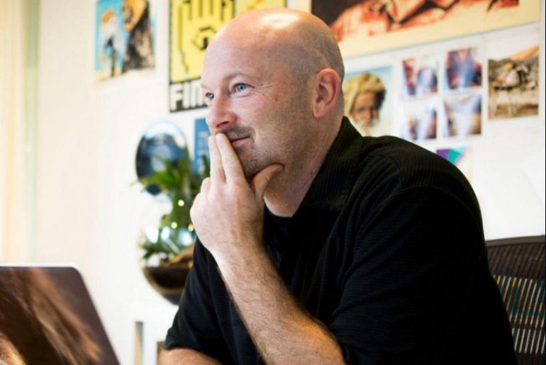
had the pleasure of interviewing Kenn Fine. As FINE’s founder and Executive Creative Director, Kenn Fine has served as creative visionary, strategist, consultant, and confidante to leaders in hospitality, wine, technology, and yet-to-be-defined industries since 1994, developing and growing dozens of award winning brands along the way.

Thank you so much for doing this with us! Can you tell us a story about what brought you to this specific career path?

Roughly 30 years ago, I founded a mountain bike clothing business, working through all the startup challenges to help make it successful before selling it off and beginning to do spot gigs with other companies. I found that I loved the continuous process of parachuting in to problem-solve creatively, and that my mind naturally used brand as a compass for making all sorts of decisions — not just the more obvious design and communications activities, but the operational and service practices that make the whole organization go. I developed this belief that brand is operations. So, whether it’s the minutiae of choosing which of 100 different varieties of Velcro straps work best in a new breed of biking shorts, or figuring out how to deliver service standards at a global hospitality brand, weaving brand into your operational DNA drives everything. So I’ve just been on one long, exhilarating, rewarding mountain bike ride from the start.

Can you share a story about the funniest marketing mistake you made when you were first starting? Can you tell us what lesson you learned from that?

It was back in the clothing company days, before we were even able to afford color printing. I had the genius idea to design a black and white “photocopyable” product brochure with a highly sophisticated scheme of delineated squares that could be colored in — manually! — using a suite of carefully selected colored pencils. I believed I had single-handedly defeated the entire overpriced offset printing industry with sheer ingenuity and elbow grease, while simultaneously imbuing our brand with a more personal and artistic flair! Then, of course, our very first promotional push required 1,000 pieces be ready to distribute within a few days. A few all-nighters and bad hand cramps later, I’d learned a valuable lesson on scale, and the real price of hard cost vs. opportunity cost.

What do you think makes your company stand out? Can you share a story?

It’s really our belief that brand has the power to make big things happen across your organization and your industry if you treat it as a compass heading for operations, not just a cosmetic layer on top of it all.

We take a vertical approach to brand integration, trying not to get lost in the top five percent of making things look good before understanding what connects the entirety of an organization’s behavior and practices. Again, to us, brand is operations.

We create brands from the inside out and design experience from the outside in. Meaning, we are thinking about the essence of what makes a company unique while simultaneously crafting the experience and expression of that brand as it meets the customer. That gives us the DNA and compass heading for everything from the product and service, to environments where it’s delivered, online and off.

The best stories in our industry come from the gaps that kind of thinking exposes, between what companies say their core purpose and promise is, and how they’re expressing it in the marketplace. We have these meetings all the time where the purported project calls for groundbreaking creative, but there’s nothing to attach it to — it is an empty sales pitch. I remember meeting with a global tech client developing what they said was a revolutionary smart phone accessory requiring breakthrough creative. We filled out NDAs, and flew down to meet with a sizable innovation team under strict security protocols, and shared our best work to be worthy of consideration. When it came time to reveal their idea, with great fanfare they pulled off the shroud concealing what appeared to be a makeshift lamp stand you could use to take photos of documents. To this day, I believe that our immediate, involuntary laughter may have lost us that project. And that perhaps a deeper understanding of brand would’ve led them to a different solution.

Are you working on any exciting new projects now? How do you think that will help people?

There’s so many. We’ve begun work with Canyon Ranch, pioneers in wellness who are looking to re-center on their mission of transformation that goes far beyond hospitality and into the impact they have on people’s quality and duration of life. The Hotel Del Coronado is completing a massive revamp and we’re helping use brand to guide and shape their vision for a new generation of Del guests to fall in love with that special place. Both follow this theme of re-imagining hospitality pioneers that started during our work with Kimpton several years ago.

Exciting ones in consumer products include our work for Chateau Ste Michelle, who’s evolving beyond traditional consumer packaged goods branding to meet today’s consumer tastes, rethinking the experience on their property and direct-to-consumer across their dozens of unique brands. And we’re working with some real digital upstarts that are changing the world by designing experience — Lime bikes are leading sharing economy urban transportation, and Mojo Lens is actually developing a contact lens that lets digital information integrate into your life seamlessly, rather than you bending to devices. That’s just a few examples of some very exciting stuff with companies who understand they need to dig deeper into how they deliver and communicate value to people in order to succeed today.

Ok let’s now jump to the core part of our interview. In a nutshell, how would you define the difference between brand marketing (branding) and product marketing (advertising)? Can you explain?

Brand is who you are. It’s your DNA. We may “sequence” it using words and pictures initially, and then expand to other important forms of documentation and standards, but it gets expressed in all the ways you do what you do. Product marketing and advertising and even brand marketing are all examples of tactics where brand plays out and comes in contact with your customers in specific ways. The important thing to remember is that a single ad campaign or product line is not your brand; it should reinforce and emerge from it, but in order to do any of these things well and consistently, you need to have a very strong, very clear core understanding that connects them all. It’s not something that gets published only in a visual standards guide; it’s something that gets published, communicated, documented, trained, improved, and proliferated every day for as long as you are in business.

Can you explain to our readers why it is important to invest resources and energy into building a brand, in addition to the general marketing and advertising efforts?

It has never been more important to be extremely clear on who you are and what you do for people inside and outside your company. You can’t just say how you’re different, you have to BE how you’re different. There’s too much noise and transparency in the marketplace to try and fake your way through with clever sales pitches alone.

We make brands that are “pully” not “pushy”. The more you invest in the brand, the more people will come to it, and the less you will have to add your pushy voice to the chaos of information in the marketplace. You simply invite and introduce.

If you would like your company’s existence to depend upon paid media, buying eyeballs and clicks and one-time sales, focus only on marketing and advertising. If you would like your company to have a foundation of earned and owned customer relationships, focus on nurturing your core brand.

It takes resolve to not resort to quick-hit tactics — there are so many platforms and methods of communication that the biggest issues in brand and communications nowadays are what to say no to. Reduce noise, distractions, and wasted motion. Don’t focus on B2B or B2C marketing, focus on H2H: human-to-human value creation.

Can you share 5 strategies that a company should be doing to build a trusted and believable brand? Please tell us a story or example for each.

#1: Know thyself. Have a clear brand foundation, value proposition, and experience intent to build upon that’s grounded in the right blend of historic reality and future aspiration. Pioneering brands, like Kimpton and their boutique hospitality or Canyon Ranch with wellness, often have a strong legacy spirit they’re trying to both recapture and reinvent. New brands are trying to build a lasting legacy, like Makr Hospitality that centers on the culinary hospitality vibe of its owner Charlie Palmer, or even Holt Homes who’s building residential communities on differentiation meant to last 100 years. Either way, it starts with knowing who you are.

#2: Be loud and proud. Confidently broadcast your distinction without fear of alienating those not in your audience. The urge to be “all things” or “common denominator” is a vestige of mass marketing past. Our work with wine brands like Ashes & Diamonds or Realm is a good example — they’re not for anyone who seeks a traditional wine vibe, and they’re highly successful at it. Pebblebrook Hotels set up a whole new brand — the Unofficial Z Collection — dedicated to the idea that hotels are not a place to sleep, but to wake up. I think of Mojo Lens, who’s leaning into the transformative impact of wearable tech at a time when some are afraid to tread there.

#3: Map the experience. It’s not just about sales funnels, it’s about knowing when you have permission and opportunity to impact a customer in some way. For Lime, knowing how customer use and need information drove digital communication strategy in a new sharing economy category. Bode is a brand trying to make hospitality group-friendly as never before by engineering a shared experience more reliably inspiring than Airbnb or branded hotels. Hotel Del Coronado expanded their property by mapping guest interest to earn added stays and spend by being more relevant and timely. Be methodical about where you can add value to the way customers think and behave.

#4: Empower your culture. We have a saying: “customers buy brands that employees buy into.” So many industries now depend on finding, attracting, retaining, training, motivating, and aligning their people around a common cause. Our tech clients are nowhere without committed engineers. Hospitality is nothing without great service. Our yearslong collaboration with Kimpton is the case in point. Aligning their customer brand and their employer brand, having those mapped journeys overlap to create “ridiculously personal experiences” is why they’re a great brand and consistently voted a top workplace, too.

#5: Acknowledge your customers. Maybe this sounds too basic, like it should amplify to “the customer’s always right” or “cherish your customers.” But start with this, that in every decision you make you will think of the people who pay the bills. You will find ways of considering their point of view and experience, with clarity and empathy. Doing this helps you keep your brand promises. It also leads you to all sorts of tiny gestures, rituals, and touchpoints that do not go unnoticed. I think of the loyalty program we helped Kimpton shape, Kimpton Karma rewarded guests not just for buying but for doing the things that ensure they had a great brand experience and kept the promise “good things come to those who stay” by acknowledging them all along the way. Also, it leads to lots of very cool brand schwag.

In your opinion, what is an example of a company that has done a fantastic job building a believable and beloved brand. What specifically impresses you? What can one do to replicate that?

I think it’s interesting to answer that question not by professional dissection but by observing our own human response toward it. I know in my own life I tend to gravitate toward unassuming natural brands like Tom’s of Maine (at least before they were bought out), or Bob’s Red Mill for many reasons. In my line of work, we get a lot of “I wanna be like Apple” input when we ask what brands they want to emulate and I’ve always been an Apple loyalist. But in recent years, a new brand has emerged to get more mentions: Tesla. We could attribute that to being purpose-driven, as much a cause as a brand. They have a strong loyalist community who will enumerate the ways the product is demonstrably superior, and some vocally conspiratorial detractors who will promote its risks and ulterior motives. They got there by emphasizing design, innovation, and continuous improvement in operations that’s reflected in all the experiences where the car and its driver intersect. Out of necessity, they maintain their own rebel operational infrastructure to provide everything from off-channel sales to roadside assistance. But more than all that, think of the many attempts to start even a standard car brand in the past that have failed while Tesla is inventing a category using no advertising. Their willingness and ability to take on the combustion engine institution and create a highly aspirational consumer and business brand is not much short of miraculous, and if you can approach your brand with half that drive and moxy, you will succeed.

In advertising, one generally measures success by the number of sales. How does one measure the success of a brand building campaign? Is it similar, is it different?

If your only measures of success attach to the short-term return on media spend investment, you will not build a brand. You can measure those returns in simple behavioral ways, from clickthroughs to purchases at points of sale, online or off, and optimize them over time. But if you do that to the exclusion of all else, you can become a victim of your own success where you begin chasing the market instead of creating one. You lure the wrong audience using the wrong message — often, you begin to discount and bend your message to suit short term returns.

The right measures to layer on top of that will depend a bit on your industry and model, but the things to measure in brand are about the price and margin your product commands (measures like revPAR or ADR in hospitality, average purchase price in real estate, contribution margin in consumer goods, etc), the lifetime value of the customers you attract and retain, and the equity that is created in your company by the “soft” asset that is the brand perception you’ve built in the marketplace. These are the measures that tell you you are no longer a commodity that must pay to maintain its place in the market, but a company that has a strong, loyal customer base willing to pay a premium for your product. That is the game.

What role does social media play in your branding efforts?

It’s really different for every organization. The important thing is to understand the extent to which social, or really any channel, is a hub or a spoke in delivering your message and connecting with customers.

It can be a very meaningful place to interact with people, and it’s important to treat it not just as a “broadcast” channel but as a place to have a conversation. The slippery slope of social media is when it becomes its own independent “activity engine” that requires constant content that may feel disconnected from the rest of what you do and just there to create noise. So we spend a lot of time orchestrating that using social media “playbooks” that extend from the core brand to do the job that’s right for the channel. And you have to be prepared to use it the way the customers want to use it, which means it will be some combination of promotional messaging channel, owned media, customer service department, and random incident report all mixed into one. The important thing is trying to retain the balance that is right for your company while remaining responsive to the customers who want to find you there.

What advice would you give to other marketers or business leaders to thrive and avoid burnout?

Take care of yourself first, stay curious by doing creative and challenging things outside of work. Then bring your mad game to your workplace.

You are a person of great influence. If you could inspire a movement that would bring the most amount of good to the most amount of people, what would that be? You never know what your idea can trigger. 🙂

People in the creative trades share a remarkable alignment on what makes organizations admirable, and we hold the power to help them succeed or not through our superpowers with strategy, ingenuity, words, designs, images, and ideas. What if our entire industry resolved to work only on behalf of organizations that could demonstrate responsibility for the positive impact of their products, services, and actions on people, communities, and our planet? Those companies we threw our weight behind would disproportionately and decisively win.

Can you please give us your favorite “Life Lesson Quote”? Can you share how that was relevant to you in your life?

A leader is best when people barely know he exists, when his work is done, his aim fulfilled, they will say: we did it ourselves. — Lao Tzu

It’s one of those quotes that should speak for itself. But the color I would add to it is that branding doesn’t get handed down from the mountain on stone tablets by aloof, black turtlenecked creative directors. It is created and enacted by aligning a great many people over a very long time who must all feel invested in the outcome.

We are blessed that very prominent leaders in business and entertainment read this column. Is there a person in the world with whom you would like to have a lunch or breakfast with? He or she might just see this, especially if we tag them. 🙂

Tom Robbins. His imagination is an inspiration to me and, I find, unexpectedly very practical as it relates to how I approach my work. He could literally make a can of beans worthy of a story. Everything he did was ridiculously different, completely sincere, rich with irreverent statements on our social context and the human condition. I’d like to find out if you can teach and learn that.

By 

Passionate about bringing emerging technology to the market.

Sourced from Thrive Global

Black is, arguably, the queen regnant of all colors. It emanates dominance, mystery, elegance, and reflects a wide spectrum of emotions. Depending on the context, it can be conservative or unconventional, luxurious or minimal. Its usefulness simply knows no bounds.

Thanks to its versatility, black plays an important role in all forms of art. In design, it is often used as a standalone color, mostly in logos, as it can help add a touch of power and sophistication to a brand. Think of Louis Vuitton, Gucci, Chanel, Adidas, or Nike, to name a few. However, black can also serve as a spectacular backdrop for websites. It helps put all other elements in the spotlight and accentuates the brightness and vivaciousness of surrounding colors.

Below you’ll discover 25 stunning examples that prove the potency of black as a background color. While some of them use the simple yet timeless combination of black and white, others combine a variety of colors with their black backgrounds. But they all unquestionably illustrate how dark designs can help brands and individuals differentiate themselves from the crowd and create awe-inspiring projects. The websites we’ll introduce you to are:

Synchronized Studio

Synchronized Studio is a team of creatives and experts in digital art direction, branding, web design, and much more. A word that best describes this website is – powerful. There’s a loading animation that looks like a lightning bolt tearing the dark background as the numbers go from 0 to 100 indicating the loading status. The background is particularly interesting. For one, it’s not static. It resembles black silk wrinkled sheets, and the movement of your mouse causes the “sheets” to stir. The cursor leaves a lime-colored trace behind that adds a touch of color to the homepage. Inner pages are black and white, save for the projects page which is especially fun to explore because of the horizontal drag effect.

Trip in the Dark

Trip in the Dark is an astonishing project created by the Voskhod digital agency that I could wax poetic about ad infinitum. While the website loads, you first see a blinking eye placed on a black background inviting you to be patient while you await for your adventure in the dark to begin. You can then choose the way in which you wish to experience the site – with your ears, eyes, and/or by using your voice to interact with it. Once that’s settled, you’re introduced to Volodya, a not-your-typical tour guide. The background is initially white, but as he begins to narrate his experience and informs you that he’s visually impaired, the light switches off and you’re enveloped in darkness. He tells you his story using his voice as well as through a series of spectacular illustrations that lead you to a crossroads. There you can choose between exploring places or getting to know locals. If you select the former, you’ll be able to make your own map based on the real sounds of the city. You can select a maximum of 5 sounds that you should place in designated slots to then see your route through Yekaterinburg. If you go right and choose to meet locals, you’ll have the opportunity to hear several interesting stories that highlight the importance of listening to sounds, both external and the ones within ourselves.

Andrew Leguay

Andrew Leguay is a designer who specializes in branding, digital products, and lifestyle marketing. His creativity is evident in every single pixel of his commendable portfolio website. As you wait for it to load, the screen becomes more and more chaotic with each passing second. Words such as organization, strategy, branding, marketing, culture, product, framework ambush the screen and are all you can see at one point. It all clears out in an instant and then you get the chance to explore Andrew’s work. The entire website is designed using just three colors – black, white, and dark orange. The background is black, which allows the featured elements to stand out. The font choices are interesting and unusual, especially the typefaces used in headlines. And when it comes to animation effects, the glitching on scroll effect wonderfully complements the cool vibe of the entire site.

Yuto Takahashi

Yuto Takahashi is an art director and a web and graphic designer. His website is mesmerizing from the get-go. The homepage starts off with a somber background image of a woman that appears to be submerged underwater. This composition looks calming and mystical, and it stands as an alluring invitation into Yuto’s creative world. To dive into it, you must first hold down the mouse button for a few seconds. What you’ll discover are his works masterfully displayed on a black background. The color palette he used on the website is not overpowering and it subtly contrasts the dark background. While you scroll and the projects appear on the screen one after the other, you’ll notice how their surface is wavy, resembling turbulent waters. As soon as the scrolling stops, the scroll-triggered animation effect is gone and the images become still. If you click on any of the pictures, you’ll see an in-depth presentation of the featured projects.

Clement Merouani

The website of Clement Merouani, a French art director and photographer, looks like a modern online art exhibition that you can visit and admire from the comfort of your home. You can control the carousel of his colorful works with your mouse. As you scroll or drag from left to right or vice versa, you’ll notice how the edges of displayed images become protuberant. The side towards which they lean depends on the direction in which you scroll. Clement’s website is essentially minimal and well thought out. The background is dark, elegant, and it ensures his works are in the spotlight. There are no distractions, no redundant elements that might draw your attention away. All the while you stay focused solely on his art. If you click on Index at the top left corner of the screen, you’ll see all of Clement’s works displayed in the Pinterest style on a black background.

Sam Phlix

Sam Phlix’s website is minimal to the core and a perfect example of how you don’t have to go overboard with special effects to make an eye-catching online presentation of your work. There’s a black backdrop, big white letters, and monochromatic imagery. Oh, and a carousel, the “wild child” of this site. If you bring the pointer on the wheel and hold the mouse button, the carousel will start to spin, simultaneously inverting the website’s colors – the background becomes white and the letters turn to black.

A Day Out

A Day Out’s works are displayed in large, irregularly-shaped, multi-colored blocks dotted all over the dark background. The masterminds behind this studio have cleverly used colors and the shapes of displayed elements so that you can’t help but feel the strong pull to explore their portfolio. Even as you click on a project of your choice to learn more about it, the black background will still be there with large imagery added on top of it to show you every single aspect of the selected project. Back on the homepage, the studio’s name is written in large typography and is visible at all times. As you scroll, the letters start to move, going from one side of the screen to the next, often swapping places. The fonts these guys used are very simple, colored in white, and placed in stark contrast with the darkness behind them.

Spatzek Studio

Spatzek Studio’s website looks powerful and bold from the first scroll to the last. The riveting visuals and witty textual content form the perfect amalgam that illustrates the studio’s creative genius and their skillset. They say they don’t want to over-complicate things but rather care about emotions and creating projects for humans. It goes without saying that their homepage looks spectacular, but the about page is probably unlike anything you’ve seen before. There are yes / no questions to which you must answer before getting to read the studio’s bio. The text alone is fun to read, but thanks to the hilarious videos they’ve added to the description, things become all the more fun for the visitor. There’s a lot going on no matter what part of the website you go to. Lots of motion, large fonts, video content, etc. but everything looks harmonious because of the neutral black background.

Digital Marketing Conference

The Digital Marketing Conference is organized every year by the famous Russian creative agency Possible. The website they’ve made for the 2019 edition is nothing short of majestic. You feel like you’re suspended in the air, exploring the continuously rotating dark universe of the conference by dragging the mouse cursor in every which direction while eerie sounds play in the background. All you see is black and white, with traces of red here and there. Above you are the starry skies with the DMC 2019 logo shining bright in the middle of it. If you keep looking up, the logo fades away, the stars spin harder and lose their form, and you feel like you’re sucked into some kind of digital vortex. Before you get dizzy, it all clears out after a few seconds, and the sky goes back to being starry again. Interactive links are placed at eye level and they carry info about the event, its program, speakers, etc. If you look down, you’ll see a map of Moscow with a clearly marked conference hall. The creativity of this 360° project doesn’t cease to amaze from one pixel to the next, and you can experience it even in VR.

Design Canada

Design Canada is a documentary film that introduces us to the finest Canadian graphic designs. The website was created by the phenomenal Locomotive agency. They’ve designed it in quite a simple yet compelling way, relying mostly on the colors of the Canadian flag – red and white. The background is black, which helped accentuate the iconic logos and other design examples. Animation effects, transitions, and micro-interactions are engaging, and they help make the browsing experience smooth, enjoyable, and entertaining.

Throwbacks Music

The majestic Throwbacks Music takes us back in time and gives us an entertaining, interactive 3D music experience. The black background is omnipresent on the entire website. We can listen to the great old songs that are popular to this day and learn more about musicians who created them. The library of featured artists is displayed in the form of a carousel, and as you move from one artist to the next, you feel as if spinning a record. The pictures of artists are black and white until you stop “spinning”, which is when they gain color. When you find a musician you like, you can hear a preview of whichever of their songs is included in Throwbacks Music’s music catalog. To listen to the song in its entirety, all you need to do is press and hold the spacebar. That action will take you to the page where, besides hearing the song, you can read more about the selected artist. Before you scroll away to the next musician, you can have some more fun and play virtual guitar strings by moving your mouse over them.

Mav Farm

Mav Farm’s website is definitely something else. While it loads, you can see the name of the app written in futuristic-looking blue and purple letters across the screen. Once the content’s ready, an eyeball pops up at the bottom of the page luring you in and inviting you to click on it to enter the website. And then, you step into a surreal universe where WebGL scroll navigation rules everything. There are lots of colors, futuristic elements, complementing typography and terrific animation effects that look breathtaking on a black background while truthfully portraying the description of the company, which is – A new network and an alternate reality.

Black WordPress Themes

VIEW COLLECTION 

Pearce banner

Pearce

Portfolio Theme

Dor banner

Dør

Modern Architecture and Interior Design Theme

Overton banner

Overton

Creative Theme for Agencies and Freelancers

Eclipse SRL

The website of the Italian agency Eclipse SRL is minimal and very fun to explore. Its ambient is very dark, matching the brand’s name. The homepage background is black and its monotony is occasionally disrupted by the passing dark moon. You’re encouraged to hold the mouse button and “draw” on this virtual blackboard. As you drag the mouse pointer across the page in whatever direction you please, you’ll leave a white trace made up of words in different sizes behind. If you click on the crescent moon at the top right corner of the screen, you’ll see a page filled with images depicting different lunar stages. On hover, some of them turn into Super Mario, Michael Jackson, or the iconic Pink Floyd’s Dark Side of the Moon album cover art. This is also where you can read more information about the agency and explore their projects.

Akufen

The first thing you see as the Akufen’s website loads are floating 3D cubes that levitate towards the middle of the screen. They form a large unit at the center that follows the movement of your mouse. Everything’s in black and dark grey hues, save for white typefaces. Exploring their portfolio feels very smooth thanks to the infinite scroll effect. The projects line up one after the other while the background remains dotted with dark cubes. The 404 page is charming and in stark contrast with the rest of the website. Its background is black, but there are occasional colorful, full-screen glitches interrupting the black and white synthesis.

Mysta Electric

Mysta Electric is a phenomenal tattoo artist that creates “dark graphic tattoos with beautiful melancholy” and his website perfectly matches that vibe. It’s entirely monochromatic, oozing coolness from one pixel to the next. The first thing you see is Mysta’s head in the background. Wherever you may move your cursor, the head will follow the movement. As you start to scroll, large typefaces take up the screen telling you Mysta’s story. If you hover over some words, you’ll see pictures of Mysta at work and with some of his clients. There’s also an extensive image gallery containing some of his awe-inspiring and idiosyncratic tattoos, as well as a black and white video that gives us a glimpse into the artist’s creative process.

Maxilla

Maxilla is a visual studio and a digital agency coming from Japan. Besides an interesting name and a cool logo, they also have a website that serves as an example of the striking things you can achieve with a black canvas and a lot of imagination. They start off with a bang – the first thing you see is a majestic radial menu featuring their portfolio. The names of projects are written in large, all-caps, white types, but on hover, your cursor turns into a big, black spot that sucks the white out of letters and leaves them outlined in the dark. Inner pages also reflect the agency’s creative approach to design, in particular, their about page. There’s an illustration of the white deer’s head at the center that follows every movement of your mouse. Next comes some short text informing you about what the agency does, and then – bam! You see a picture of a huge plush deer caught in the headlights, placed in the middle of the street. A few scrolls later, as if nothing happened, the deer is gone and Maxilla’s contact details appear.

Longshot Features

Longshot Features is a production company with a terrific horizontal-scrolling website that introduces us to their wonderous world of film. It’s filled with remarkable animated art of the pointillism master Mattis Dovier. When you click on any of the featured cinematic illustrations, you’ll reveal the story of the studio, the films they’ve made, etc. The stunning pixel art and the whole website are made relying on the black and white hues, proving once more the undisputed creative power of this timeless color pairing.

Cultish

Cultish is a South African creative studio with a beautiful website that fuses seemingly unmatchable elements. The first thing you see is Penitent Saint Peter, a Jusepe De Ribera’s painting from the 17th century. As you move your mouse over it, the parts of the image where the cursor is placed twirl leftwards, giving this classic composition a modern twist. Again, there aren’t that many colors on the homepage – the background is black and the letters are white or blue. But somehow the website doesn’t ever look dull. Aside from the large painting taking up the upper part of the page, you’ll also discover images of the studio’s projects while moving your mouse through the darkness. Inner pages are predominantly monochromatic as well, adorned with sporadic splashes of blue.

Juraj Molnár

Juraj Molnár’s website proves, once again, that black is possibly the best choice for portfolio websites, and that less is certainly more. The transitions from one section of the site to the next are smooth and subdued, with the progress bar displayed at the left-hand side of the screen. This is a mainly typographic site with a mix of bold and outlined letters. When you hover over the names of Juraj’s projects, a few images show up on the screen, inviting you to explore in greater depth the selected work. I especially liked the animated outlined illustration of a beating heart. It’s placed right next to the list of awards Juraj has won so far, indicating that he probably holds all those accolades close to his heart.

Gucci Marmont

The creativity of the people behind Gucci is inspiring, and not just on the runway. The websites their team has created for their big campaigns are all picturesque and mesmerizing. The one they made for the Gucci Marmont collection is no different. The website shows the Marmont bags as parts of still life paintings reminiscing the Renaissance era. The paintings are hung on a wall, and as you study them, you almost forget that the purses are the charming intruders that don’t naturally belong to any of these artworks. Given the colorfulness of the images, the choice of the black background is ideal.

Intro to Coding for Designers

Intro to Coding for Designers is a beginner’s class that teaches designers the fundamentals of coding. The color choice for this website is not surprising. The black background along with white, orange, blue, and green elements are all typical of coding in Javascript, CSS, and HTML, which are the programming languages this course teaches you about. This website is quite simple, but it’s amusing to explore. There’s a playful feel to it, as the authors have added a bunch of geometric shapes that run away from your mouse pointer as soon as you hover over them.

Kontrapunkt

Kontrapunkt is one of the leading Scandinavian design agencies and they’ve created a stunning online exhibition celebrating the Kontrapunkt typeface. They’ve singled out eight projects in which this font is used, demonstrating its versatility. The agency has opted for the predominantly dark color palette on the homepage, with lots of black and grey elements that are contrasted with white and yellow textual content. The typeface overview is informative and comes with lots of beautiful cursor animations. You can explore each project further by clicking on it. The exciting project pages shine more light on the typeface and demonstrate how it looks in action.

Masters 1987

Masters 1987 is an event production company from Los Angeles whose client list includes Oscar, Netflix, HBO, among many others. The use of a black background allowed them to promote their services in a striking way by opting for vivid imagery, all-caps typefaces, and snazzy interactions that ensure a cool browsing experience. The cursor looks especially charming. It’s like a comet that turns into a spotlight when you move it across letters. When placed on images, it puts them in commotion. The pictured objects zoom in and out, the photograph surface seemingly becomes undulating, and the color of the area where the mouse pointer is inverts.

Wiseslang

Wiseslang is a platform that gathers creatives from various fields. Their website looks subtle and impressive at the same time. The darkness throughout is filled with floating white dots or particles that assemble into all kinds of shapes. To navigate the website, you should use the arrows placed on the left and right sides of the screen. You can learn more about Wiseslang and the projects they’ve worked on, and regardless of the section you decide to explore, the playful white particles stay on the screen all the time.

Skyline Films

Skyline Films come with a website that all cinephiles will appreciate. The movies are displayed on what looks like an infinite cinematic canvas that you can explore by holding & dragging your mouse in any direction you wish. When you stumble upon a movie you like and stop moving the cursor around, a trailer for that specific feature will start to play. And if you click on the movie’s name, you’ll discover more information about it, its storyline, etc. The featured movies are all bursting with color, so the choice of a black background is not surprising in the slightest.

Final Words

Black is an exceptional, visually appealing backdrop color that gives a sense of depth to any project and highlights featured contrasting items. It helps brands tell their story in an attractive and unusual way that sets them apart from competitors and makes them more memorable.

As the websites from our roundup depict, black looks best when paired with lighter hues. When you use brightly-colored typography on a dark background, you don’t have to worry about readability, which is a common issue in dark design. And to create arresting projects, you don’t need to go wild with special effects. As you could see, sometimes all it takes are two colors, a couple of cool animation effects, and simple graphic content to make a memorable and astounding website.

Sourced from Qode Magazine

Sourced from Forbes

Email marketing campaigns have taken a lot of flak over the years, but they remain one of the most resilient advertising methods. The bottleneck that invariably occurs with email campaigns is the click-open rate.

The click-open ratio is an essential metric in determining how engaging your content is and whether you could do more to drive readers to your content. Low click-open rates might even suggest that you’re annoying your recipients. If you start losing subscribers, it’s a clear sign that you’re doing something wrong.

Below, 13 thought leaders from Forbes Communications Council share their insight into how businesses can improve their click-open rates.

1. Make Sure You Provide Value

All communications have to provide value if they are going to effectively further dialogue between the brand and a prospect or customer. Don’t depend on producing clickbait or pithy subject lines to drive engagement. These tactics might result in opens, but if you want true engagement, prioritize value to the recipient and not just the value to your marketing automation. – Anna Convery-Pelletier, Radware

2. Understand What Drives A Click

Marketers that are seeing low click-open rates first need to understand what drives a click. For email, it’s content: creatives, headline/body copy or interactive elements. My tip is to ensure you are segmenting your audience and providing content that is specific to them. I have never seen this hurt email performance — it only drives relevance, clicks and meaningful engagement. – April Mullen, SparkPost

3. Research Your Audience

Research your audience to get to know them better. Does your current email sign-up process provide any data that can be used to get insights on their reading habits? For example, how often do they want to hear from you or what time of day do they check their inbox? This will help inform your strategy and ultimately ensure that you’re reaching your audience in the right place at the right time. – John Orlando, Constant Contact


4. Offer Free Educational Resources

Getting people to buy has been difficult during COVID-19. When people are just trying to keep their doors open, email campaigns need to nurture customers and prospects with free webinars, education and resources, as opposed to pushing them to buy. This approach drives clicks, especially when your competitors are not offering this support. Clients will think of you first after business recovers. – Nysha King, Healthmonix

5. Keep It Simple, Test Subject Lines

Sometimes less really is more. Over the years, with email clients adding new subfolders (thanks, Google) like Promotions, Updates, and Social, the more designed your email is, the more likely it will end up in one of those non-primary folders. Our initial goal is to get those emails seen. Once they are seen, it’s about crafting smart subject lines so we do A/B testing of all subject lines. – Liz Weir, LevLane Advertising

6. Create Curiosity

Entertainment, education and relevancy are the keywords. Create curiosity with humorous clips of the relevant email content in your subject and always include a short preview text to increase the intrigue. An example might be “Subject: Pig drawings & awards” with “Preview Text: How your pig drawing can foretell your business & personal success, and new lockdown award categories inside.” – MaryPat Kavanagh, Terahertz Device Corporation

7. Provide Quality Content Consistently

In the long term, the best way to improve click-open rates is to become known for consistently high-quality content. It is always possible to influence your audience through creative subject lines to garner high click-open rates, but without high-quality content, it works against a brand’s interests. When a brand offers real value, in time, an audience builds true engagement and trust. – Ajit Ghuman, Narvar

8. Don’t Send Emails To Lists Of People

It’s all about data and your target audience. Don’t send emails to massive lists of people. Break down your data to send the right message to the right people. If your audience cares about the content, with the right subject lines, your click-open rates will soar. Think about it, do you open emails that clearly don’t apply to you? – Amber Mullaney, QSR Automations Inc

9. Connect With The Audience As A Human

Be human. Too many brands focus on professionalism and proving that they are the expert rather than connecting with their audience as a human. Speak to the heart of the challenge you are helping your audience solve. If you’re customer-obsessed, you’ll never have to worry about being disconnected from your audience because they’ll guide you on your next step as you help them achieve their goals. – Holly Tate, Vanderbloemen Search Group

10. Personalize Your Messaging

It’s all about personalization. If you want your customers to be interested in your message, it needs to feel like it’s dedicated to them. Make sure to include their name, perhaps a specific fact that you have about them (location, last item they bought, event they attended). Check that the subject is in the field of interest of the recipient — male recipients are typically not interested by the pink women’s skirt on special. – Nicolas Archambault, Midway Group

11. Focus On Data Maintenance

Data maintenance is vital for segmenting your target audience and achieving high deliverable rates. The better you know your audience, including past interaction and interests, the better you can serve their needs and curiosities. Rigorously excluding “bad data” by maintaining suppression lists has helped us improve deliverability and email domain reputation, resulting in successful email campaigns. – Astrid Pocklington, Enghouse Interactive

12. Don’t Use Clickbait Techniques

Don’t use clickbait techniques to make people open emails. That only leads to being marked as spam. Do the research on organizations and individuals on your list and write personalized emails. Do a test run to see if you have spelling and other errors. Understand their problems and provide solutions. Using appropriate subject lines and tailored content helps improve click-open rates. – Preeti Adhikary

13. Send Plain Text Emails

Keep in mind the beauty of a plain text email. We all know what email marketing — or as most know it, spam — looks like. Differentiate yourself by going basic and craft short, simple plain text emails. Customers are smart and wise to marketing gimmicks. In our tests, this approach substantially outperformed, with higher open rates and conversions. – Sair Mir

Sourced from Forbes

By

It’s no secret that Google Ads (formerly known as Google Adwords) and Facebook Ads have a long-standing rivalry. What is it about these two platforms that cause so much discussion? And how do you choose which platform to utilize for your business?

When it comes to your ROI (return on investment), it’s essential to make sure you invest in the right platform to generate ad revenue. Digital marketing experts are no stranger to this question, but the response is almost always the same; it depends on your company and your target audience!

Both options are great, and depending on your business objectives, one may be a better fit for your budget. In this ever-changing world of digital marketing, it’s helpful to invest in the right ads. If you’re ready to invest in one of these platforms and finally choose a side in the Google Ads vs. Facebook Ads debate, this article is a must-read!

Google Ads vs. Facebook Ads: Why the Debate?

In reality, there isn’t a “better” option, because both platforms perform differently from each other and bring their unique benefits to the table. Some more specific questions to ask are:

  • What is my available advertising budget?

  • Which one is better for reaching my target audience?

  • What stage of the buyer’s journey am I trying to earn?

Most internet users regularly use both of these platforms. Depending on the age, income range, lifestyle, and other factors that make your audience unique, one may be better at investing your budget. But, what other factors are important to increase your ROI? When you take a look at what makes these platforms unique, and the Google Ads vs. Facebook Ads cost, it can become easier to make your decision.

WHAT ARE GOOGLE ADS?

Customers have more choices now than ever before, as businesses worldwide create websites for their businesses. To be successful, you need to change how you find, deliver, and retain customer interest at each stage of the purchasing funnel.

The different types of campaigns you can use with Google are:

  • Search Network Campaigns

  • Display Network Campaigns

  • Google Shopping Ads

  • Video Campaigns

  • App Campaigns

Google has been instrumental in facilitating these changes by implementing their PPC (pay per click) advertising approach that uses your industries keywords to charge you only for the clicked ads. Also known as paid ads, this technique can be efficient or expensive, all based on your industry. Other search engines use methods, but Google is the most popular and successful option available for this type of marketing.

WHAT ARE FACEBOOK ADS?

While Google Ads focuses on paid search, Facebook Ads are all about paid social. Your target audience’s behaviors and patterns are what make social advertising so effective. Through Facebook, your customers can connect with other consumers, voice their personal experiences with your company, and stay up to date with your business.

The different formats of ads you can use on Facebook are:

  • Video

  • Photo

  • Slideshow

  • Carousel

  • Dynamic Product Ads

  • Lead Form Ads

Over 180 million businesses use Facebook for their business advertising or to connect with customers. Like all things on the internet, other social media platforms like Instagram and LinkedIn Ads are quickly becoming valuable tools for business owners around the world.

How Does Each Platform Benefit Your Business?

What are the different benefits each of these platforms offers your business, and what are the different options available? When it comes to brand awareness, sales generation, and more, this list of top three perks for each has you covered!

The Benefits of Google Ads:

  1. You can bid on millions of keywords to get your ads to rank higher, reach new people, increase your exposure, and more.

  2. Earn higher SERP (search engine results page) ranking by creating relevant ads. Money doesn’t buy the top advertising spots, so any sized budget can allow you to compete with top brands for customers.

  3. Google uses search and display networks to help you create ads that will appear in search results. The variety of options that can help you generate more leads.

The Benefits of Facebook Ads:

  1. People share tons of information about themselves on Facebook, like interests, beliefs, hobbies, and more. You can use this natural transference of data to target the people most likely to shop with you.

  2. Once you have a database of the people most likely to shop with you, you can import that data to Facebook and target those people with your ad campaigns.

  3. A critical part of successful advertising is your conversions. Earning sign-ups, sales, subscriptions, followers, leads, and whatever else matters to your business will help you succeed.

So, Which Platform Has the Best ROI?

It’s clear that there are benefits to advertising on both platforms, but what matters at the end of the day is your ROI. In the great debate of Google Ads vs. Facebook Ads, it comes down to which one will bring you the highest return.

Theoretically, if you took two campaigns in the current market and ran them for 30 days to gauge their performance, specific trends may start to appear. Both Facebook and Google are focused, in this instance, on earning memberships for a gym:

  • The Facebook option earned 103 memberships and had 150,000 impressions, but had an $11.00 cost per conversion.

  • The Google option gained 200 memberships at an impressive $4.00 per conversion and collected useful data about the types of ads that worked best.

While Facebook looks like the more expensive option, you can’t deny that a large number of impressions could lead to a higher long term return. The best social media platform campaign is truly based on those valuable impressions and regularly reminding your audience that you can help them solve their problems.

Where to Start

Your business and industry will heavily weigh which platform would be best for your business. Rather than Google Ads vs. Facebook Ads, consider instead what your company needs and where you can reach your target audience.

For more information about digital marketing, contact our experts at Trigger Media & Digital. For more industry insight about social media and internet advertising, check out the other articles on our blog.

By

Sourced from Trigger Media|Digital