I had a nice chat with my buddy Don Dillonthe other day, and this was one of the big takeaways:
Once you’re a good photographer with a substantial body of work, NOW WHAT?
Meaning — what are your next steps in your photography? Some simple ideas:
Use Adobe Sparkto make a dynamic website/portfolio of your best work. Then share the link with friends and family and ask them: “How do the photos make you feel?” Then add testimonials to the page.
Publish your photographs as an “e-magazine” (digital magazine) by using iBooks Author (video tutorial)
Use Adobe InDesign to create a print book layout, and send the PDF file to a local printer, to make a ‘zine’ (magazine) of your work. Start by printing 20 copies, and distributing them to friends and family for free. Based on their feedback, try to sell them to your followers for $19.95 each afterwards.
Start blogging about your photographic experiences and life experiences. To keep it simple, signup on wordpress.comand start blogging! The secret: your blog posts don’t need to be “good”. Just make them honest, fun, and share your works in progress.
Continue to build your following: Start an email newsletter via Mailchimp.com(what I use here) and keep your followers updated with your progress.
The rolling stone never gathers moss: Keep on rolling. The purpose is for you to keep making photography FUN! (Don’s idea). As long as you’re having fun in photography, you’re doing all the right things!
There are a multitude of blogging platforms out there and it can be an overwhelming endeavor to find the right one for your blogging needs, budget, and skill level. Luckily, we’ve come up with a list of the best blogging platforms out there. There’s sure to be at least one platform that will fit your preferences and help you reach the goals you have for your blog.
There is a viable free option, not just a free trial.
Blog post interface is simple to use.
The views statistics feature is very informative.
What We Don’t Like
You must upgrade to at least the Premium (mid-tier) option before you can really customize the look of your site.
WordPress.com is a great option for beginners with its easy-to-use blog editor and easy to understand page view statistics page, but it’s also not so overly simple that bloggers interested in learning the nitty-gritty of web design can’t do so while they work on customizing their blogs to their particular aesthetic.
WordPress.com offers a free service option, as well as a number of Premium service subscription options. For those interested in hosting their own blog’s site, you can also sign up for WordPress.org.
The pricing of a WordPress site starts at $0 (for the free service option). From there, there are five different premium options ranging from $3 to $45 per month. These subscriptions are billed yearly, though.
14-day free trial that doesn’t require a credit card.
What We Don’t Like
No permanent free option.
Lowest annual plan rate is expensive and offers only basic controls.
If you think your blog may involve a bit of eCommerce, then Squarespace may be the right fit for you. Squarespace’s pricey premium plans tend to work best for those who plan to sell products or receive donations through their blog’s site. In fact, three out of their four paid plans offer at least four or more eCommerce features, such as the ability to accept donations and “sell unlimited products.”
Squarespace allows its users to pay for its service plans either on a monthly or annual basis, though users who pay annually will pay 30 percent less than those on the monthly payment plan. If paying annually, the per month price starts at $12 at the lowest tier and ends at $40 at the highest service tier. If you’re paying monthly, the price range is $16 – $46 per month.
Quickly set up a free blog with just a Google account.
What We Don’t Like
Design templates look dated and overly simple.
Blogger is the easiest, quickest blog platform to use on this list, primarily because it’s free to use, the content creation interface is easy to use, and all you need is a free Google account to set your blog up.
That said, you’ll need to purchase a domain separately if you want to customize your blog’s web address.
Preset blog post formats make it easier to curate and produce content on your Tumblr blog page.
Preset allow for more creative storytelling among users.
Reblog feature makes it easier to develop a following for your blog .
What We Don’t Like
Reblogging can clutter your page with other people’s posts instead of having yours front and center.
Tumblr isn’t quite a traditional blog, but that’s okay because it isn’t really meant to be. Tumblr blogs are perfect for building online communities, content curation, and showing off your passions and projects with (usually) bite-sized blog posts, multimedia posts, and memes. Tumblr blogs tend to resemble brightly colored bulletin boards filled with a variety of posts.
The reblogging feature is particularly useful, as it allows other Tumblr users who enjoy your posts to display your posts on their page for their followers to see, which gets your work the exposure it needs. Tumblr is free to set up and use.
No emphasis on trying to drive traffic to your blog posts for the purposes of getting paid which drives genuine engagement.
You can remove your articles from Medium even after publication.
Totally free to publish articles on the site.
What We Don’t Like
Difficult to build a following at first.
If you want Medium to promote your posts, you must follow specific curation guidelines.
There are a number of blogging platforms that will allow you to publish your articles and make money off of them. Medium is unique among these because Medium bloggers who choose to join the Medium Partner Program can be paid for their work if Medium subscribers (readers who pay a monthly fee in appreciation of the work produced on Medium) engage with with their work in a meaningful way.
Medium bloggers in the Partner Program essentially don’t have to worry about hosting their own blog site, or about driving traffic to their articles to get advertising clicks.
The Medium blog post editor is very simple and easy to use, and it’s also free to publish articles on Medium.
A wide variety of beautiful, blog-style design templates and themes.
Free option available.
14-day free trial of a Wix Premium service plan.
What We Don’t Like
The lowest priced Premium plan doesn’t have many benefits.
Wix offers a lot of features geared towards making web design and blogging as simple as possible, including the Wix Editor that has a drag and drop-style website builder and built-in Search Engine Optimization.
There’s also the Wix ADI (Artificial Design Intelligence), which allows users to design a website in just a few minutes by answering a few questions to help the artificial intelligence in Wix ADI determine the optimal web design for your blog’s goals.
Wix does offer a free service option and a 14-day free trial of any Wix Premium service plan. The Wix Premium service plans for websites range in price from $13 per month to $39 per month.
Professional level blog experience, that’s beautifully designed.
Search Engine Optimization is included.
What We Don’t Like
Service plans are pricey.
Limits to how many views your site can have per month and you’ll be asked to upgrade to a higher-priced plan if your views exceed that limit on a “three month rolling average.”
If your blog is intended to be used as a company blog or as a publication, Ghost may be the best option for your needs. In fact, it’s even used by companies like DuckDuckGo, Mozilla (of Firefox fame), and even Tinder.
If you go with Ghost, you can expect to have your site’s updates and backups totally managed by Ghost. Additionally, features include support for other staff members or admin for your site and even support for content in multiple languages.
There is no free service option. The premium options range in price from $29 to $199 per month, if you choose annual billing. If you choose monthly billing, the range increases to $36 to $249 per month.
Free option comes with comes with 500MB of storage and Search Engine Optimization.
Fully customizable themes/design templates.
Mobile apps for both Android and iOS devices.
What We Don’t Like
The only difference between the free plan and the lowest tier paid plan is the latter comes with a custom domain.
Weebly comes with a vast assortment of beautiful and modern-looking design templates, and they’re all fully customizable. Like Wix, Weebly also features a drag-and-drop style website builder. There is a free service option, while paid service plans range from $5 to $25 per month and are paid annually.
The Learning Center Guide provides helpful information on how to craft successful blog posts and online content.
You own the copyright to your work on HubPages.
What We Don’t Like
Can take up to six months to start seeing earnings.
You must drive traffic to your pages to earn money.
HubPages is perfect for bloggers passionate about very specific, very niche subjects. It’s also great for bloggers who are willing to learn all about what it takes to drive web traffic to online articles to make those article profitable.
Like Medium, you can make money from your articles through an earnings program, but unlike Medium, HubPages does rely on web traffic and views to determine how much its “Hubbers” get paid. It’s free to publish your articles on HubPages.
All monthly subscription plans come with unlimited storage.
Layouts are easily adjusted by just dragging and dropping.
What We Don’t Like
No free options.
The lowest priced plan doesn’t come with the ability to fully customize your site’s design.
Typepad, for the most part, is a very basic blogging platform boasting pretty web designs, and for three out of the four service plans: the ability to create unlimited blogs.
In addition, all levels of service include unlimited storage, which can be helpful if you’re planning on blogging often and with large-sized multimedia content. Besides a 14-day free trial, Typepad is not free to use and paid plans range from $8.95 per month to $49.95 per month.
Absurdly Driven looks at the world of business with a skeptical eye and a firmly rooted tongue in cheek.
You could tell this was coming.
All you had to do is open your eyes and see what was going on.
Starbucks customers were abusing the system and making a mockery.
The staff, too, weren’t all that happy about selling something that, frankly, made a mess.
No, I’m not talking about the infiltration of the colorful and pointless Frappuccino.
Instead, I’ve been disturbed by something I thought I had a few more days to enjoy.
As my colleague Bill Murphy Jr. recently revealed, Starbucks stopped selling newspapers at the end of August.
Any newspapers. All newspapers.
My local Starbucks did it a week ago. Just like that, with no announcement.
The staff removed the rack upon which the Wall Street Journal, the New York Times and the San Francisco Chronicle had perched.
Suddenly, the place seems devoid of a fundamental design element.
Please forgive me, but I’ve been attached to newspapers since I was a child.
They kept me away from other humans first thing in the morning, which was a benefit to both sides.
There’s something about a newspaper’s smoothness, the physical feel of a paper meticulously prepared, the columns written by the witty and the angry.
It was an essential and formative part of my morning experience.
I don’t want to have to go to the wide-open web. I first want to bathe gently in a little physical curated locality.
I’d go to Starbucks, pick up my Grande Almond Milk Latte and my Chronicle and repair back home, ready to read about the San Francisco Giants’ latest frustrating performance or learn which local council had banned the word manhole.
Or, Good Lord, sister.
Starbucks stopped selling papers because customers would steal them. Worse, they’d sometimes read them without paying and then toss them back onto the rack.
Now, it’s all gone and the transition has been painful.
I know I have choices. I can buy my coffee, then go elsewhere to buy a paper.
There’s a nearby CVS, for example, or a local supermarket.
But that’s two trips and, all too often, my pathetically irritable morning mind isn’t up to that.
I could also have the paper delivered, but then I’d have to go online anyway to cancel delivery whenever I’m out of town.
And when it rains, the paper gets tossed onto the driveway and is soaking wet by the time you get up.
So I’ve tried to resist buying a paper at all. I’ve tried to tell myself that I must become at one with the new world.
After all, I’m sure I could get the same information on the Chronicle‘s website.
But I don’t want to have a purely virtual relationship with the Chronicle. I don’t want to treat it like every other virtual entity. I want to tuck it under my arm, bring it home and make things a little more personal.
Still, removing the Chronicle from my life has made me consider the real truth.
I bought it for the sports pages. And the Friday movie reviews by the extraordinary Mick LaSalle.
That was it.
Yes, there were other elements — such as the local news section and the entertainingly bloviating cynicism of former mayor Willie Brown — that occasionally gave pleasure.
But it had become a habit, one that I never questioned and one that I always (told myself) enjoyed.
Even when I realized that the paper might be shrinking and the number of writers wasn’t exactly expansive anymore.
There remain two questions.
One, can I continue to live without a physical Chronicle?
And two, will this give me a reason not to go to Starbucks anymore?
Perhaps that, too, has become just one of those habits, one that I should begin to examine in depth.
Perhaps I only ever went to Starbucks for the Chronicle.
Given that the average person receives 121 emails a day, it may seem like an ineffective way for marketers to reach customers. But that’s not the case. According to a study by McKinsey, email still remains an extremely powerful way to acquire new customers —nearly 40 times more powerful than Facebook and Twitter combined.
And customers spend more as a result. The same McKinsey study found that the average order value of emails that prompt purchases is 17 percent higher than on social media.
But not all marketing emails are created equal. Some have a much higher probability of being opened than others. Factors that can affect whether a customer opens something or trashes it include the time of day you sent it, the subject line, and the type of message it is.
What type of marketing email is opened the most? Happy birthday email with a special offer. According to data from Square’s email marketing platform, automated birthday offers generate the highest engagement, with open rates and redemptions more than 2.5 times higher than the average across all types of email campaigns.
That makes sense if you think about it. Birthday email is highly targeted and more personally relevant to each customer who receives it. That makes them more likely to get noticed than, say, a massive blast about a sale.
In fact, personalized automated email — like welcome messages, birthday offers, and winback campaigns — far outperforms one-off campaigns to your entire customer list. On average, email open rates for automated offers with Square’s email marketing tool are 1.7 times higher than blast campaigns containing offers. They also have a 2.3 times higher redemption rate within seven days of the email send date.
That doesn’t mean that blast campaigns don’t have strategic value for marketers. People who sign up for an email list usually do so because they want to know about things like sales or news announcements. But for businesses looking to cut through the email noise on a consistent basis, “happy birthday!” is where it’s at.
Innovation seems to be one of those few evergreen words. It has never gone out of fashion as it is so intertwined with humankind’s development. So in today’s digital world it comes to no surprise that innovation has become nothing short of a religion with “innovate or die” as its battle cry. When a company succeeds, people attribute its good fortune to superior innovation. When it fails, people say it lacked the ability to innovate.
But unfortunately popularity has its own drawbacks. Sometimes it seems that innovation is used as a catch all word. From political debates to the board room and from startups to advertisements.
Using innovation as a catch all word is risky as it might lead to confusion, miscommunication and wrong expectations. The importance of clarifying what everyone around the table means when they say innovation become apparent to me during an engagement with an exhibition and trade fair organizing corporation. I was invited to moderate an executive off-site workshop during which the attendees were to come up with a medium term strategic road map. From the get go the CEO told everyone attending that, moving forward the company needs to be more innovative than it was. To which some of the directors replied that their respective units are already innovative enough. However, only through examples were both parties able to find common ground and avoid a heated debate that could have derailed the entire event.
You see, from the directors’ perspective moving away from paper-based maps to an app meant innovation. However, for the CEO that only counted as keeping up with the times. What the CEO wanted to see were use cases around the application of drone technology and virtual reality. Essentially the CEO wanted breakthrough innovation. But in the absence of a clear definition and classification of innovation in that company, the directors were only doing incremental innovation.
Innovation by type
In his book, Mapping Innovation, Greg Sattle identifies 4 types of innovation. And makes the case against treating innovation as one-size-fits-all from a process, strategy and KPI perspective.
The first type of innovation Greg is talking about is sustaining innovation. This is the most popular type, because most of the time companies are seeking to get better at what we’re already doing. They want to improve existing capabilities in existing markets. This innovation type is characterized by a good understanding of the customer base, its problems and the ways to solve it. These incremental innovations can be thought of as variations on an existing successful theme. For example, for an FMCG company doing household cleaners, a sustaining innovation might involve making a particular cleaning agent 10% stronger or pairing it with a new scent.
The second type Greg talks about is breakthrough innovation. Essentially this type of innovation is characterized by a good understanding of a problem that needs solving but a fairly poor understanding of the ways to solve problem. As Thomas Kuhn explained in the The Structure of Scientific Revolutions: ‘we advance in specific fields by creating paradigms, which sometimes can make it very difficult to solve a problem within the domain in which it arose — but the problem may be resolved fairly easily within the paradigm of an adjacent domain’.
To exemplify. With the increase in popularity of smart phones a new problem appeared — screen shattering. The problem was well understood but the solution wasn’t that trivial, and moving beyond the bulky covers was proving a challenge. Enter Gorila Glass, manufactured by Corning. The New York-based company produced the first glass light bulbs for Thomas Edison in 1879, pioneered Pyrex cookware in 1915, supplied the windows for the spacecraft Friendship 7 (which was flown by John Glenn for the first U.S. manned orbital flight), created missile nose cones during the Cold War, and was the site of Frank Hyde’s serendipitous discovery of high-purity fused silica in 1932 — the precursor to the optical fibers that connect us to the Internet today. One of the company’s most recent accomplishments is the development of Gorilla Glass, which on the 1962 invention of ChemCor. In addition to being strong, it’s also remarkably thin — from .5 mm to 2 mm — so the glass can replace acoustic glass and is superior to other glass in terms of power conduction and other technical aspects. Plus, its thinness means the devices it protects are lighter, which saves on shipping costs. Already in 2011 Gorilla Glass was found in 200 million devices, roughly 20% of the handsets in the world at that time. It was 20 times stiffer and 30 times harder than plastic, which explained its popularity in the consumer electronics world.
The third type, disruptive innovation. These are the sort of big ideas that many of us have in mind when innovation in mentioned. They are called disruptive because they disrupt the current market behaviour. Rendering existing solutions obsolete, transforming value propositions, and bringing previously marginal customers and companies into the center of attention. The iPod is a prime example of that. For it radically changed the way we listen to and buy music. But other examples can include Uber, Netflix and Airbnb.
In a nutshell, disruptive innovation changes the basis of competition. Because of technological shifts or other changes in the marketplace companies can potentially find themselves getting better and better at things people want less and less. When that happens, innovating your products won’t help — you have to innovate your business model.
Lastly Greg is talking about basic research as the forth type of innovation. To Greg basic research is needed when neither the problem (or market) nor the solution are well enough understood. Basic research is needed as pathbreaking innovations never arrive fully formed, they always begin with the discovery of some new phenomenon.
As you can see, clarifying the type of innovation one talks about will help sharpen the conversation, align expectations and help identify the right KPIs through which progress is measured. Since breakthrough and disruptive innovation are so different from incremental innovation, they need to be measured differently. For incremental innovation metrics need to focus efficiency: how efficient are projects going through the pipeline and how are they stacking up against forecasted and actual economic return. For breakthrough and disruptive innovation, given the inherent uncertainty of something that’s new, the measurements must be different — this is the focus of innovation accounting.
Zooming out you can very well view the four types of innovation as either complex or complicated. Complicated problems can be hard to solve, but they are addressable with rules and recipes. They also can be resolved with systems and processes, like for example hierarchical structure. Incremental innovation and basic research fall into this category. While complex problems involve too many unknowns and too many interrelated factors to reduce to rules and processes. A technological disruption like blockchain is a complex problem. A competitor with an innovative business model — an Uber or an Airbnb — is a complex problem. There’s no algorithm that will tell you how to respond.
Rick Nason, an associate professor of finance at Dalhousie University’s Rowe School of Business, explains in his new book, ‘It’s Not Complicated’ that: if you manage complex things as if they are merely complicated, you’re likely to be setting your company up for failure.
Innovation by form
Now that we clarified types of innovation we can zoom in and look at innovation from the perspective of form. Under each type, innovation can take many forms, and Larry Keeley’s book ’10 Types of Innovation’ is a good resource for a deep-dive.
Understanding innovation by form is essential in aligning on what success look like for each initiative in a company’s portfolio and how it will be measured.
Take ‘customer engagement’ or ‘brand’ innovation as examples. These 2 forms have a direct impact on new revenue and the best way to measure their success (or failure) is though KPIs reflecting interactions. On the other however, ‘process’ and ‘structure’ innovations have a impact on cost reduction. Hence the best suited KPIs for the job of measuring success will be financial ones or time related ones (eg.: time-to-market, cost-of-sale etc.)
Wrapping up
Not having a clear definition of innovation in your company is dangerous as this will impact expectations, actions and most importantly KPIs.
Innovation should not be used as a catch all word as it comes in many types and forms — each needing a different methodology, KPIs and tools to give the best outcome.
CEO Fabrizio Freda revealed commitment to them in an earnings call
Estée Lauder is betting big when it comes to influencers: The beauty giant is spending 75% of its digital marketing budget on influencer marketing.
This statistic was revealed by president and CEO Fabrizio Freda in Estée Lauder’s second-quarter earnings call this week, saying that the vast majority of its marketing dollars were going to digital nowadays, with influencer marketing being the primary beneficiary of that investment.
“Over time we have invested much more in advertising, and now I would say that every one of our brands has some investment depending on where they are,” said Freda. “These investments are mainly now in digital. Seventy-five percent of our investment now are in digital social media influencers, and they’re revealing to be highly productive.”
Freda said that these investments in influencer marketing have paid off for Estée Lauder because it’s part of a greater strategic move toward putting marketing dollars into innovations and initiatives that prove effective when it comes to growth. Estée Lauder’s use of influencers are far-reaching, from signing big-name spokesmodels like Kendall Jenner and Karlie Kloss, to working with micro-influencers on YouTube and Instagram.
“They’re highly productive because we are doing a very good job in advertising, quality on asset, in targeting but frankly they’re very productive because we have learned much better how to focus our investment where there is growth,” he added. “When you expose your investment to growth, they have a much better rate of return. And that’s what is happening in this moment and that’s what we manage daily.”
That one of the world’s largest beauty companies—Estée Lauder owns nearly 30 skincare, hair and makeup brands, including Clinique, La Mer and Smashbox—is putting such a sizable investment in influencer marketing is a major sign of the growing acceptance of influencers in the marketing industry. Industry wide, marketers are spending $8.5 billion on influencer marketing, according to Mediakix. According to Statista, Estée Lauder spent over $900 million on influencer marketing in 2017 solely in the U.S.—a number that’s likely risen in the years since, given the company’s apparent commitment to influencers.
Overall, Estée Lauder reported positive results this quarter, with net sales of $14.86 billion, a 9% increase from last year’s net sales, which were $13.68 billion and net earnings rising from $1.11 billion at this time last year to $1.79 billion this year, according to the company.
In an effort to engage customers, online retailers are incorporating a variety of emerging technology tools into their ecommerce platforms. Social commerce has become one of the most talked-about practices, where consumers can make purchases directly through a brand’s or retailer’s social media page.
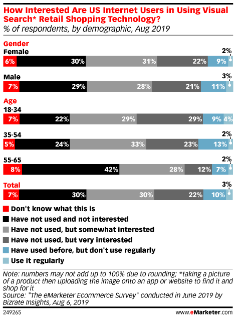
According to an August 2019 survey conducted by Bizrate Insights, social commerce ranked among the most-used emerging ecommerce behaviors by US consumers, far more so than visual search, augmented or virtual reality (AR/VR) and voice commerce via smart speakers. More than one-third of US consumers said they had purchased products through social media. And among the 66% who had not engaged in social commerce, 27% said they’re at least somewhat interested in using it in the future. This was an increase from November 2018 polling, which found that 29% of respondents said they had made a social commerce transaction and 71% who hadn’t.
“Social commerce has definitely emerged as one of the recent growth stories of ecommerce, fueled by social platforms making it easier for brands to showcase their merchandise and for shoppers to follow, browse and buy products,” said Andrew Lipsman, principal analyst at eMarketer. “Despite the added features, the real driver behind this trend is that social media is providing contextual relevance to shopping in a way it didn’t previously.”
While other new retail technologies have not been adopted as widely as social commerce, there is still significant interest among consumers. Bizrate Insights found that 13% of US consumers now use visual search, compared with 9% in November 2018. Among the technologies, visual search also generated the most interest among consumers, with 56% of non-users claiming they were at least somewhat interested.
Fueled by world-class, data-driven insight, the Experian Marketing Engine™ is the end-to-end, turnkey solution. With identity resolution, auto audience targeting, media activation and campaign measurement, you can find reach and retain more customers than ever before.
However, not all visual technologies have received the same interest. Just 6% of US consumers have used AR and VR, per Bizrate Insights.
Though it has potential—AR/VR shopping was up from just 4% in November 2018, and 39% of non-users expressed interest in the technology in the August 2019 poll—it still lags behind social commerce and visual search.
“The reality is that social commerce took a full decade to catch its stride, and new technologies like visual search, AR and VR are still very early in their adoption curve,” Lipsman said. “As these visual enhancements get introduced into social media environments, they will eventually find useful applications for shopping—but will take some time before becoming mainstream.”
In this fast-paced industry, it’s easy to prioritise short-term results at the expense of long-term impacts which may not become apparent for some time to come. It may look great that your sales are up this month but is this occurring at the expense of the health of your brand?
Ahead of The Drum Advertising Awards 2019, we spoke to David Buttle, global marketing director, commercial at Financial Times about why marketers are still prioritising short-term tactics over long-term strategy, why it’s such a challenge for marketers, and what an industry-wide response will require.
Studies continue to show that marketers are prioritising short-term tactics over long-term strategy to meet the demands of the marketplace. How do you think this is impacting marketing effectiveness?
There’s an abundance of industry evidence and academic studies that show that creating customer-based brand equity in the shape of awareness, affinity associations and perceptions of quality, lead to loyalty. This, in turn, reduces price sensitivity and increases margins. By focusing on just activation, all of those commercial mechanisms are being left untapped by businesses.
‘The long and the short of it’ – a report by Les Binet and Peter Field, on average marketers, should invest 60% of their budgets in long-term brand building and 40% in short-term sales activation. Why do you think many marketers are finding this goal a huge challenge?
Our research suggests that there are a number of reasons for this. First and foremost, is the availability of metrics. Digital technologies have given marketers the capability to measure the commercial impact of direct-response campaigns reliably and in real-time. That just isn’t impossible with brand-building. The contrast between the nature of metrics between direct response and brand building is certainly one of the causes driving the shift.
Other forces are shareholder pressure and quarterly reporting cycles. We know that has an impact as well.
There’s a skills dimension to it also. Our research seems to indicate that the skill of brand building seems to be lost. That confidence in how to build a brand doesn’t exist in the marketing department in the way that perhaps it once did.
To build on those missing skills marketing leadership needs to value them and invest in training, development and recruitment in that area. Ultimately, for this to change the employment markets needs to demand that.
Do you think it is a real struggle for marketers to place a value on creative and planning at a time when a short-term ROI is more highly valued, or with an increasing number of agency negotiations undertaken entirely by procurement?
The requirement here is a bridging of the language between the marketing and finance worlds. The marketing discipline needs to find a credible way, in the eyes of procurement, to discuss the value associated with the creation of brand equity. This will help businesses to attach value to brand-building marketing as part of the procurement process. In turn, this should go some way towards freeing up budgets for investment the brand rather than just performance marketing.
What would you propose to the marketer trying to rectify this apparent imbalance in brand and activation advertising?
One of the strongest recommendations in our report was that discussions around brand health, brand strength and brand equity, need to be had at the most senior levels in organisations. Doing that will create awareness at board level of the importance of brand and the familiarity with some of the measurements that are in place and that can be put in place around the brand. And that would go a long way towards freeing up investments to improve the situation.
An industry-wide response is required to appreciate long-term brand building, while delivering growth short and long term. What would that response look like?
At an industry level, it’s about building a robust evidence base around the commercial return that brands deliver. That would be a good first step.
The metrics for brands should be linked more directly to commercial performance. If at an industry level we can understand the impact that brand awareness has on, say, cost per acquisition, average margin or price sensitivity etc, then that’s going make it a lot easier for individual marketers to have the discussions within businesses. There is also more work that can be done on brand metrics generally to make them more credible.
Feature Image Credit: Marketers should focus on brand metrics when it comes to building long-term brand strategy
Almost a third of millennials say they’re cutting back on alcohol, up from the 21% who said they were drinking less alcohol in 2018, according to a survey by Bank of America Merrill Lynch.
Beer is being hit the hardest, with 27% of the millennials who say they are cutting back saying that they are drinking less beer.
The top reason the millennials surveyed provided for drinking less beer was due to calorie concerns or believing that “beer makes me fat.”
Companies are responding by trying to rebrand beer as a healthy option, as well as investing in wine and hard seltzer.
Millennials are cutting back on alcohol, and beer is being hit the hardest.
31% of millennials polled by Bank of America Merrill Lynch said they are drinking less alcohol than before, up from 21% in 2018. BAML surveyed 1,000 millennials in the US and UK, publishing results in a note on Monday.
Among millennials who are drinking less, 35% said they were drinking less of all kinds of alcohol. 27% said they were drinking less beer — more than the 26% who said they were drinking less spirits and 12% who said they were drinking less wine.
Beer sales have slipped in the US in recent years, with sales by volume dropping by 1% in the US from 2017 to 2018, according to Euromonitor data shared with Business Insider.
According to BAML’s survey, the No. 1 reason millennials say they are ditching beer is due to nutritional concerns linked to the carb-heavy beverage.
Ilya S. Savenok/Getty Images for Guinness
37% of the millennials who said that they are drinking less beer said they were ditching the drink because of brews’ calorie counts or because “beer makes me fat.” 19% explained the change by saying they preferred other types of alcohol, and just 5% said beer is no longer trendy. 29% mentioned other reasons for ditching beer, including “health concerns,” breastfeeding a child, and “stopped binge drinking.”
AB InBev and other beer makers have attempted to win over anti-beer millennials by reframing brews as nutritious options. Bud Light, for example, centered its Super Bowl campaign on the fact that the beer is not made with corn syrup, unlike rival Coors Light.
“But if we manage to make them see clearly beer really is predominantly made with natural ingredients as it is, if we talk about low carbs, low calories, if we have tailor-made propositions like Michelob Ultra, we can change that game,” Marcondes continued.
Beer giants are also diversifying outside of beer. AB InBev, Natural Light, and PBR have rolled out hard seltzer brands over the last year in an effort to win over health-conscious customers. AB InBev also acquired Babe Wine, the maker of White Girl Rosé, in June.
Feature Image Credit: Millennials are cutting back on alcohol. Lucy Nicholson/Reuters
Every business needs a website, but the restaurant industry has even more at stake than most.
When someone’s out of the house and their stomach starts growling, the first thing they’ll do is reach for the phone. Google, Facebook, or a third-party app will all point to a restaurant’s online presence, and that’s how potential customers will quickly decide where to eat.
In other words, any restaurant that doesn’t have a stellar website risks leaving money on the table — and leaving their tables empty during the dinner rush.
To figure out all the dos and don’ts of restaurant website design, I spoke to food critics, marketers, advertisers, and restaurant web designers. In this article, I’ve compiled everything they had to say, and included a host of examples.
Here’s the full list of tips — you can click on each one to jump directly to it, or just keep scrolling to see each one in turn.
The Basics:
Start with a template– website builders have fantastic restaurant templates to choose from
Stay mobile friendly– a huge number of your potential customers will view your site on a phone
Keep it simple– don’t overcomplicate your site when a few core pages will suffice
Skip the frills – review your site and cull what’s not necessary for it to work
The Basics of Creating a Restaurant Website
A simple approach is best when it comes to creating a restaurant website. Don’t create a convoluted series of pages that force potential customers to click endlessly to get to that all-important booking form or address for your restaurant. Instead, focus on a few well-designed pages that hit their purpose and make things feel effortless for visiting customers.
Start with a Restaurant Website Template
Your restaurant is unique, and that needs to be reflected by creating a website that matches its identity. However, this doesn’t mean you can’t rely on a solid template to help get you started.
The easiest way to create a restaurant website for the first time is using a website builder. These brilliant modern tools let anyone get up and running with a professional-looking website in no time at all. The best ones have a large range of high quality templates to help you build a brilliant looking website in moments.
For example, using a tool such as Wix or Squarespace, you select from the outset that the type of site you’re creating is a restaurant site. You’ll immediately be greeted with a range of restaurant website templates to choose from – these will be good to go with a polished, well-designed welcome page, contact page and dummy menu page. You’re then free to add your own descriptions, imagery and unique identity.
It needn’t cost a fortune, either. For example, Wix allows you to create and publish a website for around $100 per year – and regular Wix discounts are available, too.
Stay mobile friendly
Looking just as good on a mobile device as on a desktop computer: It’s a basic requirement for a modern website, and it has been for years. Yet this is still a hurdle that restaurant websites fail to clear on a regular basis.
Most of the experts I consulted for this article cited this issue. The impact on your website couldn’t be greater, as mobile devices made up 48.7 percent of global website traffic in the first quarter of 2019.
That percentage is likely even higher for restaurants, as many hungry potential customers are already on the go when they first start researching the best bite to eat near them. Google, Yelp, or Foursquare are common restaurant aggregating sites, and they all see heavy mobile traffic. A website that’s unreadable on mobile will deter over half your audience.
The example above, Pitch, is an example of a simple mobile-friendly design. It offers all the same information on mobile and desktop, while changing its format to stay just as readable.
“These days, an overwhelming number of folks will view restaurant websites on mobile. Who sits at a desktop and researches restaurants? Nobody! They all do it on the fly on their mobile devices.”
More isn’t always better. Your website should have one goal, to bring in more customers. To do that, you’ll just need a handful of simple pages, or even just one page that viewers can scroll down to see everything. Adding minimal elements like flat, 2D design and white space rarely hurts — Just check out the website for New York City’s Dear Irving.
Keeping the site simple isn’t all minimalism, however: One sorely overlooked perk of restaurant websites is access for those with disabilities. CDC analysis shows one out of four Americans has a disability, yet restaurants are “the #1 industry getting sued over inaccessible websites” at the moment, according to Sheri Byrne-Haber, former head of accessibility for McDonald’s.
Alt tags, frequent descriptions, simple copy and straightforward webpage design can all help a text-to-audio translator, and will keep your site easy for everyone else to skim through as well. The less friction keeping a viewer from checking out your sandwich selection, the better.
Focus on essential info
Your address. Your hours. Your menu. Your reservation policy. That’s all your restaurant website needs to include, but trust me, it really needs to include them.
The lack of essential details on restaurant websites is a big deal for anyone who’s considering a meal out on the town, and no one knows this better than restaurant critics, who can’t just move on to the next Yelp listing. Andy Hayler, restaurant critic for Elite Traveler magazine and author of The London Transport Restaurant Guide, has eaten at every three Michelin star restaurant in the world as of 2018. He’s seen his share of restaurant websites. Missing information is his pet peeve, and he has a list of what he’d love to see:
“Obviously restaurant sites have wildly differing budgets and so inevitably some are a lot better than others. However one thing that I find odd is how many of them fail in the basics. From my perspective I would like to see, easily and prominently on the home page, and not buried away in some dark corners of the site:
The menu, or at least a sample menu
The address and phone number of the place
How to make a reservation
The wine list (in full, not some years out of date sample with no prices)
Opening hours
and then only after that am I interested in the “story of the restaurant” and its roots in the childhood memories of their egocentric chef and a long screed about how he sources things locally and can’t be bothered with an a la carte menu.”
Granted, there’s still room for an authentic About page that tells the restaurant’s story, according to Providence Cicero, who served as The Seattle Times’ lead restaurant critic for the past eleven years.
“A lot of restaurants fall back on marketing-speak when they describe who they are and what their mission is. They should reveal their passions, their experience and their vision, but make it personal. Diners will connect with people’s stories more readily than with generic ad copy.”
~Providence Cicero, former lead restaurant critic at The Seattle Times
Update often
Anyone familiar with the internet knows that it’s constantly evolving. Or maybe the better term is “devolving,” as links break, domain names move, and hosting service renewal periods fly past. Anyone managing a website for a business like a restaurant needs to constantly be checking that everything is up to date, from open hours to menu items.
Website refreshes fall under the “update often” mantra as well: Your site should always reflects your restaurant brand, and if you don’t re-examine it every few years, it’ll eventually fall behind the times.
An address animated with a Flash-based graphic was cutting edge in 2007, but no one wants an address they can’t copy and paste into Google Maps, even if Adobe hadn’t discontinued their Flash Player earlier this year. The Le Jardinier website, however, stays effortlessly updated.
Creating a website for your restaurant? Choose the best website builder first
Remember that your restaurant website is an extension of your restaurant’s brand identity. For plenty of customers, it may be the very first interaction they have with your business – and as we all know, first impressions count. Make sure that the language, imagery and even the choice of font match up to the type of brand you’ve created with your restaurant.
Know your brand
Are you classic or rustic? Healthy or decadent? Antique or buzzy? Elegant or meat-and-potatoes? All these details make a difference in how your restaurant and its website should look. A lot of branding has to do with what you don’t do rather than what you do.
The type of food you serve impacts your brand, too. An Irish pub looks different in people’s heads that a taco stand, and your customers will want to see that difference play out online as well.
To figure out your online brand, try Googling similar restaurants and seeing how the best ones present their websites. The Olympia Oyster Bar site is a good example: The white background, bright-lit images of oysters and white wine, and hand-drawn light blue logo all tell you that it’s a breezy, beachy location.
“The website is the public’s first impression of your restaurant. Make it helpful and informative, as well as provocative.”
~Providence Cicero
Consider color psychology
Different colors are associated with different emotional responses: Red brings up feelings of stimulation, hunger, and attention-seeking, while yellow stirs up happiness and friendliness.
Fast food franchises really love pairing the two of them.
Still, you shouldn’t feel like you need to rely on these colors, or any other color psychology tricks — a local Mom-and-Pop restaurant doesn’t need to optimize as much as a trillion-dollar fast food franchise. For a more subtle approach, check out the blazingly red lobster slapped on the homepage of the Burlington, Ontario-based seafood joint Spencer’s.
At the least, your website does need to use a coherent color scheme. If the colors clash, a viewer won’t know where to focus, and might be thrown off of visiting the restaurant at all. Critic Andy Hayler has witnessed “colour schemes that would pass muster on a horror film site.”
“In order to get people to eat at your restaurant one needs to use warm and welcoming color. When it comes to color psychology, the designer needs to persuade an individual that this is a clean and tasty restaurant to eat at.”
One easy way to create a classy, cohesive look for your restaurant website is to choose primarily light or primarily dark images and backgrounds.
Every image on the homepage slideshow for the Mexican Toca Madera restaurant website has a dark background, helping the white typeface of the restaurant name stand out and letting the website maintain a single coherent tone.
For an example of a light color scheme, check out the website for the French-Peruvian restaurant Astrid&Gastón, which uses a slideshow of white-plated meals on a white tablecloth or light brown wooden plank.
In both cases, the websites have settled on a simple color scheme that’s easy to follow, yet sets a tone that represents their restaurant. Want smokey mood-lighting? Try dinner at Toca Madera. Feel like a bright, sun-lit brunch? Astrid&Gastón might be for you.
Pick your typeface
Even the typeface and font sizes matter on a website. Once again, it’s all about the brand.
What best conveys the mood that your restaurant embodies? A three-star restaurant with a wine menu may look best with flowing, graceful calligraphy or perhaps an elegant minimal sans serif font. A fast-casual street food vendor, however, might use a bold, chunky typeface to better represent the unpretentious and outdoorsy meals it serves.
You’ll need to keep readability in mind when picking out the best typeface: Some typefaces look great when used for a single word or two, but fail when you’re using them for entire paragraphs. One of Andy Hayler’s problems with restaurant websites, for example, are the “menus in 4 point font.”
Fable, a Vancouver, BC-located farm-to-table restaurant, has a simple one-page website that stands out thanks to its selection of blocky, rugged typefaces and textured background patterns. The typefaces are reminiscent of a woodcut print, calling to mind the local ingredients you’ll enjoy and down-to-earth mood of the restaurant.
The best website builders have simple templates to get you started in moments
Time to get the appetite worked up. The right photos and videos can mean the difference between customers making that booking or looking elsewhere. Focus on a few key fundamentals when choosing which images you use on your site. You’re going to want to pick photos that show your restaurant and its food in the best light.
Create a featured image
Your website’s homepage will be the first thing visitors see. You’ll want to include a splashy, eye-catching image, and there’s just one rule determining what it is: It needs to represent your brand.
For a lot of restaurants, that’s an impressive shot of their most drool-inducing dish. (If your restaurant has done a photoshoot, you probably already have your best photo in mind.) For others, the most representative image might be their swanky interior design, or the majestic view on their patio.
If the weather around your restaurant tends to be warm and inviting — like at Catch’s LA-based location — you shouldn’t let your visitors forget it!
“On Catch’s website, we love that they open with a gorgeous shot of the restaurant, since that is one element they are really known for – an airy and beautiful environment to dine and enjoy LA’s amazing weather.”
The menu on your website must be as obvious and easy to read as possible. A customer wants to know what you offer. If they have any doubt, they’ll just move on to the next available eatery. A restaurant website needs to win that fast-twitch “where do I eat” decision on a nightly basis to stay in the game.
In other words, don’t just upload a PDF of your menu and call it a day. A static image of the entire menu won’t work either: You’ll miss a chance to gain the SEO benefits of letting search engines see every dish you make.
Instead, present the entire menu on its own webpage. Some websites include a few images to pique interest in their best-selling dishes, but a cleanly designed text menu is often the best way to go.
Here’s a great example from Cassia Santa Monica: The information-dense menu is easy to read, with clearly delineated sections that the eye can easily follow.
“First, I want to see the menu design. Does the menu pair fonts well? Are the margins properly formatted and menu sections clearly delineated? These things are important because the flow of the menu has a direct impact on my interest in visiting the restaurant.”
~Eden Weinberg, graphic designer and creative marketing manager, Bell + Ivy
Consider social media integrations
Instagram, Facebook, and Twitter are great ways to promote your best dishes or special promos, and you’ll definitely want to include hyperlinked logos to your social media accounts on your site.
Some restaurants go even further, however, and embed social media posts directly within their website, saving viewer from needing to click through in order to check them out.
When it comes to social media on restaurant websites, Instagram is far more popular than Twitter or Facebook, thanks to its subculture of foodies who love documenting their meals. A daily updated Instagram feed also adds a little social proof, as your customers can see how many likes your dishes can pull in.
The square images of an Instagram feed look great stacked against each other, as the tiled, clickable images near the bottom of Piada Italian Street Food’s homepage prove. Dang it, now I’m craving that lobster bisque.
Think carefully about video
Including a video in your restaurant’s website is a tricky move to pull. On the one hand, it can be an engaging, fun way to take viewers on a virtual tour of your kitchen, showcasing your wares and best dishes. But on the other hand: If you can’t pull it off, you might just tip your hand a little too far, exchanging your classy mystique for a few minutes of shaky iPhone footage.
A great video takes a great budget: You’ll need a good camera, someone who understands how to set up shots and how to light a scene, and a workspace that’s large enough for a small crew to operate within. A professionally shot video will likely cost at least a few thousand dollars, and might not be worth the cost of investment for a single restaurant with a tight budget.
And whatever you do: Don’t make it autoplay with audio. I don’t care how affable your chefs are, I don’t want to hunt through my browser tabs to figure out which one is informing
That said, a video can showcase a restaurant’s energy in a way that static images can’t. TOCA Toronto offers a great example of a well-done video embedded in its homepage, with shots highlighting their tableside service and a happy customer digging into a dessert.
Focus on the Details
Little things make a big difference when it comes to designing your restaurant website. You wouldn’t want to rush your plates out the kitchen without ensuring the highest standards have been maintained, and your website is no different. Make sure that even the smallest details reflect your brand perfectly, and don’t forget to keep the site up-to-date.
Track seasonal menu changes
Updating a seasonal menu online can be a boring chore, but that’s just why it can help you stand out. A fresh, up-to-date seasonal menu reassures customers that you sweat the details.
This is also where the temptation to use PDF menus can be strongest, as it makes updating a breeze for the restaurateur — but it makes actually reading that menu just a little more tough for your website viewers.
The Manhattan-based ACME Bistro makes the bold choice to turn its seasonal menu into a pop-up window that blocks out everything on the page, ensuring no one can miss it.
You’ve heard of “the customer is always right,” but there’s a lesser known but equally useful corollary, “the customer is always lazy.” Updating your website’s menu with the changing season can be a pain, but it’ll result in happier customers.
Define your online order policy
Can customers order through the website for deliver or pickup? Can they place reservations online? Different restaurants have different policies, and it makes a huge difference in website functionality and design.
If you offer a delivery service, for example, you’ll need to make sure all your prices are clearly marked and up-to-date, or you’ll deter customers who won’t know how much they’ll need to pay.
And if you allow online reservations, make sure that a bold “Reservations” button is one of the first things customers see, like the one that the Boston, MA-based Blake’s includes at the top of its site. Even the best website won’t result in more sales if the customers don’t have an option to start saving a table on the spot.
One final word of advice: When it comes to actually placing the reservations, many restaurants seem to love OpenTable, a single-serving third-party integration designed for the job. If you opt for it, one marketer I spoke to suggests, you may want to opt for a widget that can save customers time.
“One design element I see used very frequently is a button that only directs right to OpenTable. OpenTable actually now has widgets where you can book a table directly from your website. This helps keep your users on site and removes the need for the user to visit multiple pages to book.”
~Ethan Herber, Head of Advertising and Marketing, WP Codeus
Single or multiple locations?
If you have more than one location, you should make this clear on your homepage.
Some restaurant franchises will offer a new domain name and website for each location, but most simply list all their locations and addresses in a header across the top of their homepage.
If you have three locations, the website’s header might hold the addresses of each. If you have four or five, it might only have room for the town name of each. The Flying Pig is an example of both.
In 2017, the webpage featured three locations, complete with phone numbers and addresses.
By 2019, the franchise had added another location, and needed to make their header a little more simple.
Limit those popups
When researching this piece, I was invited to buy tickets to bottomless rosé Sunday, try a two-for-one lunch special, and subscribe to endless email newsletters — all by invasive popup windows that forced me to close them before I could see anything else.
Popups shouldn’t completely fill the page, serving as the very first introduction that a potential customer gets. They need context. Annoying popups are a surprisingly common misstep, even from otherwise stellar sites.
A great alternative? The tasteful (no pun intended) black strip of a popup that New York City’s vegetarian restaurant Dirt Candy uses to remind visitors to reserve a table ahead of Mother’s Day. It only runs across the very top of the site, so it doesn’t distract or obscure anything, and it won’t reappear once it’s been closed.
Skip the frills
Once you’ve followed all the steps here for the best possible restaurant website, there’s just one more tip left: Go back and prune out anything that’s not serving a purpose.
Some restaurants include lengthy blogs or profiles of their workers. Others throw in music players or animated graphics. But instead of drawing customers in, these extra frills are more likely to confuse them and dilute your website’s message. Remember the essentials — address, hours, menu, and reservations — and pare away everything else that you can.
Toronto’s Bar Isabel website offers a great example: The essential information is centered on the page alongside a spare black and white background, perfect for clarity on both mobile and desktop.
“Extra graphics and text need to be a part of the ‘added value’ equation. If the item is not relevant, necessary, or consequential in any way, it shouldn’t be on the site. Keeping clutter off of a site doesn’t mean it will look bad, it means that you understand why your site exists and how your clients will be using it.”
Next Steps Creating Your Perfect Restaurant Website
Hopefully by now, you’re feeling a lot more confident in the best way to go about creating a restaurant website that will drive customers through your door. It can feel like there are a lot of considerations, but in case you’re overwhelmed, remember that a good website builder tool can do most of the hard work for you.
Above all, you don’t need to be an expert to use a website builder. These brilliant tools give you slick templates and easy drag-and-drop functions to help you customize things with ease.
Not sure how to mobile-optimize a site? A website builder will do it automatically for you. Unsure how to create a Contact Us form, or embed a Google Map with your restaurant’s location? All of this can be ready-prepared in the template – a few simple tweaks is all you need to add your own contact details.
The other thing to remember is that website builders are great value. It will typically cost you under $10 per month to create a site, publish it, and keep it hosted online.
Which website builder should you choose? We’ve tested the biggest website builder brands on the market, and our top choice is Wix, thanks to its brilliant ease-of-use, great help & support, and range of templates. From a purely design point of view, we feel Squarespace has the best templates, including a range of fantastic restaurant website designs.


:max_bytes(150000):strip_icc()/WordpressScreenshot-de1badf1c1c544a48fa134d62d72caad.jpg)
:max_bytes(150000):strip_icc()/Squarespacescreenshot-455227b729644ca0ab58a670e3a6a9cf.jpg)
:max_bytes(150000):strip_icc()/BloggerScreenshot-1f38dfe6b8874419ae66b618d89c1b07.jpg)
:max_bytes(150000):strip_icc()/Tumblrscreenshot-8a0580382d0b45fcb21b48d2c8e69c97.jpg)
:max_bytes(150000):strip_icc()/Mediumscreenshot-7b3af368012749e9859e120c2e4b7cb8.jpg)
:max_bytes(150000):strip_icc()/Wixscreenshots-c3f535357b7143df851f0689f75774c0.jpg)
:max_bytes(150000):strip_icc()/Ghostscreenshot-201c141a032c419eb8d76ed6eb2008fb.jpg)
:max_bytes(150000):strip_icc()/Weeblyscreenshot-8761d97121d247e7a67d15449060c56b.jpg)
:max_bytes(150000):strip_icc()/Hubpagesscreenshot-4c598edcf8aa4c978321804f4b8df77a.jpg)
:max_bytes(150000):strip_icc()/Typepadscreenshot-1742ceb11e074577a4459cdf0689defc.jpg)