By
Technology is advancing, changing how users navigate websites, digital products, apps and interfaces. The user experience has become more enjoyable and much more efficient than it used to be.
Although these changes have become widely accepted by users and the teams that design them, there are still hurdles that can impact your website. There are design elements that have the power to enhance user experience, but if overused or not used correctly, they can cause your users to feel cognitive strain in order to get what they are seeking. Cognitive strain occurs when users have to go through hurdles when they are navigating complicated interfaces, leading to difficulty enjoying an experience or making decisions. Cognitive strain becomes distracting and can cause your users to leave your website.
Let’s explore a few digital design advancements, and how to use them just right.
Use Your Animations Purposefully
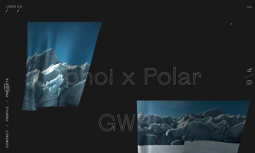
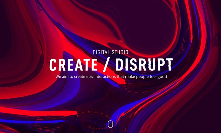
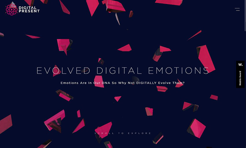
Interactive web animations are one of the many common ways designers create visually appealing web experiences that feel immersive. Web animations add a delightful extra layer to a design. However, it is key to ensure that they are not overused, as then they can lose their appeal and overstimulate your users. The best way to incorporate animation in a meaningful way is by analysing how to use them. Is the animation propelling the user forward in their journey in any way through a transition to another webpage? Is the loading time of the animation interrupting the flow of the overall experience—potentially causing increased bounce rates? These are elements to consider when incorporating animations into your website.
Subtle but powerful ways to include animations can be hover animations that grow or pulse, scroll animations that offer a dynamic transition to the next part of a website without too much motion, or even a moving graphical element that offers visual interest without getting in the way of any content. Fast-moving animations or animations that overtake the page can overstimulate your audience if overused; therefore, minimal movement is usually the better choice.
Consider Your Chatbot
Chatbots have been around for a while. They are used mainly to help with the automation of customer support, answering questions and more. Chatbots are integrated into e-commerce websites for product recommendations or streamlining questions for customer support, while service websites often use them for tasks such as scheduling appointments. Although they are handy when it comes to enabling businesses to handle larger quantities of user interactions, do you really need them on your website if it extends beyond e-commerce purposes?
Depending on your target audience and demographic, chatbots can be hit or miss. According to a study that surveyed different generations on their thoughts about chatbots, 20% of Gen Zers prefer to start customer service interactions with a chatbot, compared to only 4% of baby boomers. The latter are particularly unaccepting of chatbots that pop up on websites automatically: “53% of Boomer respondents indicated that uninitiated chatbots ‘annoyed’ them, compared to only 28% of millennials and 24% of Gen Z consumers.”
To create an overall enjoyable user experience for all, make sure that all of your users can easily and painlessly use your website to do the things they need to do. If your brand caters more to older generations, consider alternative communication and calls-to-actions that lead to fillable contact forms or email and phone number options. If your audience is a mixed bag, including chatbots can be helpful, as long as they don’t completely overtake the screen or are presented as a pop-up. Therefore, consider whether your website benefits from having a chatbot, or whether you can opt out with alternative options.
Optimize Your Assets
Grabbing your users’ attention is one of the main goals for robust web design; your visuals can impact that. Regarding the photography and other visual assets across your website, ensure that they are optimized for the web. Images that are too large can impact the loading time it takes for users to see them—furthering the chance of users experiencing cognitive strain and ultimately leaving your website. Forty percent of people will leave a website if it takes more than three seconds to load. To decrease the loading time of your photo assets, make sure they are no more than around 150 kilobytes, and that you resize original photos down closer to that resolution.
Images that have not been properly optimized also might not fit well within the design of your site. They might be too large or too small, or their resolution might not match the display capabilities of the device users are on. These inconsistencies can be distracting, making it harder for users to concentrate on the main content.
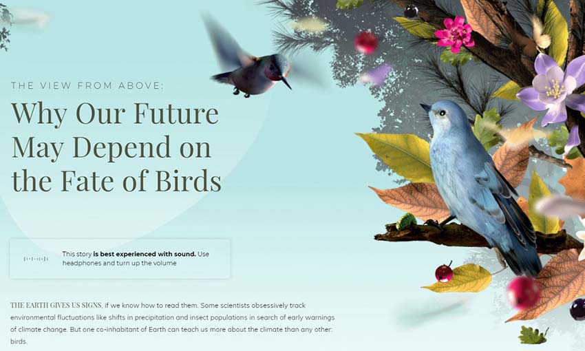
Optimizing your assets can also mean what kinds of images you’re using and how you’re using them. Using stock imagery, for example, can be a great way to incorporate elements that help tell the visual story of a website, but including photos of your actual company or brand can help elevate your user-centric approach and carry out your brand ethos further. Users are more likely to trust and feel the authenticity of your brand if you include photos that are company-related versus stock photography.
Using photos in the right context is also important. If a stock image isn’t directly related to the content it’s paired with, it can confuse users. They might exert unnecessary mental effort trying to connect the image with the content, causing cognitive strain.
As you navigate the ever-evolving landscape of digital design, it is imperative to make thoughtful and purposeful design decisions to avoid causing unnecessary cognitive acrobatics for your users. By fostering an environment of simplicity, user-centricity and contextual relevance, you can ensure that your website not only captivates and engages users but also that it facilitates a seamless and intuitive journey.
Feature Image Credit: getty
By
Creative Director of ArtVersion, a Chicago design consultancy. We craft ideal user experiences for the world’s most innovative companies. Read Goran Paun’s full executive profile here.
Follow me on Twitter or LinkedIn. Check out my website.