Tag

Conversion Rates

Browsing

By Kanishka Kumawat

Strategies for Achieving Higher Conversions and Better ROI

No matter how you plan your email marketing strategy, the goal is always the same– driving results.

The only way to know the effectiveness of your strategy is by measuring your conversion rates. They are paramount for achieving the results you want while nurturing a strong community.

Driving sales and revenue are the insights that impact the bottom line of your marketing strategy. They tell you if you are making an impact on your audience and inspiring action.

If you want to understand how to master conversion rates and optimize them to your needs, here are some of the best practices and real case studies that will help you stay on top of the game.

Table of Contents

Introduction to Email Marketing Conversion Rates

Email marketing conversion rates are the direct indicator of your influence on your audience.

They help you understand the percentage of your audience engaging with your content and ultimately being driven to take action — whether that is making a purchase, downloading a PDF, or using a discount code.

Once you optimize this element, you can gauge your campaigns effectively and achieve your desired results.

For example, you can track the number of clicks, impressions, and conversions generated by your campaigns. You can also track the cost per click (CPC), cost per impression (CPM), and return on investment (ROI) of your campaigns.

What Are Email Marketing Conversion Rates?

Say you’re running an email campaign to showcase your new digital product. The conversion rate will show you the percentage of people who not only clicked on that product link in your email but also went ahead and bought it.

A high conversion rate signals that your content resonates with your audience, your Call-to-Action (CTA) is driving results, and your campaign is casting spells of success left and right!

Importance of Tracking and Analysing Conversion Rates in Email Marketing

Understanding Email Marketing Conversion Rates

Tracking and analysing conversion rates in email marketing form the bedrock of success.

Here are five reasons why these are not mere numbers but indispensable metrics that hold the power to optimize your marketing strategy:

Performance Evaluation: At the heart of every email campaign is the desire to see results. By understanding which aspects of your emails contribute to higher conversion rates, you can optimize your content, design, calls-to-action, and targeting to improve your campaign’s performance.

Optimization Opportunities: When you analyse your conversion rates you can identify pain points and areas for optimization. Constant iteration is the key to growth and your conversation rates will point to the aspects where you are lagging.

Return on Investment (ROI): The effort and time you invest in your marketing campaigns should translate into a measurable ROI. This is the metric that tells you how effective your work has been.

Segment and Target: Personalization is the key to winning people. Analyse different segments of your email list to understand specific audience preferences. In doing this, your campaigns will resonate with your audience on a personal level and induce higher conversion rates.

Test and Iterate: By conducting A/B tests and experimenting with your subject lines, CTAs, or content, you can pinpoint what resonates best with your audience. Constant iteration and testing allows you to produce highly refined content and enhance campaign performance.

Understanding Average Email Marketing Conversion Rates

Average email marketing conversion rates provide insights into building successful email campaigns. By analysing these rates, businesses can optimize their strategies and achieve better results.

These are the benchmark metrics that reveal the average conversion rates across different niches. This empowers you to fine-tune your strategies, optimize your content, and achieve better results in engaging and persuading your audience.

Factors That Influence Average Conversion Rates

From Sender Reputation to your landing page, many factors dictate your conversion rate. Here are some of the five factors that you can work on starting today:

Call-to-Action (CTA): A clear and compelling CTA can work wonders. This is what inspires people to take action. Example – Sunlighter’s CTA for referrals.

Understanding Email Marketing Conversion Rates

Email Design and Layout: First impressions matter, and your email design can make or break it. Your email layout will enhance your subscribers’ experience and boost interaction. Example – Milk Road’s UI

Understanding Email Marketing Conversion Rates

Personalization and Segmentation: Generic emails are a thing of the past. Successful marketing is not about selling products– it’s about seeing and understanding people and embracing their needs.

That’s why personalized emails that address people by their names will garner a stronger community.

Timing and Frequency: The right timing can make all the difference. Avoid overwhelming your subscribers with excessive emails to yield better results. This is where you can set a schedule for yourself. Example – “5-Bullet Friday” by Tim Ferriss is a weekly email newsletter where he shares five handpicked recommendations related to tools, books, articles, gadgets, and more that he’s found valuable.

Why Trust me: I earned my audience’s trust by regularly sharing a video series called Half Baked on Instagram every Saturday, which received 27,683 views back in 2020. The audience became familiar with the content and eagerly awaited its release at 8 PM each Saturday.

Reputation and Trustworthiness: Trust is the currency of email marketing. Being transparent with your content and thoughts will make you more relatable to your audience and build a sense of trust. Example- Home screen’s home page.

Understanding Email Marketing Conversion Rates

Conversion Rate Optimization (CRO) Techniques

Conversion rate optimization (CRO) is the process of improving the conversion rates of your email campaigns. The goal is to make an impact on people and build trust. Building credibility takes a long time, but when done right, it has a high ROI.

Five effective CRO techniques to enhance your email marketing conversion rates:

Understanding Email Marketing Conversion Rates

A/B Testing: Experiment with elements like subject lines, CTA buttons, layout, and images to test what your audience loves the most about your emails. Test-iterate-repeat.

Clear and Compelling CTAs: Your CTA will guide the subscribers to take action. It has to be concise and persuasive which builds transparency.

Example – “I’d love to hear from you. What are you building right now and what are you struggling with? Reply to this email, I’d love to know!”

Mobile Optimization: Most people check their emails on their phones. Mobile-responsive emails will cater to their needs. With beehiiv, you can design your emails for PC and mobile with the same ease.

Landing Page Optimization: Create relevant and optimized landing pages that align with the email content and make it easy for the readers to say “yes”.

Use of Visuals: Incorporate relevant images and videos to make the email content more engaging and impactful. A balance of text and visuals is necessary.

Benchmarks and Industry Standards for Average Conversion Rates

Industries with direct sales and immediate purchase opportunities, such as e-commerce and retail, boast higher average conversion rates. Customers in these sectors often make a purchase, leading to quicker actions and higher conversions.

While industries focusing on lead generation may experience lower conversion rates. The desired action in these cases involves a more extensive decision-making process, resulting in a longer sales funnel.

Take a look at the average conversion rates we noticed at beehiiv in 2023:

Understanding Email Marketing Conversion Rates

Key Metrics for Evaluating Email Marketing Conversion Rates

Thankfully, tracking the performance of email marketing is fairly straightforward. The majority of email marketing services come equipped with built-in analytics tools that enable you to monitor and comprehend the effectiveness of your email campaigns.

By measuring key metrics like open rates, click-through rates, and conversion rates, you gain valuable insights into what is effective, and what is not, and, most crucially, how to refine your future emails for better results.

Click-Through Rates (CTR) And Its Relationship to Conversion Rates

Understanding Email Marketing Conversion Rates

Click-through rate (CTR) is calculated by dividing the number of unique clicks by the number of delivered emails and multiplying it by 100.

It is closely related to conversion rates because it signifies the initial interest and interaction of your subscribers with the email campaign. A higher CTR indicates that more readers found the email content compelling and took the next step by clicking on the CTA or link.

This active engagement is a crucial precursor to achieving conversions.

Open Rates and Their Impact on Conversion Rates

Open rates measure the percentage of subscribers who opened an email compared to the total number of delivered emails. Open rates are influenced by:

  • Subject lines
  • Sender name
  • Preview text

While open rates indicate that the email caught the recipient’s attention enough to open it, they do not directly correlate with conversions. Some subscribers might open an email out of curiosity or interest but not proceed with the desired action. When the open rate is combined with KPIs like CTR, you can gain a comprehensive understanding of email campaign performance.

The relationship between open rates and conversion rates lies in the recipient’s initial interest and engagement. A well-crafted subject line and compelling email content can entice recipients to open the email and explore further. Subsequently, the content’s relevancy and the effectiveness of the CTA play a crucial role in driving recipients toward taking the desired action and achieving conversions.

How To Determine Conversion Rates in Email Marketing

With email platforms like beehiiv, you don’t need to calculate your campaign conversion rates as you can easily get the analytics report which shows you the performance, sources, etc.

beehiiv’s analytics go beyond simple numbers. You can dig deeper into the sources of your conversions, understanding which emails or segments are driving the most significant results. This empowers you to optimize your content and targeting, tailoring your campaigns for maximum impact.

Calculation Formula for Conversion Rates

Conversion rate is the percentage of subscribers who either complete the desired action or become customers, depending on your conversion goal.

Understanding Email Marketing Conversion Rates

Conversion Rate (%) = x number of signups or purchases / x number of Delivered Emails X 100

To calculate the conversion rate, follow these steps:

Track and count the number of recipients who completed the desired action (e.g., signed up, made a purchase) as a result of the email campaign. This number will be the numerator in the formula.

Calculate the total number of delivered emails. This includes emails that were not bounced or marked as spam. This number will be the denominator in the formula.

For example, if an email campaign resulted in 200 signups and there were 10,000 delivered emails, the conversion rate would be:

Conversion Rate (%) = (200 / 10,000) * 100 = 2%

This means that the email campaign achieved a 2% conversion rate, with 2% of recipients completing the desired action of signing up.

Tracking Conversions and Attributing Them To Specific Email Campaigns

Tracking conversions is a crucial aspect of email marketing to measure the effectiveness of campaigns and understand audience behaviour. To track conversions and attribute them to specific email campaigns, you can use specialized tools and techniques:

Unique URLs or UTM Parameters: Create unique URLs or add UTM parameters to the links in your email campaigns. These parameters help identify the source of traffic and track conversions from specific emails.

Conversion Tracking Pixels: Use tracking pixels or codes placed on the conversion page (e.g., thank you page after signing up). When your potential subscribers reach this page after clicking the CTA, the pixel fires and the conversion is recorded.

ESP: Your ESP will help you with insights and analytics by giving you an in-depth look into the actions taken by people on your email. Using a good emailing platform can not only affect your conversion rates but also your deliverability– so that you don’t end up in your subscribers’ spam folders!

Tools and Software for Measuring Conversion Rates

As the times have changed, you don’t have to worry about manually tracking your open rates or checking your web views. There are so many tools out there that can help you measure your conversion rates without any hassle, but these two are the best:

Google Analytics: Not only is google analytics free, but is also the top tool that people use to get detailed insights on their campaign performances.

beehiiv: Your emailing and analytical partner. With beehiiv you can track your performance, automate your campaigns and get 3D analytics that help you level up your marketing strategy.

Understanding Email Marketing Conversion Rates

Strategies for Improving Conversion Rates in Email Marketing

There are many ways to improve your email marketing strategy and some of them can be as simple as making changes to the way you write your subject lines. These strategies work because they are grounded in understanding and catering to the needs of your audience.

Your subject lines and CTAs are the connections you build with your readers at first glance.

Crafting Compelling Subject Lines and Email Content

The first step in building your email list is getting people to subscribe to your newsletter. The next step in that ladder is them opening your emails. Your subject line is what they see first to help them determine whether the email is worth their time and interest.

They are the gateway to engagement. Approximately 47% of users open emails based on the subject line. Craft compelling subject lines that pique curiosity and drive recipients to open your email. This will increase your email open rates.

To Create Subject Lines That Truly Stand Out, Consider the Following Tips:

Be clear and concise: Keep your subject lines concise and to the point. Avoid being vague or misleading, as your subscribers might feel deceived and mark your emails as spam.

Understanding Email Marketing Conversion Rates

Personalization: The psychology behind mentioning someone’s name in an email is rooted in a cognitive bias known as the “name-personalization effect.” This effect is a result of the brain’s automatic attention to self-relevant information, which is part of our natural social cognition.

Create a sense of urgency: Incorporate words that create a sense of urgency or exclusivity to encourage immediate action. The best example of this is “limited-time deal” offers that brands push forward during their sales.

Pique curiosity: Spark curiosity by using intriguing questions or teasing snippets of valuable content. When you give people a sneak peek into your content, it channels them to open your email and get the details.

Understanding Email Marketing Conversion Rates

Emphasize benefits: Highlight the benefits or value of opening the email. Ask yourself– “What value are my readers going to get after reading my mail?” and tell them about the same.

Understanding Email Marketing Conversion Rates

A/B testing and Optimization

A/B testing is a technique that allows you to experiment with different variations of your emails and subject lines to determine which performs best.

By splitting your email list into two groups and sending different versions of your subject lines or email content to each, you can assess which version yields higher engagement and conversion rates.

Here’s how to conduct effective A/B testing:

Choose one variable: Focus on testing one element at a time to accurately measure its impact. For example, test different subject lines while keeping the email content the same.

Segment your list: Divide your email list into two equal segments randomly.

Test and analyse: Send version A to one segment and version B to the other. Monitor the results and analyse the performance of each variant.

Implement the best-performing version: Based on the results, choose the winning version and implement it in your future campaigns.

Utilizing Persuasive Copywriting Techniques

Compelling email content is the driving force behind conversions. Persuasive copywriting techniques help influence recipients’ decisions and prompt them to take the desired action.

Here are some persuasive copywriting tips for email content:

Know your audience: Understand your target audience’s pain points, desires, and motivations. Tailor your content to resonate with their needs.

Understanding Email Marketing Conversion Rates

Address benefits not features: Communicate how your product or service benefits your audience and solves their problems. The more niche it is, the better. Example – A newsletter for Product Managers– you don’t have to have 100k subscribers, even 10k people can build a strong community.

Use storytelling: Weave engaging stories that connect emotionally with readers and make your message memorable. It could be real-life incidents or pop-culture inspired.

Write action-oriented CTAs: Use strong and clear calls-to-action that encourage your subscribers to act immediately.

Use power words: Incorporate powerful words that evoke emotions and captivate attention. Keep editing your email copy until you feel satisfied. When you feel like you’re done, go through your copy as a reader to get a different perspective.

Real-World Examples of High-Converting Emails

From big businesses like Airbnb and Uber to creators, high converting emails are not that difficult to figure out, all that it takes is an understanding of consumer psychology.

Here’s a breakdown of one of the best emails by Michael Houck:

  • Talking about the Top 1% (who doesn’t want to be there?) and sharing his key learnings from people like Ben Horowitz and Matt Mochary.
  • Mentioning the new things he has been working on, which keeps his subscribers eager to know more.
  • Giving social proof. “Promote your startup to 14000+ founders”
  • Reading time – 5 mins. He’s not asking for a lot of commitment from me, it is an easy ask.
Understanding Email Marketing Conversion Rates

Here’s how Superhuman AI did the same!

  • Subscriber count doesn’t always determine success. In specific niches, like a private equity newsletter with 2,000 senior manager readers, the value of the audience matters more. Even with a smaller subscriber base, sponsors may pay generously for ads as a result of the highly targeted audience.
  • Mastering writing is akin to exercising—results don’t come overnight. Quantity leads to quality and consistent action is key. It wasn’t easy at the start, but it is all about putting in more reps. Success comes from learning through continuous practice and experimentation.
Understanding Email Marketing Conversion Rates

Tracking and Analysing Email Marketing Conversion Rates

Your first campaign might not give you the best results and that’s a part of the process. You need to write what people want to read. Having an audience-first approach is what always works.

The more you experiment, the better understanding you will get out of your audience’s expectations. When you realize what works, double down on that!

You can start by trying out different content types, themes, or storytelling approaches that consistently capture your audience’s attention. Continuously adapting and optimizing based on your learnings leads to a stronger alignment between your email content and your audience’s desires.

Regularly analyse these performance metrics and make data-driven improvements to your email campaigns:

Click-Through Rate (CTR): Track the percentage of recipients who clicked on the links or CTAs in the email.

Open Rate: Monitor the percentage of recipients who opened the email.

Bounce Rate: Keep an eye on the percentage of emails that were not successfully delivered due to invalid email addresses or other issues.

Unsubscribe Rate: Monitor the percentage of recipients who opted out of your email list.Test different subject lines, CTAs, content, and design elements to identify what resonates best with your audience.

Best Practices for Achieving Higher Conversion Rates in Email Marketing

Achieving higher conversion rates is not rocket science, rather it is just about three main things:

1. Building a Responsive Email List

A responsive list consists of engaged subscribers who are genuinely interested in your content, products, or services. Here are some tips to build and maintain a responsive email list:

a. Use double opt-in: Implement a double opt-in process to confirm subscribers’ interest and ensure they willingly subscribe to your emails.

b. Offer valuable incentives: Provide valuable incentives such as exclusive content, discounts, or free resources to encourage sign-ups.

e. Regularly clean and update your list: Remove inactive or unengaged subscribers to maintain list quality and improve deliverability rates.

2. Email Segmentation and Targeting Strategies

Segmenting your email list allows you to deliver targeted messages tailored to specific groups. This also gives you insights on what you need to focus more on and who your most engaged subscribers are.

This level of personalization not only increases the relevance of your emails but also enhances engagement and conversion rates. It allows you to speak directly to the interests and pain points of each segment, making your communications more meaningful and effective.

Here’s how to use email segmentation effectively:

a. Demographic segmentation: Divide your list based on demographic data such as age, gender, location, or job title.

b. Behavioural segmentation: Segment subscribers based on their interactions with your emails, website, or previous purchases.

c. Interest-based segmentation: Group subscribers with similar interests or preferences to deliver content that aligns with their needs.

d. Buyer journey segmentation: Tailor emails based on where subscribers are in the buyers’ journey to nurture leads effectively.

3. Deliverability and Email Reputation Management

Ensuring your emails reach the recipients’ inboxes and avoiding the spam folder is crucial for email marketing success. Follow these practices to maintain a positive email reputation:

a. Authenticate your emails: Use DomainKeys Identified Mail (DKIM) and Sender Policy Framework (SPF) to authenticate your emails and prove their legitimacy.

b. Monitor engagement metrics: Keep a close eye on open rates, click-through rates, and spam complaints to measure email engagement.

c. Avoid spam traps: Regularly clean your email list to remove inactive and invalid email addresses that may become spam traps.

d. Provide clear unsubscribe options: Make it easy for subscribers to opt-out if they wish, as this can reduce the likelihood of spam and also boost your deliverability.

e. Comply with anti-spam laws: Familiarize yourself with anti-spam regulations like the CAN-SPAM Act and GDPR to ensure compliance.

Lessons Learned From Successful Conversion Rate Optimization Strategies

The best way to build an audience through email marketing is by a blend of sharing what you know best and what people won’t find anywhere else.

This connection forms the foundation upon which you can build lasting relationships and foster trust. Sharing your specialized knowledge not only positions you as a credible source but also showcases your commitment to providing real value to your audience.

Here are three key takeaways from this blog that you can put into action starting today:

Understanding Email Marketing Conversion Rates

Personalization matters: Personalized emails that cater to individual interests and preferences drive higher engagement and conversions.

A/B testing is key: Continuously test different elements in your emails to discover what resonates best with your audience.

Relevancy increases conversions: Sending targeted and relevant content based on segmentation leads to improved conversion rates.

Your emailing platform can make or break the game, choosing beehiiv will not only help you dodge the spam folders of your subscribers but also give you support in case you feel stuck.

Start emailing today, and join the hive!

By Kanishka Kumawat

Sourced from beehiiv Blog

By

Protect your business from the looming recession with these business marketing strategies! Help ensure your business has long-term growth.

In 2022, the United States is fortunate enough not to be in a recession. However, the odds of a recession in 2023 are on the rise. Experts predict there’s currently a 30% chance of recession, and that number has doubled over three months.

As a large or small , it’s essential to have a plan if a recession hits. Luckily, there are several recession-proof business marketing strategies that you can use. These marketing ideas will help your business continue to find success, even during a recession. Continue reading, and find out how you can fuel your business growth:

Strategy 1: Focus on customer experience

Today’s market values authenticity and excellent customer service. Around 65% of Millennials are willing to pay more for customer experience.

The best businesses know that happy customers give great reviews and spread the word quickly. It’s much easier to market your business when customers have already mentioned your company as one of their favourites. In fact, word-of-mouth marketing is a critical factor in 74% of purchase decisions. It drives six trillion dollars of spending every year.

By focusing on customer experience, you’re saying that you want to be the best in the market. There are a few ways you can improve the customer experience:

Provide quality products: In the event of a recession, customers will be even more careful about what they spend money on. Make sure your products and services are of high quality and that customers will be happy with them. This puts you in the good graces of your target market, because you’re providing a quality product or service.

For example, if you’re selling shoes, you need to make sure that the shoes are made of high-quality materials that will last for a long time.

If you’re providing a service, you need to ensure that your services are always completed promptly.

Provide high-quality customer service: Customer service is dying in America. Everyone talks about making customers happy; however, many companies fail to deliver the expected level of customer service.

You’ll never be able to make everyone happy. However, you need to make sure you’re delivering excellent customer service. Make sure that when customers walk in the door, you do everything within your power to show them you’re honest, reliable, quick, efficient and friendly.

Sometimes the best customer service you can provide is just listening. Take the time to really listen to your customers and build a partnership with them.

Always look for ways to improve: As a business, you should constantly find ways to improve while still providing high-quality services. What can you do to make your products or services better? Can you reduce the price? Can you reduce the wait time? Can you provide a guarantee on your products or services? This is the time to go above and beyond to impress your target market. Let them know that you’re different from your competitors.

Strategy 2: Improve your conversion rates with automatic emails

All businesses can improve their conversion rates. The most important thing is to ensure that you’re sending out automatic emails to your customers.

By promoting your content through email marketing, you can ensure that you’re reaching each one of your customers and getting them excited about your products.

Strategy 3: Analyse your competitors

Analysing your competitors is one of the smartest strategies you can use. By analysing your competitors’ content and their backend search engine optimization (SEO), you can capitalize on what they fail to do.

Strategy 4: Use social media to engage with customers

Social media is a fantastic way to get your business in front of the eyes of larger audiences. By having a robust social presence and a solid social media strategy, you can drive interested consumers to your online store.

By ensuring that you’re interacting with customers on social media and establishing yourself as the authority in the niche, you can guarantee that you’re getting the best possible and reviews that your business can get.

It’s also important to build a strong social media presence through exclusive content. It’s not enough to simply post your content online. You need to ensure that it’s only available to your customers on your social media sites. This will encourage a strong relationship between your customers and your brand, which will drive up your conversion rates by encouraging customers to share your content with their friends and family.

Strategy 5: Use content marketing to attract customers

Content marketing is a strategy that allows you to attract potential customers by providing them with informative and valuable content. With content marketing, you can reach a larger audience of interested consumers and drive sales and traffic to your online store. Here are some tips:

Create a blog and keep it updated: Creating a blog and keeping it updated is an excellent content you can use to attract interested consumers. A blog is a fantastic way to share knowledge and information with your customers, and by blogging and keeping your blog updated, you can guarantee that you’re always being current and up-to-date with the market. Blogs are also a fantastic way to build backlinks to your site, which helps influence your search engine ranking.

Publish content that inspires customer interaction: Publishing content that inspires customer interaction is one of the most effective ways to improve your conversion rates. You can build a next-generation marketing strategy by creating content that encourages customers to share their own experiences with your products.

Strategy 6: Don’t forget to track your progress

With this final strategy, you can see if your marketing strategies are working. By using a backend analytics tool, you can confirm that you’re actually seeing growth. This will allow you to tell if the marketing strategies that you’re using are really working.

There are many out there. However, by using the right strategies, you can ensure that your marketing strategy is recession-proof.

Business Strategies, Entrepreneurial Advice & Inspiring Stories are all in one place. Explore the new Entrepreneur Bookstore

By

Sourced from Entrepreneur

Sourced from Influencive

Ecommerce conversion rate refers to the percentage of visitors to your ecommerce website/store or landing page who fulfil the action you want them to (e.g., purchasing a product, subscribing to your newsletter or a service, etc.) depending on the nature of your business.

Are you opening a new online store, but don’t know how to improve conversion rates? Perhaps you already own an ecommerce business, but are unable to turn leads into customers?

You’ve come to the right place.

Ecommerce conversion rate refers to the percentage of visitors to your ecommerce website/store or landing page who fulfil the action you want them to (e.g., purchasing a product, subscribing to your newsletter or a service, etc.) depending on the nature of your business.

The higher the conversion rate of your website – the more productive and impactful your marketing efforts are. In this guide, we’ll discuss the best approaches you can undertake to boost your conversion rates.

How to Calculate Conversion Rate

Calculating your conversion rate is essential for keeping track of your business growth. The mathematical formula is very simple – divide the total number of converted clients by the number of your website visitors, then multiply the result by 100 to get the percentage.

For example, if your store made 60 sales from 3,000 visitors in a month, you divide 60 by 3,000 then multiply the result by 100. Therefore your conversion rate is 2%.

So, how do you know if that is a good conversion rate?

Based on the latest data, the average conversion date for ecommerce should be between 1.5% and 2%, so you’re right where you want to be.

10 Tips to Increase Conversion Rates

There are lots of strategies to increase online conversion rates. We’ve compiled the best and most effective tactics you can implement to boost the sales from your website.

Let’s get started.

A/B Testing

A/B testing, also called split testing, is a technique used to assess the responsiveness of your website and monitor how different changes may attract more visitors and stimulate conversion rates.

This technique relies on creating two instances of your site to test the different versions simultaneously and compare which one has a better effect on visitors. Using A/B testing is an essential and fast way to learn more about the status of your conversion rates. It can be used to analyse website designs, headlines, landing pages, and content.

A/B testing also helps you easily differentiate between your business strategies that are actually working and those that need improvements. However, in order for this to work accurately, your website must already have stable amounts of traffic.

Still, if your sample size is too small, the results won’t accurately reflect the effects of the changes made when the number of your site visits rises.

Unique Selling Proposition (USP)

Unique selling proposition (USP) is what makes your business or product unique and standing out among your competitors. This needs to be displayed clearly on your homepage. It can be anything, from certain quality certifications to the way your products are created (handmade, 100% local craftsmanship, etc.).

You can display your USP in the tagline under your brand logo which will appear on every page of your website. You can also show it off on your homepage in full size, to let visitors know what they’re getting as soon as they access your online store.

Website Design and Product Visuals

It takes 50 milliseconds for a visitor to get a first impression from your website. Accordingly, you must make every millisecond count for a successful conversion. Designing your website based on studying your target audience will help you choose the right colour scheme, font styles, and create an aesthetic balance to capture their attention.

Shoppers prefer clear, organized, and easy-to-navigate pages. Having a cluttered website that’s full of flashy banners, pop-ups, and random content will put off your visitors. Instead, be subtle about guiding your shopper through your website to the desired call to action (CTA).

It’s also smart to place your navigation bar away from intersections so the visitor focuses on the CTAs rather than navigate away. In addition, an F-shape design of a website is more favored by users.

The F-shape pattern is based on occupying the top and left side of your page with important elements or content as people prefer to read horizontally starting from the upper part then move down a little further to read in another horizontal manner. Finally, they scan the rest of the page vertically from the left side. Therefore, make sure to arrange the essential elements and CTA along the F-shape lines.

How you display your products plays an important role in improving conversion rates. Displaying clear photos of products from different angles with zoomed-in details and detailed descriptions will help customers make a purchase decision faster.

Boost Your Website Speed

A slow website is often a traffic killer and doesn’t rank well. Did you know that 75% of shoppers tend to abandon slow websites just out of impatience?

There a few actions you can take to avoid this disaster and make your website load faster:

Use Google PageSpeed Insights (PSI) to keep track of your site performance on different devices. This tool gives you reports of any performance issues on pages and how you can improve their loading speeds.
Use a Content Delivery Network (CDN) to access a global network of servers and help your customers reach your website quickly from different locations.
Make sure to compress and optimize the size of imagesand other media files on your website. This can boost your page speeds significantly.
Optimize your code by removing unnecessary formatting, code comments, and characters such as commas and spaces.
Reduce page redirects to minimize the wait time for the completion of the HTML response cycle. This happens when visitors are redirected to another page.

Create Offers and Discounts

Shopping cart abandonment is a serious issue for online stores and people tend to empty their carts when they feel they can get a better bargain elsewhere.

Offering discounts may increase purchases and conversions, but you should award incentives strategically to avoid profit loss. It’s best to find a balance between promotions for new customers and existing ones. You can also provide referral and seasonal discounts to keep the ball rolling.

Offer coupons or vouchers to existing customers occasionally to maintain their loyalty through push notifications, SMS, or email for example. Another good use of discounts is promoting other sales platforms like a mobile app. Rewards like a free item or a voucher when a customer makes a purchase through your phone application.

Provide Multiple Shipping Options

Put yourself in your customer’s shoes. You finally find exactly what you’re looking for, but might end up facing one or more of these scenarios at the check out:

Shipping rates are too high
Item takes too long to be delivered
Limited shipping options
Not enough information about the delivery process
No option to track your order
No clear refund policy

What are you going to do in this case? Most probably, you won’t proceed with the purchasing process and look elsewhere.

Shipping is an integral element of an ecommerce store and an important conversion rate optimizer. That’s why it’s critical to ensure you provide a smooth and transparent delivery experience for your customers, especially one-time shoppers. This is one of the best ways to turn normal users into loyal fans.

Fast shipping is a high priority when it comes to driving more sales. Collaborate with a third-party logistics service (3PL) that has a proven successful shipping history and maintains a network of locations that aligns well with your business.

Give your customers various shipping options like home delivery and include extra services such as pick-up from your retail store (if available), or from the nearest 3PL station.

Free shipping is another excellent perk to increase conversion rates and will also give you an edge over your competitors. For instance, you can offer this service for customers who make purchases over a certain amount or for bundle deals.

Make sure to include a clear and detailed shipping policy on your website. Let your customers know when they should expect their goods to be delivered and provide them with a tool to track their orders.

Build Customer Trust

Your competitors may offer similar services or products, but customers will always go for the most trustworthy business. Clients need to be in the know and feel their opinions matter in order to trust your brand and continue doing business with you.

So, how can you achieve that?

Customer support is the bridge between customers and your brand. Providing excellent client assistance ensures your visitors will feel appreciated. As a result, they will return to your store and spread the good word about it, leading to more traffic and higher conversion rates.

Train your staff to handle queries and complaints with care and efficiency. Implement multiple support channels such as live chat, ticket system, phone, and email. Add FAQ and comprehensive knowledge base sections to your website for self-assistance.

Getting customer feedback through reviews and ratings on the products/services you sell, and surveys about the level of service they receive is crucial. This level of transparency makes it easier for other potential clients to learn more about your products and build a long-lasting bond with your brand.

Take Advantage of Social Platforms

Being available on social media is not only a marketing strategy to widen your target audience but also a way to win the trust of potential visitors.

Social media platforms, such as Facebook, Twitter, and Instagram allow people to get to know your business. For those who already used your service or bought your products – it’s a platform to express their honest opinion about their experience. In return, this gives other potential shoppers a sense of trust that your business is legit and has been used by plenty of customers.

Another advantage of being on social media is that you can create paid ads (i.e. Facebook’s marketplace or Instagram’s Instafeed) and use the platform’s popularity to have a wider outreach to your target audience and potential customers.

Create a Sense of Urgency

Creating a sense of urgency or scarcity is to indirectly give the impression to your visitors that if they don’t take a specific action (e.g., purchase an item), they’ll miss a great opportunity. This can be done using several different strategies. The most common one is displaying a notification under each product whenever a few items are remaining in stock (usually less than 10).

Another common marketing strategy is to have limited time offers. For instance, having a certain attractive discount that’s only available for a specific period of time (a day, the weekend, until the end of the week, until the end of the month, etc.). Shop owners often display a countdown until the offer ends to make it even more exciting.

Creating this sense of urgency plays a big part in visitors’ subconscious attempts to avoid missing a good chance.

Make Your Website Mobile-friendly

It doesn’t come as a surprise that mobile shopping, or m-commerce, is gaining popularity as more customers find it easier to purchase goods using their phones.

For that reason, having a mobile-friendly website can greatly increase your conversion rates. Adding a mobile app for your smartphone users is even better. The most important thing is for your site to be easy to navigate, load fast, and don’t contain bugs when viewed on any screen or device.

You can easily advertise your user-friendly mobile app on your website and include a link to the store where users can download it from. Having this means that visitors will be able to access your site or app no matter where they are, boosting your traffic numbers in return.

Final Thoughts

Getting your customers to convert is more paramount than just attracting them to your website. By implementing the discussed tips, you’ll be able to optimize your conversion rate and gain even more clients in a shorter time. You’ll also notice improvements in your marketing campaigns, brand popularity, and rise in traffic.

Sourced from Influencive

Sourced from 1WD 1stWebDesigner

In 2020, smartphone sales were 1.57 billion units worldwide, an increase from 1.52 billion units in 2019. Such impressive figures continue when we look at the world’s tablet shipments and deliveries. In the third quarter of 2020, Apple alone shipped 13.9 million units of tablets. These figures, as surprising as they are, make us think about the impact on mobile websites and website owners. The demand for smartphones and other mobile devices have been responsible for connecting 4.66 billion people with the internet. This number has gone up by 7.3 per cent since last year. Out of this, mobile internet traffic has been more than half of all the internet traffic all around the world. As a website owner whose website is not mobile-friendly, this is a matter of great concern and something to help shape our website in the correct direction.

It is now time that website owners understand that mobile users are top priority and should be taken seriously. If you are still backing on the desktop website with a bunch of media queries and letting luck shape your revenue, I will help you decode the importance of responsive design and how to make a high converting mobile web pages.

Responsiveness and Conversion Rates

A lot of the people take the responsiveness and conversion rates as a cause and solution pair in the website world. But converting a mobile web page is a much more complex process than just making your website responsive or mobile-friendly. Sure, responsiveness is an important aspect of conversion and is the first step in the website development but it alone cannot increase your CTR. In 2015, Google started giving more preference to responsive and mobile-friendly websites. Improving for a better experience for their users, Google does not want people to keep searching for that one perfect website which is rendered proportionately on the device. This move gave the website owners a wake-up call to focus on the user experience and mobile-friendliness as much as possible.

So how can we improve our conversion rates once we have the responsive website built? To be fair, responsiveness is more concerned towards scaling your website up and down. If my images are scaled in the proper ratio on a 5.5-inch device, I have got a responsive website. But the user is never concerned about responsiveness. Instead of praising the scalable elements, the user is more concerned about how fast those elements rendered on to the device? My user is more concerned about their own preferences and benefits.

Nearly 8 out of 10 users bounce back when the content is not properly visible on the mobile device. Such anomalies on the mobile website bring down conversion rates and affect the business. In the subsequent sections, we will focus on things that are responsive in nature (no doubt!) but is not enough that can make the user click that CTA of yours or purchase a product from your website. Soon we will realise that responsiveness has much more than what meets the eye. Let’s see how we can put ourselves up to the user’s expectations.

PS – We have used LambdaTest LT Browser to show website view in various device viewports. Know more here – https://www.lambdatest.com/lt-browser

Do you need all the content on the mobile?

The first thing to ask in developing a website for mobile is the content you are about to show on the device. A device’s screen is small, which means you have to show less but relevant content on the small space provided to you. The content should be able to communicate to the user without using too many words. A user is not going to read everything just to find if he gets anything pleasing for himself. That is your job to show him what he needs to see. The content analysis can be boiled down to three major categories: the headline, the font size and the content.

What’s a perfect headline?

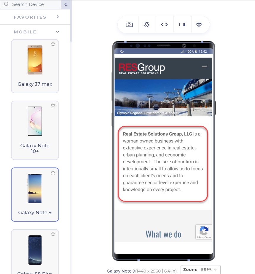
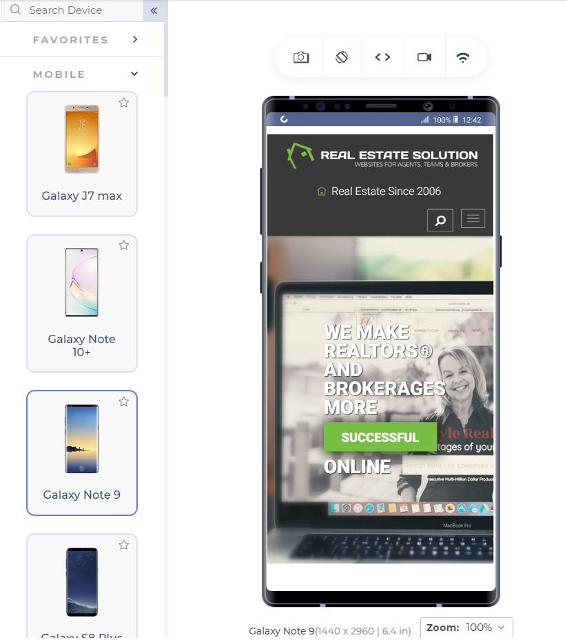
A web page starts with a headline which is probably the first thing a user sees. This is your chance, the moment that decides whether the user will increase the session duration or will bounce back. The following two website ranks on the first page of Google for “real estate solutions”:

Anatomy of High Converting Mobile Web Pages - 1

The above landing page is from RESGroup while the below screenshot is from Getrealestatesolution.

Anatomy of High Converting Mobile Web Pages - 2

Apart from a weird header which is taking 25% of your valuable screen space, the headline is concise and easy to read. The RESGroup have focussed on a long heading (if that what it is) and forces users to scroll the entire page to find something meaningful for them. A good point to note is that although building up trust on the user is important by embellishing the web page with your achievements, a user needs to find something which they can use. They rarely care about what you have to offer but more about how they can be benefitted. Remember, a user makes up his mind about the website in just 50 milliseconds.

Scrolling from up to bottom and reading about your achievements will result in an increased bounce rate. Getrealestatesolution is building up trust and showing their achievement both cleverly into a single line: “We make realtors and brokers more successful”. This more or less would translate to “We are capable enough to make you successful” and “You will be successful if you join us”.

Font-Size: Should my user zoom in?

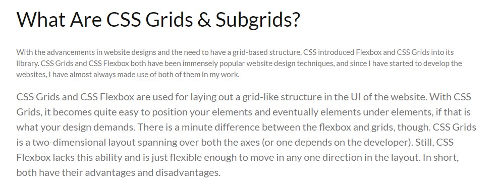
Font-size is an extremely important part of a landing page (or any other page) to determine the conversion rate of your website. A font-size of 16 px or 1 em is considered perfect for good readability of the content. Although one might argue that they can still read properly on 14 px, there are a large percentage of visually impaired people to be taken into account. The main target audience of the majority of businesses lies in the range of 15-49 years which is 28% visually impaired, as per WHO data. The following screenshot shows a blog on CSS Subgrids with 12 px font and the original font below it.

Anatomy of High Converting Mobile Web Pages - 3

Although text can be enlarged by zooming into the mobile device, it moves the content out of the screen and makes the screen scrollable which is not liked by the users.

The relevance of Keywords- Which words to choose?

The final thing to remember while presenting content to the user is to use specific keywords which are relevant to the user. Mobile screens are very small with 5.5 inches being the most popular among the users as per a 2019 study. With a little time and smaller space in our hands, we want to gain a user’s trust as soon as possible so that he sticks on the website and does not bounce back.

The specific keywords process first starts by eliminating all the redundancy and loose words. Words such as “very”, “extremely”, “best” etc are considered fillers in the content. “We are very professional and provide the best services” could be transformed to “We are professional in providing real-estate services”. The second sentence is more effective and uses 1 less word than the first.

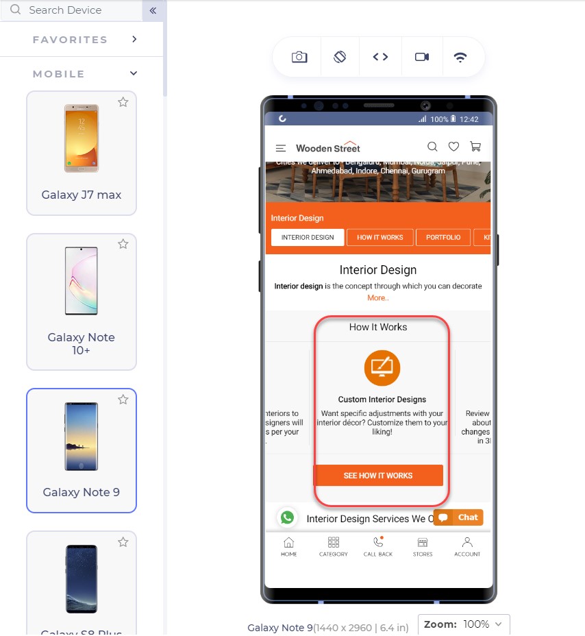
After elimination comes the relevant keywords to pitch to help you convert through the web page. These keywords will work as something your user can trust upon. At least, the user should be well convinced that you are the best and believe me, writing “best” does no charm in conversions. So, instead of being verbose and explicitly pitching your projects, choose minimal but effective words that show your confidence, experience and professionalism. In my analysis, I found two interior design services websites that portray this point quite clearly.

This is the landing page of Woodenstreet

Anatomy of High Converting Mobile Web Pages - 4

In addition to proving our point of small font-size, the only effective sentence in this segment is “Customize them to your liking!” which makes me feel the fact that I will have control over customizations but not a strong one. The words are loose to build trust over to the service company.

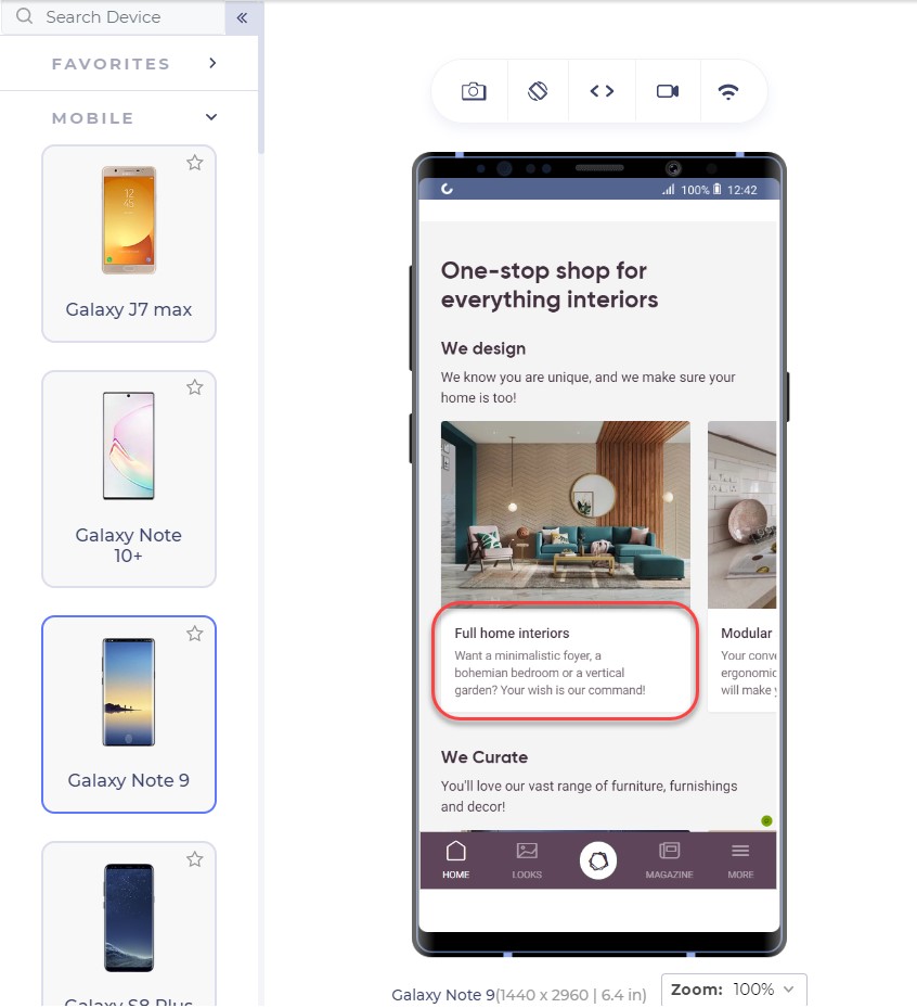
Another competitor of this website is Livespace. The same section on their website looks like this:

Anatomy of High Converting Mobile Web Pages - 5

The segment focuses on keywords and experience by the lines of sophisticated keywords that will lure the user. I too want someone who knows a bohemian bedroom!! (Just Kidding!)

Also, notice the transformation of the same sentence in these two websites. Where Woodenstreet says, “Customize them to your liking!”, Livespace says, “Your wish is our command!”.

Which one do you think has more weight to convert your page?

For the enhancements of the content, you do not need to remove the white spaces and fill every gap on the web page. White spaces are good! They let the elements breath in the congested space and every element can get proper attention from the user. For larger content, you can also use bullets that can deliver more information in lesser sentences.

To ensure yourselves of the appearance of your website on mobile devices, you can use tools which can help you emulate the experience. A developer-friendly browser such as LT browser is also a great choice since it provides a complete solution with loads of features (including a debugger) and performance reports to analyze. LT browser can show you your website on any mobile device of your choice in a couple of clicks.

Test Responsiveness on LT Browser

Emulators and simulators have been long used to test the website on different devices. But today, for a specific tester’s need, we can take advantage of a mobile-specific testing browser that provides a complete environment for the tester. A developer-oriented browser such as LT browser can provide additional features highlights of which are given below:

  • A large list of in-built tools: A list of 40+ in-built screens can render the website in a couple of clicks.
  • Comparison Grid: A comparison grid shows two mobile devices side by side for the testers to compare. The tester can also use scroll-sync to mirror his actions on both the devices simultaneously.
  • Screenshot capture and Session recording: The tester can take screenshots of the device screen and mark a bug and send the video/image to the team.
  • Third-Party Integrations: The third-party integrations allow the developer to share the bugs or issues with their teammates with a single click.
  • Network Throttling: A very important feature to check user experience is how the website performs under various network bandwidth. This can be achieved with network throttling in LT browser.
  • Local Testing: Local testing allows the developer to test their website even before publishing it on a domain service. With the local tunnel, they can view the website on any device from the local system.
  • Performance Report: To analyse the final performance, developers and testers can view the performance report and share it or save it for future use.

The thumb zone and its importance in conversion

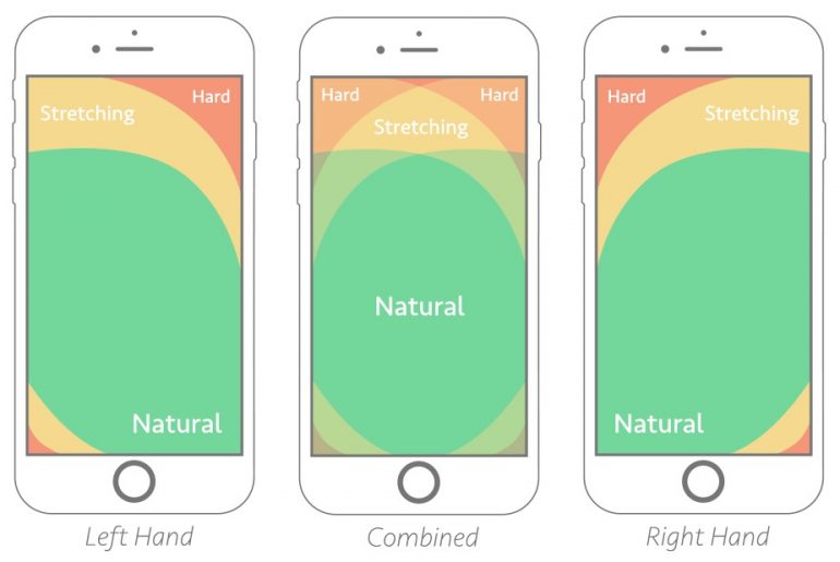
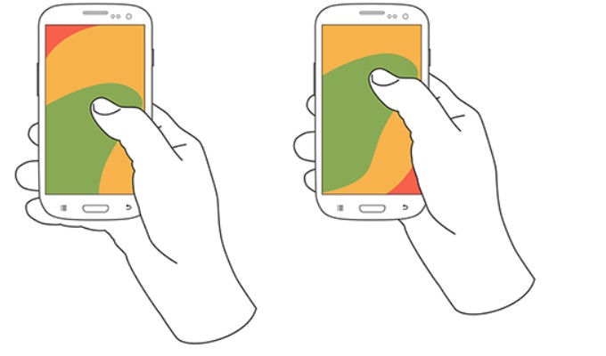
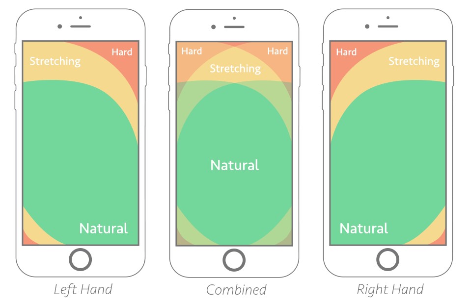
The thumb zone has been a conclusive argument for some time now and a strong foundation to many pieces of research in mobile designs and mobile web implementation. The thumb zone is the area on the mobile screen determining how hard or easy it is for our thumb to reach a certain point. A research study by Hoober concluded that 49% of people operate their mobile phones with one hand and only a 15% with two hands. Among those who do, 67% are operating through their right thumb with two major positions:

Anatomy of High Converting Mobile Web Pages - 6

Note: The second image is placed slightly above as compared to the first image.

The color that you see in the above image: is our thumb zone. A thumb zone in general for a person using their phone with one-hand can be magnified as follows:

Anatomy of High Converting Mobile Web Pages - 7

The green zone is the easiest to achieve: hence the most important for our conversion goals. The yellow zone is a bit hard to reach but manageable: something we can put less important things in such as headings and other content, things which are not clickable. Finally, the red zone is the toughest to reach and is the worst place to put our CTA.

Another worst position to put our CTA is at the bottom of the page or deep down below. No user would want to scroll down 4 5 times and search your CTA on the webpage. A lot of them probably don’t even know about CTA buttons and if it exists on that website or not.

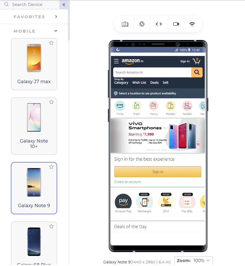
The best way is to put CTA in the thumb zone and on above-fold in the first web page view. Amazon has put similar thought into their CTA and the following is their landing page:

The Sign In button is exactly where our green zone lies with the width being enough that we do not touch anything accidentally.

From the above page, we observe two interesting things: first the Sign In is also available at the top right (the hardest) position too and our green zone has another CTA “Create Account”.

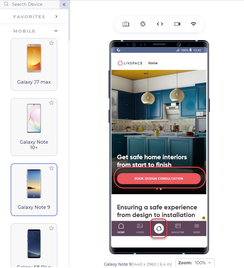
Having two sign-in options reminds the user about signing in two times. You would see the button anyway even if you do not click that. LiveSpace uses the same approach on its website in a little different way:

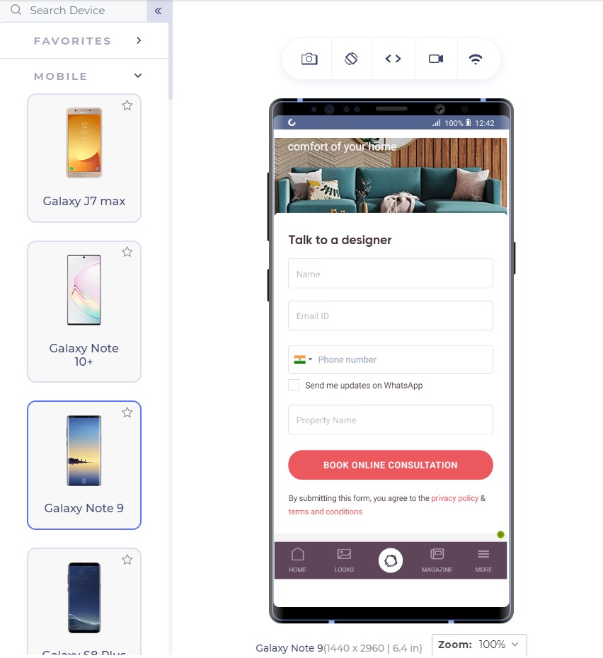
The bottom button is fixed and is a constant reminder to “book design consultation”. The second approach is interesting. There are two possibilities of an unknown user: either he signs in (given that he has already registered) or he creates a new account.

Deciding among the two is important for an owner to come to a final conclusion of primary CTA and secondary CTA. Having two CTAs is generally not considered a good approach as it confuses the user but even if you do, one of them should stand out in comparison to another, as in Amazon.

What CTA to use?

As a website owner, you might have a lot of services to provide: a consultation booking form, you want to showcase your cheap pricing too! And you want them to call you by a single click from the home page itself!! A CTA can increase your revenue with high conversions but a CTA cannot be the developer’s wish. It has to be what the audience wants. To increase your mobile conversions through CTAs, you need to analyse what your visitors are more interested in.

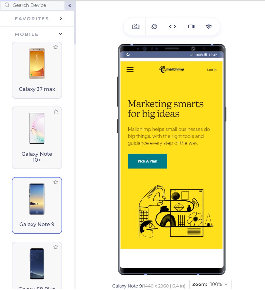
Google Analytics is a great way to start here. Google Analytics provides the keywords your visitor is most interested in. Mailchimp has a lot of good features which can be used as CTAs for example, “Start Campaign”. But their website on mobile uses the CTA linked to pricing:

CTAs are something to ponder upon and it is also a good idea to include a good input from the marketing and sales team which can suggest to you the user’s inclination quite well.

With keywords in hand, the next step is to think about the CTA text that can bring out more conversions through a responsive mobile web design. In the above screenshot, Mailchimp could have used, “See pricing” but they went with “Pick a plan” even though the page links to the pricing page.

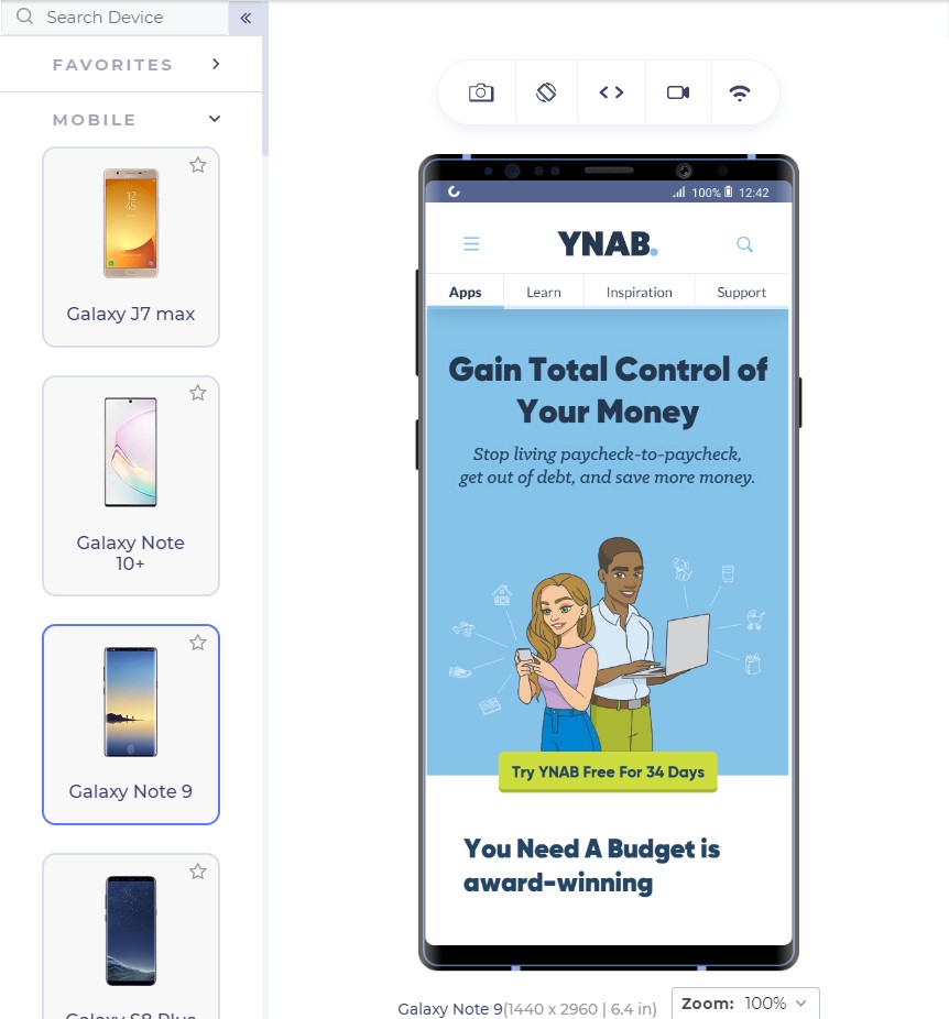
Similarly, Youneedabudget provides the user with “Try YNAB Free For 34 Days” instead of Sign Up or Try YNAB Free.

Research these words and find out why your user visits your website. Show them exactly what they are looking for through the CTAs and the conversion rates would see an increase.

The CTA should also look like a “CTA” and work like one. If the CTA gets blended into the background and looks like a ghost button, it loses its purpose. CTAs should be a contrast in colour speaking out loud and demanding attention from the user; that is what they are there for.

Mailchimp does that perfectly with a little darker shade of yellow in the background and CTA with blue; a complete contrast.

For business providers looking for direct leads, forms work as fine as a button since they cannot provide all the information in concise segments and users have a lot of other doubts. For example, interior designing. Interior designing has different requirements for different users and personal contact is necessary. A responsive form works as a great CTA here:

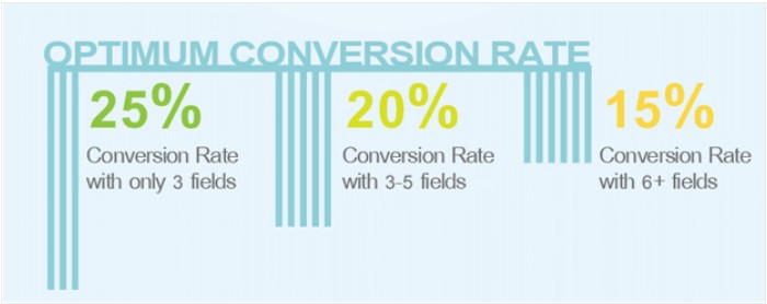
The number of fields is important to understand the conversion rates. A user is not interested in filling too many fields and will bounce back too easily. Quicksprout shows how the number of fields leads to a lower conversion rate on the mobile:

More than 5 fields in a form is intimidating for the user and the user is unlikely to complete the form. If you cannot manage to lower down the fields below 6 or 7, use the autocomplete feature of the browser in your HTML code so that the user can quickly fill out the form in one tap. Autocomplete is available in major browsers today and is helpful for the user.

If your CTA is a call button, it should be a one-click button instead of plain text. Do not expect your user to take the burden of copying the number and moving onto his dial pad, paste it and then call you.

Remember the 2-second rule!
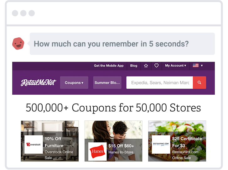
Google aims at 0.5 second load time when it comes to loading any Google’s product. But don’t worry, we still have not touched such a high-performance statistic practically although we have come a long way in the last decade. Google states that 2 second is the user’s “acceptability” for the website load time. So how is it affecting our conversion rates?

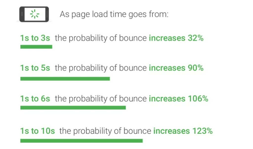
As it turns out, the bounce rate depends heavily on the website loading time:

Gone are the days of 2G connection when people could wait a hundred seconds for the website to load. With the increase in elements on the website leading to a lower load time, the conversion rate drops by a whopping 95%!!

What can we do to increase loading speed?

The question drops to the mind as to what we can do as web developers to decrease the web page load time when the network plays a vital role which we have no idea about. As a developer, we can follow a series of checks on our responsive mobile design to ensure higher conversion rate and simultaneously lower bounce rates:

Content Display Improvement

A good way to start is to code the web page to display something (if not all) to the user as early as possible. For example, AJAX queries are a great way to show a partial content to the user on the first view.

Server Improvement

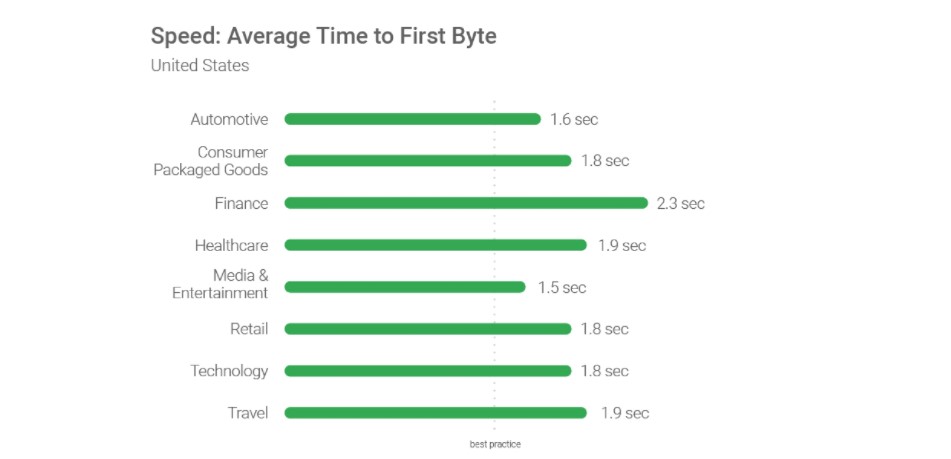
Use a good server!! Servers play an important role as they are responsible for not only communicating with requests but also sending the first byte to the user. Google recommends a time of 1.3 seconds for the mobile server to communicate with the first byte. The lower the better.

The figure shows recommended average response time of the mobile server in various categories:

Request Count Optimization

Lowering the number of requests to the server also decreases the overall page load time. The lesser number of requests would generally mean lesser elements to fetch. While Google recommends less than 50, today’s average lies somewhere between 120-170.

Weight of Elements

An extremely important factor in determining the loading speed of the website is the weight of elements present in the mobile web page. The study found out that websites use too many elements in order to lure the users which slows down the loading speed even on the 4G connection (which is the most popular). 70% of the pages took 5 seconds for any visual element to first appear on the web page. This has made the average loading time to 15 seconds as compared to the recommended 2 seconds.

The main culprit; images. Providing an extremely high-quality image will just decrease the conversion rates especially the ones which are nowhere related to the product such as background or achievement thumbnails. Applying very high-quality images without compression can load up the page to as high as 4MB which is more than the average.

The analysis is done in the study also found an image worth 16 MB of size on a web page which is a simple blunder, an invitation to decrease the conversion rates. What can we do? Compress these images and use proper image formats.

By simply compressing the images on the web page, the developers can save up to 250 KB of size on as high as 25% of the website analysed. Image format can help you in decreasing the load time too. Out of all the mobile-friendly websites, 46% use JPEG and 28% use PNG. The reason behind the success of JPEG is that it is a lossy compression losing bits in the process. JPEG is a great format to use when too much focus is not on the extreme detail of the image like nature images, landscapes or background color shades etc. PNG on the other hand is lossless and saves the bits in the process. PNG images are great when sharpness, details and observations are required in the image.

The following image is a JPEG image:

This image is of a natural scene and hence does not demand very small details for the user. Your user will not zoom into the Taj dome to check out the colour shade. This image makes about 127 KB in size.

The same image in PNG consumes 714 KB of the web page which is extremely unnecessary.

To determine your website’s performance, you can use a trusted tool PageSpeedInsights by Google.

To increase the speed of the landing page, developers can also make use of CDN or Cache that web service providers such as Amazon offer. These are very fast and help store data according to the geographic locations.

A/B Testing and you are done!

When Google launched ads on Gmail, they were not sure which blue colour to use. In their experiment, they decided to provide different shades of blue to different users and see their response. With 1% of users getting one shade and another 1% getting another, Google ended up testing among 40 shades of blue to 40 different groups. The final blue selected in this experiment earned them an additional $200 million in revenue.

This is termed as A/B testing. A/B testing is a process of comparing two different versions of a web page by giving them to different groups and recording their response. A/B testing has been used extensively today to finalize the colour, location or size of the CTA button. An experiment between green and red CTA buttons showed that the red CTA button performed 21% better on 2000 page visits. The 21% increase in the conversion rates points towards how important A/B testing is today.

This does not mean every red CTA button will outperform green ones. Performing A/B testing will provide conclusive results by which you can increase the conversions and they are different for different websites.

Not only CTAs, as a developer you can also test the headlines, buttons and other important content to decrease the bounce rate which eventually does result in increased conversions. You can use Heatmap tools for A/B testing.

Conclusion

If you ever believed that responsiveness is everything there is to increase the CTR, you are not alone. The researches and studies have brought out a lot more about the behavioural aspect of a user than we knew before. From colour to the font-size, conversion rates on a mobile device is like a house on wooden pillars. All of them together increases the CTR to its capabilities and give your revenue a boost up.

Apart from the points discussed in this post, as a developer, you can also perform certain enhancements on the website for better conversions. User experience always matters on a mobile website. Whether it is conversions, word of mouth or any other target, you will always be rewarded for a better user experience. Enhancements such as not losing the sessions when the back button is pressed, providing cart support on multiple devices or shutting up the navigation bar in a hamburger menu. These enhancements are always noticed by the user and the easier it is for him, the better are the chances of conversions. So the next time you are busy developing your website, make a checklist and boost up that conversion rate from mobile web pages.

Sourced from 1WD 1stWebDesigner

By Brandon Weaver.

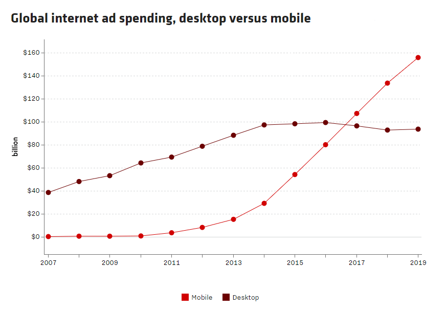
For the first time in history, mobile has grown to represent a larger portion of the digital advertising landscape compared to desktop. According to Zenith’s forecast, mobile spending will reach $156 billion by 2019, accounting for 62.5% of internet expenditure. With the exception of television, that’s more than all traditional media combined:

mobile landing page report ad spending

Unfortunately, many brands are stuck in the early stages of mobile maturity and aren’t prepared to stay afloat in the “mobile first” world surrounding them. In fact, only 32% of marketers have systematically integrated mobile into their marketing strategy, failing to realize that adhering to a desktop-centered approach is a dangerous disconnect that could eventually lead to self-sabotage.

To boost conversion rates, marketers must stay relevant. Most importantly, they must create a positive post-click experience with mobile landing pages, because this is ultimately where conversions take place.

That’s why we recently announced the first benchmark for mobile landing page performance — The State of Mobile Conversions Report — to give hope to all digital marketers that you can get higher conversion rates if you optimize your pages appropriately:

This comprehensive report provides digital marketers with valuable insights including:

  • Why mobile landing pages are integral to improving conversion rates
  • Factors that contribute to a high-performing mobile landing page
  • Mobile conversion rates across multiple qualifiers
  • The landing page software landscape and what to look for in a solution

In particular, it highlights mobile conversion rates across various industries and analyses why some business sectors tend to convert at a higher rate than others. Here’s a brief look…

Mobile conversion rates by industry

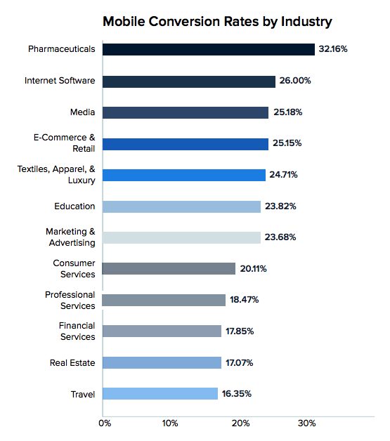
According to our research, the Pharmaceutical industry takes the lead in mobile conversions, with an average conversion rate over 32%. Internet Software, Media, and E-Commerce come in second, third, and fourth, respectively, with mobile conversion rates ranging from 25-26%. The Travel industry places last with a rate of 16.35%. Granted, that’s about half of the leading industry, but still much higher than the previous industry-reported 2.35% landing page conversion rate:

mobile landing page report industry conversion rates

What’s particularly interesting is that each industry places where it does because of one primary factor: Consumer-facing brands and verticals have prioritized creating mobile apps, rather than optimizing their mobile web experience. This is why industries like Travel have the lowest mobile landing page conversion rates. By investing heavily in their mobile apps, their mobile web presence has suffered.

Conversely, verticals that rely on interacting with users in all contexts and across all devices understand the importance of optimizing their mobile web experience, instead of mobile apps alone. This explains why industries such as Pharmaceuticals, Internet Software, Media, and E-Commerce have the highest mobile conversion rates.

Research suggests that consumers are likely to ignore or delete most of their apps almost immediately after downloading them. This means that an app-focused strategy limits the potential of businesses to get in front of their customers. In contrast, mobile websites appear in search results and can be shared on social media for increased visibility. Frankly, apps don’t generate nearly the amount of conversions as mobile web pages.

3 mobile landing page examples

In addition to standard landing page best practices, there are three key factors that impact mobile conversion rates: responsive design, personalization, and loading speed.

Now we’ll analyze three landing pages across a variety of industries to see how they implement those first two factors — responsive design and personalization — as well as several other landing page optimization techniques.

(Keep in mind for shorter landing pages, we’ve shown the entire page, but for longer pages, we only displayed above the fold. You may need to click through to the page to see some of the details we discuss. Also note that some pages may be undergoing A/B testing with an alternate version than is displayed below.)

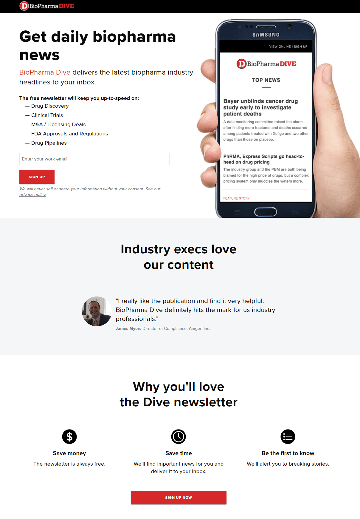
1. BioPharma Dive

First the desktop page followed by its mobile counterpart:

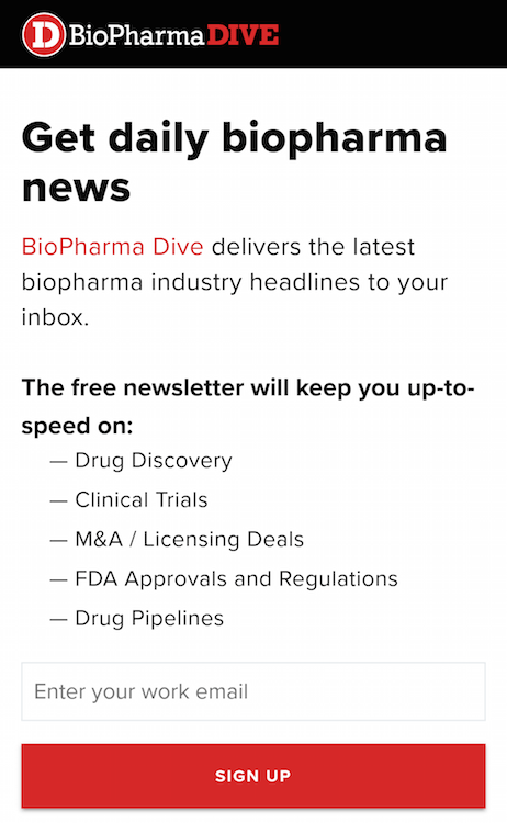
mobile landing page report pharmaceuticals

mobile landing page report pharmaceuticals phone

It’s likely that this Pharmaceuticals landing page converts well for several reasons.

First, it’s mobile-optimized, and the image of the smartphone clearly displays this.

The company logo at the top of the page immediately let’s visitors know where they are, and the fact that it’s not hyperlinked to the homepage reduces the landing page bounce rate.

The page headline and subheadline let visitors know exactly what the landing page offer is, and the bold and bulleted copy directly underneath is skimmable, and quickly tells them what type of information their free newsletter will include. The use of first-person copy here — and throughout the rest of the page — helps make visitors feel that the offer is personalized to them.

Only one form field encourages prospects to complete it, and the red CTA button entices them to click to sign up for the newsletter. The second CTA button at the bottom of the page is an anchor tag that automatically takes visitors back to the top of the page to complete the form. Note that highlighting the form field, adding white space, and changing the CTA button copy to something more specific would help draw attention and likely generate more conversions.

The customer testimonial — complete with full name, affiliation, employment position, and headshot serves as social proof, for an even stronger influence on prospects. The privacy policy under the CTA button lets prospects know that their personal information won’t be shared without consent.

Iconography with minimal copy in the “Why you’ll love the Dive newsletter” section adds to the page’s skimmability and readability — two factors that help reduce bounce rate and improve conversion rate. Removing the two exit links from the page footer would also contribute to a lower bounce rate.

2. Spotify

First the desktop view, then the mobile view:

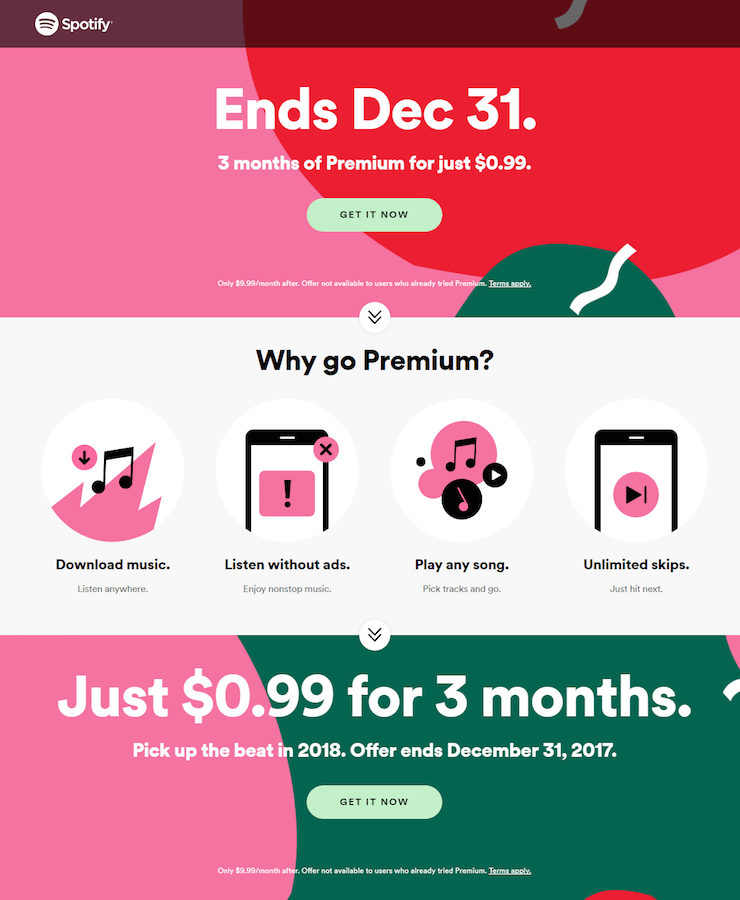
mobile landing page report Spotify

mobile landing page report Spotify phone

Although the copy isn’t very personalized (no first-person point of view), it does stress a sense of urgency. Letting prospects know that this great offer is time-sensitive and will expire on December 31, 2017 is likely to compel them to act quickly.

The downward-pointing arrows serve as both directional cues and anchor tags, letting visitors know that there’s more to see further down the page, and conveniently taking them there for an positive user experience.

Minimal copy helps make the page aesthetically pleasing and less intimidating, while iconography and various font formatting make it easy to skim, navigate, and digest. The click-through design helps minimize landing page friction as well.

Similar to the previous example, removing the exit links from the page — the company logo in the header and footer, the “Terms Apply” link, social media buttons, and the footer navigation — would likely improve conversion rates.

3. Northern Trust

mobile landing page report financial services

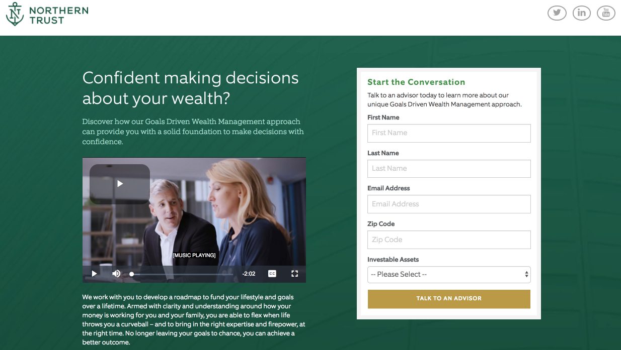
In contrast with the first two examples, this Financial Services landing page is not optimized for mobile. On a smartphone, all of the content is crammed into the middle of the page in one narrow column, which is unfortunate because the page does feature several optimized elements:

mobile landing page report Northern Trust

The question headline gets prospects thinking about how a financial services company could benefit them. First-person copy helps personalize the offer to the prospect. The video is professionally made, only two minutes long, and contains captions, making it an engaging, interactive way of delivering important information without filling the page with overwhelming copy that most visitors prefer not to (and probably won’t) read.

Encapsulating the form with a frame and color contrast helps draw attention to it. Additionally, five form fields is appropriate for this stage of the marketing funnel, and shouldn’t deter prospects from completing it. The CTA button color contrasts well with the rest of the page, and the CTA button copy is specific and action-oriented.

Even with those optimized elements, the fact that the page is not optimized for mobile is undoubtedly hurting the conversion rates.

Find out more with the complete landing page report

Mobile landing pages stand at the forefront of customer acquisition. Knowing this and the fact that mobile usage will only continue to grow, it’s essential that your content be mobile-responsive and deliver a positive user experience across all devices.

Download the report for more groundbreaking insights, strategies behind mobile conversions, mobile conversion rates across monthly digital advertising budgets and geographic locations, an overview of mobile conversion technology, and more.

By Brandon Weaver

Sourced from Instapage

Sourced from marketing charts.

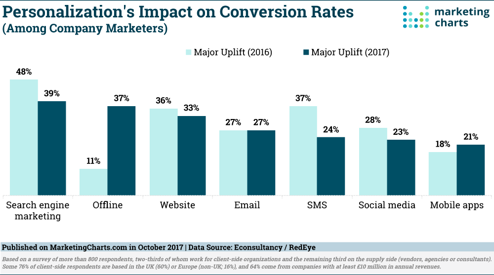
In-house marketers continue to see the most bang for their personalization buck in the area of search engine marketing, but those implementing personalization in offline channels are reporting more success this year. That’s according to the latest annual Conversion Rate Optimization Report [download page] from Econsultancy and RedEye.

Some 39% of company marketers report a major uplift in search engine marketing conversion rates as a result of implementing personalization. While that’s down from last year’s 46%, the proportion experience an uplift of some degree increased marginally to 93%.

The biggest improvement in personalization’s perceived impact this year, though, is for offline channels. While only 15% of company respondents report personalizing their offline channels, fully 37% of those report a major uplift in conversion rates as a result of doing so. That’s more than 3 times the share (11%) from last year’s report.

Anecdotally, respondents shared that they’re personalizing experiences by joining up online and offline in ways such as: syncing direct mail with relevant social and email activity; offering items to upsell in-store based on click-and-collect orders; and using in-store loyalty cards to provide insights to digital communications such as email and SMS.

Personalization Efforts Mainly Limited to Email, Websites

Overall, some 62% of company marketers surveyed report undertaking some form of personalization in their marketing activity, down from 66% last year.

Email (90%) is by far the most common area of personalization for these marketers, though a majority (53%) this year are also personalizing their websites. That aligns with separate research from Evergage, in which email and websites were the only channels in which a majority of marketers reported using personalization. Previous data had found that while email personalization is considered effective, website personalization is far more difficult to execute.

This year’s report from Econsultancy and RedEye does show an uptick in the use of personalization in a couple of areas. Indeed, more than one-quarter of company marketers now say they personalize social media and search engine marketing (each at 27%), up from 17% and 18%, respectively.

The report separately found that more marketers are conducting paid search testing to improve conversion rates – suggesting that search is becoming more of a priority in personalization and conversion rate optimization.

Marketers Paying More Attention to Personalizing Website Journeys

In terms of websites, landing pages (62%) and home pages (61%) are the most likely to be personalized by marketers, much as they were last year.

This year shows a big increase in the use of personalization for customer journeys: 40% are personalizing specific journeys (up from 31% last year); and 33% are personalizing the post-purchase journey (up from 20% last year).

The full report is available for download here [download page].

About the Data: The results are based on a survey of more than 800 respondents, two-thirds of whom work for client-side organizations and the remaining third on the supply side (vendors, agencies or consultants). Some 76% of client-side respondents are based in the UK (60%) or Europe (non-UK; 16%), and 64% come from companies with at least £10 million in annual revenues.

Sourced from marketing charts.

By Susan Gilbert

Today I have some conversion resources to help you improve your business sales and reach. Here’s four links with tips and tricks to kick start your Monday.

In order to generate more sales your business needs to optimize your website and fine tune your marketing programs. Using the right tools that have proven results will help you be more successful. Would you like to improve your bottom line online? Take advantage of these website tools, and let me know how they work for you!

1) Advanced user actions – Decibel Insight

Find out exactly what your visitors are looking for on websites and apps. Decibel Insight is a powerful analytics tool that helps you gather information on the customer experience at each level of the buyer’s journey. Find out where frustrations are occurring due to website errors and where they are navigating the most through heat maps. This intuitive digital behavior resource is a must-have for any business who wants to improve their customer service and sales.

2) Improve your website forms – Formisimo

Find out exactly how your forms are performing on your website. Formisimo provides detailed A/B testing that allows you to better understand your current conversion rates. An explanatory report is then provided so that you don’t have to analyze the data yourself. Learn more about user behavior and whether the buying process is advantageous for them.

3) Re-engage with your customers – Really Good Emails

Stop missing those all important customer emails coming into your inbox each day. Really Good Emails is unique tool that monitors your communication and campaigns and provides smart templates that will capture the reader’s attention. Select from a large selection of categories such as Abandon Cart, Product Feedback, Recent Purchase, and more. Include videos and images that speak directly to your customer’s needs.

4) Give your website a 5 second test – Five Second Test

Would you like to find out what visitors are experiencing as soon as they arrive? There is a great tool to help you quickly test out your landing page. Five Second Test provides one platform to enter your URL or upload designs for precise analyzing. This is a great way to get instant UI feedback without having to spend a lot of money on expensive software.

Hopefully you will find these conversion tools useful to your business sales.

Sourced from Susan Gilbert