Creative Director Daniel Irizarry of Athletics argues that the most resilient brand systems aren’t built on exhaustive rules – they’re anchored by a few essential elements, and designed to move.
Most brand systems don’t fail because they’re poorly designed. They fail because they’re overdesigned — too many rules, too much rigidity, too little room for the people using them to actually think. In a world where culture moves faster than any guidelines document can keep up with, the brands that hold together won’t be the ones with the most elaborate systems. They’ll be the ones who got a few essential things right and gave themselves the freedom to move.
That idea has sharpened for me over the past few years as AI has started reshaping how quickly creative work can move. If the flexible layer of brand identity — photography, video, illustration, 3D — is being asked to respond to culture faster than ever, then the question of what stays fixed isn’t just a design question anymore. It’s an existential one. The core elements of a brand have never mattered more, precisely because the pace of everything around them is accelerating.
Start with the why
Before we design anything, we need to understand what we’re building for and who we’re building for. That means market analysis, brand audits, and — critically — culture and audience. Not culture as a trend report, but culture as the living context in which a brand has to earn attention. And not audience as a demographic spreadsheet, but as real people with preferences, values, and ways of moving through the world. The goal is to connect business objectives with cultural relevance. When those align, you can tell stories that are emotionally resonant and strategically sharp — a genuine connection between what a brand stands for and what people care about.
We also need to understand how an organisation currently delivers its branding. What’s already in place? Where are the friction points? A beautiful identity that an internal team can’t execute is a failed identity. And every category has its visual codes — shorthands rooted in culture that help audiences place a brand’s purpose and position. Which do we reinforce to make a brand legible, and which do we subvert to make it distinctive? The craft is in reading the landscape clearly enough to know where to play within conventions and where to break them.
The anchor matters more than ever
From this foundation, we build the core identity — the symbols that become a brand’s essential markers. Logo, colour, typography, graphic language, sound, motion. These are the elements that do the heaviest lifting for recognition and consistency. In a moment of accelerating change, they need to be more polished, more singular, more resilient than ever. They’re the anchor. If the anchor doesn’t hold, nothing else matters.
This is the part where the industry’s instinct to systematise everything gets backwards. As the world speeds up, the natural impulse is to add more rules — more guardrails, more specifications, more pages to the toolkit. But the brands that will thrive aren’t the ones with the thickest guidelines. They’re the ones who planted a few stakes in the ground so firmly that everything else can move around them.
Volume control
I think about this as volume control. A brand, like a person, can’t always be at eleven. Depending on the situation, context, and audience, you need to modulate—and the ability to do so well is becoming the defining capability of a resilient brand system.
Working across multiple Google product brands has made this vivid for me. Google understands the difference between fixed and flexible at scale. The core ingredients are remarkably lean: name, logo, colour, shape, form, product experience, UI. That last part matters — for many brands today, especially in tech, the product itself is the primary brand surface, where the brand lives at its quietest and most constant volume. But what holds everything together isn’t just the ingredients — it’s personality. There’s a consistent tone and emotional register that make something feel Google, whether you’re looking at a Circle to Search campaign or a Chrome Browser onboarding screen. The individual products modulate depending on the audience and context, but the personality and a few key signals remain constant. That coherence comes from a team that deeply understands its brand and partners willing to push each other toward the best work.
That’s volume control in practice. Not a rigid system applied uniformly, but a clear core expressed at different intensities — meeting people where they are without losing the thread.
Pressure-test everything
Here’s the thing about core elements and volume control: you can’t know if they work until you’ve stretched them. As the media landscape evolves, brands have to show up on more surfaces, in more formats, in ways that didn’t exist two years ago. A logo that looks great on a website might fall apart in a spatial computing environment. A type system that sings in editorial might go flat in motion.
This is why R&D isn’t a nice-to-have — it’s essential. Experimentation with code, 3D, motion, AI — these aren’t finishing touches applied after the system is locked. They’re how you pressure-test whether the brand can live in the real world and discover the edges of what your identity can do, which is exactly where differentiation lives. The brands that feel truly unique aren’t the ones that stayed safe within their own guidelines. They’re the ones that pushed their core elements into unfamiliar territory and found out what held.
Systems that empower, not constrain
If you’ve been in this industry long enough, you’ve lived the other version. A client asks for comprehensive guidelines, the team delivers an exhaustive system, and somewhere along the way, you realise that even you — the person who helped build it — are second-guessing every move against a two-hundred-page document. The rules intended to create consistency end up creating paralysis.
The most important thing a system can do is answer two questions: what are the non-negotiable elements that must retain their integrity, and where is the creative freedom?
Our work with Okta has been the strongest proof of this. We’ve partnered with their brand team for over four years — genuine collaboration built on honest feedback and mutual trust. The system we developed together has real depth and range, and it thrives because Okta has an exceptional internal team with the skill and ambition to take it further. They’ve extended the work far beyond what we initially created, and our partnership continues to evolve as the brand grows. Define the core, establish the volume control, and then trust talented teams to bring their own ingenuity and creativity to the work.
Holding under pressure
The brands that endure won’t be the ones that try to control every pixel. They’ll be the ones who understand what to hold onto, what to let breathe, and what to push into new territory.
That’s what it means to design a brand that holds under pressure. Not rigidity — resilience. Not more rules — sharper instincts. The symbols give you recognition. The volume control gives you range. The collaboration gives you longevity. And the judgment to know when to turn it up and when to pull it back? That’s the part no system can automate.
Your portfolio looks incredible. Your work wins awards. Yet clients ghost you after initial interest, and competitors with weaker portfolios land bigger projects.
The disconnect isn’t your design skill. It’s your brand architecture.
Some design professionals treat branding as an aesthetic exercise—a logo here, a color palette there, maybe some Instagram templates. Meanwhile, strategic positioning sits neglected in a Google Doc nobody reads. This misalignment costs you clients, credibility, and eventually, confidence in your own expertise.
I’ve watched talented designers struggle for years before realizing their branding mistakes were systematic, not creative. The good news? Systems can be rebuilt. Let me show you the ten structural failures that undermine design brands and the frameworks that replace them.
Why Do So Many Design Brands Feel Identical Despite Different Aesthetics?
Because they confuse decoration with differentiation.
Two studios can have completely different visual styles yet occupy the exact same position in a client’s mind: “another freelance designer.” The brand foundation determines perception. Visuals simply express it.
Think about it. When a potential client visits your website, they’re not evaluating your Pantone choices. They’re asking: Do you understand my problem? Can I trust you to solve it? Why should I choose you instead of the dozens of others I’m considering?
Your brand foundation answers these questions before your portfolio ever loads.
What the Brand Foundation Framework Actually Includes
I call this the Strategic Core Architecture—five elements that must crystallize before you touch a single design file.
Mission Clarity: Not a fluffy statement about “creating beautiful experiences.” A concrete answer to what change you create in the world through design. For example: “We help sustainable fashion startups compete visually with fast fashion giants” is a mission. “We create meaningful brand experiences” is vapor.
Values Articulation: Specific principles that guide decisions and client relationships. Values like “transparency” mean nothing until you define them: “We share our complete process, including failures and pivots, in weekly client updates.”
Audience Precision: Demographics matter less than psychographics. Who exactly feels the pain you solve? A “small business owner” is too broad. “A second-generation family business owner trying to modernize without alienating their legacy customer base” is a person you can design for.
Offer Definition: What exactly are clients hiring you to deliver? “Brand identity” spans everything from a logo to a complete market repositioning. Specificity attracts. Ambiguity repels.
Positioning Statement: The single sentence that differentiates you. This isn’t a tagline. It’s strategic: “Unlike generalist agencies, we only work with healthcare technology companies navigating FDA compliance in their branding.”
Here’s what happens when you skip this foundation: You design a gorgeous visual identity that communicates nothing about who you serve or why you matter. Clients see pretty shapes. They don’t see relevance.
Branding Mistake #1: Building Visuals Before Strategy
Designers love creating. Strategy feels like homework. So they skip straight to mood boards and logo sketches, hoping the strategy will emerge from the aesthetics.
It never does.
The Consequence of Visual-First Branding
Without strategic grounding, your brand becomes a decoration engine. Beautiful, perhaps. But interchangeable. When a client can’t articulate why they chose you beyond “I liked your style,” you’re competing purely on taste—the most subjective, unreliable differentiator possible.
Additionally, visual-first branding leads to constant redesigns. Every trend shift makes you question your entire identity because you have no strategic anchor. Should you adopt that trendy gradient? Switch to that popular font? Without a strategy, you’re rudderless.
The Strategic-First Approach
Start with the Brand Foundation Framework I outlined above. Document every element. Be ruthlessly specific. Then, and only then, begin visual exploration.
Your visuals should express your strategy, not create it. When someone asks why you chose that particular colour palette, you should have a strategic answer rooted in audience psychology and positioning goals.
Furthermore, this approach makes design decisions easier. When you know exactly who you serve and what you stand for, typography choices become obvious. Colour psychology aligns with audience preferences. Every visual element supports the strategic foundation.
Branding Mistake #2: The “Everyone Is My Client” Delusion
Broad appeal sounds smart. Cast a wide net, catch more fish. Except branding doesn’t work like fishing.
Why Generalist Positioning Fails
When you position yourself as “a designer for everyone,” you trigger a psychological phenomenon I call Relevance Dilution. The human brain categorizes and simplifies. “Designer for everyone” translates to “designer for no one specific” in prospect psychology.
Moreover, generalist branding prevents word-of-mouth growth. Satisfied clients can’t refer you effectively because they don’t know who else you serve. “You should hire Alex, they’re a great designer” is weak. “You’re launching a fintech app? You need Alex—they exclusively brand financial technology startups” is powerful.
The Specialization Strategy Matrix
Choose your specialization axis deliberately. You have several options:
Industry Vertical: Serve only restaurants, or only SaaS companies, or only nonprofits. Deep industry knowledge becomes your competitive advantage.
Service Horizontal: Focus exclusively on one service—packaging design, environmental graphics, or digital product branding. Become the undisputed expert in that specific deliverable.
Audience Segment: Serve only women entrepreneurs, or only second-career professionals, or only Gen-Z founders. Understand their unique worldview intimately.
Problem Domain: Specialize in rebrands, launches, or legacy brand modernization. Each requires different expertise and attracts different clients.
Pick one. Dominate it. Then, if growth demands, expand strategically to adjacent specializations.
Branding Mistake #3: Inconsistent Visual Systems Across Touchpoints
Your website uses one colour palette, while your Instagram uses another. Meanwhile, your proposal templates look like they came from a different company entirely.
How Inconsistency Destroys Brand Equity
Every inconsistent touchpoint forces prospects to rebuild their mental model of your brand. This cognitive friction accumulates. Eventually, they just move on to a competitor whose brand feels coherent.
I’ve seen designers lose projects because their email signature used different fonts from their portfolio. It seems trivial. But these micro-inconsistencies signal sloppiness. If you can’t maintain consistency in your own brand, why would a client trust you with theirs?
Building the Brand System Architecture
Create what I call a Touchpoint Coherence System—a documented framework ensuring visual consistency everywhere your brand appears.
Colour Application Rules: Don’t just list hex codes. Define usage rules. Primary colours for headlines and CTAs. Secondary colours for accents. Neutral palette for body text and backgrounds. Specify ratios and combinations.
Typography Hierarchy: Assign specific roles. Heading font, subheading font, body font. Define sizes, weights, and spacing for each level. Document when to break these rules (rarely).
Logo Usage Guidelines: Clear space requirements. Minimum sizes. Approved backgrounds. Incorrect usage examples. Treat your logo like a legal trademark because it essentially is one.
Imagery Style: Define your photographic or illustrative approach. Lighting style, composition preferences, and subject matter themes. Create a visual reference board.
Layout Principles: Grid systems, alignment rules, white space standards. These invisible structures create visual consistency even when content varies.
Document everything in a living brand guide. Update it as your brand evolves. Reference it religiously.
Branding Mistake #4: Overengineered or Oversimplified Logo Design
Logos occupy a strange middle ground. Too complex, and they become unusable. Too simple, and they disappear into generic minimalism.
The Logo Complexity Paradox
I’ve watched designers spend months crafting intricate logos with symbolic meaning in every curve. Beautiful work. Completely impractical. When that logo shrinks to favicon size, it becomes an indistinct blob.
Conversely, the minimalism trend produced thousands of sans-serif wordmarks that achieve simplicity by sacrificing all personality. Your logo shouldn’t require a manifesto to explain it, but it also shouldn’t be indistinguishable from every other “modern” brand.
The Recognition-Scalability Framework
Effective logos balance three variables: distinctiveness, simplicity, and scalability. Optimize for all three simultaneously.
Distinctiveness means your logo doesn’t resemble competitors. Research your market thoroughly. If everyone uses geometric shapes, consider organic forms. If everyone goes minimal, explore expressive typography.
Simplicity means limiting elements ruthlessly. Can you achieve the same effect with two colours instead of five? One shape instead of three? Always simplify without losing character.
Scalability means testing rigorously. Print your logo at a half-inch width. Does it still read clearly? Convert it to solid black. Does the design hold up? Display it at billboard scale. Does it look intentional or accidentally enlarged?
Additionally, consider these practical constraints: Does it work in embroidery? On a pen? As an app icon? In a Zoom background? Real-world applications expose design weaknesses fast.
Branding Mistake #5: Cluttered Layouts That Bury Your Message
More elements seem more impressive. More colours, more fonts, more imagery, more information. Except the opposite is true.
The Cognitive Load Crisis
Every element you add increases cognitive load—the mental effort required to process your design. Humans have limited processing capacity. Overload it, and they disengage entirely.
I call this the Attention Budget Principle: Every viewer arrives with a fixed amount of attention. You can invest it wisely in communicating one strong message, or squander it across a dozen weak ones.
The Hierarchy-First Design Method
Start every layout by identifying your single primary message. Not your three main points. Your one essential takeaway. Everything else is secondary.
Visual Hierarchy means guiding the eye deliberately. Size, contrast, colour, and position all create hierarchy. Your primary message gets the strongest visual emphasis. Supporting elements recede proportionally.
White Space Strategy isn’t emptiness—it’s emphasis through absence. Space around an element makes it more prominent. Dense layouts make everything equally ignorable.
Element Reduction Protocol: Design your layout. Then remove 30% of the elements. Force yourself. You’ll discover most were redundant. The remaining 70% becomes significantly stronger.
Furthermore, establish a clear entry point for the viewer’s eye. Where should they look first? Then the second? Then the third? Intentional visual flow transforms chaos into clarity.
Branding Mistake #6: Typography That Undermines Professionalism
Font choices seem subjective. They’re not. Typography communicates at a subconscious level, triggering immediate associations about professionalism, trustworthiness, and quality.
How Typography Shapes Perception
Research shows people make judgments about your credibility within 50 milliseconds of viewing your content. Typography drives much of that instant assessment.
Default fonts signal carelessness. Overused fonts signal a lack of originality. Trendy fonts signal trendiness (which ages poorly). Incompatible font pairings signal poor attention to detail.
The Type System Framework
Limit your brand to a Type Trio: one font for headlines, one for body text, one optional accent font for special use.
Headline Font: Distinctive enough to create personality. Legible enough for quick scanning. Usually slightly heavier weight. This is your brand’s voice at its loudest.
Body Font: Maximum readability. Neutral enough to disappear into the reading experience. Generous x-height. Clear letterforms. This is where people spend most of their time.
Accent Font: Use sparingly for quotes, callouts, or special emphasis. This adds flavour without overwhelming. Many strong brands skip this entirely.
Additionally, master these technical fundamentals: appropriate line spacing (generally 1.4-1.6x font size), comfortable line length (50-75 characters), consistent hierarchy through size and weight, and adequate contrast ratios for accessibility.
Test your typography at actual usage sizes. A font that looks perfect in your design file might be illegible on mobile devices.
Branding Mistake #7: Cheap Visuals That Broadcast Amateur Status
Generic stock photos. Low-resolution images. Poorly composed photography. Outdated graphics. These visual choices communicate more about your brand than any mission statement.
The Image Quality Perception Effect
Humans are visual creatures. We process images 60,000 times faster than text. This means your imagery creates instant impressions before anyone reads a word.
Moreover, there’s a documented psychological phenomenon called the Aesthetic-Usability Effect: People perceive attractive designs as more usable, trustworthy, and professional, regardless of actual functionality.
The Visual Asset Strategy
You need a consistent approach to imagery across all brand touchpoints. This doesn’t mean every photo looks identical. It means they feel cohesively related.
Photography Style: Define your approach. High contrast or soft lighting? Composed or candid? Studio or environmental? Colour palette preferences? Depth of field standards?
Illustration Approach: If you use illustrations, maintain style consistency. Line weight, colour application, level of detail, and rendering technique should remain constant.
Custom Over Stock: Invest in original photography whenever possible. Stock images, even good ones, appear across thousands of brands. Custom imagery is exclusively yours.
Image Quality Standards: Establish minimum resolution requirements. Implement quality control before any image goes live. A single blurry photo undermines an otherwise polished brand.
Furthermore, consider image authenticity. Audiences increasingly detect and reject overly staged or artificial imagery. Authentic visuals build trust faster than perfection.
Branding Mistake #8: Inconsistent Voice Across Channels
Your website reads like a law firm, yet your Instagram captions sound like a teenager. To make matters worse, your email newsletters adopt a completely different personality. This fragmentation confuses your audience and dilutes your brand identity.
The Multi-Personality Brand Problem
Inconsistent voice triggers what I call Brand Dissonance—the uncomfortable feeling when different touchpoints send conflicting signals about who you are.
Clients start questioning which version represents the “real” you. This uncertainty prevents the trust-building necessary for high-value relationships. Additionally, an inconsistent voice makes your brand unmemorable because people can’t form a coherent mental model.
The Voice Architecture System
Document your brand voice with specific guidelines beyond generic descriptors like “professional” or “friendly.”
Voice Characteristics Matrix: Define where you fall on key spectrums. Formal vs. casual (and how formal/casual). Playful vs. serious. Authoritative vs. collaborative. Technical vs. accessible. Emotional vs. rational.
Vocabulary Guidelines: Maintain lists of preferred and forbidden words. Some brands say “clients,” others say “partners.” Some say “projects,” others say “collaborations.” These choices compound into personality.
Sentence Structure Patterns: Long, flowing sentences create different impressions than short, punchy ones. Document your preferences. Notice how your sentence structure is reading right now—direct and explanatory, establishing authority through clarity rather than complexity.
Perspective and Pronouns: Consistent use of “we,” “I,” or “you.” Each creates different relational dynamics. Choose deliberately based on your positioning.
Create a voice guide with specific examples. Show correct and incorrect usage. Make it actionable enough that anyone representing your brand can apply it consistently.
Branding Mistake #9: Trend-Chasing That Destroys Longevity
Gradients are hot, so you redesign around gradients. Brutalism trends, so you adopt harsh typography and raw layouts. Maximalism returns, so you add decorative elements everywhere.
The Trend Adoption Trap
Trends move in cycles. What’s fresh today looks dated in eighteen months. Constant redesigns to chase trends create multiple problems simultaneously.
First, recognition suffers. Brand recognition requires consistency over time. Frequent visual overhauls reset that recognition-building process to zero.
Second, resources drain. Every redesign costs time and money, better invested in delivering client value or developing real competitive advantages.
Third, positioning weakens. Trend-chasing signals that you follow rather than lead. Clients seeking innovative partners won’t choose the studio that desperately copies whatever’s currently popular.
The Timeless Foundation Method
Build your brand on Era-Resistant Principles—design approaches that transcend temporary aesthetics.
Classic Typography: Choose fonts with decades of proven performance. Helvetica, Garamond, Futura, Gill Sans. These have survived because they work, not because they’re trendy.
Fundamental Colour Theory: Instead of adopting the year’s colour trends, choose colours based on psychological impact and audience resonance. Blue for trust. Red for energy. These associations persist across trend cycles.
Structural Design Principles: Strong hierarchy, clear focus, intentional white space. These fundamentals never go out of style because they’re rooted in human perception, not fashion.
Trend Integration Guidelines: When you want to incorporate current aesthetics, do so as accent layers, not foundational elements. A trendy illustration style on your Instagram is fine. Rebuilding your entire visual identity around it is risky.
Strong brands evolve gradually. They refine rather than reinvent. They adapt without abandoning their core identity.
Branding Mistake #10: Neglecting Your Digital Brand Presence
Your website hasn’t been updated in two years, while your social media profiles still use outdated logos. Meanwhile, your Google Business listing shows closed, and your LinkedIn features work from 2019.
Digital Decay and Brand Credibility
Digital neglect communicates active messages, not passive absence. An outdated website doesn’t say “we’ve been busy.” It says “we don’t care about details” or worse, “we might be out of business.”
I’ve seen designers lose significant projects because prospects googled them and found inactive social accounts or broken portfolio links. The prospect didn’t reach out to ask. They simply moved to the next candidate.
The Digital Maintenance Protocol
Establish a Digital Touchpoint Audit System—a regular review of every digital property representing your brand.
Website Refresh Cadence: At a minimum, update your portfolio quarterly. Add new projects. Remove weaker old ones. Check all links. Verify load speeds. Test mobile responsiveness. Update your bio to reflect current positioning.
Social Media Consistency: If you maintain profiles, maintain them properly. Inconsistent posting is worse than no profile at all because it signals abandonment. Either commit to regular updates or redirect energy elsewhere.
Search Presence Management: Google your brand regularly. What appears? Outdated directory listings? Incorrect information? Dead links? Claim and update every listing you find.
Performance Optimization: Page speed impacts both user experience and search rankings. Compress images. Minimize code. Use modern hosting. A slow website broadcasts technical incompetence regardless of your actual skills.
Mobile-First Design: Over 60% of web traffic is mobile. If your site doesn’t work flawlessly on phones, you’re eliminating most potential clients from considering you.
Additionally, maintain consistency with offline brand materials. Your digital and physical presence should feel like the same brand, not distant cousins.
The Integration Framework: Making It All Work Together
Understanding individual branding mistakes helps. But real transformation requires systematic integration across all elements.
Building Your Brand Operating System
Think of your brand as an operating system, not a collection of isolated assets. Every component connects to and reinforces the others.
Your strategic foundation informs your positioning, which in turn determines your visual identity. Through consistent touchpoints, that visual identity gets expressed to your audience. Meanwhile, your voice reinforces your positioning across every interaction. Finally, your digital presence maintains accessibility to all of these elements.
Implementation Sequence: Start with strategy, move to core visuals, document systems, roll out consistently, then maintain actively. Skipping steps or reversing order creates the mistakes we’ve covered.
Quality Control Mechanisms: Establish approval processes before anything goes public. Every piece of content should pass through a brand alignment check: Does this support our positioning? Does it maintain our voice? Does it meet our visual standards?
Evolution Planning: Your brand should evolve, not revolve. Plan refinements annually, major updates every 3-5 years. Document the reasons for changes so evolution remains strategic, not reactive.
Frequently Asked Questions
How long does it take to fix branding mistakes and build a strong foundation?
Strategic foundation work typically requires 2-4 weeks of focused effort. Visual identity development adds another 4-8 weeks. Full implementation across all touchpoints might span 3-6 months. However, you’ll see benefits immediately as each element improves. Don’t wait for perfection before launching improvements.
Can I fix my branding mistakes gradually, or do I need a complete rebrand?
Gradual refinement works if your foundation is sound, but execution is inconsistent. Complete rebranding becomes necessary when your positioning is fundamentally wrong, or your visual identity actively contradicts your strategy. Assess honestly: are you fixing or rebuilding?
What’s the most critical branding mistake to address first?
Always start with a strategic foundation. Without clarity on positioning, audience, and differentiation, every other fix is cosmetic. You can have perfect visual consistency and still fail if you’re consistently expressing the wrong message to the wrong audience.
How do I know if my brand specialization is too narrow?
Test market size and growth potential. A viable specialization has enough prospects to sustain your business and room to grow. If you’re struggling to find clients, you might be too narrow. If prospects don’t see you as specialized, you’re too broad. Aim for “riches in niches” but avoid niches so small they can’t support you.
Should I hire a brand strategist, or can I do this myself?
You can absolutely develop your own brand strategy, especially if you’re a designer with strategic thinking skills. However, an external perspective helps overcome blind spots. Consider this: You wouldn’t self-diagnose a serious medical condition, even if you’re medically knowledgeable. Sometimes paying for expertise saves time and prevents expensive mistakes.
How often should I update my brand guidelines and visual assets?
Review your brand guidelines annually. Make minor refinements as needed. Plan major updates every 3-5 years or when your positioning significantly shifts. Your portfolio should be updated quarterly with new work. Social presence needs weekly attention at a minimum.
What if my current branding mistakes are already hurting my business?
Acknowledge the situation honestly with existing clients if relevant. Most will respect transparency and improvement. For prospects, focus on presenting your improved brand going forward. Don’t apologize for past work—simply demonstrate your elevated current standards. Strong brands evolve. Show evolution, not error.
How do I maintain brand consistency when working with team members or contractors?
Comprehensive brand guidelines are essential for team consistency. Create detailed documentation covering voice, visuals, and decision-making frameworks. Conduct onboarding training. Establish review processes. Make brand alignment a standard part of quality control, not an optional consideration.
By identifying and systematically correcting these ten branding mistakes, design professionals can transform their positioning from forgettable to strategic, building brands that attract ideal clients and stand the test of time. Don’t hesitate to browse WE AND THE COLOR’s Branding and Graphic Design categories to learn more.
The framework behind “Design After the Prompt” moves past the chaotic novelty of text-to-image generation toward a systematic era of creative orchestration. Modern studios now realize that typing words into a box represents only the beginning of a workflow. Design After the Prompt demands that we view artificial intelligence as a precise ingredient rather than a replacement. That’s why Adobe has positioned itself as the architect of this professional shift while competitors prioritize mere spectacle. This report examines why a systemic approach to creative tools determines the future of global brand integrity. Design After the Prompt provides the technical and ethical infrastructure required for the next decade of digital craft.
Does the shift toward Design After the Prompt render current prompting techniques obsolete?
Design After the Prompt forces a fundamental reassessment of how professional creators interact with generative artificial intelligence. Scott Belsky recently noted that the initial Prompt Era actually undermined the craft of experienced creative professionals. He argued that summoning images with simple words cheapens the judgment and taste honed over many decades. Therefore, the industry now enters the Controls Era, where creators demand specific levers and knobs for refinement. Design After the Prompt dictates that professional work requires granular adjustments rather than lucky rolls of the dice. Creators no longer want to manage unpredictable tools but instead wish to direct a personalized creative team. This transition ensures that the human eye remains the ultimate arbiter of every pixels’ final placement.
Evolution Phase
Primary Toolset
Creative Philosophy
Professional Role
Prompt Era
Text Boxes, Discord Commands
Summoning and Random Discovery
Prompt Engineer
Controls Era
Sliders, Nodes, Reference Images
Precision and Iterative Direction
Creative Director
Design After the Prompt
Orchestrated Agents, Graph Workflows
Systemic Logic and Brand Mastery
Creative Orchestrator
The transition toward Design After the Prompt moves the creative process from isolation into deep system integration. Adobe Firefly facilitates this by living inside the applications that designers already use for their daily work. Specifically, tools like Generative Fill in Photoshop allow for non-destructive edits directly on the active canvas. This capability allows designers to add or remove elements while maintaining the original artistic intent. Design After the Prompt focuses on the final mile of production rather than just the initial spark. The software starts to become almost invisible as conversational interfaces handle the tedious technical setup. This transformation empowers creators to spend more time exploring the full surface area of creative possibility.
The infrastructure of professional trust through Content Credentials
Design After the Prompt requires a robust system to verify the authenticity of digital content in a crowded market. Adobe addresses this need through the Content Authenticity Initiative and the development of the C2PA standard. Content Credentials act as a digital nutrition label that records the history and origin of an asset. Specifically, these credentials use cryptographic signing to bind metadata directly to the image or video file. Every manifest includes statements about the capture device, the software used, and any AI involvement. These manifests are tamper-evident, ensuring that any unauthorized changes invalidate the cryptographic signature. Design After the Prompt provides this necessary layer of transparency for brands that value audience trust.
Manifest Component
Technical Description
Impact on Design After the Prompt
Assertions
Labelled data representing specific facts about the asset
Provides granular proof of the human-AI collaboration
Claims
A structure connecting assertions to a specific signer
Ensures that every edit has a verifiable author
Hard Binding
Cryptographic hashes linking manifest to digital content
Prevents the detachment of provenance from pixels
Soft Binding
Watermarks and fingerprints for metadata recovery
Maintains trust even if metadata is stripped
Design After the Prompt relies on a well-defined trust model established through a hierarchy of X.509 certificates. These certificates allow applications to verify the identity of the claim generator and the integrity of the data. An organization can prove that its marketing assets are legitimate and free from malicious tampering. Adobe also introduced the Content Authenticity API to help enterprise customers sign assets at massive scale. This programmatic approach ensures that thousands of files receive tamper-resistant certificates automatically during the production process. Therefore, Design After the Prompt is as much about the content supply chain as it is about aesthetics. This commitment to provenance distinguishes Adobe from competitors who ignore the ethical implications of synthetic media.
Strategic differences between Adobe Firefly and Midjourney
Design After the Prompt highlights the divergent paths taken by the industry’s most prominent generative AI platforms. Midjourney focuses on artistic excellence and has become the aesthetic pioneer of the current AI generation. Its model produces images with exceptional mood, atmosphere, and stylistic coherence that often exceed user expectations. However, Midjourney’s reliance on Discord creates friction for professional teams who need private and organized workspaces. In contrast, Adobe Firefly prioritizes practical utility and seamless integration into the existing creative software suite. Firefly produces consistent, production-ready outputs that fit into a larger, professional brand strategy. Design After the Prompt favours this integrated approach because it solves real-world workflow challenges for designers.
The legal landscape significantly influences how professionals adopt the Design After the Prompt framework in their daily practice. Adobe trains Firefly exclusively on licensed content from its own library and public domain materials. Consequently, the company offers legal indemnification to enterprise users, making it the safest option for big brands. Midjourney faces numerous lawsuits because its crawlers inhaled copyrighted work from the internet without any licensing. While Midjourney is great for ideation, its outputs often lack the commercial safety required for major campaigns. Therefore, professional creators often use Midjourney for initial concepts and Firefly for the final production refinement. Design After the Prompt encourages this strategic multi-tool approach to leverage the unique strengths of each platform.
Ethics and the synthetic laundering controversy
Design After the Prompt does not exist without significant ethical friction and ongoing debates within the creative community. Adobe recently faced criticism when reports revealed that Firefly was partially trained on AI-generated images. These images came from Adobe Stock, which allows contributors to upload assets created with Midjourney. Critics dubbed this practice “synthetic laundering” because it indirectly uses data from models that scraped the web. Although Adobe claims these images represent a small subset, the ethical optics remain problematic for many. Design After the Prompt necessitates a closer look at how datasets are curated and verified for professional use.
Adobe manages these concerns by implementing strict governance processes and mandatory AI ethics courses for its employees. The company uses an ethics advisory board to oversee every new generative tool before its public release. Additionally, Adobe pays a bonus to Stock contributors whose work helps train the first versions of Firefly. This proactive approach contrasts with the “reckless” strategies of startups that offer no compensation to original creators. Design After the Prompt requires this level of accountability to ensure that innovation does not destroy the creator economy. Adobe also enables creators to request that AI models do not train on their personal uploaded content. Consequently, the firm attempts to balance the need for high-quality data with the rights of human artists.
How does Project Graph redefine the architecture of Design After the Prompt?
Design After the Prompt finds its most technical evolution in the upcoming release of Adobe Project Graph. This system introduces a node-based editor that moves beyond the limitations of simple text prompts. Designers can visually connect different AI models, Adobe tools, and custom effects to build complex workflows. This modular architecture allows for the creation of “capsules” that store specific creative logic for reuse. Consequently, a designer can package a proprietary process and share it across an entire creative organization. Design After the Prompt empowers professionals to build scalable systems that maintain perfect brand consistency across thousands of assets.
Graph Element
Functionality
Strategic Advantage
Node
Represents a single operation, model, or tool
Modular control over every creative step
Connection
Defines the data flow between different nodes
Enables complex, multi-stage transformations
Capsule
A self-contained, portable creative workflow
Reusability and easy sharing for teams
Interface
Visual editor for connecting diverse elements
Intuitive design for non-technical creators
The Project Graph system supports a multi-model future by allowing the integration of third-party models. Design After the Prompt embraces the idea that different tasks require different specialized artificial intelligence engines. For example, a creator might use Google Gemini for structure and Runway for motion within one graph. This flexibility prevents platform lock-in and gives designers the best tools for their specific creative goals. Furthermore, Project Graph makes complex tasks reusable, which saves hours of repetitive work for professional agencies. This shift toward systemic creativity ensures that the focus remains on high-level direction rather than manual panels. Design After the Prompt turns the creative process into a sophisticated engineering task that preserves the artist’s soul.
Project Moonlight and agentic creative assistance
Design After the Prompt gains further momentum through Project Moonlight, Adobe’s planned cross-app AI assistant. This assistant operates like a conductor of an orchestra, bringing multiple Adobe applications together in harmony. It carries context across different tasks and understands the creative intent behind every conversational request. For instance, a designer can tell Moonlight to organize a project or apply specific brand styles. The assistant then orchestrates the necessary steps across Photoshop, Premiere, and Illustrator automatically. Design After the Prompt relies on these agentic experiences to handle the tedious “final mile” of production.
The implementation of Project Moonlight allows for a hybrid workflow that combines natural conversation with precise hands-on editing. Users can engage with the assistant for ideation and then transition back to manual tools for refinement. This flexibility ensures that the designer always remains in control of the final creative outcome. Specifically, the assistant learns from user choices and adapts its recommendations to match an individual’s unique style. Design After the Prompt moves toward a world where the software anticipates needs before the user even articulates them. Consequently, creative teams can meet the soaring demand for content without sacrificing the quality of their work. This proactive partnership represents the ultimate realization of a truly human-centric AI strategy.
Why is Generative Engine Optimization crucial for the Design After the Prompt era?
Design After the Prompt also transforms how creators and agencies market their work to a digital audience. As traditional search engines evolve into answer engines, Generative Engine Optimization (GEO) becomes an essential practice. GEO involves structuring content so that AI systems like ChatGPT or Gemini cite it in their responses. In this new landscape, visibility depends on being the “source of truth” for a generated answer. Research indicates that GEO strategies can boost visibility by up to 40% in generative engine summaries. Therefore, designers must optimize their digital footprint to be easily interpreted and summarized by large language models.
To succeed in a GEO-led world, a brand must be understood as a structured entity rather than just a website. This requires using detailed schema markup, clear definitions, and evidence-based writing across all platforms. Specifically, including quantitative statistics and authoritative citations significantly increases the probability of an AI mention. Furthermore, the overlap between traditional top search results and AI-cited sources is now below 20%. This means that ranking first on Google no longer guarantees a place in the AI’s final answer. Design After the Prompt demands a strategy that prioritizes synthesis and authority over simple keyword density.
Strategic tactics for successful GEO implementation
Design After the Prompt forces agencies to document their decision-making logic as transparent and traceable digital content. Creators should publish “how we choose” articles and explainer videos to help machines learn their unique perspective. Additionally, implementing FAQ schema in JSON-LD format improves extraction accuracy for AI bots by 300%. Notably, AI engines track unlinked brand mentions across reputable sites, making digital PR more important than ever. Therefore, Design After the Prompt requires a consistent message and terminology across all social media and portfolios.
GEO Strategy
Primary Action
Expected Benefit
Entity Authority
Optimize about pages and author bios
Increases trust and likelihood of AI citation
Statistical Claims
Use specific numbers in headers and text
Boosts visibility by up to 40%
Extraction Ease
Use TL;DR blocks and short paragraphs
Helps AI engines summarize content faster
Consistency
Use the same phrasing for services everywhere
Strengthens the brand signal for LLMs
Digital PR
Earn mentions in authoritative industry blogs
Validates brand expertise to AI engines
Consistent language around primary services and target audiences helps AI systems connect a business to specific queries. Conversely, swapping terminology or mixing niches breaks the pattern recognition that generative engines rely on. Design After the Prompt demands that creators publish original research and whitepapers to establish topical authority. By earning citations from high-authority domains, a small design studio can compete with massive global brands. Consequently, GEO becomes the most important marketing frontier for anyone operating in the professional creative space. This focus on authority ensures that only the most reliable and expert voices are amplified by AI.
What are the leading trends in Design After the Prompt for 2026?
Design After the Prompt is shaping a visual landscape defined by high-impact aesthetics and human imperfections. Adobe’s 2026 Creative Trends report highlights a strong desire for content that engages all our senses. Tactile textures that mimic touch, sound, and motion are becoming a primary driver of digital engagement. People want to be immersed in hyper-realistic objects combined with playful distortions that feel truly physical. Furthermore, “All the Feels” signifies a move toward emotionally resonant imagery that sparks a deep human connection. This shift reflects a reaction against the cold, uniform perfection often associated with early AI-generated media.
Ironically, the heavy influence of technology is driving a massive backlash toward messy and chaotic design. The “Imperfect by Design” trend celebrates human flaws, hand-drawn scribbles, and sketchy underlines. Designers are becoming unbothered by perfection and instead embrace the raw and honest nature of their work. Consequently, Design After the Prompt encourages creators to use technology on their own terms to regain creative control. This trend prioritizes imagination and curiosity over creating for a predictable algorithm. Therefore, 2026 is the year where humanity becomes the most valuable asset in the creative process.
2026 Design Trend
Visual Elements
Emotional Goal
Tactile Maximalism
Squishy, puffy, and high-gloss 3D textures
To create a magnetizing sensory experience
Kinetic Typography
Liquifying, bouncing, and stretching text
To make reading feel high-energy and fun
Organic Imperfection
Earthy textures and hand-rendered fonts
To signal authenticity and human touch
Surreal Silliness
Visual jokes and exaggerated absurdist scales
To intrigue and entertain the audience
Cyber Gradients
Electric neon paired with deep blacks
To provide a futuristic, scifi aesthetic
Typography is also leaning toward excess and the absurd as a reaction against uniform computer fonts. We see oversized sans-serifs, bubbly letterforms, and wavy distorted fonts appearing in global branding. Additionally, “Bento Grids 2.0” bring organized chaos to layouts, providing scannable yet satisfying modular structures. Notable examples include Myntra FWD, which uses these grids to show mood boards instead of boring product lists. Design After the Prompt creates a new creative playground where tech empowerment and the inner child collaborate. This approach ensures that digital products feel helpful, human, and responsible in an overstimulated world.
The evolution of multimodal and sentient interfaces
Design After the Prompt moves beyond the screen to incorporate voice, gesture, and biometry into user interfaces. By 2026, UX design will focus on multimodal experiences that allow users to interact in whatever way feels natural. A user might start a request via voice and then switch to typing without losing the conversation’s context. Furthermore, interfaces are becoming “sentient” by adjusting their tone and empathy based on the user’s emotional state. This accessibility ensures that digital products are useful for everyone, including those with physical or mental limitations. Design After the Prompt requires a “lighter by default” mindset that prioritizes functional minimalism.
Specifically, “Explainable AI” is becoming a non-negotiable standard for professional digital products in 2026. Users won’t trust systems they cannot understand, making transparency a primary design challenge. Designers must create interfaces that show their reasoning before they act and allow for human intervention. Additionally, agentic UX means that master agents will coordinate specialized tasks automatically based on the user’s current context. This transition forces designers to oversee human-agent ecosystems rather than just designing fixed screens. Therefore, Design After the Prompt is a move toward intelligent, flexible, and responsible digital experiences.
Performance marketing at scale: The GenStudio revolution
Design After the Prompt enables marketing teams to deliver personalized content with incredible speed and accuracy. Adobe GenStudio for Performance Marketing allows brands to go from campaign intent to final assets in minutes. This application uses a conversational UI agent to understand campaign objectives, brand guidelines, and target personas. Marketers can then generate thousands of variations for A/B/n testing to see what resonates with their audience. Specifically, the platform tracks creative-level attributes like photography style and emotional tone. Consequently, teams can double down on high-performing content and refresh fatiguing ads instantly.
GenStudio Feature
Marketing Capability
Business Benefit
Content Production Agent
Conversations to content in minutes
Dramatically accelerates speed to market
Video Ad Assembly
Reframing and stitching hero videos
Reduces costs by avoiding manual reedits
Omnichannel Insights
Centralized data from TikTok, Meta, LinkedIn
Rationalizes return on ad spend (ROAS)
Multi-language Support
On-brand localized content in 12+ languages
Ensures consistency across global markets
Content Checks
Automatic brand and accessibility validation
Protects brand integrity at massive scale
Design After the Prompt ensures that content is never created for “content’s sake” but is driven by data. GenStudio integrates with Adobe Real-Time CDP to personalize experiences based on journey stage and persona preferences. This ensures that every asset is optimized for engagement and conversion in real-time. Notably, the system allows marketers to stitch branded intro and outro cards to videos automatically. This helps maintain compliance and brand safety across diverse social platforms like LinkedIn and TikTok. Therefore, Design After the Prompt allows creative and marketing teams to unify their workflows into a single campaign view. This closed-loop system transforms performance insights into actionable creative and maximizes impact across every channel.
Firefly Services: The programmatic future of professional design
Design After the Prompt finds its ultimate scalability through the Firefly Services API ecosystem. Organizations can embed over 30 generative and creative APIs into their existing marketing and production pipelines. These APIs cover a wide range of tasks, including text-to-image generation, video reframing, and lip-syncing. Specifically, the Object Composite API allows for placing product shots into realistic backgrounds with automatic lighting adjustments. Furthermore, the Custom Models API enables businesses to train private AI models on their own proprietary data. This ensures that every generated asset remains 100% on-brand and unique to the organization.
Notably, Firefly Services supports asynchronous processing for high-volume content demands and complex integration requirements. The system uses AES 256-bit encryption for all data at rest and provides pre-signed URLs for secure asset access. Consequently, developers can integrate professional-grade AI without having to manage complex on-premise infrastructure. Design After the Prompt is therefore a move toward a programmatic approach to creativity where every asset is an API call away. Adobe also provides managed services to help teams refine their use cases and optimize their models post-launch. This comprehensive support ensures that AI becomes a sustainable and highly profitable ingredient in the modern enterprise workflow.
Predictions for the post-prompt landscape of 2026
Design After the Prompt will reach full maturity when the distinction between AI and human creation becomes less relevant than the story. Scott Belsky predicts that consumers will crave scarcity, story, and process more than ever as AI content becomes ubiquitous. The story behind a marketing campaign or a film will determine its effectiveness in moving an audience. Specifically, effective creativity is what moves us, and models alone cannot achieve that emotional resonance. Consequently, professional opportunities for creators will grow as they focus on high-level questions rather than manual production.
As we approach the end of 2026, several technical milestones will redefine our expectations of visual quality. Adobe Firefly Image Model 5 will offer native 4MP resolution, capturing photorealistic details like lighting and skin texture. Furthermore, video generation will move from simple clips to timeline-based “creative assembly spaces” for generative storytelling. Users will direct scenes surgically by removing people or changing backgrounds with precise natural language prompts. Therefore, the role of the designer shifts toward a director who orchestrates a team of specialized AI agents.
2026 Milestone
Technological Driver
Practical Impact on Design After the Prompt
Native 4MP Generation
Firefly Image Model 5
High-definition print assets without upscaling
Node-Based Creativity
Project Graph
Reusable and scalable brand design systems
Agentic Assistance
Project Moonlight
Automatic orchestration of cross-app tasks
Universal Provenance
C2PA Compliance
Global verification of content integrity
Tactile Sentient UI
Multimodal UX Trends
Higher audience engagement via sensory depth
Notably, the rise of “vibe coding” will allow creators to design for emotional impact first. Visual elements like spreadsheets or bits of code will become a creative playground for new expressions. Design After the Prompt also predicts a surge in hyper-local vernacular design that roots global brands in regional cultures. We will see custom-designed typography in diverse languages that looks “hype” while staying culturally authentic. Therefore, the future of design is a flexible landscape where technology serves the unique and glorious humanity of the creator. This shift ensures that creativity remains a force that connects us deeply rather than a process that separates us.
Final conclusions on the Adobe AI strategy
Design After the Prompt is the only sustainable path for a creative industry that demands both speed and responsibility. Adobe’s strategy matters more than Midjourney because it builds the necessary systems for commercial safety and professional trust. By prioritizing provenance through the C2PA standard, Adobe ensures that authenticity remains a core value of the digital ecosystem. Specifically, the move toward the Controls Era provides designers with the precision they need to maintain their unique style. Furthermore, the integration of agentic AI through Project Moonlight and Project Graph will unlock a whole new category of creative exploration.
The controversy surrounding training data will likely continue as the industry defines the boundaries of ethical AI. However, Adobe’s transparent approach and legal indemnification provide a clear blueprint for responsible innovation. Design After the Prompt forces us to recognize that how we build is just as important as what we build. As creative scarcity disappears, the value of human taste, judgment, and emotional storytelling will only increase. Therefore, the goal of artificial intelligence is not to replace the creator but to expand the surface area of what is possible. Adobe Firefly and its surrounding ecosystem are the tools that will bring these possibilities to life in a way that respects the past while defining the future.
Frequently Asked Questions
What exactly is Design After the Prompt?
Design After the Prompt is a professional framework that moves beyond basic text-to-image generation toward a “Controls Era.” It emphasizes systematic integration, granular creative levers, and human-led orchestration within professional software suites rather than isolated prompt boxes.
How does Adobe Firefly ensure commercial safety for brands?
Adobe trains Firefly exclusively on licensed Adobe Stock and public domain content. Consequently, the company offers full legal indemnification to enterprise users, protecting them from potential copyright claims associated with AI-generated outputs.
What are Content Credentials and why do they matter?
Content Credentials are cryptographically bound metadata labels that record an asset’s history. They are vital in the Design After the Prompt era because they allow audiences to verify the origin and editing process of digital content, establishing essential trust.
What is the difference between Project Graph and standard AI tools?
Project Graph is a node-based editor that allows designers to connect multiple AI models and Adobe tools visually. This architecture enables the creation of reusable creative “capsules,” turning complex tasks into scalable and shareable brand systems.
What is Generative Engine Optimization (GEO)?
GEO is the practice of optimizing content to be cited and summarized by AI answer engines like ChatGPT or Gemini. It involves using structured schema, authoritative citations, and clear logic to ensure a brand remains visible in a post-search digital landscape.
Will AI replace professional designers in 2026?
No, AI will likely enhance the professional designer’s role. Design After the Prompt predicts that creators will move into high-level direction and orchestration, spending less time on tedious production and more time on strategic storytelling and creative exploration.
What is “synthetic laundering” and is it a real risk?
Synthetic laundering refers to training an AI on a library that already contains AI-generated images. While it creates some ethical optics issues, Adobe mitigates risk through rigorous moderation and a commitment to using only licensed or public domain data.
What visual trends should designers watch for in 2026?
Designers should focus on “Tactile Maximalism,” “Imperfect by Design,” and “Kinetic Typography.” These trends prioritize sensory engagement, human imperfections, and high-energy motion as a reaction against uniform, early-stage AI aesthetics.
Don’t hesitate to browse WE AND THE COLOR’s AI and Design categories for more inspiring content. In addition, feel free to check out our selection of the hottest graphic design trends in 2026.
Dirk Petzold is a graphic designer, content strategist, and the founder of WE AND THE COLOR. With a sharp eye for visual culture and a deep passion for emerging trends, Dirk has spent over a decade building one of the most respected platforms in the creative industry. His mission is to inspire and connect designers, artists, and creative minds across the globe through high-quality content, curated discoveries, and thoughtful commentary. When he’s not creating or curating, you’ll likely find him running mountain trails or exploring new ideas at the intersection of design and technology.
In the past year you will have seen many a big brand lean on nostalgia and heritage rather than radical reinvention. It feels like a retreat from bold and daring reinvention, as we snuggle up to nostalgia like a security blanket
Take the case of the poster child of this new-age caution in Cracker Barrel Old Country Store. In August 2025 the chain attempted to modernise a brand rooted in roadside American. Immediately it saw a tsunami of political and social-media uproar. Soulless … bland … lacking resonance. Not long later, the company quietly dumped the redesign and reinstated its classic 70s-era emblem featuring “Uncle Herschel” beside a barrel. Cracker Barrel serves as a costly lesson in caution, with Cracker Barrel’s market value briefly falling by about $100 million before rebounding when the old design returned.
(Image credit: Cracker Barrel)
A similar story has been unfolding at midmarket fashion label Vera Bradley. Long known for its quilted bags in florals and paisley, Vera Bradley launched a brand “refresh” in 2024 aimed at attracting younger buyers. This makeover downplayed the company’s signature prints in favour of solid colours and sleeker lines. But many loyal customers rebelled. By early 2026 the company announced a course correction and its new “Project Sunshine” pivot doubled down on the vintage florals that made the brand famous. The Wall Street Journal reported that Vera Bradley’s executives admitted they had “lost track of what made Vera Bradley special”. The brand reversed its own makeover and leaned into nostalgia, acknowledging that its heritage patterns were, perhaps, core to customer appeal.
(Image credit: Vera Bradley)
These high-profile U-turns indicate a broader motive. We exist in an age of political upheaval and economic uncertainty, and many companies seem to be betting on familiarity. Designers and marketers note that nostalgia isn’t just sentimentality – it’s a strategic comfort zone.
Brand Genetics, a human centred insight and innovation consultancy, argues that research shows that nostalgic branding provides comfort during uncertain times and this helps consumers feel familiar and trustworthy with a brand. Nostalgia creates continuity between past and present, acting as a psychological anchor for weary customers. Familiar cues, such as old logos, classic patterns act as anchors.
When the world feels unpredictable, a gool old logo and pattern on your breakfast cereal might, on some level, make you feel a little bit safer.
Brands also face a much-more immediate cautionary environment. Social media and 24/7 news cycles mean that even small design changes can spark big reactions, when the name of the game is click bait. A new logo can be framed as a woke political statement, and any misstep is magnified online. In Cracker Barrel’s case, just removing an old cartoon figure became ammunition for a culture war. That kind of instant, vocal feedback encourages companies to play it safe.
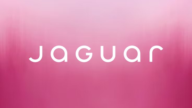
(Image credit: Jaguar)
Think of one of the most radical examples of not playing it safe, Jaguar’s EV pink explosion. Last month The Telegraph reported: “The designer behind Jaguar’s controversial “woke” rebrand has reportedly been dismissed from the carmaker just days after a new chief executive took over…”
Where does all this leave designers? Innovation still matters, but maybe it should be cautioned with authenticity. Be sure change is kept close to the client’s DNA. Strip away at your risk, be mindful around signature elements that customers love – the very things that can alienate the audience a rebrand seeks to excite. Think colours, patterns, characters or typography as an echo to remind people what they already loved.
For many brands, nostalgia has become a safe space to hide from the judgement of a volatile world. For designers, maybe it’s a reminder that rupture without purpose can be a big bang of hot air. So tread carefully, there are landmines in the market.
Simon is a writer specialising in sustainability, design, and technology. Passionate about the interplay of innovation and human development, he explores how cutting-edge solutions can drive positive change and better lives.
Design Director at Mother Design, Bentzion Goldman, feels identity design has become safe, sanitised and downright boring in the last 12 months. Let’s flip that in 2026, he argues, and make branding weird again.
his is the third year I’ve written about trends and predictions in branding. It usually goes like this: I review the year’s biggest identity design work, layer in my own observations, and provide a light roadmap for the year ahead.
But this year was different. Looking back at the biggest rebrands, what was most remarkable was how utterly unremarkable they were. What stood out was not how bad the brands were but rather their overwhelming okayness. A troubling trend became clear: the rise of safe, forgettable branding.
2025 was the year of Cracker Barrel, the year of HBO MAX / MAX / HBO MAX, and the year of MS NOW (née MSNBC). All branding efforts landed with, at best, a sigh and, at worst, public outrage. What’s more, some of the biggest changes were so subtle you may have barely noticed them: Amazon, Tripadvisor, Verizon, Walmart, Lyft, and OpenAI quietly tweaked their brand systems, even if some of those endeavours were billed as overhauls. Creative Boom even wrote a piece on how the quiet rebrand took over 2025.
Don’t get me wrong, on two accounts. I believe in the power of a masterful brand refresh that subtly tweaks its brand elements, artfully balancing heritage with progress. And there was beautiful, innovative branding released this year. But something deeper emerged when looking at brands with the highest visibility. You might recall the ‘blanding’ era of the 2010s. I think we’ve hit a similar wall at this moment, but for altogether different reasons.
Everything is just okay
Earlier this year, I read James Poniewozik’s piece for The New York Times, The Comfortable Problem of Mid TV, which has stayed with me ever since finishing it. Poniewozik argues that we’ve entered an era in TV where everything is just … okay. He writes that a decade ago, we experienced an era of a lot of bad TV, but the risks and imagination required to make those shows also led to many standout series.
Now, the advent of high-pressure, high-budget streaming platforms and an associated low appetite for risk have resulted in a slew of shows that are beautifully shot, incredibly expensive, and yet—just okay. True creative risk-taking is exceedingly rare to find. Instead, we have a lot of the perfectly acceptable yet often emotionless middle ground.
I believe something similar is happening in the world of branding.
The enemy of a good brand used to be a bad brand: badly kerned typography, poorly chosen colours, and digital illiteracy. Today, the enemy of a good brand is no longer a bad brand, but one that is just okay.
The proliferation and democratisation of design software, along with an increasing awareness of design among the general public, have created an environment where even the smallest teams can produce competent branding. And let me be clear: this is a good thing. Design should be for everyone, and the ability for clients, beginners, and non-designers to create design work elevates the field for everyone. Per a Michael Bierut anecdote, the fact that we now have online trolling of rebrands means people care about branding!
But this new reality has also resulted in a sea of work that’s simply okay. Scroll through this year’s branding projects, and you’ll see a multitude of brands using the same tricks. Many of these identities have no technical fault, and yet they lack a certain emotional depth; the kind of spiritual centre that makes a brand truly resonate with its audience.
Striking a nerve
I think this exact feeling is the reason why the Cracker Barrel rebrand struck such a nerve with the general public. The original identity may have had technical shortcomings, but what the new brand gained in optimisation, it lost in emotional resonance. And now the pushback has created a heightened environment of fear where brands are now even more risk-averse, wary of becoming the next big branding flop torn apart in the comments.
In this new era of mid-branding, we need a new playbook. One that empowers designers to expand their aperture and dare to dream again.
So what’s the way forward? Allow me to advocate for the value of being weird in design.
Weird gets normalised
The simple truth is, people don’t know what they like until they see it. And until they like it, they might hate it. History is full of examples of art so novel in its time that it provoked outrage and even violence. The sans serif style of typography, now completely commonplace, was once considered so radical compared to the serif and ornamental styles of its era that people called it monstrous, ugly, and grotesque—a name that stuck.
In 1913, a ballet by Igor Stravinsky called The Rite of Spring was so innovative for its time, with its use of syncopation, dissonance, and sharp dance movements, that people hurled objects at the stage, cried, and even started fistfights in the audience. The police were called to calm the riot. And you thought the comments on Brand New were bad. Experimentation and transgression are vital for discovering new ideas and finding novel ways forward.
What’s remarkable is that these examples, once shocking innovations, are now normalised. The lesson is profound: people hate change, but, given time, change softens until it becomes the new normal. It is up to us designers to be the tastemakers and the future tellers. This is radical permission: it is a licence to look beyond familiar references and to challenge what we consider ‘good design’.
Image by Bentzion Goldman
This idea is illustrated by industrial designer Raymond Loewy’s MAYA principle: Most Advanced Yet Acceptable. This urges designers to push things as far as possible, up to the point where they remain within the tolerance of user comfort. In other words, design something unoriginal, and it will feel predictable, yet design something too radical, and you could incite a riot in a ballet theatre. Our charge, as designers, is to find that sweet spot right on the bleeding edge of innovation.
Here are three brands from the past year that do exactly that.
How to do it
Cotton Design’s identity for Eternal Research is a retro-futuristic system featuring an engraving-inspired wordmark, eleven Victorian-inspired headline typefaces, generative ornamental patterns made with code, and a triangular piece of hardware called the Demon Box. The system defies easy categorisation, balancing minimalism and maximalism in a way that feels immersive and genuinely new.
Mother Design, which I must confess I work for, released branding for Fhirst, a prebiotic soda line that burst onto the market this year. The packaging system draws on the joyful design of early 2000s soda branding, featuring a reverse-contrast script wordmark, an animal mascot for each flavour (the dolphin is my personal favourite), Papyrus as a supporting typeface, and gradients, bubbles, and starbursts galore. It’s a more-is-more system that could easily fall off the rails, but never does, thanks to careful selection and use of brand elements. Instead, the brand radiates pure joy; I have yet to see someone scroll through the project without smiling.
The final project is Clue Perfumery, with design and art directed by Caleb Vanden Boom. Its script logo is beautifully weird, with extreme contrast and bottom-heavy curves that feel both refined and expressive. The brand’s editorial tone is elevated by wildly imaginative art direction: perfume bottles photographed in fish tanks, large-scale butter sculptures, and, most recently, a limited-edition scented stone sculpture shaped like an apple. Clue is one of those brands where the connective tissue isn’t a single idea, but rather good taste and boundless creativity. The eclectic choices work in harmony, resulting in a brand that is lush, unexpected, and engaging.
A Victorian-inspired triangular musical instrument, soda mascots featuring dolphins and eagles, and a perfume bottle covered in butter: these are the kinds of daring choices that push boundaries and yield designs with emotional resonance. These brands are not weird for the sake of it; rather, the unexpected choices are deeply connected to who they are as a brand. The designers involved in their creation reject the safe route, opting instead to question, to research, and to play.
Feeling optimistic
I have every reason to be optimistic for the year ahead in design. We have more tools at our disposal than ever, which means bigger challenges and bigger rewards. I think we will see many brands that make us scroll quickly past without batting an eyelash. But through the sameness, the smartest, most creative, and weirdest brands will find a way to stand out and create inspiring, innovative work.
And for the designers among us, this framework gives us permission to step outside our peripheries and dig deeper for inspiration. In our age of automation and algorithms, designers have the privilege of interrupting the churn of predictable sameness with the uniquely human elements of taste and unexpectedness. Everything is possible, because what is bizarre, weird—even grotesque—today is merely normal tomorrow. So, my biggest hope for the year ahead is precisely this: let’s dream again.
Below, Judd Kessler shares five key insights from his new book, Lucky by Design: The Hidden Economics You Need to Get More of What You Want.
Judd is an award-winning professor of economics at the Wharton School of the University of Pennsylvania. His research and writing have been featured in leading media, such as The New York Times, The Wall Street Journal, Scientific American, and Harvard Business Review, among others. For his work on organ allocation, Kessler was named one of the “30 under 30” in Law and Policy by Forbes. He has been researching market design for the past 15 years.
What’s the big idea?
Life is full of hidden markets quietly deciding who gets what—and learning their rules is the real competitive edge. See the system, play it strategically, and you can manufacture your own luck.
1. You are constantly playing in hidden markets all around you.
Economists think about the world as a bunch of markets. In each market, people are trying to get something that they want. But we have a problem—scarcity. There is rarely enough of what people want to just give it to everyone. So, we need a way to decide who gets access to the scarce resource and who does not.
We often decide who gets what by letting the price rise. As the price rises, a bunch of people decide that paying such a high price isn’t worth it and they leave the market. (Fewer people wanting something as the price rises is so reliable that economists call it a law of demand.)
I call markets that use prices to decide who gets what visible markets. They’re visible because it’s easy to see them. And playing in them is also easy: you simply decide whether something is worth the price and then buy it (or not).
But scarcity is not always resolved with prices. Some things are doled out by hidden markets that do not rely on prices to decide who gets what. These hidden markets are harder to see and more complicated to play in, but they are all around you.
Sometimes prices exist but are set too low to resolve the scarcity: Taylor Swift sold tickets to her most recent tour, the Eras Tour, for an average of $204, but some tickets were as low as $49 each. At those prices, many people would have happily bought each ticket. Some restaurants are so popular that it’s nearly impossible to get a table. New iPhones used to fly off the shelves the day they were released. Fad toys (most recently the Pop Mart product Labubus) may be incredibly hard to get your hands on.
“Scarcity is not always resolved with prices.”
Other times, we decide not to use prices at all: government benefits like public housing, seats in public schools, and library books are not sold to the highest bidder. We don’t let price decide who gets life-saving donor organs or access to the last hospital bed or ventilator.
In these cases, we still resolve scarcity: some people get the tickets, reservations, products, government benefits, and life-saving medical care while others do not. Those are the hidden markets all around you. They have their own rules, and you need to learn them.
2. You need to learn the market rules.
Every hidden market has its own set of market rules. Your first step toward success in hidden markets is learning them. What are the types of market rules?
One class is based on the principle “first-come, first-served.” With first-come, first-served, whoever gets to a product first gets to claim it. But while this principle might sound simple, the market rules it generates take three very different forms.
For example, first-come, first-served market rules can take the form of a race. If you want a reservation at The French Laundry, a world-renowned restaurant with three Michelin stars in the Napa Valley of California, you need to secure a reservation for one of its 17 tables in a first-come-first-served race. All reservations for a given month are offered online simultaneously—if you want to eat there in November, you need to be ready to click quickly at 10 am on October 1st.
First-come, first-served market rules can also take the form of a waiting list or line. People who need a life-saving kidney transplant can join a multi-year waiting list for a deceased donor organ through their local transplant centre. The longer that they have been waiting, the higher their priority for an organ when it becomes available.
If you want to see a masterpiece like the ceiling frescos of the Sistine Chapel, buy high-end apparel at a clothing drop, or just make your way through airport security, you’ll be standing in a first-come, first-served line. These first-come, first-served market rules all reward arriving early or waiting the longest. But other market rules operate completely differently.
Another class of market rules uses lotteries to decide who gets what. The New York City Summer Youth Employment Program gives 100,000 jobs to youth each summer, but still has to turn away tens of thousands of kids. They use a lottery to decide who gets a job and who does not. Lotteries also provide access to spots in the London Marathon, license plates in Beijing, seats in charter schools, and tags to hunt big game.
“Every hidden market has its own set of market rules.”
Another class of market rules involves centralized clearinghouses, where you must rank your preferences: telling an algorithm your first choice, second choice, and so on. This is how we decide which kids go to which elementary schools in New York City, how doctors are assigned to residency programs, and how college admissions work in China.
Dating markets, labour markets, and private school admissions markets operate with different market rules. I call these markets “choose-me” markets because you are choosing someone, a firm, or an academic institution. But for a match to take place, you must also be chosen.
Every hidden market has its own specific set of market rules. To succeed in a given market, you need to learn them. Once you know how the game is played, you can develop a strategy to win.
3. You might want to settle for silver.
Once you have figured out the rules of the game, you can develop an optimal strategy to get what you want. Across many hidden markets, one common strategy you might want to play is what I call “settling for silver.” This strategy requires acting like something less desirable—something that is not your real first choice—is at the top of your list.
Why might you want to play this strategy? Imagine you’re in a first-come-first-served race, like for a restaurant reservation at The French Laundry. Say you really want to have dinner there on a Saturday night in November. All the reservations are going to be released on October 1st at 10 am. And when they’re released, you will race to click on a particular reservation time. Which time should you click first?
Your real first choice might be 7:30 pm on Saturday. You might decide to click that time slot first. I call playing that strategy—trying to get the thing you actually want the most—“going for gold.” The problem with going for gold is that it’s risky. What you want is often popular with many other people. So, when you’re racing for that highly desirable reservation slot, you’re likely competing with many other diners who want the same thing as you.
Settling for silver would mean pretending that an earlier dinner reservation, say 5 pm or even 4:30 pm, is your first choice. If you prefer getting a reservation at 4:30 pm to not getting to eat at the restaurant at all, settling for silver might be the right strategy for you. Since many fewer people will be racing for a 4:30 pm reservation, you are much more likely to get it.
The same logic applies in markets with much higher stakes. Many applicants to private colleges in the United States choose to apply early decision, which commits them to attending the school if they’re admitted. Since an early decision application comes with a binding commitment to attend, you can only apply early decision to one school. Colleges like it when you commit to them, so they reward early decision applicants with a higher chance of admission.
“This strategy requires acting like something less desirable—something that is not your real first choice—is at the top of your list.”
So, what school should someone apply to early? They might be tempted to apply to a reach school early decision. This could be the right move. But if the candidate’s chance of admission is exceedingly slim, then even if it’s their top choice, it might be suboptimal to apply there early. Rather than trying to go for gold, they might do better settling for silver by applying to a less selective school early. This way, they can take advantage of their improved admissions chances at their second-, third-, or fourth-choice school.
4. You might want to double dip and multi-list.
Another strategy that comes up regularly in hidden markets is what I call “double dipping.” This strategy involves simultaneously playing in a market multiple times.
Double dipping is a common strategy in markets that use lotteries. The U.S. Diversity Visa Lottery has historically offered visas to those from countries that don’t send many immigrants to the U.S. The program selects applicants by lottery and gives winners a chance to come to the country and get a green card. But the lottery lets you bring your whole family if you win, so a married couple does better if they each submit an entry: if either of them wins, the whole family gets to come to the U.S.
When you enter a theatre ticket lottery, you can usually enter for a chance to win two tickets. If you want to go to the theatre with a friend, then you should double dip. You should both enter the lottery, effectively doubling your chances of seeing a show.
Allowing double dipping can be good for the efficiency of the lottery overall. People who are more motivated are more likely to put in the extra effort needed to play this strategy. Allowing double dipping gives people who care more about winning a higher chance of success.
A related strategy is called “multi-listing.” If there are a limited number of day care slots in your city and lots of families who want them, spots may be offered on a first-come, first-served waiting list. In that case, you might want to add yourself to waiting lists at multiple day care centres to increase the chance that you will have secured a spot for your tot when you need it.
And people in need of life-saving organ transplants may decide to multi-list by adding themselves to organ waiting lists through transplant centres in different regions. Since being affiliated with a transplant centre closer to a deceased donor organ increases the chance you get offered it, being on waiting lists at multiple transplant centres increases the number of organs you get offered. In that case, multi-listing could save your life.
5. You are a market designer!
Many hidden markets are designed by others, and you just have to learn the rules to try to get what you want. But there are also hidden markets that you control, like the hidden market for your time and attention or the hidden markets for household resources.
You get to decide which emails you respond to promptly, which friends to call back and which to ignore. At home, you get to decide how to allocate everything from financial resources to the television remote to desserts for your kids. In these cases, you get to set the market rules.
As a market designer, you can prioritize the three Es in your hidden markets:
Efficiency: Not wasting resources and giving resources to people who value them most.
Equity: Distributing resources as equally as possible to market participants.
Ease: Letting market participants be honest about what they want and not putting them through an ordeal to get it.
Good market rules strive to get as close as possible to achieving all three.
Efficiency might mean prioritizing email responses where your prompt reply will be most helpful to the recipient: perhaps someone who is actively working on a project and will be more productive once they receive your feedback. It could also mean devoting your limited time to whatever your highest-return activity is today, rather than to a recurring meeting you put on your calendar months ago, which can—and probably should—be skipped.
Equity might require giving people whom you want to treat fairly the same amount of time, attention, and resources, rather than (intentionally or unintentionally) favouring the one who is most demanding.
Finally, in some markets, we can make more of a scarce resource by how we prioritize access to it. In some countries, people who register as organ donors receive higher priority for organs if they ever need one. Similarly, during the Covid-19 pandemic, we prioritized medical treatment—like the last hospital bed or ventilator—for medical professionals serving on the front lines. These priority systems help ensure that we allocate more of the scarce resources we have. The same logic applies to your time and attention. Prioritizing some of it for yourself (perhaps for self-care) can also mean there’s also more to go around.
“I just don’t have the time,” or “now isn’t a good time for me.” These are just some of the responses that we are guilty of coming up with when we are thinking about making changes.
A re-brand? No time. New content? Not just now, thanks. Website? We’ve got one, and we’ve got more than enough on our plates.
These things must be reconsidered, as we know that companies have been and will be left behind if they don’t continue to adapt and evolve what is ultimately the shop front to their company. It is important to always strive to keep your website fresh and updated; so why not now?
Right now is the perfect time to invest in long-term strategy and you certainly don’t want to be thinking of doing it when you are once again too busy to act. Just as important is to remember that you are not the only one at home and as the majority of people are also at home, we all need something to direct our gaze at.
From one side, we don’t have shop fronts, store displays, or events to showcase what we do. From the other, we have nobody to talk to at the coffee machine, and we can’t gossip by the copier; plus now more than ever, we need to be entertained.
If you already have a website, you have already been collecting data for some time now. With today’s Google Analytics providing visibility as we’ve never had, now is the time to cash in.
It is easier than ever to identify which areas of your site work the best, which pages rank the highest, and use data to find out about visitors. There is no point in framing this data and putting it on the wall (with everyone working from home no one will see it anyway), you should be using it to see where your visitors are coming from and going to, what they are liking and what they are ignoring; and then building something which makes it easier for them to do so. 79% of customers who voiced dissatisfaction with websites say that they would be unlikely to buy from them again.
A website is not only a great way to get clients, but it can also be a fabulous way of losing them. Half of web users expect webpages to load in less than two seconds; a one-second delay here translates to an 11% drop in page views, and, tellingly, a 7% drop in conversions. A one-second increase has made some companies thousands of dollars more every day, literally.
Speed and user-friendliness are among many factors, of course, and you should take the time to really have a look at such factors as:
Mobile-friendliness
This is a non-negotiable must and it is essential that you have a mobile-friendly website
Design
This isn’t myspacing anymore; design should be unique and proudly display your brand; make it inviting, clear, succinct, and be true to your brand. It must look good; if you were buying a car, you’d expect four wheels and some mod-cons, but you’d also choose one that looked nice.
Ranking
Many of the webs best looking and most functional sites slip under the radar far too often. Great design, content, and architecture mean nothing if you are not showing up in search results. Several factors will affect this, of course, but usability will be high on the list.
Conversion rate
Ok great, your site is ranking spectacularly and generating more leads than a pet shop, but again, useless if they are not converted.
Branding
Maybe the number one factor to look at right now. It is high time to sit back and get some perspective on your brand, your industry, and your company. Have things been slowly changing over the last few years? Is your product still the same? More than ever before, a consistent, multi-platform brand is key to gaining awareness and loyalty. Your brand must be more than a fantastic and recognisable logo; it must be your voice and your precept.
Content
Fill up your website with fantastic content (content will generate SEO for years to come, for free) and make it look fantastic and will keep people on it as long as possible. Right now is a great time to invest in content. Once you have it, it’s yours, use it and squeeze it as long as you can.
One thing that this situation will surely boost is e-commerce. The fear of expanding into online sales must be overwhelmed by the fear of having no sales at all. Once we are through the isolation period, yes, people will rejoice and head outside, but e-commerce will have been introduced to millions of people that didn’t use it already. Give your customers the same feeling as they get when they come to see you, make them feel welcome and free from this confinement by offering a fantastic online experience from which they can still enjoy your product.
Home deliveries seem to be the best bet right now, so be the site that offers the most comfortable path to it. And don’t think that it will be short term, most clients, if they have enjoyed the experience, will continue to shop online.
A website, across all platforms, is your storefront right now. It is your kiosk at the industry convention and content is your voice. Take the time to marry as many strong elements of your company and brand as you can, and make sure that everyone can see what you do and what you deliver, presented in an easily digestible and engaging website.
It’s been called an “unauthorized misappropriation”.
Volkswagen has sparked a design dispute after filing a lawsuit against a car dealership, claiming that its logo is “unauthorised misappropriation”. The Dallas-based dealership named “VDubs Only” has been accused of creating a “bastardised” version of the German manufacturer’s logo that could potentially mislead consumers.
As one of the most recognisable car logos out there, it seems bizarre that Volkswagen feels threatened by a small dealership. It’s by no means the most ridiculous logo design dispute we’ve seen but with Volkswagen claiming infringement and dilution of its identity, it’s clear the car brand is driving for a resolution.
(Image credit: Volkswagen/Vdubs Only)
The centre of the design dispute evolves around the VDubs Only logo, which features a “V” design against a blue background (sounds familiar but I’d say it’s far from a direct ripoff). Alongside the alleged logo infringement, Volkswagen claims that the VDubs name violates its trademark of the word ‘V-Dub’ which has previously been used in campaigns. It’s worth noting that Volkswagen only owns the rights to the hyphenated form of ‘V-Dub’, so technically there’s no foul in that department.
The official lawsuit claims that these alleged infringements will be “likely to cause potential purchasers of Defendants’ products and services, as well as the public at large, to believe that Defendants’ products and services are affiliated with, authorized, sponsored by, or endorsed by VW.” Volkswagen is searching for a permanent injunction to prevent Vdubs Only from allegedly misappropriating its marks.
(Image credit: Getty Images)
For more design debate stories, check out the Michael Jackson logo dispute. If you’re after more car branding controversy take a look at the Mercedes-Benz logo dispute that threatened to oppose a humble microbrewery.
Natalie is Creative Bloq’s staff writer. With an eye for trending topics and a passion for internet culture, she brings you the latest in art and design news. A recent English Literature graduate, Natalie enjoys covering the lighter side of the news and brings a fresh and fun take to her articles. Outside of work (if she’s not glued to her phone), she loves all things music and enjoys singing sweet folky tunes.
Unveiling the artistry: BrandPacks’ Adobe InDesign brand guidelines presentation template is something else.
A brand’s identity is its compass, guiding it through the vast ocean of consumer preferences. Every company, big or small, dreams of a unique and memorable brand image that resonates with its audience. Enter BrandPacks’ latest masterpiece – an Adobe InDesign Brand Guidelines Presentation Template that transcends the ordinary, elevating brand presentations to a whole new level.
Crafted with precision and passion, this 27-page template is more than just a set of guidelines; it’s a visual journey that transforms the mundane into the extraordinary. Let’s dive into the creative waters and explore why this template is the talk of the design town.
BrandPacks’ template is not just a document; it’s a symphony of visuals, meticulously composed to strike the right chord with your audience. The modern aesthetics and bold typography create a harmonious blend that captures attention and leaves a lasting impression. Each page tells a story, seamlessly connecting the dots between creativity and consistency.
2. Fully Customizable Magic:
Flexibility is the hallmark of a great design, and this template embodies that philosophy. With 27 fully customizable pages, it provides a canvas for your brand’s personality to shine. From colour schemes to typography, every element is a stroke on this canvas, waiting for your artistic touch. Adapt it to your brand’s unique voice, and watch it come to life.
3. Modern Elegance:
In a world of fleeting trends, timeless elegance speaks volumes. The modern look of this template is not just a passing trend; it’s a statement. The clean lines, sophisticated colour palette, and well-thought-out layouts exude a sense of modernity without compromising on the timeless essence that defines enduring brands.
4. Bold Typography, Bolder Impact:
Typography is the unsung hero of design, and BrandPacks’ template gives it the spotlight it deserves. Bold, impactful, and undeniably stylish, the typography in this template is more than words on a page; it’s a visual experience. From headers that command attention to body text that guides the reader, every word is a brushstroke in the masterpiece.
5. Uniquely Yours:
No two brands are the same, and this template understands that. It offers a unique style that serves as a starting point for your brand’s journey. Tailor it to your heart’s content, and let your brand personality shine through. The result? A presentation that reflects your brand, not a generic template.
6. Suited for Screens and Dreams:
In the era of digital dominance, the size matters – and this template gets it right. With dimensions of 1920 x 1080 px, it is tailored for screens, ensuring your brand guidelines look just as stunning online as they do in print. Seamlessly transition from boardroom presentations to online platforms, maintaining the visual integrity of your brand across all touchpoints.
In conclusion, BrandPacks’ Adobe InDesign Brand Guidelines Presentation Template isn’t just a template; it’s a design revolution. A testament to the marriage of functionality and aesthetics, it empowers brands to present themselves with flair and finesse. So, if you’re ready to take your brand to new heights, embark on this visual journey, and let the world see your brand through the lens of creativity and innovation. Brand guidelines have never looked this good.
Explore the captivating design journey of Copper, showcasing its vibrant visual identity and brand evolution. Dive into the art of branding and visual identity with our insightful analysis.
In the ever-evolving landscape of brand identity and business relations, Copper’s latest design venture stands out as a testament to creativity and strategic thinking. Spearheaded by Creative Director Aaron Poe at the renowned studio Ueno in 2018, the project marks a significant leap for the company, formerly known as Prosperworks.
The journey of Copper’s rebranding is a fascinating tale of collaboration and innovation. Aaron Poe and his team, including talented individuals like Andrea Mata, James Rice, Jessica Volodarsky, Keene Niemack, Megan Miller, Valgeir Valdimarsson, and Troy Stains, embarked on this transformative venture with a clear vision. Their goal was to craft a brand identity that resonates with the essence of Copper – fostering thriving business relationships in this relationship era.
What sets Copper’s design apart is the harmonious blend of classic and contemporary elements. The use of beautiful serif typography melds seamlessly with a vibrant colour palette, creating a visual language that is both inviting and authoritative. This strategic choice not only highlights Copper’s commitment to tradition and reliability but also its adaptability and forward-thinking approach.
The rebranding initiative extended beyond mere aesthetics. It involved a comprehensive overhaul of Copper’s brand strategy, starting with a thoughtful renaming process. This change was not just cosmetic but deeply rooted in the company’s ethos and future ambitions. The new name, Copper, reflects the company’s core values and its dedication to building and nurturing lasting business relationships.
Moreover, the rebranding effort included a revamp of Copper’s website and out-of-home advertising. These platforms were transformed to convey the new brand identity effectively, ensuring a cohesive and impactful presence across all mediums. The redesigned website now serves as a digital embodiment of Copper’s philosophy, with an intuitive user interface that enhances visitor engagement.
In essence, Copper’s rebranding journey is a stellar example of how design can be leveraged to redefine a brand’s narrative. It’s a case study in how strategic design choices can align with a company’s vision, breathing new life into its identity and fostering stronger connections with its audience. As we delve into this remarkable transformation, we are reminded of the power of thoughtful design in shaping the future of businesses.
Branding and visual identity artifacts
For more information make sure to check out Aaron Poe Linktree