Tag

design

Browsing

By

As we enter a new decade, we look at where design is heading.

A new decade brings new trends, and the evolution of existing ones. Last year saw exciting developments across the spectrum of visual design that will develop and evolve in the new year.

Here, we look at what’s hot in design right now and how we see it developing in 2020, covering everything from web design to fun fonts to graphic design and UI. Here are seven of our biggest predictions for what we’ll see happening in design this year. You heard it here first.

01. Branded animation

With GIFs now part of how we communicate, anyone designing for digital knows that people love movement. Illustration has become big for social media and web design over the last few years, but there’s now growing demand for the illustrations to move as shorter attention spans need to be satisfied.

GIFs can be a powerful way to bring brands to life. In 2020, we expect to see more fully branded motion graphics, from micro-interactions to moving logos to animated GIFs celebrating milestone events on social media.

Animations will also get more continuous. The safety video from Delta Airlines (above) shows the direction branded animation is going in, with one scene rolling into the next through fluid dynamic transitions that evolve and tell a story. The trend to build each scene out of the previous one takes viewers on journeys through a transforming world. And animation doesn’t only live online or on a screen.

Branded animations designed by London-based Animade were an integral part of Mailchimp’s rebranding in 2019, including the monkey logo that winks when you move the cursor over it, but the animators also created this interactive wall art. Interactive illustrations will offer a chance to reinvent communication and tools and engage with illustration in real-world environments.

02. Ultra minimalism

Calendly’s ultra minimalist landing page focuses attention on the call to action (Image credit: Calendly)

Minimalism seems like it will never become passee. It looks clean, sleek and for websites, it reduces loading time and scores better in search results. Services like Slack, Monday and Calendly are aware of this and have been leading the trend for minimalist landing pages that put the focus on the call to action and conversions.

With no distracting background elements, their sites are easy to navigate and make it easy to sign up. The trend is to complement the white space and simple message with an illustration – Calendly uses a modern looking line drawing to add to the clean feel, Monday opts for an animated demo with pots of colour to draw the eye, while Dropbox  dispenses even with the illustration, dedicating half the screen to the sign up form. Other sectors are following the trend, opting for simple and direct approach, which will stay with us in 2020.

03. Combining realism and flat design

design trends 2020

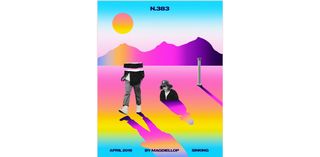
Magdiel Lopez combines realism and flat design to stunning effect (Image credit: Magdiel Lopez)

Recent years have seen a huge trend for flat design, and over the last year, isometric design has been the big thing, led especially by design for cryptocurrency sites, while 3D has been getting better and better. Now we’re starting to see more of a tendency to get the best of both worlds by layering elements of flat design and realistic 3D images. This can be through combining 3D design and flat design or through collages that combine flat design and photography like the beautiful dreamy posters created by Magdiel Lopez.

His work bridges the gap between the simplicity of flat design and the complexity and authenticity of realism, and communicates interaction between the real and digital worlds. The combination of 3D and flat design can also be a way to bring goods to life, such as on the urban trekking shoe company Déplacé Maison website or highlight blended learning experiences like on the Ocean School website.

04. Playing with the elements

design trends 2020

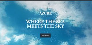
Azure The Oceanic’s site offers an engaging sense of freedom with cursor-controlled play  (Image credit: Azure The Oceanic)

In web design, there’s a growing tendency to play with water, air and light to create engaging effects, which follows a trend in design in general towards rejecting rigid geometric lines and shapes in favour for soft, flowing lines. It’s fun and playful, approachable, easier on the eye and still feels new.

The design and text on the Beyond Beauty project’s website seem to float around the space, conveying the sense of freedom that the project embodies. Expect to see a lot more free-floating elements in 2020 as we say goodbye to gravity. The theme for flowing shapes and lines is taken up also in the use of water and lights, for example, with cursor-controlled shimmer and ripple effects like in this site from property developers Azure The Oceanic. The Barovier & Toso website also uses cursor controlled liquid ripple and shimmer effects to give a sense of mystery and luxury to its products.

05. Heavy but simple fonts

design trends 2020

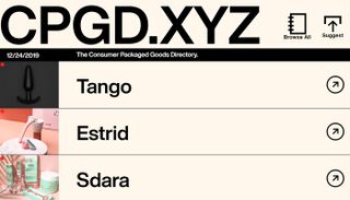
 CPGD’s site is on trend for 2020 with bold simple text (Image credit: CPGD)

The trend for big and heavy fonts is not going to move easily. With people spending more of their time online on small screens, big fonts are practical, but it’s a trend that extends to the world of graphic design and even packaging, since they also look great and give personality to text. When it comes to thickness, the rule for 2020 will continue to be the bigger and bolder the better, with text taking centre stage and overtaking image and video as the main element.

Designers are using bold or extra bold fonts paired with simple backgrounds or much lighter text to create interesting contrast in a design. Text may even go beyond a composition’s edges, and be split into multiple lines. CPGD, a list of direct to consumer brands, is on trend with a site that uses bigger Helvetica Now Display much bolder than most ecommerce sites, which can often suffer from lots of small text.

Large text is not only for headlines and titles, but sites like that of Germany agency Polar Gold show a trend to beef up the size of the text in paragraphs too, and expect to see more incorporation of movement too like in the bold and playful Piano Trio Fest site.

06. Dynamic live data visualisation

design trends 2020

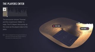
The Economist showed lived data visualisation based on the reaction of fans during a football match (Image credit: The Economist)

Data visualisation has been a growing trend for years. And there’s much more to come. In 2020, complex live data – like dashboard stats – will become even more immediately available, and designers will need to showcase information in a way that adapts to changes and dynamically animates. In the past year, The Economist’s Reimagine the Game offers visualisation of fans’ reactions in the stadium during football matches providing a kind of timeline of the match  complete with goals and yellow cards. In 2020, expect data visualisations to go dynamic live, interactive and to cover everything.

07. AR and VR finally go mainstream

design trends 2020

AR and VR offer whole new design mediums (Image credit: Getty Images)

It’s been a long time coming but VR is finally coming into the mainstream and is expected to become  one of the most consumed technologies of the next few years. What’s exciting for design is that more than being a trend, virtual reality offers a whole new medium to design for. UI and UX within VR is huge area in which to explore not only how we touch a screen but how we move around inside it.

Expect big opportunities in holographic 3D design and virtual reality e-commerce solutions, while AR will increasingly offer more demand for digital animation, with magazines like The New Yorker bringing pages to life through our phones’ cameras and Apple and Google introducing their own AR development platforms, ARKit and ARCore. And whatever happens in the areas of VR and AR is also bound to have an effect on wider design.

By

Sourced from CREATIVE BLOQ

By Douglas Montague

How rethinking brand expression influenced Microsoft products and vice versa

Imagine a sheet of paper with a couple dozen tiny dots spread out on it. Their placement doesn’t seem random. You can sort of make out a shape, but there’s no obvious way they go together.

Now imagine a sheet with identical tiny dots, only each one is numbered. The dots may still look like a jumble, but the numbers indicate how they link together. You draw a line from one to two, two to three, and so on. Oh look, you’ve drawn a seal balancing a beach ball on its nose! Gold star.

Working for a big company sometimes feels like staring at thousands of dots and having little idea how to connect them. I’ve been with Microsoft since 1995, but I don’t think I understood how these dots could work together until 2015.

That’s when we changed our marketing strategy. Before, the product design team would build and design the experiences, and the marketing team layered a brand identity on top to sell it. With the 2015 change, branding was no longer a “layer” of marketing disconnected from the product experience. Instead, branding became directly tied to and influenced by the product. And maybe, just maybe, the brand could influence the product in return.

In the heavily siloed world of giant corporations, that was practically crazy talk.

One dot at a time

Simplicity became our mission. We first needed to build brand principles and the brand story (in other words, why we exist in the world). Then, we’d figure out how the principles and story inform the product experience. We theorized that connecting experience and expression among product, brand identity, and marketing, and extrapolating those principles into meaningful guidance across the company, would create a better experience for customers.

Numbers started to appear next to those scattered dots staring me in the face. The trick was getting other people to see them, too.

To show people the value of brand creative teams in marketing, we needed to have a lot more conversations with product design. First, we needed to understand what they were building and where they were headed. Second, we needed to create a visual identity closely tied to the product’s visual language, which a worldwide marketing organization could later implement.

Easy enough, right?

Thankfully, our senior leadership encourages us to work together for the greater good of the company, pushing away our own egos as much as possible to bring success to all. We call this One Microsoft. Particularly in our area, acting as One Microsoft is a necessity: we have a tiny creative team and can’t succeed without the assistance of other great creatives, so we need to understand each other’s business and create together. When it works, it’s magical.

Case study: transforming Microsoft Office

Rebranding Office was one such magical example. For the first time, we looked to product teams for cues to lift the brand identity and create simple, scalable guidance. We worked directly with product design, an approach that we’d take later with Azure and HoloLens 2.

Our approach had five steps:

  1. Create the brand story working across brand strategy, engineering, and marketing, including a deep dive into product design principles and future principles.
  2. Conduct an end-to-end visual audit of the entire customer journey.
  3. Identify visual patterns and cues from the product, and from the parent Microsoft brand, to create a visual identity for the brand expression.
  4. Build creative principles and theories around color, illustration, typography, and photography, then stress test across all communication touchpoints in the marketing funnel.
  5. Create a simple design system that designers could scale worldwide without much creative oversight.
Three large black boards with print outs of the current Office branding.

Three large black boards with print outs of the current Office branding.

Boards from one of the many visual audits done in 2016 for Microsoft Office.

Our audit concluded that Office needed a more sophisticated yet simplified visual identity connecting our product experience and marketing communications. The marketing teams were doing their best; they followed the Microsoft brand guide for reference, but the broadness of the guide and visual system made it difficult to implement. We pared down the brand system in the name of simplicity.

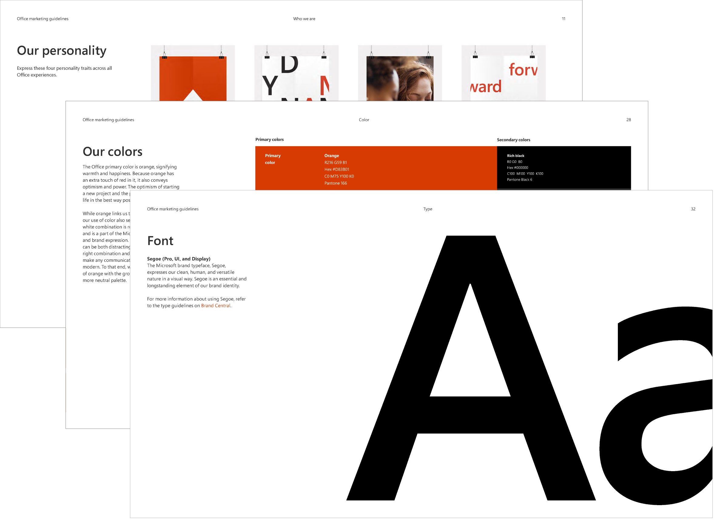
Office brand guideline examples including personality, colors, and font.

Office brand guideline examples including personality, colors, and font.

Pages from the Microsoft Office Brand Guidelines.

Our collaboration effectively linked the pre-purchase marketing communications to the post-purchase ones. For example, we used our marketing expertise at engaging users to improve the first-usage experience (for example, the “how to” videos that introduced users to Office online). In that space, the product team focused more on UX, not the kind of branded moments within the product where you can tell a story.

The fifth step in that process was perhaps the toughest, simply because of scale. Several hundred marketers worked on Office, each with their own budget, each choosing their own creative. Because of that, and their concern that we’d just scold them for doing things wrong, none of their work went through a creative review process. We not only had to change how people worked, but we also had to assure them we had their best interests in mind.

In time, people from other teams understood that we weren’t focused solely on creative, that we wanted to help them meet their business objectives and performance metrics. Again, it comes back to that One Microsoft principle of trusting each other and helping each other succeed. Product teams started seeking out our involvement, and marketing trusted us to make more things on their behalf.

Keeping a good thing going

We emulated this turning point elsewhere. We worked directly with principal designers Paul Cooper and Lance Garcia to build creative principles (for everyone keeping track, that’s step 4) that ended up changing the patterns and UX of . Functionality informed brand choices, which reflected back on the site itself.

The front page of the Azure.com website.

The front page of the Azure.com website.

Azure.com

The same goes for HoloLens 2, which was perhaps our most daunting task. The product team had worked on it for two years by the time we stepped in to begin branding, so we had catching up to do. (Yes, not ideal.)

HoloLens 2 works in mixed reality, a new medium for most users. Because of that, people need more than product photography or UI to understand how it works. So, I partnered closely John Nguyen and David Wolf from the product design team to come up with a solution. We were inspired by prismatic light in holograms and by the way the product sensors understand the world and generate a 3D map. We believed that this prism and map would tie the marketing and the product experience together in a beautiful way. The product experience largely informed the elegant brand we created for HoloLens 2 and subsequent marketing materials.

Four expressions of the HoloLens branding.

Four expressions of the HoloLens branding.

HoloLens 2 Prismatic Color Blend used in illustration, full-bleed backgrounds, and HoleLens 2 wordmark logo.

These marketing materials turned out well — so well that they influenced the product. Romiro Torres, the creative director for HoloLens 2 UX, was working out the visual expression and experience of how the device maps a room. He integrated the same visualization into the product experience, so users see the same visualization we created for marketing when HoloLens 2 maps the room they’re standing in.
HoloLens 2 Room Mapping from the launch announcement in Barcelona

Chances are that doesn’t sound like a big deal to you, but it felt huge — that “maybe, just maybe” moment I mentioned earlier. If you listen closely, you can hear silo walls cracking.

Those are the kinds of moments we strive to create every day. They become a lot more likely when teams spend the time to truly understand each other. Branding makes that easier. It provides that layer of customer clarity, connecting the dots so that marketing and product can take a step back, look at the lines, and say, “Wow, a seal balancing a beach ball!”

By Douglas Montague

Microsoft Brand Creative Director. I don’t believe creative that has commercial success tags it with an odious suggestion that is stinks. Views are my own.

Sourced from Medium

By Don Norman
Roberto Verganti and I published an article in the July 2019, Harvard Business Review on the virtues of criticism (Verganti, R., & Norman, D. (2019, July 16, 2019). Why criticism is good for creativity. Harvard Business Review. https://hbr.org/2019/07/why-criticism-is-good-for-creativity. May require registration or payment.)

Here is the basic argument

One of the most popular mantras for innovation is “avoid criticism.” The underlying assumption is that criticism kills the flow of creativity and the enthusiasm of a team. Aversion to criticism has significantly spread in the last 20 years, especially through the advocates of design thinking. (In 1999, in the ABC Nightline video “The Deep Dive,” which ignited the design thinking movement, criticism was stigmatized as negative.) In IDEO’s online teaching platform, the first rule of brainstorming is “defer judgment.” To make this rule even more practical and straightforward, others have reworded it to say: “When a person proposes an idea, don’t say, ‘Yes, but…’ to point out flaws in the idea; instead, say, ‘Yes, and…’” — which is intended to get people to add to the original idea.

We challenge this approach. It encourages design by committee and infuses a superficial sense of collaboration that leads to compromises and weakens ideas. Our view, the product of years of studies of and participation in innovation projects, is that effective teams do not defer critical reflection; they create through criticism.

The secret of criticism in innovation lies in the joint behavior of the participants. Those offering criticism must frame their points as positive, helpful suggestions. Those who are being criticized must use critiques to learn and improve their ideas. When conducted with curiosity and respect, criticism becomes the most advanced form of creativity. It can be fascinating, passionate, fun, and always inspiring. Let us combine “Yes, and” with “Yes, but” to create the constructive and positive “Yes, but, and.”

By Don Norman

Sourced from LinkedIn

Sourced from Inc.

Best practices for creating modern, printed brand ambassadors with staying power.

Vladimir Gendelman, an Entrepreneurs’ Organization (EO) member in Pontiac, Michigan, is the founder and CEO of Company Folders, an award-winning online printing company specializing in presentation folders. The company made the Inc. 5000 list of the fastest-growing private companies in America for three consecutive years. As a thought-leader in print design and business, we asked Vladimir about the best ways to transform your marketing materials. Here’s what he shared:

While digital marketing is a significant focal point on the business landscape, print marketing–which started nearly 200 years ago–remains a robust marketing tool. Whether it’s trade shows, in-person networking or direct mail campaigns, print materials elegantly convey information about your company, brand and products.

Unlike their digital counterparts, print marketing materials aren’t instantly deleted with a click. They have staying power. When done well, print materials can work in conjunction with digital marketing efforts to differentiate your company and help customers remember you.

To do print marketing well, there’s pressure to capitalize on the next great design trend. Given how long print marketing has endured, it can be challenging to come up with fresh ideas.

Sometimes, the best way to step up your game is to leverage existing techniques with a unique twist. That’s what our team focuses on when creating new designs for clients, whether it’s finding a cool way to emboss a product or using a coating to highlight a specific design feature.

Here are five ways to create memorable, inspiring print marketing materials.

1. Cut it out

Marketing material designs aren’t limited to square or rectangular shapes. Consider reshaping the piece itself to match your logo or another brand element. Recipients will make the connection when the guitar shop’s business card is shaped like a guitar pick, and round business cards literally stand out from the pack at conferences.

For folders or brochures, you can add multiple curves, change the pocket shape, or create a custom-shaped window. Such windows not only provide a quirky design element–they also encourage recipients to look inside by offering a peek at the contents. Die cuts can outline or accentuate essential design elements such as a company logo or featured product.

2. Give it a lift

Embossing lifts your design from the stock, providing a raised, textural effect. It can be used to create geometric patterns or emphasize specific areas of your design. You can even give your die cut more pizzazz by embossing the border. Nothing is off-limits: You can add embossed elements to folder pockets, envelope flaps and business cards.

Photo courtesy of Company Folders, Inc.

Combining embossing with other imprint methods can transform and refresh a piece. That’s the case with this folder designed for a fine jewelry store. The foil stamp visually communicates elegance, while the embossed logo adds a level of sophistication and calls attention to the flap of the product.

3. Make it feel real

A poignant image stirs emotions, whether by drawing attention to your cause or identifying uses for your product or service. The key is avoiding basic, generic stock images.

Instead of images of your product sitting on a desk or in a field, choose an image showing the product in use or various scenarios in which the products would be ideal. Images must look and feel authentic as if they were plucked from a target customer’s camera roll or social media feed. Authentic imagery makes it easier for people to connect with your brand.

4. Add a coating

Incorporating a stock coating into your design can be the cherry on top of your sundae. In addition to providing extra protection to print marketing materials, it draws the eye to specific design elements by adding unique texture and shine. Coatings also add a level of sophistication and luxury, implying that you use only the highest-quality materials, which can make customers feel more comfortable working with you.

A spot-UV coating makes specific colors pop, or it can create its own element on the stock. A soft-touch coating provides a smooth, suede-like feel, giving recipients a tactile experience that will help them remember your product. For a more subtle look, matte coatings provide contrast and protect your design without the shiny, reflective appearance of a gloss coating.

5. Give it depth

Ever seen a design that makes you want to reach out and touch it? That’s the magic of 3D design, which adds a new level of depth to any element, from fonts to graphics. It adds complexity to an otherwise simple piece. It’s a best practice to use 3D design features sparingly and balance them with 2D counterparts to avoid weighing down your design.

Designer Katt Phatt transformed the Netbee logo to 3D so that it jumps off the screen. The key in this instance is Phatt’s keen attention to detail–showing each individual wire and cog makes the logo more realistic.

While new trends take shape every day, you can make a modern design statement with existing techniques utilized in distinct ways to give marketing materials a sleek twist. A great designer will be able to mix the old and the new to create a timeless printed piece that stands out.

Feature Image Credit: Getty Images

Sourced from Inc.

By

Get your hands on premium design assets for life.

Is your creative project taking longer than you anticipated? If so, check out EpicPxls. This design package will streamline your productivity by providing you with premium curated fonts, graphics, templates, mobile app designs and much more.

Whether you’re a graphic designer, web developer or a blogger, there’s plenty to enjoy with this EpicPxls deal. You’ll be able to download 20 premium items per month for life, all for the reduced price of $99. That’s a massive 95 per cent saving on the regular price of $2,400.

With no recurring payments, you can sign up today safe in the knowledge that you’re not going to get stung by charges further down the line. Supercharge your creativity and your productivity today by getting your EpicPxls deal for $99.

Feature Image Credit: EpicPxls

By

Sourced from CREATIVE BLOQ

By

EnFont Terrible lets you remix your fonts in seconds.

You can never have too many fonts, we’ve found, and just to complicate matters we’ve also found a fantastic new site that makes it absurdly easy to mutilate your existing type, turn it into whole new pieces of typographical joy and even create stunning kinetic typography in a matter of seconds.

It’s called EnFont Terrible, which is by far the best pun you’re going to hear this week, and it’s the work of Spanish designer Javier Arce. He claims that he doesn’t really know about kerning or any of that complicated typography stuff, but decided to make his own type generation site anyway.

If you can’t be bothered with typography tutorials, you’ll be delighted to learn that EnFont Terrible is quite gloriously simple to use; either use the default fonts that come with it or upload your own, and by dragging a few sliders around you can warp and mutate it into something quite weird and wonderful in a matter of seconds, without having to know the first thing about typography.

Once you’re happy with it, just hit the Create Font button in the bottom right-hand corner and you’ll instantly save your mutant creation in OpenType format.

As a serious typographic tool it probably leaves a little to be desired, but as a fun way of mucking about with fonts it’s very hard to beat, and with the right input fonts and a bit of experimentation you could quite easily grow a massively expanded font collection over the course of an afternoon.

Don’t take our word for it, though; you can get to grips with EnFont Terrible’s tools here.

By

Sourced from CB CREATIVE BLOQ

By Joseph Grenny;

Creativity is learnable providenceIt feels like an inexplicable miracle when it arrives, and we may never be able to isolate all the variables that generate it. But, in my experience, we can reliably create the conditions to invite it.

Twenty years ago, I was involved in a terrifyingly inspiring project, working with some of Kenya’s poorest citizens in one of Nairobi’s most blighted areas. Our goal was to generate self-help strategies that would enable this group to climb a few rungs up the economic ladder. The audacity of this effort hit me in the middle of a flight from Brussels to Nairobi. I had fallen asleep briefly just long enough to become immersed in a nightmare. I dreamed I had somehow become the president of Kenya, and this filled me with overwhelming despair. When an announcement about approaching turbulence jarred me into consciousness I’ve never been happier. But the dream had hammered home the weight of the task I was heading toward. I was to lead a two-day meeting with hundreds of people for whom the stakes could not be higher. We had a clear goal but no concrete plan. I knew the work was worth pursuing, but I had never done what we were trying to do and felt inadequate to the task. I hoped and prayed that worthwhile ideas would come. And they did. The trip was successful in ways that exceeded my competence. This was a welcome surprise, but one I had done my best make happen.

Here are some of the ways I’ve learned to be more predictably creative.

Frame the problem, then step back. 

Like a grain of sand in an oyster, cognitive irritation stimulates creativity. When you give yourself a compelling, complex, unsolved problem — and make sure to clearly, concisely, and vividly articulate it — your brain becomes irritated. For months before my trip to Nairobi, I carried around a pad of paper on which I had handwritten the following statement: “How, with no outside resources, will we create 300 middle-class jobs for the people in our group?” The problem turned in my mind. One way to further amp up the cognitive irritation is by slogging through a first, unsatisfying round of generating solutions. This effort is more about priming the pump than solving the problem. Then, walk away for a bit, and allow the unconscious work — that which draws from a fuller complement of mental resources, experiences, and creative connections — to begin.

Obey your curiosity. 

Steve Jobs claimed that “creativity is just connecting things.” I agree. If you want to be more creative, you need to have more things to connect. The best way to

The problem turned in my mind. One way to further amp up the cognitive irritation is by slogging through a first, unsatisfying round of generating solutions.

build a rich mental database that will help you solve problems later is to honor passing curiosities. If something tickles your brain, spend a moment with it. Follow paths that have no obvious purpose other than to satisfy a whim. It could be an article or a conference session that intrigues you; a book that you inexplicably notice; a person to whom you are introduced. It’s tempting to let these opportunities pass, but you do so at your creative peril. They become the Lego bricks, tinker toys, and pipe cleaners from which your creative masterpieces emerge. My Kenyan experience was the product of scores of conversations, books, lunches, and papers that seemed to have little immediate value. But I invested in them anyway — and it paid off.

Keep a shoebox. 

Next, find a way to collect and organize your experiences. For example, when I read, I fanatically highlight. I then go back and re-read the highlighted passages. And then I cut and paste the best of them into a document so I can easily find them later. This three-step process (highlight, review, organize) increases the likelihood that I retain the information and, eventually, am able to conjure fertile connections between all the tidbits. During that same transcontinental flight, I think somewhere over Egypt, a memory of a book on large group decision-making that I had read five years earlier tickled its way to my consciousness. I had not thought of the book since, but I had highlighted, re-read, and tagged it at the time, so I opened my laptop and reviewed key ideas that would inform the agenda our group used to leap forward in coming days.

Do things that don’t interest you.

Early in my career, Will Marre, the founding president of Stephen Covey’s training company, admonished me to subscribe to a handful of business journals he listed, then added, “And every time you read one, be sure to read at least one article that holds no interest for you.” I’ve been rewarded time and again for doing so. Many things that end of up in my shoebox have come from conference workshops, articles, or online videos that began as a chore and ended with an insight. My work in Kenya, for example, was heavily influenced by a Christian Science Monitor article I had forced myself to read 10 years earlier. Sometimes, we call things “boring” simply because they lie outside the box we are currently in.


Invite uncomfortable conversations.  

Another great creative stimulus is to regularly engage in conversations with people from whom you might normally recoil. Three of the more unexpectedly fruitful conversations of my life were with a racist cabby in London, a drug dealer seatmate on a plane, and an extremist political advocate in Puerto Rico. While I didn’t change teams as a result of these conversations, I gained valuable perspectives from lives I will never live. This discipline helped me find the psychological flexibility I needed in Kenya. At times, a member of our group engaged in the graft so common to their experience. I needed to find a balance between empathy and accountability. Long practice in grappling with others’ realities helped me approach the situation with determination rather than disgust.

Stop and work when it hits.

I can tell when something is coalescing inside of me. At an unexpected time, I will feel a rush of clarity. The final discipline of inviting creativity is to honor these moments by writing. If I interrupt whatever is happening at the time to transcribe and organize my thought flow, I accelerate the development of ideas.

This three-step process (highlight, review, organize) increases the likelihood that I retain the information and, eventually, am able to conjure fertile connections between all the tidbits.

If I ignore those moments — or try to kick them down the road — I find them impossible to re-conjure. I lose emerging clarity and slow the process. A couple of hours from Nairobi, I felt a rush of ideas. I was exhausted and drowsy, but I recognized the first symptom of inspiration for what it was. Before the plane landed, I had a powerful opening speech written as though it had been dictated. I simultaneously envisioned the two-day group process that helped the group coalesce around a detailed and hopeful strategy.

Over the next two years, I helped my 300 co-conspirators form a worker-owned cooperative. From their meager but collective efforts, they assembled enough capital to begin an enterprise that employed many of them. These experiences contributed to the founding of a non-profit that has, to date, helped tens of millions around the world to improve their economic circumstances.

Creativity may always be part mystery. But we can all practice disciplines that invite its beneficent arrival.

By Joseph Grenny;

Sourced from ascend

By Jacob Cass,

Want to know how to get high paying design clients?

This video explains how I went from $300 design projects to 5 figure projects.

I concisely discuss 5 tried and true strategies to get high paying design clients including:

  • Your Portfolio & USP
  • Building Relationships
  • Marketing Strategies
  • Pricing Creativity (Proposals & Closing Deals)
  • Upsells

Inside, I recommended putting this book on your radar: Pricing Creativity by Blair Enns. It’s expensive ($200+) and only available on his website. Alternatively, you could read a short summary or a listen to a podcast to learn more about “value based pricing”.

Let me know if you have any other tips for how to get bigger design clients.

» Subscribe to my YouTube channel.

By Jacob Cass,

Sourced from Just Creative

Sourced from Skuirel

Someone has said, “A picture speaks a thousand words”. This fact was never more true for anyone else, but for graphic designers. Graphic design is a process of communicating with your target customer using tools like typography, photography and illustration.

Common uses of graphic design can be found in corporate designs in the form of logos and branding, editorial design for magazines, newspapers and books, environmental design, communication design, product packaging and signage. It also includes advertising and web designing.

Graphic design has wide reaching applications. It has application in road signs, interoffice memorandums, reference manuals, selling products or ideas, logos, colors, packaging and branding too. Other applications of graphic design include the entertainment industry, vinyl album covers, opening and closing credits in filmmaking, artwork used for designing T-shirts. It is also an important part of information design. This information could be for newspapers, magazines, blogs and television. It could also be for film documentaries, illustrating news stories on the web, data visualization, and information graphics.

Who Is a Graphic Designer

A graphic designer is one who creates and combines symbols, pictures and text to communicate ideas and messages. A typical graphic designer uses all the three tools namely typography, page layout techniques and visual arts techniques to make visual compositions. A graphic designer is an important member of the branding team. In other words, a graphic designer is a professional within the graphics design and graphics arts industry who communications through images both in still and moving communication media.

Click HERE to read the remainder of the article.

Sourced from Skuirel

By

2019 is set to see ecommerce sales increase by 19.5% globally, offering an opportunity to savvy brands who are up to speed on the latest web design trends and developments to drive significant additional market share.

But what do brands need to bear in mind in 2019 to ensure that they continue to deliver relevant standout online design, and therefore sales?

Mobile First

It’s vital to implement mobile first design in 2019. In 2015 mobile searches overtook those on desktop, making mobile search the highest search form worldwide. In accordance with this, Google has changed which sites they index first — they now prioritise mobile sites over those that aren’t mobile friendly.

However, it’s worth bearing in mind that this push toward mobile first design isn’t just based on ranking factors or SEO, the visual result must enhance the user’s experience on the device that they will most likely be searching from.

This focus on mobile first requires a fundamental shift in the way that websites are designed. It used to be that a site would only be created for a desktop or laptop computer and a mobile-friendly or mobile responsive design might be added as well. Today, it’s critical to design the site for the mobile user first, before creating a version that will also standout for those on desktops.

Micro-animations/movement

Using moving micro-animations along with feedback loops – that deliver movement when hovering over an icon – help make websites more usable and engaging. The details of the micro-interactions: the button clicks and the page transitions can greatly improve a user’s experience on your site, meaning they are far more likely to return. It’s this meaningful motion, connecting an action with a reaction, that satisfies a user’s desire for interactivity. And with touch interfaces, especially on small screens, it has never been more important to deliver motion in micro-animations and feedback loops to make the interaction smooth and guide users on their journey to checkout.

Custom and classic fonts

Expect a move back to custom and classic font design – clean but formal – with bigger and bolder typefaces, and a move away from humanist fonts as brands aim to standout against the proliferation of humanist typefaces.

Colour

Bright colours should be used more liberally in 2019 to deliver greater standout. The last two years has seen an explosion of big, bold colour across the internet with an increasing number of brands choosing to use their core packaging brand colours as backing for their graphics, with clashing tones moving away from the edgy start-ups into the mainstream. Those who have embraced arresting colours include The Premier League, Sky and eBay. Though bear in mind a classic font design and bright colours won’t be suitable for all. The choice of font and colours has to be right for the values of the brand and resonate with the audience they are targeting.

Optimise for search

As is always the case, making sure the design of your website is optimised for search algorithms is vital. Developments in web design will be driven by what Google’s constantly evolving search algorithm looks for. To this end, make sure that the content being communicated is relevant to your target audience and written as naturally as possible. Google looks for honest, human generated content. Of course, this must be quality content to encourage others to have weblinks back to your site to aid your SEO efforts. If users want to share your copy this highlights to Google that you are a valuable resource and the reward for your efforts will be an improved organic search ranking.

Speed

With research revealing over half of consumers leave a website if it takes more than three seconds to load, websites must be designed with speed in mind. Also, the faster your site loads the better it will rank in search results, particularly in Google search. This is not to say that websites should be sparse affairs with limited content and imagery for the purposes of speed. With better broadband it’s much easier to have image and content heavy sites that can load quickly. However if you have an app it’s seriously worth considering hosting it on a Progressive Web App (PWA) for speed purposes. A PWA can be launched from a home screen and can be ready in less than a second, often beating native apps in load times.

All brands need to constantly evolve their web design to continue to standout and deliver an engaging experience to their users that generates sales. By recognising and having these six web design points front of mind, brands will be well placed for a profitable 2019 online.

By

James Pruden is studio director at Xigen

Sourced from The Drum