Tag

design

Browsing

By

Trends come and go. The graphic design world is always evolving. Some design trends fade away for months, others stay for years. Today we’ll spill the beans on which graphic design trends will generate buzz this year.

Whether you will follow the crowd or set up a new trend yourself – the choice is yours. Either way, it is vital to be up-to-date. We have taken the time to browse the web and find out which design trends will take the leading positions in 2018. We will also reveal some of the graphic design trends which should better stay in 2017.

Year 2018 is pretty much all about imagination off limits. The majority of our examples depict a combination between two or more trends, even though we have focused on each one separately. Hope it sounds promising, so let the show begin!

1. The ‘Little Big Idea’

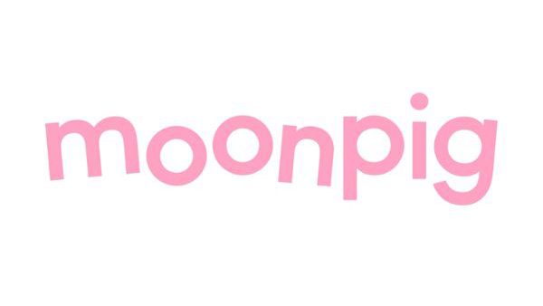
Moonpig’s rebrand was about sweating the small stuff

“The design theme of 2017 was big impact, but paradoxically the best work achieved it by really sweating the small stuff,” says Chris Moody, creative director at Wolff Olins. “The things I have found the most striking are the consommés – those jobs that focus on something singular and use it to create something with clarity, distinctiveness and beauty: the ‘Little Big Idea’.

“2017 was about simple ideas, executed with intelligence and insight to create real, radical impact. W+K’s work on the Dutch women’s football team was a tiny logo tweak that managed to question heritage, patriarchy and even what a logo stands for. The Moonpig rebrand did more with the kerning of an ‘o’ than a thousand animated cartoon characters ever could.

“If 2018 is going to be as chaotic, channel-hopping and crazy as 2017 was, elegant logic will be the only way to cut through.”

2. Braver colours

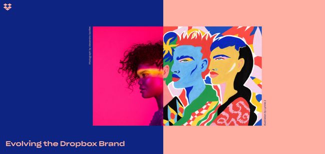
The Dropbox rebrand made strong use vibrant colour

“2017 has been a riot of colour, with graphic designers making big, bold choices,” says Shaun Bowen, creative partner at B&B studio. “Perhaps in an effort to inspire positivity after a difficult year in 2016, we’ve seen an influx of bright colours, often with flat graphics and only one or two colours used at any one time,” he adds.

“More and more brands are also using their core packaging hue as the backing colour in posters and supporting graphics.

Max Ottignon, co-founder at London branding agency Ragged Edge, tells a similar story. “We’ve noticed our clients getting braver,” he says. “Fluoro colours and clashing tones have moved away from edgy startups into the mainstream. eBay’s new identity has colour right at its heart, using it as a way to communicate both its breadth and inclusive personality.”

Mireia Lopez, creative director at DARE, concurs. “We’re seeing the use of vibrant colours in juxtaposition with bold imagery,” she says. “This can be seen as a response to minimalism and material design, from using white spaces and clean layouts to unexpected colour combinations and distinct varied typographical styles – and is across all areas of branding as well as digital.

“The new Dropbox brand direction, for example, is doing this with its creative use of images, and corporate identities such as NatWest are shifting to a fresh and modern feel, using the potential of brighter colours to increase higher conversion rates. In my field, digital, this development is probably due the fact that sites can load faster and screens on phones are bigger, so it’s easier to play with images.”

“Using bright colours helps content stand out from meme-filled social media,” notes Nathan Sandhu, founder and creative director of Jazzbones Creative.

Click HERE to read the remainder of the article

Sourced from

Sourced from ABDUZEEDO

Part of the Daily Design Inspiration series that started it all on Abduzeedo. This is where you’ll find the most interesting things/finds/work curated by one of us to simply inspire your day. Furthermore, it’s an opportunity to feature work from more designers, photographers, and artists in general that we haven’t had the chance to write or feature about in the past.

For this Daily we are selecting in digital art, graphic design, fashion and more. Our goal is to diversify the types of work and in the future we can perhaps categorize them in different sections. For now we are going to stick to the simple format of images and links. I hope you enjoy and share with use via Twitter or our Tumblr.

Until further notice, we’ll display the images and the titles added to them. Because of little issues we had in the past, the images are still linked to their authors, we just won’t mentioned who shared them like we used to.

Daily Design Inspiration

Daily Design Inspiration

Sourced from ABDUZEEDO

By John Brownlee

Paula Scher, Sagi Haviv, Jessica Walsh, and others reveal how they handle their worst clients.

Sometimes, you have to agree to disagree. But what do you do with clients who just fundamentally have terrible taste in design? They’re paying the bills, creating a problem that almost every designer has to face in his or her career at least once: How do you tell your clients that their taste sucks?

We asked five designers at four leading design firms how they deal with the nightmare client who is actively thwarting their ability to do their jobs. Here’s what they had to say.

Stop in the name of the law

“I have said this when a client has asked me to do something visually putrid: ‘I can’t do that, and it will be nearly impossible for me to explain why I can’t do it, and if I show it to you, you may even like it. But pretend that I am a lawyer and you asked me to do something patently illegal that would cause my disbarment and professional shame forever. That is what you are asking me to do.’” — Paula Scher, Pentagram

Photo: Flickr user Brandon Grasley/Illustration: elic via Shutterstock

Shift the focus of the conversation

“‘Your taste sucks.’ Politely translated: ‘It’s not about what one likes or dislikes, it’s about what works.’ Our experience is that the initial feelings and reactions about visual identity designs are meaningless because we are trying to establish something that can endure for many years and have the potential to become iconic. We therefore try to shift the focus and the conversation away from personal taste and subjective preferences (“I like circles; I hate blue”) and toward more strategic considerations: Does the design work? (We also never show a client anything that we can’t live with if selected.)” — Sagi Haviv, Chermayeff & Geismar & Haviv

Educate them

“Ha, I would never tell them their taste sucks! I would simply try to give them my best recommendation, based on explicit connections to the content of a project. [As designers,] our job is to educate clients on why we make the decisions we do, based on precedent, legibility, and/or function. If a client is telling us how to design, they’re probably not a client worth having.” — Jesse Reed, Pentagram

Photo: Stockette/Illustration: Matthew Cole via Shutterstock

Try to reason with them

“Working with clients with bad taste has to be one of the toughest things to do if you are passionate about the work you do.

I try not to get into any arguments because at the end of the day it is their brand not mine.

Try these tactics:

1. Remind them they hired me for a reason and ask to save their money and just do it yourself.

2. Ask them if they want “my professional” opinion that clearly does not match their “non-professional” opinion.

3. Depending on the situation I will try to find examples of how other companies have made a similar mistake they are about to make.

4. Let their actions speak louder than my words by letting them make that mistake and wait for them to hire me to correct it.

5. Simply tell them I disagree and remove myself from the project.” — D’Wayne Edwards, Pensole

Just tell them

“We’re pretty straightforward and real with our clients, if they suggest something that will not work, we just tell them it’s a bad idea.” — Jessica Walsh, Sagmeister and Walsh

By John Brownlee

Sourced from Fast Company

By

The human brain is a formidable machine.

Get yourself doing the same task over-and-over-and-over, and your brain will start shaping itself around that task.

If you’re an interface designer, chances are you’ll build a special eye for type sizes, alignment, color tones. If you’re focused in UX, your brain will likely be stronger in skills like systematic thinking, flow definition, hierarchy, and consistency.

The same applies for spotting errors.

The evolution of thoroughness

As you start your design career, finding mistakes and inconsistencies is a fun little exercise you do every now and then.

It’s exciting.

Each pixel off, you’re able to notice makes you feel more powerful. You feel entitled, sometimes even a little arrogant; after all, you are now able to poke holes in other people’s work. That’s an interesting superpower to have.

A few years in, your brain becomes even better at it — and you finally learn to use that skill for good. To create stronger work. To check yourself before sending out a deliverable to your team. To make sure everything you deliver is flawless, consistent, and thoroughly QA’d.

Fast-forward a decade, and your brain is completely transformed. Finding inconsistencies isn’t a conscious process anymore — it’s second nature.

You see patterns and flaws others don’t see.

You do it invisibly, without noticing or talking about it.

You do it simply because you can’t not do it.

Seeing flaws others don’t see — photo by Bryan Colosky

Embarrassment gets you there faster

Honestly, the only way for you to learn from your mistakes is when someone catches them — either you or someone else. When no one catches an error, it’s like it never existed in the first place. You don’t learn anything from errors that went unnoticed.

Catching an error or inconsistency in your own designs is nerve-wracking. You feel powerless. You rush through to correct it, but the damage is done: you are already starting to question your own abilities as a designer.

Now, having an error caught by someone else is a thousand times worse.

It’s embarrassing; even destructive.

But it’s necessary.

(I’m talking about self-awareness, not someone else trying to actively shame you for a minor design inconsistency. That’s just wrong.)

Embarrassment plays an important role in shaping a bulletproof and inconsistency-free design skillset. The self-consciousness you feel when someone catches your mistakes becomes fuel to doubling your attention next time you are sending work out for other people to review.

The worse you feel, the more effort you’ll put into being more thorough and more attentive to details next time around — to avoid going through that negative feeling again.

The more your pride is hurt, the more your thoroughness builds.

This article was originally published on uxdesign.cc.

By

Sourced from TNW

By Christina Crawley.

Email is as important as ever. While it’s not part of the latest generation of shiny digital marketing tools, it is still very much one of the most effective. Ahead of any social media handle, the email inbox remains the most coveted digital possession, being checked and refreshed at all hours of the day.

From cold business solicitations to newsletter subscriptions, I see many companies and organizations – especially those in the social good sector – that miss conversion opportunities by not following basic email design norms. To ensure that the emails you are sending to your target audience are effective – i.e., they are noticed, opened, read and acted upon – design must take a front seat. No, this isn’t about fancy, shiny templates. It’s about following structural design best practices so that your email grabs people’s attention, even before they’ve opened it.

To improve open rates, click-through rates and, ultimately, increased engagement with your brand, the following items need your attention as you build your email marketing content.

Strong Email Subject Lines

Just as we all sift out the junk and flyers in our paper mailboxes, email subject lines determine in large part whether a message is even worth the time it takes to open. Be compelling, but also be clear. Focus on your value proposition and show your readers what to expect when they open your email – whether that’s a discount toward their next purchase or to learn about your organization’s latest research findings.

Relevant Preview Text

This is probably my biggest pet peeve, mainly because it’s easy to do well but is often overlooked. Preview text is content from within the email that you can see before you have opened it. It appears both on desktop and on mobile and is the next clue (after the subject line) for someone to know whether they should open your email or not. Don’t waste that space with automatic text such as, “This email may include images. To view in your browser, click here.” Jump on the opportunity to take another stab at grabbing their attention and relaying the objective of your ask.

Well-Structured Content

If you’ve gotten as far as getting your email opened, that’s great. It’s now more important than ever to keep your audience’s attention and interest. Avoid long, text-heavy emails that require so much scrolling that people forget what they were hoping to get out of them. As a follow-up from your subject line, clearly state your message, and be as brief as possible. You only have a couple seconds of their time. Long emails with lots and lots of text are not an effective way to communicate your message or inspire your readers to act.

Clear Calls To Action

Once you’ve mastered the art of catching someone’s attention and getting them to take those ten to fifteen seconds to read your email, make that next step as easy and obvious as possible: Use a clear call to action (CTA). Your email should ideally have only one of these. Too many emails try to do it all in one, e.g., wanting someone to register for an event and also read an interesting white paper. Once they’ve clicked out of your email, the chances are very small that they will come back for that second CTA. So focus on one, and make it easy for them to complete with a reasonably sized button. When in doubt, take the Goldilocks approach on the size question: Not too big (you’ll just annoy people), not too small (you don’t want them to miss it), but just right so they see it, understand it and click through.

The above items make up the fundamental pieces of your email. As a next step, A/B testing will help you optimize your approach – from testing the placement of your CTA buttons to the callouts you use to lure your audience in – as will your email analytics. No matter what, make sure you are covering your bases. From there you can then focus on optimizing your content to reach even more people.

By Christina Crawley

Director of marketing at Forum One, leading global marketing and outreach to the world’s most influential nonprofits and foundations.

Sourced from Forbes


By

Consumer outcry surrounding the global overuse of plastics has caused multitudes of FMCG, retail and food companies to rapidly readdresses their packaging strategies. But is the drastic jettisoning of PET plastic really the best route for brands to take?

If David Attenborough is the prophet of the anti-plastic generation, Chris Griffin is the pragmatist. As multinationals from Evian to Adidas scramble to reduce the amount of plastic in their supply chains in response to consumer outcry, the chief executive of the Museum of Brands, Packaging and Advertising is quietly cynical with regards to brands’ efforts.

“From the consumer’s point of view, the plastic debate is so complex that I don’t think they can engage in anything other than the top line soundbite,” he says. “The consumer is going to be fed many lines – like ‘we’re going to make all our new bottles out of sugar cane’ or something. That’s probably not going to happen worldwide on the scale of a global brand.”

The reason, Griffin believes, is because product lifecycles are complicated. Designers spend years understanding the end-to-end process of packaging – from conception to burial in either landfill or recycling plant – and therefore the choice of whether or not to use plastic should not be one made by a PR department.

“Brands have to be very careful not to respond too quickly to media pressure,” he says. “If they say … ‘We’re going to go for all sugar cane-based packaging’, that’s going to be dangerous for them because they won’t be able to deliver it.

“What might work as a comment this year, could get them in trouble next year.”

Yet there’s no doubt the pressure on brands to do something about the amount of plastic they produce is enormous. Last month saw a brigade of passionate, if not militant, protestors launch a ‘plastic attack’ on a Tesco store in Bath (they ripped off wrapping and left it dumped at the tills), ‘reduce plastic waste’ brings up 38m+ results on Google and online vitriol spun towards Whole Foods over selling orange segments in plastic boxes caused the retailer to pull the product almost instantly.

Since David Attenborough urged humanity to halt plastic use in order to save ocean ecosystems in Blue Planet II, the list of brands promising to reduce or jettison plastic from their packaging has extended exponentially. Commercial pressure has given plastic a bad name – but that’s not entirely a good thing, argues Griffin. Plastics, after all, evolved with and as part of the notion of the 20th century brand.

“Plastics do some incredible things: preserving by using the absolute minimal amount of material,” he explains. “The moldability, the formability … you can get shape and character, you can get brand attributes into your packs.”

Griffin’s appreciation for the material is slightly ironic considering his museum has launched an exhibition dedicated to sustainable and, largely, plastic-free packaging. Yet his favourite exhibit is of two cucumbers, one wrapped in plastic and one naked: while the green skin of the cucumber is cited by many anti-packaging activists as natural packaging, it’s the unwrapped fruit that goes mouldy first.

“The energy that goes into food production is phenomenal,” Griffin says. “And if we don’t get it from the field to the plate because it’s wasted [because of a lack of packaging], that’s a huge waste of energy.”

A similar argument was made by The Genuine Coconut Company when it was lambasted for wrapping its coconuts in film; its retort was the packaging helps the milk stay fresh for longer, and plastic is fully recyclable. Additionally, disability campaigners have defended the accessibility of pre-chopped and wrapped vegetables, which have also been much maligned since the Blue Planet II episode aired.

A food industry without plastic may then be unobtainable – or even undesirable, at least for the time being. But as countries such as the UK continue to wait for a comprehensive national recycling system, it’s brands that are leading the charge in researching sustainable solutions. Unilever announced last week (4 April), for example, that it’s collaborating with Dutch startup Ioniqa, which has developed a technology to break down PET plastic to a molecular level.

“That means we can take any type of PET waste, then break it down to remove colour and impurities,” said Sanjeev Das, the conglomerate’s global packaging director, in a statement. “We can then turn it back into pure, clean, transparent PET plastic that’s food-grade ready.”

Coca-Cola has promised to help collect and recycle a bottle or can for every container that it sells by 2030, alongside aiming to manufacture plastic containers with 50% recycled content by the same date. On a smaller scale, rival P&G is working with the recycling company Terracycle to manufacture Head & Shoulders bottles made partially of plastic washed up on beaches and waterways.

Interestingly, Terracycle has found gaining support from big multinationals, such as P&G, to have been easier than garnering it from the NGOs it relies on to collect the beach plastic.

“P&G wanted to do something sustainable, something to make a difference,” explains Stephen Clarke, head of communications at Terracycle Europe. “And although there’s quite a lot of work to get buy in from various departments from within a company, our biggest problem was actually getting the NGOs to buy into it. It’s getting them to do something different.”

While the FMCG multinationals (which have budget and scale on their side) lead on recycling innovation, Griffin sees potential in the luxury sector when it comes to the development of sustainable plastic alternatives.

“As a designer, some sustainable materials are just fabulous to work with,” he says. “Corrugated cardboard looks beautiful, materials come from crustaceans have fabulous textures and some [materials] that come from various plant materials are wonderful to work with and wonderful to design with. But they’re not on the scale that will be economical for volume. So I think luxury’s a whole new area where sustainable thinking is necessary.”

The potential for luxury, sustainable packaging to double as a proof point for the wider industry is a sentiment shared by a number of design houses.

“As with any aspirational market, the luxury packaging sector is a platform for materials and innovations to be revealed and translated into other areas,” says Toby Wilson, chief operating officer at MW Luxury Packaging. “Naturally, the more a new technology, technique or material is used, the more accessible it becomes.”

However Wilson is cognisant that the luxury sector has, thus far, been immune to the pressures of sustainable packaging due to the assumed long lifespan of its products. A consumer is more likely to keep and reuse a beautiful Fortnum & Mason chocolate box, for instance, than a Milk Tray.

“But this is changing,” he says. “Quality and brand aspiration is critical and therefore innovation in high quality and high-performance materials is essential. Materials that perform and present need to be developed to maintain the luxury credibility that a brand demands.

“This will come through innovation and material development.”

The current trend for minimalism (little to no branding on packaging) in the luxury sector has also meant for easier experimentation with avant-garde, sustainable materials, says Victoria Walmsley, media developer at Progress Packaging. The agency has been working with recycled cottons, canvas and hessian, as well as corrugated board and recycled boards.

“There is definitely a strong wave of encouragement [for more sustainable materials] that comes from designers, manufacturers, and the consumers, too,” she says. “We do see more enquiries asking us how they can make things pretty but also reusable. I think reusability once a product has been opened is the key requirement. The market doesn’t just want to provide bags and boxes that will get used once and then thrown away anymore.”

Yet environmental charities, quite understandably, aren’t ready to rest the future of the world’s oceans on the luxury sector’s ability to innovate alternatives to plastic. For Julian Kirby, lead plastic-free campaigner at Friends of the Earth, the onus is on a number of actors to make change.

“Currently the companies that make and market packaging only contribute about 10% of the costs of collecting and processing it, meaning the remaining 90% is borne by tax payers through cash-strapped local authorities,” he says. “A mix of sectors working together could rapidly provide answers we need to the plastic pollution crisis, with big companies having the power to make alternatives to plastic the mainstream choice.

“However, for this change to come about on a mass corporate scale we need central government action.”

By

Sourced from THE DRUM

By

Coca-Cola’s latest experiment in opening short design briefs to the entire world illustrates its plans to no longer be seen as “a traditional advertiser” by appointing consumers – not agencies – as its co-creators.

The drinks giant’s head of digital, David Godsman, admitted at the Adobe Summit opening keynote that the digitally connected world is “somewhat unknown” to the brand. Nevertheless, 12 months ago it embarked on a five-year digital transformation programme, underscored by four key areas: operations, business, culture and experiences.

Surprisingly, Coca-Cola has filed its marketing and advertising operations into the latter category. Not only is Godsman asking his “traditional brand marketers to become experience makers”, but he’s earmarked the fans of Coca-Cola as vital to its content creation strategy.

“Digital allows us to create unifying experiences which – regardless of language or place in the world – helps to bring them together,” he said. “Digital enables them to participate actively with us and co-create the experiences we bring to market

“We don’t see a world where we will continue as a traditional advertiser in that sense.”

James Sommerville, Coca-Cola’s vice president of global design, introduced one of the first forays into this strategy of consumers-as-creators. Coke x Adobe x You, which quietly launched last October on social media, comprised a succinct brief open to the entire internet, which read: ‘Create a work of art celebrating Coca-Cola, sport, movement, strength, and unity using Adobe Creative Cloud tools’.

“We thought: ‘What would happen if you just gave the world’s designers three or four simple tools and a short brief – so short that you could tweet it?’,” explained Sommerville.

So far, the project has thrown up around 1,500 submissions, from trippy, fun animations to meticulous hand-drawn illustrations. All the designers were commissioned to feature the red Coca-Cola circle, while Adobe and Coca-Cola kept the Tokyo Olympics 2020 under wraps.

“If you scan these pages you’ll see the enthusiasm to work on our products and our brand,” said Sommerville, adding that the project “really is the start of our journey”.

The brand is arguably in need of a revived creative strategy. Diet Coke’s latest offerings have failed to capture the mass imagination that 1995’s ‘Diet Coke Break’ managed to, for instance, while ‘Because I Can’ was pretty much panned creatively.

It’s unlikely that Coca-Cola will eschew working with creative agencies for consumer creations altogether. Sommerville stressed that “we love our agencies partners, we need our agency partners”, but he also loves to “discover the hidden gems”. By that he means freelance artists such as Noma Bar, the graphic designers going viral, or “some guy working in Starbucks right now on a laptop”.

But when conglomerate does come looking for agencies in the future, it may start knocking on other doors. Sommerville’s design lab is currently experimenting with prototypes such as a fountain that dispenses mobile data in lieu of soft drinks – the kind of project that will certainly require the expertise of creative technologists, but perhaps not those of traditional creatives.

“I really want to invite the creative community to reimagine the whole experience,” said the Atlanta-based, Huddersfield-born designer. “Everyone in this room, everyone on this planet, has the right to work with Coca-Cola.”

How does he plan on keeping those divergent, global ideas tied to a common brand idea? By looking back on the vast history of Coca-Cola.

“We have a little phrase called Kiss the Past Hello,” he explained. “A lot of people talk about failing fast – for us this is the Coca-Cola way of saying a very similar thing. Our past is so important to us. It educates us. The good, the bad, what worked, what didn’t.

“Those stories are the same, but the context has changed. We are about technology, we are about transformation and we are about talent. But ultimately for us the experience starts at the product – it’s the texture, it’s the touch of the glass, it’s the temperature.”

By

Sourced from THEDRUM

Here’s why you need to get your advertising to zoom in.

By MediaStreet Staff Writers

The relationship between desire and attention was long thought to only work in one direction: When a person desires something, they focus their attention on it.

Now, new research reveals this relationship works the other way, too. Increasing a person’s focus on a desirable object makes them want the object even more – a finding with important implications for marketers seeking to influence behaviour.

The study, published in the journal Motivation and Emotion, is the first to demonstrate a two-way relationship.

“People will block out distraction and narrow their attention on something they want,” said Anne Kotynski, author of the study. “Now we know this works in the opposite direction, too.”

In marketing, advertisements with a hyper focus on a product’s desirable aspect – say zooming in on the texture of icing and frosting – might help sell a certain brand of cake.

Findings suggest the ad could be targeted to people who have shown an interest in a similar product, such as running the cake commercial during a baking show.

This finding also works in other areas outside advertising too. For example, doctors could potentially help their patients develop a stronger focus on healthy activities that they may desire but otherwise resist, such as exercising or eating a balanced diet.

The study’s findings also add a wrinkle to knowledge of focus and emotion. According to a spate of previous research, positive emotions, such as happiness and joy, widen a person’s attention span, while negative emotions such as disgust and fear, do the opposite: narrowing a person’s focus.

“We conceptualise fear as drastically different from desire,” Kotynski said. “But our findings contribute to growing evidence that these different emotions have something key in common: They both narrow our focus in similar ways.”

The findings also fit the notion that both of these emotions – fear (negative) and desire (positive) – are associated with evolutionarily pursuits that narrowed our ancestors’ attentions.

For example, fear of predators motivated attention focused on an escape route, while an urge to mate motivated focus on a sexual partner.

“If a person has a strong desire, research says this positive emotion would make them have a wide attention span,” Kotynski said. “Our research shows we developed a more beneficial behaviour around desire: focusing our mental energy on the important object, much like fear would.”

The study

Study participants were shown images of desserts mixed in with mundane items. They were instructed to pull a joystick toward them if the image was tilted one direction and push the stick away if it was tilted the opposite direction. Researchers recorded the reaction time of each.

Participants who responded fastest to pull the images of desserts were those whose attention had been narrowed. Responses were much slower to the mundane, and for participants whose attention was broad, suggesting narrowed attention increases desire for desserts but not for everyday objects.

The study used dessert pictures to measure reaction time because such images have been shown to increase desire across individuals, most likely due to a motivation to seek high fat, high calorie foods that is rooted in evolution.

There you go people. If people love cars and you can get them to focus on the car you are hawking, you’ll have a better chance of converting that to a sale. May the ROI forever be in your favour.


Do you supply services to the Irish Media Industry? Have you listed your company in our Media Directory? It’s free! Everyone’s favourite price! Click here to do it now.