By Dirk Petzold
Are you wondering what the top graphic design trends will be in 2023? We tell you!
The graphic design industry is ever-changing and keeping up with the latest trends can be tough. But, if you want to stay ahead of the curve, it’s important to know what’s popular in the design world. That’s why we’ve put together a list of the top 20 graphic design trends that we think will be big in 2023. From neon colours to vintage graphics, there’s something for everyone on this list!
So, without further ado, here are the top 20 graphic design trends for 2023:
1. Neon Colours
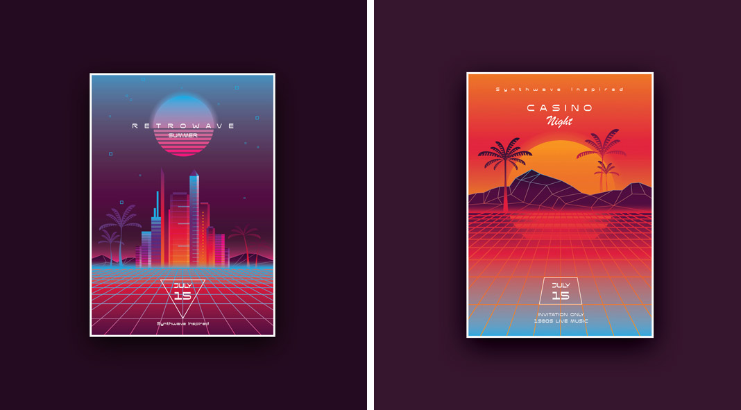
Neon colours are making a comeback in a big way and they’re perfect for graphic design. They’re bright and eye-catching, and add a touch of fun to any design. Neon colors are perfect for logos, flyers, posters, and other marketing materials. That’s right – those garish, eye-catching shades that were once reserved for birthday parties and bowling alleys are now being used in everything from corporate designs to magazine covers. So what sparked this neon revival? Some say it’s a reaction to the muted tones of the digital age, while others believe that designers are simply looking for new ways to stand out in a saturated market. Whatever the reason, there’s no denying that neon is one of the hottest trends in graphic design right now.
So if you’re looking to add a little pizzazz to your next project, don’t be afraid to reach for the neon crayons. Just don’t be surprised if your clients ask you to tone it down a bit.
2. Minimalist Design
Minimalist design is all about simplicity and clean lines. This trend has been popular for a few years now and it shows no signs of slowing down. It’s simple, clean, and modern, making it a great choice for branding, marketing materials, packaging, and web designs. If you want to create a modern and stylish graphic, opt for a minimalist design.
3. Bold Typography
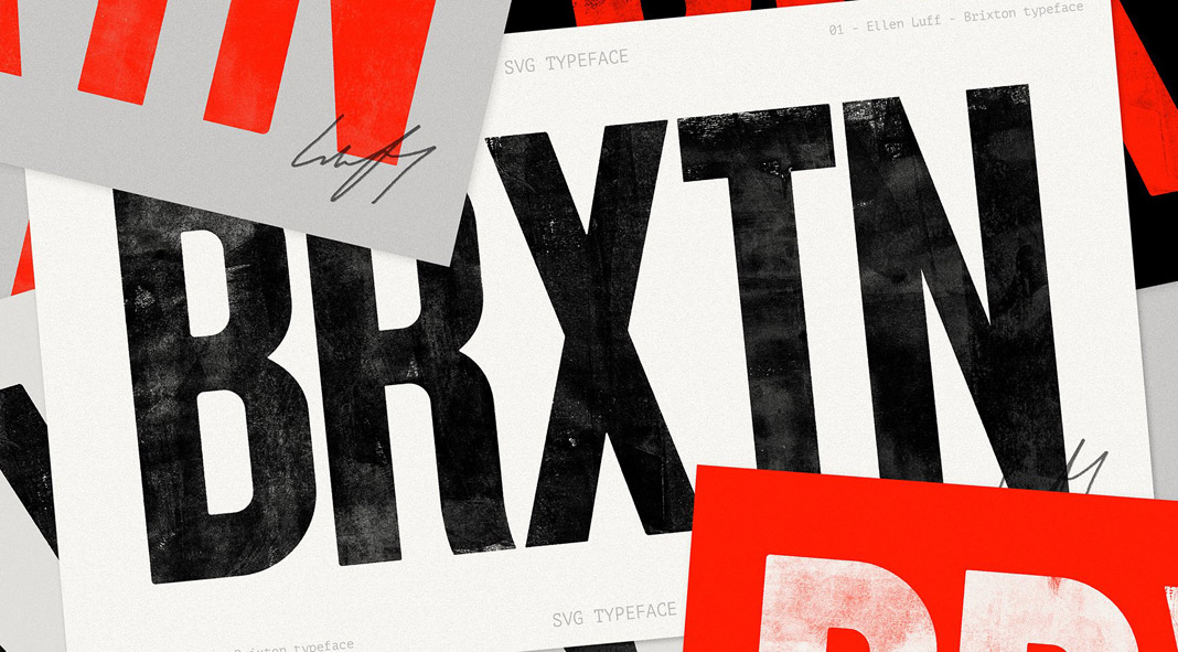
Bold typography is another great way to make your graphic design stand out. Use large, eye-catching fonts to grab attention and add impact to your design. Just be sure not to use too many different font styles in one graphic, as this can look cluttered and confusing. From street signs to movie posters, this style of lettering is everywhere you look.
4. Vintage Graphics
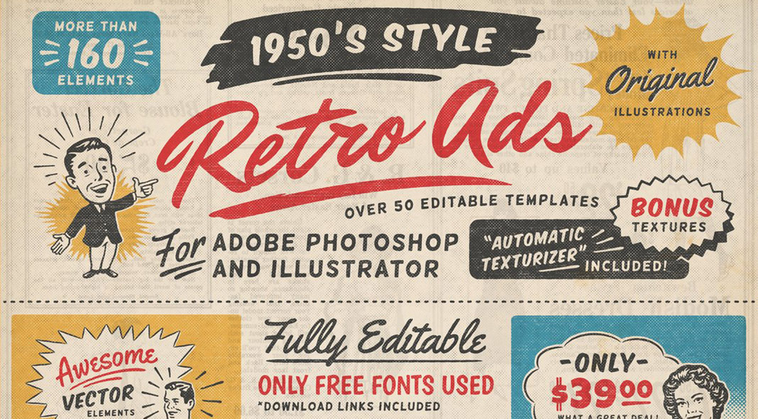
Vintage graphics are making a big comeback in the design world. If you’re looking for a graphic that has a retro feel, consider using vintage graphics. By pairing vintage illustrations with modern fonts and layouts, designers are able to create stunning visual effects that are both nostalgic and contemporary. This trend is also evident in the resurgence of vintage-inspired logos and brand identity designs. As more businesses seek to create a unique and memorable brand identity, vintage graphics are becoming an increasingly popular design element. With their ability to evoke a sense of history and nostalgia, vintage graphics are sure to remain a popular trend in the world of graphic design. You can find some great vintage graphics online or hire a graphic designer to create something custom for you.
5. Geometric Shapes
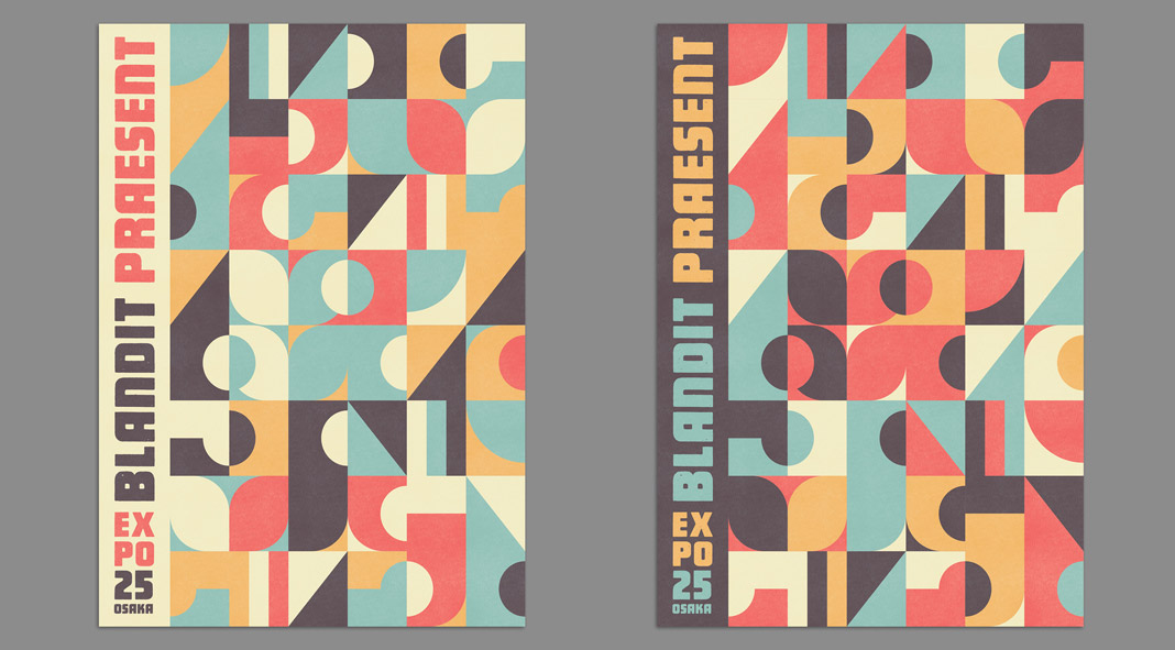
Geometric shapes are simple, yet effective, and they can add interest to any graphic design. Use basic shapes like circles, squares, and triangles to create patterns, or use more complex shapes to add depth and dimension. In recent years, we have seen a resurgence of geometric shapes in both web and print design, and it shows no signs of slowing down. While some geometric shapes are more playful, others can be used to create a more serious or sophisticated look. No matter what your style, there is a geometric shape that will suit your needs. So go ahead and embrace the trend!
6. Hand-Drawn Elements
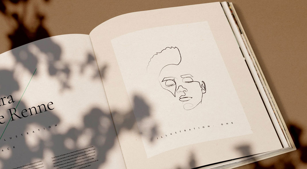
Natural hand-drawn elements add a personal touch to any graphic design. Whether you use simple sketches or more complex illustrations, hand-drawn elements can add a unique touch that sets your graphic apart from the rest. If you’re looking for a way to add hand-drawn elements to your graphic, there are many resources online that you can use. You can find free clip art and illustrations, or hire a graphic designer to create something custom for you. Just be sure to keep the overall look of your graphic consistent with the overall style of your design.
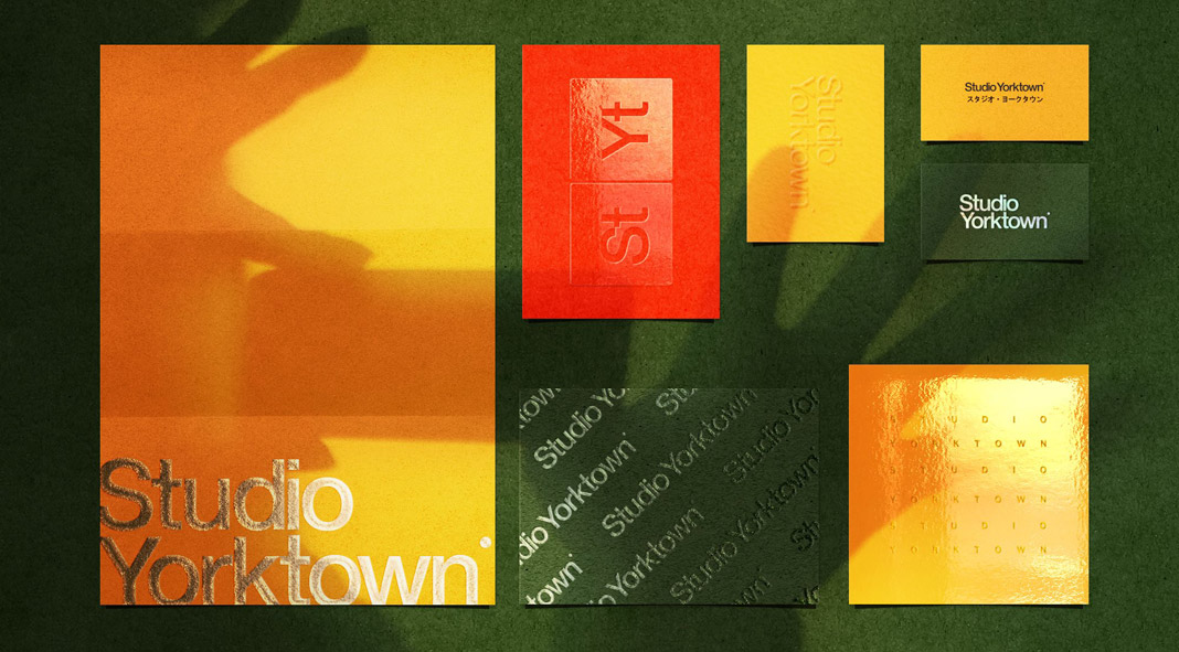
7. Duotone Colors
Unlike traditional color schemes, which use three or more colors, duotone schemes rely on just two tones. This minimal approach can create a sleek and sophisticated look, perfect for brands that want to convey a sense of sophistication and style. This trend adds a bit of interest to any design without using too many colors.
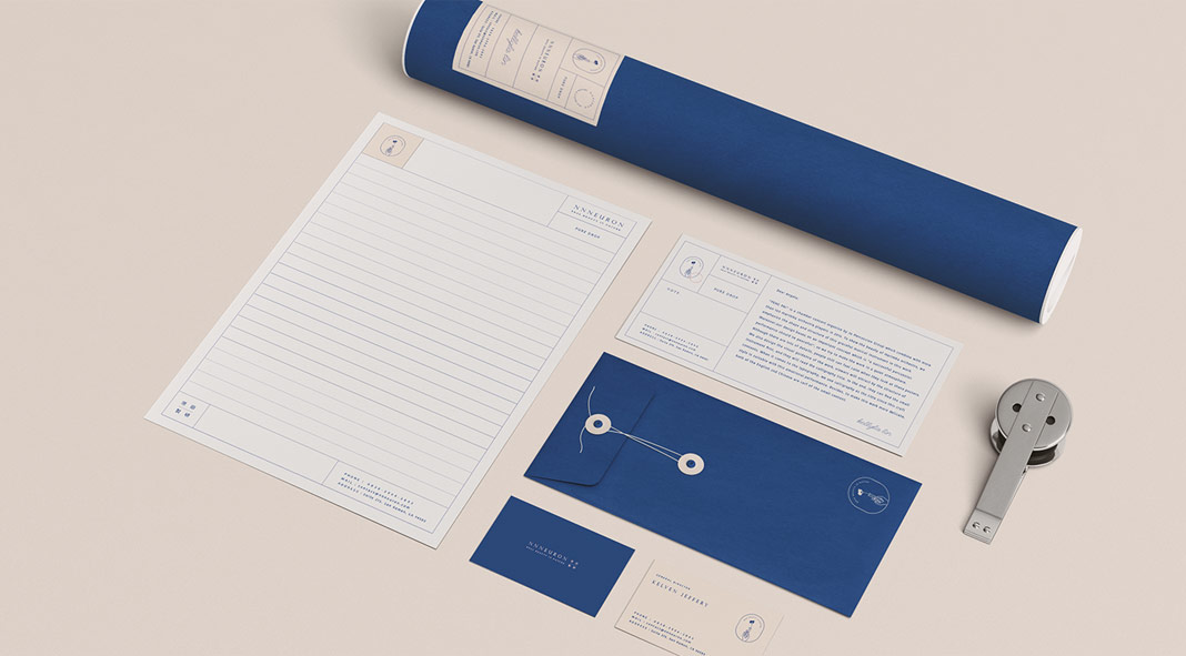
8. Metallic Colors
Metallic colors are shiny and eye-catching, making them perfect for graphic design. Use metallic colors to add a touch of luxury to your graphic or to make it pop against a plain background. From shimmering gold to rich bronze, these colors add a sophisticated style to any design.
9. Negative Space
So what is negative space in graphic design? It is the empty space around and between the subjects in a graphic. This trend is all about using negative space creatively to add interest and impact to your design. It’s a minimalistic approach that has been gaining popularity in recent years, as more and more designers strive to create clean and sophisticated designs.
10. Animated Graphics
Using animated graphics is a great way to add movement and interest to your graphic design. Everywhere you look, from advertisements to websites to social media posts, businesses are using animation to capture attention and stand out from the competition. And it’s not just small businesses; even major brands are using animated graphics to communicate their messages. While some may dismiss animated graphics as a passing fad, there’s no denying that they are an effective way to engage audiences and deliver information in a memorable way. You can hire a graphic designer to create a custom animation for you or use free resources online to create simple animations.
11. Infographics
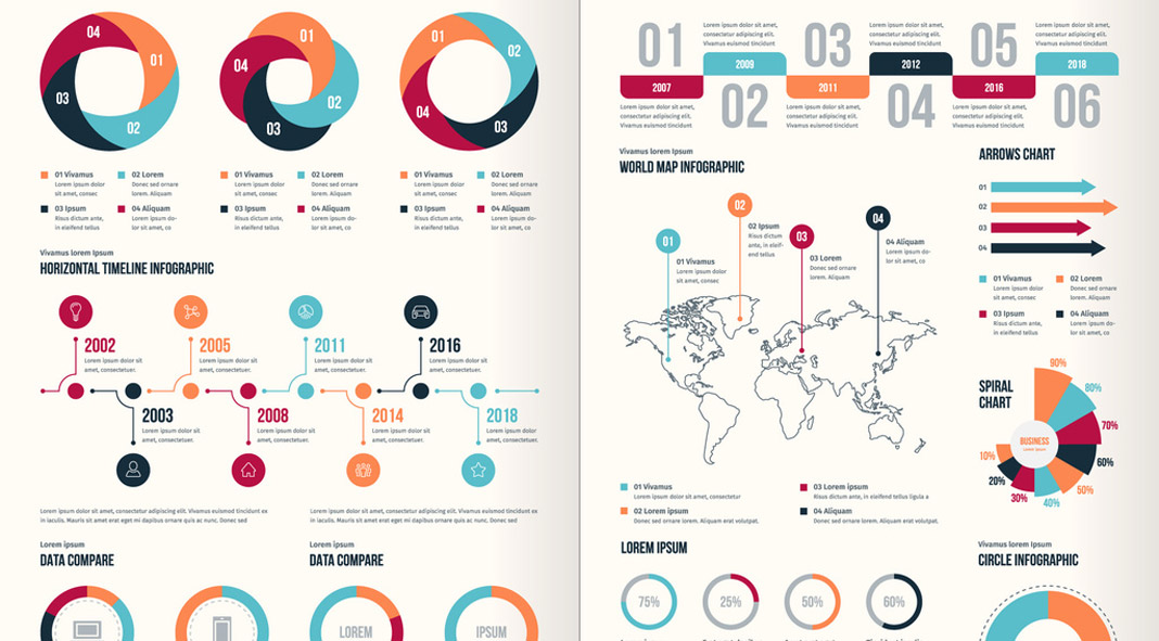
Infographics are a great way to present information in a visually appealing way. As a society, we are constantly inundated with information. In the age of the internet, we have access to more data than ever before, and it can be overwhelming to sift through everything and find what we’re looking for. This is where infographics come in. An infographic is a visual representation of data or information, and they have become increasingly popular in recent years as a way to quickly and easily communicate complex ideas. For graphic designers, infographics offer a unique challenge, as they must distill a lot of information into a single, visually-appealing image. As infographics continue to grow in popularity, we can expect to see more designers experimenting with this trend.
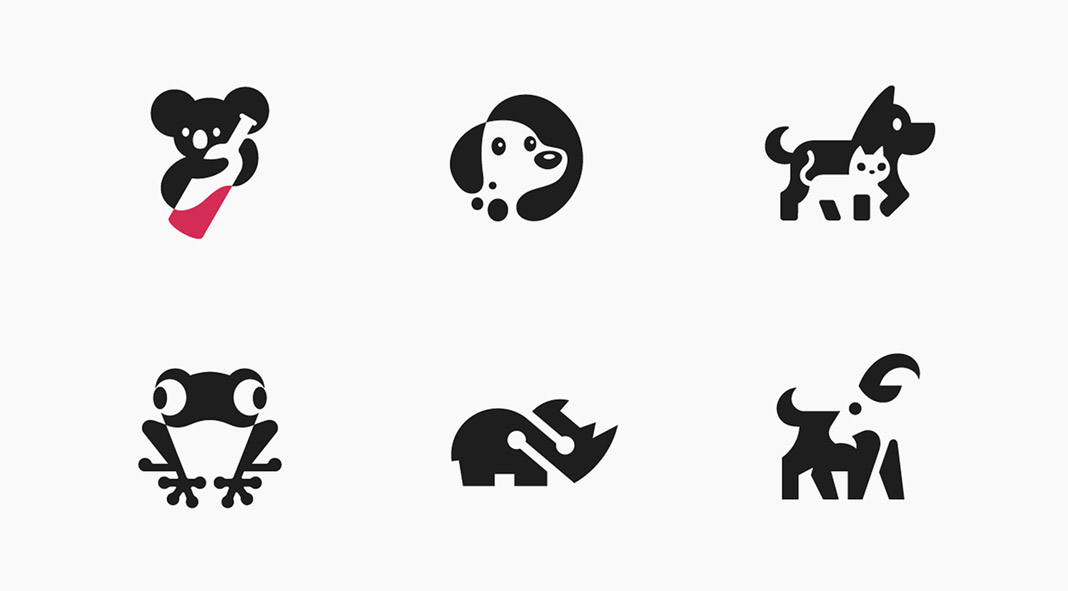
12. Icons
Nothing new but icons are simple, yet effective, graphic elements that can be used to represent different concepts or ideas. You’re probably thinking, “Icons are so overdone. Everyone is using them.” But that’s exactly why they’re such a popular graphic design trend right now. Icons are eye-catching and easy to understand, making them perfect for grabbing attention in a crowded marketplace. And because they’re so versatile, they can be used in a variety of ways to communicate your brand’s unique identity. So if you’re looking for a way to make your mark, consider using icons in your next design project.
13. Photo Manipulation
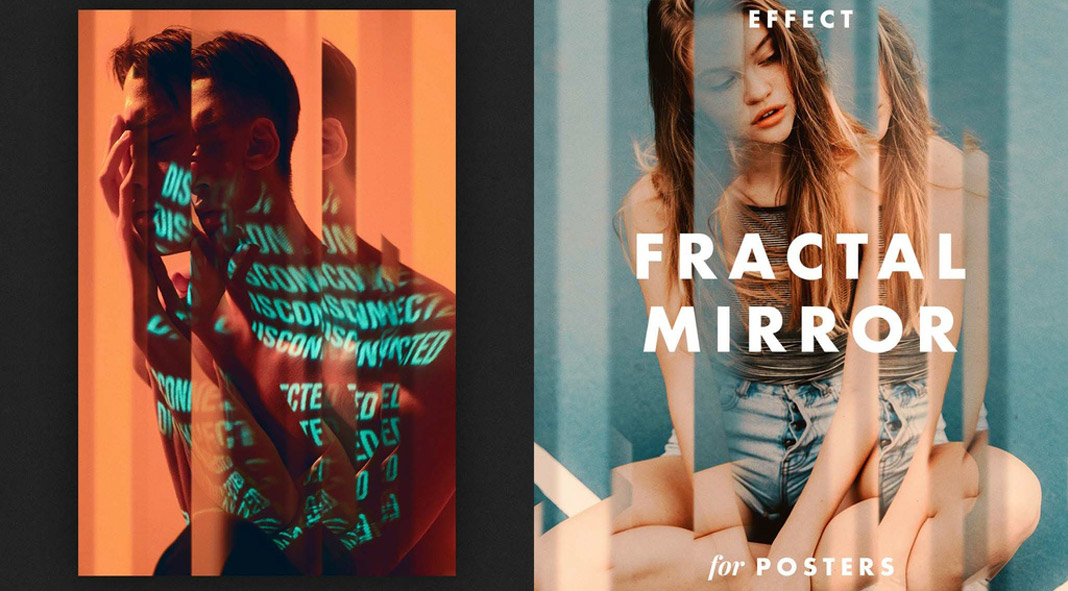
The creative task of photo manipulation is the process of manipulating images to create a desired effect. This graphic design trend is perfect for those who want to add a bit of creativity to their work. There are many different techniques that can be used in photo manipulation, so it’s a great way to experiment with your graphic design.
14. Vector Graphics
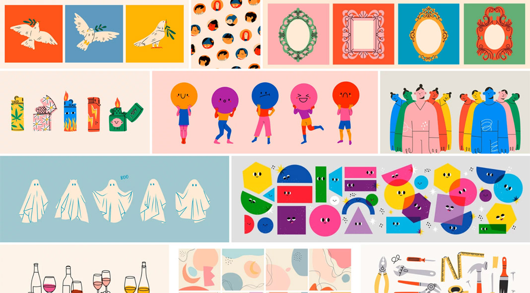
Vector graphics are computer graphics that are created using mathematical objects called vectors. They can be transformed to any size without loss of quality. Sure, vector graphics are nothing new in the design world but the clean and modern style is currently very popular and can be found across any type of media ranging from print to the web.
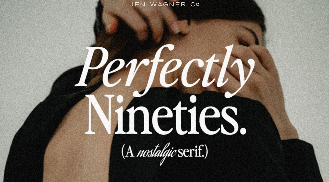
15. 90s-Inspired Design
90s design was all about big bold statements. From chunky die-cut shapes to DayGlo colors, 90s designers had a knack for making an impact. And while some 90s trends have since fallen by the wayside, others are currently making a comeback. So what makes 90s design so special? Part of it has to do with the fact that 90s designers weren’t afraid to experiment. They pushed boundaries and challenged convention, creating a style that was both eye-catching and forward-thinking. But 90s design also has a certain sense of nostalgia about it. Whether you love it or hate it, there’s no denying that 90s design is here to stay.
16. Grain and Noise Textures
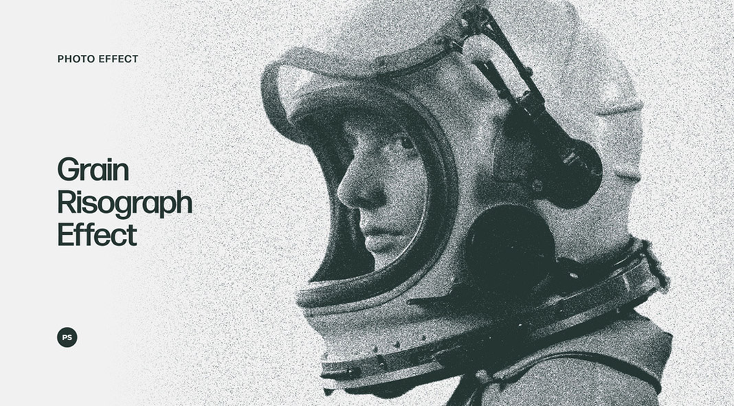
One of the latest trends in graphic design is the use of grain and noise textures. These textures can add a sense of depth and realism to your design, and they can also be used to create a vintage or distressed look. Grain and noise textures are often used in conjunction with other effects, such as halftone dots or overlays. When used correctly, they can help to create a cohesive and visually arresting design. However, like all trends, grain and noise textures should be used sparingly, as too much of either can quickly become overwhelming. So if you’re looking to add a little grain or noise to your next project, be sure to use it judiciously.
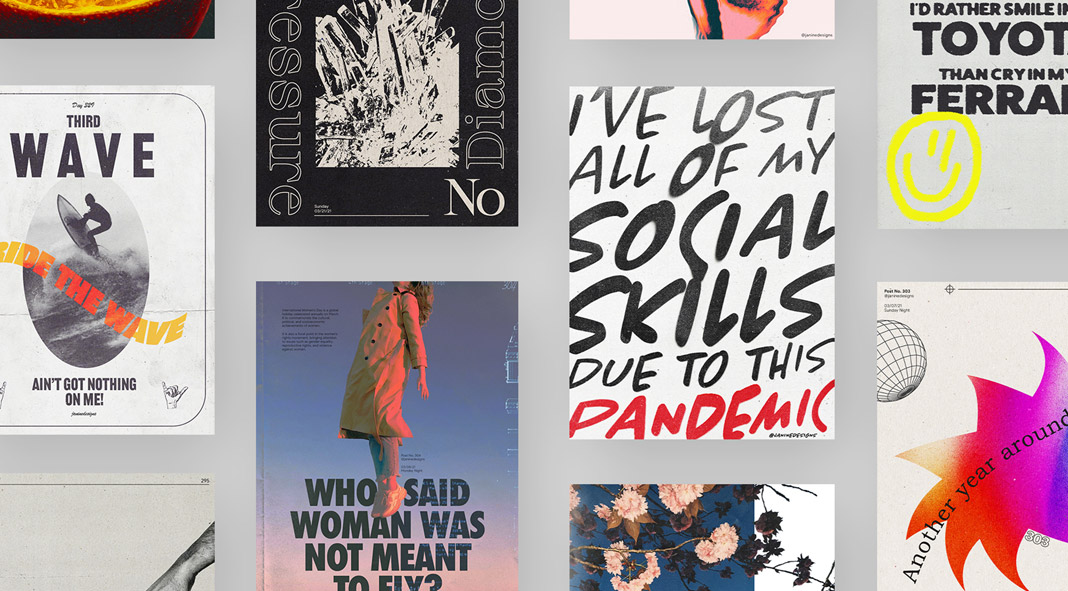
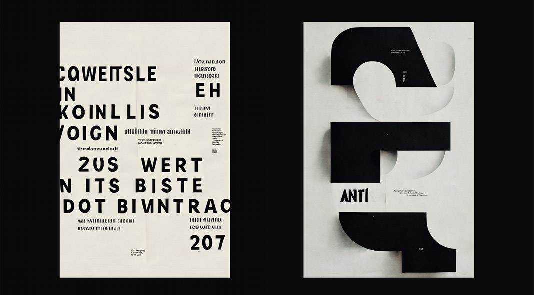
17. Experimental Typography
In the world of graphic design, experimental typography is having a moment. This trend involves pushing the boundaries of typefaces to create unique, eye-catching designs. While experimental typography has been around for decades, it has recently gained popularity thanks to the rise of digital design tools and social media. As a result, experimental typography is now being used by everyone from major brands to small businesses. And while not everyone is a fan of this trend, there’s no denying that experimental typography can be incredibly effective when used correctly. So if you’re looking to add a touch of personality to your next project, don’t be afraid to experiment with your typography.
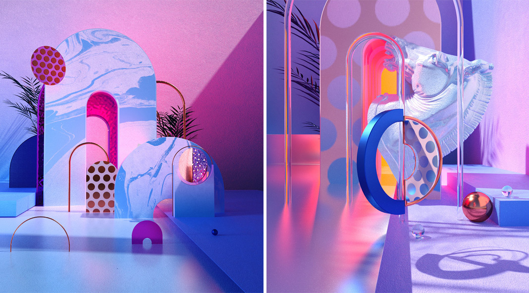
18. Computer-Generated Graphics
It’s no secret that computer-generated graphics are becoming increasingly popular. Once relegated to the world of science fiction movies and video games, computer-generated graphics are now being used in everything from advertisements to product packaging. And it’s easy to see why. With their ability to create realistic images and text effects, computer-generated graphics offer designers a lot of flexibility. Plus, thanks to advances in technology, computer-generated graphics are becoming more and more realistic all the time. As a result, we’re likely to see even more computer-generated designs in the coming years.
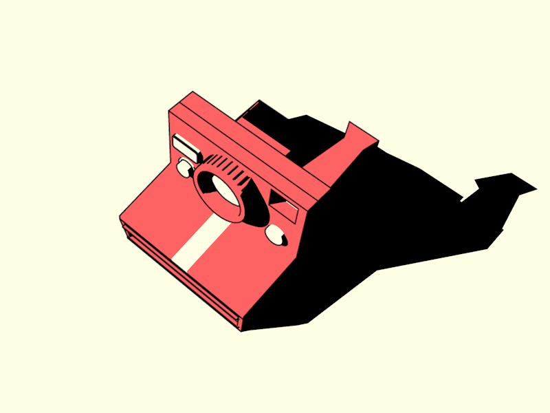
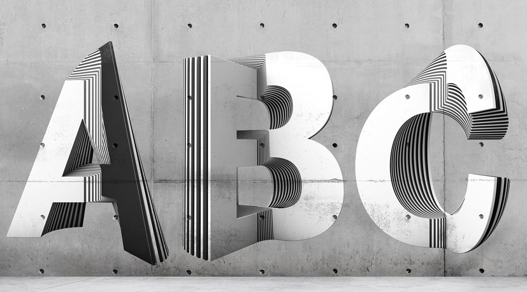
19. 3D Elements
3D elements are nothing new. In fact, they’ve been around for centuries in the form of sculptures and other art forms. However, 3D design is now starting to make its way into the world of graphic design, and it’s definitely making a splash. Thanks to advances in technology, rendered 3D elements can now be created with ease, and they offer a unique way to add depth and interest to any project. From logos to illustrations, 3D elements are becoming increasingly popular, and it’s easy to see why. If you’re looking to add a touch of dimension to your next project, don’t be afraid to experiment with 3D design.
20. Serif Fonts
These days, serif fonts are all the rage in the world of graphic design. And it’s no wonder why! These traditional fonts convey a sense of sophistication and elegance, making them perfect for luxury brands or high-end businesses. But you can also use serif fonts to add a touch of stylishness to more down-to-earth designs. So whatever your project may be, don’t be afraid to add a little serif flair. After all, that’s what all the cool kids are doing these days.