One inevitability of Pride month is what’s (un)affectionately known as Corporate Pride – which, as the name suggests, involves all manner of brands paying lip service to the cause with rainbow logos and the like. One of the slightly more creative efforts this year came from Coca-Cola – but it appears to have backfired spectacularly.
The company’s new custom bottle creator lets users personalise a rainbow-coloured Coca-Cola bottle sticker by entering a word, name or phrase of their choice. But the list of banned phrases, as well as some that are allowed, has proven somewhat questionable. (Check out our best print ads for some bold advertising that actually works.)
If the user attempts to create a bottle with one of Coca-Cola’s prohibited words or phrases, they’ll receive the message: “Oops! Looks like the name you requested is not an approved one. Names may not be approved if they’re potentially offensive to other people, trademarked, or celebrity names. We’ve worked hard to get this list right, but sometimes we mess up. If you think this is an error, please contact our Customer Care team. Otherwise, please try again, keep it fun and in the spirit of sharing!”
And, naturally, users have been testing the limits of what Coca-Cola considers “fun and in the spirit of sharing”. In one of many eyebrow-raising examples, ‘White Lives Matter’ = fine, whereas ‘Black Lives Matter’ = not fine.
“We’re continuously refining and improving our Share A Coke personalisation tool to ensure it is used only for its intended purpose,” a Coca-Cola spokesperson told CNN Business. “Actual bottles are not made with words that are inconsistent with the program’s intent. We have clarified in the tool’s preview mode that proposed language may require further review.”
While we appreciate the company’s desire to filter out offensive phrases, one can’t help but wonder whether Coca-Cola’s half-hearted censorship mechanism is actually better than no mechanism at all. Like McDonald’s tasteless coronavirus-themed logo, Coke has ended up, no matter how well-intentioned, with a bonafide marketing fail on its hands. Still, at least it’s in good company this year – who can forget Burger King’s abysmal attempt at humour on International Women’s Day a few months back?
If you’re anything like me, you’re probably sick and tired of all of the gurus telling you how easy it is to make extra income from a side hustle. This isn’t because those side hustles don’t work, but they don’t always provide the same successful outcome for everyone who tries them — especially introverts.
Since introverts are known to be reserved, quiet and thoughtful, the opportunity to earn some spare cash from side hustles remotely are perfect for them. Remote side hustles also provide introverts with the opportunity to make money on their own time without worry of a daily commute.
1. Freelance writing
Spending a few years freelancing to bulk up your writing portfolio of both clients and content can lead to a well-paying and flexible career.
Along with copywriting, blog writing and ghost-writing, finding a niche as a freelance writer for more technical pieces will allow you to charge clients more due to the dedication and focus they require. Sites like USA Wire will actually pay you to contribute content.
2. Graphic design
Many introverts who start dabbling in design — even if they haven’t designed before — find they have a talent for it.
Tools like Canva can help you design infographics, email templates, fonts and more. Before getting started in graphic design, consider:
What kind of services you want to offer
Your target customer market(s) and pricing
Which software(s) you will use
3. Web design
Every brand in today’s world needs a website. Though building websites as a freelancer today is more challenging due to market saturation, it remains a strong side hustle option from the flexibility, creativity and control it provides.
Introverted web designers can set themselves apart from other web designers by becoming more talented in niche areas of web design, such as:
SEO optimization
Content strategy and creation
Copywriting
Social media management
Establishing pay-per-click advertising campaigns
4. Video editing
Video editing provides introverts with the freedom to create their own schedule and negotiate pricing with clients. Tools like Magisto and Splice make the video editing process much easier than in years past, too.
Here are just a handful of markets to give you some ideas on which to target for a video editing side hustle:
Conference videos
Explainer/educational videos
Marketing/promotional videos
Recorded presentations
Recorded speaking events
5. Audio engineering
If introverts have the essential tools at their disposal, they can quickly start offering audio engineering services like mixing, producing and tracking. Here are some things you need to do:
Audio engineers also offer their produced soundtracks to other industries such as podcasters or stock audio platforms, and even earn money by streaming their music online through apps like Spotify or YouTube.
6. Social media management
Social media can be a very lucrative side hustle for introverts. The trick to making real money from managing social media as a side hustle lies in the power of networking.
As a social media manager, your time will mostly be spent managing clients’ websites and social media accounts, approving comments and reviews and ensuring web pages are published on time.
Having a virtual assistant job as a side hustle entails routinely interfacing with only one other person. It can typically be done entirely remotely, too, making it more appealing to introverts.
Virtual assistants can expect to make between $10-20 per hour (depending on your employer) for a number of tasks like:
Reading/writing/responding to emails
Scheduling appointments
Managing calendars
Posting content on websites/social media
8. Taking surveys
There are plenty of legitimate ways to get paid by answering surveys, as many companies outsource survey agencies to gain insight on consumer behaviour. Most pay between $0.50-2.00 per survey, and each one shouldn’t take more than 5-15 minutes to complete.
9. Book reviews
Reading is a common hobby for many introverts, so why not get paid to read and review some books?
Some of the best sites to use to get paid for your reviews (and even get some free books) include:
If you already have an existing blog, you can also make money by writing sponsored posts or book reviews. If you have enough clients as a freelancer, you could also earn money as a freelance book reviewer.
10. Read emails
For introverts who shy away from the conversation, getting paid to read emails can end up being a dream side hustle.
Thankfully, there are now a ton of different sites you can sign up for that pay you to read other peoples’ emails, including the following sites:
Blogging is a great way to make money that requires minimal interaction with others. Monetizing your blog may take a few months to see its potential, but the ability to create a winning blog you can monetize lies in:
Creating quality content
Producing content that can be consistently consumed and shared
Partnering with advertisers to sell digital ad space on your blog
If you stick to this process, your blog can make money off the content you want to write.
12. Affiliate marketing
If you already have a strong following on Instagram, you can promote a brand’s latest product or service. Each sale you facilitate earns you a portion of the sale.
The potential income you can make through affiliate marketing is virtually unlimited, depending on the size of your target audience and their buying trends as consumers.
13. House sitting
If you’re looking to make money each month with almost no work or social interaction, becoming a professional house sitter may be your best bet.
As a house sitter, your mission is simple: stay at the client’s residence and occupy it in their absence.
House sitting is a common need for homeowners who routinely leave town or travel. If a client’s pet needs care, you can charge even more per day or week, depending on the client.
14. Podcasting
Starting a podcast as an introvert can prove to be a very lucrative side hustle depending on the topic(s) of audio content you produce, as well as the quality and consistency of that content.
Many podcasts are recorded solo, meaning introverts don’t need to worry about outreach to potential interviewees. Instead, spend that time to learn about how you can best market your podcast, and to who.
15. Transcription
If you’re an introvert with crazy-awesome typing skills, look into online transcriptions as a side hustle.
Transcriptionists convert audible conversations or content into typed documents. Today, everything from YouTube videos to legal proceedings requires transcription.
Transcriptionist work can pay very well for those with a knack for it, and most employer’s transcription guidelines tend to follow the most basic transcription training courses, which you can easily find available for free online.
16. Dog walking
Let’s be real: As an introvert, there are times when you will simply grow tired of dealing with other people. As a dog walker, the most interaction you’ll have with other people is through the dog’s owner.
Getting started as a dog walker is made even easier with apps like Rover or Wag. Depending on where/when/who you walk for, you can make between $15-30 for less than an hour of time that you spend walking!
17. Food delivery
Since the Covid-19 pandemic began, food delivery sales have been at an all-time high. For introverts with reliable transportation, this presents a great side hustle opportunity.
Becoming a designated driver for apps like DoorDash or Instacart offers ways to make extra money, including tips. Since the bulk of the work is driving, introverts may find this an appealing way to earn $10-15+ per hour, depending on where they live and the number of deliveries completed each day.
18. Day trading
The recent rise in cryptocurrencies such as Bitcoin and Dogecoin has seen millions become more aware of the earnings day trading can bring. However, trading on the stock, futures or foreign exchange market is where most day traders make their money.
According to one trading expert, the best trading times are when markets officially open and close (around 9:30am and 4:00pm) each day. Because the first hour of each day tends to be when trade prices are most volatile, trading at these times provides the best potential for profits.
Remember: you never lose money off of stocks you don’t sell, you only lose money when you sell (rather than buy) during the dip.
It’s that time of year again. With the end of 2020 mercifully in sight, design forecasters have begun making their predictions for what the world of graphic design might look like in the year to come. And judging by the latest infographic, there could be some surprises in store for 2021.
Packed with ideas and inspiration for graphic designers, the infographic by design agency 99designs reveals 11 trends for 2021, along with a handy explanation of each. And the one thing that ties them all together is the theme of “putting people first”. (Take a look at our best infographics for more inspiring examples).
2021: the year of geese in suits (Image credit: 99designs)
According to 99designs, 2021 will be all about people and characters. From authentic representation, ensuring that stereotypes are ditched in favour of diversity, to irreverent characters such as “anthropomorphic sushi” (fair enough), apparently we can expect to see lots of personality in design next year.
A few older styles will also be making a reappearance, the company says. ‘Symbol revival’ will see modernised versions of classic icons from empowering Goddesses to stars and stoic lions make a comeback, while the fun world of pop art is set to be resurrected. Expect grainy colours and heavy inking aplenty (check out our art techniques guide if you’re looking for tips).
In an accompanying blogpost, the company explains that “while past trends were driven by the promise of a new decade, borrowing from sci-fi and futuristic tech, 2021’s graphic design trends are putting people first.” The company sampled opinions from its global community of graphic designers to create the list of 11 upcoming trends.
This isn’t the first graphic design forecast we’ve seen for 2021. Last month, Coastal Creative revealed 8 huge design trends for 2021. Check out all 11 of 99design’s predictions in the full infographic below.
Find out what’s in store for design in the next 12 months.
After experiencing all the year has thrown at us so far, we can’t be the only ones looking forward to 2021 (it hasn’t been cancelled yet, has it?). Perfect for creatives who want to get a jumpstart on life beyond Christmas, this infographic sets out seven key graphic design trends expected to blow up next year.
Full of useful information, this infographic from Ryan McCready might be one of the best we’ve seen (check our list of best infographics for more). It intelligently explains why certain trends are on the way – relating them to current consumer needs in relation to the rollercoaster that has been 2020 (muted colour palettes instead of bold, brash colours, for example – because they feel safe and secure). Click the picture below to see it in its full glory.
(Image credit: Ryan McCready on venngage.com)
According to the graphic, the general design arc will be to favour simplicity and practicality. This means that flat icons and illustrations are making a comeback, classic serif fonts will take centre-stage and text-heavy videos are here to stay as a necessity (because of the limitations the pandemic has put on shooting production-heavy footage).
You can also look forward to seeing (and creating) simple data visualisations, an abundance of geometric shapes and social media slide decks to communicate longer messages (things are probably going to remain pretty complicated, after all).
They say Adobe Photoshop and Illustrator are the gold standard graphic design programs, but what if you don’t have an extra £200 laying around for a one-year license to a single service?
And what if you don’t have the extra time or patience for the extensive training? We’re glad you asked.
Design Wizard Pro can help you take care of all your graphic design needs for less than £40, and you can use it for life without annual payments. This design platform is particularly advantageous for small businesses and entrepreneurs, but honestly, anyone who needs to create graphics will find it useful. Whether you’re looking for a way to spruce up your marketing or want to put a little razzle-dazzle on your social media accounts, it’s a super convenient way to do so.
You can easily upload your own fonts, photos, and logos, and create custom palettes to personalise your workspace and match your branding. Plus, with the Design Wizard Pro plan, you’ll have access to over one million premium curated images, over 100 free fonts, and 30,000 design templates, so you’ll always be able to find what you need. Oh, and you never have to worry about copyright complications, as they’re all licenses for commercial use.
Originally £468.66, a lifetime subscription to Design Wizard Pro is now available for just £30.49.
Are you making the most of Adobe Stock? Here are some extra ways it could save you time.
When you need a stock image for your graphic or web design, Adobe Stock is the place to turn. Integrated seamlessly into the Creative Cloud, it provides you with access to millions of high quality photographs and illustrations, not to mention templates, vectors, video footage and more.
But even if you’re already using Adobe Stock on a regular basis, you may well be missing a trick or two, that could save you a serious amount of time and energy.
Read on as we highlight some of the less-obvious uses for Adobe Stock that you may not have considered. And if they inspire you, then why not take out a one-month free trial to Adobe Stock?
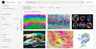
01. Visual inspiration
Adobe Stock is a stride ahead Google Images when it comes to visual inspiration
(Image credit: Adobe Stock)
Right at the start of a project, when you’re still thinking loosely about concepts and ideas, it’s natural to go looking for inspiration. And for most people, Google Images is often the default.
But think about it: the images you’ll find there are going to vary hugely in quality, while on Adobe Stock there are millions of consistently high quality, professionally created photos, illustrations and videos to inspire you and give you fresh visual ideas. So you’re far better off using the sophisticated search filters provided by Adobe Stock, and seeking out visual inspiration there instead!
02. Website mockups and wireframes
The main aim of a digital mockup or wireframe is to get the functionality right, and make sure that the site or app can fulfil the needs of the user in a fast and efficient manner.
For this reason, they’re often created as “bare bones” designs, with zero imagery, and that approach can be appropriate when you’re just working on things in-house. But once you get to getting sign-off from stakeholders and clients, it can be worth using some of the high quality stock photography or illustrations available on Adobe Stock to make it look a little nicer and more approachable.
Because however much you ask people to “see past” the lack of visuals, it’s often a psychological hurdle that non-designers find difficult to navigate.
And the best news is, if you don’t want to spend any money, you don’t have to. You can use watermarked versions of any Adobe Stock image in your designs, and you only have to pay once you’ve got sign-off. If you don’t use them, you don’t pay: simple!
Adobe Stock saves you time by letting you search for pics of a certain shape (in this case, square)
(Image credit: Adobe Stock)
From Facebook and Twitter to Instagram and Snapchat, there’s so much noise on social media these days that attracting people’s attention with a brand campaign is a tough ask.
But one thing’s for sure: the brain processes pictures far more quickly than words, and so powerful and eye-catching images are key to attracting those eyeballs.
A small investment in the high quality photography and illustrations that Adobe Stock can provide, then, will pay off handsomely when it comes to clicks and likes.
And not only are you free to crop the images you license to whatever shape and size you need, but you can even save yourself time by, for example, searching for only square, horizontal, vertical or panoramic images.
04. Moodboards
The moodboard is a time-honoured tool in conveying the mood and spirit of a proposed campaign, and getting approval from clients and stakeholders before you head too far down the wrong path.
To create one, many people often just scrape images from Google, because while this is technically copyright infringement, in practical terms they’re unlikely to ever get sued for it.
However, legal issues aside, it’s worth considering using images from Adobe Stock instead. After all, they’re available in high resolution, so will look much better blown up at size. Plus the millions of high quality images available, in combination with sophisticated search filters, means that you’ll be much more likely to find the right images to bring your moodboard to life.
The email newsletter seen a massive resurgence in recent years. Perhaps as a reaction to the amount of noise on social media, people seem to like like the idea of a regular, curated and above all, short summary of what they need to know about a certain subject.
In some cases, they’re even willing to pay for this service, and some people now make their living entirely based on producing a must-read email newsletter.
Whether your newsletter is paid-for or free, though, success isn’t guaranteed, though. You have to produce one kick-ass newsletter if you’re going to succeed in this busy marketplace.
And so here again is an arena where the right images can play a key role. Liven up your email newsletter with some high quality imagery from Adobe Stock, and – as long as the content is equally high quality – your sign-ups and open rates should soon start to climb.
06. Your blog
If you’re writing a personal blog or the official blog for your design studio, imagery is again a great way to lure people in.
Most of the time you’ll probably want to use killer images from your latest design work, but that may not always be possible. The client may not have given permission, for example. Or perhaps there aren’t great visuals from the work to show (if your work was in the field of strategy, or web development, for example).
In such cases, don’t just leave a blank, or post an uninspiring image. Think outside the box, and search Adobe Stock for images that represent the theme of the story instead. For example, if you’ve has been invited to sit on a government panel to discuss how the creative industry should respond to Brexit, you might want to use the image above to highlight your news.
07. A/B testing
Want variations on this pic? Click here, then scroll down to ‘More from this series’
(Image credit: Adobe Stock)
A/B testing is about serving up two versions of a web page, Facebook ad, etc, to your audience and seeing which one leads to the most conversions. Given the importance of imagery, it’s often useful to test different lead images, to see which one leads to the best results.
The good thing about Adobe Stock is that there are often images from the same photoshoot, which means you can choose between small variations on the same image. This makes Adobe Stock ideal for when you really want to nail down the perfect image to help your website conversion rate.
08. Your personal videos
Most video professionals will know about Adobe Stock’s motion design templates, which allow you to add cool effects, titles, transitions and more to your projects with very little effort. But they’re so simple to use that anyone can use them for their own personal videos too. Especially as many of them are free!
To see how easy it is to use Adobe Stock’s motion design templates without any training, check out our tutorial on how to add wow to your holiday videos.
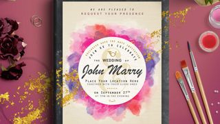
Planning a wedding? Adobe Stock can help here, too! It has an amazing range of top quality templates for your wedding designs that are fully customisable within Photoshop, Illustrator and InDesign.
Finally, Christmas is approaching, you’re a designer so why not design your own bespoke Christmas cards? It’s a great way to delight a client or potential client, and make sure they remember you. Or alternatively, you might just want to put a smile on the face of a friend or family member.
Someone has said, “A picture speaks a thousand words”. This fact was never more true for anyone else, but for graphic designers. Graphic design is a process of communicating with your target customer using tools like typography, photography and illustration.
Common uses of graphic design can be found in corporate designs in the form of logos and branding, editorial design for magazines, newspapers and books, environmental design, communication design, product packaging and signage. It also includes advertising and web designing.
Graphic design has wide reaching applications. It has application in road signs, interoffice memorandums, reference manuals, selling products or ideas, logos, colors, packaging and branding too. Other applications of graphic design include the entertainment industry, vinyl album covers, opening and closing credits in filmmaking, artwork used for designing T-shirts. It is also an important part of information design. This information could be for newspapers, magazines, blogs and television. It could also be for film documentaries, illustrating news stories on the web, data visualization, and information graphics.
Who Is a Graphic Designer
A graphic designer is one who creates and combines symbols, pictures and text to communicate ideas and messages. A typical graphic designer uses all the three tools namely typography, page layout techniques and visual arts techniques to make visual compositions. A graphic designer is an important member of the branding team. In other words, a graphic designer is a professional within the graphics design and graphics arts industry who communications through images both in still and moving communication media.
Trends come and go. The graphic design world is always evolving. Some design trends fade away for months, others stay for years. Today we’ll spill the beans on which graphic design trends will generate buzz this year.
Whether you will follow the crowd or set up a new trend yourself – the choice is yours. Either way, it is vital to be up-to-date. We have taken the time to browse the web and find out which design trends will take the leading positions in 2018. We will also reveal some of the graphic design trends which should better stay in 2017.
Year 2018 is pretty much all about imagination off limits. The majority of our examples depict a combination between two or more trends, even though we have focused on each one separately. Hope it sounds promising, so let the show begin!
1. The ‘Little Big Idea’
Moonpig’s rebrand was about sweating the small stuff
“The design theme of 2017 was big impact, but paradoxically the best work achieved it by really sweating the small stuff,” says Chris Moody, creative director at Wolff Olins. “The things I have found the most striking are the consommés – those jobs that focus on something singular and use it to create something with clarity, distinctiveness and beauty: the ‘Little Big Idea’.
“2017 was about simple ideas, executed with intelligence and insight to create real, radical impact. W+K’s work on the Dutch women’s football team was a tiny logo tweak that managed to question heritage, patriarchy and even what a logo stands for. The Moonpig rebrand did more with the kerning of an ‘o’ than a thousand animated cartoon characters ever could.
“If 2018 is going to be as chaotic, channel-hopping and crazy as 2017 was, elegant logic will be the only way to cut through.”
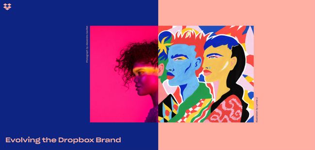
2. Braver colours
The Dropbox rebrand made strong use vibrant colour
“2017 has been a riot of colour, with graphic designers making big, bold choices,” says Shaun Bowen, creative partner at B&B studio. “Perhaps in an effort to inspire positivity after a difficult year in 2016, we’ve seen an influx of bright colours, often with flat graphics and only one or two colours used at any one time,” he adds.
“More and more brands are also using their core packaging hue as the backing colour in posters and supporting graphics.
Max Ottignon, co-founder at London branding agency Ragged Edge, tells a similar story. “We’ve noticed our clients getting braver,” he says. “Fluoro colours and clashing tones have moved away from edgy startups into the mainstream. eBay’s new identity has colour right at its heart, using it as a way to communicate both its breadth and inclusive personality.”
Mireia Lopez, creative director at DARE, concurs. “We’re seeing the use of vibrant colours in juxtaposition with bold imagery,” she says. “This can be seen as a response to minimalism and material design, from using white spaces and clean layouts to unexpected colour combinations and distinct varied typographical styles – and is across all areas of branding as well as digital.
“The new Dropbox brand direction, for example, is doing this with its creative use of images, and corporate identities such as NatWest are shifting to a fresh and modern feel, using the potential of brighter colours to increase higher conversion rates. In my field, digital, this development is probably due the fact that sites can load faster and screens on phones are bigger, so it’s easier to play with images.”
“Using bright colours helps content stand out from meme-filled social media,” notes Nathan Sandhu, founder and creative director of Jazzbones Creative.
One thing’s for sure, 2018 has delivered designs that are anything but boring. It’s been a year dominated by imagery that’s funky, wild, fanciful and even absurd—perhaps reflecting the increasingly nutty world we live in. So sit up, take notice and see how you can incorporate some of these electrifying graphic design trends into your images.
Glitch effect
Mistakes, imperfections, blemishes. Rather than rushing to erase or correct what’s gone wrong, we’re embracing the accidental and finding the beauty in the flawed. In a world where technology touches every aspect of our lives, it makes sense that we’d incorporate the inevitable glitch into our imagery. Weird color surges happen, as do file corruptions and crooked lines, disorienting compositions and blurry photos. While our initial tendency is to make things neat and tidy for the viewer, it’s time to consider the joys of awkward discomfort.
80s and 90s Retro
Who came of age in the 80s and 90s? Millennials. Who are businesses trying to woo? Millennials. And who are the creative leaders deciding what’s in and what’s out? Um, yeah, you guessed it: Millennials. So if you want to know why we’re being inundated by color palettes full of turquoises and teals and peaches and pinks, randomly placed geometric shapes and patterns, squiggly lines and retro illustrations, it’s because we’re resurrecting that golden age when hair was big, Pokemon could only be found on cards and videos, and everyone was watching “Friends.” (Oh, wait, they’re still watching “Friends.”)
Groovy Gradients
Another popular trend from the past (this time the early aughts) that’s making a major comeback is the gradient, sometimes known as “color transition.” You can’t look at your iPhone’s app display without seeing a gradient or seven, but this time around, the style is getting an update. Instead of sticking with linear transitions going horizontally or vertically, the new gradients can be radial (starting at a single point and emanating out) or even have different starting points, creating a more swirling, spirally effect.
Trippy typography
Designers are having the time of their lives playing with fonts, text and typography. They’re erasing key parts of letters while still maintaining their readability. They’re flouting conventional lines and placing letters haphazardly across the page or screen. They’re allowing text to interact directly with photographs and illustrations in imaginative ways. There are handmade fonts, layered letters, abstract forms, sliced and diced and dripping text that will make the viewer dizzy with delight. And most incredible? The return of the serif font, which is making a welcome comeback after a too-long absence from our digital screens.
Authentic Photography
Authenticity has been a buzzword not just in design, but in advertising, branding, business, social media, arts, entertainment, politics—pretty much every sector of society. One of the easiest and most effective ways to tap into an authentic vibe is through photography. Photos offer a realness that can’t be matched, especially pics that aren’t staged or arranged but rather have a documentary feel to them. While stock photography has been flooding the internet for a while, those canned images seem to be phasing out and are being replaced by messier imagery with imperfect lighting, lots of action, interesting compositions and deeper emotions.
Digital design luminary and Swinburne grad, Tim Kotsiakos, is using his years of experience to shape the future of digital design students.
A 22-year career in graphic and digital design has provided Tim with a vital outlook on the landscape, one which he aims to impart to aspiring designers.
Since completing a Bachelor of Graphic Design (Hons) at Swinburne in 1995, Tim has blazed a trail in digital design, navigating huge changes in technology and garnering an impressive reputation within the industry.
Immediately following his graduation, Tim became a senior designer for DTDesign, working with fellow Swinburne grad David Trewern to establish an upstart design studio that would be able to compete in an ever-changing and close-knit Victorian design industry.
“It was a pretty exciting time to be in the industry and it was all very new,” says Tim.
“The industry was so small, we’d meet at a bar once a month and we’d all fit in the tiny back room.”
Becoming a creative director
Tim’s first exposure to the industry also played a vital role in shaping the kind of creative director he wanted to be as his career developed.
“Some of these early experiences certainly helped me understand the importance of being truly human-centric. Being able to watch David interact with clients and build his own business was a massive influence, and one I’m still very grateful for,” says Tim.
Tim spent eight years playing an integral role in pushing DTDesign to the forefront of the Victorian digital design scene, where he developed his knowledge of production and interface design for the user experience (more commonly referred to as Information Architecture at the time).
Developing these skills early in his career helped Tim stand out from the crowd, giving him the opportunity to collaborate with the Australian Graphic Design Association (AGDA), where he developed his outlook on the business of design.
“It was a very good reminder of how many amazing, hard-working design businesses there are in Australia, and a reminder of how many of them are small, micro-businesses,” Tim says.
“It helped me form the opinion that to do great design work you also need to be great at business.”
Taking on the world
Following brief stints at Atomic and Eclipse (Deloitte), Tim joined the world-renowned Reactive design team as a creative director. He completely overhauled the Reactive brand and website, before collaborating with a number of international clients, including British Airways.
Working in conjunction with Reactive’s London office, Tim developed an in-flight entertainment interface that would work while reclined in first class with a handheld remote, as well as in a confined space in economy, utilising a touch screen display.
This experience, working in a small team of “really experienced people” had a lasting effect on Tim, as it provided a model for him to launch his own design company in 2015.
MASS effect
After a fruitful tenure at Reactive, Tim’s new company MASS hit the ground running, quickly developing a reputation for exceptional design output and client collaboration, which Tim hopes will lay the foundations for future growth.
“We’re excited about solving big problems in lateral ways and we want to work on projects that have a long-term impact on peoples’ lives.”
“If we achieve this and continue to grow, we’ll be absolutely rapt!”
While managing his small Fitzroy-based team, Tim has also returned to his Swinburne roots, becoming heavily involved in developing the Make It, Break It Design Sprint, a five-day program that allows communication design students to workshop creative new ideas in a team format.
In addition, Tim has been involved in adjudicating an honours year ‘shark tank’, allowing these same students to pitch their ideas to established industry experts and garner feedback that can help shape their own design outlook, a role Tim takes great pride in.
“My goal has always been to remain connected with education, and Swinburne has made it very easy for me to do so,” says Tim.
“I’m impressed to see an emphasis on research and user-centred design… the immediate benefits to students are obvious, but I think there is a longer-term benefit to the industry.”
“If we raise the overall quality of graduates we can in turn progress the industry.”