Tactile design is reshaping branding, packaging, and digital UI with texture, embossing, and material surfaces that make design feel as good as it looks.
Screens have flattened everything. Swipe, tap, scroll — interaction is mostly frictionless now. But a countermovement is gaining ground. Designers across branding, print, packaging, and even digital interfaces are leaning into texture. They are making surfaces that suggest weight, grain, and resistance. They are designing things that feel like something.
This is tactile design. It is not a single aesthetic. It is an approach — a commitment to material honesty and sensory depth. When a brand prints its identity on uncoated stock with debossed letterforms, the paper’s tooth becomes part of the message. When a package uses kraft board with a blind-embossed logo, the roughness and the relief tell a story about craft and care before the product is even opened.
Tactile Design in Branding and Packaging
The most effective tactile design in branding starts with material selection. Studios working across print and packaging consistently reach for surfaces that have presence: cotton rag stock, duplex boards, textured uncoated papers, and natural materials like linen and wood pulp. These choices carry meaning. An uncoated cream paper reads handmade. A heavy coated board reads luxury. Kraft reads honest and sustainable.
Finishing techniques add the next layer. Debossing presses type or imagery into the surface, creating a recessed impression that readers touch without thinking. Embossing does the opposite, raising forms above the sheet. Foil stamping adds metallic contrast while still referencing physical material. Letterpress printing, with its characteristic ink bite and impression, turns the act of reading into a physical encounter with the page.
Tactile Design in Digital and UI
UI designers have long experimented with material metaphors — subtle noise overlays, paper-grain backgrounds, and linen-pattern interfaces that recall physical surfaces. The goal is not skeuomorphism for its own sake. It is warmth. A slight texture on a background removes the sterile coldness of a pure flat surface. It grounds the interface in the physical world.
Haptic feedback in mobile design extends this logic. A well-timed vibration when a button activates does not just confirm the action — it adds a moment of physicality that flat audio feedback cannot replicate. As displays improve and surface materials evolve, tactile design will bridge the screen and the hand more precisely.
The best tactile work understands that texture is not decoration. It is communication. Every grain, every impression, every surface choice sends a signal about quality, intent, and care. The studios and designers pushing this work are not chasing a trend. They are recovering something that flat digital design left behind.
Some of the most controversial redesigns have had surprising staying power.
Over the last few years we’ve seen some truly headline-making rebrands. And if you know anything about the attention economy in the twenty-first century, you’ll know that headline-making equals controversial. Hate sells, and there’s nothing people love to hate more than a beloved brand trying out a bold new look.
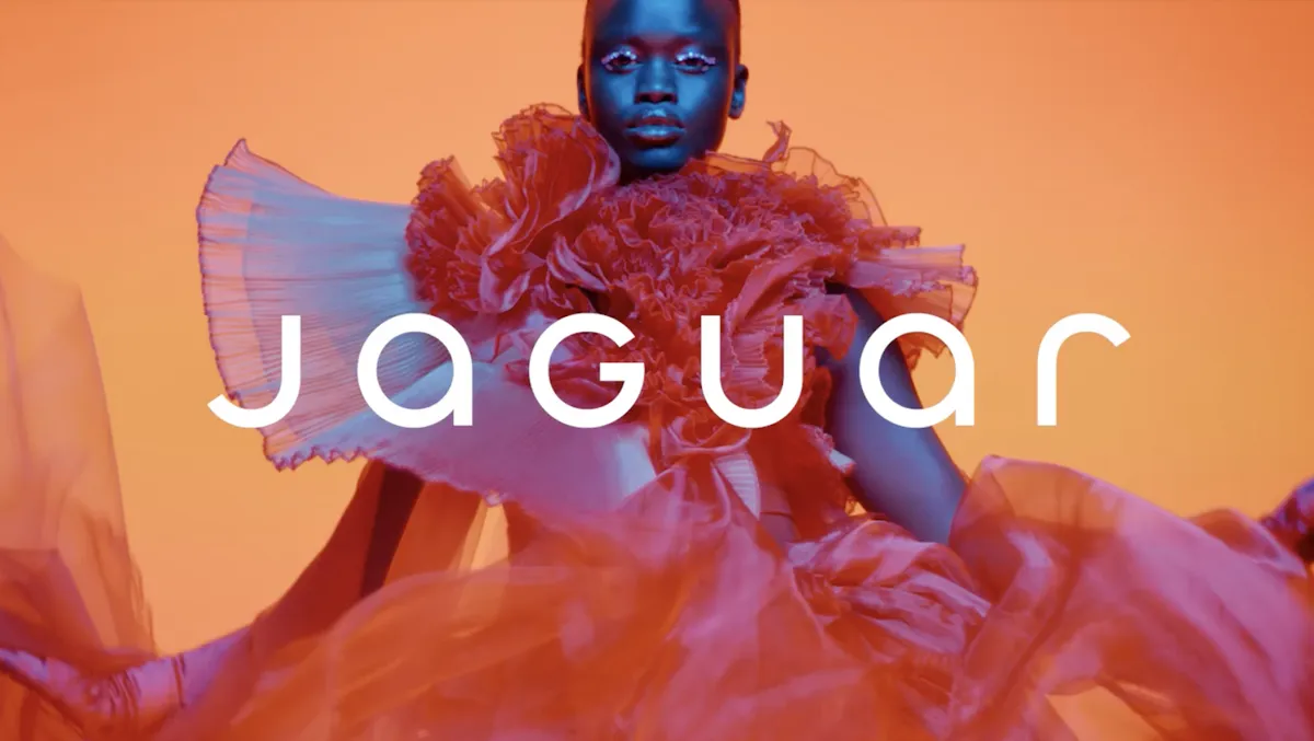
Perhaps the most obvious example from recent memory is Jaguar, whose colourful and curvy new look prompted outcry in 2024. And then there’s Cracker Barrel, which angered MAGA (and more) by doing away with its ‘old timer’ mascot’ last year. The vitriol directed at these new identities was on another level, with real-world effects for the brands.
The ‘controversial’ Cracker Barrel rebrand (Image credit: Cracker Barrel)
One one hand, in today’s social media age, perhaps the response to these rebrands wasn’t surprising. Seeing figures like Elon Musk call Jaguar woke or Donald Trump Jr ask “WTF is wrong with Cracker Barrel” feel par for the course in the 2020s. By removing iconic assets, those rebrands were doing something bold and, yes, possibly foolish – even on paper, a Jaguar campaign without any cars sounds a bit daft.
But the alarming thing here is that these backlashes so clearly cowed the respective brands. Cracker Barrel was publicly contrite about its redesign, announcing on social media, “You’ve shown us that we could’ve done a better job sharing who we are and who we’ll always be” before wheeling back the rebrand. And this is despite the brand also offering a rationale for the new logo that actually made a lot of sense: to simplify the design for new, digital applications.
The response to the Jaguar rebrand has allegedly led to the firing of the brand’s design chief and the dropping of its ad agency (Image credit: Jaguar)
As for Jaguar, to an outsider, the rebrand appears to be going strong – it still adorns the brand’s website, along with the new tagline, “Copy nothing. Delete ordinary.” But behind the scenes, it sounds like the backlash has led to some profound changes, including the design chief being sacked and the advertising agency being dropped.
Now, rebrand U-turns are nothing new. We’ve been seeing brands ditch their new designs in response to controversy for decades. GAP’s 2010 rebrand lasted all of six days, while Tropicana’s 2009 redesign managed a few months. But the difference is that there was nothing political about those backlashes – they were purely about the loss of an iconic design. Both Jaguar and Cracker Barrel, however, were mostly criticised for “going woke”. And the noise got so loud so quickly that the brands bottled it.
GAP’s 2010 rebrand lasted all of six days (Image credit: Gap)
And what they perhaps forgot is that online noise does, eventually, die down. Some of the most controversial rebrands of the last couple of decades have proven to have remarkable staying power. Back in 2014, the new Airbnb logo faced an avalanche of criticism accusing it of everything from lack of originality to sexual symbolism. Twelve years later, it’s still going strong – and hardly anyone remembers the initial controversy.
Similarly, Instagram‘s switch from its realistic retro camera icon to a minimalist gradient in 2016 was initially wildly unpopular, with the bright gradient called childish and ugly at the time. Turns out Instagram was ahead of the curve – that skeuomorphic camera would look positively dated today, whereas the gradient Instagram logo is now one of the most recognisable in the world.
Who’s still complaining about the Airbnb logo?
What these examples show is that while the internet has always been quick to judge rebrands, perhaps the best judge is time. Once all of the noise has died down, longevity serves as pretty categorial proof that a rebrand was sound.
Indeed, some rebrands from the 2020s are now half a decade old, giving us the benefit of hindsight to decide what truly worked and what didn’t. Burger King’s flat design bonanza is still sizzling five years later. Conversely, in the wake of the recent news that it’s slashing its metaverse department, Facebook’s 2021 ‘Meta’ rebrand finally looks like a failure in 2026.
So while the internet will always be a wild west of lightning fast reactions, perhaps we ought to bear in mind that the true marker of a successful rebrand is time. Are people still complaining once the dust has settled five years later? Or is it, like Airbnb, now just a solid and recognizable brand identity? And perhaps the brands feeling threatened by cries of “Woke!” need to remember the same thing too.
Daniel John is Design Editor at Creative Bloq. He reports on the worlds of design, branding and lifestyle tech, and has covered several industry events including Milan Design Week, OFFF Barcelona and Adobe Max in Los Angeles. He has interviewed leaders and designers at brands including Apple, Microsoft and Adobe. Daniel’s debut book of short stories and poems was published in 2018, and his comedy newsletter is a Substack Bestseller.
Your portfolio looks incredible. Your work wins awards. Yet clients ghost you after initial interest, and competitors with weaker portfolios land bigger projects.
The disconnect isn’t your design skill. It’s your brand architecture.
Some design professionals treat branding as an aesthetic exercise—a logo here, a color palette there, maybe some Instagram templates. Meanwhile, strategic positioning sits neglected in a Google Doc nobody reads. This misalignment costs you clients, credibility, and eventually, confidence in your own expertise.
I’ve watched talented designers struggle for years before realizing their branding mistakes were systematic, not creative. The good news? Systems can be rebuilt. Let me show you the ten structural failures that undermine design brands and the frameworks that replace them.
Why Do So Many Design Brands Feel Identical Despite Different Aesthetics?
Because they confuse decoration with differentiation.
Two studios can have completely different visual styles yet occupy the exact same position in a client’s mind: “another freelance designer.” The brand foundation determines perception. Visuals simply express it.
Think about it. When a potential client visits your website, they’re not evaluating your Pantone choices. They’re asking: Do you understand my problem? Can I trust you to solve it? Why should I choose you instead of the dozens of others I’m considering?
Your brand foundation answers these questions before your portfolio ever loads.
What the Brand Foundation Framework Actually Includes
I call this the Strategic Core Architecture—five elements that must crystallize before you touch a single design file.
Mission Clarity: Not a fluffy statement about “creating beautiful experiences.” A concrete answer to what change you create in the world through design. For example: “We help sustainable fashion startups compete visually with fast fashion giants” is a mission. “We create meaningful brand experiences” is vapor.
Values Articulation: Specific principles that guide decisions and client relationships. Values like “transparency” mean nothing until you define them: “We share our complete process, including failures and pivots, in weekly client updates.”
Audience Precision: Demographics matter less than psychographics. Who exactly feels the pain you solve? A “small business owner” is too broad. “A second-generation family business owner trying to modernize without alienating their legacy customer base” is a person you can design for.
Offer Definition: What exactly are clients hiring you to deliver? “Brand identity” spans everything from a logo to a complete market repositioning. Specificity attracts. Ambiguity repels.
Positioning Statement: The single sentence that differentiates you. This isn’t a tagline. It’s strategic: “Unlike generalist agencies, we only work with healthcare technology companies navigating FDA compliance in their branding.”
Here’s what happens when you skip this foundation: You design a gorgeous visual identity that communicates nothing about who you serve or why you matter. Clients see pretty shapes. They don’t see relevance.
Branding Mistake #1: Building Visuals Before Strategy
Designers love creating. Strategy feels like homework. So they skip straight to mood boards and logo sketches, hoping the strategy will emerge from the aesthetics.
It never does.
The Consequence of Visual-First Branding
Without strategic grounding, your brand becomes a decoration engine. Beautiful, perhaps. But interchangeable. When a client can’t articulate why they chose you beyond “I liked your style,” you’re competing purely on taste—the most subjective, unreliable differentiator possible.
Additionally, visual-first branding leads to constant redesigns. Every trend shift makes you question your entire identity because you have no strategic anchor. Should you adopt that trendy gradient? Switch to that popular font? Without a strategy, you’re rudderless.
The Strategic-First Approach
Start with the Brand Foundation Framework I outlined above. Document every element. Be ruthlessly specific. Then, and only then, begin visual exploration.
Your visuals should express your strategy, not create it. When someone asks why you chose that particular colour palette, you should have a strategic answer rooted in audience psychology and positioning goals.
Furthermore, this approach makes design decisions easier. When you know exactly who you serve and what you stand for, typography choices become obvious. Colour psychology aligns with audience preferences. Every visual element supports the strategic foundation.
Branding Mistake #2: The “Everyone Is My Client” Delusion
Broad appeal sounds smart. Cast a wide net, catch more fish. Except branding doesn’t work like fishing.
Why Generalist Positioning Fails
When you position yourself as “a designer for everyone,” you trigger a psychological phenomenon I call Relevance Dilution. The human brain categorizes and simplifies. “Designer for everyone” translates to “designer for no one specific” in prospect psychology.
Moreover, generalist branding prevents word-of-mouth growth. Satisfied clients can’t refer you effectively because they don’t know who else you serve. “You should hire Alex, they’re a great designer” is weak. “You’re launching a fintech app? You need Alex—they exclusively brand financial technology startups” is powerful.
The Specialization Strategy Matrix
Choose your specialization axis deliberately. You have several options:
Industry Vertical: Serve only restaurants, or only SaaS companies, or only nonprofits. Deep industry knowledge becomes your competitive advantage.
Service Horizontal: Focus exclusively on one service—packaging design, environmental graphics, or digital product branding. Become the undisputed expert in that specific deliverable.
Audience Segment: Serve only women entrepreneurs, or only second-career professionals, or only Gen-Z founders. Understand their unique worldview intimately.
Problem Domain: Specialize in rebrands, launches, or legacy brand modernization. Each requires different expertise and attracts different clients.
Pick one. Dominate it. Then, if growth demands, expand strategically to adjacent specializations.
Branding Mistake #3: Inconsistent Visual Systems Across Touchpoints
Your website uses one colour palette, while your Instagram uses another. Meanwhile, your proposal templates look like they came from a different company entirely.
How Inconsistency Destroys Brand Equity
Every inconsistent touchpoint forces prospects to rebuild their mental model of your brand. This cognitive friction accumulates. Eventually, they just move on to a competitor whose brand feels coherent.
I’ve seen designers lose projects because their email signature used different fonts from their portfolio. It seems trivial. But these micro-inconsistencies signal sloppiness. If you can’t maintain consistency in your own brand, why would a client trust you with theirs?
Building the Brand System Architecture
Create what I call a Touchpoint Coherence System—a documented framework ensuring visual consistency everywhere your brand appears.
Colour Application Rules: Don’t just list hex codes. Define usage rules. Primary colours for headlines and CTAs. Secondary colours for accents. Neutral palette for body text and backgrounds. Specify ratios and combinations.
Typography Hierarchy: Assign specific roles. Heading font, subheading font, body font. Define sizes, weights, and spacing for each level. Document when to break these rules (rarely).
Logo Usage Guidelines: Clear space requirements. Minimum sizes. Approved backgrounds. Incorrect usage examples. Treat your logo like a legal trademark because it essentially is one.
Imagery Style: Define your photographic or illustrative approach. Lighting style, composition preferences, and subject matter themes. Create a visual reference board.
Layout Principles: Grid systems, alignment rules, white space standards. These invisible structures create visual consistency even when content varies.
Document everything in a living brand guide. Update it as your brand evolves. Reference it religiously.
Branding Mistake #4: Overengineered or Oversimplified Logo Design
Logos occupy a strange middle ground. Too complex, and they become unusable. Too simple, and they disappear into generic minimalism.
The Logo Complexity Paradox
I’ve watched designers spend months crafting intricate logos with symbolic meaning in every curve. Beautiful work. Completely impractical. When that logo shrinks to favicon size, it becomes an indistinct blob.
Conversely, the minimalism trend produced thousands of sans-serif wordmarks that achieve simplicity by sacrificing all personality. Your logo shouldn’t require a manifesto to explain it, but it also shouldn’t be indistinguishable from every other “modern” brand.
The Recognition-Scalability Framework
Effective logos balance three variables: distinctiveness, simplicity, and scalability. Optimize for all three simultaneously.
Distinctiveness means your logo doesn’t resemble competitors. Research your market thoroughly. If everyone uses geometric shapes, consider organic forms. If everyone goes minimal, explore expressive typography.
Simplicity means limiting elements ruthlessly. Can you achieve the same effect with two colours instead of five? One shape instead of three? Always simplify without losing character.
Scalability means testing rigorously. Print your logo at a half-inch width. Does it still read clearly? Convert it to solid black. Does the design hold up? Display it at billboard scale. Does it look intentional or accidentally enlarged?
Additionally, consider these practical constraints: Does it work in embroidery? On a pen? As an app icon? In a Zoom background? Real-world applications expose design weaknesses fast.
Branding Mistake #5: Cluttered Layouts That Bury Your Message
More elements seem more impressive. More colours, more fonts, more imagery, more information. Except the opposite is true.
The Cognitive Load Crisis
Every element you add increases cognitive load—the mental effort required to process your design. Humans have limited processing capacity. Overload it, and they disengage entirely.
I call this the Attention Budget Principle: Every viewer arrives with a fixed amount of attention. You can invest it wisely in communicating one strong message, or squander it across a dozen weak ones.
The Hierarchy-First Design Method
Start every layout by identifying your single primary message. Not your three main points. Your one essential takeaway. Everything else is secondary.
Visual Hierarchy means guiding the eye deliberately. Size, contrast, colour, and position all create hierarchy. Your primary message gets the strongest visual emphasis. Supporting elements recede proportionally.
White Space Strategy isn’t emptiness—it’s emphasis through absence. Space around an element makes it more prominent. Dense layouts make everything equally ignorable.
Element Reduction Protocol: Design your layout. Then remove 30% of the elements. Force yourself. You’ll discover most were redundant. The remaining 70% becomes significantly stronger.
Furthermore, establish a clear entry point for the viewer’s eye. Where should they look first? Then the second? Then the third? Intentional visual flow transforms chaos into clarity.
Branding Mistake #6: Typography That Undermines Professionalism
Font choices seem subjective. They’re not. Typography communicates at a subconscious level, triggering immediate associations about professionalism, trustworthiness, and quality.
How Typography Shapes Perception
Research shows people make judgments about your credibility within 50 milliseconds of viewing your content. Typography drives much of that instant assessment.
Default fonts signal carelessness. Overused fonts signal a lack of originality. Trendy fonts signal trendiness (which ages poorly). Incompatible font pairings signal poor attention to detail.
The Type System Framework
Limit your brand to a Type Trio: one font for headlines, one for body text, one optional accent font for special use.
Headline Font: Distinctive enough to create personality. Legible enough for quick scanning. Usually slightly heavier weight. This is your brand’s voice at its loudest.
Body Font: Maximum readability. Neutral enough to disappear into the reading experience. Generous x-height. Clear letterforms. This is where people spend most of their time.
Accent Font: Use sparingly for quotes, callouts, or special emphasis. This adds flavour without overwhelming. Many strong brands skip this entirely.
Additionally, master these technical fundamentals: appropriate line spacing (generally 1.4-1.6x font size), comfortable line length (50-75 characters), consistent hierarchy through size and weight, and adequate contrast ratios for accessibility.
Test your typography at actual usage sizes. A font that looks perfect in your design file might be illegible on mobile devices.
Branding Mistake #7: Cheap Visuals That Broadcast Amateur Status
Generic stock photos. Low-resolution images. Poorly composed photography. Outdated graphics. These visual choices communicate more about your brand than any mission statement.
The Image Quality Perception Effect
Humans are visual creatures. We process images 60,000 times faster than text. This means your imagery creates instant impressions before anyone reads a word.
Moreover, there’s a documented psychological phenomenon called the Aesthetic-Usability Effect: People perceive attractive designs as more usable, trustworthy, and professional, regardless of actual functionality.
The Visual Asset Strategy
You need a consistent approach to imagery across all brand touchpoints. This doesn’t mean every photo looks identical. It means they feel cohesively related.
Photography Style: Define your approach. High contrast or soft lighting? Composed or candid? Studio or environmental? Colour palette preferences? Depth of field standards?
Illustration Approach: If you use illustrations, maintain style consistency. Line weight, colour application, level of detail, and rendering technique should remain constant.
Custom Over Stock: Invest in original photography whenever possible. Stock images, even good ones, appear across thousands of brands. Custom imagery is exclusively yours.
Image Quality Standards: Establish minimum resolution requirements. Implement quality control before any image goes live. A single blurry photo undermines an otherwise polished brand.
Furthermore, consider image authenticity. Audiences increasingly detect and reject overly staged or artificial imagery. Authentic visuals build trust faster than perfection.
Branding Mistake #8: Inconsistent Voice Across Channels
Your website reads like a law firm, yet your Instagram captions sound like a teenager. To make matters worse, your email newsletters adopt a completely different personality. This fragmentation confuses your audience and dilutes your brand identity.
The Multi-Personality Brand Problem
Inconsistent voice triggers what I call Brand Dissonance—the uncomfortable feeling when different touchpoints send conflicting signals about who you are.
Clients start questioning which version represents the “real” you. This uncertainty prevents the trust-building necessary for high-value relationships. Additionally, an inconsistent voice makes your brand unmemorable because people can’t form a coherent mental model.
The Voice Architecture System
Document your brand voice with specific guidelines beyond generic descriptors like “professional” or “friendly.”
Voice Characteristics Matrix: Define where you fall on key spectrums. Formal vs. casual (and how formal/casual). Playful vs. serious. Authoritative vs. collaborative. Technical vs. accessible. Emotional vs. rational.
Vocabulary Guidelines: Maintain lists of preferred and forbidden words. Some brands say “clients,” others say “partners.” Some say “projects,” others say “collaborations.” These choices compound into personality.
Sentence Structure Patterns: Long, flowing sentences create different impressions than short, punchy ones. Document your preferences. Notice how your sentence structure is reading right now—direct and explanatory, establishing authority through clarity rather than complexity.
Perspective and Pronouns: Consistent use of “we,” “I,” or “you.” Each creates different relational dynamics. Choose deliberately based on your positioning.
Create a voice guide with specific examples. Show correct and incorrect usage. Make it actionable enough that anyone representing your brand can apply it consistently.
Branding Mistake #9: Trend-Chasing That Destroys Longevity
Gradients are hot, so you redesign around gradients. Brutalism trends, so you adopt harsh typography and raw layouts. Maximalism returns, so you add decorative elements everywhere.
The Trend Adoption Trap
Trends move in cycles. What’s fresh today looks dated in eighteen months. Constant redesigns to chase trends create multiple problems simultaneously.
First, recognition suffers. Brand recognition requires consistency over time. Frequent visual overhauls reset that recognition-building process to zero.
Second, resources drain. Every redesign costs time and money, better invested in delivering client value or developing real competitive advantages.
Third, positioning weakens. Trend-chasing signals that you follow rather than lead. Clients seeking innovative partners won’t choose the studio that desperately copies whatever’s currently popular.
The Timeless Foundation Method
Build your brand on Era-Resistant Principles—design approaches that transcend temporary aesthetics.
Classic Typography: Choose fonts with decades of proven performance. Helvetica, Garamond, Futura, Gill Sans. These have survived because they work, not because they’re trendy.
Fundamental Colour Theory: Instead of adopting the year’s colour trends, choose colours based on psychological impact and audience resonance. Blue for trust. Red for energy. These associations persist across trend cycles.
Structural Design Principles: Strong hierarchy, clear focus, intentional white space. These fundamentals never go out of style because they’re rooted in human perception, not fashion.
Trend Integration Guidelines: When you want to incorporate current aesthetics, do so as accent layers, not foundational elements. A trendy illustration style on your Instagram is fine. Rebuilding your entire visual identity around it is risky.
Strong brands evolve gradually. They refine rather than reinvent. They adapt without abandoning their core identity.
Branding Mistake #10: Neglecting Your Digital Brand Presence
Your website hasn’t been updated in two years, while your social media profiles still use outdated logos. Meanwhile, your Google Business listing shows closed, and your LinkedIn features work from 2019.
Digital Decay and Brand Credibility
Digital neglect communicates active messages, not passive absence. An outdated website doesn’t say “we’ve been busy.” It says “we don’t care about details” or worse, “we might be out of business.”
I’ve seen designers lose significant projects because prospects googled them and found inactive social accounts or broken portfolio links. The prospect didn’t reach out to ask. They simply moved to the next candidate.
The Digital Maintenance Protocol
Establish a Digital Touchpoint Audit System—a regular review of every digital property representing your brand.
Website Refresh Cadence: At a minimum, update your portfolio quarterly. Add new projects. Remove weaker old ones. Check all links. Verify load speeds. Test mobile responsiveness. Update your bio to reflect current positioning.
Social Media Consistency: If you maintain profiles, maintain them properly. Inconsistent posting is worse than no profile at all because it signals abandonment. Either commit to regular updates or redirect energy elsewhere.
Search Presence Management: Google your brand regularly. What appears? Outdated directory listings? Incorrect information? Dead links? Claim and update every listing you find.
Performance Optimization: Page speed impacts both user experience and search rankings. Compress images. Minimize code. Use modern hosting. A slow website broadcasts technical incompetence regardless of your actual skills.
Mobile-First Design: Over 60% of web traffic is mobile. If your site doesn’t work flawlessly on phones, you’re eliminating most potential clients from considering you.
Additionally, maintain consistency with offline brand materials. Your digital and physical presence should feel like the same brand, not distant cousins.
The Integration Framework: Making It All Work Together
Understanding individual branding mistakes helps. But real transformation requires systematic integration across all elements.
Building Your Brand Operating System
Think of your brand as an operating system, not a collection of isolated assets. Every component connects to and reinforces the others.
Your strategic foundation informs your positioning, which in turn determines your visual identity. Through consistent touchpoints, that visual identity gets expressed to your audience. Meanwhile, your voice reinforces your positioning across every interaction. Finally, your digital presence maintains accessibility to all of these elements.
Implementation Sequence: Start with strategy, move to core visuals, document systems, roll out consistently, then maintain actively. Skipping steps or reversing order creates the mistakes we’ve covered.
Quality Control Mechanisms: Establish approval processes before anything goes public. Every piece of content should pass through a brand alignment check: Does this support our positioning? Does it maintain our voice? Does it meet our visual standards?
Evolution Planning: Your brand should evolve, not revolve. Plan refinements annually, major updates every 3-5 years. Document the reasons for changes so evolution remains strategic, not reactive.
Frequently Asked Questions
How long does it take to fix branding mistakes and build a strong foundation?
Strategic foundation work typically requires 2-4 weeks of focused effort. Visual identity development adds another 4-8 weeks. Full implementation across all touchpoints might span 3-6 months. However, you’ll see benefits immediately as each element improves. Don’t wait for perfection before launching improvements.
Can I fix my branding mistakes gradually, or do I need a complete rebrand?
Gradual refinement works if your foundation is sound, but execution is inconsistent. Complete rebranding becomes necessary when your positioning is fundamentally wrong, or your visual identity actively contradicts your strategy. Assess honestly: are you fixing or rebuilding?
What’s the most critical branding mistake to address first?
Always start with a strategic foundation. Without clarity on positioning, audience, and differentiation, every other fix is cosmetic. You can have perfect visual consistency and still fail if you’re consistently expressing the wrong message to the wrong audience.
How do I know if my brand specialization is too narrow?
Test market size and growth potential. A viable specialization has enough prospects to sustain your business and room to grow. If you’re struggling to find clients, you might be too narrow. If prospects don’t see you as specialized, you’re too broad. Aim for “riches in niches” but avoid niches so small they can’t support you.
Should I hire a brand strategist, or can I do this myself?
You can absolutely develop your own brand strategy, especially if you’re a designer with strategic thinking skills. However, an external perspective helps overcome blind spots. Consider this: You wouldn’t self-diagnose a serious medical condition, even if you’re medically knowledgeable. Sometimes paying for expertise saves time and prevents expensive mistakes.
How often should I update my brand guidelines and visual assets?
Review your brand guidelines annually. Make minor refinements as needed. Plan major updates every 3-5 years or when your positioning significantly shifts. Your portfolio should be updated quarterly with new work. Social presence needs weekly attention at a minimum.
What if my current branding mistakes are already hurting my business?
Acknowledge the situation honestly with existing clients if relevant. Most will respect transparency and improvement. For prospects, focus on presenting your improved brand going forward. Don’t apologize for past work—simply demonstrate your elevated current standards. Strong brands evolve. Show evolution, not error.
How do I maintain brand consistency when working with team members or contractors?
Comprehensive brand guidelines are essential for team consistency. Create detailed documentation covering voice, visuals, and decision-making frameworks. Conduct onboarding training. Establish review processes. Make brand alignment a standard part of quality control, not an optional consideration.
By identifying and systematically correcting these ten branding mistakes, design professionals can transform their positioning from forgettable to strategic, building brands that attract ideal clients and stand the test of time. Don’t hesitate to browse WE AND THE COLOR’s Branding and Graphic Design categories to learn more.
There is nothing more valuable than a lasting first impression. Whether you have a blog, business, brand, or online community, capturing your audience’s attention in the first few seconds is more important than ever. Now, most people think about branding as a website’s content, such as graphics, but there’s a whole new world of customization out there in regards to website addresses that can help with branding.
Creative domain names are an alternative to traditional website addresses and an opportunity to make your website stand out in your industry. Who knew that the Internet had gotten so much bigger and now offers so much more choice! As the leader in this industry, Identity Digital helps brands, creative individuals, and entrepreneurs elevate their online presence with the world’s largest and most relevant portfolio of domain extensions.
Here are the top seven domain extensions you didn’t know could help you stand out online:
For Techies & Creative Entrepreneurs
.life
Mission-driven businesses, health and wellness gurus, and founders looking for a unique domain that speaks to the heart of their business should look no further than .life. This domain extension projects energy and conveys the impact on lives, enabling companies to communicate their vision to prospective customers quickly—for example, nurture.life.
For the Personal Finance Coach
.finance
If there is one industry that has boomed as a result of the Internet, it is the world of personal finance. Whether you’re offering tools people can use to make investments or your services as a personal finance coach for larger money goals, this domain extension can make your business stand out with a keyword to help get you in front of more eyes (e.g., northstar.finance).
For the Event Planner
.events
There is an event planner for everyone’s unique vision or tool to help streamline your conference operations. .events can help connect you with the people looking for your services (think ticketing.events). It has the perfect balance of keeping you open to serve many kinds of events while standing out from similarly named businesses.
For the Local Pizza Spot
.pizza
We all have a local pizza spot we wish would get more attention online. The food is delicious, customer service is excellent, and it’s family-owned, but more people need to learn that it exists. Building a website with .pizza, such as marios.pizza, can help a new online business stand out.
For the Travel Company or Vlogger
.travel
This one is perfect for the travel content creator or tour guide company finally ready to make that website. For example, adventures.travel. People already associate your name with travel, so make it that much easier for them to find you online with this extension.
For the House Flipper
.properties
When you see a property, you see potential, and you’ve turned disasters into turn-key homes. Showcase your portfolio of flipped homes or vacation rentals with a URL ending in .properties, such as boltfarm.properties, and establish yourself as a critical player in the real estate market.
For the Freelance Consultant
.consulting
Turn your side hustle into a full-blown freelancing business with .consulting in your URL (e.g., ssl.consulting). Let people know you are open for business and offering your expertise as a consultant by bringing your work to the eyes of more potential clients.
Feature image credit: Gilbert Flores/Variety via Getty Images
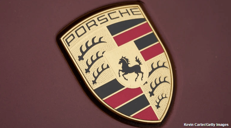
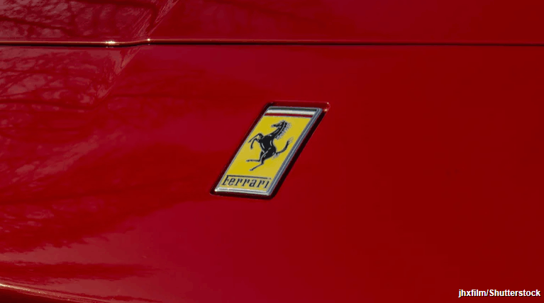
There are plenty of car brand logos with hidden meanings, but the reason why Porsche and Ferrari both use a horse as their logo boils down to their individual histories, not branding strategy.
Even though the resemblance is uncanny, both brands derived inspiration from independent moments in European history that just happened to revolve around one animal. Porsche’s horse has direct ties with the land where the brand’s story originates. The company was founded in Stuttgart, a city whose coat of arms has featured a rearing horse for centuries. To pay tribute to its origins, Porsche placed the horse at the center of a crest when it first introduced its logo in the early 1950s.
On the flip side, Ferrari’s horse carries personal and symbolic significance. During World War I, Italian fighter pilot Francesco Baracca painted a prancing horse on his aircraft. After his passing, the horse became a symbol of his legacy. In 1923, when Enzo Ferrari (the founding father of Ferrari) won his first ever race in North Italy, he met Baracca’s father and went on to develop a great friendship with his family. Enzo was eventually moved to adopt that very horse as a logo on his racing cars, believing it would bring good luck.
So, did either brand copy the other? Not really. The two brands share the same animal for entirely different reasons — and these aren’t just the only two brands using the Stuttgart horse. A strange little car company called Steinwinter has basically the same exact logo as Ferrari.
The detail that complicates the story
The explanation above is usually presented as the full story. However, it still doesn’t fully explain why the two horses look more alike than coincidence would allow. The connection becomes complicated once we take the story beyond Francesco Baracca himself.
The part of the story involving Enzo’s encounter with Baracca’s family members is well-documented. What’s not clear is where Baracca got his horse emblem from in the first place. Some speculators indicated that Baracca could have taken this emblem after downing a German pilot whose aircraft carried a horse emblem from their home city, which would be Stuttgart in this case.
If those accounts are to be believed, then the horse that Ferrari adopted is the very same horse that Porsche borrowed from its hometown. While this detail adds further depth to the story, it still doesn’t suggest that either brand has deliberately copied the other. Instead, it shows how the same image could move quietly across borders and contexts, changing meaning as it went.
Why the similarity in logos never became a problem
What ultimately allowed both brands to keep the horse without conflict is how clearly each logo defined its own meaning. In the case of Ferrari, the prancing horse logo became official when it finally commenced the production of its vehicles post World War II. The logo consists of a black horse (also known as Cavallino Rampante) depicted against a yellow background to symbolize the city of Modena, and the Italian flag rests above it all. The horse was positioned facing left, as per the direct instruction of Enzo Ferrari, and this was carried onto Ferrari road cars beginning with the 125 S.
For Porsche, the horse came from the Stuttgart crest of arms. The horse was situated at the centre of a shield that contained the words “Stuttgart” and “Porsche,” along with colours referencing the Württemberg region. The crest has been on the Porsche 356 since the early 1950s, and it was later incorporated onto hubcaps and car bodies. Although the logo has evolved over the years, the horse has stayed part of the larger crest design — and Porsche’s new logo has all of the same elements with slight stylistic changes.
Design Director at Mother Design, Bentzion Goldman, feels identity design has become safe, sanitised and downright boring in the last 12 months. Let’s flip that in 2026, he argues, and make branding weird again.
his is the third year I’ve written about trends and predictions in branding. It usually goes like this: I review the year’s biggest identity design work, layer in my own observations, and provide a light roadmap for the year ahead.
But this year was different. Looking back at the biggest rebrands, what was most remarkable was how utterly unremarkable they were. What stood out was not how bad the brands were but rather their overwhelming okayness. A troubling trend became clear: the rise of safe, forgettable branding.
2025 was the year of Cracker Barrel, the year of HBO MAX / MAX / HBO MAX, and the year of MS NOW (née MSNBC). All branding efforts landed with, at best, a sigh and, at worst, public outrage. What’s more, some of the biggest changes were so subtle you may have barely noticed them: Amazon, Tripadvisor, Verizon, Walmart, Lyft, and OpenAI quietly tweaked their brand systems, even if some of those endeavours were billed as overhauls. Creative Boom even wrote a piece on how the quiet rebrand took over 2025.
Don’t get me wrong, on two accounts. I believe in the power of a masterful brand refresh that subtly tweaks its brand elements, artfully balancing heritage with progress. And there was beautiful, innovative branding released this year. But something deeper emerged when looking at brands with the highest visibility. You might recall the ‘blanding’ era of the 2010s. I think we’ve hit a similar wall at this moment, but for altogether different reasons.
Everything is just okay
Earlier this year, I read James Poniewozik’s piece for The New York Times, The Comfortable Problem of Mid TV, which has stayed with me ever since finishing it. Poniewozik argues that we’ve entered an era in TV where everything is just … okay. He writes that a decade ago, we experienced an era of a lot of bad TV, but the risks and imagination required to make those shows also led to many standout series.
Now, the advent of high-pressure, high-budget streaming platforms and an associated low appetite for risk have resulted in a slew of shows that are beautifully shot, incredibly expensive, and yet—just okay. True creative risk-taking is exceedingly rare to find. Instead, we have a lot of the perfectly acceptable yet often emotionless middle ground.
I believe something similar is happening in the world of branding.
The enemy of a good brand used to be a bad brand: badly kerned typography, poorly chosen colours, and digital illiteracy. Today, the enemy of a good brand is no longer a bad brand, but one that is just okay.
The proliferation and democratisation of design software, along with an increasing awareness of design among the general public, have created an environment where even the smallest teams can produce competent branding. And let me be clear: this is a good thing. Design should be for everyone, and the ability for clients, beginners, and non-designers to create design work elevates the field for everyone. Per a Michael Bierut anecdote, the fact that we now have online trolling of rebrands means people care about branding!
But this new reality has also resulted in a sea of work that’s simply okay. Scroll through this year’s branding projects, and you’ll see a multitude of brands using the same tricks. Many of these identities have no technical fault, and yet they lack a certain emotional depth; the kind of spiritual centre that makes a brand truly resonate with its audience.
Striking a nerve
I think this exact feeling is the reason why the Cracker Barrel rebrand struck such a nerve with the general public. The original identity may have had technical shortcomings, but what the new brand gained in optimisation, it lost in emotional resonance. And now the pushback has created a heightened environment of fear where brands are now even more risk-averse, wary of becoming the next big branding flop torn apart in the comments.
In this new era of mid-branding, we need a new playbook. One that empowers designers to expand their aperture and dare to dream again.
So what’s the way forward? Allow me to advocate for the value of being weird in design.
Weird gets normalised
The simple truth is, people don’t know what they like until they see it. And until they like it, they might hate it. History is full of examples of art so novel in its time that it provoked outrage and even violence. The sans serif style of typography, now completely commonplace, was once considered so radical compared to the serif and ornamental styles of its era that people called it monstrous, ugly, and grotesque—a name that stuck.
In 1913, a ballet by Igor Stravinsky called The Rite of Spring was so innovative for its time, with its use of syncopation, dissonance, and sharp dance movements, that people hurled objects at the stage, cried, and even started fistfights in the audience. The police were called to calm the riot. And you thought the comments on Brand New were bad. Experimentation and transgression are vital for discovering new ideas and finding novel ways forward.
What’s remarkable is that these examples, once shocking innovations, are now normalised. The lesson is profound: people hate change, but, given time, change softens until it becomes the new normal. It is up to us designers to be the tastemakers and the future tellers. This is radical permission: it is a licence to look beyond familiar references and to challenge what we consider ‘good design’.
Image by Bentzion Goldman
This idea is illustrated by industrial designer Raymond Loewy’s MAYA principle: Most Advanced Yet Acceptable. This urges designers to push things as far as possible, up to the point where they remain within the tolerance of user comfort. In other words, design something unoriginal, and it will feel predictable, yet design something too radical, and you could incite a riot in a ballet theatre. Our charge, as designers, is to find that sweet spot right on the bleeding edge of innovation.
Here are three brands from the past year that do exactly that.
How to do it
Cotton Design’s identity for Eternal Research is a retro-futuristic system featuring an engraving-inspired wordmark, eleven Victorian-inspired headline typefaces, generative ornamental patterns made with code, and a triangular piece of hardware called the Demon Box. The system defies easy categorisation, balancing minimalism and maximalism in a way that feels immersive and genuinely new.
Mother Design, which I must confess I work for, released branding for Fhirst, a prebiotic soda line that burst onto the market this year. The packaging system draws on the joyful design of early 2000s soda branding, featuring a reverse-contrast script wordmark, an animal mascot for each flavour (the dolphin is my personal favourite), Papyrus as a supporting typeface, and gradients, bubbles, and starbursts galore. It’s a more-is-more system that could easily fall off the rails, but never does, thanks to careful selection and use of brand elements. Instead, the brand radiates pure joy; I have yet to see someone scroll through the project without smiling.
The final project is Clue Perfumery, with design and art directed by Caleb Vanden Boom. Its script logo is beautifully weird, with extreme contrast and bottom-heavy curves that feel both refined and expressive. The brand’s editorial tone is elevated by wildly imaginative art direction: perfume bottles photographed in fish tanks, large-scale butter sculptures, and, most recently, a limited-edition scented stone sculpture shaped like an apple. Clue is one of those brands where the connective tissue isn’t a single idea, but rather good taste and boundless creativity. The eclectic choices work in harmony, resulting in a brand that is lush, unexpected, and engaging.
A Victorian-inspired triangular musical instrument, soda mascots featuring dolphins and eagles, and a perfume bottle covered in butter: these are the kinds of daring choices that push boundaries and yield designs with emotional resonance. These brands are not weird for the sake of it; rather, the unexpected choices are deeply connected to who they are as a brand. The designers involved in their creation reject the safe route, opting instead to question, to research, and to play.
Feeling optimistic
I have every reason to be optimistic for the year ahead in design. We have more tools at our disposal than ever, which means bigger challenges and bigger rewards. I think we will see many brands that make us scroll quickly past without batting an eyelash. But through the sameness, the smartest, most creative, and weirdest brands will find a way to stand out and create inspiring, innovative work.
And for the designers among us, this framework gives us permission to step outside our peripheries and dig deeper for inspiration. In our age of automation and algorithms, designers have the privilege of interrupting the churn of predictable sameness with the uniquely human elements of taste and unexpectedness. Everything is possible, because what is bizarre, weird—even grotesque—today is merely normal tomorrow. So, my biggest hope for the year ahead is precisely this: let’s dream again.
“I just don’t have the time,” or “now isn’t a good time for me.” These are just some of the responses that we are guilty of coming up with when we are thinking about making changes.
A re-brand? No time. New content? Not just now, thanks. Website? We’ve got one, and we’ve got more than enough on our plates.
These things must be reconsidered, as we know that companies have been and will be left behind if they don’t continue to adapt and evolve what is ultimately the shop front to their company. It is important to always strive to keep your website fresh and updated; so why not now?
Right now is the perfect time to invest in long-term strategy and you certainly don’t want to be thinking of doing it when you are once again too busy to act. Just as important is to remember that you are not the only one at home and as the majority of people are also at home, we all need something to direct our gaze at.
From one side, we don’t have shop fronts, store displays, or events to showcase what we do. From the other, we have nobody to talk to at the coffee machine, and we can’t gossip by the copier; plus now more than ever, we need to be entertained.
If you already have a website, you have already been collecting data for some time now. With today’s Google Analytics providing visibility as we’ve never had, now is the time to cash in.
It is easier than ever to identify which areas of your site work the best, which pages rank the highest, and use data to find out about visitors. There is no point in framing this data and putting it on the wall (with everyone working from home no one will see it anyway), you should be using it to see where your visitors are coming from and going to, what they are liking and what they are ignoring; and then building something which makes it easier for them to do so. 79% of customers who voiced dissatisfaction with websites say that they would be unlikely to buy from them again.
A website is not only a great way to get clients, but it can also be a fabulous way of losing them. Half of web users expect webpages to load in less than two seconds; a one-second delay here translates to an 11% drop in page views, and, tellingly, a 7% drop in conversions. A one-second increase has made some companies thousands of dollars more every day, literally.
Speed and user-friendliness are among many factors, of course, and you should take the time to really have a look at such factors as:
Mobile-friendliness
This is a non-negotiable must and it is essential that you have a mobile-friendly website
Design
This isn’t myspacing anymore; design should be unique and proudly display your brand; make it inviting, clear, succinct, and be true to your brand. It must look good; if you were buying a car, you’d expect four wheels and some mod-cons, but you’d also choose one that looked nice.
Ranking
Many of the webs best looking and most functional sites slip under the radar far too often. Great design, content, and architecture mean nothing if you are not showing up in search results. Several factors will affect this, of course, but usability will be high on the list.
Conversion rate
Ok great, your site is ranking spectacularly and generating more leads than a pet shop, but again, useless if they are not converted.
Branding
Maybe the number one factor to look at right now. It is high time to sit back and get some perspective on your brand, your industry, and your company. Have things been slowly changing over the last few years? Is your product still the same? More than ever before, a consistent, multi-platform brand is key to gaining awareness and loyalty. Your brand must be more than a fantastic and recognisable logo; it must be your voice and your precept.
Content
Fill up your website with fantastic content (content will generate SEO for years to come, for free) and make it look fantastic and will keep people on it as long as possible. Right now is a great time to invest in content. Once you have it, it’s yours, use it and squeeze it as long as you can.
One thing that this situation will surely boost is e-commerce. The fear of expanding into online sales must be overwhelmed by the fear of having no sales at all. Once we are through the isolation period, yes, people will rejoice and head outside, but e-commerce will have been introduced to millions of people that didn’t use it already. Give your customers the same feeling as they get when they come to see you, make them feel welcome and free from this confinement by offering a fantastic online experience from which they can still enjoy your product.
Home deliveries seem to be the best bet right now, so be the site that offers the most comfortable path to it. And don’t think that it will be short term, most clients, if they have enjoyed the experience, will continue to shop online.
A website, across all platforms, is your storefront right now. It is your kiosk at the industry convention and content is your voice. Take the time to marry as many strong elements of your company and brand as you can, and make sure that everyone can see what you do and what you deliver, presented in an easily digestible and engaging website.
In a landmark webinar hosted by Frontify, Mitch Paone and Simon Chong explain how movement has evolved from a decorative element to a strategic necessity.
n an attention-starved digital landscape, static brand identities simply don’t cut through any more. Whether it’s a micro-interaction on a mobile interface, a kinetic logo that breathes across social platforms, or a full-scale rebrand built on behavioural logic, motion has become fundamental to how audiences experience brands today.
Brand-building platform Frontify recently hosted a webinar exploring this game-changing shift, as part of its Rebranding Redefined series. The event brought together Mitch Paone, creative director at DIA, and Simon Chong, creative director at BUCK.
Read on as I share their best insights into practicalities, pitfalls and strategic thinking behind motion-first branding.
From decorative to strategic
We’ll start with the most important point first. The fundamental question isn’t whether brands need motion any more. It’s when motion stops being window dressing and becomes central to brand strategy.
“Motion becomes strategic, not decorative, when it defines how a brand behaves, not just how it looks,” Mitch explains. “This is what we call at DIA a kinetic identity, a system where motion expresses behaviour over form. When time itself shapes a brand’s logic, motion determines rhythm, structure and continuity at every touchpoint.”
This in itself isn’t new. Mitch traces the lineage back to broadcast design from the 1960s and 1970s, later reimagined during the MTV era. “The MTV idents were radical for treating the logo as a living, modular organism that constantly reinvented itself yet maintained coherence,” he notes.
Work by Buck for Notion
For Simon, the shift happens when motion is considered from the outset. “Motion can do much more than ‘make things move’,” he says. “It stops being decorative when we start to consider it as a strategic object. At BUCK, our roots are in motion design, so we’re naturally incorporating motion throughout the process, especially in our upfront, exploratory phases, to inspire and unlock the brand identity system.”
Crucially, motion—with its inherent storytelling and emotional qualities—bridges the gap between abstract brand strategy and tangible creative expression more effectively than static design. “One of the most difficult and rewarding challenges in brand identity work is translating strategy into creative expression,” Simon explains. “Motion is arguably a much more effective bridge because its inherent qualities—storytelling and emotion—mirror strategy’s intent to clarify and inspire.”
Building scalable motion systems
So how do you create motion that works across an entire ecosystem? “The key is to view motion as a behavioural system, not a set of animations,” Mitch insists. “Scalability emerges from building a structure that generates motion, one that encodes and organises behavioural principles at every level.”
By way of example, he points to DIA’s 2018 work with Squarespace, where motion, proportion, typography and structure were developed simultaneously. “Working with François Rappo on the Clarkson typeface, we embedded motion principles directly within the typography, with clear behavioural logic governing acceleration, rhythm and spatial relationships that scaled across applications ranging from advertising to user interfaces,” he recalls. Seven years later, the identity endures.
Simon takes a similar line. “Brand identities are typically made of the same core ingredients, including logo, colour, type and graphic language,” he says. “We should now consider motion as an integral ingredient in a brand’s toolkit, as essential as colour and type.”
Work by Buck for JP Morgan
A well-designed motion system also needs to live in a range of environments. “It should have enough flexibility to allow for various levels of expression, from quiet and subtle to fun and expressive,” explains Simon. “It should also be able to adapt to different contexts, creating a cohesive throughline across the brand, from useful product interactions to attention-grabbing out-of-home executions.”
Making the business case
So how do you sell these ideas to clients? Mitch reckons it requires reframing the conversation.
“I don’t really think of it as selling any more,” he says. “Motion isn’t optional; every brand today exists in motion by default. Whether it’s a website, a mobile app or an interface, time and behaviour are integral to how people experience identity. So the conversation isn’t ‘Do we need motion?’ It’s ‘What kind of motion defines us?'”
He warns that considering motion after a visual rebrand leads to inconsistency. “When motion is considered only after a visual rebrand, as with our projects for Mailchimp and Pinterest, it leads to inconsistency and compromises. The lesson is clear: for coherent, scalable motion, behavioural logic must be foundational, not retrofitted later.”
But where, specifically, is the value? Simon frames this around three pillars: consistency, efficiency and engagement.
Work by DIA for Mailchimp
On consistency: “Motion can help to elevate both the in-product experience and marketing executions, while providing a consistent throughline between the two.”
On efficiency: “By investing in motion design earlier in the process, they will have a more comprehensive brand system.”
On engagement: “As every brand lives through screens and digital applications, motion is an incredibly effective tool for both its ability to tell stories and evoke emotion.”
Common pitfalls
So that’s how to do it. But what about how not to do it? Mitch identifies one of the biggest pitfalls as “the ‘retrofit’ mindset: attempting to add motion to a process that wasn’t designed for it. It almost always results in something that feels disconnected. You can make it look good, but it won’t behave well.”
There’s also the issue of cultural disconnect. “Most studios are still split between branding and motion worlds, each with its own language,” Mitch observes. “Brand designers discuss grids, typography and identity manuals; motion designers think in sequences, storyboards and narrative storytelling.”
This can lead to deep misunderstanding. “I’ve heard so many times from designers that ‘This will look better in motion’,” says Simon. “Of course it will, but it’s not the role of motion or the motion designer to solve the design problem! We need to stop thinking of motion and design as separate disciplines at opposite ends of a timeline. They are much more interconnected and contingent than ever.”
Guidelines that work
A traditional brand guidelines document focuses on appearance. But motion guidelines are different. “They need to define specific behaviours,” Mitch says. “The question isn’t just ‘what moves’, but ‘how and why does it move?'”
At DIA, the focus is on documenting motion logic. “That includes principles like timing, rhythm, easing, acceleration and responsiveness. For example: ‘All transitions use 400ms ease-out for expansion, 300ms ease-in for contraction.’ This creates a breathing rhythm in which elements expand confidently and retract quickly. That simple rule, applied consistently, creates personality.”
Technical documentation, though, isn’t enough. “You need to define why something moves, not just how it moves,” Mitch insists. His solution is refreshingly practical: “Rather than saying a company is about ‘openness and empowerment’, we ask: Does your brand feel more like Paul Rudd or Brad Pitt? Los Angeles or New York City? These are concrete references everyone can grasp and translate into behaviour.”
Work by DIA for Squarespace
Equally important is delivery. “The era of PDF brand books should be long behind us,” Mitch argues. “What teams need now are living systems and toolkits, dynamic environments that can be activated without friction across design, product and marketing.”
To this end, Simon advocates for a cascading system. “At the top end is the brand strategy: what the design needs to consistently communicate overall. Below that are high-level design principles that inform the entire system. In the middle are guidelines and best-practice examples. And lastly, templates, toolkits and ongoing workshops.”
This recognises that practitioners have varying expertise. “More experienced designers might only need the high-level principles and examples. Less experienced people can use the templates and toolkits,” Simon explains.
Real-world examples
So what does all this look like in practice? Simon highlights two recent BUCK projects. Notion’s AI Assistant uses subtle character animation to make artificial intelligence feel natural. “With just eyes, brows and a nose, the team crafted playful behaviours that reimagine typical UI states—eyebrows that wave while thinking, a face that momentarily falls apart for errors and more.”
For JP Morgan Payments, meanwhile, motion was infused directly into the brand’s visual language. “Linework became our foundation; a dynamic system of straight lines, circles and squares that moves with intent, symbolising the seamless global connections Payments facilitates every day.”
All in all, this was a fascinating discussion, and here’s some great news. Frontify’s next episode in its Rebranding Redefined series, Culture is the new brand currency”, takes place on 2 December 2025 at 10am EST/3pm GMT. Sign up for free at frontify.com to continue exploring how modern brands are evolving beyond traditional identity systems.
Gen Alpha loyalty is all about world-building, and brands need to keep up.
It may seem crazy to be talking seriously about children’s brand expectations, but as Gen Z edge towards thirty and the first wave of Gen Alpha hit fifteen, their entry into adulthood is rolling in fast and with that, an evolving P.O.V.
Every generation arrives with its own cultural wiring, but Gen Alpha is the first to grow up in a world where interactivity isn’t a novelty, it’s the default. They learned to swipe before they could talk, navigated YouTube long before they could read, and moved through digital worlds with an ease that makes ‘digital native’ feel outdated.
Their relationship with tech is instinctual and intuitive. They’re accustomed to an ad that knows what they want before they do or where a YouTube comment can change the content. It might all feel a bit Minority Report but in a sense, that’s how brands need to start thinking about them. The bar is high for interaction and is reshaping what brand loyalty even means. Let alone the way we think about even the best rebrands or best adverts.
For years, marketers have obsessed over Gen Z’s loyalty problem. It’s not going to stop with Gen Alpha.
According to YPulse, their brand attachment is conditional and fluid, driven less by habit and more by participation. They don’t pledge allegiance; they engage. If you give them something to do – something to unlock, remix, design or win – they’ll come back.
Gen Alpha has been raised in worlds (Minecraft, Roblox, Fortnite) that reward contribution, curiosity and co-creation. They’re all too familiar with the dopamine of designing and building, and being a part of the process. So when it comes to loyalty, while traditional loyalty programmes are built on repeat purchase, Alpha loyalty is built on reciprocity.
The takeaway is that brands will need to consistently show up and continue to offer different opportunities for interaction and participation. Shout out to JD Sports and their Christmas ad (above); a brand with campaigns rooted in youth integration.
From campaigns to ecosystems
A campaign has a beginning, middle, and end. An ecosystem doesn’t. It expands. It adapts. It gives you somewhere to go.
Gen Alpha is used to open environments where they can choose a path, double back, discover something hidden, or bring their friends along for the ride. While they don’t need a cinematic universe to feel engaged, they do want to feel like there’s opportunity to contribute or reinterpret.
LEGO creates endless ways to build, remix, and reimagine – both physically and digitally. Spotify lets people narrate their own identity through playlists, Wrapped, shared listening, and social moments. Both brands release ingredients, not finished stories, and let the audience assemble something that feels like their own.
Why linear ads fall flat
Linear campaigns, even great ones, feel restrictive and static to a generation raised on open-world play. They grew up moving through infinite digital spaces, switching roles, and shaping narratives that evolve with every decision. A 30-second ad, or even a beautifully crafted brand film, simply doesn’t match how they experience culture. They’re used to stories that branch, respond and evolve with them.
The format matters less than the feeling
Instead of linear ads, brands should build modular, explorable stories – ones that reward participation, remixing and discovery. Think playable storytelling, dynamic content that responds to audience actions, and narratives that unfold across touchpoints instead of following a single script. The format matters less than the feeling. It’s that sense of agency, participation, and shared creation that hooks them in.
The takeaway
Brands that want to matter to them need to hand over the tools, open the doors and give them room to play. Build systems where they can influence the shape of an idea, customise their experience, and feel the impact of their participation. Reward the contribution, not just the transaction.
And don’t mistake early enthusiasm for commitment. They behave like explorers: curious, mobile, quick to move on if there’s nothing new to discover. Keep the path open with ongoing prompts, unlocks and fresh layers that give them reasons to return. The goal isn’t to hold their attention – it’s to give them somewhere to go.
Louise is strategy director at Seed and a youth-focused brand experience strategist known for turning moments into measurable conversion. With roots in PR, social and creator-led comms, she brings an amplification-first mindset to everything she builds. She has partnered with brands including LEGO, Amazon Prime Video, Spotify, Diageo, Campari and Revolut.
An emotional connection with fans is as important as on-field performance.
Your team’s on-field performance might be what dominates headlines – but it’s not the only consideration for sports brands looking for long-term growth. Building an emotional connection with both fans and wider audiences is just as critical. Simply having one of the best sports logos isn’t enough.
Commissioned by Conran Design Group, a new study titled Citizen Brands 2025: Solving the Connection Deficitlooks at stakeholder expectations of sports brands today, as well as consumer perceptions of 170 cross-category brands in relation to key Citizen Brands attributes. What is a Citizen Brand? One that better connects to the people it sells to and the societies it operates within.
The study identifies a growing ‘connection deficit’– the widening gap between what consumers expect from brands and what they actually experience. In sport, this often manifests as a misstep between competitive success and emotional trust. Fans today want more than results: they want consistency, cultural identity, and values they can believe in.
With Citizen Brands, we’ve developed a framework that helps sports leaders connect to what matters for both the individual fan (reliability, betterment and originality) and wider society (inclusivity, environmentalism and contribution). This framework is proven to lead to higher purchase intent as well as stronger commercial growth: the top Citizen Brands generated up to 37% more revenue and saw 93% higher stock price growth over five years than their lower-performing counterparts.
In this year’s report, we looked at how brands like McLaren, the LA Lakers, Paris Saint-Germain, the All Blacks and Red Bull Racing stack up when it comes to activating Citizen Brand levers. It turns out it’s all to play for in sports.
Unlike brands in other categories, sports brands are underperforming on all Citizen Brand attributes. This leaves room for emerging category champions – brands able to connect and deliver at both individual and societal level, and drive growth in the process. So, what can sports brands do to strengthen these connections and drive business performance?
01. Double down on reliability and brand consistency
Of our six brand levers, ‘reliability’ is the top attribute driving commercial traction and positive sentiment. In this context, ‘reliability’ means more than smashing records or flying to the top of league tables: it’s about both dependable performance and the ability to consistently provide fan entertainment.
Take the LA Lakers: they might have only won one NBA title in the last 15 years, but through building assurance and visibility beyond performance, they outperform every other NBA team in terms of both brand valuation and social following.
Then you have the All Blacks: aside from their exceptional track record, they demonstrate reliability through one of the most consistent brand identities out there. For them, it’s about maintaining high standards on the pitch, but also ensuring the team’s values, visual identity and fan experience are reliably excellent year after year. This then keeps fans (and sponsors) invested for the long haul.
‘Betterment’, which is about improving the lives of your fans, both emotionally and functionally, was the second-highest lever driving consumer engagement for sports brands. The challenge isn’t just to engage fans for the duration of a match but to build an intimate relationship with them before, during and after. Fans now expect content and connection beyond the field of play; they want their team (or brand) to show up in unexpected ways to underline the value it offers.
Netflix’s Drive to Survive gave brands like Red Bull Racing and Ferrari the chance to go beyond the confines of the racetrack to drive engagement with fans (and create new fans along the way). Having dominated Formula 1 in recent years, Red Bull Racing are masters when it comes to dialling up ‘betterment’ during race weekends. From the VIP Paddock Club providing meet-and-greets and pit tours to festival-style fanzones with live DJs and interactive booths, they know how to entertain fans long after a podium finish.
Those looking to dial up ‘betterment’ should be thinking about designing a brand experience strategy that creates signature moments and content to enrich fan experience around the game or match itself.
02. Focus on originality to find your unique place in culture
‘Originality’ ranks as a critical driver of positive fan sentiment in sports. When a sports brand shows creativity, flair and authenticity in its branding, style or cultural collaborations, it can turn casual followers into devotees.
Being a fan (both diehard and more fair-weather) isn’t the same as being a consumer. As such, a sports brand’s origin story, history, rituals, glorious highs and crushing lows – and its ability to say something different – are key to building audience connection. In addition, top-performing brands are able to reveal their unique cultural relevance in a broader sense.
Take Paris Saint-Germain (PSG), a brand that leverages a sense of originality to expand its off-field reach. In attaching the brand to the DNA of Paris and the world of fashion through brand partnerships with Michael Jordan (Nike), Dior and Koché and celebrity endorsements, it has become a true lifestyle beacon, capturing the attention of audiences inside and outside football.
03. The long-term payoff: loyalty, equity and growth
The sports brands that will dominate in the next decade aren’t just the ones with the silverware. They’re the ones that balance emotional connection with performance –- making the fans feel something deeper: emotional equity.
Leaders wanting a slice of the pie need to look at how to best leverage a sense of reliability, originality and betterment through their brand activations. The most successful will be those who look beyond the confines of the game to cultivate ‘fans’ rather than customers and ‘communities’ instead of audiences.