By Jon Stapley
One of the most iconic marks ever created, Pepsi’s logo has been on a fascinating and tumultuous journey spanning more than a century.
From a medical tonic brewed behind a pharmacist’s counter, to one of the biggest and most recognisable brands with one of the best logos on the planet, Pepsi has been on quite a journey since its beginnings in 1893.
On the way, its logo has been through more than a few incarnations. The classic red, white and blue Pepsi globe is an instantly recognisable symbol, and the classic Pepsi-Cola wordmark was immortalised in a famous neon sign in New York City – but it wasn’t always quite so smooth. So, let’s take a closer look on a journey through more than a century’s history as we see what we can learn from all the eras of Pepsi’s logo – the good, the bad, and the downright baffling.
1893-1951: From Brad’s Drink to Pepsi-Cola

Pepsi did not begin life as Pepsi. It was invented by North Carolina pharmacist Caleb Bradham and sold over the counter at his drugstore as a medicinal drink, initially simply called ‘Brad’s Drink’. It combined kola nut extract with vanilla and sugar as well as various herbs and spices, and was advertised as a relief for dyspepsia. A cola for dyspepsia… Pepsi-Cola! You can see how ol’ Brad got there.
Some spurious unsourced logos for ‘Brad’s Drink’ are floating around online, but I’m sceptical to say the least. The first logo proper arrived with the new name, in 1898, and well, it sure is a logo – let’s take a closer look.

One of history’s all-time rough drafts, it looks a lot like someone who wasn’t particularly skilled at drawing attempted to make their own legally distinct version of Coca-Cola’s famous Spencerian script – and it’s quite possible that this is exactly what happened.
Over the following decades the logo would be considerably refined. The script would gain its familiar looping shape and the letters their distinctive curling serifs – though to be fair, the double-loop underline from the original would remain consistent. The ‘C’ also gained its stylish flag, echoing the shape of the underline, in which the instruction ‘Drink’ would sometimes be written.

This mark had reached its final form by the early 1950s, in a refined and rather lovely piece of lettering that achieved immortality when it was used on the illuminated Pepsi-Cola sign in Queens, NYC. This mark would stick around on and off for the next couple of decades.
1951-1971: Bottle cap era

By the 1940s, Pepsi had started experimenting with distinctive bottle cap designs, and this resulted in the launch in 1951 of the distinctive red, white and blue bottle cap that would go on to become the Pepsi ‘Globe’ – one of the most famous logos in the world.
The original introduction of the bottle cap has been varyingly described in the historical record as an attempt to create something unique to differentiate the brand from copycats, and a bit of tri-colour WWII-era patriotism. It was quite possibly both.
In the 1960s, the bottle cap would be updated with a strikingly modern flat sans-serif typeface, and shortly after that, the word ‘Cola’ would be omitted from the branding for the first time. This was reportedly an attempt to appeal to younger people, who apparently don’t like too many words.
1973: The Pepsi Globe

The circular logo proved so successful that in the 1970s, it was able to be divorced from the bottle cap entirely and stand on its own; clearly, people no longer needed subconscious reminding that Pepsi was a drink.
Throughout the next two decades this logo would go through a few minor tweaks and refinements, with the ‘Pepsi’ wordmark being set in the typeface Handel Gothic.
1991-2008: Going 3D

Another big shake-up arrived in the nineties, when the ‘Pepsi’ wordmark was divorced from the globe entirely. This is a time-honoured sign of runaway success for a logo, as enjoyed by the likes of Starbucks and McDonald’s – when it is deemed strong, distinctive and familiar enough to signify a brand on its own.
This was also the point where subtle suggestions of three dimensions started to be introduced into the globe. Slight shading on a version introduced in 1997 gives it the appearance of a ball, as do shining white highlights on a versions used from 2003, and stylised water droplets on a version that was used very briefly in 2008, before something big happened.
2008-2023: Emotive forces shape the gestalt of the brand identity

Okay. This. You knew this was coming.
In 2008, Pepsi decided it was time for a rebrand. Nothing wrong with that. For this million-dollar endeavour, the company contracted the New York-based Arnell Group, who produced the skewed form of the Pepsi Globe, with the white line at an angle suggestive of a smile.
However, the real story was the group’s design memo, which leaked in 2009 – and is so deliriously unhinged that some people quite credibly think it could be a hoax. Over 27 exhaustive pages, the memo’s writers talk about how the Pepsi logo is inspired, obviously, by the earth’s self-sustaining magnetic field. It discusses how ‘emotive forces shape the gestalt of the brand identity’. It compares the Pepsi logo to the Mona Lisa.
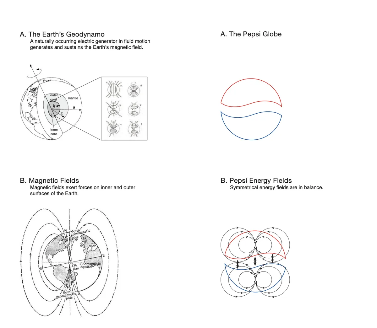
If you’ve ever sat in a design meeting and felt that the people around you were getting a bit high on their own supply, read our write-up of this infamous memo for a much-needed reminder that things could always be worse.
Also, if you’ll forgive me for editorialising for a minute – hate this one. Hate it. Hate the way it takes the beautifully simple and distinctive Pepsi globe and twists it into something that just looks… wrong. Hate the reedy, wafer-thin typeface that is, of course, all lower case. Bad. Get rid. Next.
2023-present: Return of the King

Credit where it’s due, Pepsi stuck with the bad redesign for more than a decade (they’d paid for it, to be fair). But in 2023, it was finally time to kick the bums out and go back to basics, and the company did that with a glorious reinstatement of the 1970s-style flat globe, with the Pepsi wordmark in the centre where it belongs.
No gimmicky ‘3D effects’. No looping scripts. No invocations of the earth’s geodynamo. Just one of the most iconic logos of all time, together with the simple mark of the brand that created it. And breathe. Isn’t that more relaxing?
Want more insights into how logos have changed over the years? See our rundown on the YouTube logo history, and see our guide to how to design a logo if you’re inspired to take a run at it yourself.
Feature image credit: Pepsi
By Jon Stapley
Jon is a freelance writer and journalist who covers photography, art, technology, and the intersection of all three. When he’s not scouting out news on the latest gadgets, he likes to play around with film cameras that were manufactured before he was born. To that end, he never goes anywhere without his Olympus XA2, loaded with a fresh roll of Kodak (Gold 200 is the best, since you asked). Jon is a regular contributor to Creative Bloq, and has also written for in Digital Camera World, Black + White Photography Magazine, Photomonitor, Outdoor Photography, Shortlist and probably a few others he’s forgetting.