He might have kept the Twitter name, but the bird has flown.
For a moment back there, it looked like Twitter might be back. Years after Elon torched the brand with the messiest rebrand in history and gave us the dumpster fire that is X, it the bird appeared to be rising from the ashes. ‘Operation Bluebird‘ was recently launched with the aim of creating a brand new social media experience. Called Twitter.
X, of course, sued. And this month, a judge ruled that Musk’s company could indeed keep the Twitter name. But not the logo. And it’s all because of Musk’s incendiary tweets from back in 2023 – specifically two of them.
Operation Bluebird launched earlier this year (Image credit: Bluebird)
On 22 July 2023, Musk tweeted that X was planning to “bid adieu to the twitter brand and, gradually, all the birds.” One day later, he posted that the company was taking blow torches to the Twitter logo on the building.
And now, it seems those tweets have flown back to haunt him. While Musk might be keeping the Twitter name, in a 35-page document, the judge has ruled that he’s lost the right to the bird logo, as well as the word ‘Tweet’ – citing those two Musk tweets as evidence that Operation Bluebird was “likely to succeed in proving both that X Corp. discontinued the bona fide use of the Tweet mark and Bird logo and that it intends not to resume the use of the marks.”
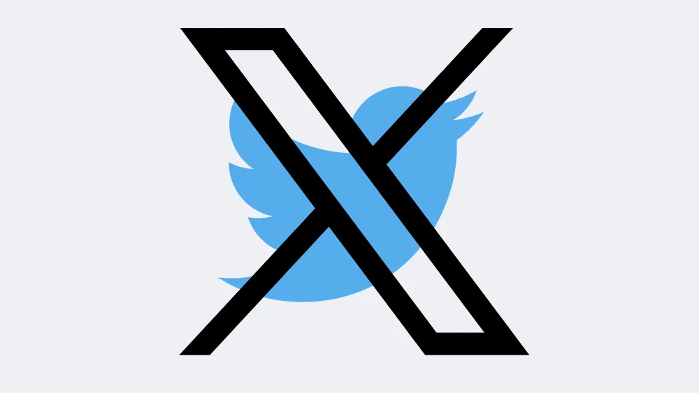
The Twitter/X rebrand was certainly messy (Image credit: Twitter / X)
“They kept the word. They let go of the bird, and they let go of the tweet,” TechCrunch quoted from a company statement from Operation Bluebird. It further states: “A ‘Tweet’ was never a corporation. It’s one person saying something. That word survived three years of a company trying to replace it, because the public declined to stop using it. We think that tells you who it belongs to.”
Daniel John is Design Editor at Creative Bloq. He reports on the worlds of design, branding and lifestyle tech, and has covered several industry events including Milan Design Week, OFFF Barcelona and Adobe Max in Los Angeles. He has interviewed leaders and designers at brands including Apple, Microsoft and Adobe. Daniel’s debut book of short stories and poems was published in 2018, and his comedy newsletter is a Substack Bestseller.
Guinness has a new campaign out, and before you’ve even looked at it, you may be wondering why the design press always gives this brand so much attention. Well, the answer has some quite deep historical roots.
The Irish stout brand actually didn’t advertise at all for the first 170 years of its history. Its strict philosophy was that the quality of the beer alone should do the talking. After the end of the First World War, though, a slump in sales meant the family that owned the company finally relented. However, they instituted an equally strict rule: the advertising had to be of the exact same exceptional quality as the beer itself.
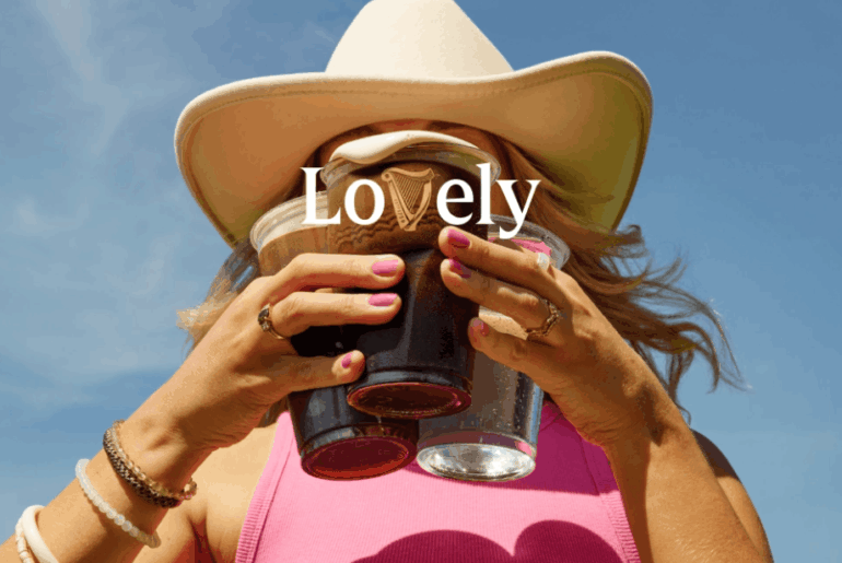
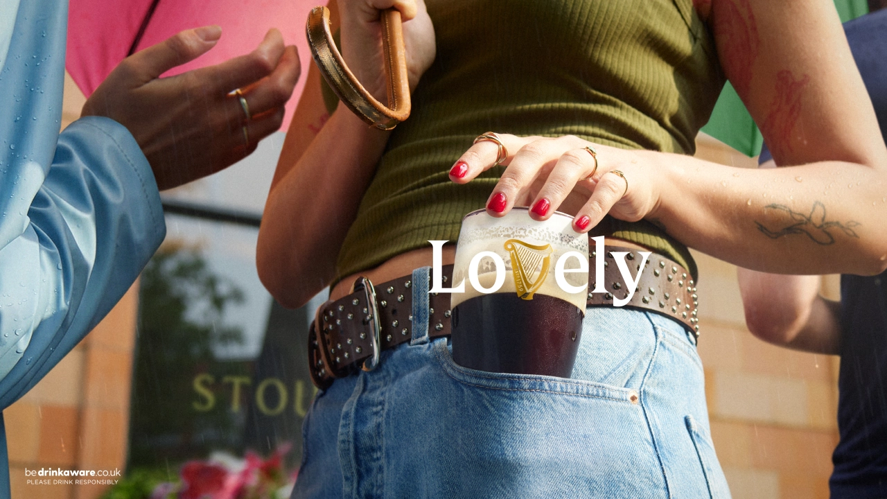
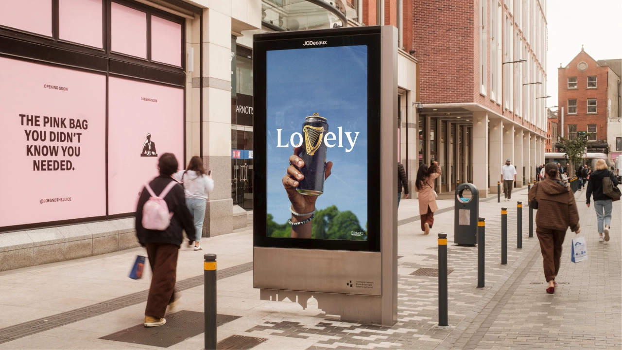
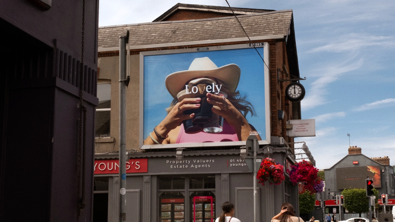
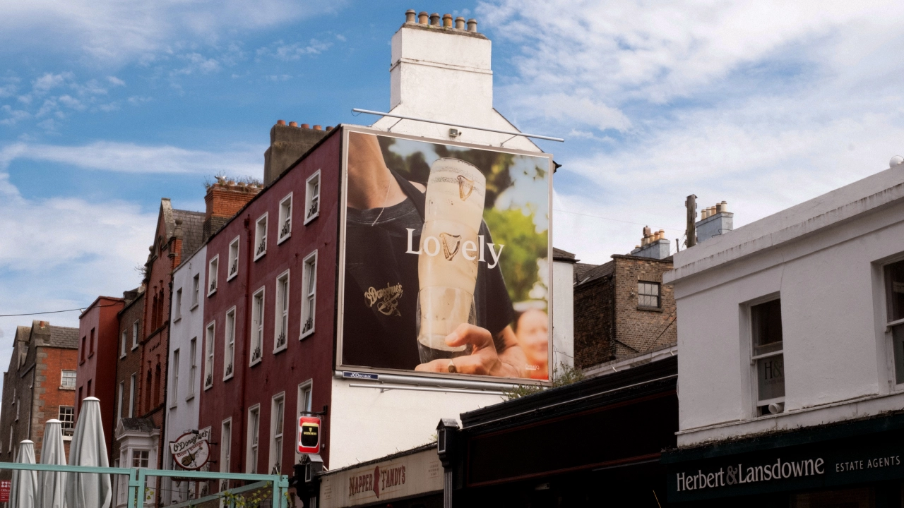
That tradition has led to a long and illustrated history for Guinness advertising, and it continues today in the form of LoVely. Delivered by and AMV BBDO, this new out-of-home campaign takes the brand’s harp, which has been on its bottle for over 160 years, and incorporates it into its typography.
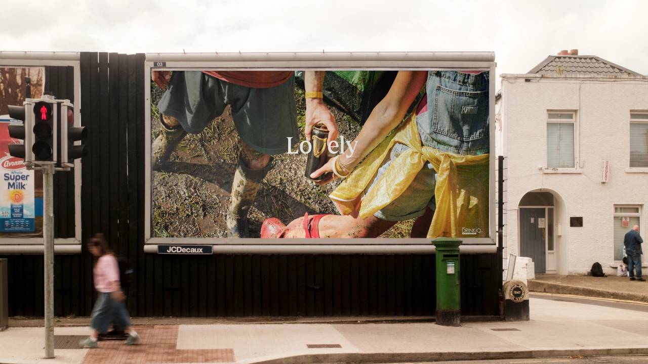
The idea is simple, yet brilliant. Take the word “Lovely,” swap the “v” for the harp mark, and feature it everywhere across the entire brand mix. Once you’ve seen it in action, it feels as if it might always have been there. As George Hackforth-Jones, global creative director at AMV BBDO, puts it: “Sometimes the best ideas are right in front of you.”
It’s a great lesson for anyone working with a heritage brand, where the constant dilemma is where to draw the line between modernising (and risk alienating your audience) and being conservative (which risks losing the younger generation coming up).
Context over redesign
The ‘LoVely’ strategy charts a clever middle course: extending a heritage asset without over-explaining it. While Guinness hasn’t redesigned its harp, it has found a new context for the one it already has; a real case of having your cake and eating it.
In this light, the key to making this strategy work is restraint. The harp hasn’t been forced or distorted into the lettering in any way: its natural silhouette already resembles a “v” closely enough that it feels natural, not engineered. It’s a good principle to follow for any heritage brand extension: finding what’s already hiding in an asset is always better than trying to come up with something new.
There’s also a call back to “Lovely Day for a Guinness,” the brand’s long-running ad platform which originated in the 1930s and which was revived last year. As Stephen O’Kelly, global brand director for Guinness at Diageo, puts it: “LoVely gives new life to one of our most famous advertising lines, refreshing Guinness’ brand heritage in a way that is timeless, contemporary and relevant across markets and channels.”
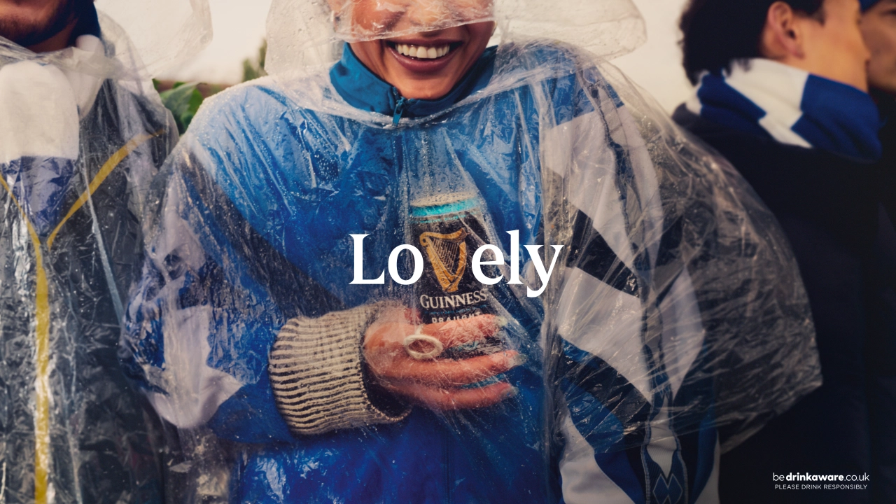
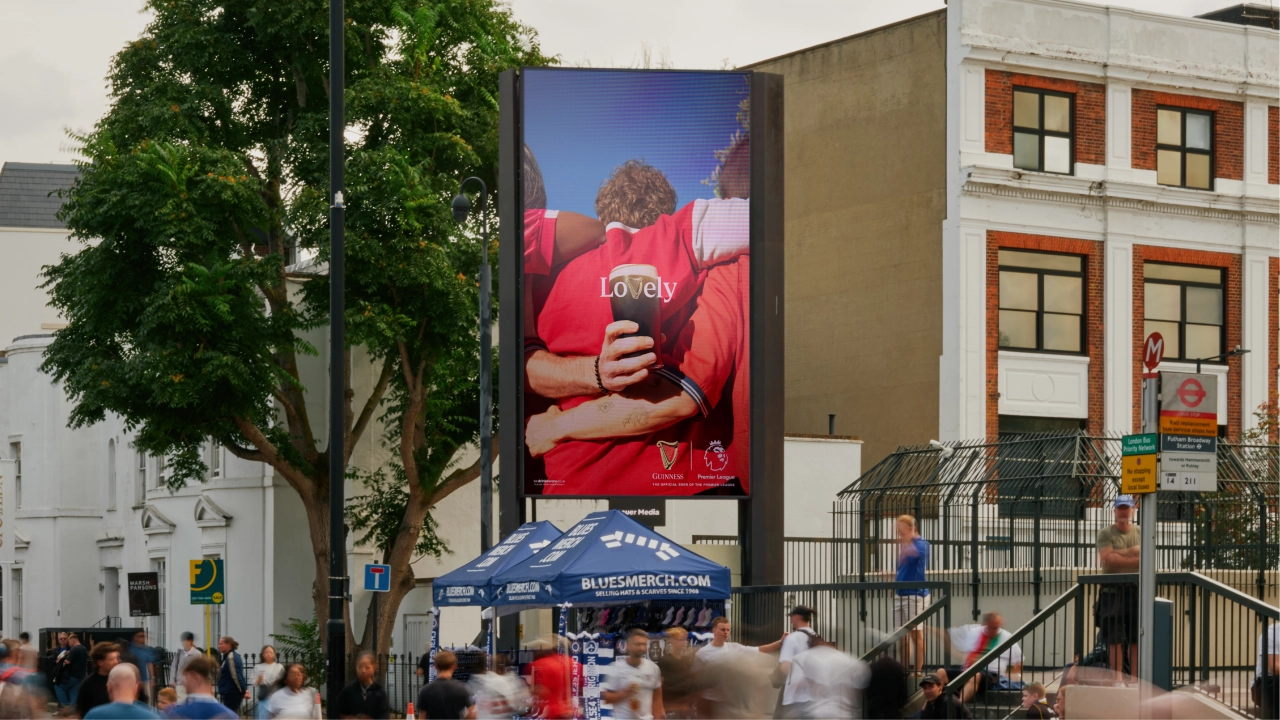
The photography, too, is executed well. Shot by Dan Burn-Forti and Peter Franklyn Banks, the campaign leans on tightly cropped, authentic-feeling slices of life: muddy wellies at a festival, an arm slung round another’s shoulders at a football match, a can nestling under a poncho in the rain.
That broad, everyday approach means the same visual language can stretch from, say, Guinness’s sponsorship of the Electric Picnic festival in County Laois, Ireland, to its partnership with the Premier League in England, without them ever feeling like different campaigns.
Strategic challenge
That kind of breadth is a strategic challenge for any global brand, and it’s one that a lot of campaigns fail to solve. ‘LoVely’ succeeds by keeping its visual system loose enough to absorb very different settings, while the harp-as-“v” device stays constant across every application, giving the whole campaign an easily recognisable through-line.
‘LoVely’ has launched first in Ireland and Great Britain across high-impact out-of-home and digital out-of-home formats, with wider expansion into Africa and Asia-Pacific to follow. Its goal, from what I can tell from the press materials, isn’t to reinvent what’s already trusted, but to find the one small shift that can bring new people in.
Brands often spend large amounts of time and money on designing a new logo. But Guinness didn’t need a new symbol. It just needed to notice the “v” that had been hiding in its harp all along.
The new era of creative content platforms is here.
The rapid rise of influencer media, the fragmented media landscape, and our always-on culture have given way to a new content beast that brands now must tackle. Today, most brands race to produce free, entertainment-first content for platform algorithms that prioritise and reward engagement above all else, often at the expense of brandconsistency.
As a result, brands often adopt a “shotgun” approach: producing lots of posts, formats, and trend-chasing content that may momentarily spike engagement but rarely compounds into durable brand meaning. This is exacerbated by audience fragmentation across countless niche platforms and communities. Traditional brand identity systems, optimised for static expression and centralised control, struggle to keep pace with these demands.
The brands that are successfully breaking this cycle are shifting their thinking from “what we look like” to “how we behave and enable others to create.” This means evolving briefs, toolkits, and governance models to support deliberate, scalable content production that serves both human audiences and platform discovery algorithms. Flexible identity systems and strategic content franchises are essential, and brands that fail to adapt risk irrelevance or incoherence.
Corporate identity to channel identity
(Image credit: NYT Cooking)
We’re in a new era of corporate identity building. What was once driven by an iconic logo, graphic simplicity, and an architecture signalling brand ownership, must now be adaptable across channels, for an audience that includes a constantly evolving AI persona. A new hybrid challenge has emerged: how to deliver on the engagement opportunity while maintaining coherence.
We see some of the more effective working models of this in traditional media brands such as The New York Times, The New Yorker, and The BBC. They retain the fundamentals of an iconic masthead and build everyday relevance by developing a variety of content franchises (NYT Cooking, Wirecutter, The Athletic, etc.), some evergreen, and some of which change from day to day and season to season.
Similarly, today’s brands need to evolve from thinking in terms of type, colour, and photography that lives within a single brand to how those same devices stretch across content franchises and media channels. Brand management must balance formal visual consistency with a dynamic editorial content platform that can flex, experiment, and occasionally challenge visual norms.
This combination of a visual constant, paired with variable systems and storytelling, allows the brand to stay recognisable while flexing to engage as the news and entertainment cycle evolves.
Platform and content thinking
(Image credit: Red Bull)
Many brands have a difficult time freeing themselves up from their “corporate identity.” However, reframing your marketing mindset for today’s channels and audiences can pay enormous dividends.
Red Bull is a clear exemplar: through Red Bull Media House, the company has built a full-fledged media ecosystem – Red Bull TV, The Red Bulletin, and creative hubs like Red Bull Studios – that produces everything from live events and music programming to cinematic sports films. By owning distribution, investing in long‑form storytelling, and operating physical and digital studios for creators, Red Bull has transformed product marketing into a portfolio of content franchises that build community, loyalty, and distinctive cultural positioning.
Every brand should be looking at its portfolio of people, ideas, events, sponsorships, and philanthropy through a similar lens: what could become a repeatable content franchise that audiences recognise and return to? And how can we think dynamically about how we use and engage with content from each of these sources?
Creating dynamic systems
From a visual perspective, the franchises you create should not be cookie-cutter replicas of each other. Your identity systems need a strong and purposeful foundation of typography and colour that can flex to support a broad content platform, from the serious and analytical to the playful and humorous.
Take The Guardian,for example, whichhas a distinct typographic family and colour palette, yet allows for a vast array of photographic and illustrative imagery, including political cartoons. It also flexes how these are used across channels, including Instagram and YouTube. Contrast the formal structure of the print and digital edition of the paper with the street voice of Instagram. This is exactly what modern brands need: a consistent core identity that can shift tone and format by channel and moment.
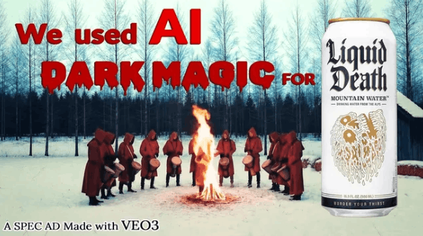
In comparison, Liquid Death’s identity is rooted in character versus the more traditional graphic guidelines. While a newer, more niche brand, it understands that “principles,” not rules, give it the flexibility and creativity to build its tribe.
In each case, a strong core identity supports diverse content series, rather than constraining them.
Now what?
It can be challenging for traditional brands to pivot how they think and act with their identity; they often have large management structures that resist newer, more reactive media models and antiquated design systems. The skills and aptitudes required to manage a brand are quite different from those needed to create it.
To start, marketers should ask themselves clear questions from a content and design perspective:
Content
Where and with whom is the brand driving engagement?
What can we learn from others inside and outside of the category?
What if we did the opposite of our competitors?
Can we dig deeper into a topic to broaden the range?
How might we atomise components for quick consumption?
We’d also recommend carving out specific time to continually play and experiment with new topics and elements to gauge interest.
Design
Are we leading or following? For example, if everyone in the category is, say, blue, do we break through by using a different colour?
Does our logo and system, or how we are using these elements, allow us to be alive in culture? What elements and rules need to change?
Where can we introduce new tools and automation to free up thinking time, and speed execution?
The shift may require a rebalancing of power, from linear campaign planning and management to zig-zagging dynamic content creation, and from a primary focus on “what we look like” to “how we behave and enable others to create.” But from this shift, we can usher in a new era of iconic design built for cross-platform success.
Brendán is a senior partner in design based in Lippincott’s New York office. A native of Dublin, Brendán has over 25 years of experience at Lippincott spanning identity design, brand voice, campaign development and customer experience innovation. Brendán has led and designed programs for a wide spectrum of clients including Aer Lingus, Ameriprise, BD, Blue Cross Blue Shield, Bombardier, CIBC, CityMD, Comcast, DuPont, Hearst, Intuit, Liberty Mutual, Morgan Stanley, MSK, Samsung, SK, The New Yorker, Toys ‘R’ Us, The Weather Channel, TimeWarner, Wells Fargo and Vale. His pro bono work includes NYC Pride, The NewYork Historical, Be The Match and Lighthouse International.
One of the most iconic marks ever created, Pepsi’s logo has been on a fascinating and tumultuous journey spanning more than a century.
From a medical tonic brewed behind a pharmacist’s counter, to one of the biggest and most recognisable brands with one of the best logos on the planet, Pepsi has been on quite a journey since its beginnings in 1893.
On the way, its logo has been through more than a few incarnations. The classic red, white and blue Pepsi globe is an instantly recognisable symbol, and the classic Pepsi-Cola wordmark was immortalised in a famous neon sign in New York City – but it wasn’t always quite so smooth. So, let’s take a closer look on a journey through more than a century’s history as we see what we can learn from all the eras of Pepsi’s logo – the good, the bad, and the downright baffling.
1893-1951: From Brad’s Drink to Pepsi-Cola
The evolution of the early Pepsi logo from 1989 to 1906. (Image credit: Pepsi)
Pepsi did not begin life as Pepsi. It was invented by North Carolina pharmacist Caleb Bradham and sold over the counter at his drugstore as a medicinal drink, initially simply called ‘Brad’s Drink’. It combined kola nut extract with vanilla and sugar as well as various herbs and spices, and was advertised as a relief for dyspepsia. A cola for dyspepsia… Pepsi-Cola! You can see how ol’ Brad got there.
Some spurious unsourced logos for ‘Brad’s Drink’ are floating around online, but I’m sceptical to say the least. The first logo proper arrived with the new name, in 1898, and well, it sure is a logo – let’s take a closer look.
It’s certainly something. (Image credit: Pepsi)
One of history’s all-time rough drafts, it looks a lot like someone who wasn’t particularly skilled at drawing attempted to make their own legally distinct version of Coca-Cola’s famous Spencerian script – and it’s quite possible that this is exactly what happened.
Over the following decades the logo would be considerably refined. The script would gain its familiar looping shape and the letters their distinctive curling serifs – though to be fair, the double-loop underline from the original would remain consistent. The ‘C’ also gained its stylish flag, echoing the shape of the underline, in which the instruction ‘Drink’ would sometimes be written.
This version from 1934 is one of the most famous. (Image credit: Pepsi)
This mark had reached its final form by the early 1950s, in a refined and rather lovely piece of lettering that achieved immortality when it was used on the illuminated Pepsi-Cola sign in Queens, NYC. This mark would stick around on and off for the next couple of decades.
1951-1971: Bottle cap era
Classy. (Image credit: Pepsi)
By the 1940s, Pepsi had started experimenting with distinctive bottle cap designs, and this resulted in the launch in 1951 of the distinctive red, white and blue bottle cap that would go on to become the Pepsi ‘Globe’ – one of the most famous logos in the world.
The original introduction of the bottle cap has been varyingly described in the historical record as an attempt to create something unique to differentiate the brand from copycats, and a bit of tri-colour WWII-era patriotism. It was quite possibly both.
In the 1960s, the bottle cap would be updated with a strikingly modern flat sans-serif typeface, and shortly after that, the word ‘Cola’ would be omitted from the branding for the first time. This was reportedly an attempt to appeal to younger people, who apparently don’t like too many words.
1973: The Pepsi Globe
The 1970s version (left), and a typographical refresh in 1986 (right). (Image credit: Pepsi)
The circular logo proved so successful that in the 1970s, it was able to be divorced from the bottle cap entirely and stand on its own; clearly, people no longer needed subconscious reminding that Pepsi was a drink.
Throughout the next two decades this logo would go through a few minor tweaks and refinements, with the ‘Pepsi’ wordmark being set in the typeface Handel Gothic.
1991-2008: Going 3D
Varyingly radical nineties-ified versions of the logo from (clockwise from top left) 1991, 1997, 2003 and (briefly) 2008. (Image credit: Pepsi)
Another big shake-up arrived in the nineties, when the ‘Pepsi’ wordmark was divorced from the globe entirely. This is a time-honoured sign of runaway success for a logo, as enjoyed by the likes of Starbucks and McDonald’s – when it is deemed strong, distinctive and familiar enough to signify a brand on its own.
This was also the point where subtle suggestions of three dimensions started to be introduced into the globe. Slight shading on a version introduced in 1997 gives it the appearance of a ball, as do shining white highlights on a versions used from 2003, and stylised water droplets on a version that was used very briefly in 2008, before something big happened.
2008-2023: Emotive forces shape the gestalt of the brand identity
The famous dramatic rebrand of Pepsi from 2008, which underwent a slight refresh (bottom right) in 2014. (Image credit: Pepsi)
Okay. This. You knew this was coming.
In 2008, Pepsi decided it was time for a rebrand. Nothing wrong with that. For this million-dollar endeavour, the company contracted the New York-based Arnell Group, who produced the skewed form of the Pepsi Globe, with the white line at an angle suggestive of a smile.
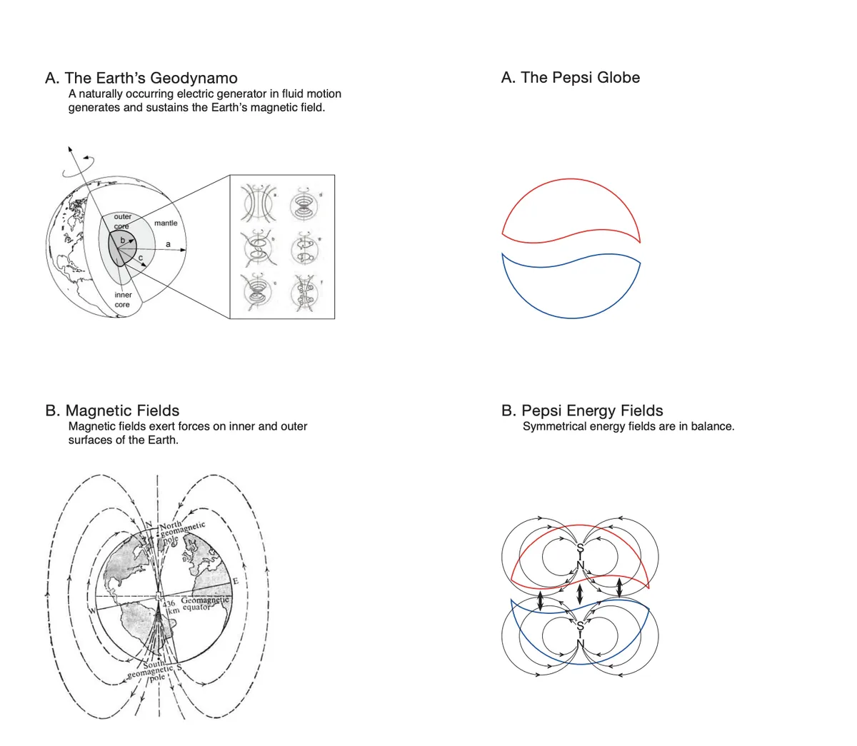
However, the real story was the group’s design memo, which leaked in 2009 – and is so deliriously unhinged that some people quite credibly think it could be a hoax. Over 27 exhaustive pages, the memo’s writers talk about how the Pepsi logo is inspired, obviously, by the earth’s self-sustaining magnetic field. It discusses how ‘emotive forces shape the gestalt of the brand identity’. It compares the Pepsi logo to the Mona Lisa.
Not now sweetie, Daddy’s shaping the gestalt of brand identity. (Image credit: Arnell Group)
If you’ve ever sat in a design meeting and felt that the people around you were getting a bit high on their own supply, read our write-up of this infamous memo for a much-needed reminder that things could always be worse.
Also, if you’ll forgive me for editorialising for a minute – hate this one. Hate it. Hate the way it takes the beautifully simple and distinctive Pepsi globe and twists it into something that just looks… wrong. Hate the reedy, wafer-thin typeface that is, of course, all lower case. Bad. Get rid. Next.
2023-present: Return of the King
That’s better. (Image credit: Pepsi)
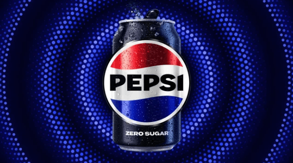
Credit where it’s due, Pepsi stuck with the bad redesign for more than a decade (they’d paid for it, to be fair). But in 2023, it was finally time to kick the bums out and go back to basics, and the company did that with a glorious reinstatement of the 1970s-style flat globe, with the Pepsi wordmark in the centre where it belongs.
No gimmicky ‘3D effects’. No looping scripts. No invocations of the earth’s geodynamo. Just one of the most iconic logos of all time, together with the simple mark of the brand that created it. And breathe. Isn’t that more relaxing?
Want more insights into how logos have changed over the years? See our rundown on the YouTube logo history, and see our guide to how to design a logo if you’re inspired to take a run at it yourself.
Jon is a freelance writer and journalist who covers photography, art, technology, and the intersection of all three. When he’s not scouting out news on the latest gadgets, he likes to play around with film cameras that were manufactured before he was born. To that end, he never goes anywhere without his Olympus XA2, loaded with a fresh roll of Kodak (Gold 200 is the best, since you asked). Jon is a regular contributor to Creative Bloq, and has also written for in Digital Camera World, Black + White Photography Magazine, Photomonitor, Outdoor Photography, Shortlist and probably a few others he’s forgetting.
Some of the most controversial redesigns have had surprising staying power.
Over the last few years we’ve seen some truly headline-making rebrands. And if you know anything about the attention economy in the twenty-first century, you’ll know that headline-making equals controversial. Hate sells, and there’s nothing people love to hate more than a beloved brand trying out a bold new look.
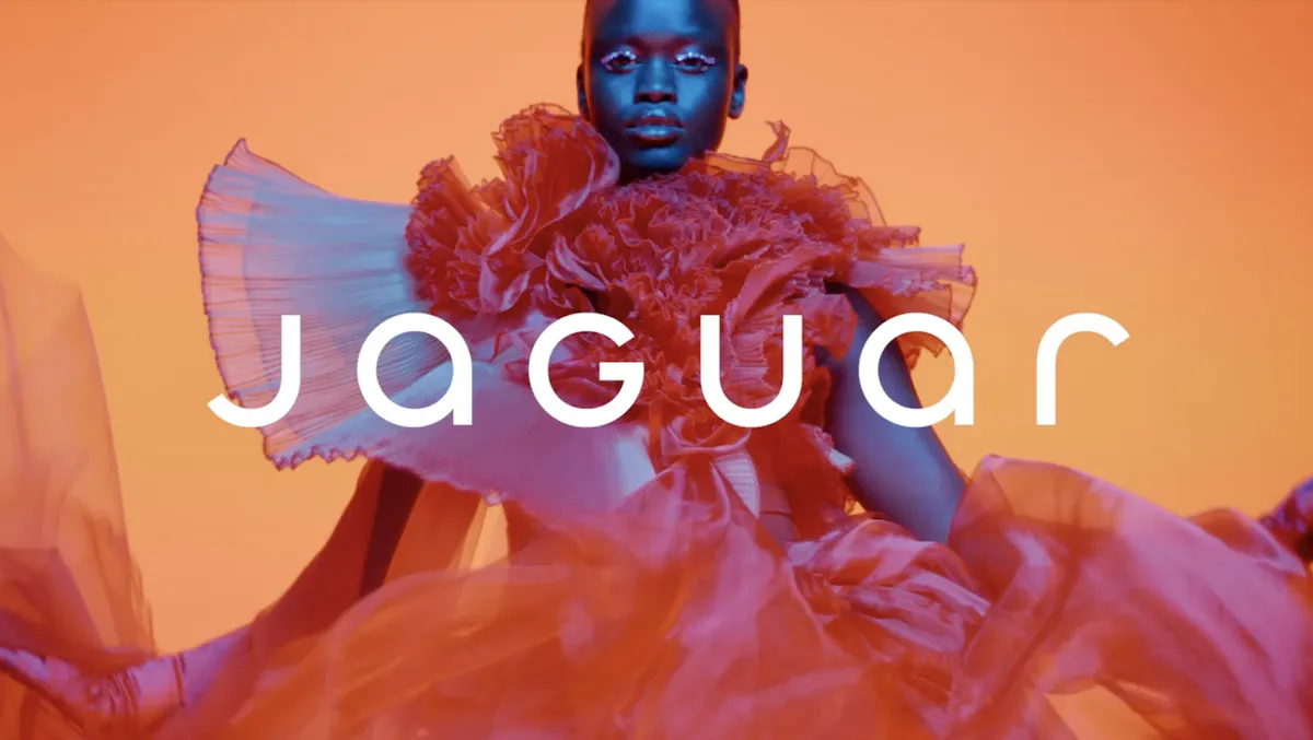
Perhaps the most obvious example from recent memory is Jaguar, whose colourful and curvy new look prompted outcry in 2024. And then there’s Cracker Barrel, which angered MAGA (and more) by doing away with its ‘old timer’ mascot’ last year. The vitriol directed at these new identities was on another level, with real-world effects for the brands.
The ‘controversial’ Cracker Barrel rebrand (Image credit: Cracker Barrel)
One one hand, in today’s social media age, perhaps the response to these rebrands wasn’t surprising. Seeing figures like Elon Musk call Jaguar woke or Donald Trump Jr ask “WTF is wrong with Cracker Barrel” feel par for the course in the 2020s. By removing iconic assets, those rebrands were doing something bold and, yes, possibly foolish – even on paper, a Jaguar campaign without any cars sounds a bit daft.
But the alarming thing here is that these backlashes so clearly cowed the respective brands. Cracker Barrel was publicly contrite about its redesign, announcing on social media, “You’ve shown us that we could’ve done a better job sharing who we are and who we’ll always be” before wheeling back the rebrand. And this is despite the brand also offering a rationale for the new logo that actually made a lot of sense: to simplify the design for new, digital applications.
The response to the Jaguar rebrand has allegedly led to the firing of the brand’s design chief and the dropping of its ad agency (Image credit: Jaguar)
As for Jaguar, to an outsider, the rebrand appears to be going strong – it still adorns the brand’s website, along with the new tagline, “Copy nothing. Delete ordinary.” But behind the scenes, it sounds like the backlash has led to some profound changes, including the design chief being sacked and the advertising agency being dropped.
Now, rebrand U-turns are nothing new. We’ve been seeing brands ditch their new designs in response to controversy for decades. GAP’s 2010 rebrand lasted all of six days, while Tropicana’s 2009 redesign managed a few months. But the difference is that there was nothing political about those backlashes – they were purely about the loss of an iconic design. Both Jaguar and Cracker Barrel, however, were mostly criticised for “going woke”. And the noise got so loud so quickly that the brands bottled it.
GAP’s 2010 rebrand lasted all of six days (Image credit: Gap)
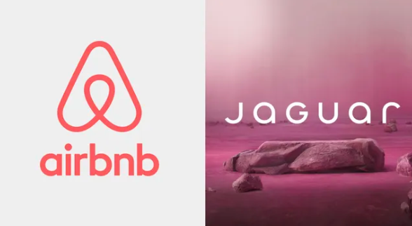
And what they perhaps forgot is that online noise does, eventually, die down. Some of the most controversial rebrands of the last couple of decades have proven to have remarkable staying power. Back in 2014, the new Airbnb logo faced an avalanche of criticism accusing it of everything from lack of originality to sexual symbolism. Twelve years later, it’s still going strong – and hardly anyone remembers the initial controversy.
Similarly, Instagram‘s switch from its realistic retro camera icon to a minimalist gradient in 2016 was initially wildly unpopular, with the bright gradient called childish and ugly at the time. Turns out Instagram was ahead of the curve – that skeuomorphic camera would look positively dated today, whereas the gradient Instagram logo is now one of the most recognisable in the world.
Who’s still complaining about the Airbnb logo?
What these examples show is that while the internet has always been quick to judge rebrands, perhaps the best judge is time. Once all of the noise has died down, longevity serves as pretty categorial proof that a rebrand was sound.
Indeed, some rebrands from the 2020s are now half a decade old, giving us the benefit of hindsight to decide what truly worked and what didn’t. Burger King’s flat design bonanza is still sizzling five years later. Conversely, in the wake of the recent news that it’s slashing its metaverse department, Facebook’s 2021 ‘Meta’ rebrand finally looks like a failure in 2026.
So while the internet will always be a wild west of lightning fast reactions, perhaps we ought to bear in mind that the true marker of a successful rebrand is time. Are people still complaining once the dust has settled five years later? Or is it, like Airbnb, now just a solid and recognizable brand identity? And perhaps the brands feeling threatened by cries of “Woke!” need to remember the same thing too.
Daniel John is Design Editor at Creative Bloq. He reports on the worlds of design, branding and lifestyle tech, and has covered several industry events including Milan Design Week, OFFF Barcelona and Adobe Max in Los Angeles. He has interviewed leaders and designers at brands including Apple, Microsoft and Adobe. Daniel’s debut book of short stories and poems was published in 2018, and his comedy newsletter is a Substack Bestseller.
We want to know what you think is the best logo ever made. Sure, we have our best logos list, which includes some of the most well-known logos in the world (and some lesser known ones) chosen by professional designers. But we have a hunch some of you might not agree with our list – and that you see greatness elsewhere. We will add the winner to our list – and share the overall results and comments, too.
Our current list includes:
Apple
Audi
Bass Ale
CBS
Coca-Cola
Cooper Union
Crate&Barrel
Davidelfin
Dunkin’
FedEx
Hillary Clinton
I Love New York
Jordan Jumpman
Kelloggs
Lacoste
LG
London Underground
McDonald’s
MIT Media Lab
Mozzo
MTV
NIKE
Open University
Penguin
Playboy
Qantas
The Red Cross
Santa Cruz
Shell
Sony VAIO
Syncopy
Tate
Toblerone
So, what do you think? Do you love a logo that’s as iconic as its brand, or have you got a sneaky secret no-one else has heard of? Is it a new, old or redesigned logo you want to crown? Are there any picks in our list you’d relegate?
Feature image credit: Adidas/Coca-Cola/Shell/Wendy’s/NBC/New York Yankees
An iconic logo redesign signals a significant shift reflecting deeper strategic change at one of the world’s most recognizable automotive brands is a logo redesign. Honda Motor Co., Ltd. has officially announced a refreshed version of its signature emblem for the automobile business.
The update will begin appearing on next-generation vehicles in 2027 and will also be integrated across Honda’s broader automotive ecosystem, from dealerships to motorsport programs.
For the first time since a logo revision in the early 1980s, Honda’s familiar “H” mark has been reimagined as a visual symbol not merely for products but for the company’s evolving identity.
The new design was first previewed on concept electric models, part of Honda’s so-called “0 Series,” which were shown in prototype form at trade shows and automotive events over the past year. These concept vehicles, including a saloon and SUV, sported the new emblem long before the broader rollout was confirmed.
Image Credit: Honda.
Honda’s accelerated push toward electrification and hybridization is the driving force behind the redesign. The new badge will debut on both fully electric vehicles and major hybrid-electric models in 2027 as the company transitions its global line-up toward more sustainable powertrains. It will sit on the hoods and trunks of flagship models and appear prominently in external branding elements worldwide.
Honda says the new logo design takes inspiration from the notion of “two outstretched hands,” representing the company’s commitment to expanding mobility possibilities and serving the evolving needs of customers. According to the press release, this graphical expression embodies Honda’s mindset of returning to its roots while embracing a transformation to meet future challenges.
A Historical Nod with a Modern Twist
The redesigned mark is more than a cosmetic refresh. Honda’s first “H” logo was adopted in 1963 and underwent periodic adjustments across decades.
Image Credit: Honda.
The version introduced today blends this heritage with a cleaner, borderless aesthetic that recalls early badge designs while signalling a modern engineering era focused on cutting-edge technologies. The deleted enclosing frame that previously surrounded the letter “H” is both a stylistic and symbolic choice.
Industry insiders and designers have noted that the simplified logo improves versatility in digital and physical applications, from illuminated front grilles to touchscreens and promotional materials. Automotive branding experts suggest that such minimalist designs age better over time and are easier to integrate across varied surfaces and media.
That said, public reaction remains mixed on automotive forums and social platforms, with some purists preferring the classic look and others embracing the change as part of a broader design evolution.
Deeper Transformation Underway
There’s more happening than a fresh badge on the grille. What we’re really witnessing is a company in the midst of a philosophical and operational reset as it grapples with seismic changes in markets, technology, and culture.
Honda’s leadership has quietly stepped back from its earlier all-electric dreams and is rebalancing its strategic compass. At its core this is a recognition that the world isn’t moving in a straight line toward battery-only cars at the pace many predicted.
Consumer demand for pure EVs has decelerated in key markets like the United States. Honda’s own data forecasts EVs making up less than 30 percent of its sales by 2030, far short of earlier internal targets.
In response, the company has slashed its planned electrification investment by roughly 30 percent, reducing what had been a massive $69 billion (¥10 trillion) commitment to about $48 billion (¥7 trillion). However, this isn’t retreat so much as recalibration.
Image Credit: Honda.
Honda is redistributing its bets toward hybrid technology; a technology it believes can deliver meaningful emissions reductions while preserving profitability and driving engagement. In practical terms, this means Honda will launch at least 13 new next-generation hybrid electric vehicles globally through 2030 and target sales of more than 2.2 million hybrid units annually by then.
This strategic shift is manifesting internally too. Honda is reorganizing its automotive operations with electrification strategy now woven directly into its core business units rather than a separate silo.
By combining electric and internal combustion development functions under one roof, Honda aims to accelerate innovation and cut time to market for new platforms that blend electric drive with traditional engines.
There’s also a software revolution brewing. Honda’s “Centralized E&E Architecture” and high-performance systems-on-chip are aimed at future vehicles that feel more like computers on wheels than mechanical conveyances. This architecture will underpin smarter safety systems, advanced driver assists, and ultimately software-defined vehicles that can evolve long after purchase.
Meanwhile Honda isn’t ignoring its roots or its enthusiast DNA. Racing prototypes and performance-tuned concepts from Honda Racing Corporation (HRC) show a renewed focus on driving passion, not just efficiency.
And behind closed doors there are serious efforts to support classic Honda models with parts and restoration programs that will keep iconic vehicles alive longer, fuelling brand loyalty and cultural cachet.
The new logo is the most visible sign of change at Honda. Beneath it, the company is recalibrating how it innovates, how it allocates capital, and how it bridges legacy engineering with future tech.
Image Credit: Honda.
Not merely a branding moment; the company is wrestling with the same strategic contradictions facing the entire auto industry — and bending in ways that could determine whether Honda leads, follows, or gets flattened by the shifts within, without, and ahead.
Beyond Cars: A Unified Brand Vision
Honda’s new emblem will not be confined to the vehicles themselves. The company plans to extend its use to dealership signage, advertising campaigns and competitive motorsport efforts. This broader implementation signals that Honda sees the logo not simply as a badge but as a unifying brand statement across its global automotive enterprise.
In particular, Honda’s expansion of the new mark into motorsport suggests a renewed commitment to high-performance and competitive platforms. It aligns with ongoing efforts to meld racing heritage with future-ready technologies, which reinforces the emotional connection between Honda’s rich racing past and its next chapter.
The timing of the logo change is no accident. The global automotive market is undergoing profound transition, with electrification and digital technologies reshaping consumer expectations and competitive dynamics.
For Honda, the refreshed emblem is an outward sign of internal evolution, intended to communicate that the company is stepping confidently into a new technological age. Corporate communications describe the launch of the mark as a “second founding” for the automotive business.
Now What?
The first production vehicles sporting the new mark are expected in 2027. These will include both all-electric and advanced hybrid models as Honda phases in updated powertrain architectures. The emblem will gradually replace the longstanding logo across Honda’s global presence. Dealers and corporate facilities will begin adopting the new branding in the months and years that follow to create a unified global identity.
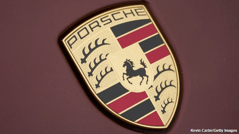
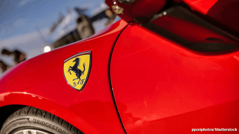
There are plenty of car brand logos with hidden meanings, but the reason why Porsche and Ferrari both use a horse as their logo boils down to their individual histories, not branding strategy.
Even though the resemblance is uncanny, both brands derived inspiration from independent moments in European history that just happened to revolve around one animal. Porsche’s horse has direct ties with the land where the brand’s story originates. The company was founded in Stuttgart, a city whose coat of arms has featured a rearing horse for centuries. To pay tribute to its origins, Porsche placed the horse at the center of a crest when it first introduced its logo in the early 1950s.
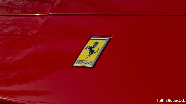
On the flip side, Ferrari’s horse carries personal and symbolic significance. During World War I, Italian fighter pilot Francesco Baracca painted a prancing horse on his aircraft. After his passing, the horse became a symbol of his legacy. In 1923, when Enzo Ferrari (the founding father of Ferrari) won his first ever race in North Italy, he met Baracca’s father and went on to develop a great friendship with his family. Enzo was eventually moved to adopt that very horse as a logo on his racing cars, believing it would bring good luck.
So, did either brand copy the other? Not really. The two brands share the same animal for entirely different reasons — and these aren’t just the only two brands using the Stuttgart horse. A strange little car company called Steinwinter has basically the same exact logo as Ferrari.
The detail that complicates the story
The explanation above is usually presented as the full story. However, it still doesn’t fully explain why the two horses look more alike than coincidence would allow. The connection becomes complicated once we take the story beyond Francesco Baracca himself.
The part of the story involving Enzo’s encounter with Baracca’s family members is well-documented. What’s not clear is where Baracca got his horse emblem from in the first place. Some speculators indicated that Baracca could have taken this emblem after downing a German pilot whose aircraft carried a horse emblem from their home city, which would be Stuttgart in this case.
If those accounts are to be believed, then the horse that Ferrari adopted is the very same horse that Porsche borrowed from its hometown. While this detail adds further depth to the story, it still doesn’t suggest that either brand has deliberately copied the other. Instead, it shows how the same image could move quietly across borders and contexts, changing meaning as it went.
Why the similarity in logos never became a problem
What ultimately allowed both brands to keep the horse without conflict is how clearly each logo defined its own meaning. In the case of Ferrari, the prancing horse logo became official when it finally commenced the production of its vehicles post World War II. The logo consists of a black horse (also known as Cavallino Rampante) depicted against a yellow background to symbolize the city of Modena, and the Italian flag rests above it all. The horse was positioned facing left, as per the direct instruction of Enzo Ferrari, and this was carried onto Ferrari road cars beginning with the 125 S.
For Porsche, the horse came from the Stuttgart crest of arms. The horse was situated at the centre of a shield that contained the words “Stuttgart” and “Porsche,” along with colours referencing the Württemberg region. The crest has been on the Porsche 356 since the early 1950s, and it was later incorporated onto hubcaps and car bodies. Although the logo has evolved over the years, the horse has stayed part of the larger crest design — and Porsche’s new logo has all of the same elements with slight stylistic changes.
It’s been called an “unauthorized misappropriation”.
Volkswagen has sparked a design dispute after filing a lawsuit against a car dealership, claiming that its logo is “unauthorised misappropriation”. The Dallas-based dealership named “VDubs Only” has been accused of creating a “bastardised” version of the German manufacturer’s logo that could potentially mislead consumers.
As one of the most recognisable car logos out there, it seems bizarre that Volkswagen feels threatened by a small dealership. It’s by no means the most ridiculous logo design dispute we’ve seen but with Volkswagen claiming infringement and dilution of its identity, it’s clear the car brand is driving for a resolution.
(Image credit: Volkswagen/Vdubs Only)
The centre of the design dispute evolves around the VDubs Only logo, which features a “V” design against a blue background (sounds familiar but I’d say it’s far from a direct ripoff). Alongside the alleged logo infringement, Volkswagen claims that the VDubs name violates its trademark of the word ‘V-Dub’ which has previously been used in campaigns. It’s worth noting that Volkswagen only owns the rights to the hyphenated form of ‘V-Dub’, so technically there’s no foul in that department.
The official lawsuit claims that these alleged infringements will be “likely to cause potential purchasers of Defendants’ products and services, as well as the public at large, to believe that Defendants’ products and services are affiliated with, authorized, sponsored by, or endorsed by VW.” Volkswagen is searching for a permanent injunction to prevent Vdubs Only from allegedly misappropriating its marks.
(Image credit: Getty Images)
For more design debate stories, check out the Michael Jackson logo dispute. If you’re after more car branding controversy take a look at the Mercedes-Benz logo dispute that threatened to oppose a humble microbrewery.
Natalie is Creative Bloq’s staff writer. With an eye for trending topics and a passion for internet culture, she brings you the latest in art and design news. A recent English Literature graduate, Natalie enjoys covering the lighter side of the news and brings a fresh and fun take to her articles. Outside of work (if she’s not glued to her phone), she loves all things music and enjoys singing sweet folky tunes.
Elon Musk has been promising X’s transition into an “everything app” for some time now, but finally, we might have a breakthrough – behold X TV. An offshoot of the social media app, X TV is set to be an all-in-one entertainment app for your smart TV, bringing X’s “high-quality” content to your home.
The X overlord teased the new app via a cryptic video, debuting the new X TV logo design. With the X icon considered one of the worst new logo designs of last year, the launch of X TV was Elon’s chance to redeem himself. I’m sad to report that the result is a little underwhelming, to say the least.
Now I’m aware that for the sake of continuity, we can’t stray too far from the original logo design, but it feels like there could’ve been a little more consideration put into the new look. It seems that X (and now X TV) is caught up in the aesthetic of being edgy and fresh, and in turn, it’s giving us soulless minimalism.
Design aside, the new app is set to be an innovative form of media consumption, using tailored algorithms and AI-powered organisation to bring you the “immersive entertainment experience” that you deserve. My reservations will be held until I can make a fair judgement.
For more Elon-related news, check out why the Cybertruck’s latest design fail looks like the beginning of the end. For the logo buffs out there, take a look at the logo design quiz that has stumped the internet.
Natalie is Creative Bloq’s staff writer. With an eye for trending topics and a passion for internet culture, she brings you the latest in art and design news. A recent English Literature graduate, Natalie enjoys covering the lighter side of the news and brings a fresh and fun take to her articles. Outside of work (if she’s not glued to her phone), she loves all things music and enjoys singing sweet folky tunes.