Tag

Graphic Design

Browsing

By 

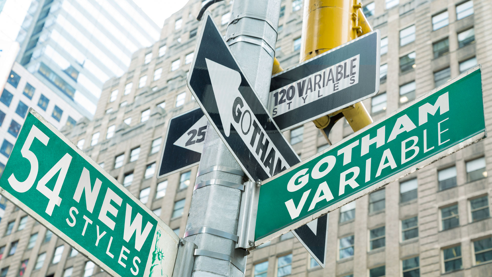
Say hello to Gotham Variable.

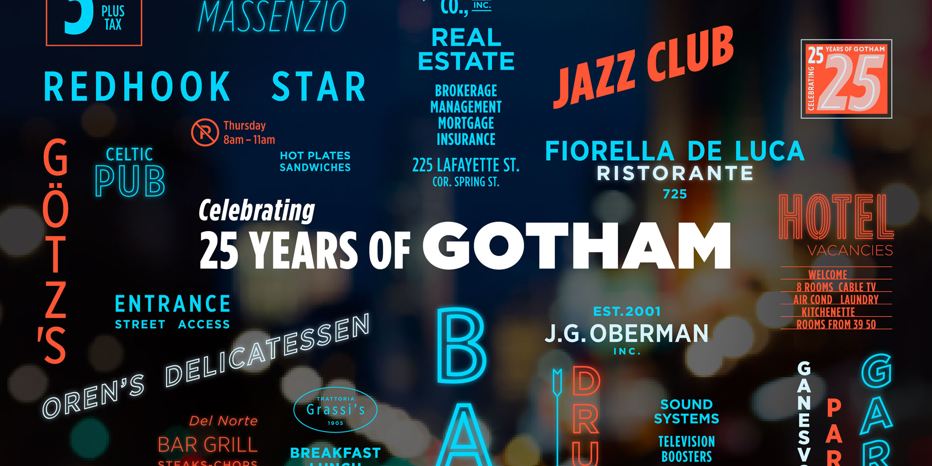
One of the most popular typefaces in the world, Gotham, has been upgraded by Monotype. Say hello to Gotham Variable, a major evolution of the iconic typeface, which introduces continuous control across weight and width in a single, performance-optimised file.

Gotham, designed by Jonathan Hoefler and Tobias Frere-Jones and published by Hoefler & Co., has been involved in various elements of global communication since it launched publicly on the January 2001 cover of GQ. It has been used by brands the world over, including Netflix and Coca-Cola, the United States Postal Service and Saturday Night Live. Twenty five years later, it enters a new era that enables a new level of creative control and adaptability.

Gotham Variable consolidates multiple static files into a single streamlined file, which improves performances, reduces load times and simplifies implementation across platforms. It’s also highly adaptable, working seamlessly across screens, systems and contexts while maintaining Gotham’s iconic qualities. There are also 54 new intermediate styles, including subtle new shades of weight and a new Compact width.

Why has it been upgraded now? “We’re at a point with variable fonts that they are more what we have come to expect from a workhorse family, rather than an experiment, an add-on, or a nice-to-have,” explains says Sara Soskolne, previously senior designer at Hoefler & Co., now executive creative director at Monotype and lead designer for Gotham Variable.

“Reverse engineering variability into an existing and very widely used family is a trickier task than creating a new family that’s conceived as variable from the start. Since Gotham was not designed with variable functionality in mind, I think it made sense to wait a little to make sure variable fonts had reached a critical mass of adoption and expectation before embarking on creating a variable version of a family like Gotham.”

Gotham Variable

(Image credit: Monotype)

Gotham was also an obvious choice for an upgrade. “Gotham has spent 25 years earning an extraordinary kind of trust, from political campaigns to billboards, and across some of the world’s most iconic brand identities,” explains Sara.

“With Gotham Variable, we tried to imagine what this typeface could become without losing sight of its powerful legacy. Many of the styles in Gotham Variable have never existed before. Making them feel like they always belonged was the hardest part, and the most essential.”

Gotham Variable

(Image credit: Monotype)

As well as its technical improvements, Gotham Variable features expanded language support, including Vietnamese, supporting complex diacritics, stacked accents and tone marks. It also includes enhanced Cyrillic and Bulgarian.

“Adding language support to an existing typeface family is no quick and easy task. Getting the proportion and style right for these new glyphs was essential to stay true to Gotham’s DNA. Particularly for the hook and horn, matching Gotham’s expressiveness was key,” says Jordan Bell, senior type designer at Monotype.

For Sara, the connection to Gotham was personal: “My relationship with Gotham stretches back nearly 20 years, which is when I first started collaborating on expansions to what was then still quite a small family. This progressed from smaller initial forays, like adding extended numeric sets and expanded Latin language support, to filling in the width range between Gotham’s original and Condensed extremes to create what became its full 66 styles that were released in 2009; and then to expanding that entire family to cover the Greek and Cyrillic scripts for its 2015 release.

“More recently, I worked with Manual Creative on several bespoke decorated styles of Gotham Condensed for the Obama Foundation, which was a lovely way to reconnect to the family and sort of test the limits of how far it can be pushed while still feeling like Gotham before leading this new Variable expansion.

“And, living in NYC this whole time, on a personal level I’ve had the good fortune of living with some of Gotham’s vernacular sources in signage around the city, to the extent these still exist.”

Gotham Variable

(Image credit: Monotype)

In terms of challenges on this project, there were a few key issues: “To my mind, the main challenges came from the fact of grafting things like variability and Vietnamese language support onto an existing family,” says Sara.

“In adding variable functionality, suddenly all the spaces in between Gotham’s static styles – which were where we hid the sleight of hand involved in making them look the way they do – are now visible and completely accessible to users. So we had to be very intentional and critical about how that was handled.

“In adding Vietnamese support, because it’s a language that includes stacked accents (which often require more vertical space to incorporate), but we couldn’t go changing the line height of Gotham, we needed to include these across the whole design space without them feeling cramped or crowded.

“Underlying all of this is the temptation, once you’re opening up the hood, to turn this into a Gotham 2.0 and revisit some of those very early decisions that are causing some trouble later on. But we agreed very early on to keep this new expansion fully backwards compatible and only expand what’s available to users, not to change anything that existed previously, which I think was absolutely the right call.”

I asked Sara which element on Gotham Variable she was most proud of: “I’m probably most proud of how this all came together to create a variable version of such a beloved family that still feels utterly like Gotham at every moment.

“Since I wasn’t one of the original designers of Gotham, but have increasingly become its custodian over the years, I have a deep sense of responsibility to the intent behind it and the DNA that was created by those original designers. That can make some decisions (such as adding new styles) feel more challenging, but it also means it feels more rewarding when I get it right.

“So, I’m particularly excited about the new Compact width we’ve added in between the original and Narrow widths, which is meant to visually look just like the original width but set more efficiently in text.

“And even after staring at it for months, I never get tired of playing with the variable width slider and watching those stroke endings change their orientation in between the Extra Narrow and Condensed. There’s still plenty sleight of hand in this version, we just had to find different places to hide it!”

Gotham Variable is available on Monotype FontsMonotype Connect and MyFontsFind out more about Gotham Variable.

Creative Bloq is now easier to access than ever before with our on-the-go app, which brings you all the content you know and love from our website, but in a super-streamlined design.

Feature image credit: Monotype

By 

Rosie Hilder is Creative Bloq’s Deputy Editor. After beginning her career in journalism in Argentina – where she worked as Deputy Editor of Time Out Buenos Aires – she moved back to the UK and joined Future Plc in 2016. Since then, she’s worked as Operations Editor on magazines including Computer Arts, 3D World and Paint & Draw and Mac|Life. In 2018, she joined Creative Bloq, where she now assists with the daily management of the site, including growing the site’s reach, getting involved in events, such as judging the Brand Impact Awards, and helping make sure our content serves the reader as best it can.

Sourced from CREATIVE BLOQ

When you purchase through links on CREATIVE BLOQ site, they may earn an affiliate commission. Here’s how it works.

By 

Nostalgia is replacing reinvention.

In the past year you will have seen many a big brand lean on nostalgia and heritage rather than radical reinvention. It feels like a retreat from bold and daring reinvention, as we snuggle up to nostalgia like a security blanket

Take the case of the poster child of this new-age caution in Cracker Barrel Old Country Store. In August 2025 the chain attempted to modernise a brand rooted in roadside American. Immediately it saw a tsunami of political and social-media uproar. Soulless … bland … lacking resonance. Not long later, the company quietly dumped the redesign and reinstated its classic 70s-era emblem featuring “Uncle Herschel” beside a barrel. Cracker Barrel serves as a costly lesson in caution, with Cracker Barrel’s market value briefly falling by about $100 million before rebounding when the old design returned.

The old Cracker Barrel logo with a barrel and old man and the more minimalist new Cracker Barrel logo side by side

(Image credit: Cracker Barrel)

A similar story has been unfolding at midmarket fashion label Vera Bradley. Long known for its quilted bags in florals and paisley, Vera Bradley launched a brand “refresh” in 2024 aimed at attracting younger buyers. This makeover downplayed the company’s signature prints in favour of solid colours and sleeker lines. But many loyal customers rebelled. By early 2026 the company announced a course correction and its new “Project Sunshine” pivot doubled down on the vintage florals that made the brand famous. The Wall Street Journal reported that Vera Bradley’s executives admitted they had “lost track of what made Vera Bradley special”. The brand reversed its own makeover and leaned into nostalgia, acknowledging that its heritage patterns were, perhaps, core to customer appeal.

Vera Bradley

(Image credit: Vera Bradley)

These high-profile U-turns indicate a broader motive. We exist in an age of political upheaval and economic uncertainty, and many companies seem to be betting on familiarity. Designers and marketers note that nostalgia isn’t just sentimentality – it’s a strategic comfort zone.

Brand Genetics, a human centred insight and innovation consultancy, argues that research shows that nostalgic branding provides comfort during uncertain times and this helps consumers feel familiar and trustworthy with a brand. Nostalgia creates continuity between past and present, acting as a psychological anchor for weary customers. Familiar cues, such as old logos, classic patterns act as anchors.

When the world feels unpredictable, a gool old logo and pattern on your breakfast cereal might, on some level, make you feel a little bit safer.

Brands also face a much-more immediate cautionary environment. Social media and 24/7 news cycles mean that even small design changes can spark big reactions, when the name of the game is click bait. A new logo can be framed as a woke political statement, and any misstep is magnified online. In Cracker Barrel’s case, just removing an old cartoon figure became ammunition for a culture war. That kind of instant, vocal feedback encourages companies to play it safe.

Logo for Jaguar

(Image credit: Jaguar)

Think of one of the most radical examples of not playing it safe, Jaguar’s EV pink explosion. Last month The Telegraph reported: “The designer behind Jaguar’s controversial “woke” rebrand has reportedly been dismissed from the carmaker just days after a new chief executive took over…”

Where does all this leave designers? Innovation still matters, but maybe it should be cautioned with authenticity. Be sure change is kept close to the client’s DNA. Strip away at your risk, be mindful around signature elements that customers love – the very things that can alienate the audience a rebrand seeks to excite. Think colours, patterns, characters or typography as an echo to remind people what they already loved.

For many brands, nostalgia has become a safe space to hide from the judgement of a volatile world. For designers, maybe it’s a reminder that rupture without purpose can be a big bang of hot air. So tread carefully, there are landmines in the market.

Feature image credit: Burger King/Pepsi

By 

Simon is a writer specialising in sustainability, design, and technology. Passionate about the interplay of innovation and human development, he explores how cutting-edge solutions can drive positive change and better lives.

Sourced from CREATIVE BLOQ

By 

There’s a lot wrong with this advert. A lot.

We all love a good advertising fail, and no more so than on LinkedIn, where piling on to deride the latest from adland is quite the sport.

The latest advert to get people talk comes from drinks brand Courvoisier. The advert shows band Ezra Collective sitting around in what I suspect is meant to be a cosy scene. For some reason only one of them has an instrument and that instrument is a drum kit.

It was chief strategy officer Kevin Chesters who brought this to the attention of his LinkedIn followers. He had a lot to say about it, including:

“I MEAN, WHERE DO YOU START?

The meaningless headline?

The generic “sociability” shot?

The ignorable and ignored “serving suggestion” line???

The mandatory bottle AND glass inclusion?

The second headline that means even less than the first?

The third feature of logo and brand just in case you didn’t notice it the first two times, on the left or bottle?

The pointless lower case/script in French to suggest sophistication? (😂😂😂)

Note to self: why are the words in the meaningless headline underlined.”

He went on to say he is assuming it was done by AI, and he’d give it a zero out of ten.

The commenters then piled on, with most agreeing with Kevin.

“Such a generic looking ad” said one person. “It’s also just a BAD photo” said another, who went on to talk about the eye lines – who/what are they looking at?

“This is actually disorientingly bad” said another commenter, while someone else called it “an absolute shocker”.

So there you have it, is this the worst billboard of 2025? There’s plenty of competition, including these creepy as hell UK billboards, these provocative billboards and this Apple billboard that turned heads for all the wrong reasons.

Feature image credit: Courvoisier

By 

Rosie Hilder is Creative Bloq’s Deputy Editor. After beginning her career in journalism in Argentina – where she worked as Deputy Editor of Time Out Buenos Aires – she moved back to the UK and joined Future Plc in 2016. Since then, she’s worked as Operations Editor on magazines including Computer Arts, 3D World and Paint & Draw and Mac|Life. In 2018, she joined Creative Bloq, where she now assists with the daily management of the site, including growing the site’s reach, getting involved in events, such as judging the Brand Impact Awards, and helping make sure our content serves the reader as best it can.

Sourced from CREATIVE BLOQ

By 

In an extract from his book Boost Your Creativity, Steve Brouwers argues why rest and relaxation are the creative’s best friend.

Today most people fill every spare moment with distractions.

Scroll. Swipe. Tap.

Mozart composed with astonishing speed, but that speed was likely made possible by long, quiet periods of internal processing – not visible ‘doing’.

It might feel like you’re doing nothing in these moments – but your brain is actually hard at work.

Doing nothing isn’t passive – it’s active recombination.

Creativity is the residue of time wasted

(Image credit: Boost Your Creativity, published by Luster) 

Beneath the surface, a network of regions called the Default Mode Network (DMN) lights up. This is your brain’s backstage crew, quietly preparing the next act of inspiration while the spotlight is off. The DMN is activated when you’re not focused on a specific task.

It thrives in the in-between spaces when you’re daydreaming, reflecting, thinking about the past or future, or imagining someone else’s thoughts. It’s the engine of empathy, memory, and mental time travel. Most importantly, it’s where creativity begins to simmer.

When you’re solving a clear-cut problem, your brain switches to a different mode: focused, logical, linear. But when you loosen your grip and let your attention wander, the DMN kicks in. That’s why your best ideas often sneak up on you when you least expect them: mid-shampoo, on the toilet, while doodling, or as you’re drifting off to sleep.

You’re not trying – and that’s the point.

The DMN connects ideas, stirs memories, and forms new patterns in those quiet moments when you’re not looking directly at the problem.

This is why some of the most powerful creative tools are the simplest: rest, reflection, movement, play, and purposeful pauses.

When you stop pushing your brain and let your mind wander, you’re not wasting time – you’re opening the door to insight.

This isn’t just theory. Creatives across several disciplines have noticed it too.

It appears that I have my best ideas just as I wake up. When my mind is not thinking about daily stuff yet and I am still lingering in that twilight zone of wondering.

Paul McCartney wrote Yellow Submarine in that twilight zone, as he was drifting off to sleep.

Designer Massimo Vignelli explained that he gets his ideas while shaving, which he emphasises, is the reason why he doesn’t have a beard.

So remember: sometimes the best way to create is to stop creating – just for a moment – and let your backstage brain take over.

Isn’t it wonderful that some of your best works are created while you’re ‘not working’ at all?

This is an extract from Boost Your Creativity by Steve Brouwers, published by Luster and available now from all good bookstores.

Feature image credit: Boost Your Creativity, published by Luster

By 

Steve is a Belgian creative director, teacher, author and speaker with over 25 years experience in the media industry. In his inspiring talks, Steve shares his insights and experiences with audiences around the world. He is known for his candid stories about imposter syndrome and procrastination – topics that resonate deeply within the creative community. He is the author of Creatives on Creativity, published by Luster in 2021.

Sourced from Creative BLOQ

By 

The brand sells heart over horsepower.

Emotion sells, and few carmakers have leaned into that truth (sometimes gracefully, sometimes aggressively) quite like BMW. Sliding into a BMW isn’t meant to feel like entering a machine; it’s meant to feel like slipping on an identity, an emotion, a story.

From its iconic car designs to its slick campaigns, BMW has spent decades engineering not just vehicles but vibes. Over time, it has perfected what many premium carmakers attempt but rarely sustain: an emotional brand world where the product is less about horsepower and more about aspiration, belonging, and that intangible spark known simply as “joy.”

BMW i4

(Image credit: BMW)

This festive season, BMW pushed that idea harder than ever. You may have seen the campaign insisting, “We didn’t invent the car… We created a feeling,” for the brand’s all-electric BMW iX3 – to a world increasingly defined by silent motors and software screens. It’s BMW trying to humanise the algorithmic future of driving, a future where “The Ultimate Driving Machine” risks being reduced to just another rolling gadget.

Of course, emotional storytelling isn’t new territory for BMW. Long before the tech-luxury wars, the brand was selling Freude am Fahren (joy of driving). Even the 1974 tagline “The Ultimate Driving Machine,” which at first sounds like a performance flex, was really a coded identity pitch: buy a BMW, and you become the kind of person who values mastery, confidence, the feel of the road.

The First of a New Era | Introducing the New BMW iX3. – YouTube

But that narrative has had to evolve. In recent years, BMW’s marketing has shifted gears from taking the driver-as-hero route to the softer sideroad of lifestyle-as-feeling. The brand no longer just sells torque curves; it sells a sense of freedom, empowerment, and success. From cinematic social shorts to immersive, multisensory showrooms, BMW engineers every touchpoint to reinforce the idea that owning its vehicles is an experience on a very human level, not a mere transaction.

This is the classic playbook of emotional branding, which connects with people’s desires, anxieties, and self-image. Customers buy the feeling they hope the product will unlock. And BMW has doubled down on this playbook, threading emotion through everything from its design language to its retail choreography.

But here’s the tension: in a market where EVs are quiet, digital, and increasingly similar under the skin, can a brand still sell emotion as a differentiator? When the visceral growl of a straight-six becomes an algorithmically tuned sound profile, does “joy” hit the same? It’s a contradiction BMW is actively wrestling with.

BMW advert

(Image credit: BMW)

Designing Emotion in Every BMW

Each new model is crafted to elicit a reaction, sometimes delight, sometimes debate. From sculpted lines to wraparound cockpits, BMW treats design not as ornamentation but as emotional triggers. The brand knows customers aren’t buying A-to-B transportation. They’re buying confidence, pride, and a little theatre.

This also explains the polarising design decisions in recent years, the giant kidney grille, for example, which sparked a miniature design civil war. But even that controversy shows BMW’s intent: emotional impact beats universal approval. BMW would rather make you feel something than nothing.

And when hardware isn’t enough, BMW turns to narrative. A 2023 electric-i4 campaign, “Father & Son. Freude Forever,” shows a father passing the joy of driving to his son. The nostalgia is dialled up deliberately: driving becomes family, freedom, legacy. Likewise, this year’s holiday film uses a child and a grandmother reconnecting through a BMW to argue that the joy of driving can bridge generations, even in an era of range anxiety and touchscreen fatigue.

It’s emotionally effective. It’s also a bit of a gamble. BMW is selling joy at a time when driving, especially urban driving, has never felt less joyful. Congestion, cameras, automation, and rising insurance costs all threaten the fantasy. The brand is essentially promising a feeling that the real world increasingly refuses to deliver.

A gif of the colour changing BMW

(Image credit: BMW)

What Designers Can Learn

For designers and brand strategists, BMW offers a compelling blueprint: build products that earn trust at a functional level, then build stories that elevate them to something people can feel. But the blueprint comes with caveats. Emotional branding only works when the product experience supports the claim. BMW’s engineering heritage gives it leeway here, but not infinite leeway.

Because if emotion becomes a veneer over a commodity product, people notice. And the EV era, flattening performance differences, muting mechanical character, makes this risk more acute than ever.

In that sense, BMW’s evolving strategy isn’t a departure but a recalibration. The machines are changing; the promise can’t. The brand seems determined to argue that even if the future is quieter and more digital, the feeling of driving doesn’t have to be, whether consumers believe that is the next chapter.

Feature image credit: BMW

By 

Simon is a writer specialising in sustainability, design, and technology. Passionate about the interplay of innovation and human development, he explores how cutting-edge solutions can drive positive change and better lives.

Sourced from CREATIVE BLOQ

“We will not stop until beauty is a source of happiness.”

Personal care brand Dove has become known for its campaigns championing real people with real bodies, as exemplified by its shunning of TikTok ‘beauty’ filters. And now, the brand is targeting AI in the latest iteration of its decades-old Real Beauty campaign.

The brand announced this week that it will never use AI-generated imagery to represent “real bodies” in its ads. And in a powerful short film, it takes aim at the generic and unrealistic beauty standards depicted in images churned out in text prompts such as “the most beautiful woman in the world.” (For more great ad campaigns, check out the best print ads of all time.)

Alessandro Manfredi, chief marketing officer at Dove, adds, “At Dove, we seek a future in which women get to decide and declare what real beauty looks like – not algorithms. As we navigate the opportunities and challenges that come with new and emerging technology, we remain committed to protect, celebrate, and champion Real Beauty. Pledging to never use AI in our communications is just one step. We will not stop until beauty is a source of happiness, not anxiety, for every woman and girl.”
Indeed, over the 20 year course of its Real Beauty campaign, Dove has repeatedly proven itself to be a force for good. From shunning AI to helping game developers code natural hair in an effort to increase diversity in video games, the brand’s inclusivity credentials continue to impress.
Feature Image Credit: Dove

By 

Daniel John is Senior News Editor at Creative Bloq. He reports on the worlds of art, design, branding and lifestyle tech (which often translates to tech made by Apple). He joined in 2020 after working in copywriting and digital marketing with brands including ITV, NBC, Channel 4 and more.

Sourced from CREATIVE BLOQ


By 

McDonald’s, Old Spice and Corona prove the best branding is multi-sensory.

Multi-sensory branding is on the rise because of one simple human truth; consumers perceive the world using all of their senses. For a brand to succeed in the modern age, it needs to be more than meets the eye, and savvy marketers are building holistic expressions that consider what people see, hear, feel and believe.

When your messaging uses a strategic combination of visual and sonic branding, all boats rise with the tide. Visual branding works on a cognitive level, sonic assets deliver on a deeper emotional level. When they’ve been designed to work in harmony, these sensory dance partners leave a lasting impression that improves performance exponentially (see our pick of the best sonic logos).

By 

Sourced from CREATIVE BLOQ